contact us | ok@ohmycode.ru
contact us | ok@ohmycode.ru
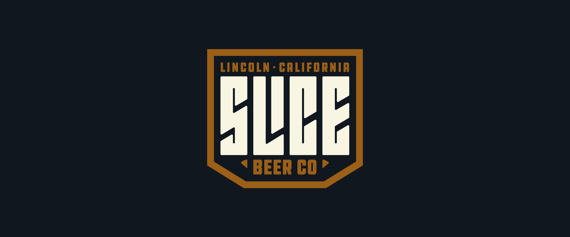
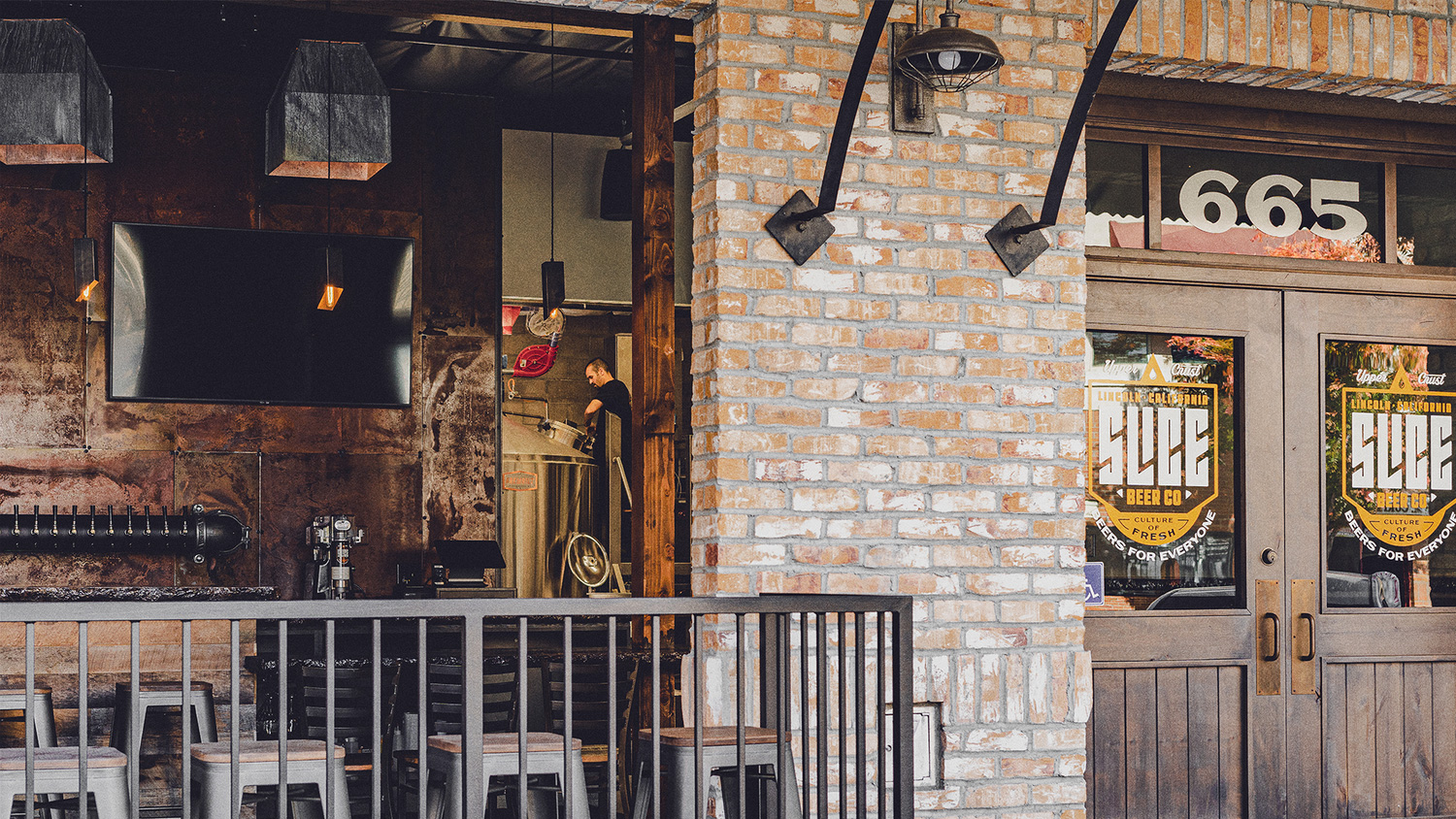
Established in 2019 in the small city of Lincoln, CA (pop. 47,000+), Slice Beer Co is a microbrewery that packs a 10 BBL brewhouse with 6 20 BBL fermentors into a small 1,100-square-foot space to serve a constantly rotating range of beers in its 500-square-foot tasting room that seats 32 patrons. With no immediate goal for growing or distribution, Slice Beer Co is focusing on its taproom experience. Its freshly brewed identity has been designed by Tulsa, OK- and St. Louis, MO-based Brethren Design Co.
As you may have noted from the introduction, this is a very “small” client but the work is largely satisfying as a full Review.
We built a visual identity that supports Slice at its infancy but also will age with the brand as it grows. Slice Beer Co is bold and innovative, small but nimble, knowledgeable but inclusive.
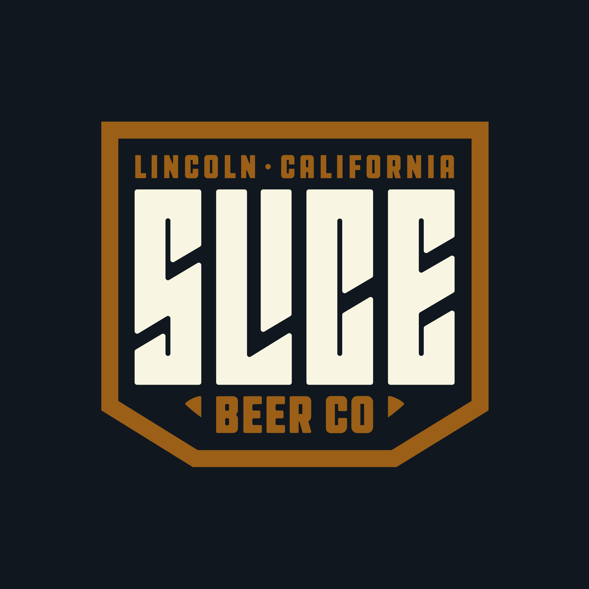
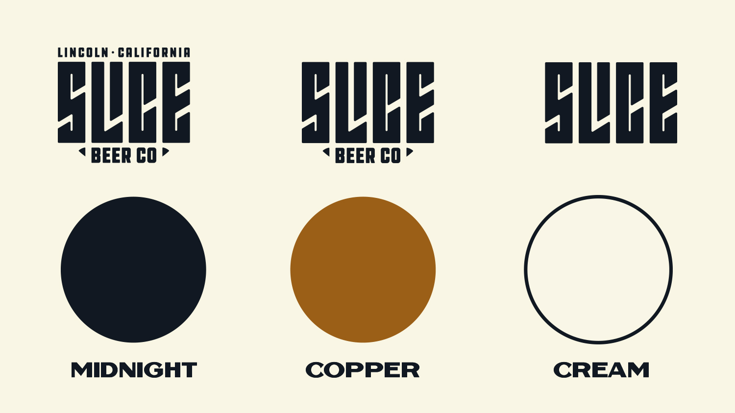
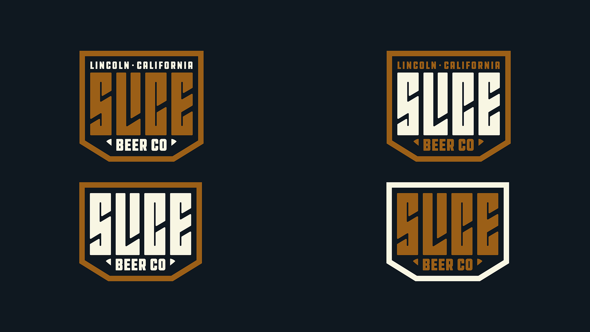
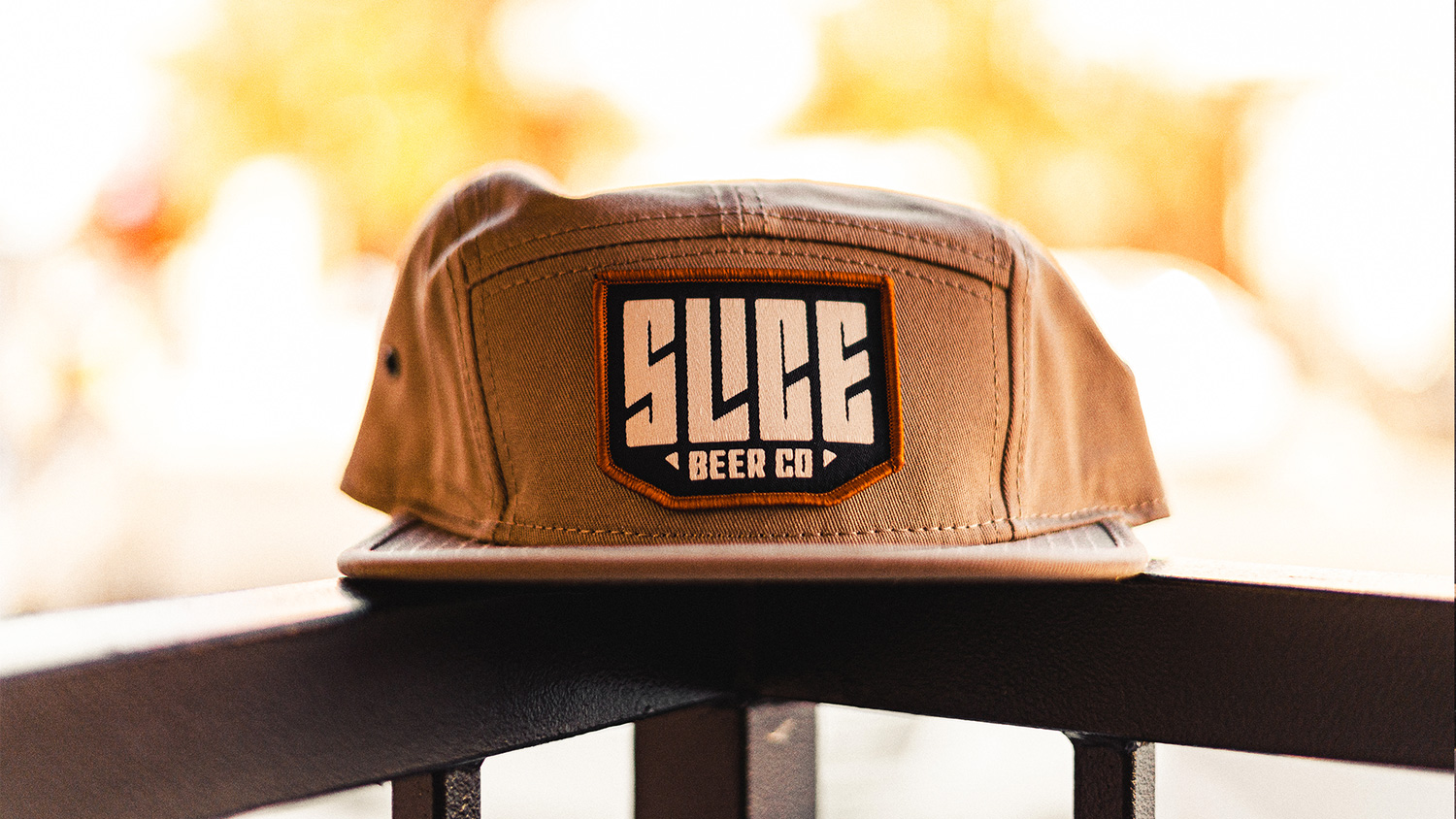
With a name like “Slice” I would expect angles in the logo and angles we get. The custom condensed wordmark with a nifty “LI” ligature to solve the wide gap that would have been created otherwise is really great. When I first saw it I wanted all the counterspaces to be like the thin ones that run vertically but I think that would have made it very hard to read and the final rendition allows that “I” to be perfectly readable. It’s also very neat how the counterspace angle created by the “LI” ligature moves upward through the counterspaces of the “C” and then the “E”. While the custom type beats to its own drum and avoids trends, the supporting typography is more brewery-like, which is a good thing as it helps ground the funky type in a more comfortable and relatable brewery visual language. Long way of saying, I like it.
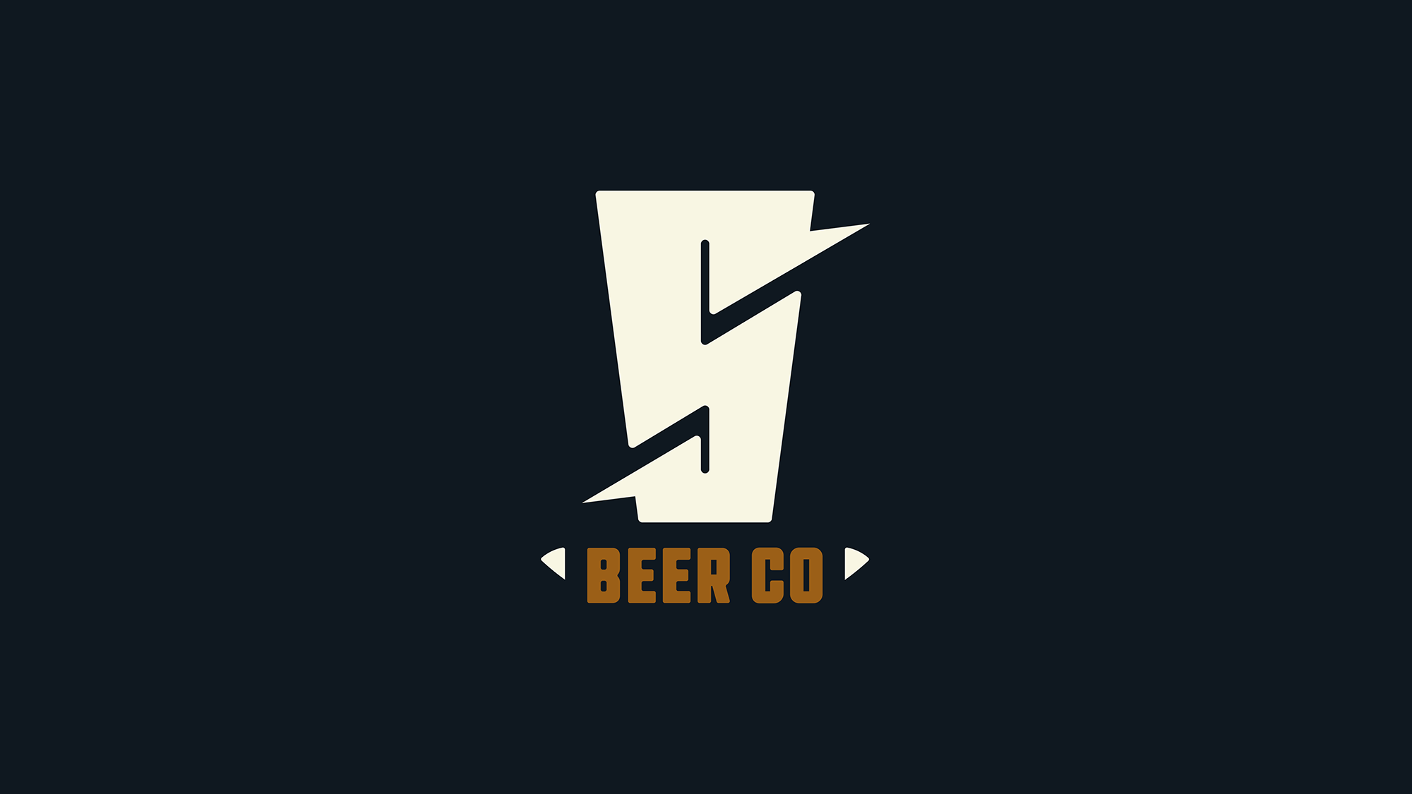
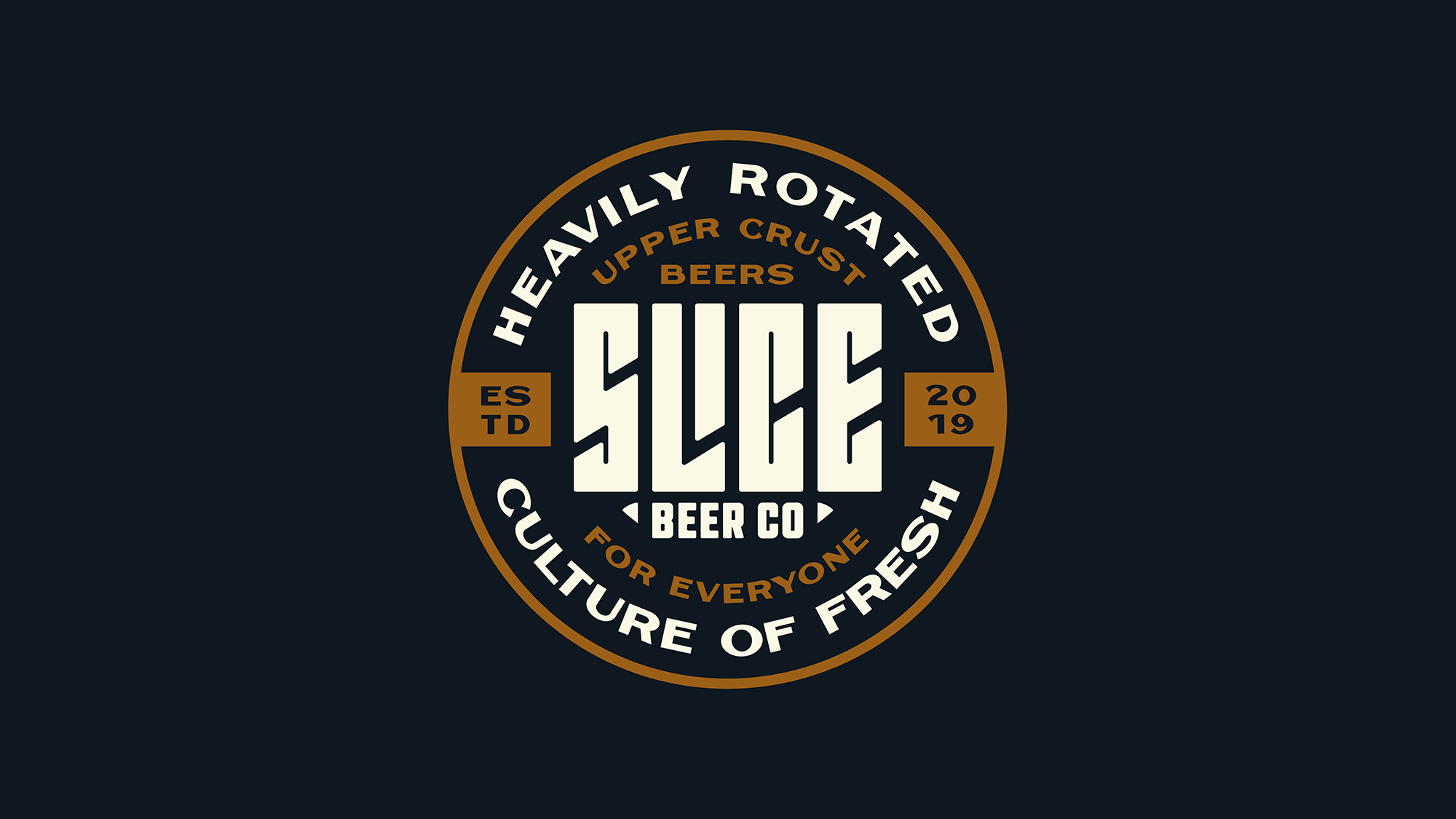
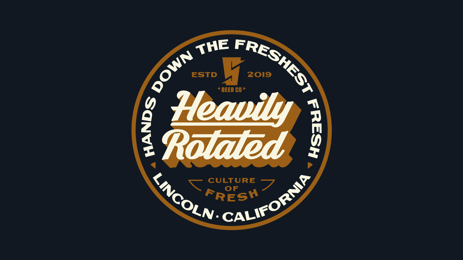
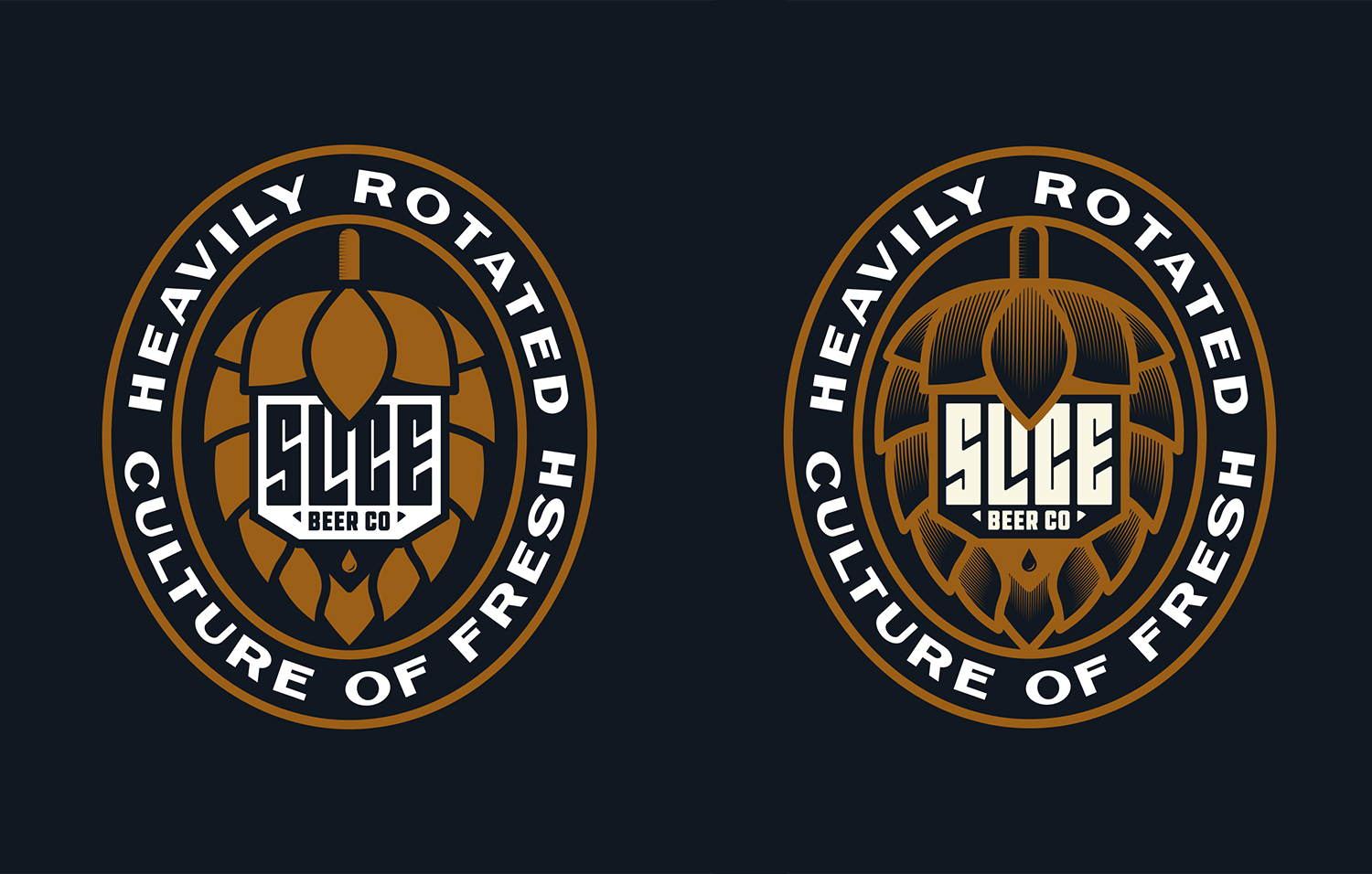
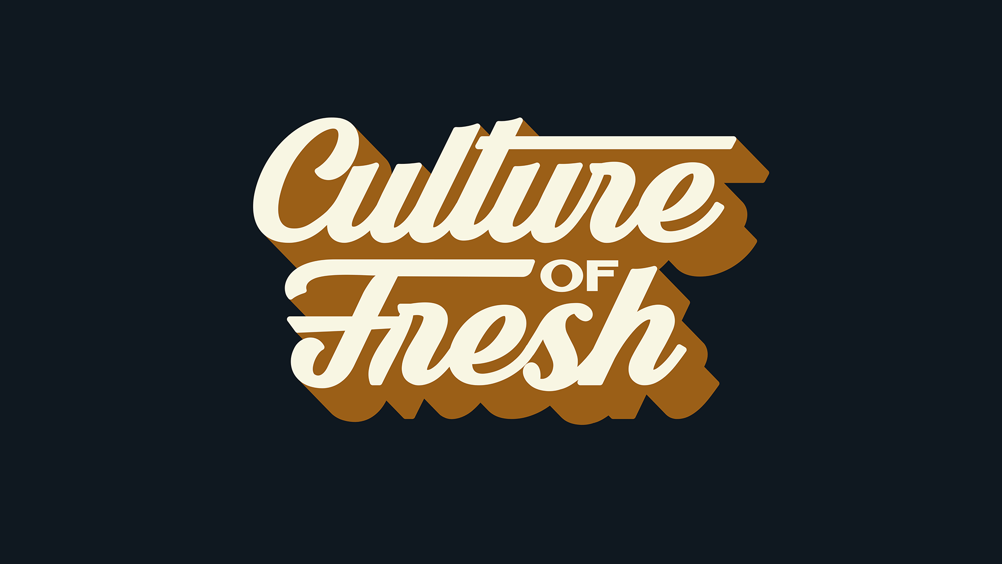
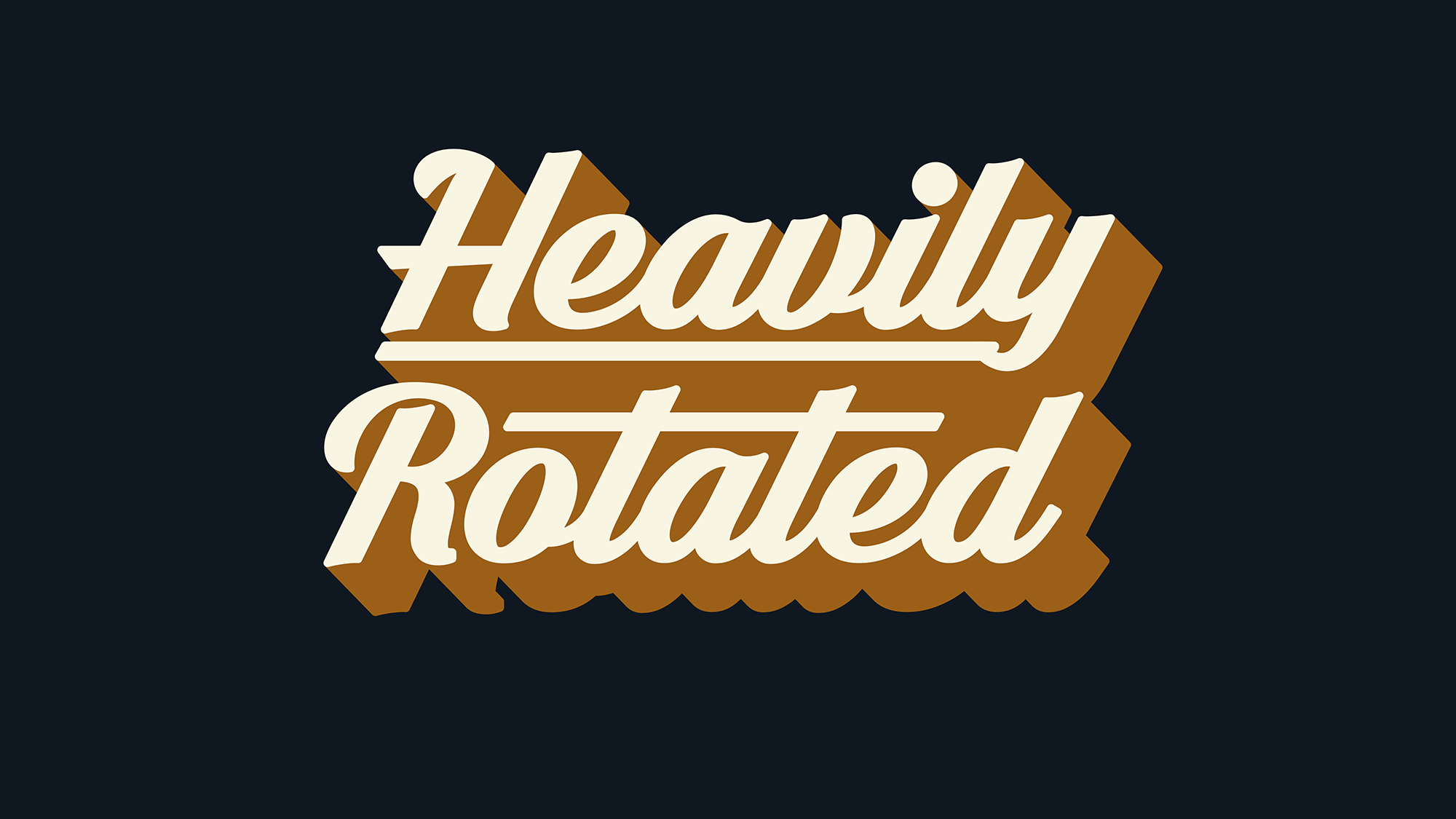
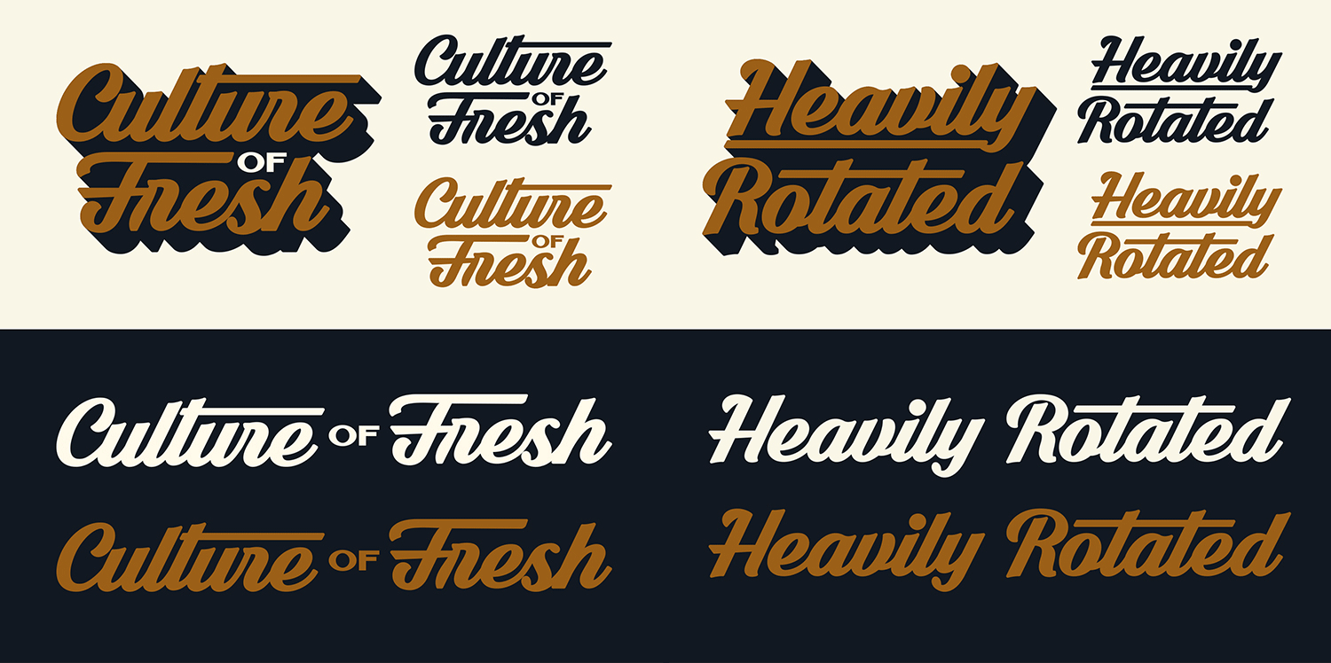
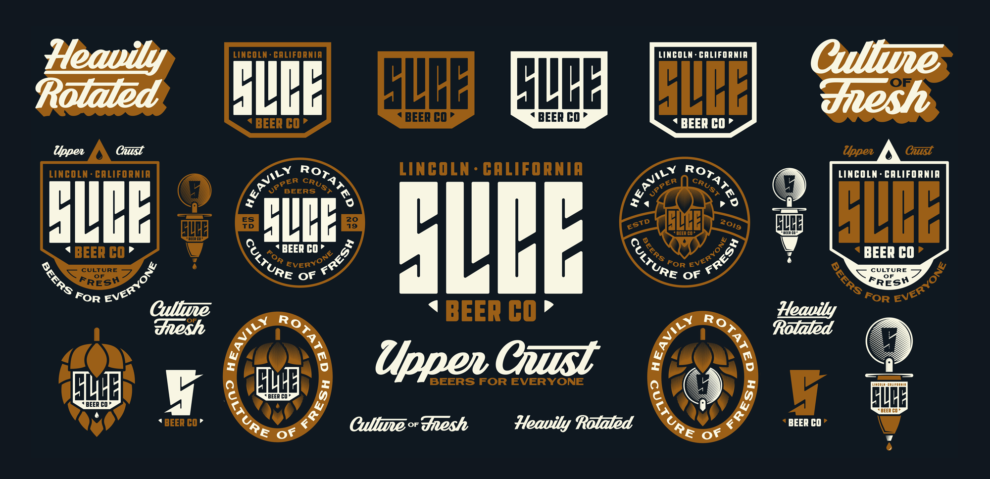
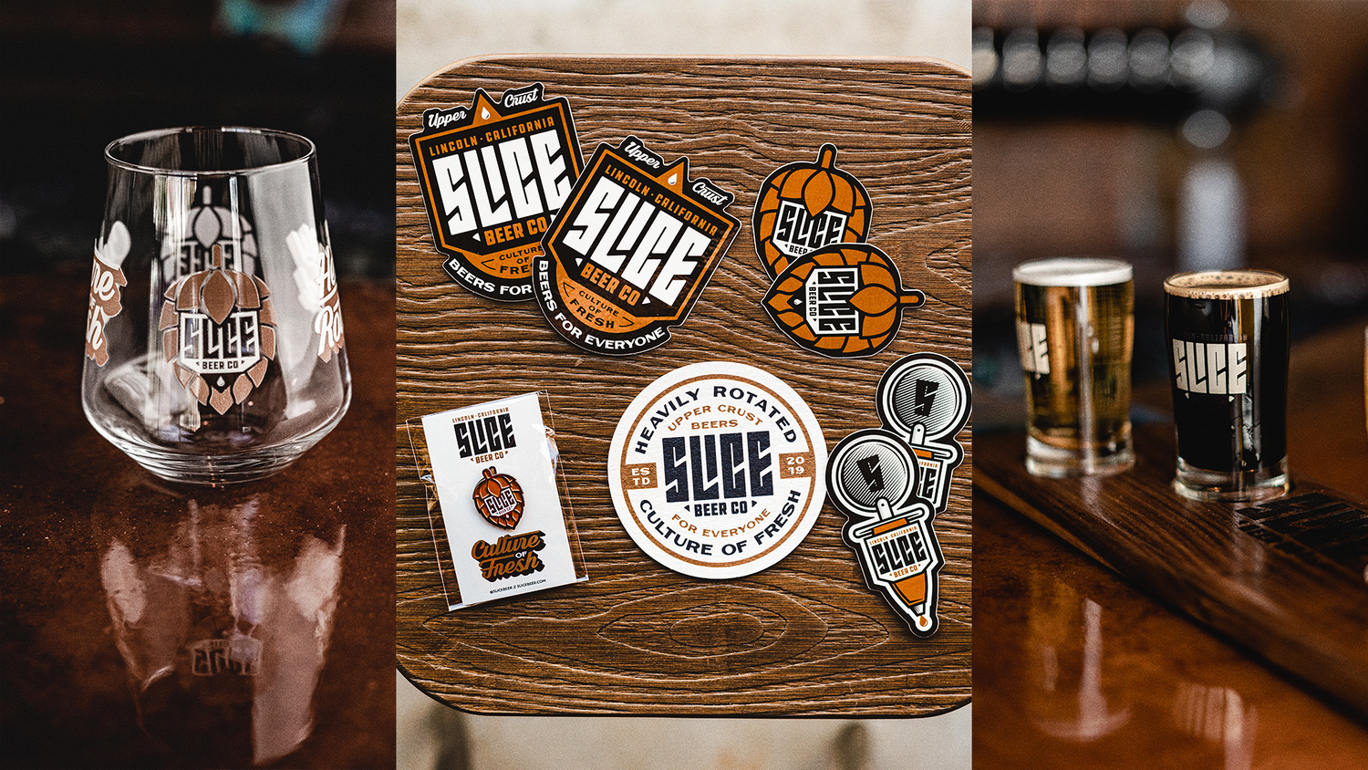
The secondary marks and badges are all kinds of fun — as they should be for a microbrewery — and while they do operate within the hipster-y brewer aesthetic they do so in an exuberant, varied way that adds up to a package that’s perfect for a microbrewery in a microcity. At first I found the superhero “S” a little annoying, but I think it’s now my favorite of the bunch. The only graphic that stands out not in a good way might be the shaded hop where the dimensionality perhaps could have been solved with hard shadows. But other than that, all the scripts and little triangles and strokes are working for me.
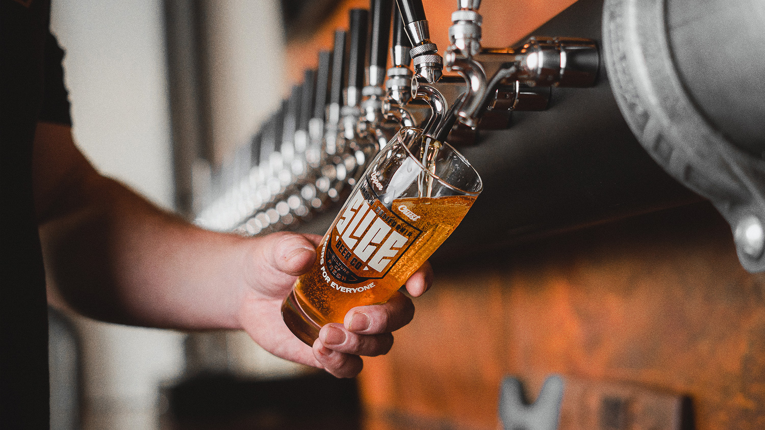
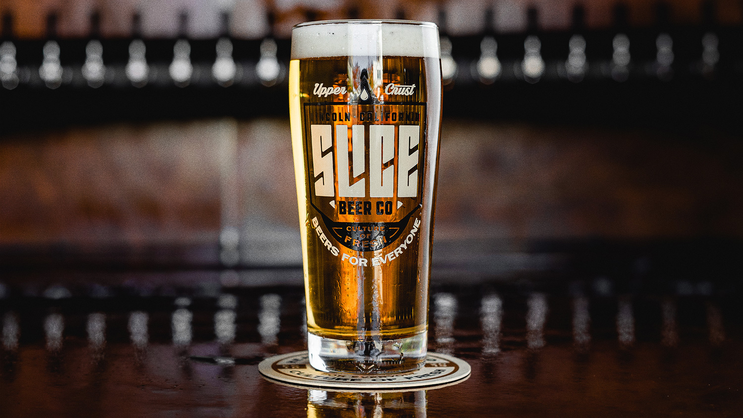
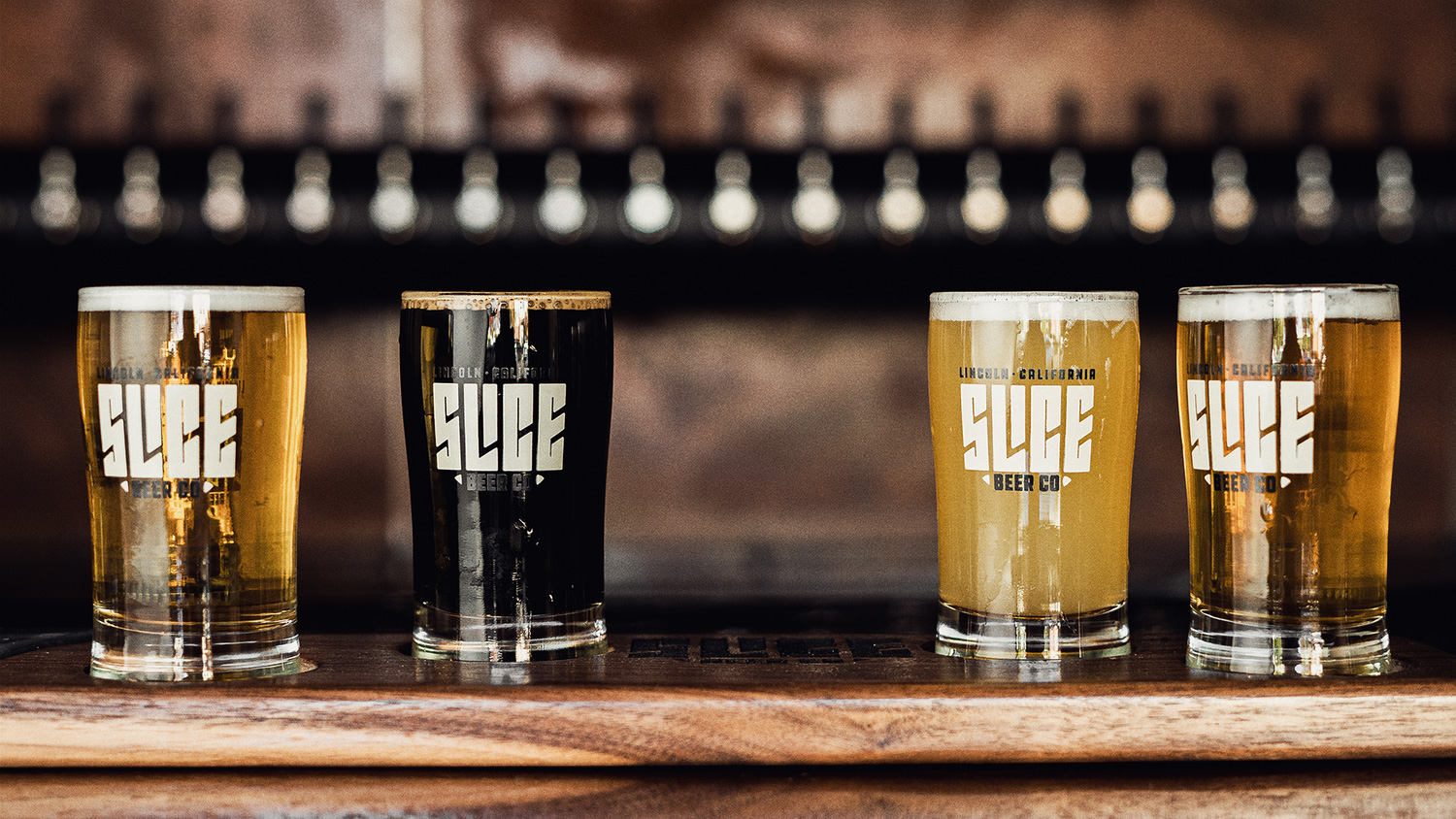
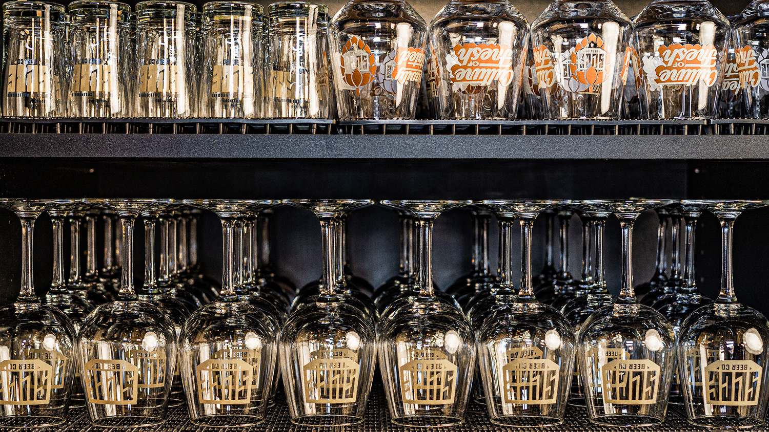
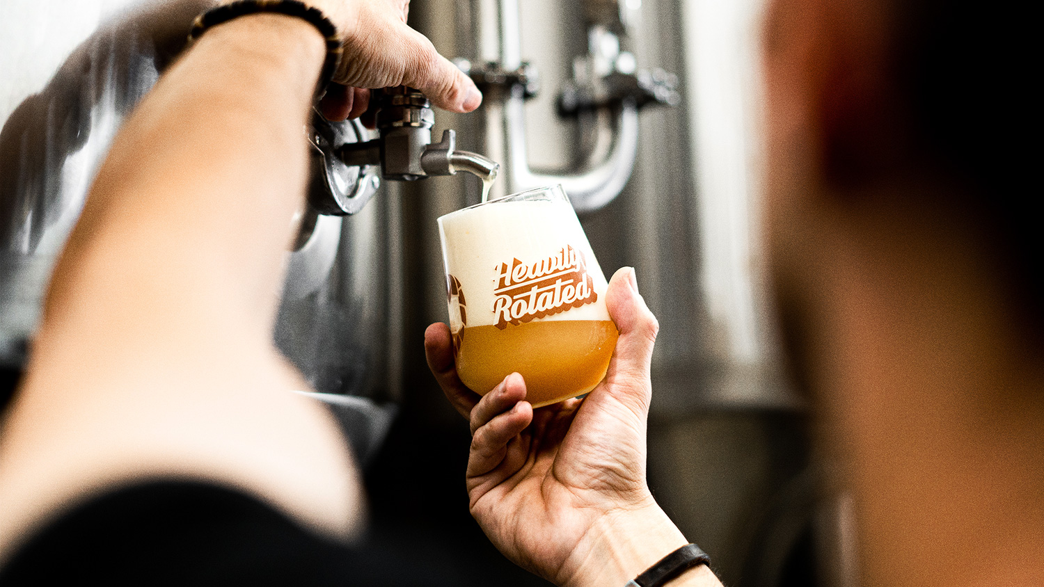
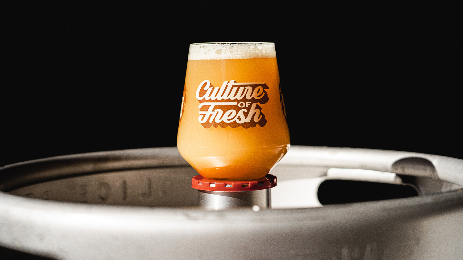
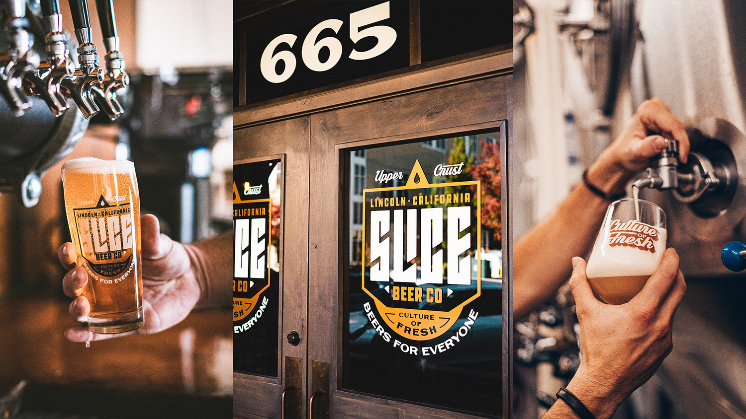
The wide range of assets is put to good use in the glassware with different kinds of glasses each using a different item, giving a great variety to all the glasses out in the taproom at any given point.
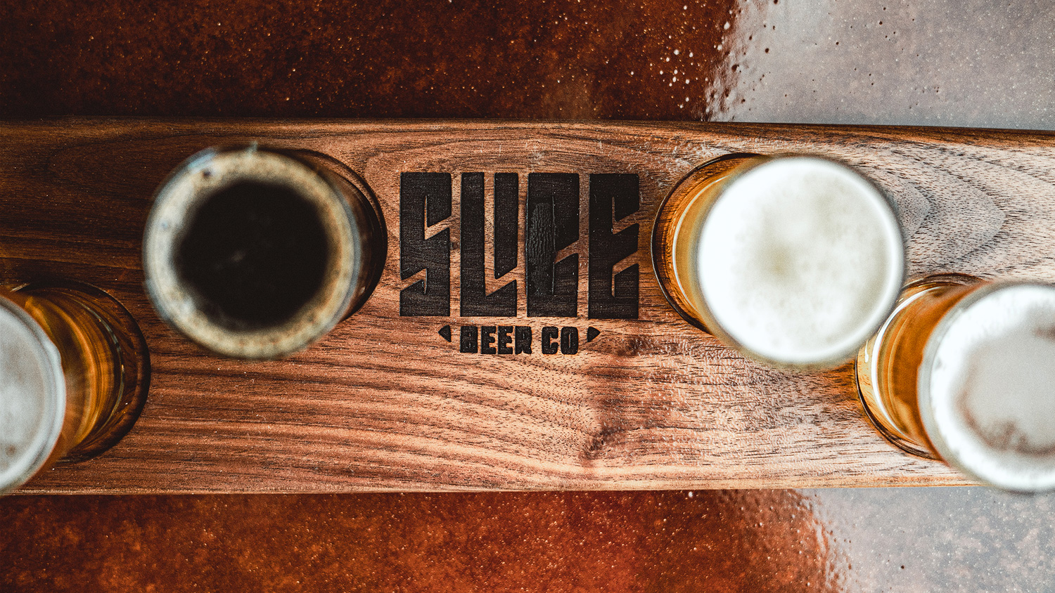
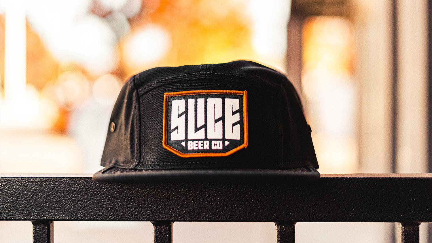
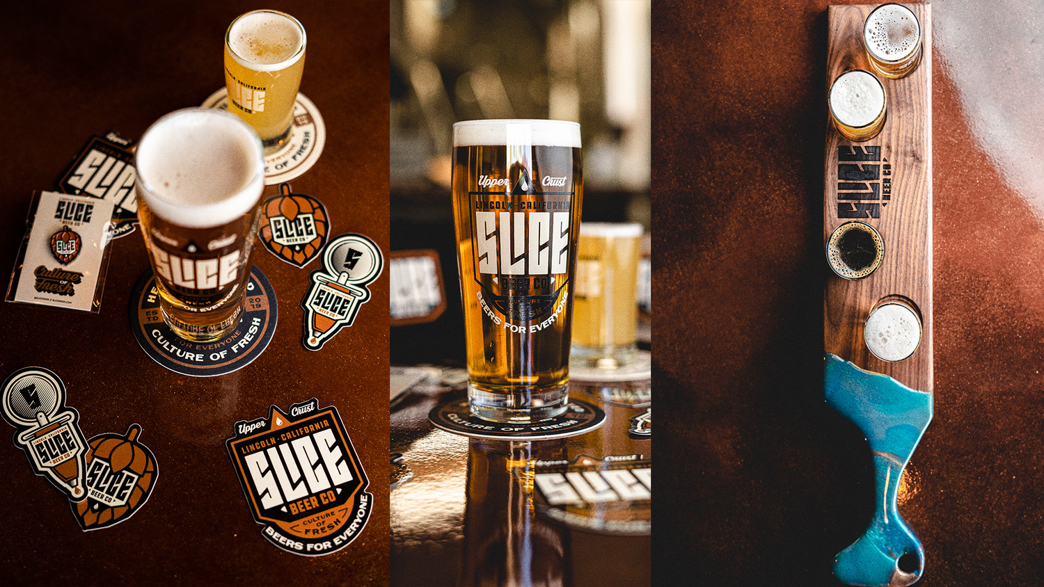
Overall, this is pure, unadulterated microbrewery goodness: no weirdness, no Brutalism, no pretentiousness… just good graphics, strong typography, and satisfying applications with a hoppy finish.

 Новости Союза дизайнеров
Все о дизайне в Санкт-Петербурге.