Обзор лучших ресурсов по разработке бренда, разработке упаковки
contact us | ok@ohmycode.ru
contact us | ok@ohmycode.ru
Established in 1796, Národní galerie v Praze (“National Gallery in Prague”) is an art gallery with a collection of European artists’ work that spans from the 1200s to the 1930s and is the largest collection of art in the Czech Republic. Owned by the state, the gallery operates across nine different buildings — the Fair Trade Palace, which houses the collection of modern art, being its largest. At the end of 2017, the Gallery launched an invitation-only competition in collaboration with CZECHDESIGN, an organization that helps clients find designers as well as organize formal competitions like this one. Ten studios were invited and paid to participate with Prague-based Studio Najbrt selected as the winner and their proposal will be implemented by Fall of this year.
The aim of the new visual identity is to make the National Gallery in Prague attractive, contemporary and expressive , to increase the awareness of this leading Czech art museum, to support the interest of visitors, increase the attendance of her collections and short-term exhibitions as well as accompanying public programs.
The identity of the new brand is based on: “The National Gallery in Prague as a lively and open institution, friendly and pleasant to visitors”, a move away from a large inaccessible institution, symbolized by today’s lion emblem.
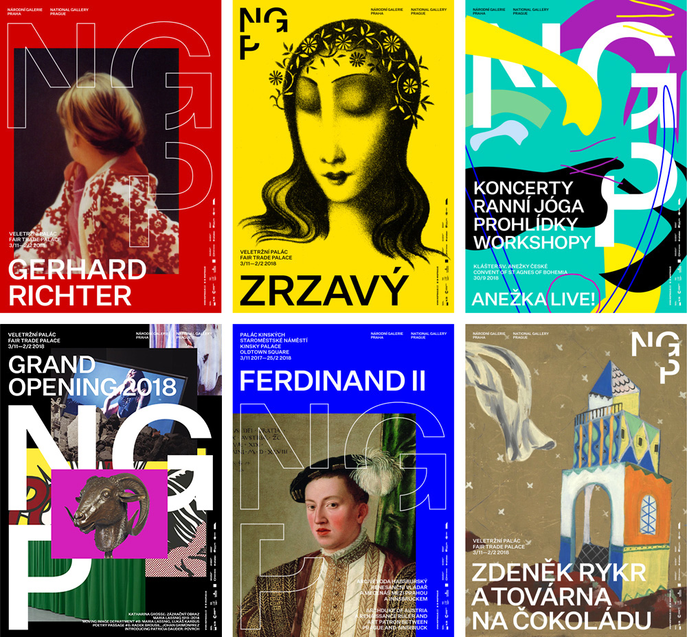
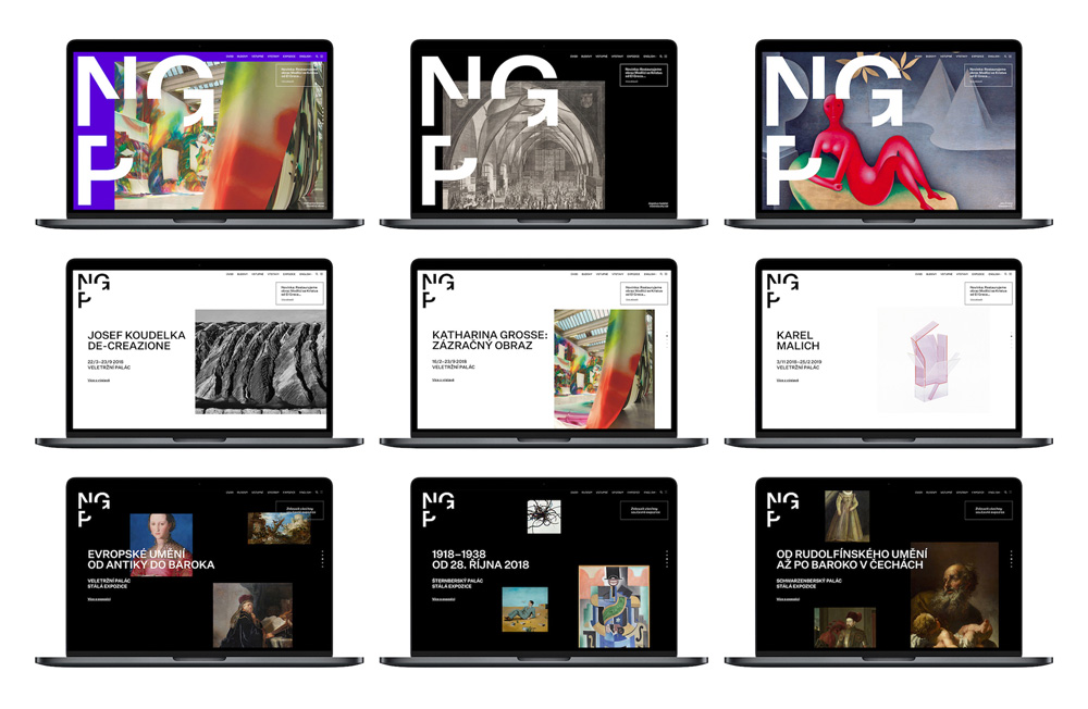
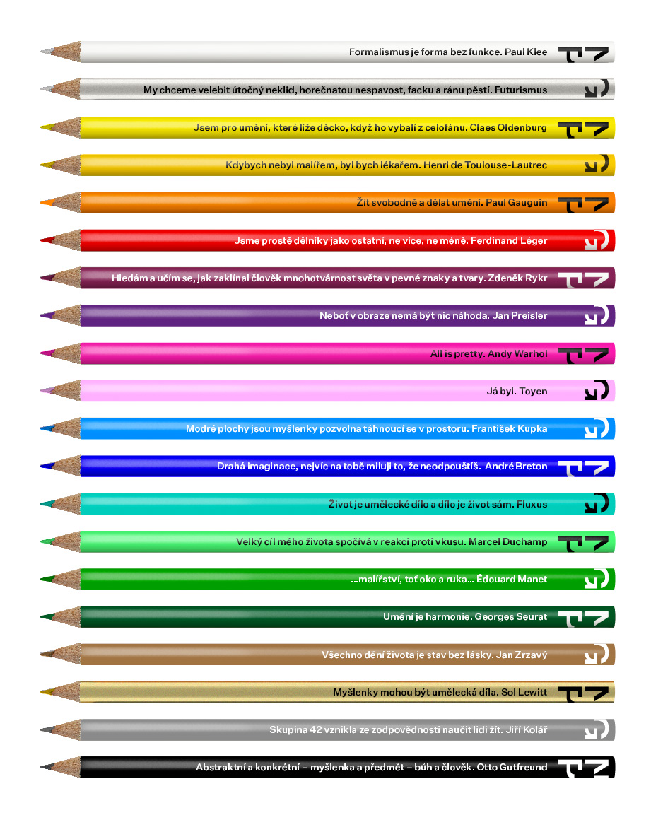
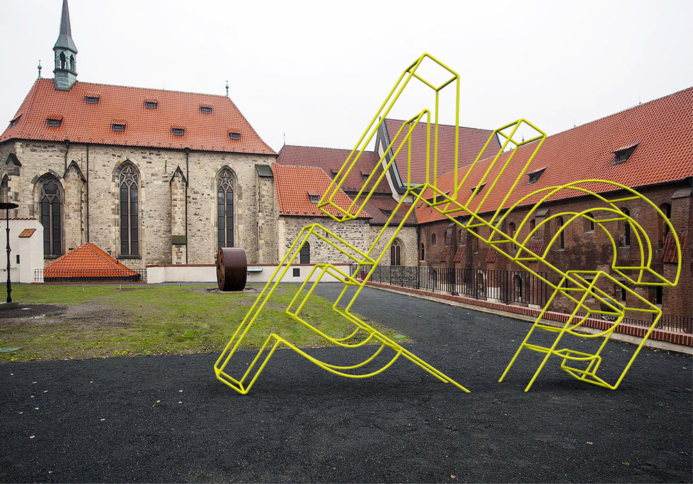
The winning visual style of the contest, to which ten studios have been called, builds on a distinctive logo inspired by the mission of the National Gallery as a space for the presentation of art. The logo defines context for different types of content (image, text, video) within the three letters of the abbreviation of the National Gallery in Prague, creating a memorable and variable brand. Color and visual style remain as open and vibrant as possible, just as the approaches of artists that are presented in the country’s most important gallery institution.
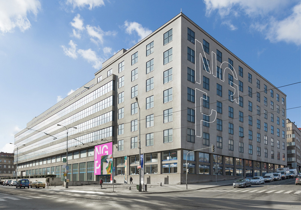
The old logo was far from inspiring or inviting and it was dully unattractive with its super spaced out, all-lowercase serif and oddly framed “e” next to the lion (which I guess was not bad). In its lack of coolness though, perhaps it did manage to convey its long history and the use of the lion, from the country’s coat of arms, made it clear it was owned by the state. The new logo falls in line with newer gallery/museum logos in its use of a sans serif and a primary black color application, so there are no surprises that it looks like it does. It’s also not surprising to see it used as a window since museums and galleries basically scream for that usage.
Despite meeting certain expectations, there are a few nice things in particular to this logo, the main one being the considered positioning of the block, where its top-right corner snaps to the inner crossbar of the “G” and its top-left corner sits right on top of the angle of the “N”. These two things might seem trivial and like obvious things to do but, in less capable hands, they would also be easy to not do. Another cool thing this logo does — which you can see better in the image below (specifically in the 3rd banner of the top row) — is that the blank block serves as a Gestalten-ish frame that neatly highlights the area underneath it and does it in a less obvious way than most logo-as-window structures. The identity then relies on the more obvious logo-as-window structure, so there is that.
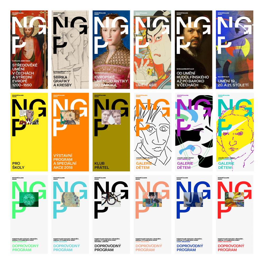
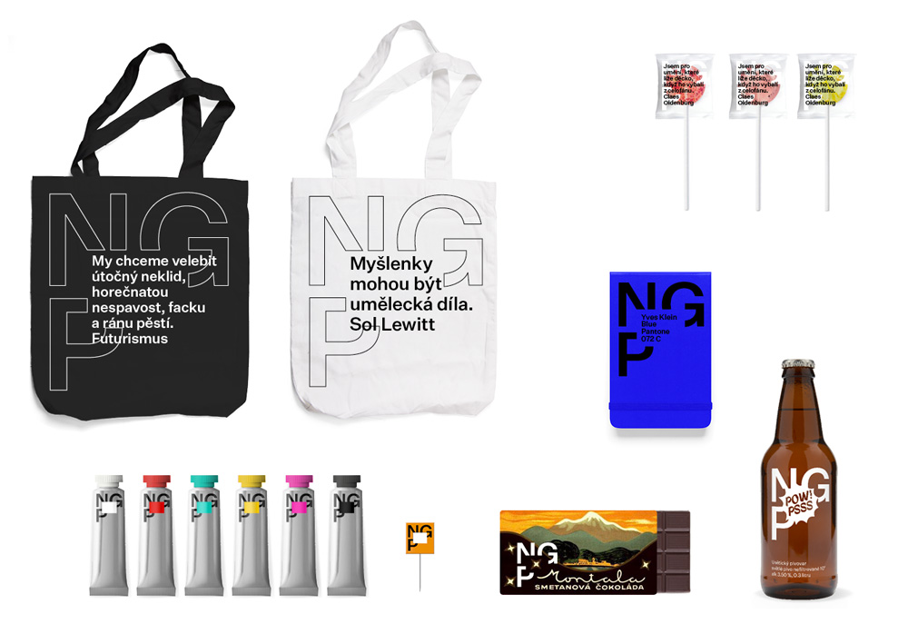
The identity has a decent flexibility where the logo can be used big or small, filled or stroked, crazy or not crazy. In part this may be because there is still no back-and-forth with the client directly so it still seems like it’s all throwing stuff at the wall and seeing what sticks in the end.

Without a doubt, the new logo feels more contemporary and brings Národní galerie v Praze in line with other large galleries. The one thing I would question is if this is too much, too fast? I don’t know what the existing identity looks like but given the existing logo, I can’t imagine the identity is too exciting or daring so I don’t know if jumping to such a visually exuberant expression is too extreme for the audience. Perhaps a segue period where the applications are less dramatic would be beneficial. Anyway, this is a well done identity with plenty of potential.
Thanks to Filip Kiko for the tip.

 Новости Союза дизайнеров
Все о дизайне в Санкт-Петербурге.
Новости Союза дизайнеров
Все о дизайне в Санкт-Петербурге.