Обзор лучших ресурсов по разработке бренда, разработке упаковки
contact us | ok@ohmycode.ru
contact us | ok@ohmycode.ru
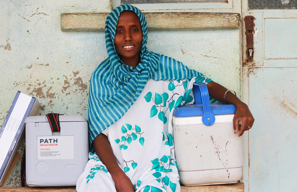
Established in 1977 (originally as Program for Appropriate Technology in Health), PATH is a non-governmental organization that works to accelerate health equity around the world by bringing together public institutions, businesses, social enterprises, and investors to solve the world’s most pressing health challenges. With 1,600 employees working in more than 70 countries, PATH develops and scales health solutions like vaccines, drugs, devices, and diagnostics, to strengthen and improve health systems worldwide. This past July, PATH introduced a new website designed by Portland, OR-based Instrument (that also worked on the brand strategy) and new identity designed by San Francisco, CA-based Manual.
In the Summer of 2017, PATH engaged Manual to overhaul their brand image. The challenge was myriad: to help better tell the story of a multimodal and diverse organization; to bring clarity and modernity to communications; to elevate their innovations; to better reflect the truly global nature of the organization; and finally, to provide a hard-working design systems toolkit that would allow designers around the world to manage brand assets. Ultimately, to reimagine what a nonprofit brand should be. While PATH was actively seeking a firm more attuned to working with the for-profit sector in an effort to elevate and differentiate themselves within the nonprofit landscape, we found the prospect of working with an NGO a welcome and refreshing opportunity.
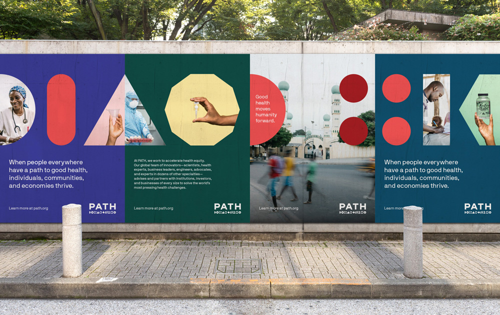
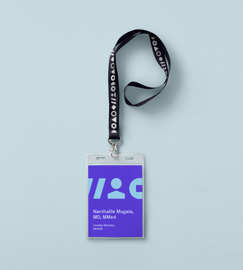
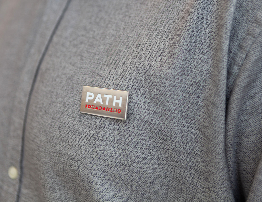
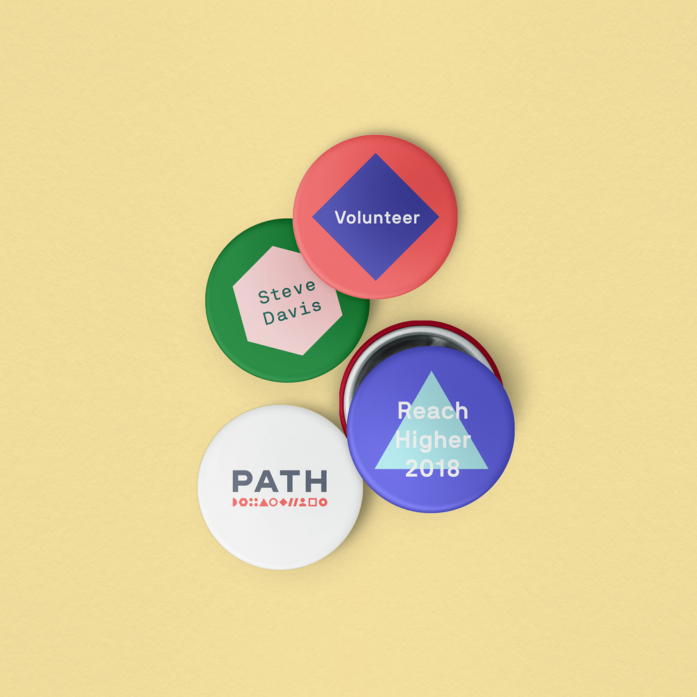
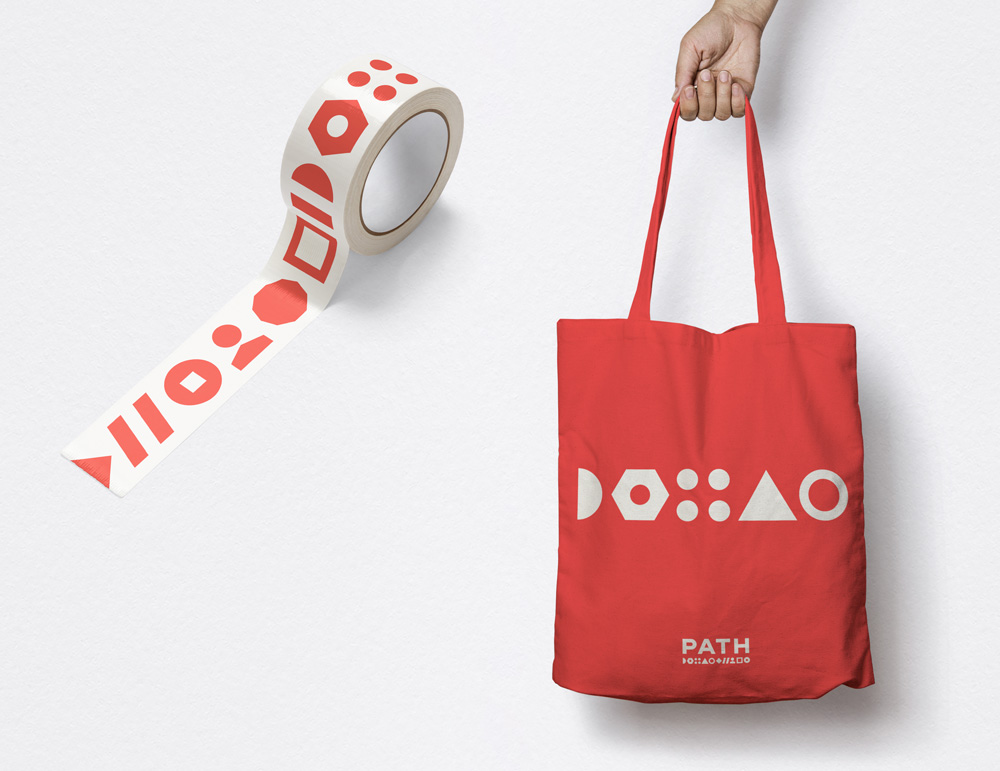
At the heart of the brand is an idiosyncratic logo. Unlike any other health organization in the world, PATH works on all pieces of the global public health puzzle, so we underscored PATH’s bold name with a string of abstract and geometric shapes that represent the diverse and innovative methods PATH employs to address global health challenges. The logo triggers connotations of networks, partnerships, and initiatives working together for a common goal.
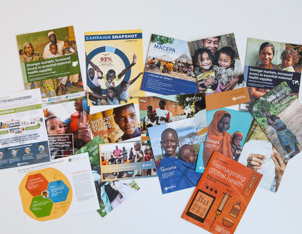
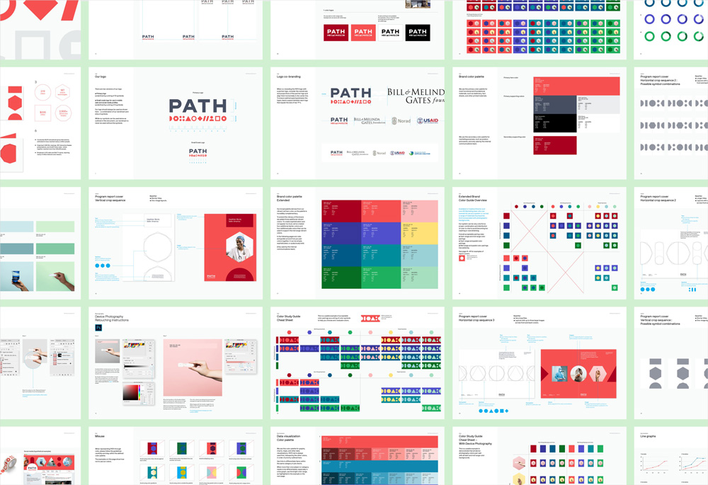
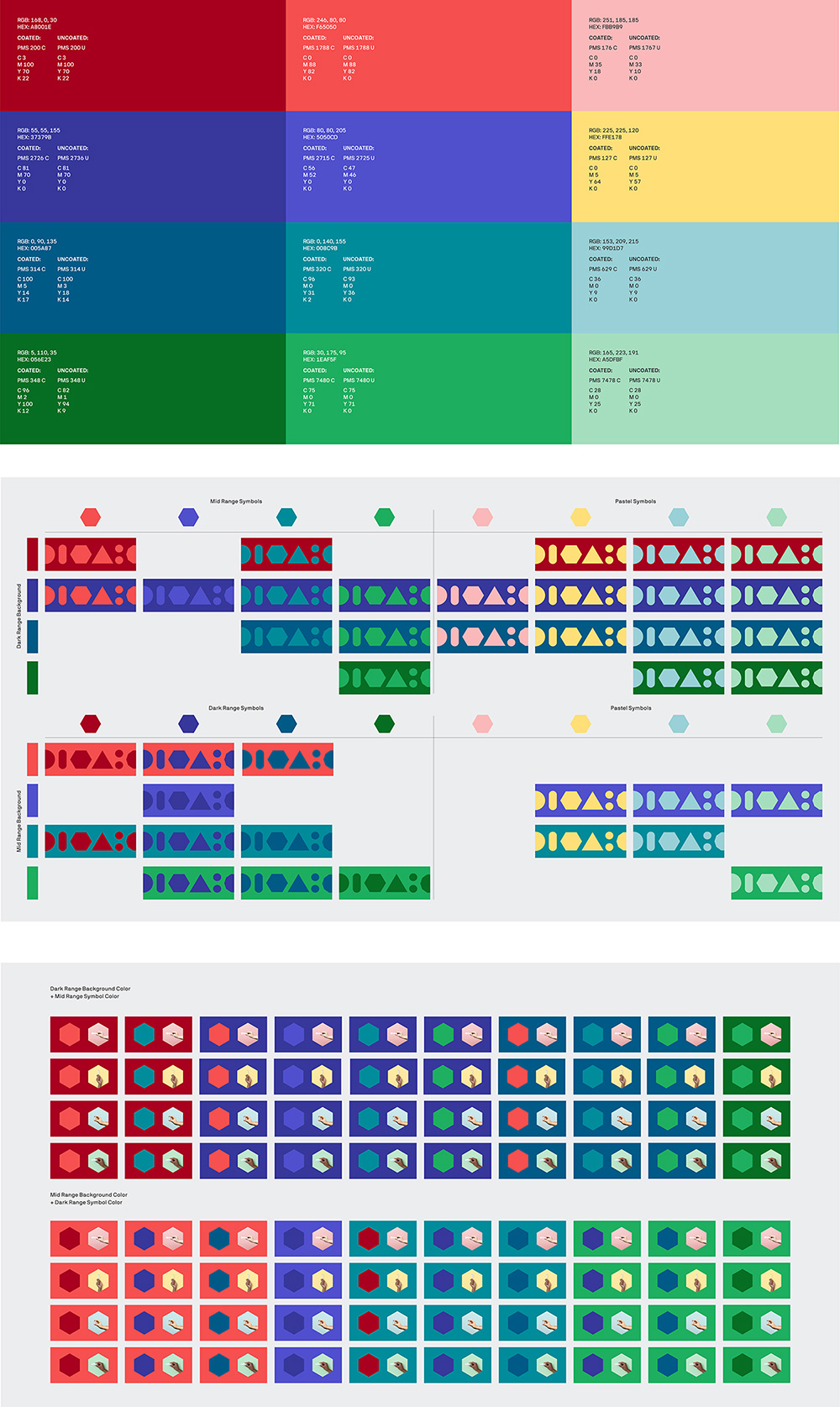
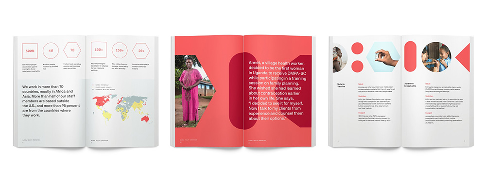
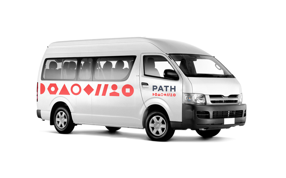
The line of abstract symbols in the logo becomes the design system for all PATH communications across print and digital. Zooming in and framing photos within this system helps unify the varying library of photography, and connects people, initiatives, and geographies together in a way that brings the whole organization under one umbrella. As you read, click, and scroll, you start to see the true DNA of PATH. We created detailed design guidelines and templates to allow for PATH employees worldwide to create communications using one simple system—from Powerpoint templates and printed reports, to web and social media content.
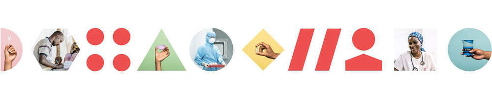
It’s hard to knock on the logo of an organization that does so much good in the world but the old logo wasn’t particularly attractive. The icon was sort of interesting and maybe with a better balance of how the dots sat within the asterisk it could have been better but the wordmark had no redeeming qualities, especially not in its horizontal scaling. The new logo is unexpected not just for an NGO but for any kind of company. The wordmark itself, of course, is not the unexpected part — this is a nice, simple, straightforward wordmark. It’s the icon underline that is intriguing, different, and unique. The first inclination is trying to decode it, as if it stands for something… there is a nut (of the bolt kind, not the squirrel kind), perhaps two slashes from a URL, a person for sure, but then the rest are abstract so it becomes almost like some kind of chemistry or physics sequence, but in the end it simply comes across as many things working together to build something bigger. Visually, it’s great, and, as the seed of the identity system, it’s very smart.
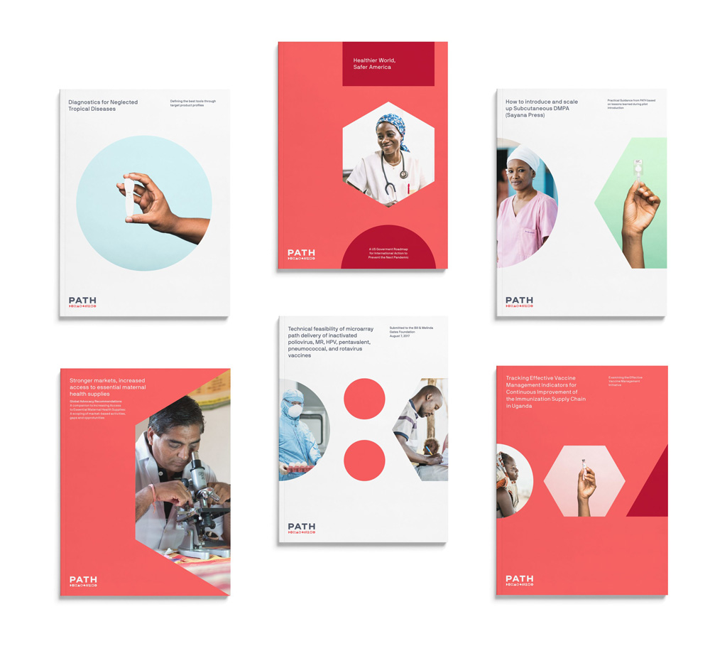
The applications are really good, straddling various moods by coming across as a balance of feeling corporate, medical, nonprofit-ish, and even a little techie. I realize that doesn’t make a lot of sense but I see the report covers and they could easily be for a Fortune 500 company, a Sillicon Valley powerhouse, or an innovative pharma company — but all of them not evil. I love the integration of the icons in different ways: with or without photography inside, large or larger, and scrolling across the layouts vertically or horizontally. It’s a strong, flexible system.
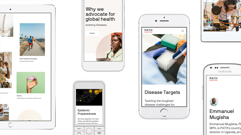
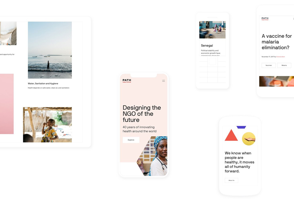
I usually don’t say anything about websites but the PATH website is quite nice.
Overall, this is a great redesign that gives PATH a confident identity and one that establishes it as a leading, global NGO.
Thanks to Ken Zinser for the tip.

 Новости Союза дизайнеров
Все о дизайне в Санкт-Петербурге.
Новости Союза дизайнеров
Все о дизайне в Санкт-Петербурге.