Обзор лучших ресурсов по разработке бренда, разработке упаковки
contact us | ok@ohmycode.ru
contact us | ok@ohmycode.ru
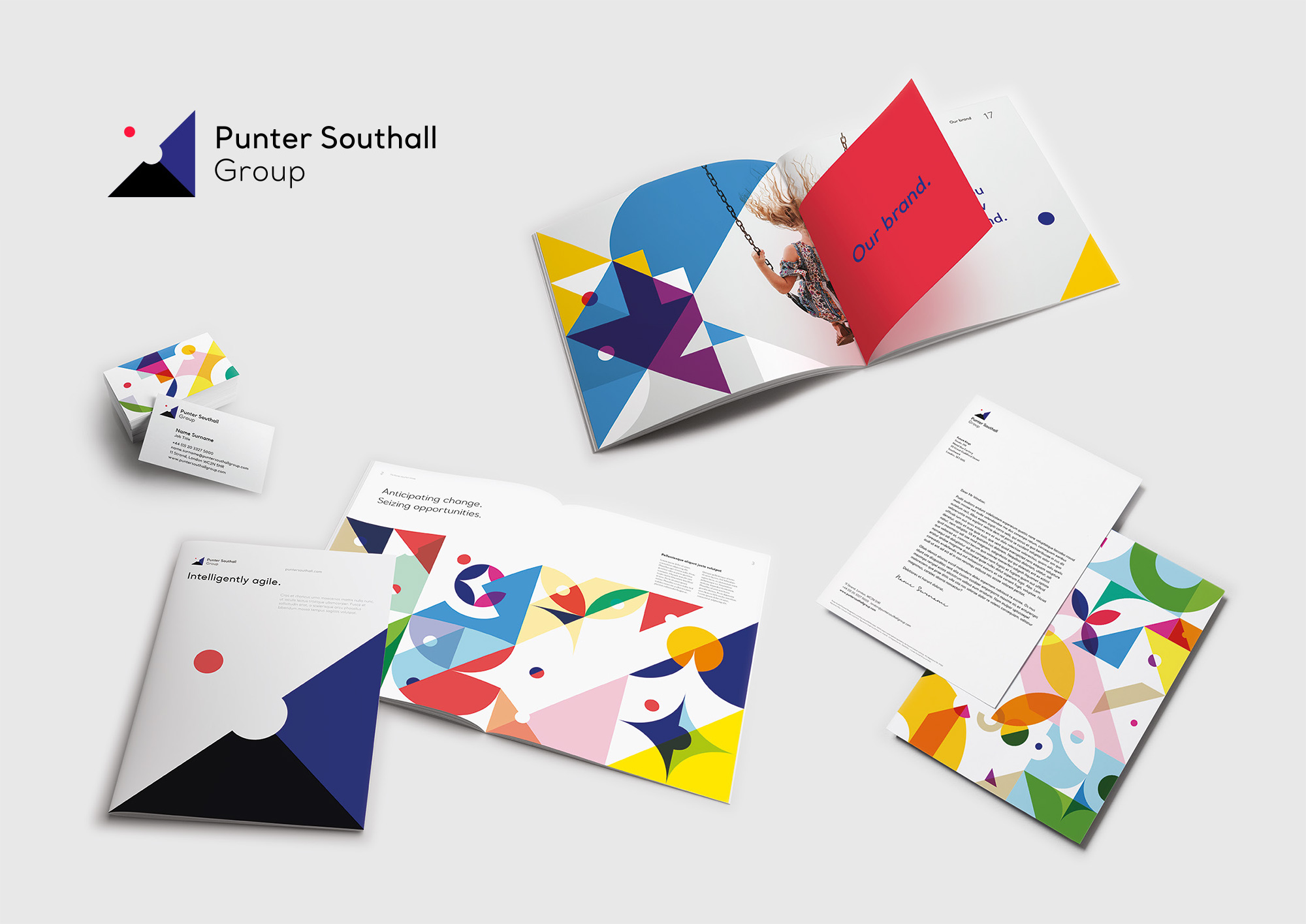
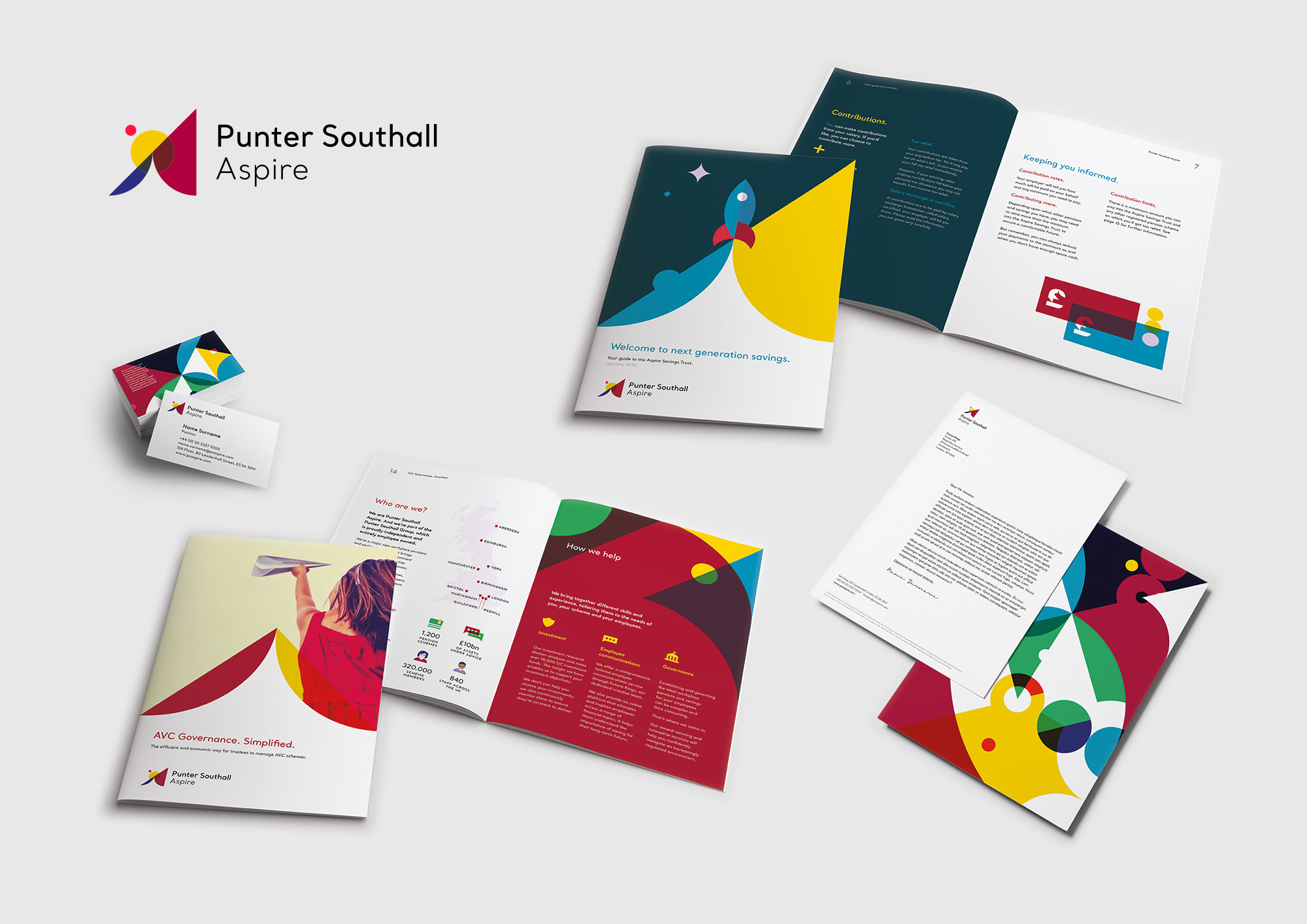
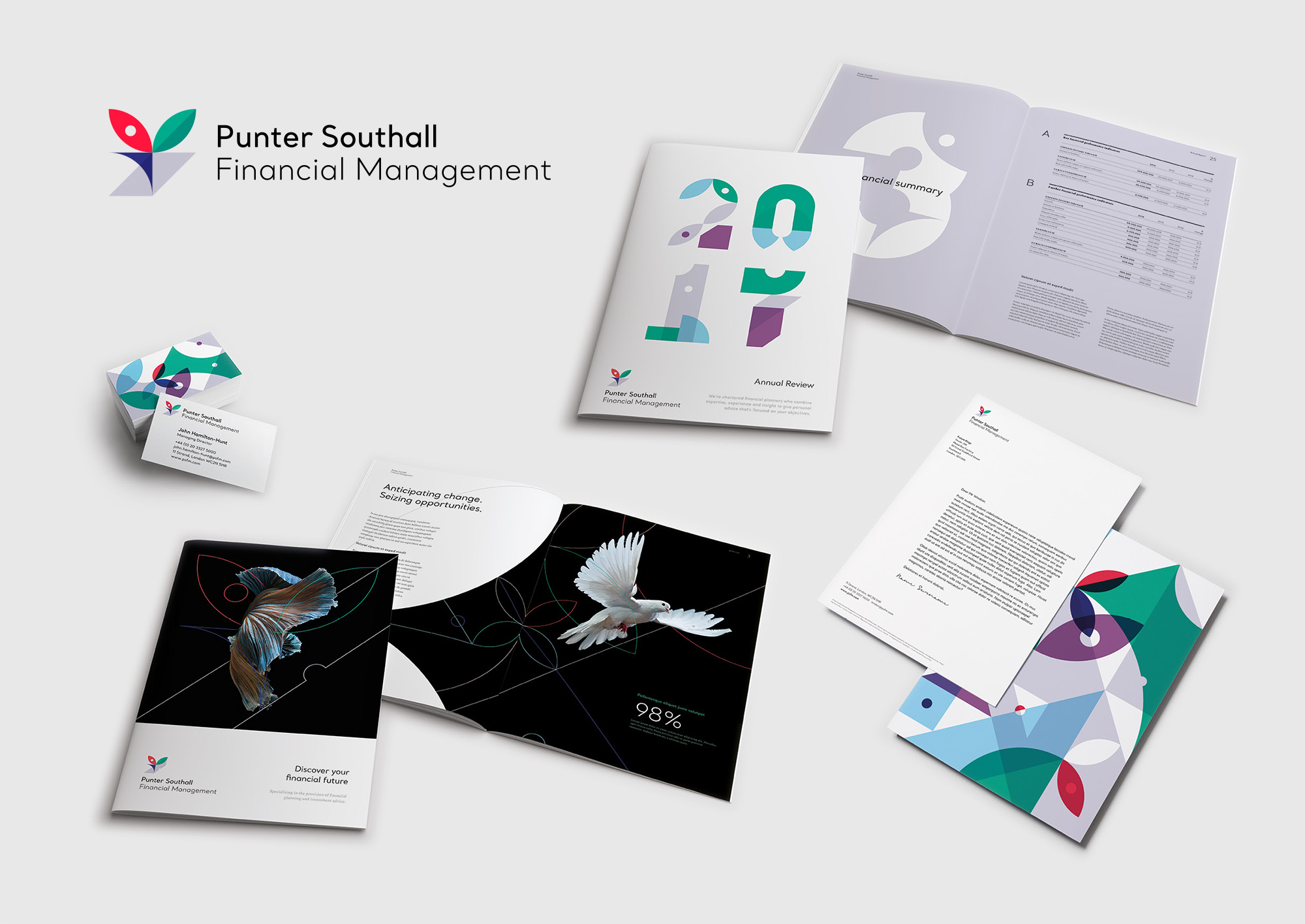
Established in 1988, Punter Southall Group provides actuarial advice; pensions consulting; and risk, administration, and investment services to private clients, pension scheme trustees, private equity investors, employers, and institutional investors in the UK. For the most part, I am not sure what any of that means but their end goal is to help their clients “discover and seize the right opportunities” and transform their financial futures. Named after its founders, Jonathan Punter and Stuart Southall, the group is parent to 15 other companies, some of which are directly related to the financial services and carry the name while others have their own name and semi-related services. Recently Punter Southall Group introduced a new identity designed by London, UK-based Future Kings.
Following workshops with key members of the individual companies, market analysis, competitor audits and reviews of the customer base, ‘agility’ emerged as a key theme for the Group.
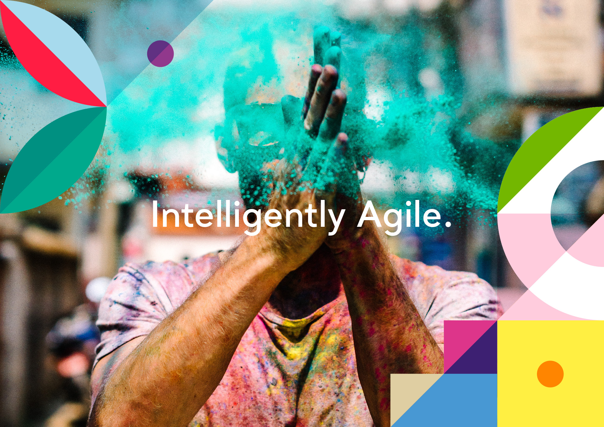
From this key insight, the Organising Idea of ‘Intelligently agile’ was born. It sums up who they are, what they care about and what makes them unique.
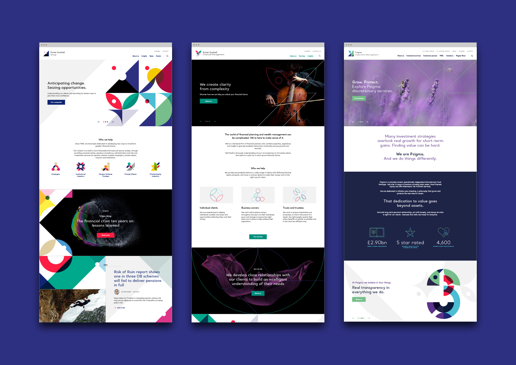
We chose to use a masterbrand-led approach to bring the different companies under the Punter Southall Group brand umbrella, while allowing enough flexibility to highlight the individual companies’ specialities and characters.
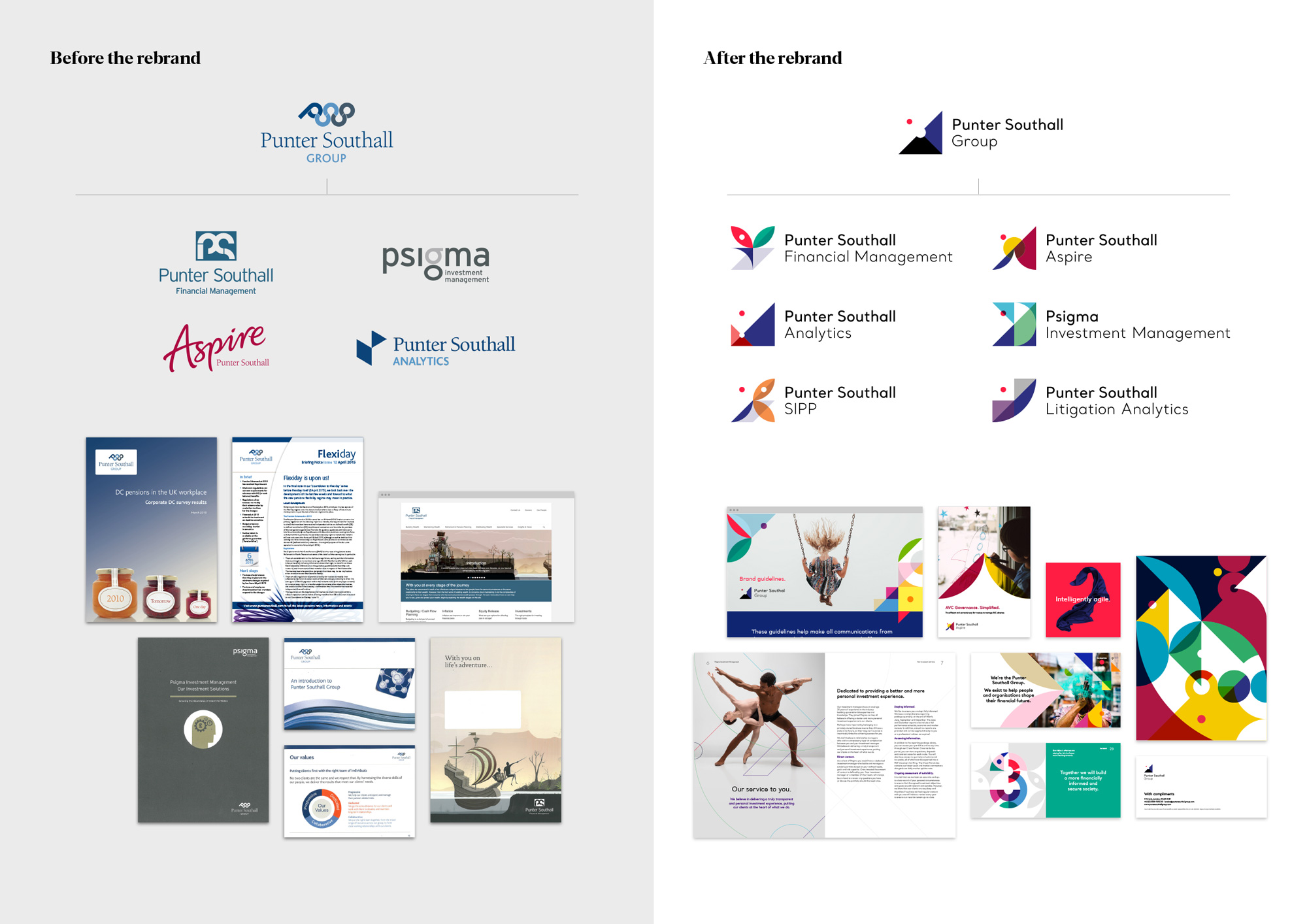
To communicate ‘Intelligently agile’, we created a bold, dynamic and flexible design system with a strict geometric grid to unite the Group’s visual identities. Each brandmark was designed using this grid to show the companies’ synergy, while individually highlighting their wide-ranging and vibrant differences.
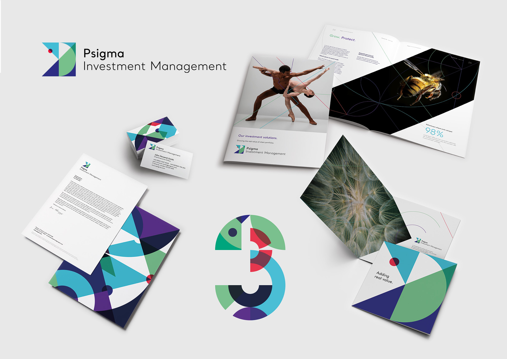
The abstract brandmarks were developed thematically. The Group’s brandmark, for example, uses a triangle with an upwards trajectory to emphasise growth and looking forward, and a red dot leaps out of the negative space to represent movement and agility. Similarly, Punter Southall Aspire, one of the Group’s companies, is built around ‘Next generation thinking’ and therefore has an abstract sunrise in the brandmark, while Punter Southall Financial Management, whose proposition is ‘Cutting through complexity’, has a graphic element cutting through the brandmark. All these shapes can then be animated to combine, cut into, and multiply over one another, further demonstrating the agility of the Group.
We then chose to use Santral, a legible and precise typeface, across the whole Group to align them visually, and a flat design aesthetic across the patterns, graphics and icons for an accessible look and feel. ‘Intelligently agile’ is also reflected in the photography, which always captures movement in some way - whether it’s a photo of a person, place, animal or object, it’s always full of energy.
The “PSG” monogram in the old logo was ambitiously abstract and there was something interesting about its structure but the execution didn’t come through for it in the end. The type was nice enough. The new Group logo, on its own, is somewhat flimsy in presence — even though it has a large triangle shape, the tiny red dot floating on its own creates an odd relationship. It’s also too abstract to carry much meaning or function as a clear identifier. As part of the group of icons, it’s a little bit more interesting and its simplicity in contrast with the rest perhaps signifies its standing as the parent brand. The other icons are all visually attractive and they look finance-y as if pie charts were having the rave the of their lives. They are probably useful Rorschach tests to see what their customers make of them as they are heavily abstract. Using the red dot in the same place for all the icons is a nice unifying touch and the wordmark treatment across the board is simple and solid.

There is a lot of motion and dynamism to the icons. Perhaps too much for a finance company but, hey, why not? The same reaction and opinion applies to the color palette… perhaps too much but, hey, why not? All of the motion things are fun and happy and add life to an otherwise strict set of logos.
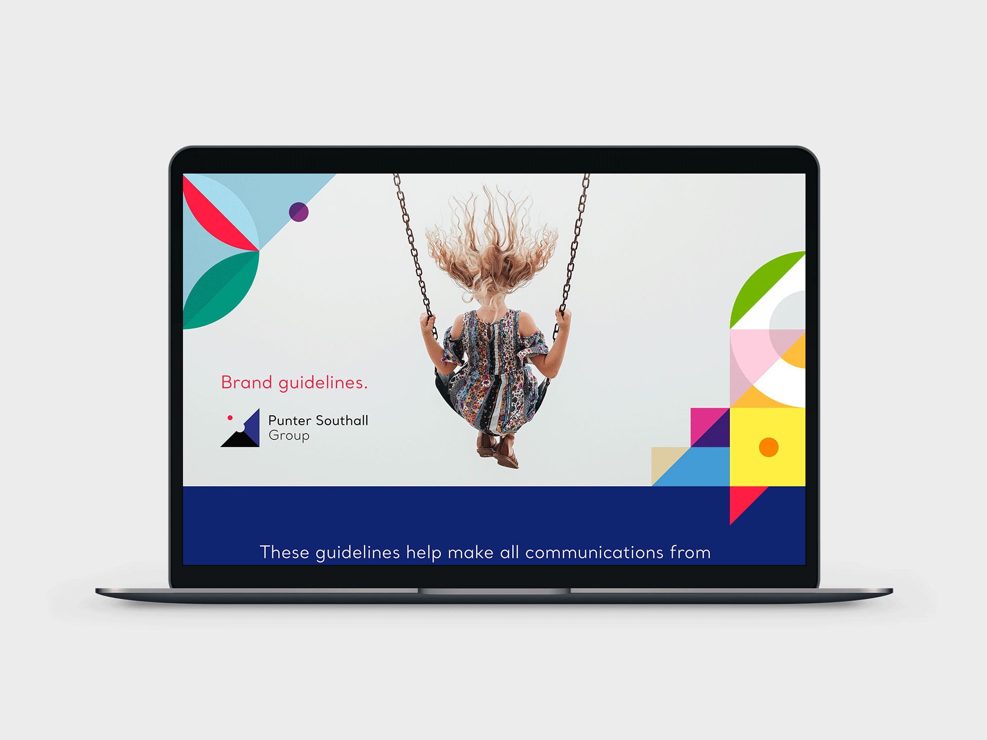
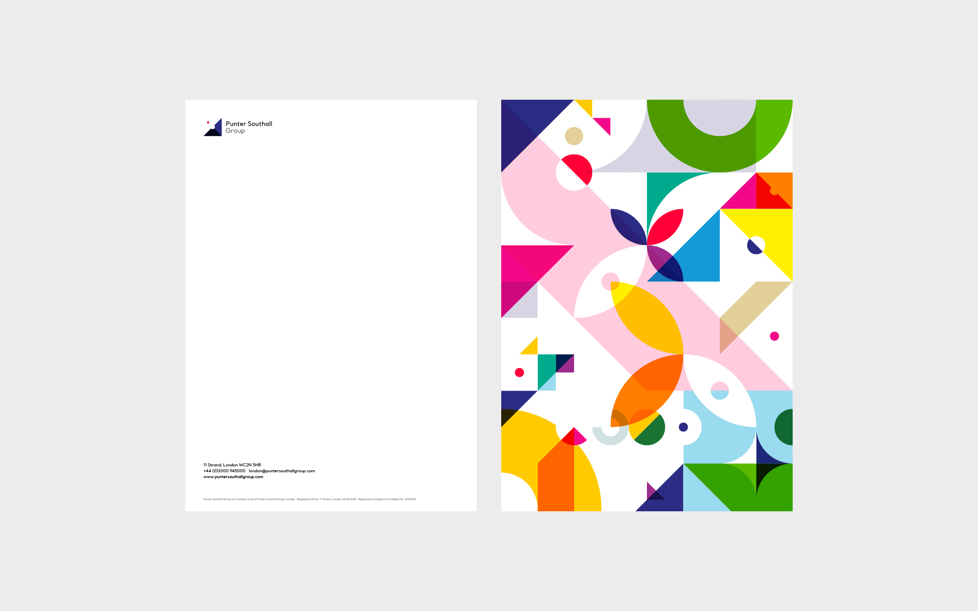


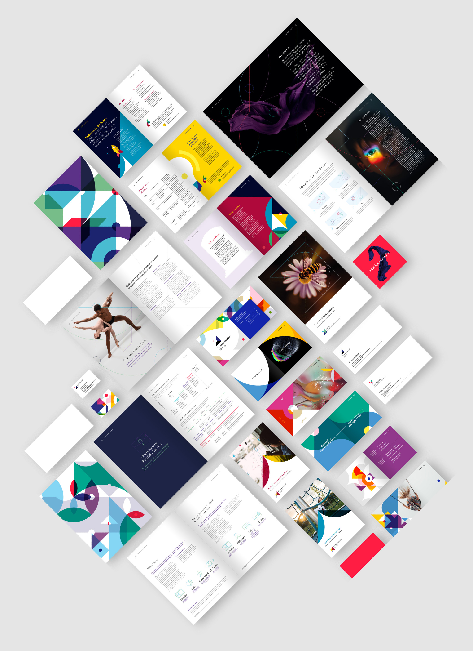
In general, I keep having the same reaction over and over: the applications can be too much at times. Too many patterns, too big, in too bright colors. As a way of standing out from the competition it sure gets the job done but I question how appropriate or useful it is to the Group and its companies to be in a constant state of shoutiness.
Overall, it’s a bold, properly-deployed, and well-extended visual system but I still have a hard time seeing consolidating this with their client base, which I assume are more buttoned-up… which might just be a bad preconception on my part and maybe what they want is a supercolorful identity in their financial investment partners. In which case, party on.

 Новости Союза дизайнеров
Все о дизайне в Санкт-Петербурге.
Новости Союза дизайнеров
Все о дизайне в Санкт-Петербурге.