contact us | ok@ohmycode.ru
contact us | ok@ohmycode.ru
(Est. 1903) “Club Atlético de Madrid, SAD, commonly known as Atlético Madrid, or simply as Atlético, is a Spanish professional football club based in Madrid, that plays in La Liga. In terms of UEFA competition titles won, Atlético Madrid is Spain’s third most successful club behind Real Madrid and Barcelona. In terms of the number of titles, Atlético Madrid is the fourth most successful club in Spanish football, behind Barcelona, Real Madrid and Athletic Bilbao.” (Wikipedia)
Vasava (Barcelona, Spain)
Atlético Madrid press release
Change.org petition
Brandemia blog post
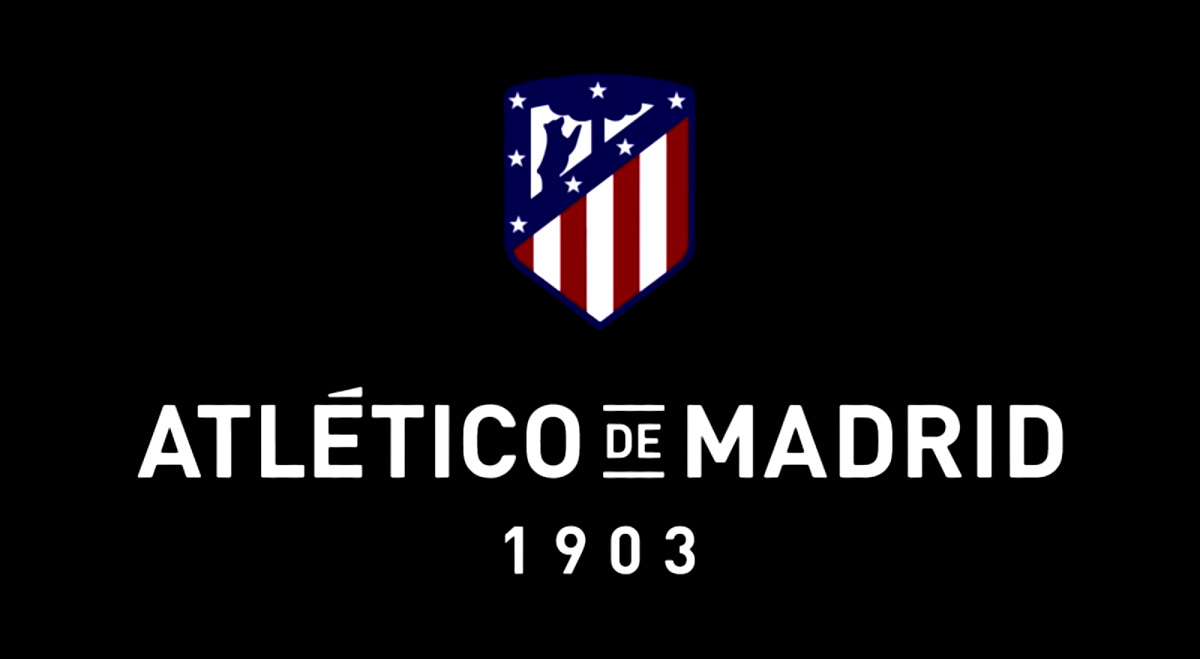
The symbol will carry our players in the chest for the next season power our heritage while respecting the established formal structure, reinforcing the identification elements that are part of the DNA of the club and recovering other as the deep blue of the founding shield and shape curve 1903.
The spirit of the Spanish shield pointed stylising while the top and nod to the emblem round a slight curve is maintained.
Disappear black, brown, green and yellow, to give prominence to the core team colors, red, white and blue modifying its intensity and tone being used now as the first historical stage of the club.
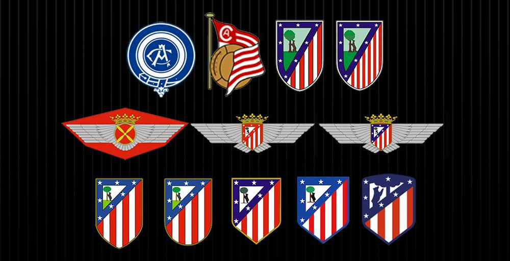
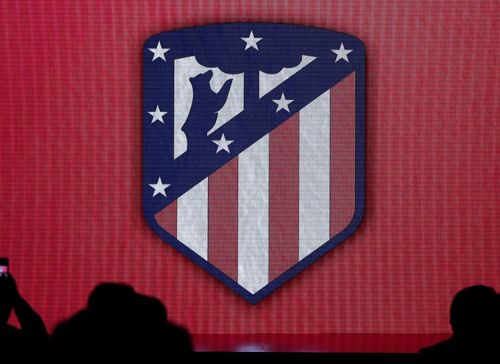
First, apologies for the low-res images… there is nothing better available. This logo/shield/badge has received a lot of heat from the club's fans, including live protests mobilized by the #ElEscudoNoSeToca hash tag (#TheShieldCanNotBeTouched) on social media and a complete meltdown and loss of perspective that establishes this logo close to doomsday-level catastrophes. My 100% detachment from the club allows me some clarity: As a logo/shield/badge to be reproduced in uniforms, social media, web, print, et al… it was terrible, starting with the worst drawing of a tree available and a complete lack of proportion in its elements. Everything about the new logo is a functional improvement that allows it to perform better while undeniably maintaining the essence of the original. This doesn't mean it's a great logo or shield but as an evolution of what has come before it, it's a (not necessarily the) logical next step. The 7 colors of the old logo have been replaced with 2, making it way easier to reproduce; the tree and bear have increased in size so that they are easier to discern at small sizes; the bars' thicknesses have been evened out; and the stars are now (mostly, I think) center-aligned with the red bars. My main criticism would be the shape of the tree that looks like a nuclear blast but, in terms of fitting a tree in that space, that gets the job done. I understand why super-fans are upset but, c'mon, in the history of botched, controversial redesigns this doesn't even make the cut.


Thanks to Emilio Zamora for the tip.

 Новости Союза дизайнеров
Все о дизайне в Санкт-Петербурге.