Обзор лучших ресурсов по разработке бренда, разработке упаковки
contact us | ok@ohmycode.ru
contact us | ok@ohmycode.ru
Founded in 1877 (originally as St Luke’s F.C. but renamed two years later), Wolverhampton Wanderers Football Club (aka Wolves) is one of the most storied teams in English football. It was one of the founding members of the Football League in 1888 and, in all but 6 of their 120 seasons, they have been within the top two tiers of play, currently competing in the Premier League after winning the EFL Championship in the 2017-18 season. With the new Premier League season kicking off this August, the Wolves introduced a new identity designed by London, UK-based SomeOne.
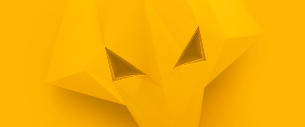
A series of lovingly-crafted 3D wolf heads will form the backbone of future communications, playing a key role in growing the fanbase, home and away.
The three-dimensional nature of the head is inspired by the history of ironmongery in Wolverhampton. Using the idea of traditional forging, but recontextualised to reach a modern global audience.
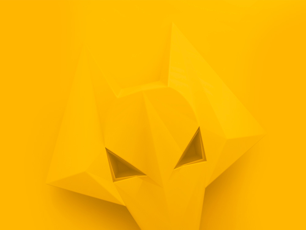

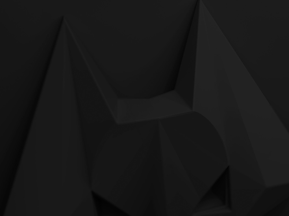
To me, one of the hardest identity projects is where you have to build a new identity while leaving the previous logo untouched and reimagine everything else around it. It’s like chopping down a tree and reattaching a new one at the trunk to existing roots. To continue the metaphor… the Wolves have solid roots in the angular wolf logo that they have used, in one form or another, since 1979. The introduction of 3D versions of the wolf provide a contemporary take on the nearly 40-year-old graphic and, literally add layers of additional depth to it. The different levels of chiseling inside the eyes, over the nose, and in the ears give the wolf an extra boost in bad-ass-ed-ness. The yellow version is the most effective and interesting — the white one is alright and the black one is too much “I’m Batman”.
It should be noted that this is becoming a go-to technique for SomeOne — the tone-on-tone 3D graphic has been previously used for The Honourable Society of the Inner Temple, D.Thomas, and (within the same industry) Aston Villa F.C.. I don’t mean to be a dick for pointing out but it’s either me or a bunch of folks in the comments. So let it be official: We are on to you SomeOne ; )
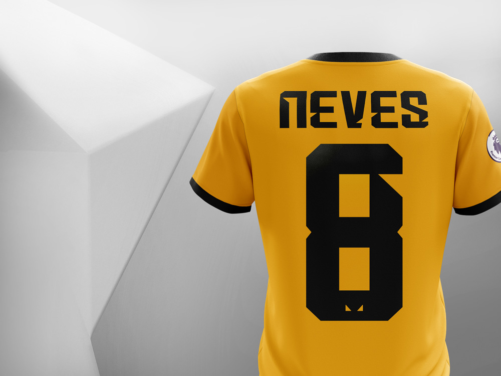
Taking inspiration from the iconic club badge, we designed two bespoke typefaces. We wanted to give a nod to the City’s industrial heritage, so opted for a bold and condensed style. By using the geometric forms of the eyes, we began removing cuts and angles from the letterforms. Moving forward, this allows the club to speak in a distinctive and ownable voice, without relying too heavily on the badge.
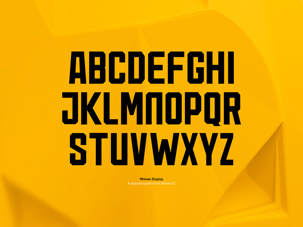
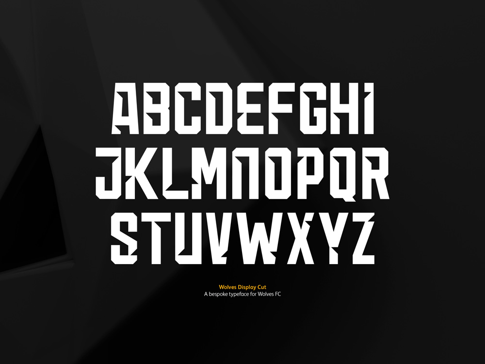
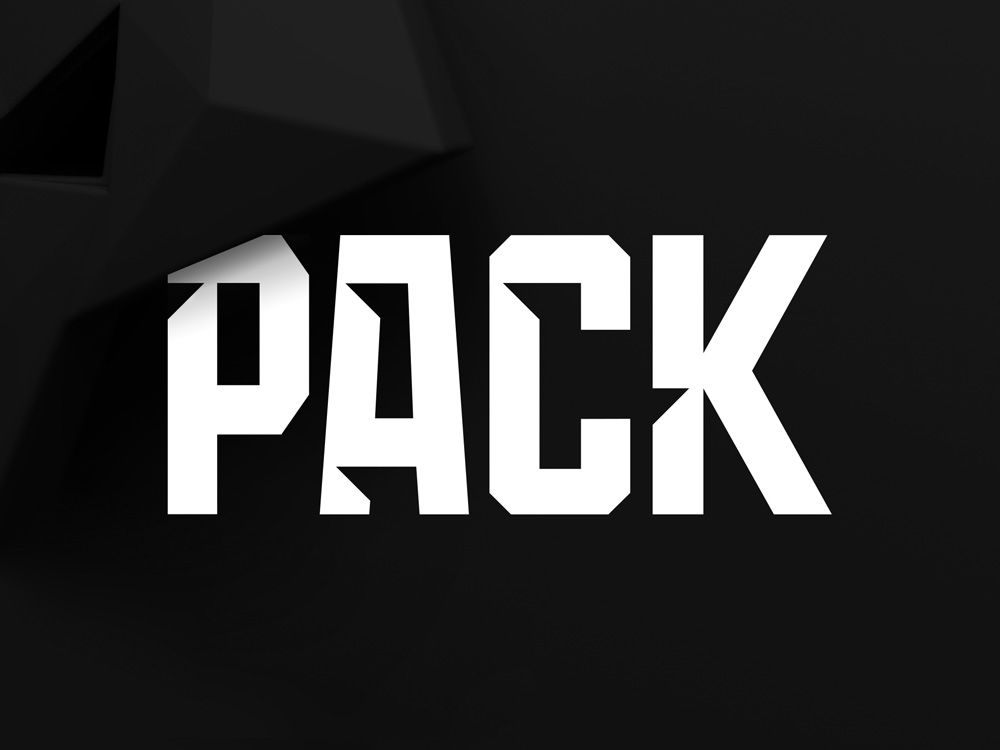
The custom fonts are standard sports fare but I do appreciate their commitment to the extra large notch cuts in the letters. They are not subtle. The font looks like it was clawed by a wolf pack and, despite my aversion for spiky notches in wrong places, this is so over the top that it works.
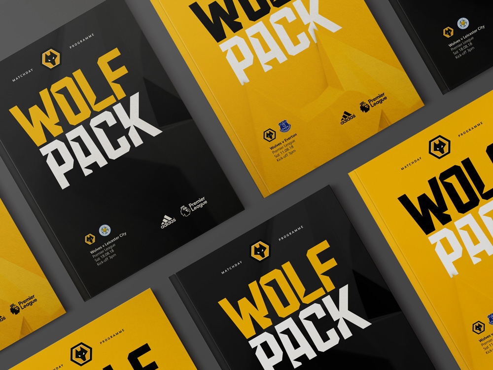
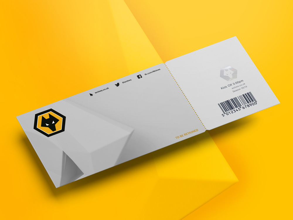
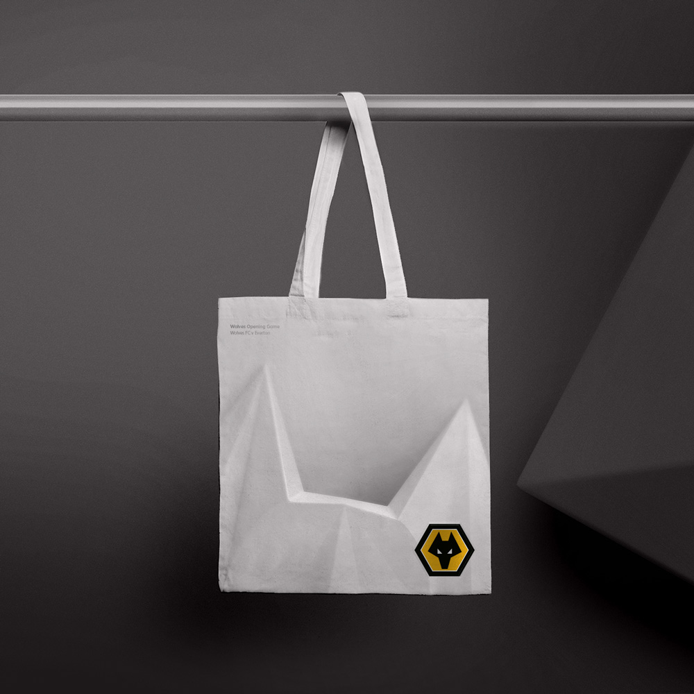
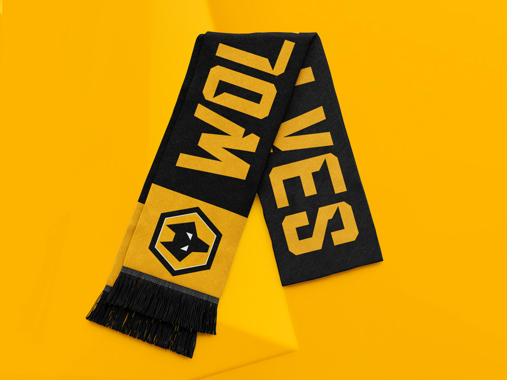
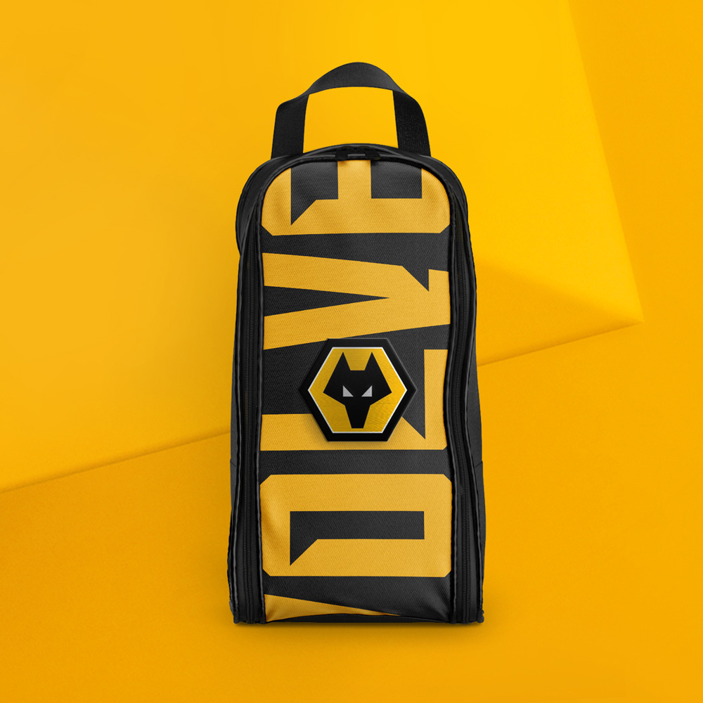

The applications are undeniably cool. I don’t care at all about the Wolves but I would buy that backpack, no questions asked. The programs look great with the 3D wolf landing on top of the type and the big font works surprisingly great as the literal foundation to present the badge on top. The abundance of angles, going in all directions (through the font, the 3D wolves, and the badge) yield a very energetic and confident aesthetic. Overall, this is a great system built around a great badge.

 Новости Союза дизайнеров
Все о дизайне в Санкт-Петербурге.
Новости Союза дизайнеров
Все о дизайне в Санкт-Петербурге.