Обзор лучших ресурсов по разработке бренда, разработке упаковки
contact us | ok@ohmycode.ru
contact us | ok@ohmycode.ru
Launched in 2009, WeTransfer is a file sharing service based in Amsterdam and Los Angeles that has grown to have 40 million active users that send more than one billion files every month. Among designers, this is the most common tool used to transfer files — I would guesstimate that I get 70% of files via WeTransfer and the other 30% by Dropbox — and like Google when it launched, the attraction to WeTransfer was its almost scary scarce simplicity that contrasted drastically with the Yahoo-ness of YouSendIt (now Hightail). The free 2GB transfer limit also helped in garnering fans and their design wallpapers in the background have helped cement its place as part of the creative industry’s workflow. Last week, WeTransfer introduced a new user interface and new logo designed in-house in collaboration with Bold Monday.
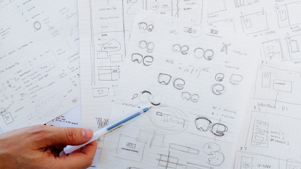
[Two] shifts are reflected in our new logo, with its focus moving away from transferring, and towards we. […] When focussing on just two characters for a logo, good is no longer good enough. It needs to be perfect, all the way down to the tiniest detail. A basic black-on-white rendering should look well-balanced at any size, and always exude its unique character. […] Starting with an empty canvas, our mission was to create a symbol that captures just the right personality, one that is technically well-executed, and can clearly be read as we.
When I first saw the original logo it didn’t inspire any confidence in trusting the service with sending files… it didn’t look professional enough but, as I said, 2GB of free transferring and no evident misleading “download” or “upload” buttons that triggered ads was enough to give it a try. Over the course of seven years, I’ve seen that logo so much that I can’t imagine it being anything else, despite its shortcomings when it comes to good or interesting typography.
The new logo doubles down on the counter-less “w” and “e” but with more graphic intention and cohesiveness between the two characters. To any new customer I doubt the “w” reads as a “w” and I hate to be the one with the petty comparison to a tooth but, with the rounded top and minimized indentation in the bottom, it’s hard not to see it. I do love the “e”, there is something very cheerful about it and it helps the “w” be the best “w” it can be.
The logo drops “transfer” altogether even though the name is still WeTransfer, which is not a huge deal breaker but it ignores that users call the service by its full name and not as “we”. “I will wetransfer it to you” already sounds weird enough that I can’t imagine “I will we it to you” will gain any traction. But I get that this is a logo, not a grammatical lesson and as such it does its job in establishing a shorthand for the service that is easily recognizable.
Outside the logo, the wider identity has been revamped from the inside out, to reflect how the service has evolved since 2009. It has a new colour palette, updated typography, a cleaner interface, a bigger message field that scales as you type, and a set of shapes - dubbed “particles” by the design team - to freshen up the look of the site, plus a set of spot illustrations commissioned for “key moments of the transferring process”.
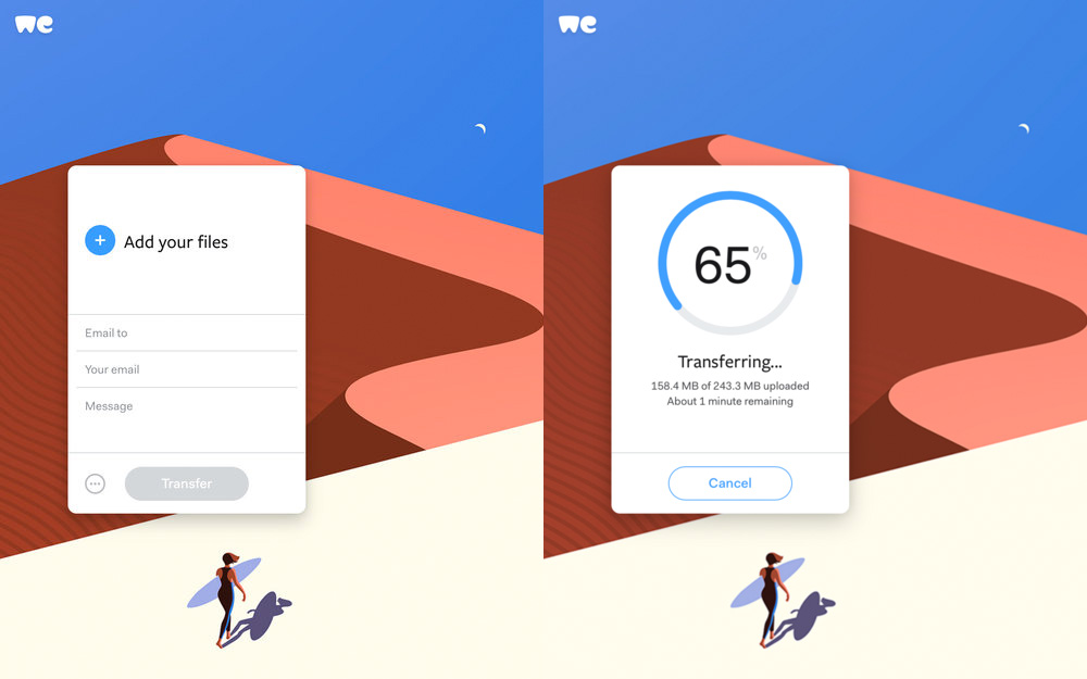
The user interface has gotten a slick update and everything about the experience of sending and downloading files feels infinitely more elegant and spruced up, while the big backdrops provide an endless stream of creative curios to tide you over as files upload and/or download with the logo minimally sized in the top left corner. Compared to Hightail or Dropbox, there is a bold confidence in the new logo to work at a small size and allow the file interaction to be the focal point. Overall, it’s a cool update to a weird logo that works because of its commitment to its origin and overall (functional) quirkiness of the brand.

 Новости Союза дизайнеров
Все о дизайне в Санкт-Петербурге.
Новости Союза дизайнеров
Все о дизайне в Санкт-Петербурге.