Обзор лучших ресурсов по разработке бренда, разработке упаковки
contact us | ok@ohmycode.ru
contact us | ok@ohmycode.ru
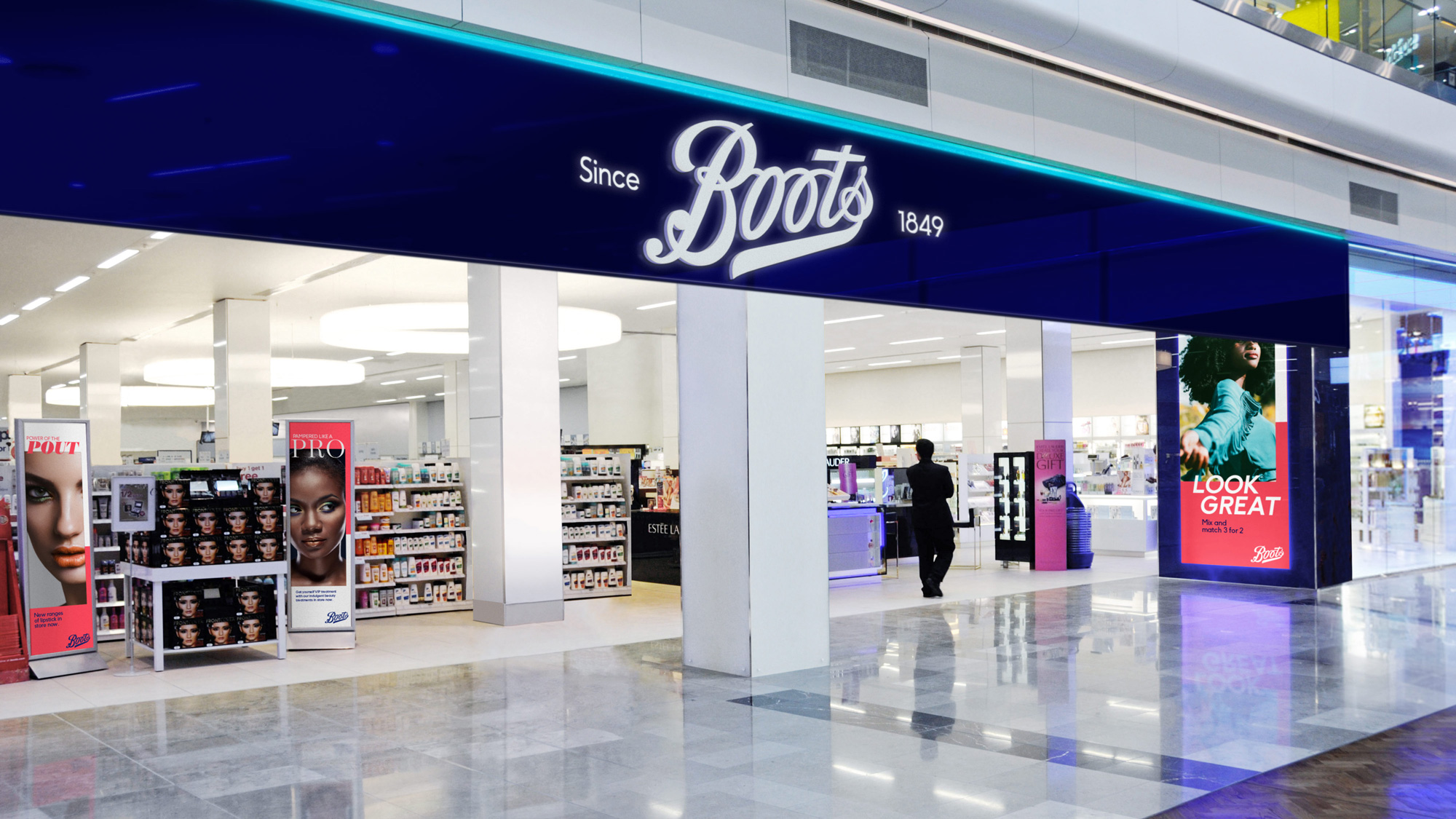
Established in 1849, Boots UK is one of the leading pharmacies-slash-health and beauty retailers in the UK. Owned since 2014 by American holding company, Walgreens Boots Alliance, Inc., Boots employs over 60,000 people in approximately 2,500 stores that range in sizes and services with most of them offering a pharmacy plus healthcare, personal care, and cosmetic products, while bigger locations can offer everything from optician services to photo processing. Earlier this year, Boots introduced a new identity designed by London, UK-based Coley Porter Bell.
Whenever you want to feel your best, you turn to Boots. Yet despite a high rating for trust, recognition, and value, customers felt that the Boots brand had become ‘dated’ and ‘old-fashioned’. The world of well-being has changed enormously over the last few decades. Being healthy is no longer about ‘the absence of illness’, it’s now a way of life and Boots was feeling pressure from all sides as everyone from discounters and bargain stores through to online brands were keen to become the next well-being partner in our lives.
The Boots brand purpose is to ‘champion everyone’s right to feel good’. Our evolved masterbrand identity projected the idea that ‘our confidence inspires your confidence’.
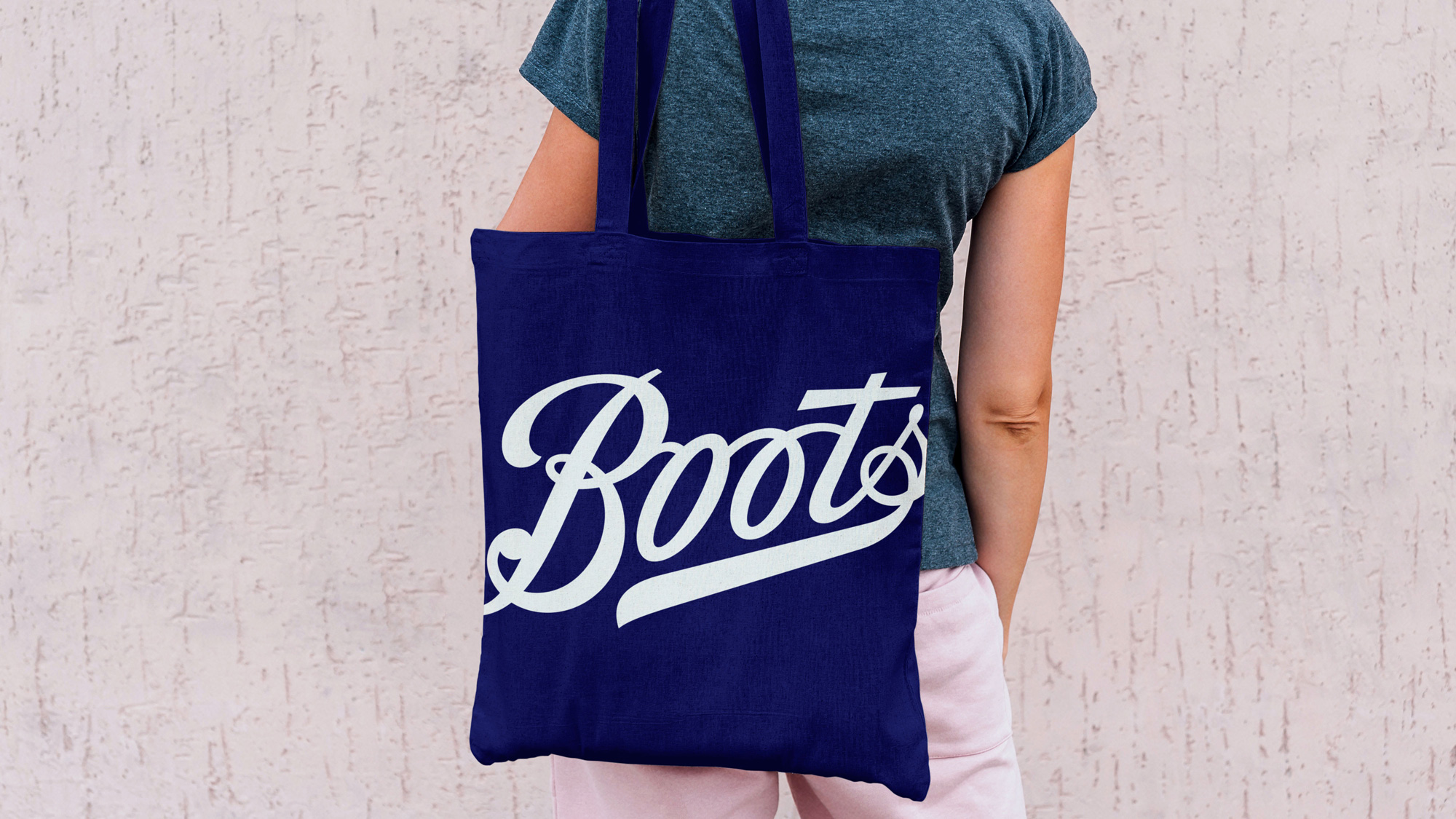
We liberated and crafted the Boots logotype from the restriction of the 1960’s lozenge, re-introduced the classically contrasting master-brand colours, created straightforward, simple type and typography, easy to read, modern in feel and symmetrical in design, built an imagery library that looks great and feels great, bringing to life people and their individual character. And finally, we created a flexible, energetic design system with a true sense of simplicity.
As a disclaimer: In this review I am 100% missing any cultural nuances about the legacy of Boots in the UK and the sentiments of people towards it. I assume it would be the equivalent of Walgreens or CVS rebranding where there a few contextual elements that help understand their place in the world. So, this is purely a design review. First, I’ll say that in no way would I ever associate the new, old, older, or older-er logos with a pharmacy or a cosmetic retail brand. To me, it looks like a clothing store but, again, I didn’t grow up with this so to folks in the UK this logo might scream Tylenol the moment they see it. The old logo was mostly okay, especially since it’s been like that pretty much for 60 years so it’s almost like it couldn’t be any other way. Without the new one I don’t think I would have realized how annoying the “t” extending all the way to the “B” really was but the new logo shows how much looser the logo is without it and how it allows the bottom swash to be more prominent. With that change alone, the new logo was worth the effort. Removing it from the holding shape is also a plus as it gives the wordmark much needed breathing room. Other small changes, here and there, all seem to be good. For the most part, even with a “big” tweak like chopping the “t”, the logo retains its essence and familiarity while providing a few new opportunities to use it more loosely in application.
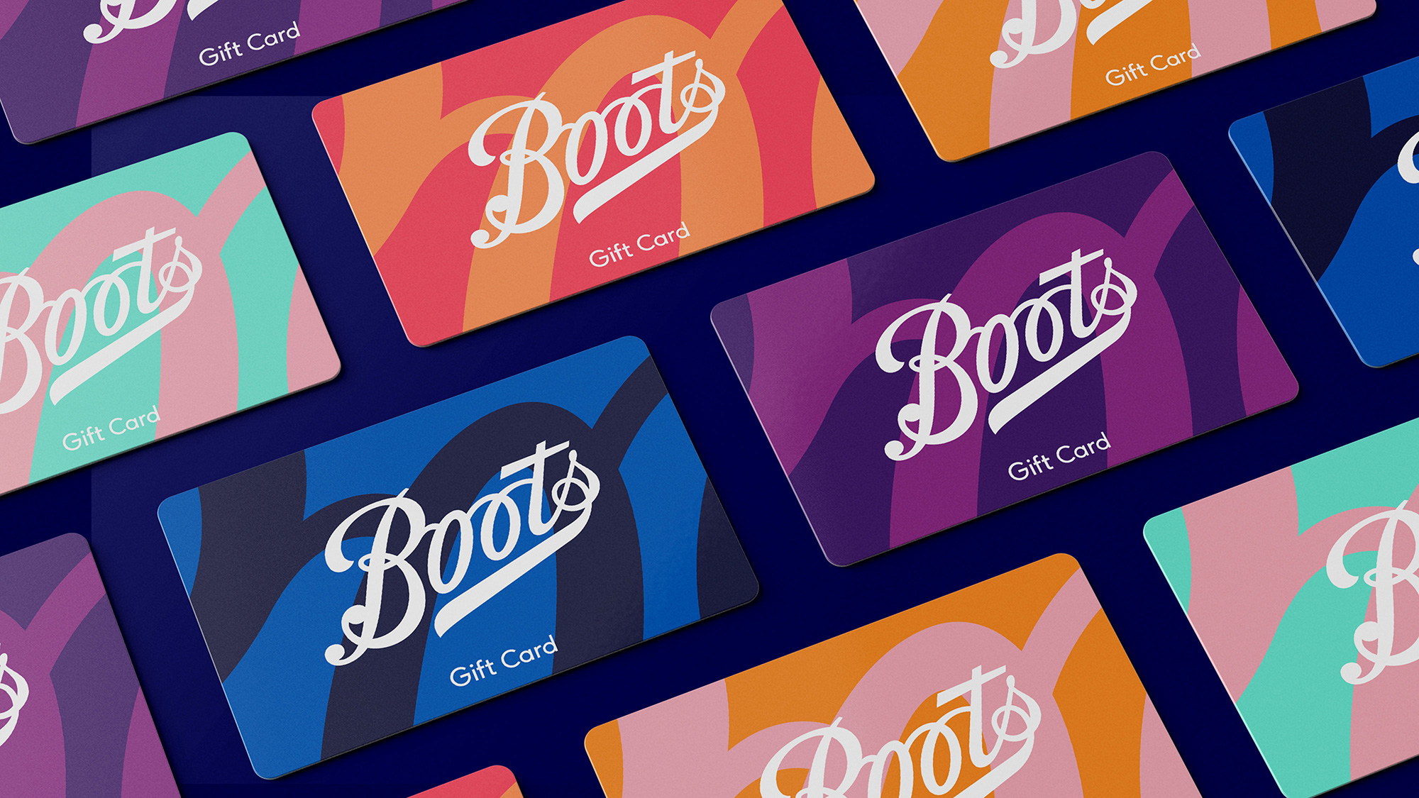
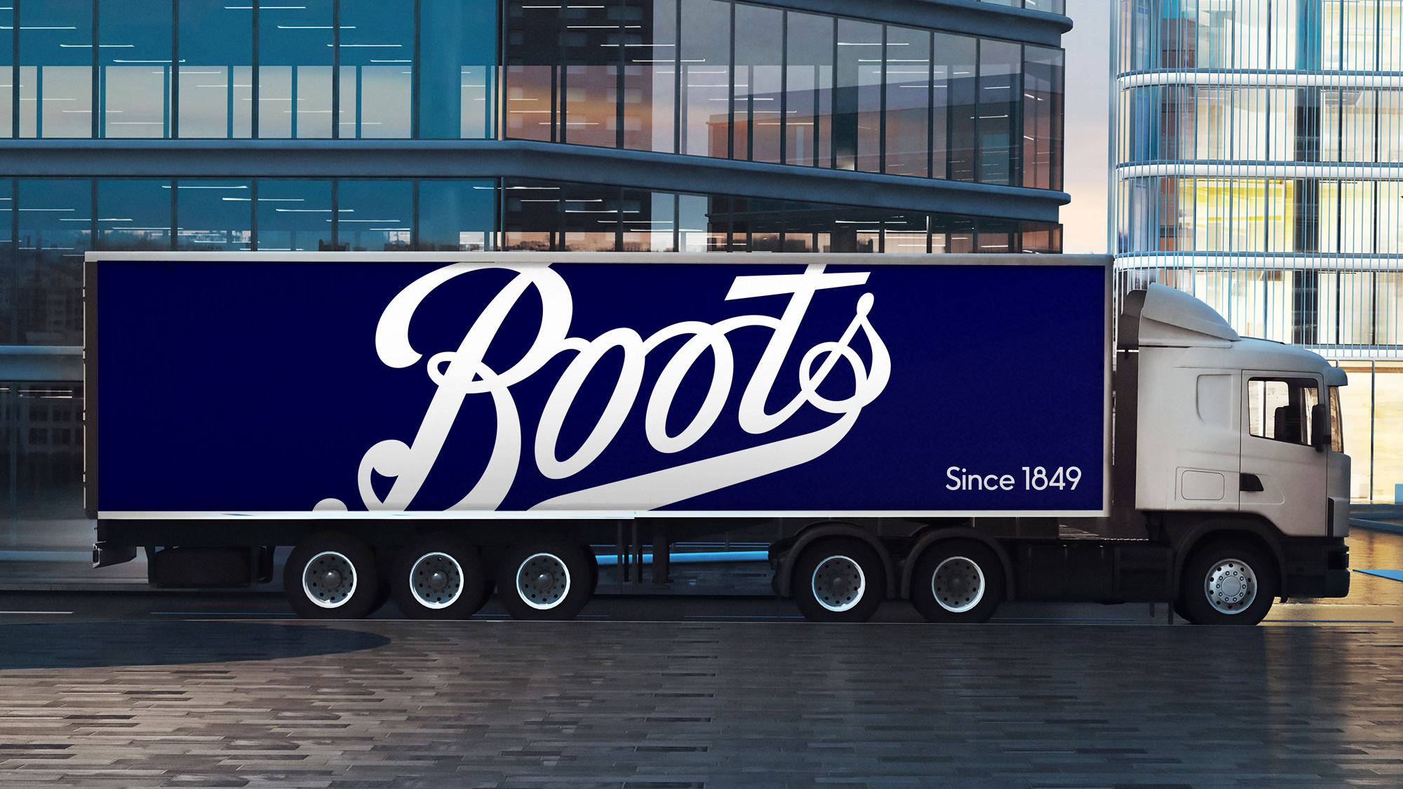
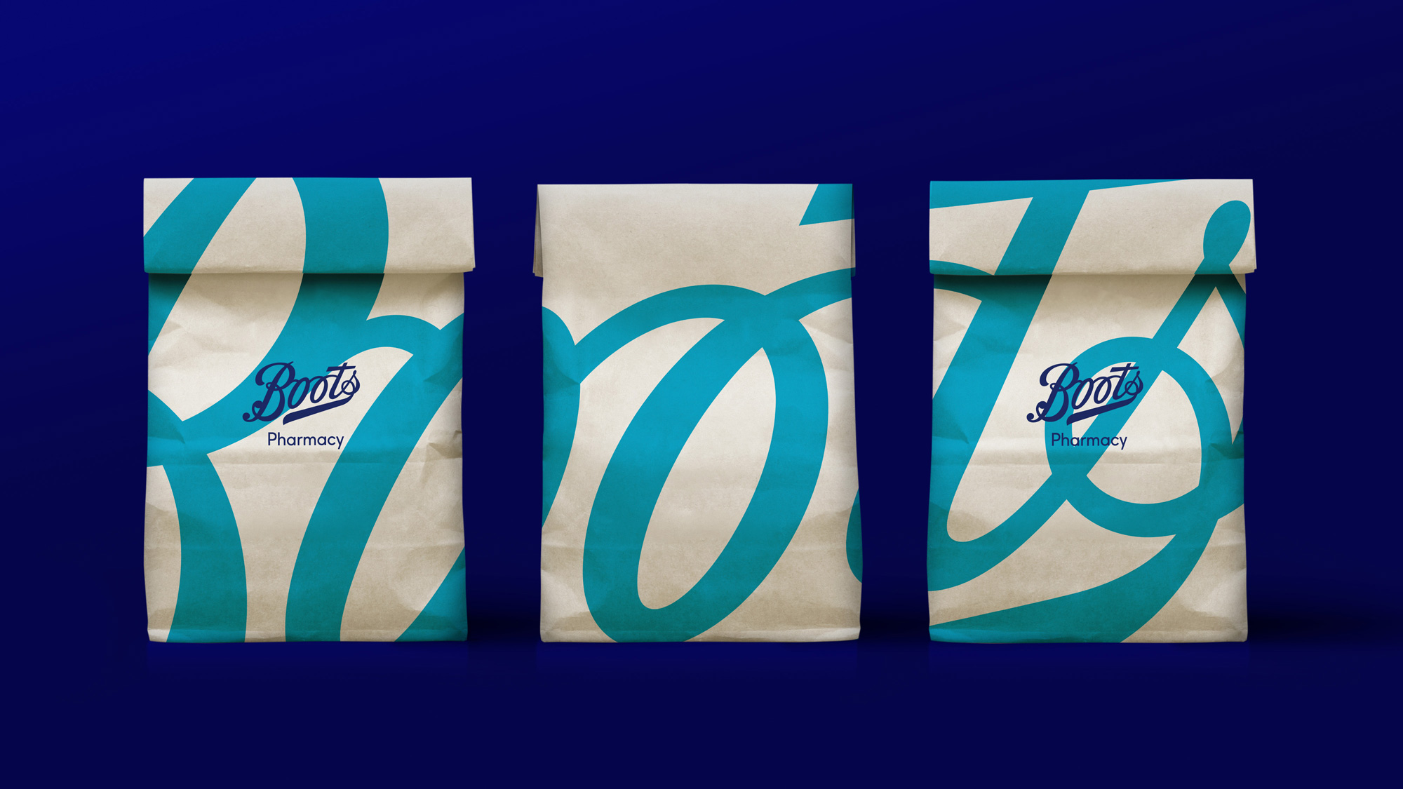
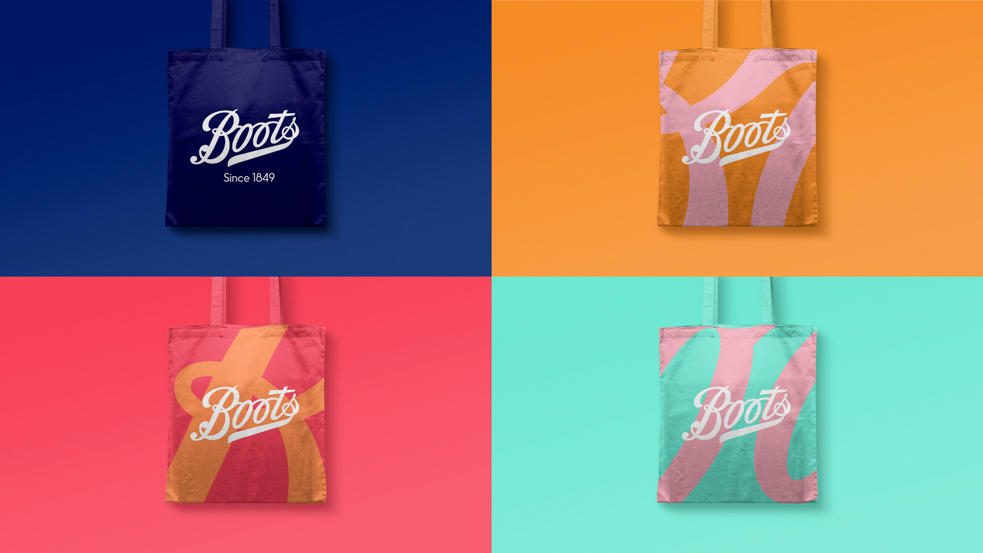
A nice example of the closing statement of the last paragraph are these gift cards, which I think are the best representation of the redesign. It’s Design 101 in that it simply takes the logo, blows it up 500% and sets it as a visually receded background. Basic but particularly effective as the curves of the wordmark become somewhat abstract. The color combinations are pretty nice too.
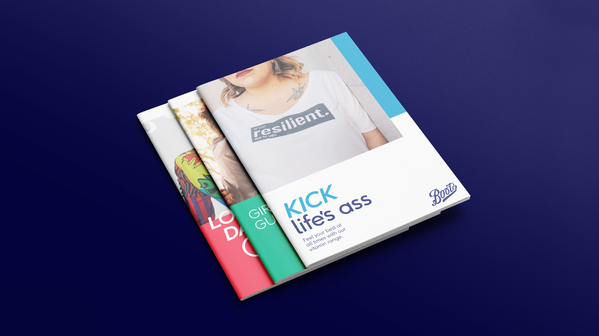
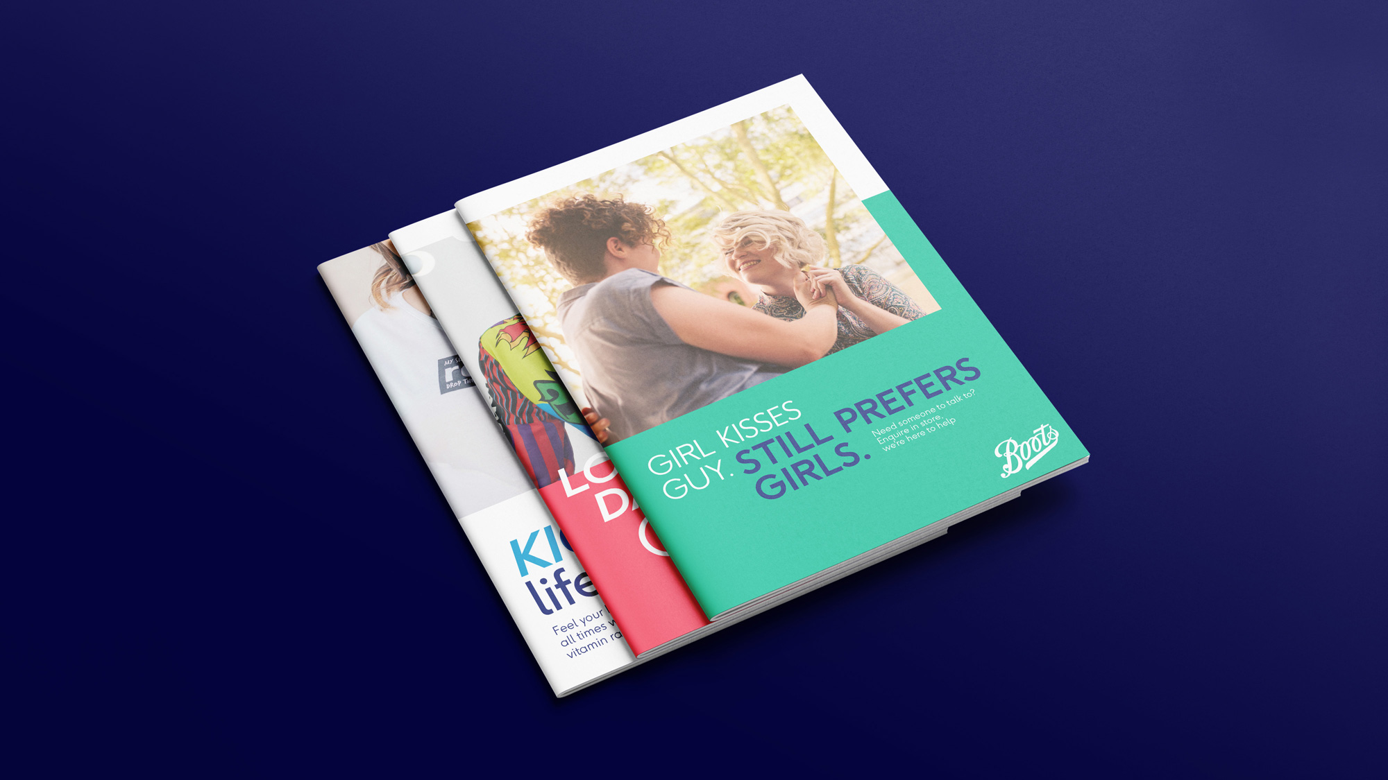
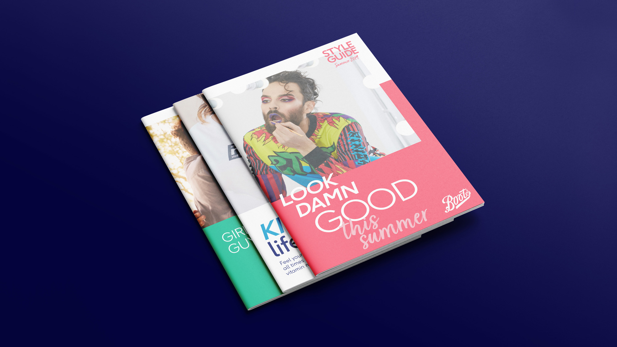
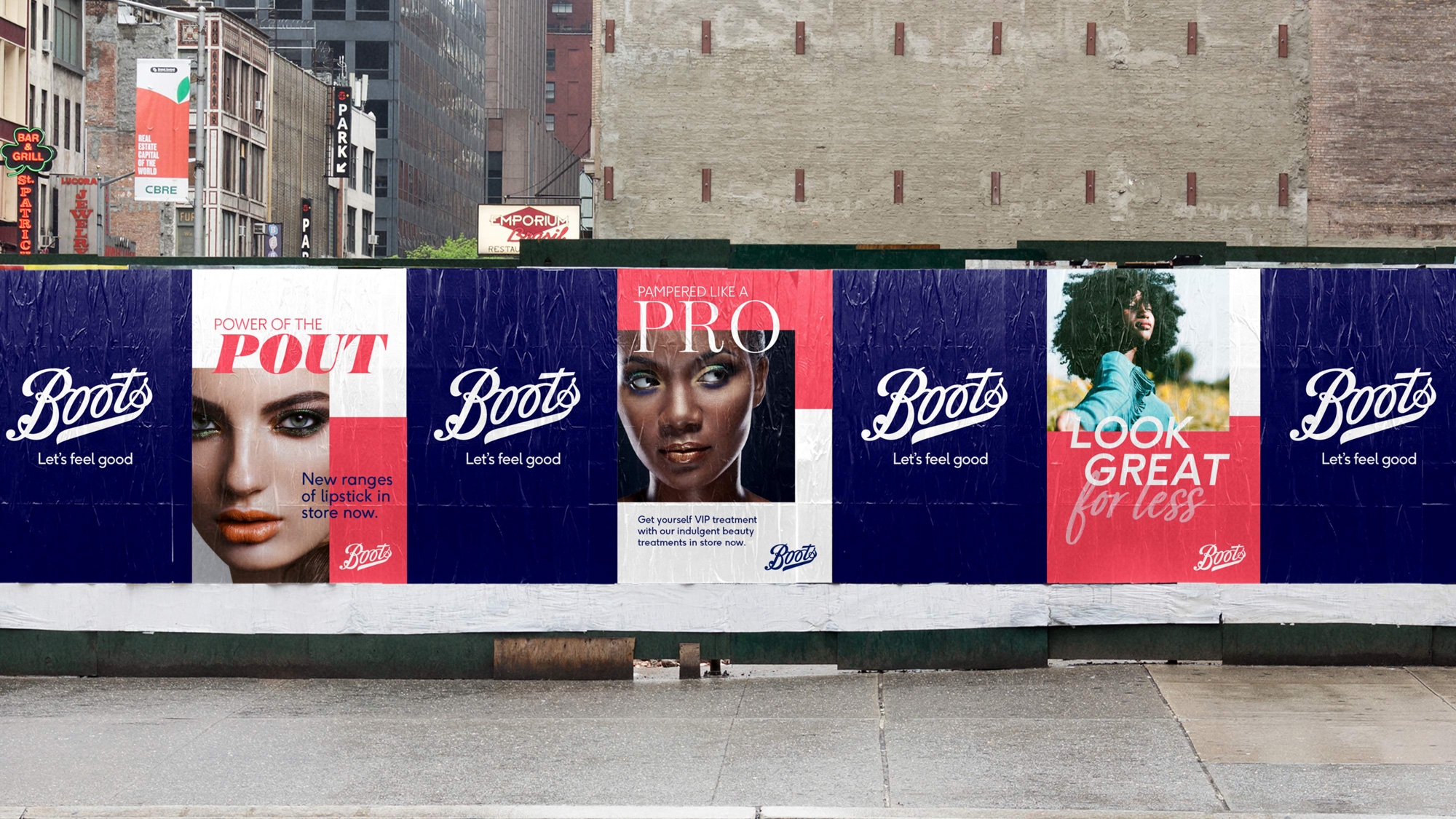
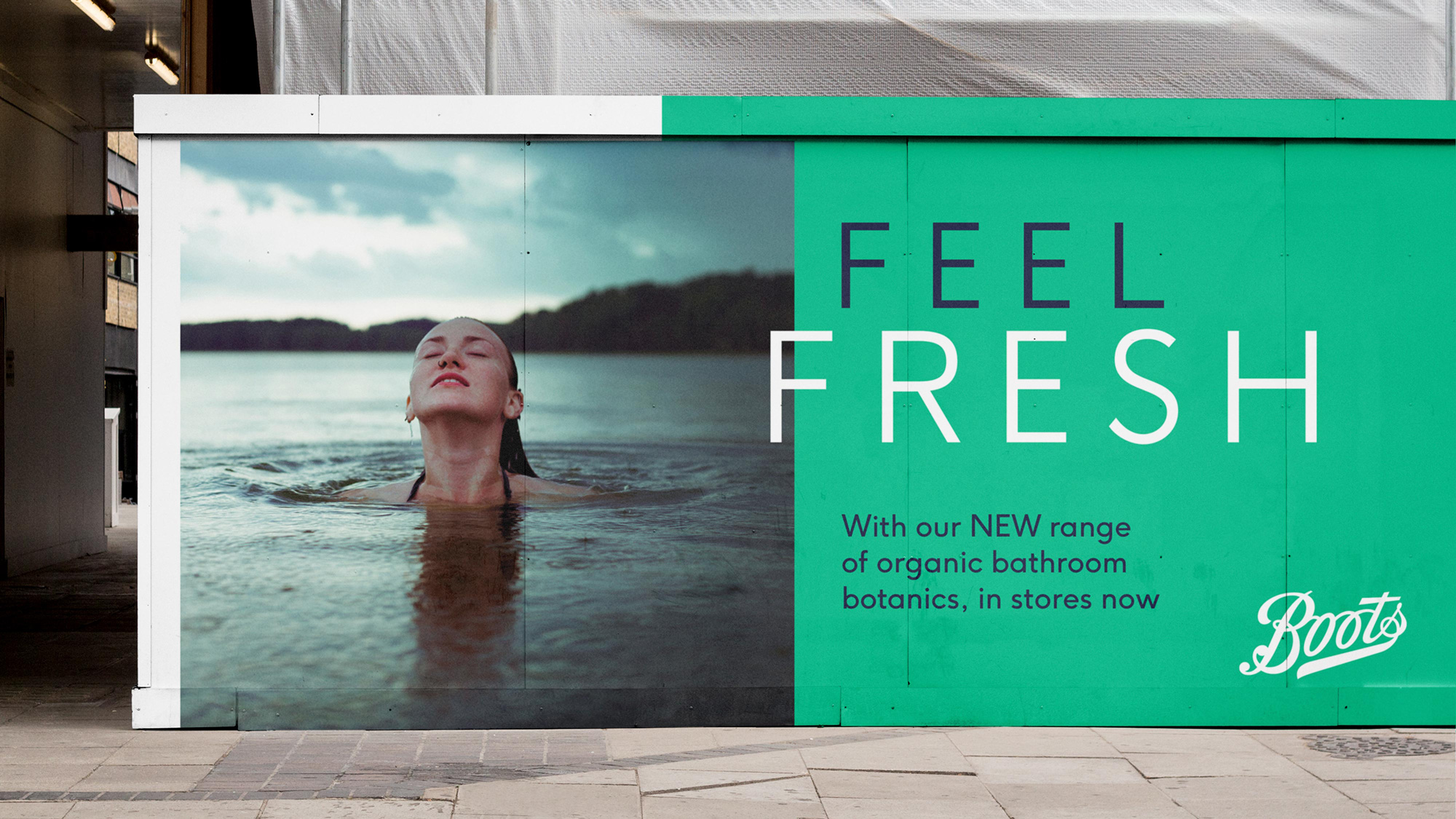
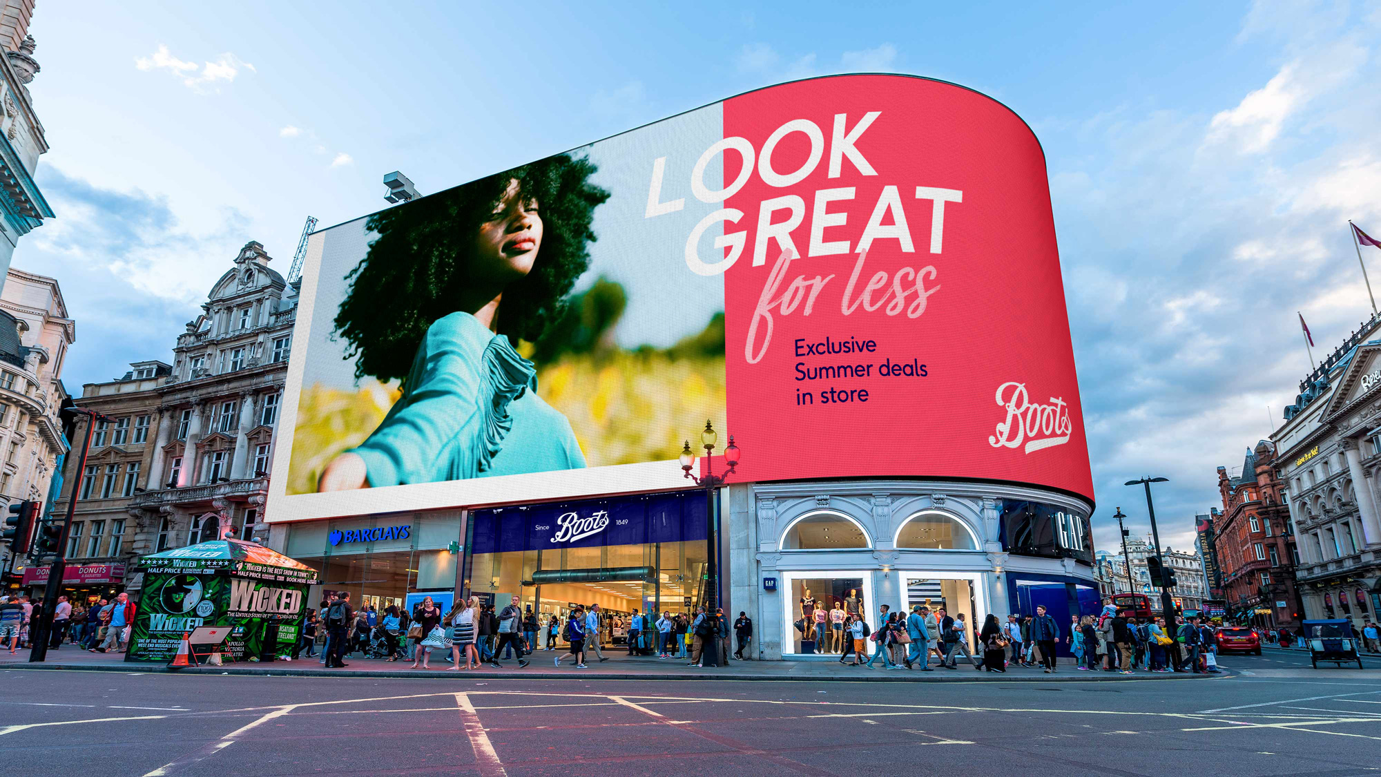

The print/ad applications are a little odd. There is a good energy going on in the mixing and matching of sans serifs in roman and italic styles with a hand-drawn script but, especially in the brochure samples, it feels somewhat disjointed. Still, there is something good brewing there.
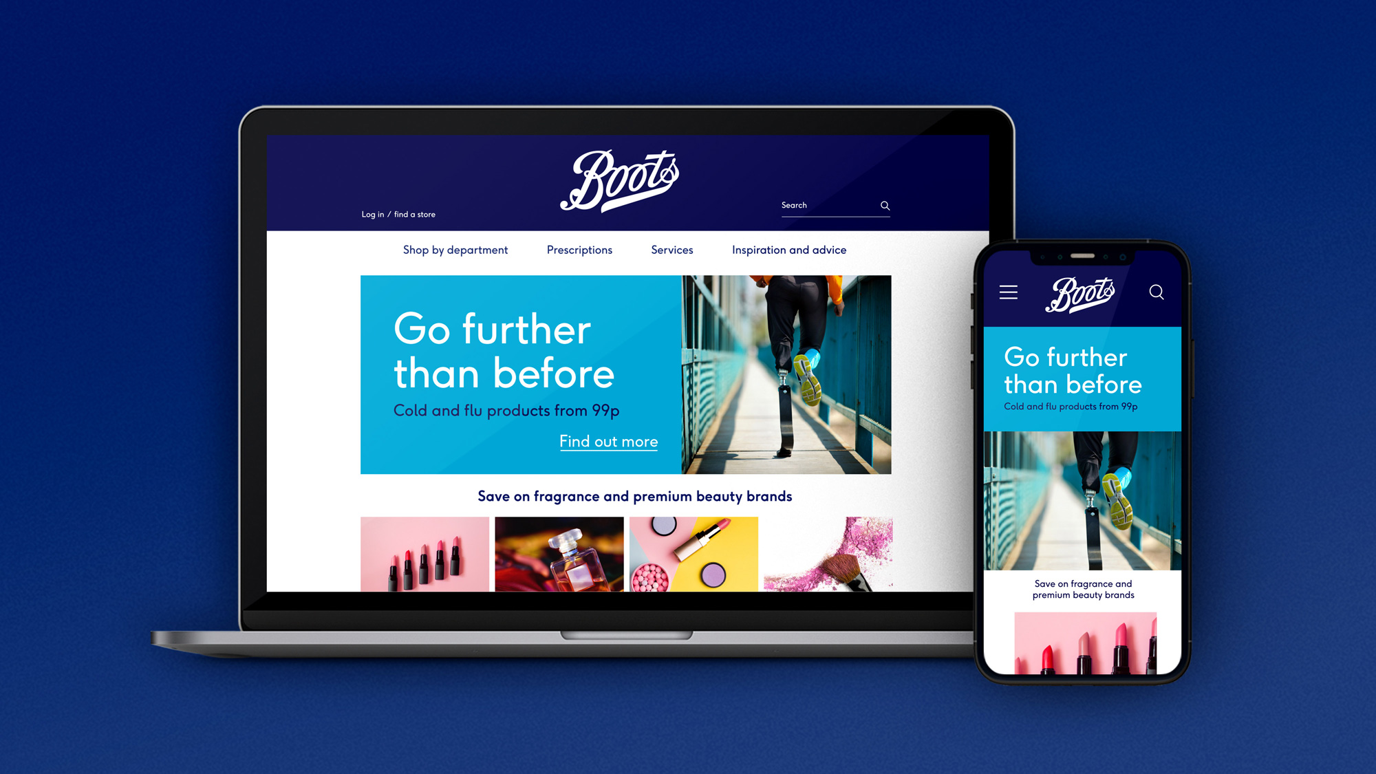
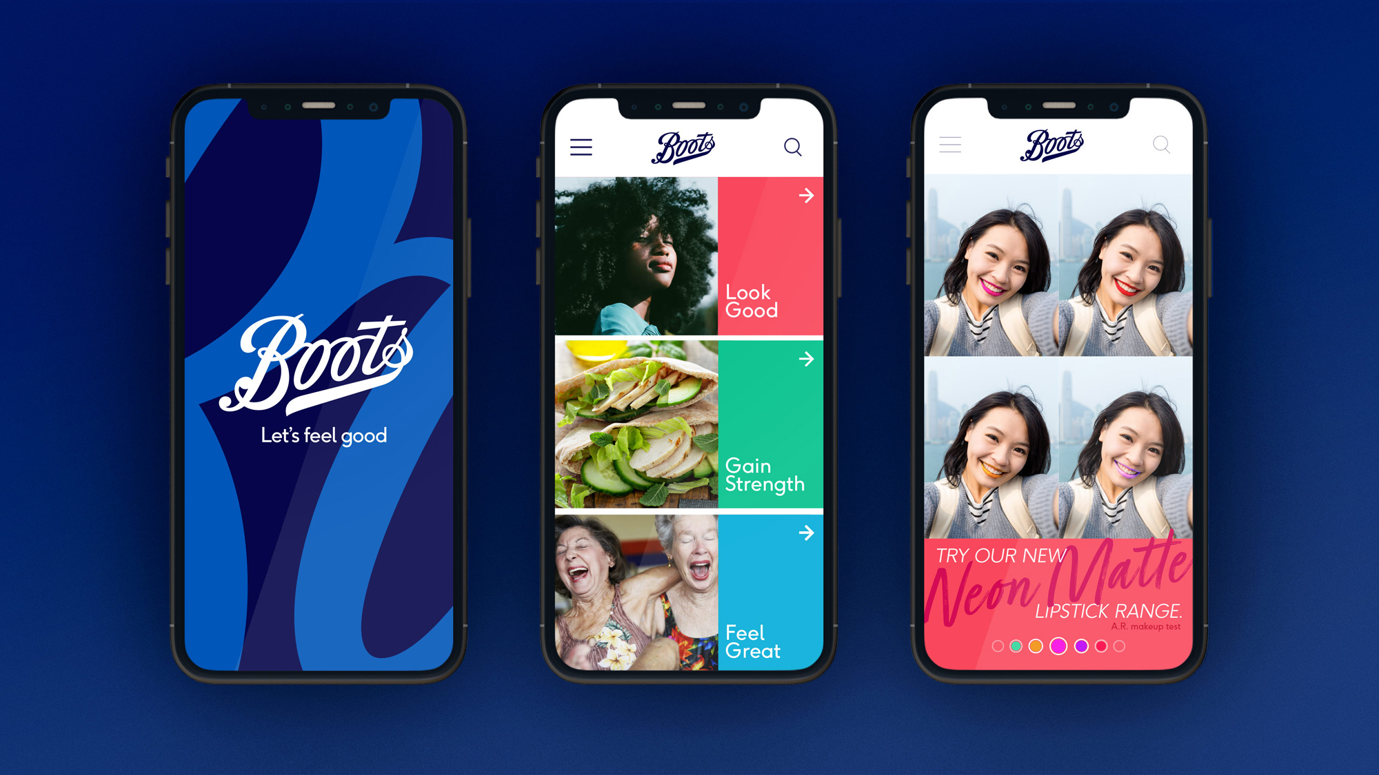
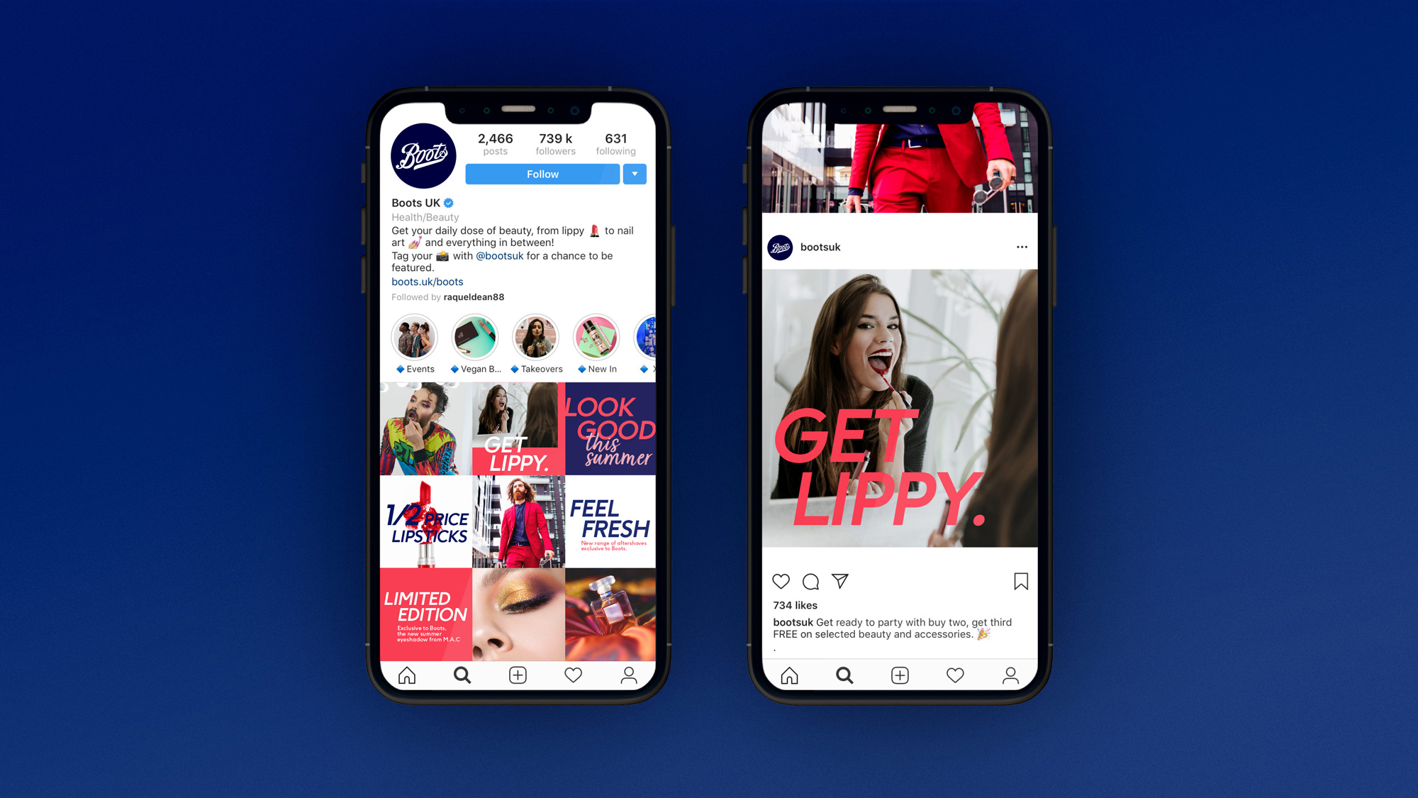
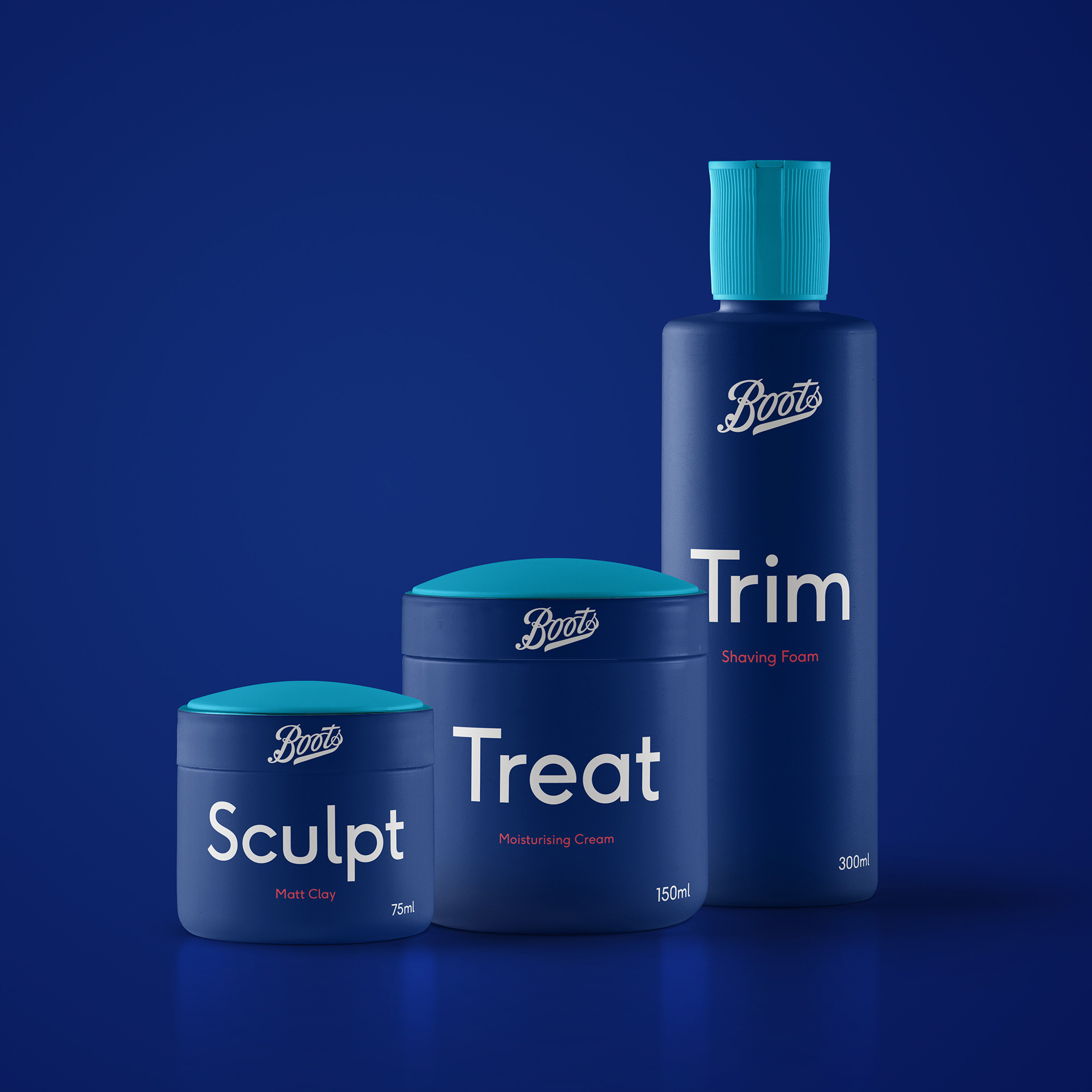
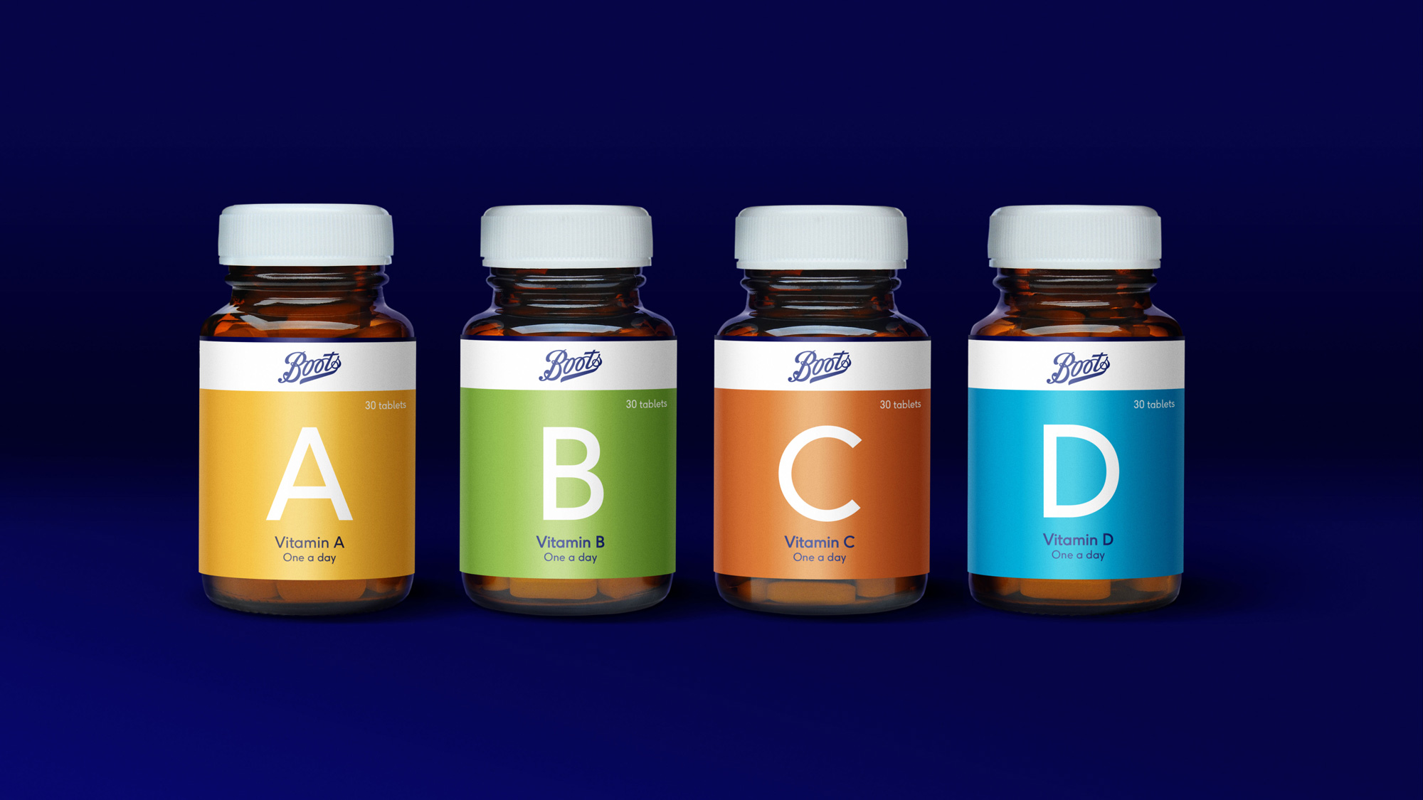
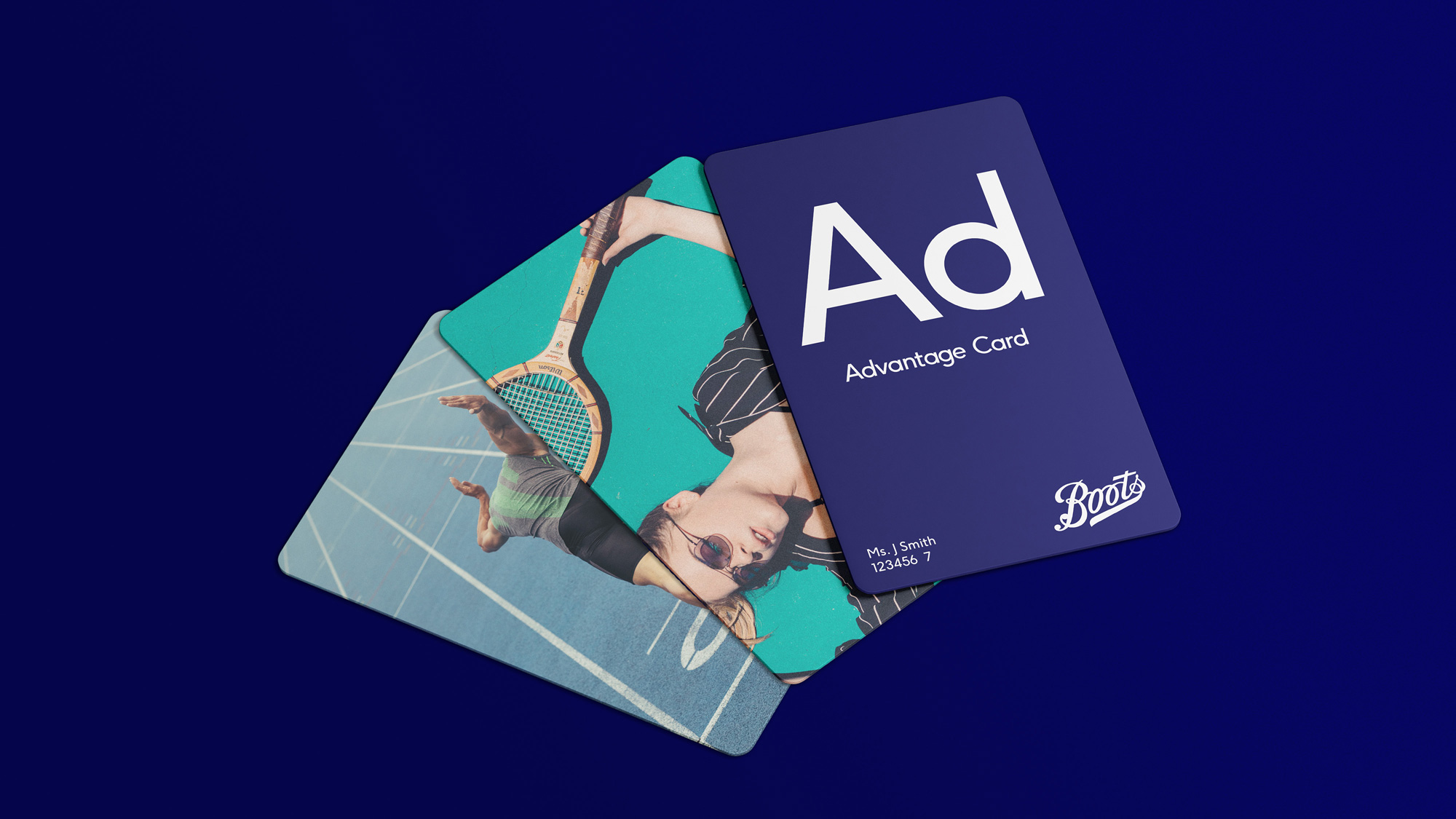
Some of the more retail-y applications are fine… hard to judge based on the limited set of renders. Like, the packaging seems promising but it’s hard to know if that’s the actual thing that will go to market. If so, wouldn’t it have been awesome of the logo crossed over from the lid into the body of the package on the creams? As they have it right now, it’s almost as if they put the logo back into a holding shape. Same thing with the vitamins, they re-constrained the logo to a band, instead of letting it break through.
Overall, this is all fine. Nothing groundbreaking or overly inspiring but enough of a clean slate to re-energize the brand at a time when retail can use all the help it can get.

 Новости Союза дизайнеров
Все о дизайне в Санкт-Петербурге.
Новости Союза дизайнеров
Все о дизайне в Санкт-Петербурге.