Обзор лучших ресурсов по разработке бренда, разработке упаковки
contact us | ok@ohmycode.ru
contact us | ok@ohmycode.ru
“Founded in 2001 by Jacobo Benbunan and Wally Olins (1930-2014), Saffron is a brand and innovation consultancy with offices in London, Madrid, Berlin, Istanbul, Mumbai, Melbourne, San Francisco and São Paulo. Saffron specializes in defining brand strategies with a focus on experience, innovation, and building strong brand cultures. Saffron’s client portfolio includes Fujitsu, Akzo Nobel, KPMG, Sodexo, Scania, Vueling, City of London, A1 Telekom Austria, ASDA, Cepsa, British Council Arts, Doha Film Institute, Voith, among others.”
N/A
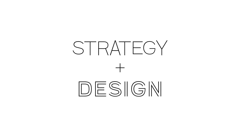
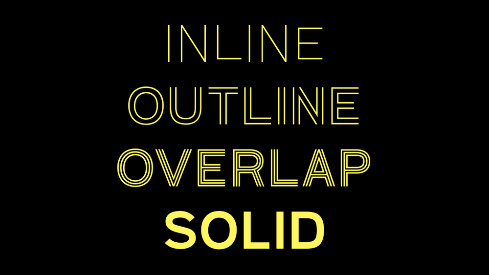
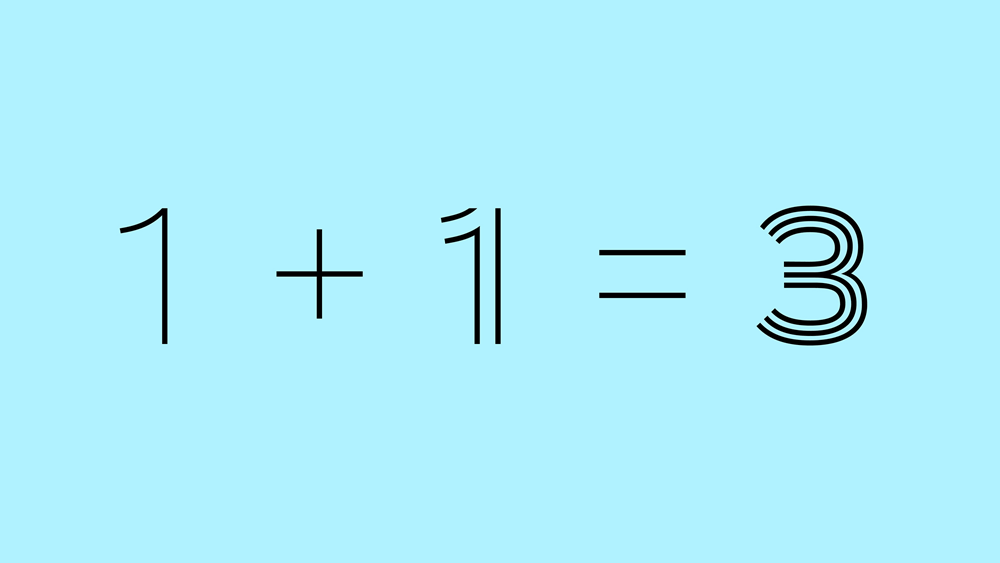
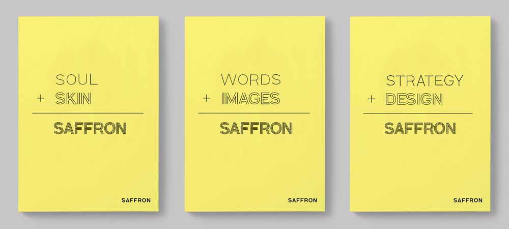
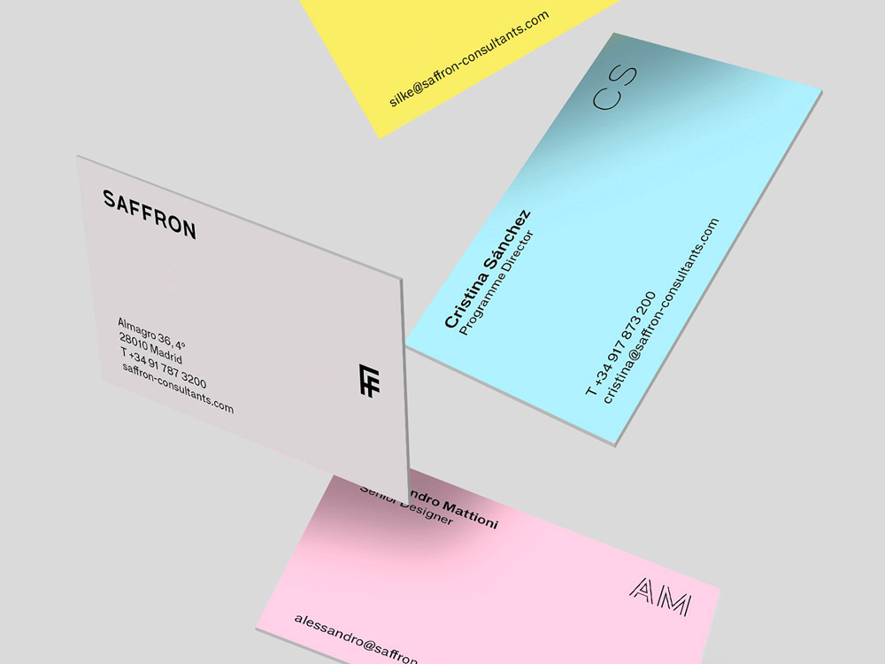
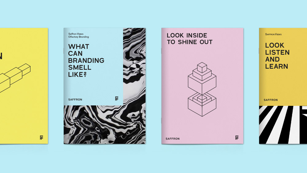
The first key element is typography. Besides giving the company personality, a bespoke family has been developed to symbolize the combination of strategy and design -- a fundamental in any brand definition process, according to Saffron. The new typographic family has four variants that illustrate this combination and, at the same time, represent the different phases of a project. The first variant speaks of the strategic part of the project - the soul - and is represented by a light typeface. The second relates to the outermost or visual - the skin - and is represented by a double contour. Combined, they form a third variant with three lines that symbolize the coming together of these two. A fourth and solid version completes the family.
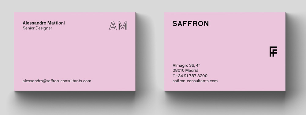
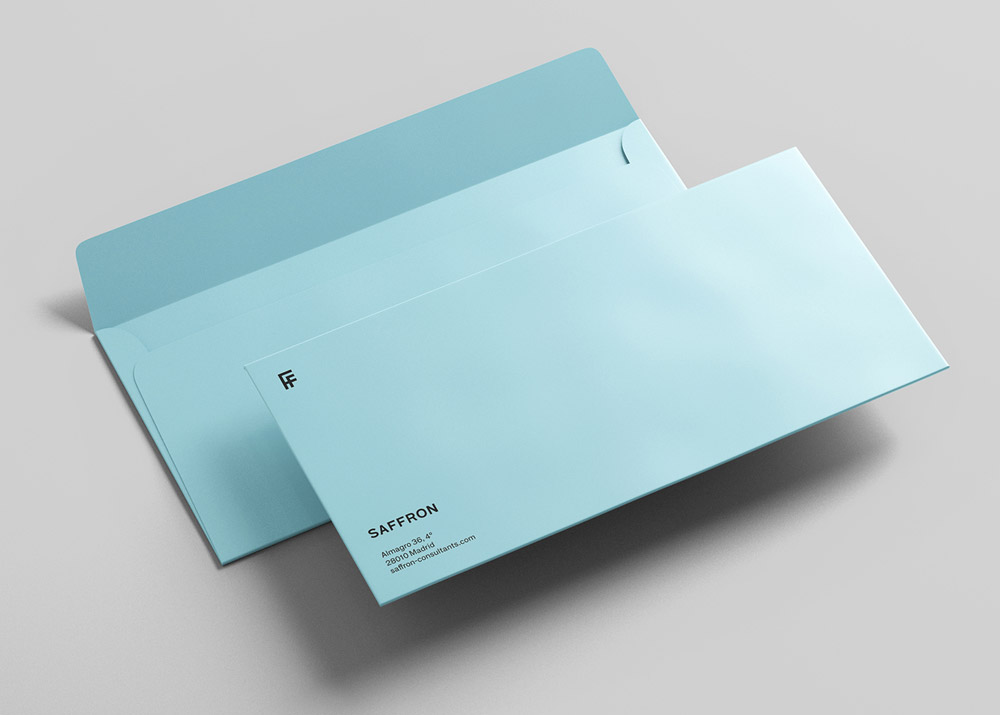
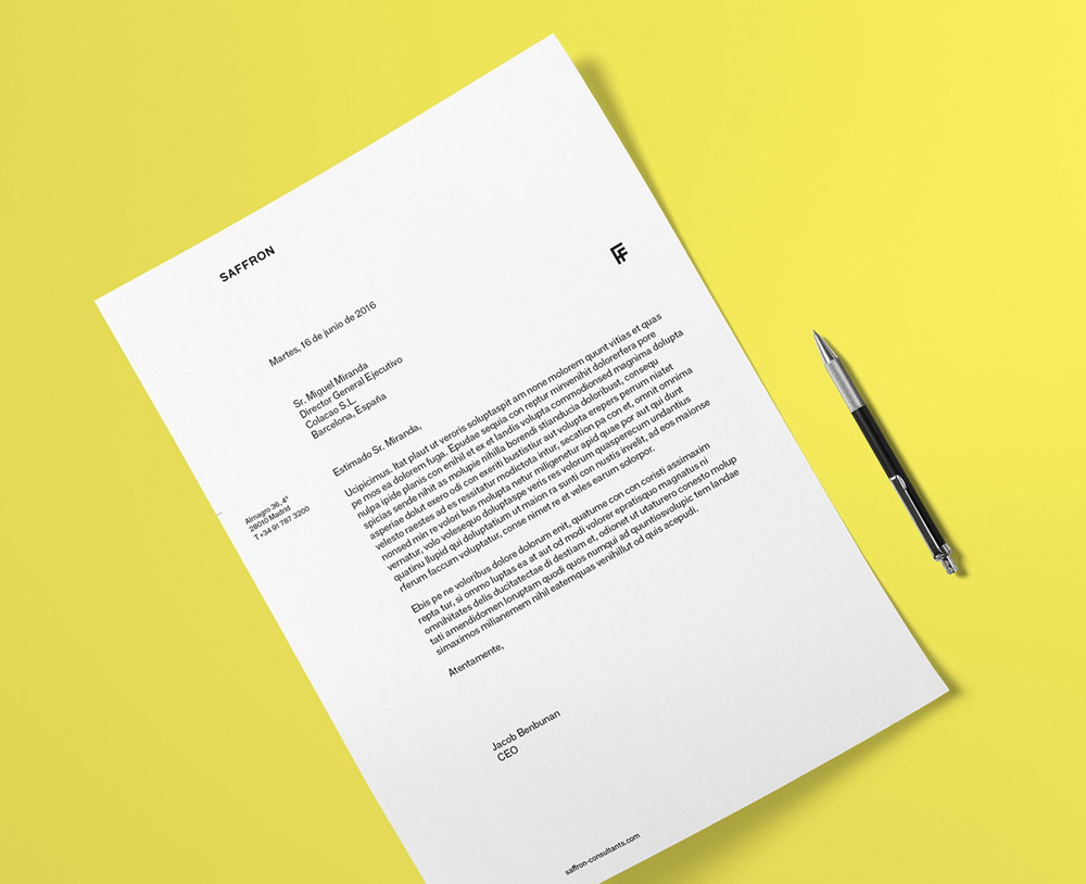
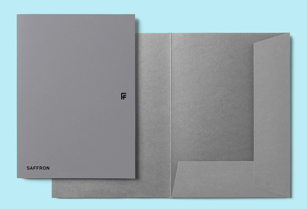
The logo is updated in line with this new spirit. It eliminates the formality of serifs and bets for a simple wordmark composed with the new typography. A new monogram is introduced, playing with Saffron’s double F.
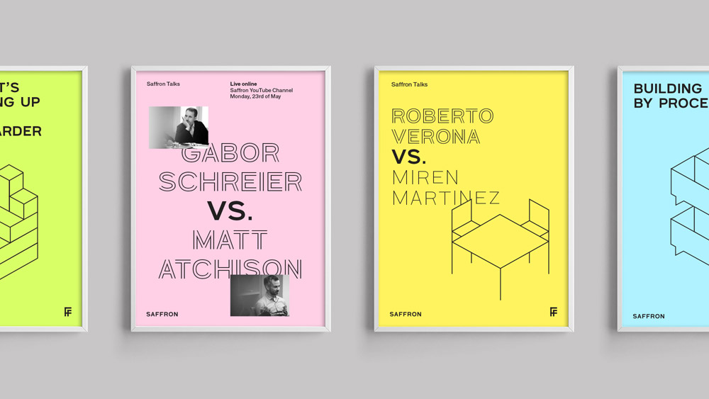
To complete the elements, Saffron presents a new, very conceptual illustration system drawn from an isometric perspective. This system will be in motion most of the time, generating a dynamic and digital visual universe.
I'm a sucker for ff ligatures so I had always enjoyed Saffron's old logo. Far from innovative or flashy, it went along with the rest of the large brand consultancies and their serif logos. Now that the tide is turning toward sans serifs for that industry, Saffron is following suit with a slightly different take on the trend. Yes, in essence, it's just a new sans serif wordmark but, literally, peel away the layers and there is something more interesting underneath, with a family of single- and multi-line typefaces building up to a solid style. It's simple but a little jarring at times, which makes it very appropriate for Saffron, who tend to operate at large, corporate levels but usually find a way to infuse their designs with an unexpected twist. The nicest element of the identity is the "FF" monogram that alludes to the ligature in the previous logo and works great as an accent in the applications (which might be a tad on the dry side). A funky and smoothly animated set of icons add another layer of interest to the identity. Overall, this strikes the difficult balance that large design firms need to achieve in order to look creative but also not scare away corporate clients.

 Новости Союза дизайнеров
Все о дизайне в Санкт-Петербурге.
Новости Союза дизайнеров
Все о дизайне в Санкт-Петербурге.