Обзор лучших ресурсов по разработке бренда, разработке упаковки
contact us | ok@ohmycode.ru
contact us | ok@ohmycode.ru
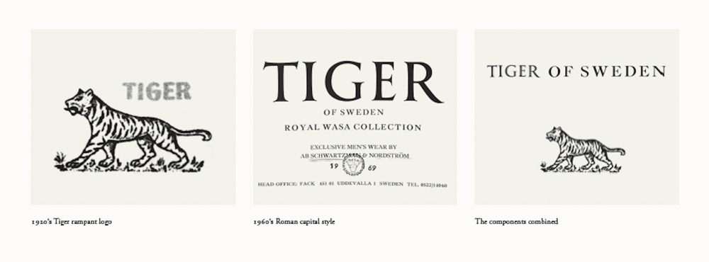
Established in 1903, Tiger of Sweden is a Stockholm, Sweden-based fashion house with a heritage in tailoring. The company was originally called Schwartzman & Nordström and “Tiger” was initially a range of suits introduced in 1920, which led to the name change in 1923. After World War II, Tiger of Sweden grew exponentially and moved into the American and other European markets in the 1960s, specializing in suits. It launched its women’s line in 1997, opened its first store in 2000, and even introduced jeans as part of its collection. Today it has stores in nearly a dozen countries. Recently, Tiger of Sweden introduced a new identity designed by Antwerp, Belgium-based A New Archive (no link found).
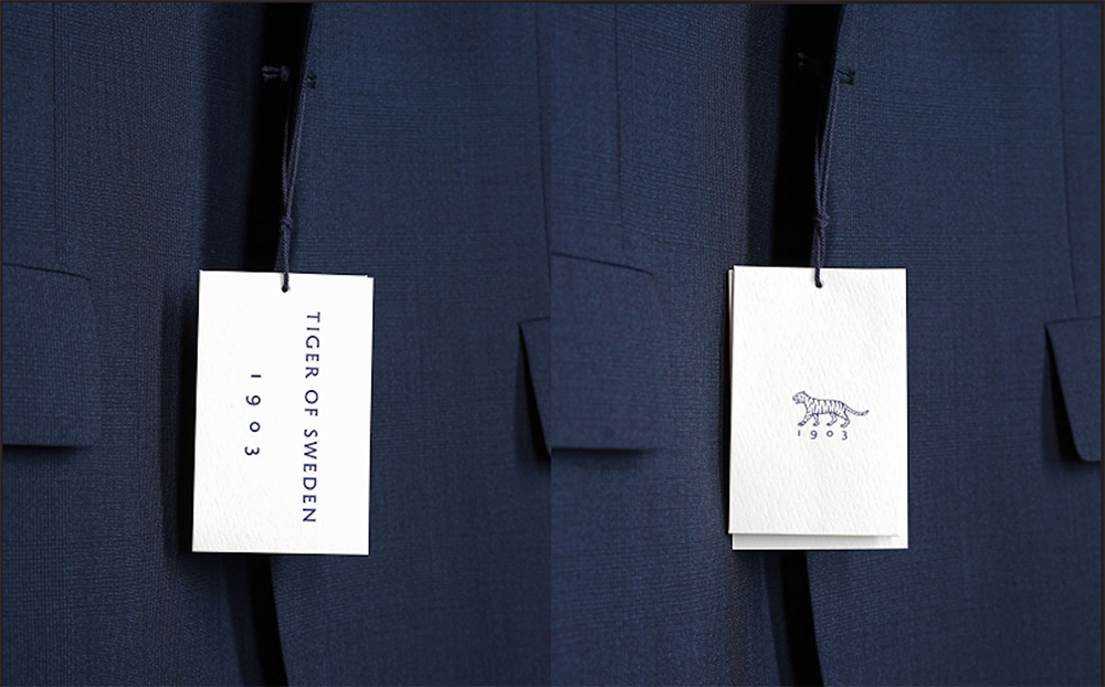
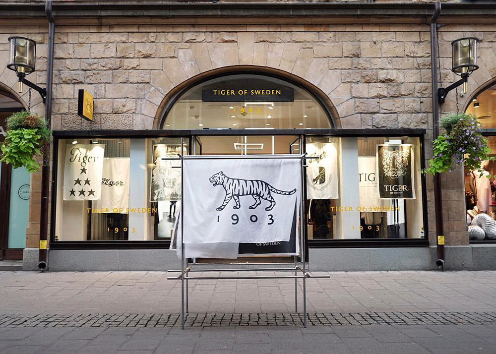
Our new visual identity has been created in close collaboration between the Antwerp-based design studio A New Archive and our Creative Director Christoffer Lundman. The new logo is based on archive findings. The tiger mark is a revived version of an emblem used on the original range of ‘Tiger’ suits, first produced in 1926. The unique new font is drawn up from a 1960’s marquee, holding that same Roman feature as letters typically used on official Swedish buildings, papers and coins. All this is a way of paving the way for our future whilst also paying an homage to our past; 115 years of tailoring heritage.

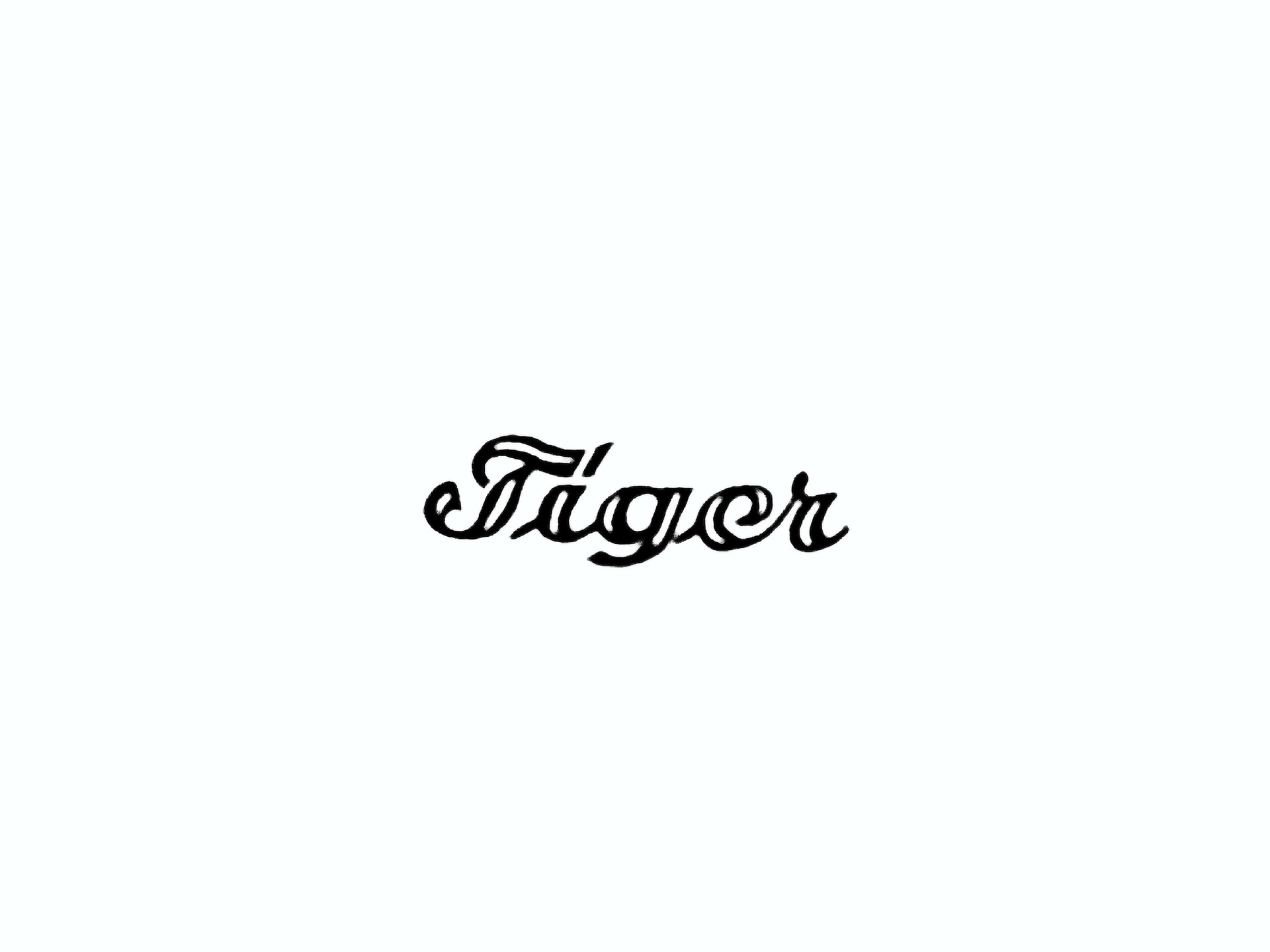
The old logo was 1980s-tastic somehow — like it could sit next to a Patrick Nagel print and it would be a perfect pair. It was actually not bad. Outdated but not bad. The new logo has a more timeless feel, as if it could have been like that for decades. While it works under the current minimalist trend, it infuses with enough flair to make it more interesting. The generously-spaced flared serif is a great alternative to another flavor-less sans and the tiger icon has a great balance of detail and abstraction and of menacing and chill. I love the detail of matching the spacing of “1903” to the legs of the tiger.
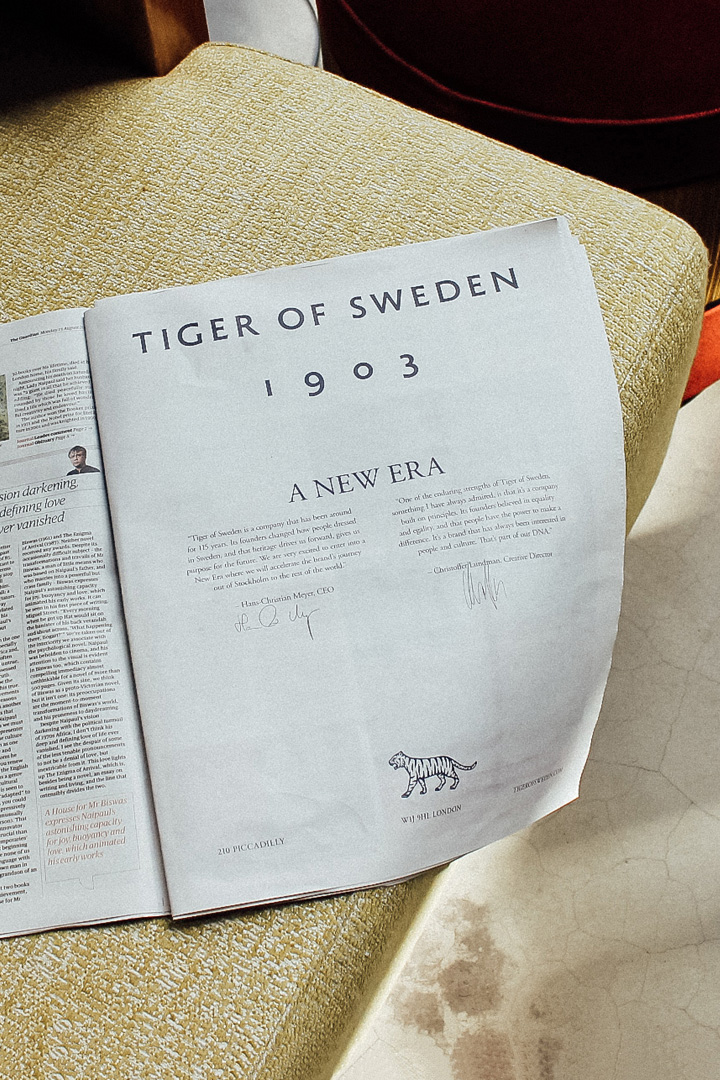
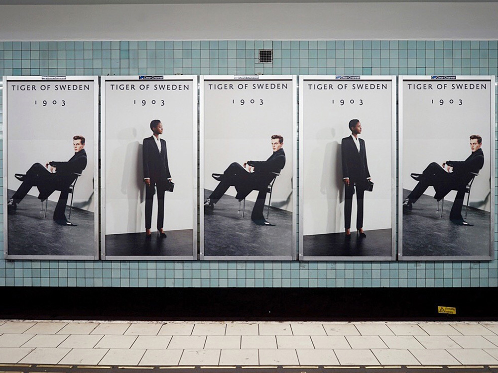

The few applications shown have a modern and classy aesthetic that elevate the presence of the brand — I can’t imagine the old logo pulling off the confidence visible in those subway ads. That logo really sells those. Overall, a very lovely and simple redesign that demonstrates how even a few minor displays of personality add up to a lot.
Thanks to Jojo Franke for the tip.

 Новости Союза дизайнеров
Все о дизайне в Санкт-Петербурге.
Новости Союза дизайнеров
Все о дизайне в Санкт-Петербурге.