Обзор лучших ресурсов по разработке бренда, разработке упаковки
contact us | ok@ohmycode.ru
contact us | ok@ohmycode.ru

Established in 1876, Ericsson provides hardware, software, and services for communications technology having developed many of the technologies that have enabled 2G, 3G, and 4G networks, currently working on 5G and the growing world of the Internet of Things. Headquartered in Stockholm, Sweden, Ericsson has over 100,000 employees — 24,000 of which are in R&D, which has yielded the company 42,000 patents. This week, at Mobile World Congress 2018, Ericsson introduced a revised icon designed by Stockholm Design Lab.
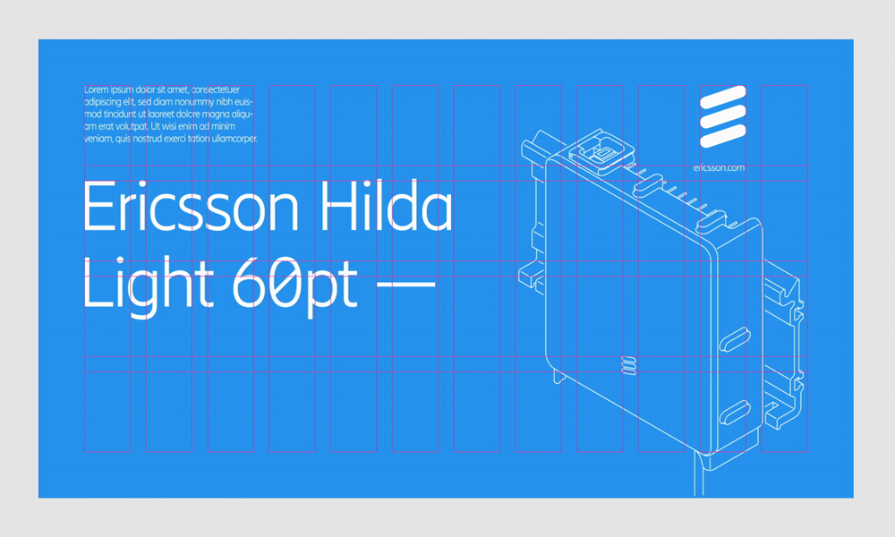
The geometry of the new, optimized Econ has been refined to align smoothly and naturally with the pixel grid. Its angle, curvature and spacing have all been adjusted for knife-sharp performance in digital environments. While each refinement is practically invisible to the naked eye, the end result is a noticeable smoother on-screen rendering - especially at smaller sizes. The Econ’s inclination angle, 18.435°, has been fine-tuned to harmonize with the pixel grid. The new improved angle ensures a uniform pixel distribution, which in turn means smoothly rendered edges.
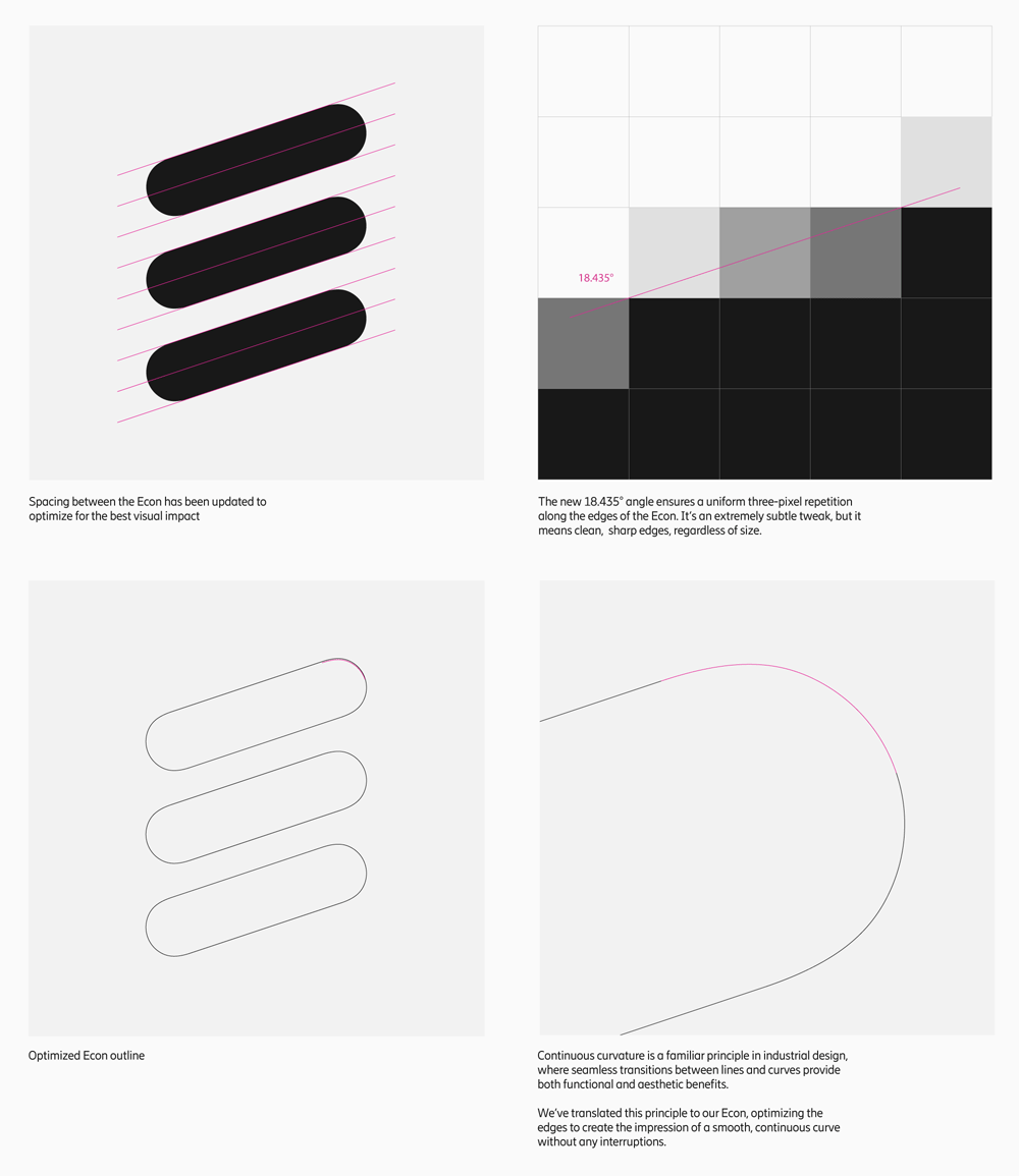


Naturally, the first question for many will be “Why bother?” and the conclusion that “No one will notice”, both of which are valid reactions but miss the point in Ericsson’s (or any other company’s) effort to provide the cleanest, clearest, best performing identity possible just in the same way they are trying to provide the best possible products and services. So, yes, no one will notice but this gives Ericsson the confidence that their logo will look as good as possible in as many places as possible. The three-pixel grayscale smoothing at the lowest-pixel-count rendering of the icon is one of the most enjoyable design-nerdery things I have seen in a while, especially given how easy it is for logos to degrade when they go small. Check their favicon… it’s kind of spectacular how sharp it looks. So, no, no one will notice but that doesn’t mean it’s not an improvement and an investment for the next 20, 30 years.
In all of this, I’m not sure what happens to the Ericsson wordmark. It all seems a push to use it less and less.
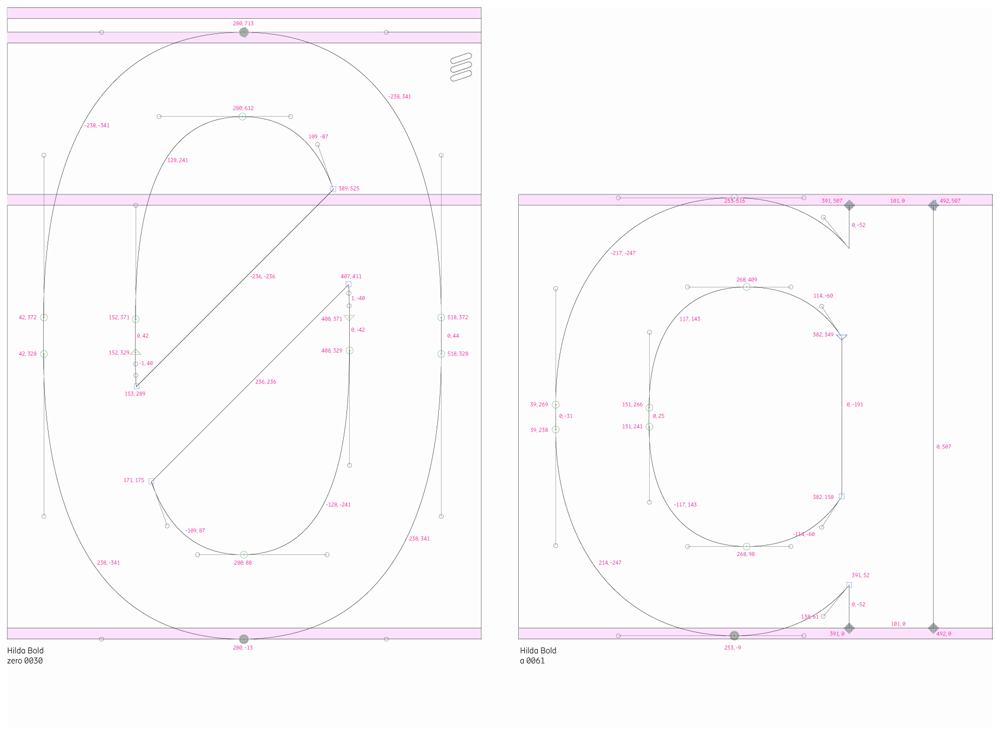
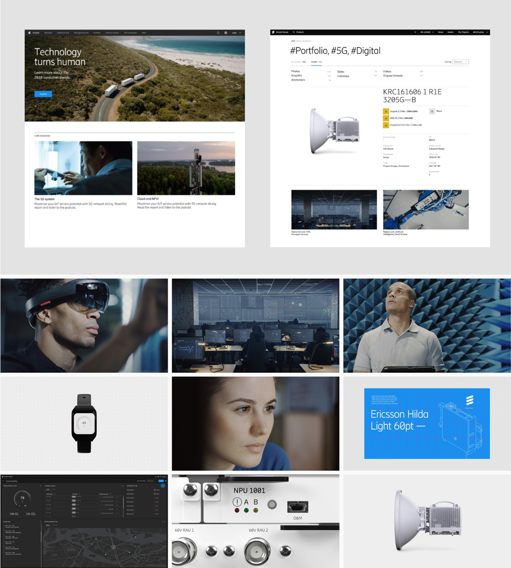
Hilda is a modern typeface designed around the user experience. With a digital first approach, the font is optimised for Ericsson GUI environments, placing functionality and clarity at the forefront. Hilda expresses technical expertise, building trust through product interactions, digital semantics and behavior.
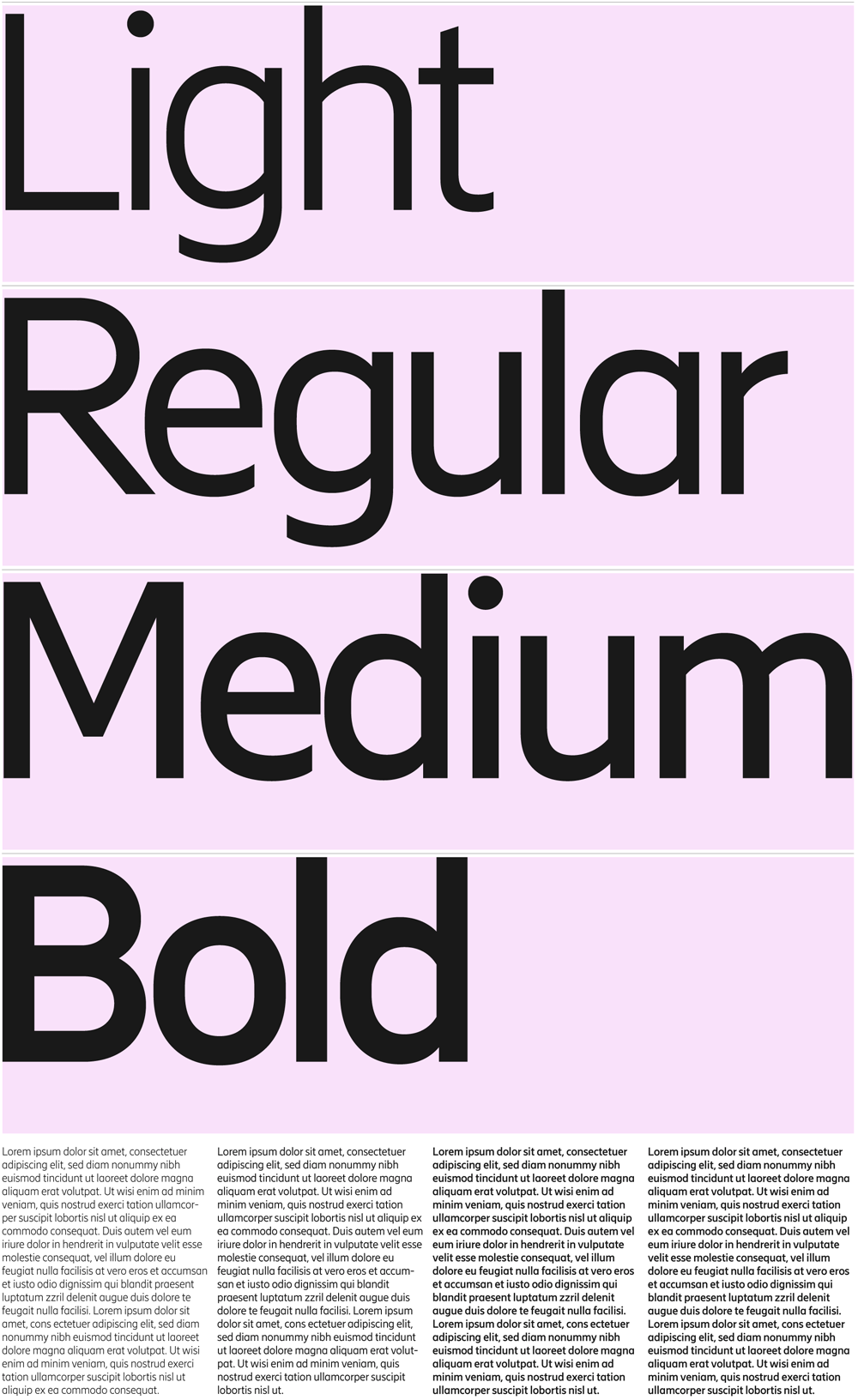
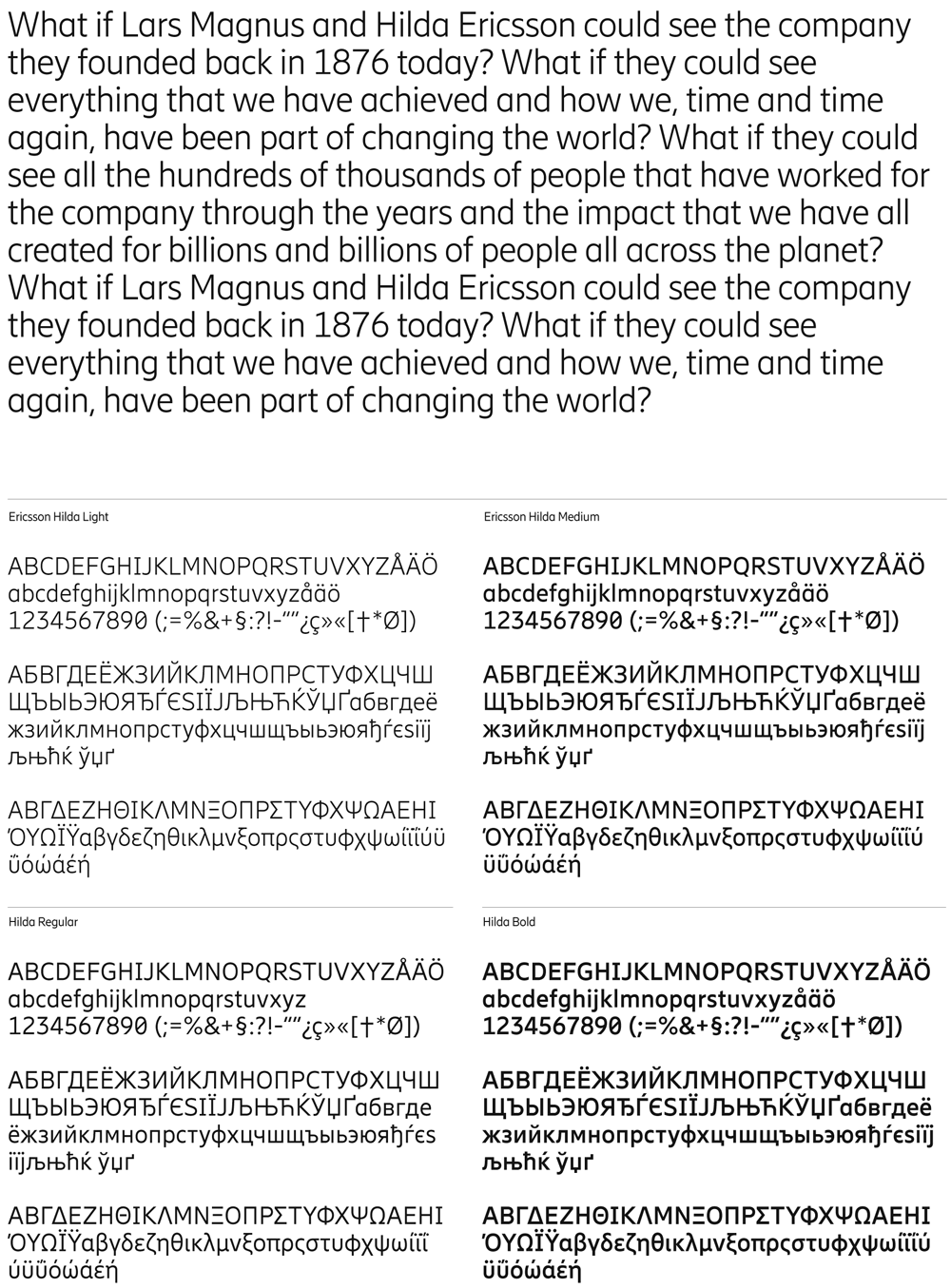
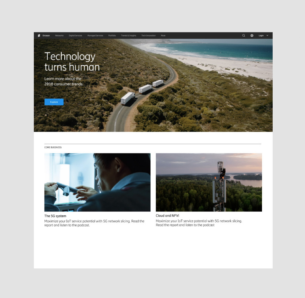
The type family is nice. Like a condensed version of Lineto’s Brown. It performs nicely on Ericsson’s website, where it’s the only family used.
Our approach to color is born from digital interfaces and information design principles. The tones we have selected are digitally native, intentionally bright and rich in contrast. The accent colors are primarily intended to help guide the user towards key messages and interactions, rather than distract them through unnecessary decorative usage. Our color palette consists of grayscale shades and accent colors. The color palette for digital product development has optimized values for its particular environment.
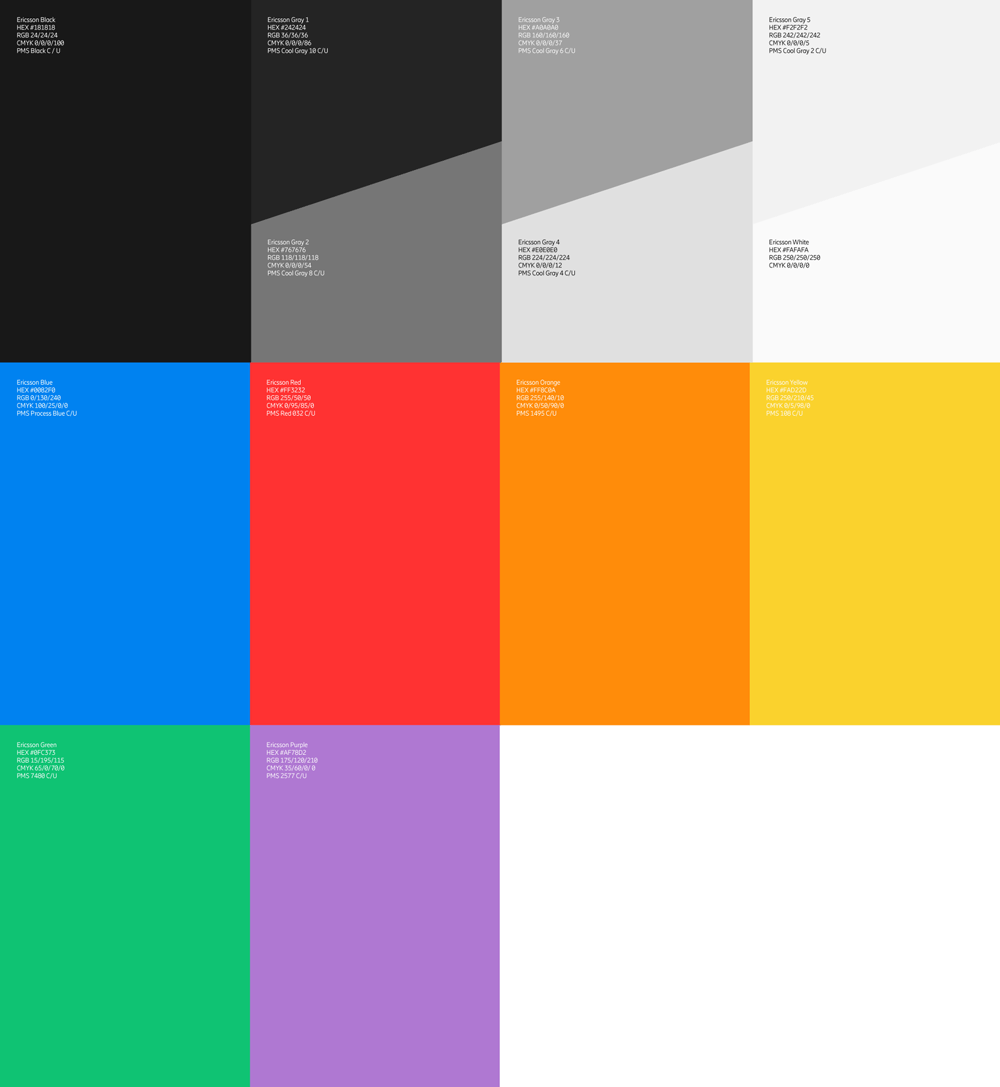
So, all of the colors. Got it.
The 2.0 icon expression is derived from the Econ, developing a subtle yet solid connection to the Ericsson heritage. By integrating the angle into the grid, the foundation creates unity and guidance for future needs.
Nice and crisp. That disappearing file icon on the fourth row, fourth column is my new favorite icon. Don’t know what it represents but I’m digging it.
The new brand identity focuses on functionality over aesthetics and aims to provide tools for simple communication and product performance, thus reflecting Ericsson’s technical expertise. The visual language takes direct influence from the products and services needs, with little space for ambiguity and meaningless decoration. The holistic design work includes optimization of the entire visual system, with the purpose of simplifying and adapting to today’s and tomorrow’s digital needs for customers. The refinements to the visual identity are a direct response to Ericsson’s business strategy and brand promise, The quest for easy.
The overall design approach seems to be “Get out of the way and let the product do the talking” which creates a confident, elegant, spare look with the icon — which by the way is nicknamed “Econ” — serving as a punctuation throughout the system. I may be wrong in this but I don’t think the Ericsson icon is as universally recognizable as, say, Apple’s or even LG’s since it doesn’t have a major consumer market presence but this new system and approach could play a role in getting it closer to a more iconic business-to-business brand like IBM — and all because of a 18.435° angle.

 Новости Союза дизайнеров
Все о дизайне в Санкт-Петербурге.
Новости Союза дизайнеров
Все о дизайне в Санкт-Петербурге.