Обзор лучших ресурсов по разработке бренда, разработке упаковки
contact us | ok@ohmycode.ru
contact us | ok@ohmycode.ru
“Ogden is a city and the county seat of Weber County,[4] Utah, United States, approximately 10 miles (16 km) east of the Great Salt Lake and 40 miles (64 km) north of Salt Lake City. The population was 84,316 in 2014, according to the US Census Bureau.[5] The city served as a major railway hub through much of its history, and still handles a great deal of freight rail traffic which makes it a convenient location for manufacturing and commerce. Ogden is also known for its many historic buildings, proximity to the Wasatch Mountains, and as the location of Weber State University. Ogden is a principal city of the Ogden-Clearfield, Utah Metropolitan Statistical Area, which includes all of Weber, Morgan, Davis, and Box Elder counties. The 2010 Census placed the Metro population at 597,159. In 2010, Forbes rated the Ogden-Clearfield MSA as the 6th best place to raise a family.” (Wikipedia)
Roger Brooks International (Peoria, AZ)
Ogden City brand page
Brand guidelines (PDF)
Roger Brooks presenting on tourism branding for the Ogden City folks
The Ogden, Utah script logo is meant to reflect a signature—a personal stamp that identifies the unique spirit and energy of those who call Ogden home. The city’s name is the primary graphic so that the destination will become more familiar with every use. “Utah” is added to indicate its location to consumers everywhere.
The Ogden tagline “Still Untamed” is a hand-drawn font style that promotes the independence, innovation and risk-taking attitude of the brand.
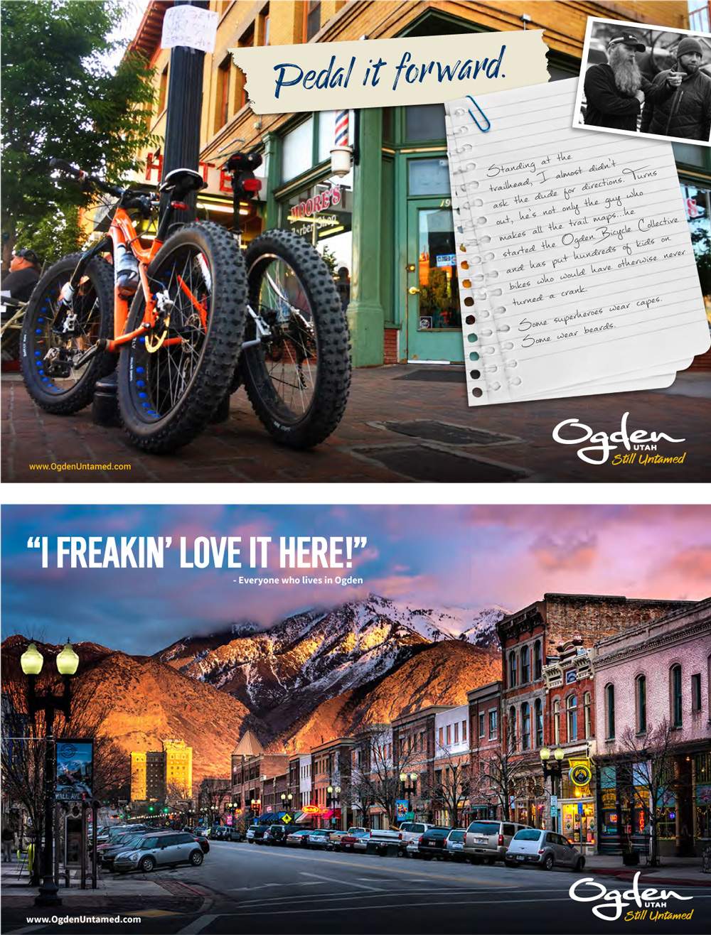
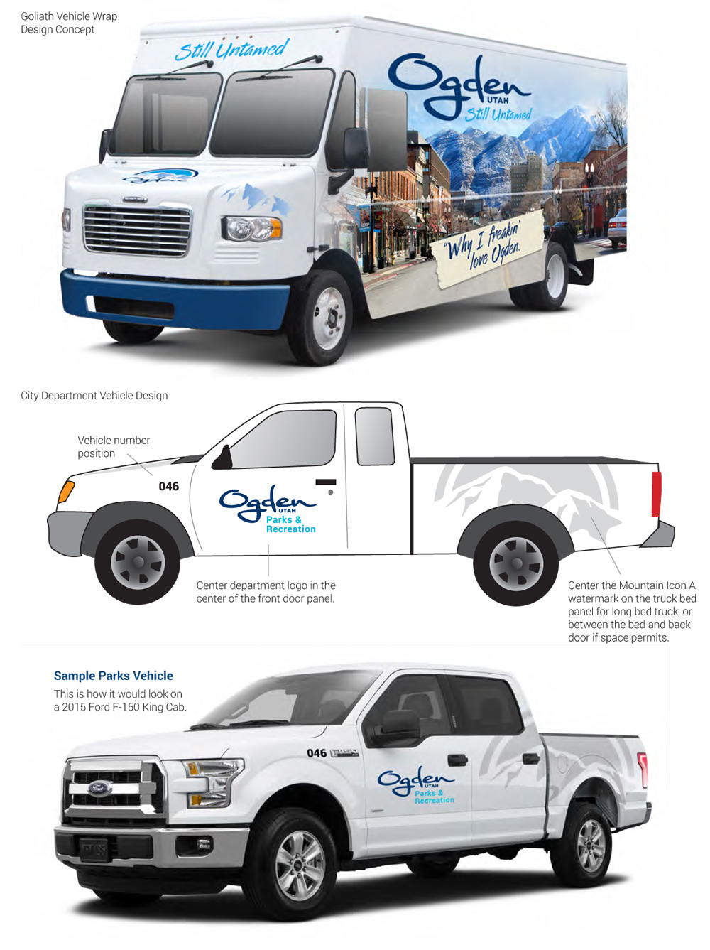
The old logo didn't have great execution or typography but it did look like a maker of backpacks for outdoor use, so it wasn't completely off the mark, given the amount of outdoor goodness in and around Ogden. The new logo could potentially be considered that it maintains the outdoors vibe with the free-flowing wordmark and if the execution didn't feel so heavily like an Adobe Illustrator brush it might be somewhat successful. Also, the lettering is ALL over the place in terms of thicknesses, curve styles, and how strokes finish or end… everything is different. The tagline is kind of okay, hinting that Ogden still hasn't been overtaken by modernity but the brush script, called Enjoy the Ride, is slightly cheesy. It's actually the gateway to the rest of the cheesiness as the applications and the guidelines encourage the use of "torn paper", "post-it", and Polaroid graphic devices straight out of the early 1990s plus the use of sentences like "I freakin' love it here". Nope. The livery is a brand nightmare on wheels: "Give ’er everything we've got!" including a weird bottled-water version of the logo with a mountain on it. Overall a big miss for a place that looks so cool and has this kick-ass sign at one of its edges. (Unless there are any trademark issues or another Ogden organization already uses it, that's a logo right there handed on a silver platter.)
Thanks to Camille Washington for the tip.

 Новости Союза дизайнеров
Все о дизайне в Санкт-Петербурге.
Новости Союза дизайнеров
Все о дизайне в Санкт-Петербурге.