Обзор лучших ресурсов по разработке бренда, разработке упаковки
contact us | ok@ohmycode.ru
contact us | ok@ohmycode.ru
Established in 1987, Foilco is a supplier of stamping foil to the print industry in the UK. Based in Warrington, England, the company supplies eight different types of foil — including classics like gold and silver as well as more exotics like transparent and holographic — and is a well-known and well-regarded supporter of the graphic design industry in the UK, sponsoring events as well as holding their own, called Multiplicity. Foilco was recently awarded The Queen’s Award for Enterprise: International Trade 2019, the highest official UK awards for British businesses and also recently introduced a new identity designed by Studio DBD in Manchester, UK.
Disclaimer: I realize this isn’t a huge company but the love of foil stamping I think is universal and we can all appreciate a nice identity for a company that spreads the joy of foil.
The first step was to simplify Foilco’s message. We wanted to clarify as much as possible what Foilco offered. Most people know they supply hot stamping foils but when we broke it down we wanted to consider what that actually meant. We worked together to understand that there were eight key types of foil that Foilco offered. This gave us a starting point.
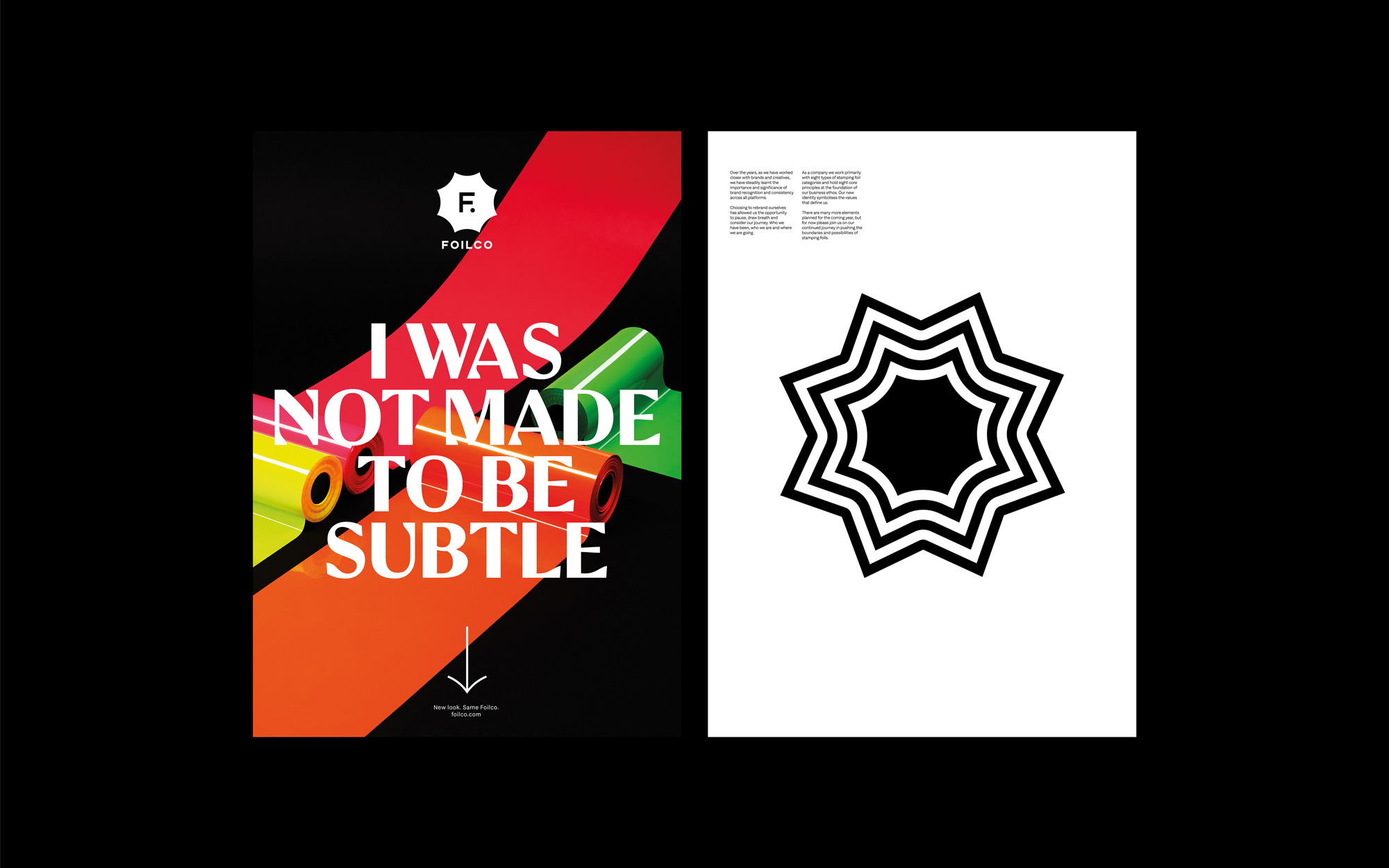
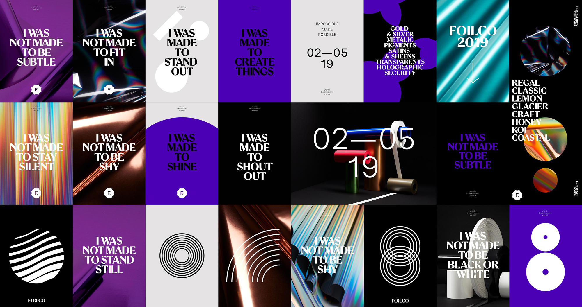
Whilst spending a lot of time within the company we saw rolls upon rolls of foil being stacked, cut, packed and dispatched. The rolls are extremely impactful in various sizes but from a creative point of view they are simplified by a circle shape. This shape gave us another element to start experimenting with. By looking at a roll of foil from the end we could see various circles and the roll mimicked the trunk of a tree with it’s many lines representing the years the tree has been growing for. This symbolised the element of knowledge for us as Foilco have over 30 years working in foil we wanted that to be apparent within the brand.
The next thing the circle was able to do was create the number eight, therefore representing the the key types of foil again. By simply placing two circles over each other we could create this number. A little research also suggested the number was synominous with the infinity symbol. This was ideal for the brand as Foilco offer over 250 colours and infinite possibilities of use. By using a simple fact of focussing on what Foilco offered we had been able to highlight knowledge and range, two key values that the company believe and helps to set them apart from competitors.
We looked harder at the company values and were able to ascertain eight key aspects that the company stood for. They are Knowledge, Discovery, Possibility, Inspiration, Innovation, Conduct, Process and Responsibility. We made sure that each word had a letter O in it to help connect the eight circles.
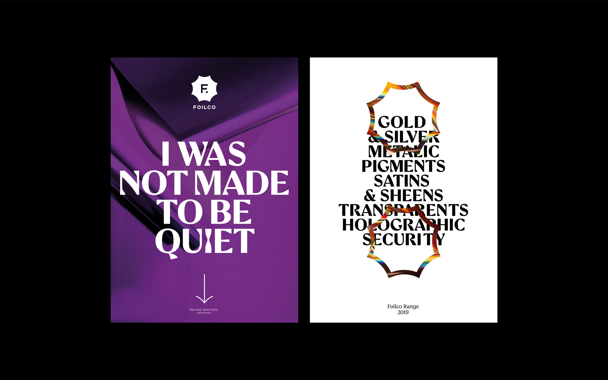
These eight circles (representing the foil types and brand values) are all interlinked and connected. Each of them share the exact same value, each as important as the other one. The shape that is created within these circles is the Foilco mark. Foilco is at the heart of the values and the product. The shape is unique to Foilco. We deliberately wanted it to be bold and classic. We needed to make sure it foiled well (of course) but could also work at various sizes. One of the issues with the original logo was the way it sat on the page. We made sure the new logo could work in a variety of ways, whilst at all times staying iconic.
The old logo was bland and generic while also making no sense while attempting to mean something: what exactly were those three oblique bars trying to represent? And the wordmark was so thin it was the kind of typographic treatment most foil stamp printers would tell you you need to make bolder because the foil won’t hold. The new logo is a literal burst of joy at first glance, with a flared octagon that could metaphorically convey the impact of foil stamping. Deep within it, though, are five long paragraphs that explain why the number 8 matters, which I respect as a process to get to a solution that is rooted in something relevant but that could have probably been explained in one paragraph. Yet, we are not here to critique the write-up but the logo, which I really like. The “F.” looks great inside the shape and I love how they tucked the period under the “F” to get the monogram neatly centered. The wordmark is nice enough but I do question the kerning on this one, which is a problem caused by the wide “L”, leaving a huge gap between it and the “C” but a tight gap between it and the “I”. Nonetheless, a lovely logo overall and I’m somewhat surprised we haven’t seen that burst holding shape before on Brand New — seems like it should be more popular.
We decided to go for a black and white colour scheme for the logo and only use colour through foil itself. Therefore we needed to create a series of images of foil. The main brief for the photographer was to make the foil look appealing and interesting whilst also appealing to a creative audience. The rolls are iconic in themselves and we wanted to make the product stand out as much as possible. We worked closely with the London based photographer Andy Mackie to shoot some creative imagery. Andy worked alongside set builder Elena Horn to help produce some really innovative shots that allow foil to be seen in a different light. As well as some delicately balanced and art directed shots we also asked Andy to shoot some more abstract images to help us create the brand for the company. Foil needed to be at the forefront of the new identity and the use of these images allows it to be just that.
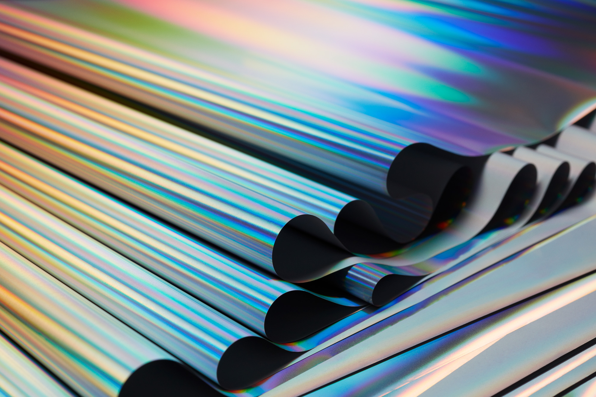

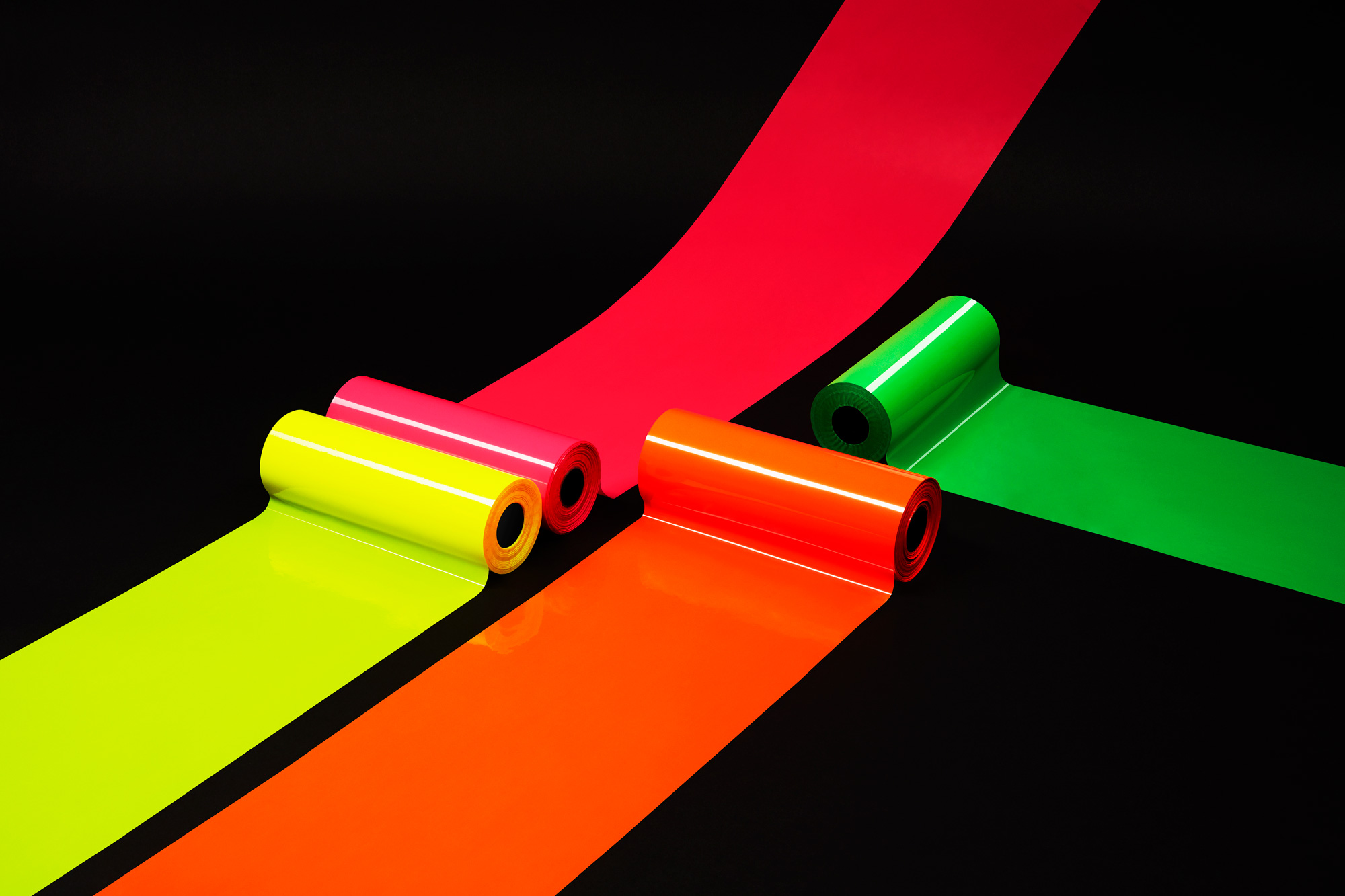
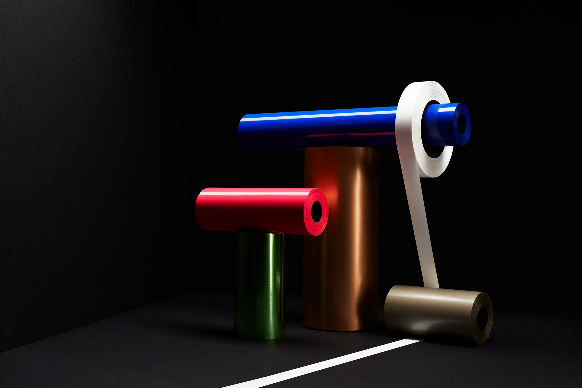
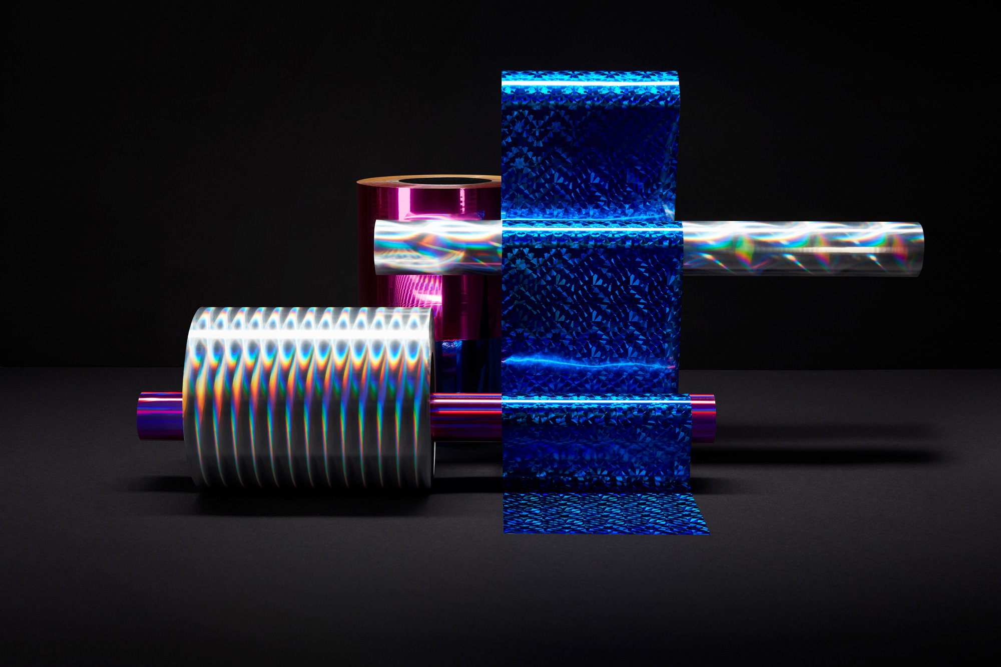
When your product looks as great as it does in its raw form it would be a disservice to not highlight it through photography and both approaches — the abstract and literal — here really make the foils mouthwatering.
As well as imagery we suggested to Foilco that they would benefit from a bespoke typeface to help the company stand out even further from their competitors. We worked with UK based Rick Banks (F37) to create a totally crafted and unique typeface. Rick visited Foilco and we discussed various ways in which the typeface needed to reflect the movement and flow of foil. Rick presented a number of initial solutions and after feedback we settled on the creation of a typeface named Pamela (The wife of founder David Hornbys and the mother to the two directors Paul and Matt). Pamela works so well with the brand logo we created and the two compliment each other in many ways.
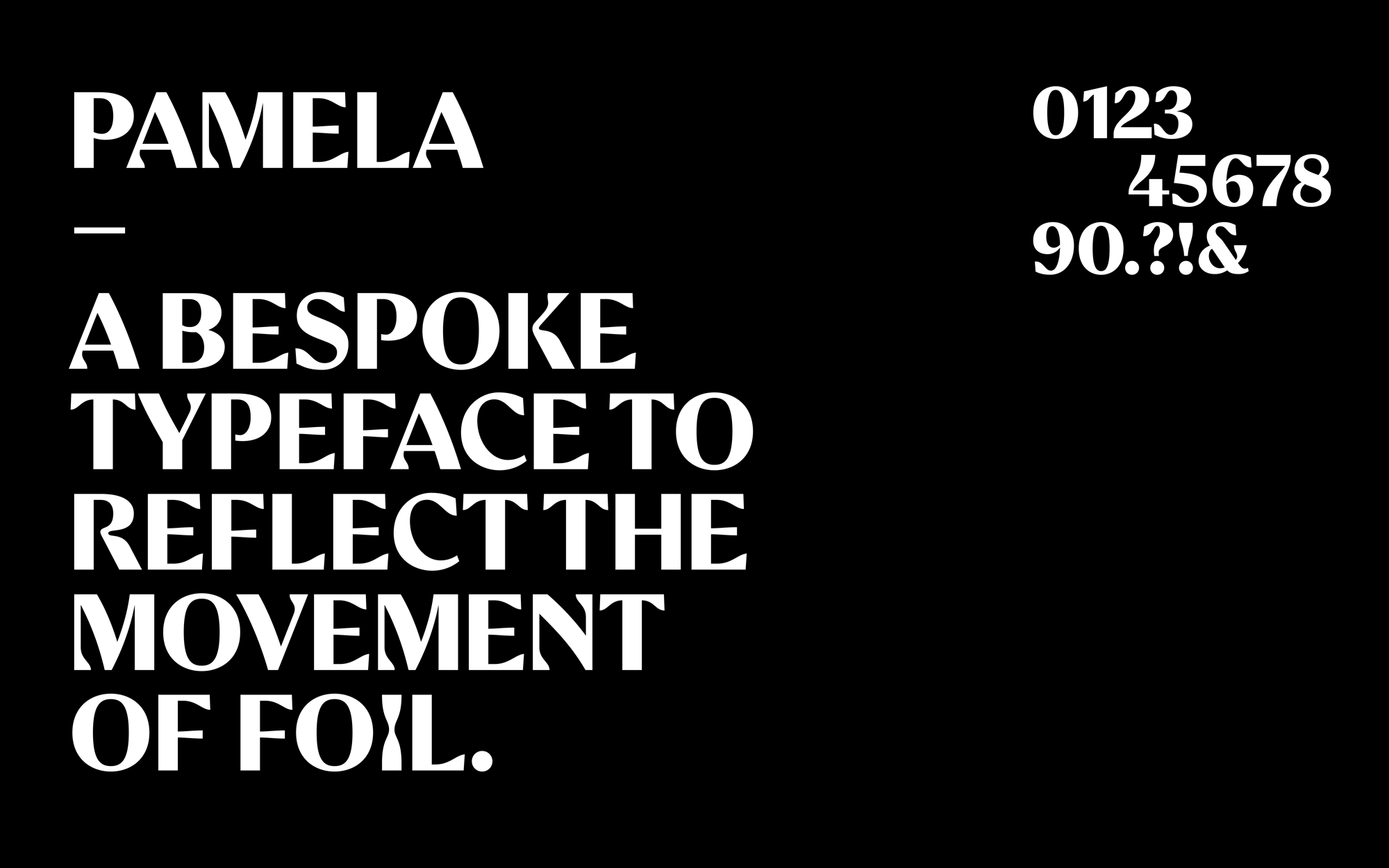
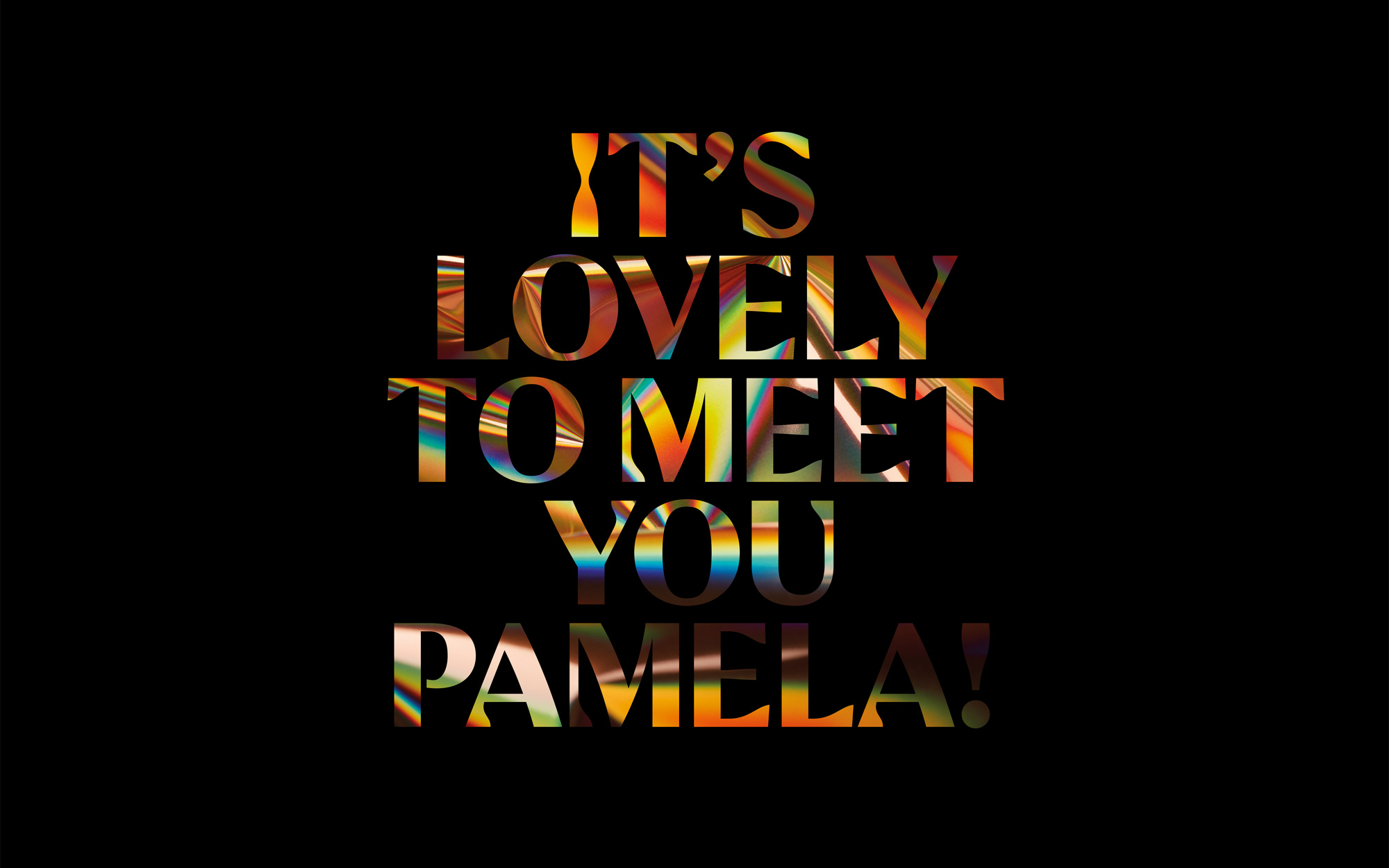
The custom typeface is super weird and I mean that as an effusive compliment. When I first received the project in my inbox, saw the logo, and then read there was also a custom typeface, I thought it would be another “proprietary” geometric sans serif to match the wordmark. But no! It’s a… something. It’s a high-contrast-flared-sans-serif-with-half-inverted-slab-chiseled-serifs thing. I would never buy it if it were retail but it’s kind of awesome and it definitely has zero fucks to give — just look at that “I”! I wasn’t sure about their statement that “Pamela works so well with the brand logo we created and the two compliment each other in many ways” but, as seen in the applications below, it’s kind of amazing that the statement holds true. The logo and Pamela are strange bedfellows.
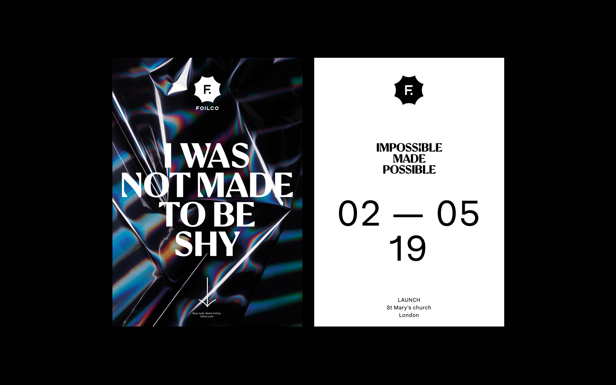
Finally we needed a series of statements and messages to launch the new brand. We ascertained a number of reasons why people use foil in their design work. Often it’s to make something stand out or focus someones attention. The tone of voice and copy is key to the new brand and again we wanted foil to be at the heart of this. The messages such as ‘I WAS MADE TO STAND OUT’ and ‘I WASN’T MADE TO BE QUIET’ are bold statements written as if the foil itself it saying them. However they are also relating to Foilco in the way that the company is innovative, confident and prepared to be different without being arrogant or egotistical.
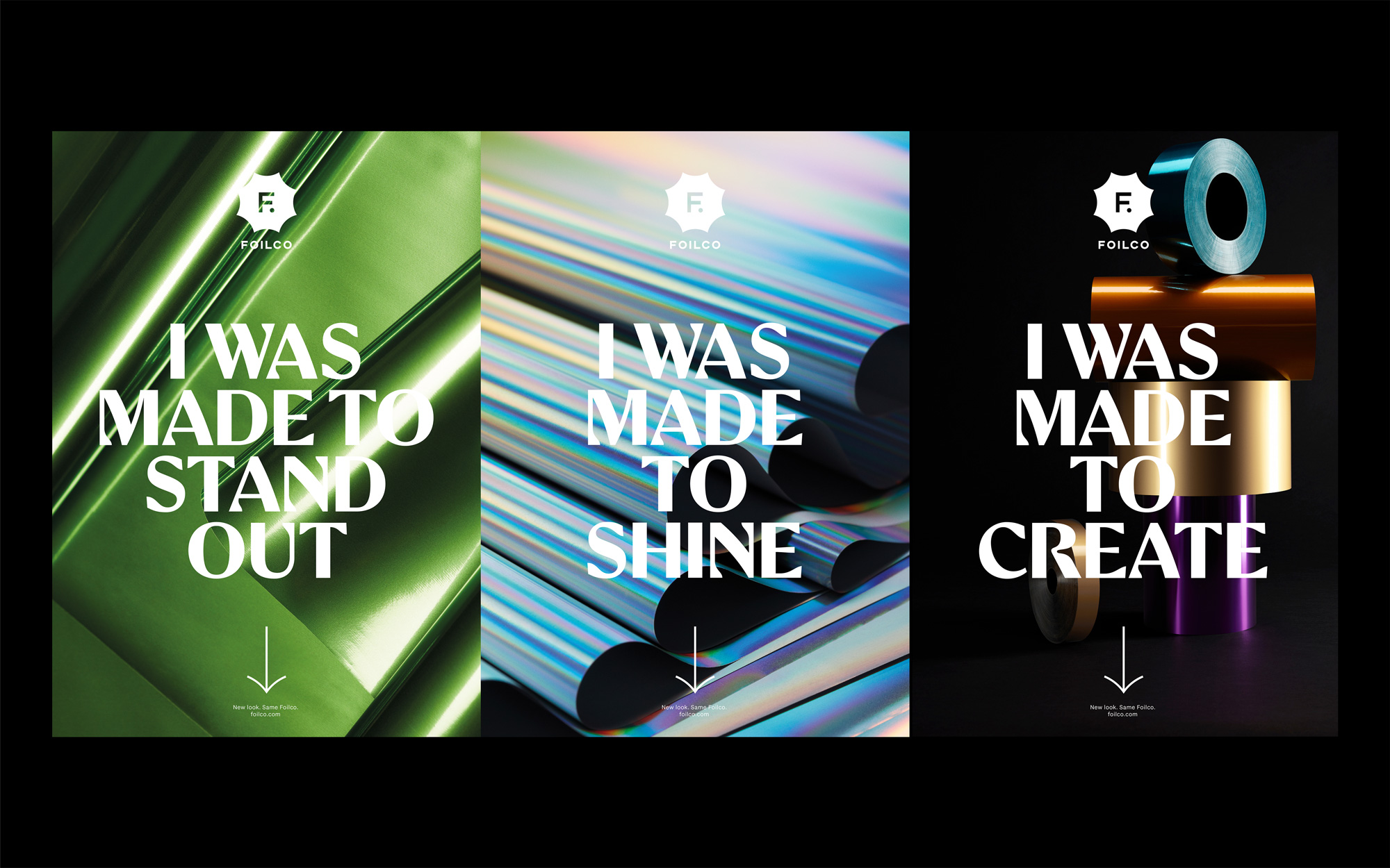
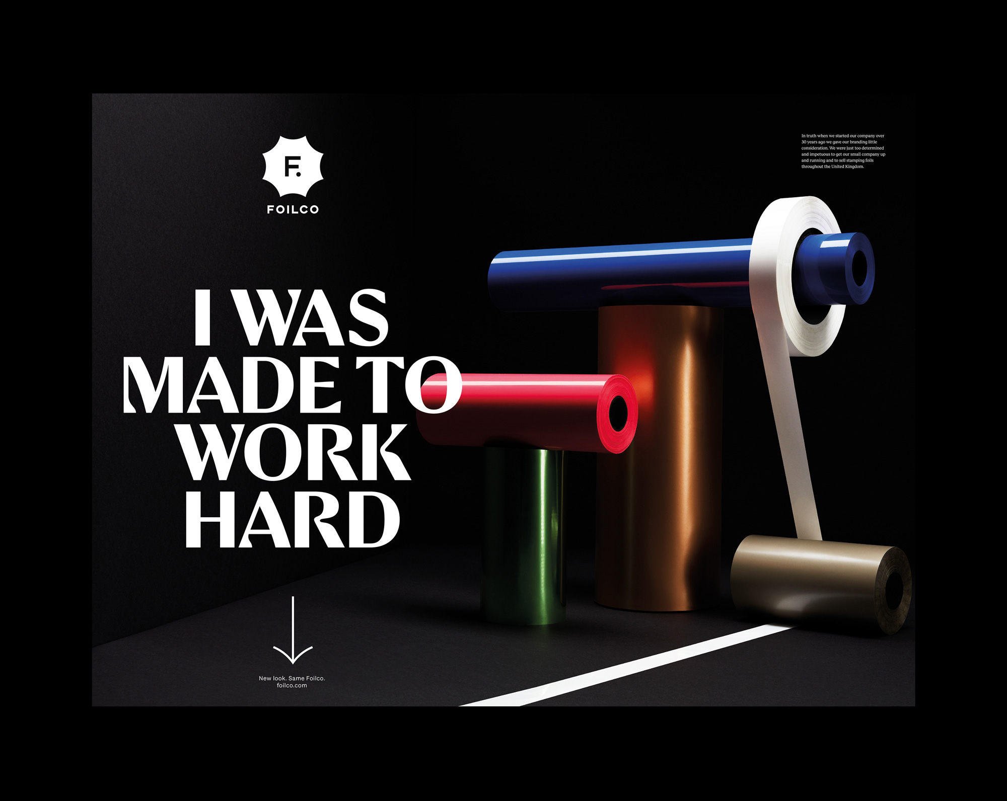
This is certainly an identity that can take more visual risks given that graphic designers are the client’s main audience but it’s easy for that to devolve into gratuitous eye candy and here all the elements have been well thought out, they are wild but restrained, and help make foil stamping even more of an offer you can’t refuse.

 Новости Союза дизайнеров
Все о дизайне в Санкт-Петербурге.
Новости Союза дизайнеров
Все о дизайне в Санкт-Петербурге.