Обзор лучших ресурсов по разработке бренда, разработке упаковки
contact us | ok@ohmycode.ru
contact us | ok@ohmycode.ru
“Tom Kerridge is a professional English chef who has worked mainly in the United Kingdom. After initially appearing in several small television parts as a child actor, he decided to attend culinary school at the age of 18. He has since worked at a variety of British restaurants, including the Michelin-starred Rhodes in the Square and Adlards. With his wife Beth, he opened the gastropub The Hand & Flowers in 2005 and within a year gained his first Michelin star. In the 2012 list, he won a second Michelin star, the first time a pub had done so. As a chef he has appeared on the Great British Menu, MasterChef and Saturday Kitchen. Kerridge currently presents Food and Drink (2015-present) and presented Bake Off: Crème de la Crème (2016), both for BBC Two.” (Wikipedia)
The Clearing (London, UK)
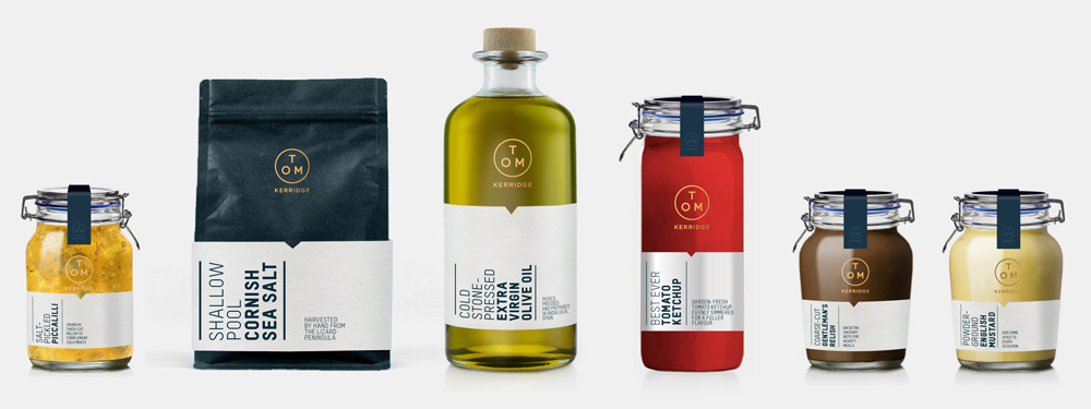
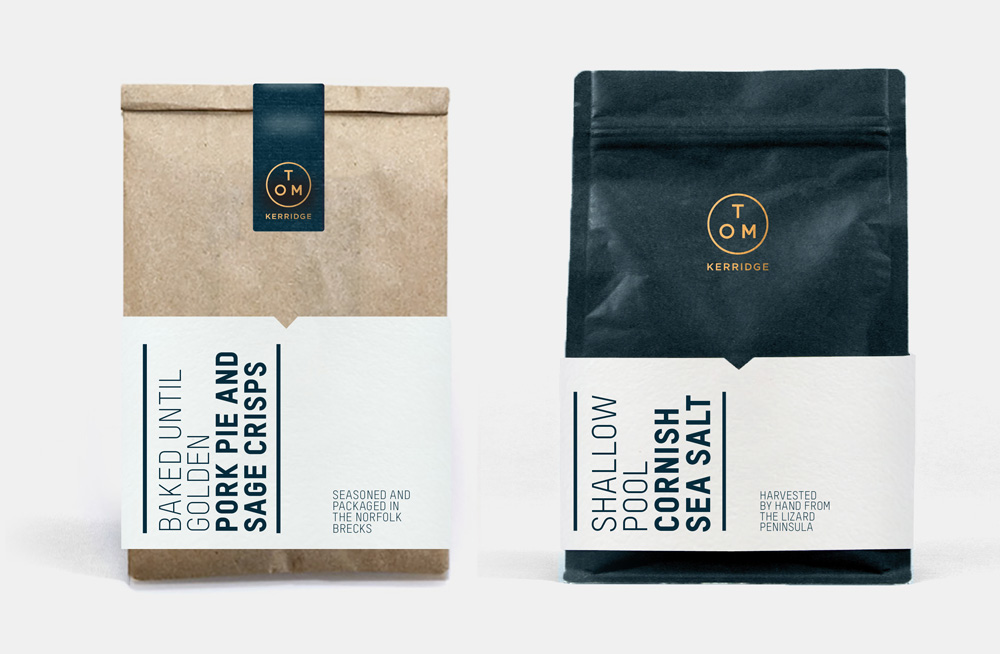
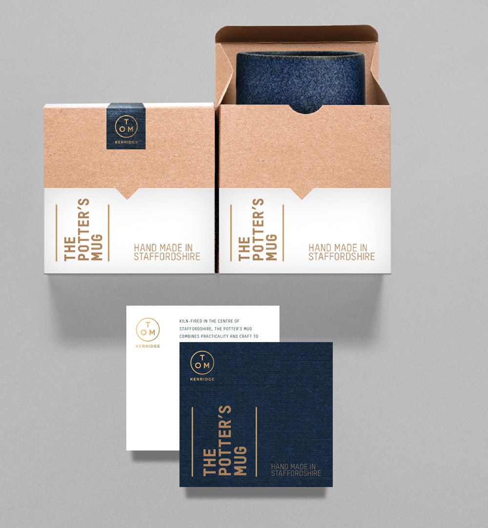
Tom asked The Clearing to build a brand that encapsulated his character and style, and allowed him to capitalise on the market opportunity to create a range of products that he’d be proud to put his name to. The result was a brand built around a simple promise that reflected the very nature of Tom’s cooking – turning the ordinary into the extraordinary by taking everything to “Another Level”. This gave us clear creative direction to tell a compelling, authentic story around the unique manufacturers and products that Tom had personally selected.
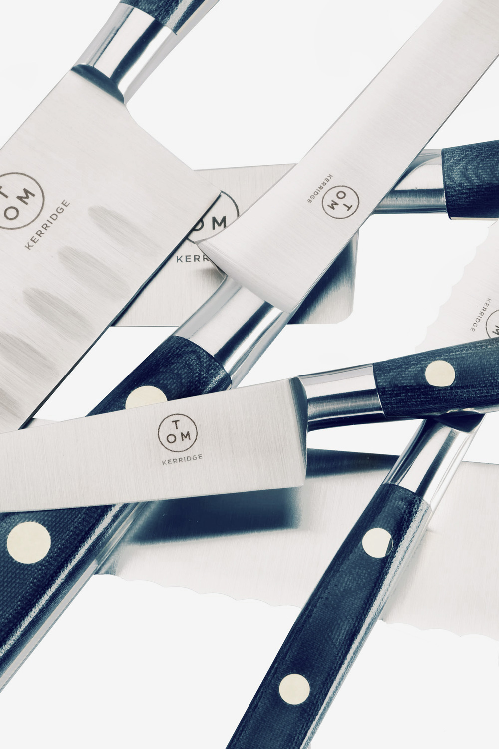
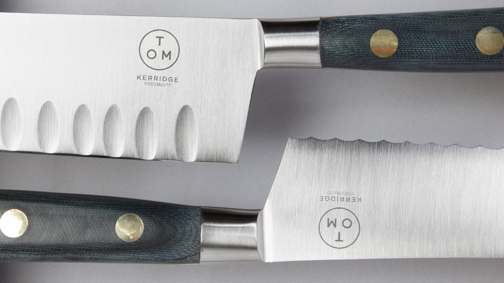
Andy Howell, Creative Director and Founder of The Clearing, said “One of the things Tom said to us when we first met was that he wanted his products to be ‘Tom-proof’ – solid, reliable and unmistakably British. The brand mark we created reflected this – it’s Tom’s personal stamp of quality.”
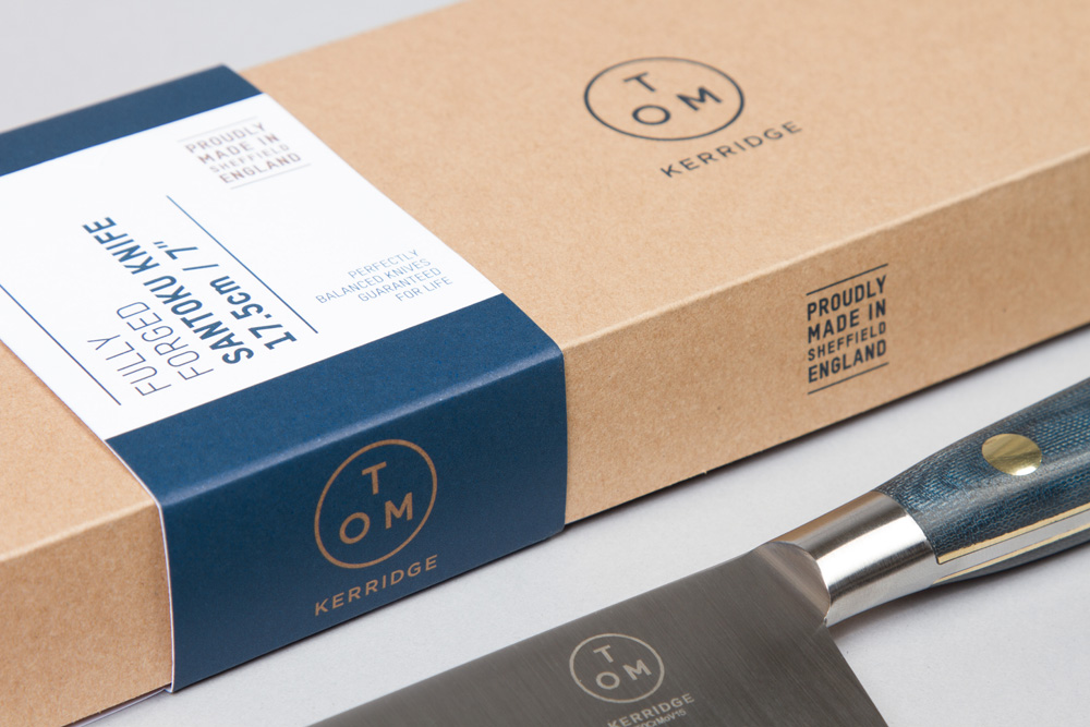
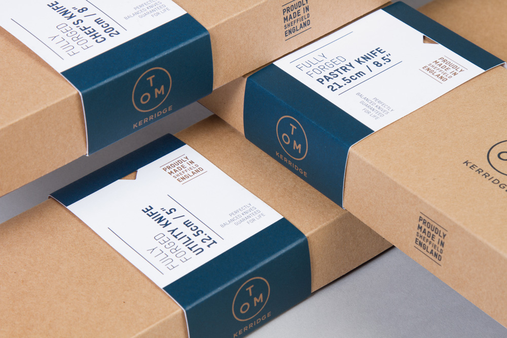
The old logo was centered Clarendon and that about sums up all there is to say about it. The new logo isn't particularly chef-y but it does have an industrial aesthetic like something you would find engraved on the back of a water heating boiler in the utility closet. Odd as that sounds, it's a compliment. I wish the ring around the letters was the exact same thickness as the letters because the latter (letters) look 101% heavier, so even if it was on purpose to visually adjust the relationship, it wasn't the right move. The last name would have been nice as well in the same thickness to create a more cohesive unit. Nonetheless, the logo looks great on the knives, mostly because the knives look pretty slick. The packaging system has a cool contrasting condensed sans serif and a minimal aesthetic that pairs well with the packaging that allows the color of the product to be seen. The little notch in the labels center-aligns with the logo but it's a little distracting when it's so close in alignment to the underline below that it looks misaligned. Overall, an elegant solution for a celebrity chef that makes the products look ready for some hard work in the kitchen.

 Новости Союза дизайнеров
Все о дизайне в Санкт-Петербурге.
Новости Союза дизайнеров
Все о дизайне в Санкт-Петербурге.