Обзор лучших ресурсов по разработке бренда, разработке упаковки
contact us | ok@ohmycode.ru
contact us | ok@ohmycode.ru
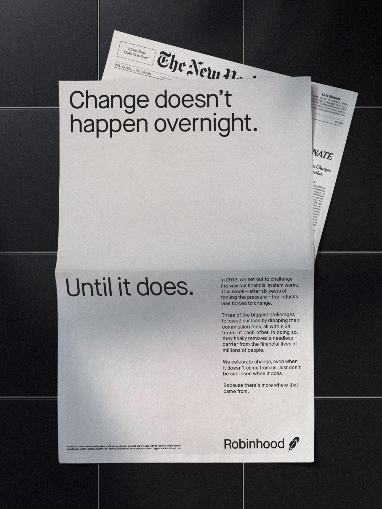
Established in 2013, Robinhood is a financial services company that offers commission-free trading through an online-only platform on their website and dedicated mobile app with the mission to democratize finance for all and provide everyone with access to the financial markets, not just the wealthy. Offering people the ability to invest in stocks, ETFs, and options as well as cryptocurrencies, Robinhood is a FINRA regulated broker-dealer, registered with the U.S. Securities and Exchange Commission. As it introduces new offerings, such as cash management and fractional shares, and enters new markets, Robinhood has introduced a new identity designed by the San Francisco, CA, office of COLLINS in collaboration with Robinhood’s creative team.
COLLINS was invited to help redefine the Robinhood brand strategy and its expression — in partnership with internal teams — so that, as Robinhood forges this new future, its brand will match its ambition.
Our insight? Don’t just make finance “less difficult.” Make finance more engaging and understandable. And do so in a way unlike anybody else.
The result: an evolved, future-focused brand that balances a high-performance product experience with a more engaging and inspiring creative expression. A Robinhood that encourages customers to imagine better futures and helps to build them.
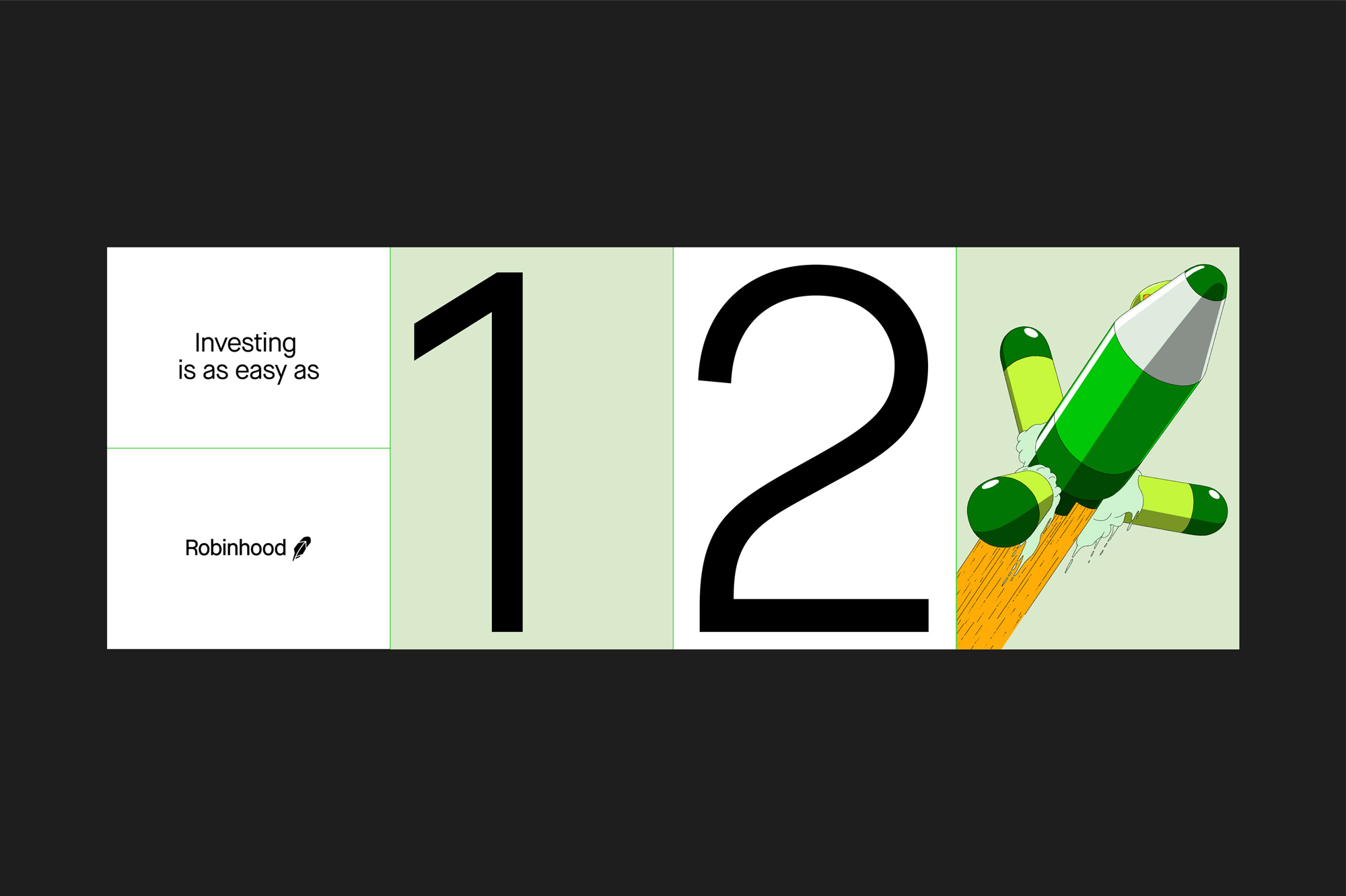
Imaginative illustrations and bold information graphics are aimed to be both evocative and instructive. Visual metaphors are used to translate complicated topics like ‘ETFs,’ ‘Fractional Shares, ‘Bull Market’ and even the ‘American Dream’ - into relatable concepts. An educational ethos is articulated and reinforced across the product ecosystem, from the company’s comprehensive “Learn” resource to its entertaining “Snacks” podcast.
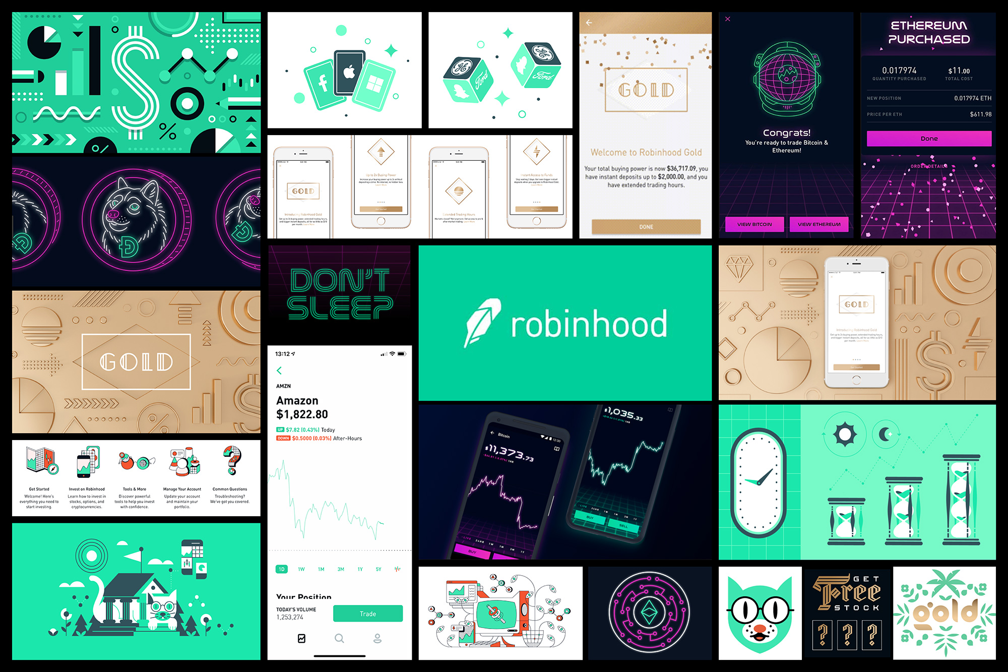
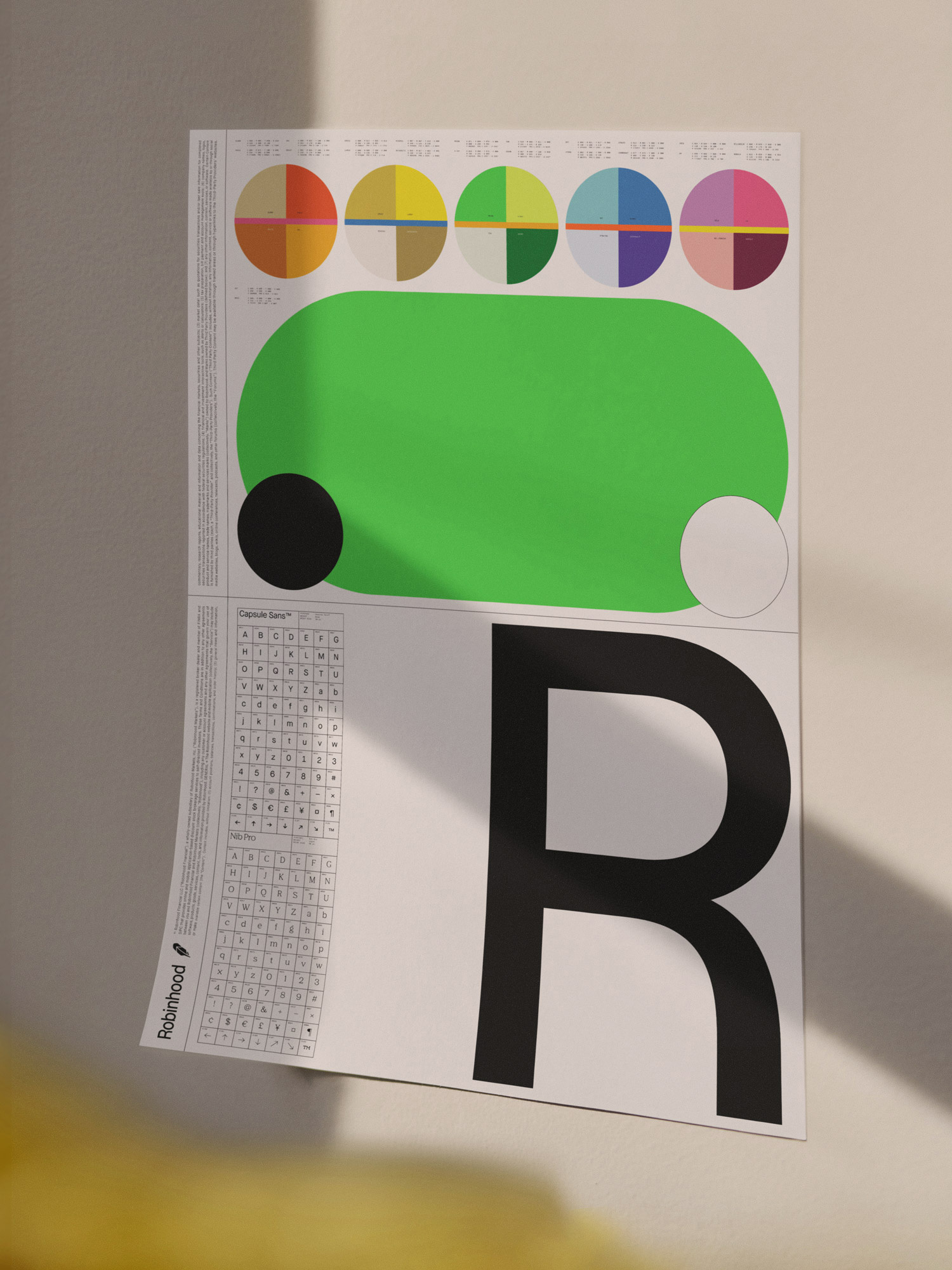
In terms of the logo update, there is not a whole lot to analyze. The feather icon remains the same but has been moved to the other side and the wordmark has shifted between similar-looking sans serifs. Without being too passionate about it, I would say both changes are positive and the new logo does feel more polished. The best change is the size relationship between icon and type where now the feather is smaller, making it feel more like a lighter-weight feather as opposed to a comically-large writing quill.
In terms of the new illustrations, brace yourselves…
[From] a visual design perspective, the illustration system really takes center stage. We settled on a vision of the future very quickly, motivated by the notion that investing is really about hoping for a better future. We wanted to show what a world might look like if we all had access to systems of wealth creation.
The challenge with any vision of the future is you need to essentially reimagine everything; clothes, architecture, technology, even culture, and economics. The details are important, even if they’re not the focus of the scene, or explained at all. This practice is called world-building, and it’s common in all storytelling-based mediums — from comics, to books, TV and film — using backstory, value systems, character dossiers, histories, and so on, to enrich the images on a page. Lord of the Rings is a classic example — and the Marvel Universe a more recent success story.
We began last year by hosting workshops in our San Francisco office with Robinhood’s leaders to imagine the world fifty years into the future — one built around Robinhood’s values and belief that collective participation is a source of power.
We then sought inspiration by visiting a variety of future-facing leaders — from self-driving car makers, to animation studios like Pixar that build story-worlds, to urban planners responsible for defining the future of our cities. In concert, the teams looked to classic futurists like Pierre Christin, Ursula Le Guin, Octavia Butler, and Larry Niven — as well as pop culture classics like 2001: A Space Odyssey, Blade Runner, Star Trek, Jodorowsky’s Dune, 5th Element, and even Dragon Ball Z. This ultimately fueled much of the content you see in the new Robinhood illustrative world.
Aesthetically, both the COLLINS and Robinhood teams shared a passion for illustration and sci-fi pop culture, and reveled in the chance to work at that intersection. We looked to classic masters of the genera; Jean-Claude Mézières, Robert McCall, Vincent Di Fate, John Berkey, Chris Foss, Sid Mead and of course the iconic Jean Giraud (Mœbius) for whom a few of the launch illustrations are a little bit of an homage. The style itself is called ligné claire, popularised by graphic novels of the 50’s. Ultimately, as we plan for many thousands of illustrations in this style over the lifetime of this work, we sought to build a unique brand world that is deep, historically informed and would last across time.
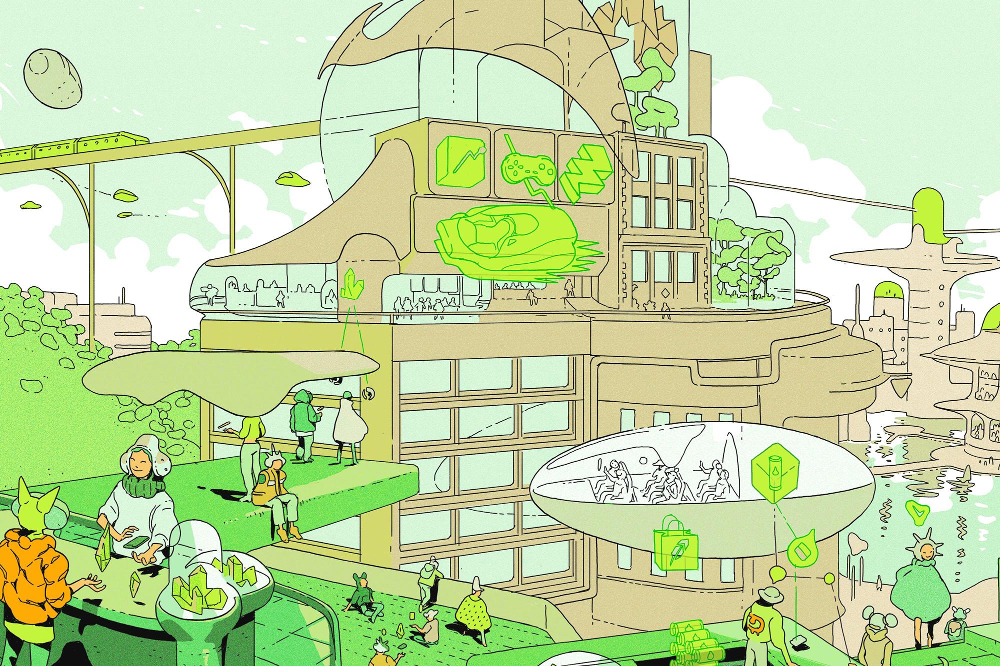
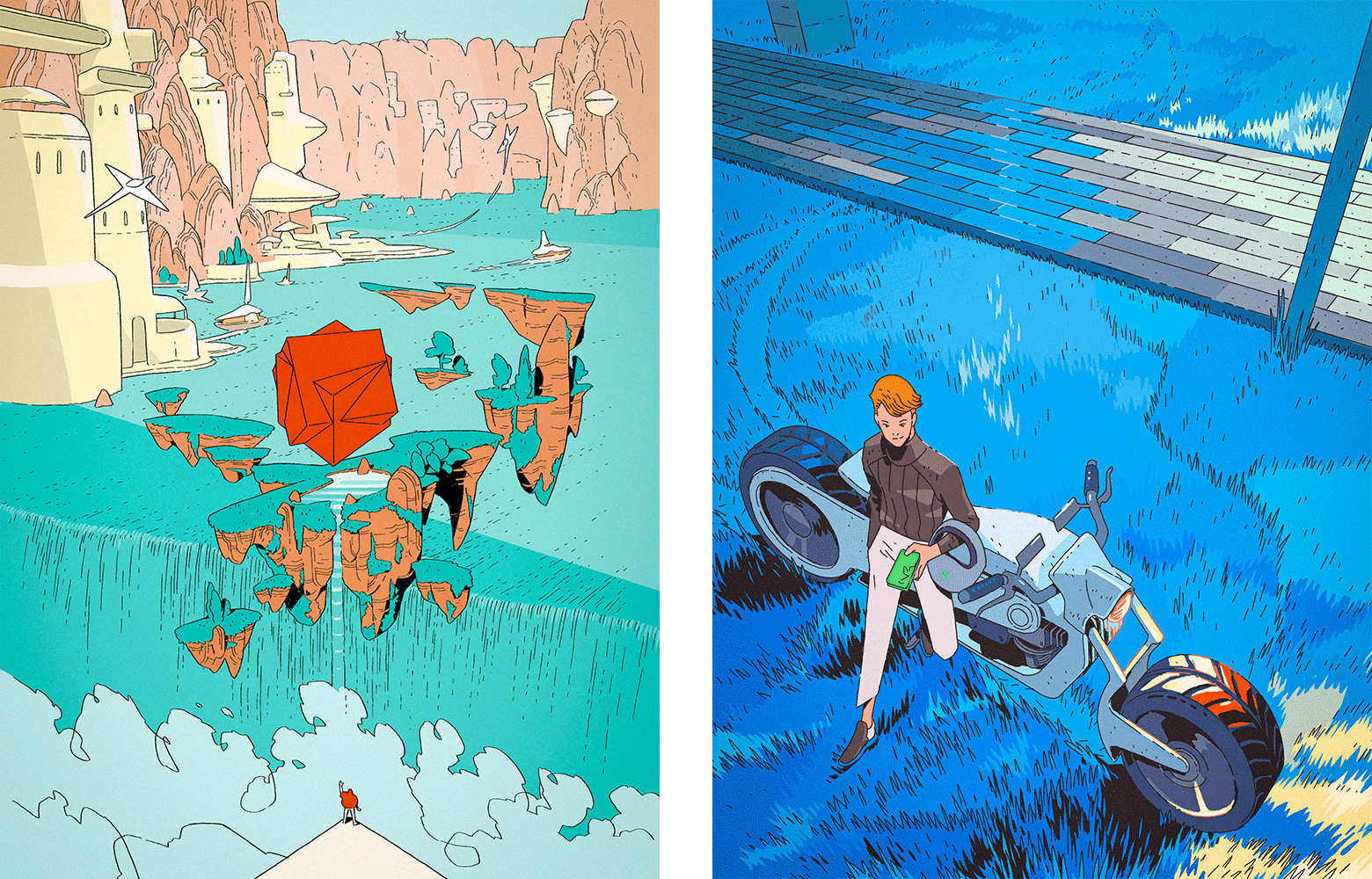
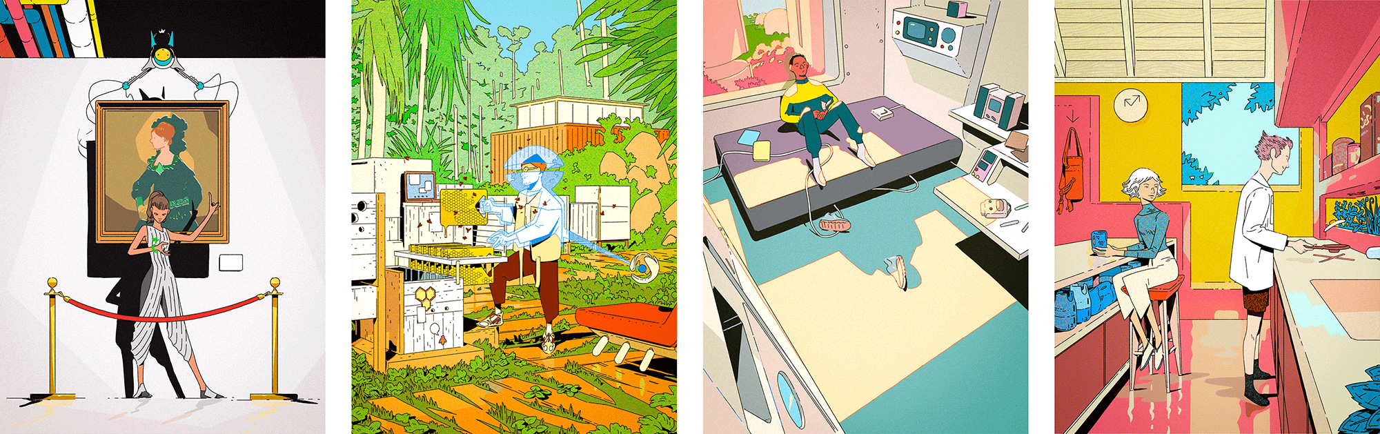
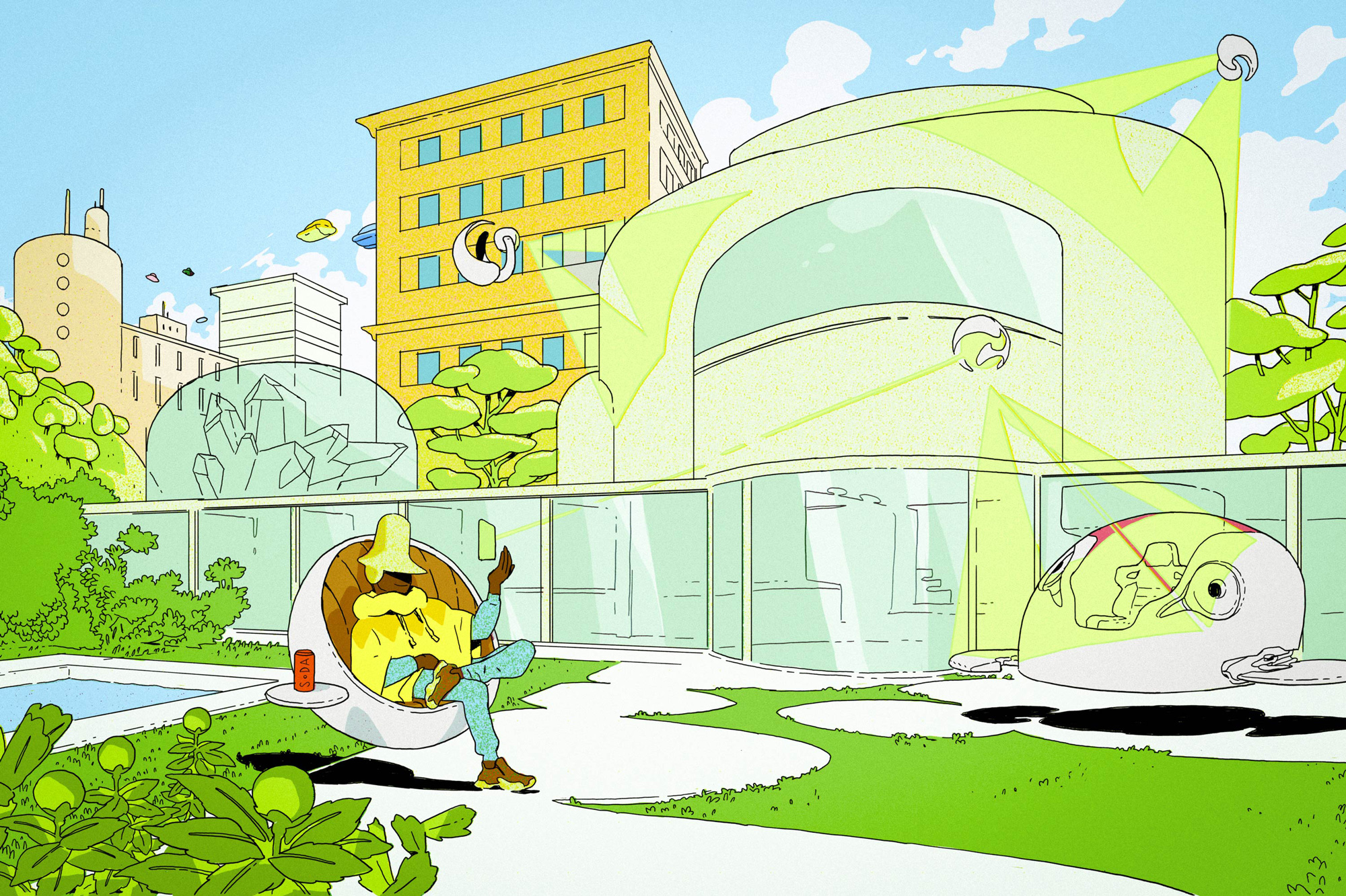
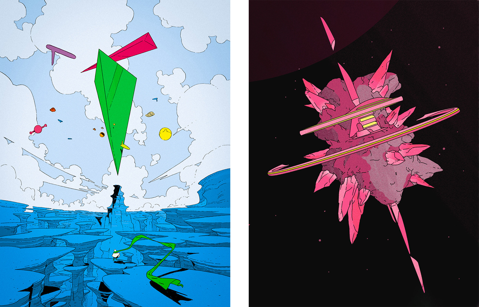
We have been talking so much about illustrations recently that this project couldn’t have come at a better time as it’s the first time, in a long time, that we see so much ambition and innovation in illustration as the driving force behind an identity. (To be clear on one thing, by “innovation” I don’t mean that the style of illustrations are new but that the style of illustrations is new in their use on not just a fintech brand but almost any other brand in any industry.) I will firstly admit that the whole future theme throws me off… I get the concept that it’s about visualizing a world improved by the positive financial effects of Robinhood but I think there is some disconnect between the visuals of that sci-fi future and what those have to do with current-day trading — and societally-speaking one could probably analyze these to death as to whether this is the kind of future one wants to live in. Nonetheless, I’m a visual person and, visually, this is simply a feast. As much as the sci-fi scenes look cool I am much more attracted to the technical, educational, product-driven illustrations that visualize investment and financial terms — you can see a boatload of them here — probably because they feel more functional and serve a communication purpose. Looking at their Instagram account it’s interesting to start seeing these sci-fi-ish scenes as their normal way of expression and how it all starts to look like it’s operating on a different wavelength thanks to both the style and content of the illustrations.
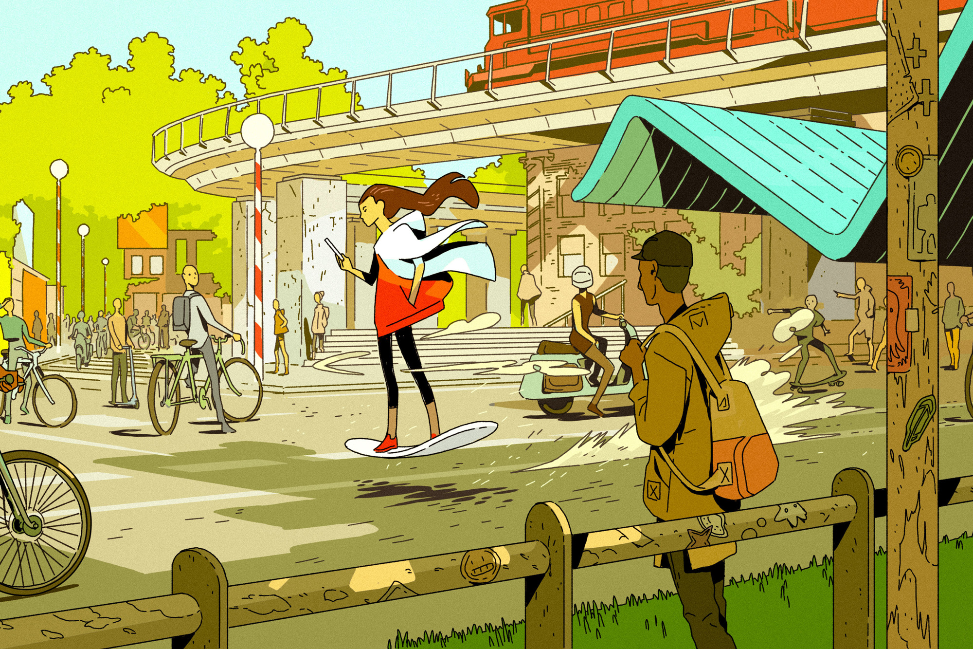
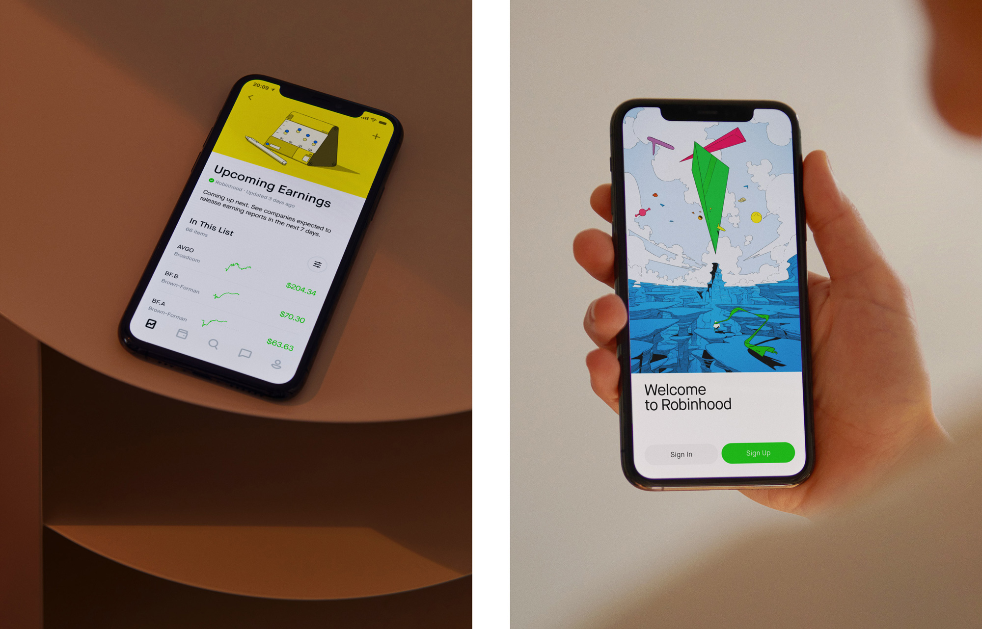
From the perspective of the product, the Robinhood app is known for its simple, straightforward, and accessible interface. Any updates to the visual identity needed to build on this strength, embodying the languages of efficacy and clarity, and building on past successes in the design of the product interface. To do this we leaned into a number of elements that naturally fit this task:
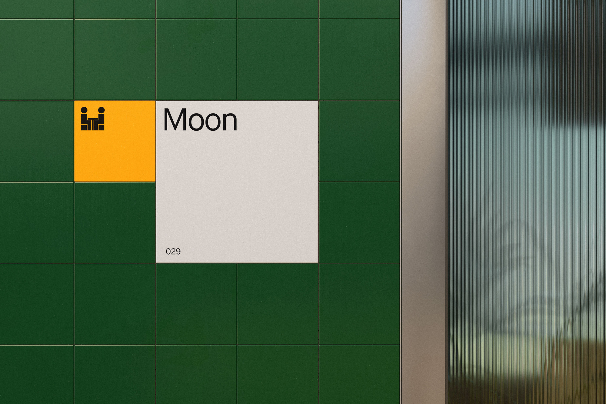
1. An icon style influenced by the universal and recognizable icon language of the ISO (International Organization for Standardization). Think clear, practical, public signage with a slightly more futuristic, chunky character.
2. A layout system that clearly delineated space and organized information. This references both the cells of a graphic novel and the fine-line work common in more standardized clerical documentation.
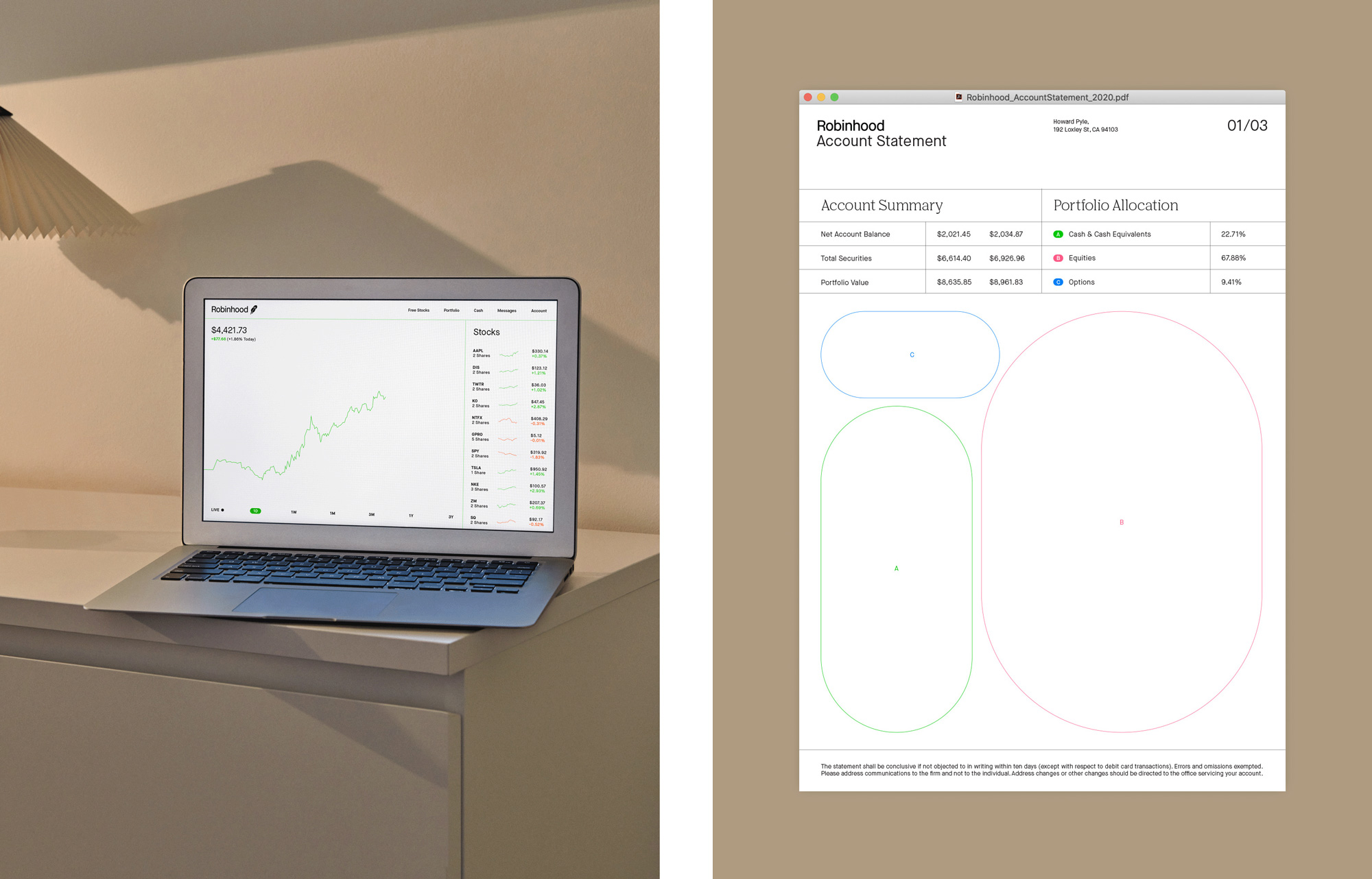
3. A new typographic voice. The Robinhood team had selected Maison, by Milieu Grotesque, as a replacement to their old typeface. A practical and precise sans with a variety of features that proved effective across the app, web, and marketing. Through the design process, we surprised ourselves (and Milieu!) by selecting an older version of it, commissioning key updates, including a custom ‘R’ for the new wordmark — ultimately renaming it Capsule Sans.
[As] a compliment to this more expressive side of the identity, we also introduced an oddly classic-yet-contemporary serif called Nib — by Colophon — full of warmth and personality. This second typeface gives Robinhood a more editorial voice as the company builds more educational resources and provides tonal flexibility within its growing content.
In terms of design, there is a lot of great attention to detail in the presentation of the identity elements. It’s hard to disagree with anything because it’s all so slickly presented and, well, there is not much to disagree with: the Sans serif is nice, the serif is nice (very nice, actually), the colors are nice, and the icons are nice. It’s a little hard to tell how all these things come together as the applications presented are limited — and weird (see fire extinguisher at the end) — but judging from the website and, again, their Instagram, it comes together quite simply and convincingly. I would love to see more that layout system in action and how it applies to more real-life scenarios and uses — I like its simplicity and the use of the thin green strokes but I wonder if they are too simple to exist out in the world with the sci-fi images at their core?

Overall, the feeling I get is that this is all very slick and polished, which is good, as I think there is something reassuring about how crisp everything is when it comes to a product through which you invest your money. I absolutely love the illustration style and I think it’s a great way to visually and conceptually separate Robinhood from not just traditional investing (which is easy) but from the many fintech brands around the world that have all adopted a very similar approach making it hard to tell what separates any of them from the others and if what it takes to do that are flying cars, meteorite cities, and giant hologram feather icons, so be it.
 each year since publication began in 2006

 Новости Союза дизайнеров
Все о дизайне в Санкт-Петербурге.
Новости Союза дизайнеров
Все о дизайне в Санкт-Петербурге.