contact us | ok@ohmycode.ru
contact us | ok@ohmycode.ru
Launched this Summer, Assembly is a new 121-room hotel in London’s West End, right on Leicester Square, designed and envisioned specifically for the traveller who doesn’t want to stay cooped inside their room all day — there are no TVs, mini bars, or phones in any room. There are, however, large pink plastic bunnies. The hotel is owned by Criterion Capital, “the largest landowner between Piccadilly Circus and Leicester Square”, and is managed by Bespoke Hotels, which manages over 200 properties worldwide. The identity for the hotel has been designed by London-based Ragged Edge.
The competition focus on the experience inside the hotel. But young travellers don’t visit cities to hang out in their rooms. Our strategy aimed to combine the excitement of Airbnb with the reassurance of an established hotel. So Assembly sets out to provoke a sense of adventure, inspiring guests to ‘Get Up and Go’.
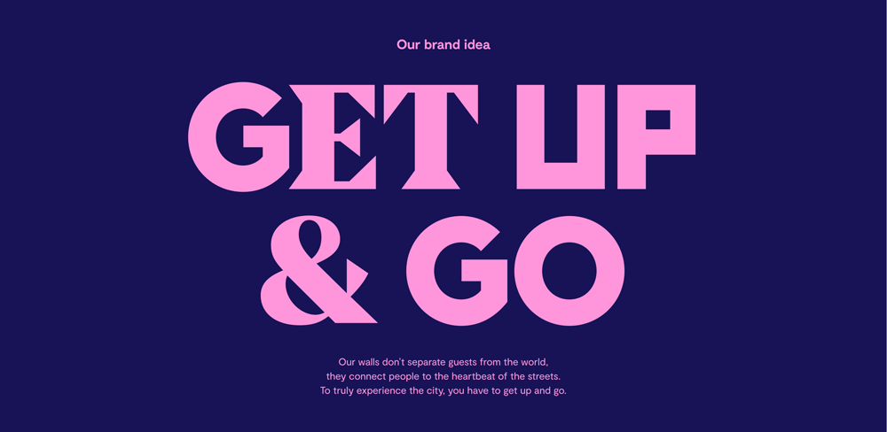
The identity was conceived as the antidote to the cookie-cutter aesthetic favoured by much of the category. It was built around a bespoke typeface designed to reflect the diverse range of experiences on the hotel’s doorstep. The eye-catching letterforms are used playfully throughout the customer experience, scattered across layouts in a visual representation of the brand idea.

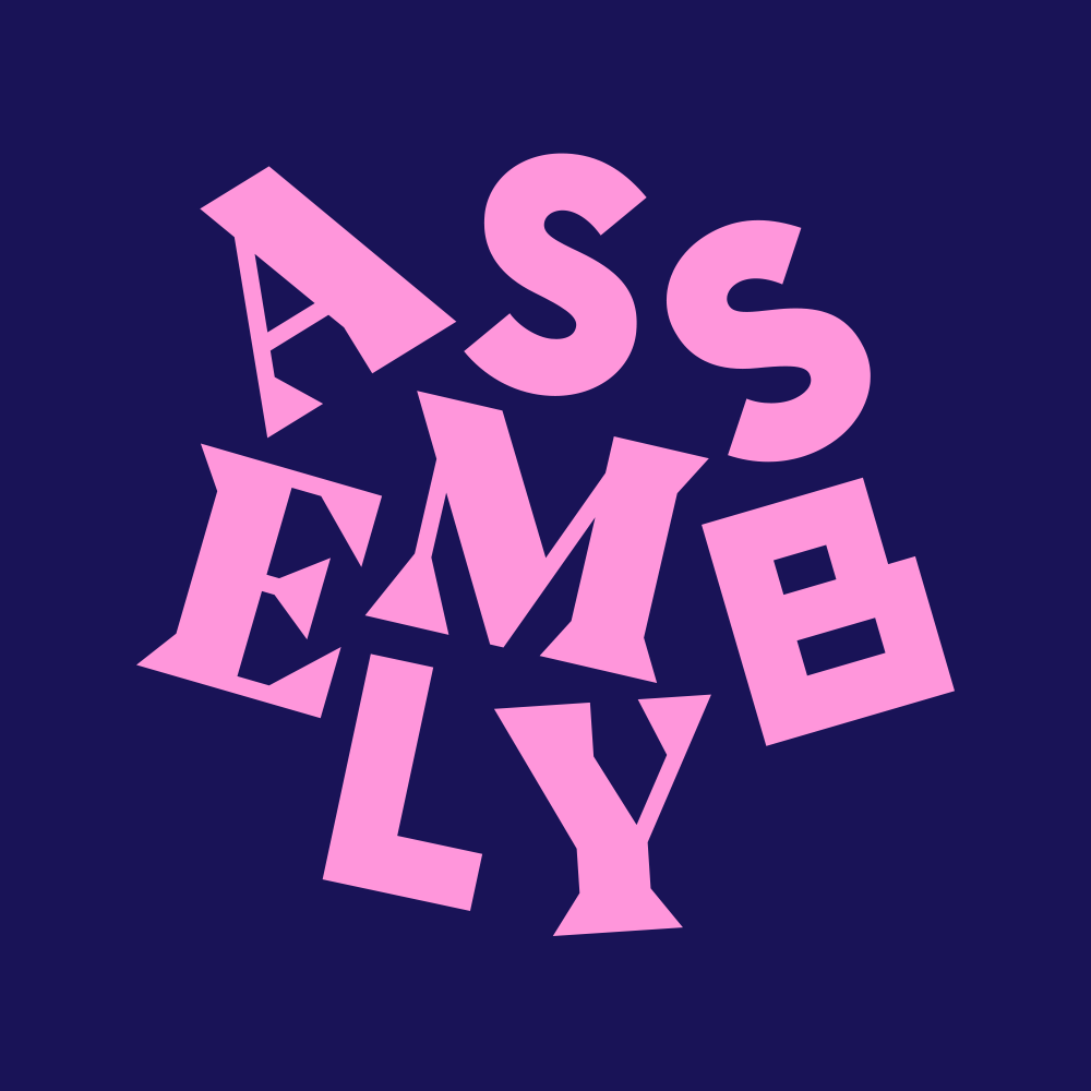
With a name like Assembly, the assembled style of letters in the logo pays off efficiently and, more importantly, I think it immediately hints at what kind of hotel it is and who it’s for: not for my parents, maybe a little for me, and a lot for those born after 1985. The logo looks fun, quirky, and a little kinky with those sharp serifs. It’s kind of amazing that the thee varying styles — serif, sans, and blocky — work together so well structurally (both in the logo and the font). For logo nerds it’s hard not to see Medium’s “M” or Blogger’s “B” in there but most guests won’t give a hoot. The jumbled version for social media works well and, again, pays off of the name, now with some assembly required. The color palette is on the verge of every-color-ever but the slightly muted tones and what appears to be a limit of eight colors reigns it in.
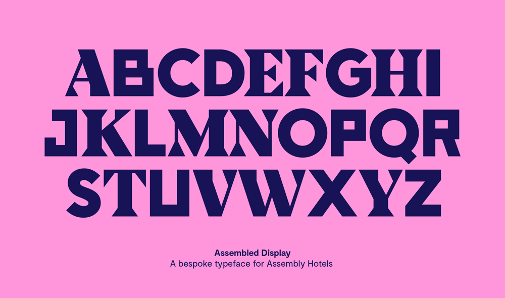
At the core of the identity is the custom font, which is nicely done and well balanced in its different styles. In application it’s interesting how varied the typography looks without each character having alternates for the three different styles — i.e., the “O” only comes in sans and not in serif or blocky. It would have been feasible to OpenType the shit out of it but the restraint is surprisingly welcome. The font has a Jonathan-Barnbrook-lite vibe that works well for the hotel (but also makes you wonder how much more wicked this could have been if done by Barnbrook). Design nerdery aside, well done on the font.
Photography, capturing candid, smile-in-the-mind moments, comes from everyday city explorers, not professional photographers. And room art, purchased from local artists in the area, is authentically tied to the city.
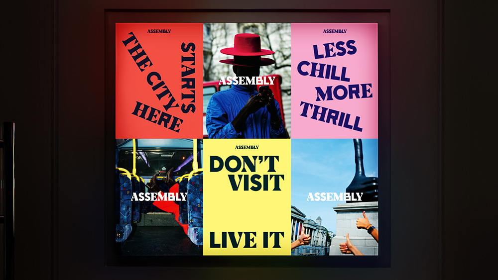
Where other hotels talk about staying in and getting comfortable, Assembly encourages its guests to explore the city. With hero lines like “Get Lost” and “Don’t Visit. Live It.” Assembly always sounds punchy, upfront and full of energy.
The copywriting gets a little irritating when it tries too hard to be cool — “less chill more thrill” — but, along with the font and person-on-the-street photography style, it conveys the style of the hotel effectively.
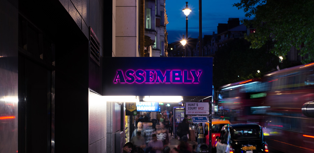
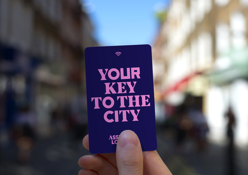
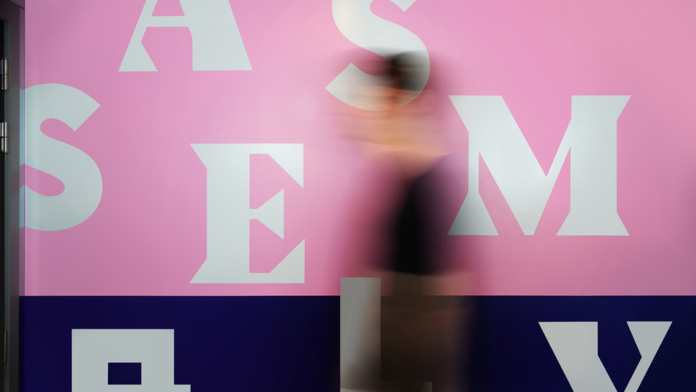
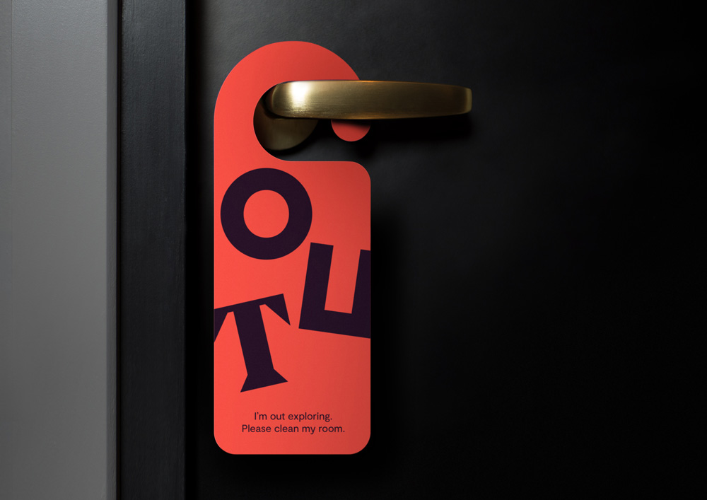
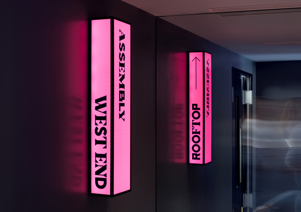
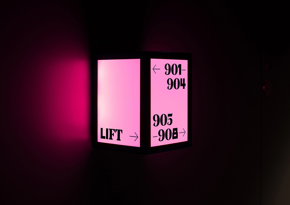
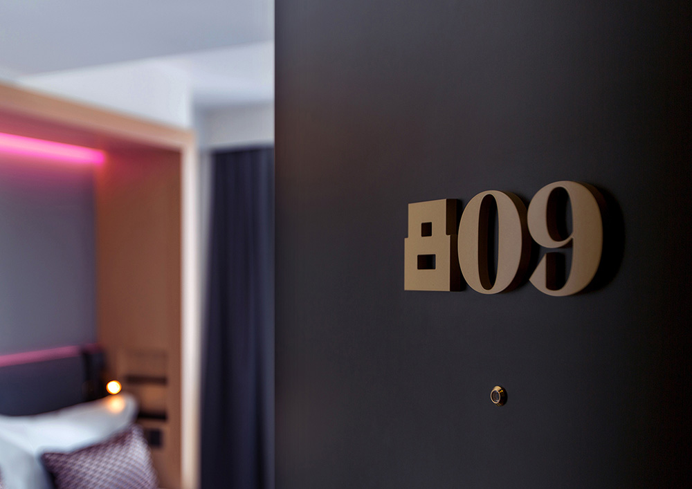
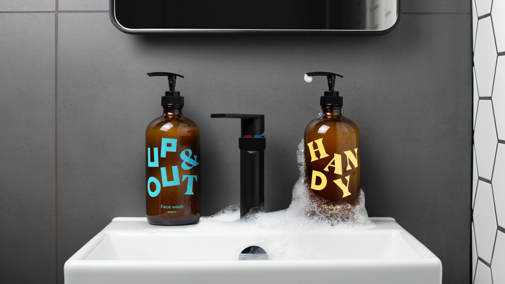
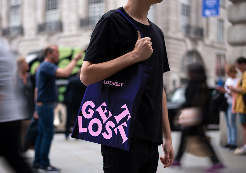
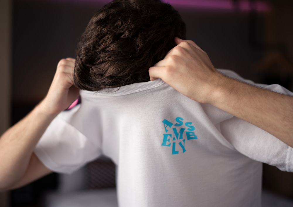
The applications are bold and energetic and I like how the typography can be used assembled (as in the signage) or disassembled (as in the soap and shampoo bottles) and still maintain continuity. Overall, this is well executed and right on cue for the intended audience.

 Новости Союза дизайнеров
Все о дизайне в Санкт-Петербурге.