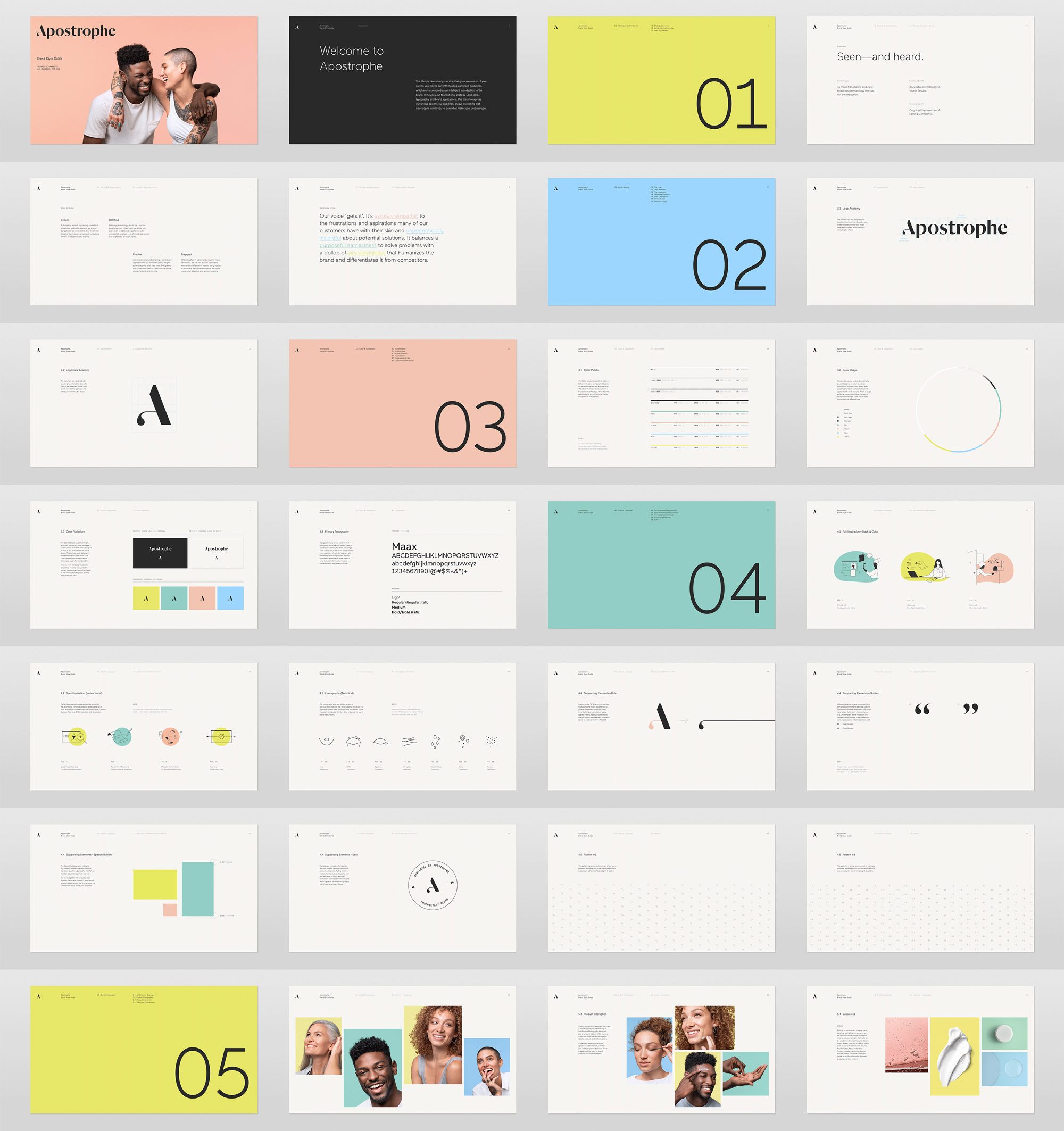
Обзор лучших ресурсов по разработке бренда, разработке упаковки
contact us | ok@ohmycode.ru
contact us | ok@ohmycode.ru
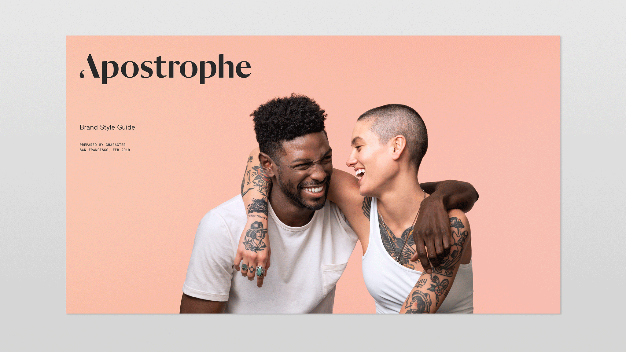
Established in 2012 (originally as YoDerm), Apostrophe is a telemedicine platform focusing on dermatology, offering online access to board-certified dermatologists that provide prescriptions fulfilled and delivered by the service, helping customers avoid going to a pharmacy to pick them up. Focusing on skin, eyelashes, and hair and working directly with manufacturers to negotiate lower prices, Apostrophe delivers its own line of branded products to the majority of states in the U.S.. With the recent name change, Apostrophe introduced a new identity designed by San Francisco, CA-based Character.
Formerly called YoDerm, we renamed the company Apostrophe, a symbol that embodies ownership. The name signifies a company dedicated to providing patients with that feeling that they own their skin concerns and are provided treatments on their own terms.
When designing Apostrophe’s logo, we were inspired by the idea of fluidity—both a subtle nod to patients’ movement forward but also underlining of Apostrophe’s easily-applied creams, liquids, and substrates. A custom logotype was built and crafted from scratch. The letterforms take their roots from the typefaces of the Renaissance but with a twist of modernism by being a sans serif.
When it comes to anything healthcare-related I prefer for things to not include “Yo” in their name — it was cool when Yo! MTV Raps did it but I believe that was its best-case use. Nonetheless, having “derm” in there made it very clear what it was about. The new name is a little random for me and it’s a bit of a stretch to apply it to a dermatology brand but, hey, disrupters gonna disrupt and giving the prescriptive service a lifestyle moniker is as wrong as it is right.
The new logo is nice, in an elegant high-contrast sans serif and a custom “A” with a hidden apostrophe. I keep wanting to see the apostrophe higher on the logo as opposed to down on the baseline but maybe I’m taking it too literally? The approach yields an interesting “A” but there is definitely a lack of apostrophe-ness to the logo. Seeing the “r”, I wonder if maybe that was a better place for a quirky apostrophe. Still, this is a logo I could see in the skincare cases at a nice department store.
The color palette is designed to feel fresh, clean and pure, but balanced with an element of technicality and precision. The selection of neutral grays creates a foundation in technology, while the mint palette creates a fresh feeling of clarity, transparency, and optimism.
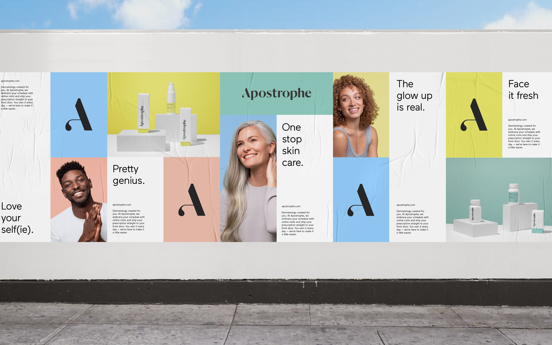
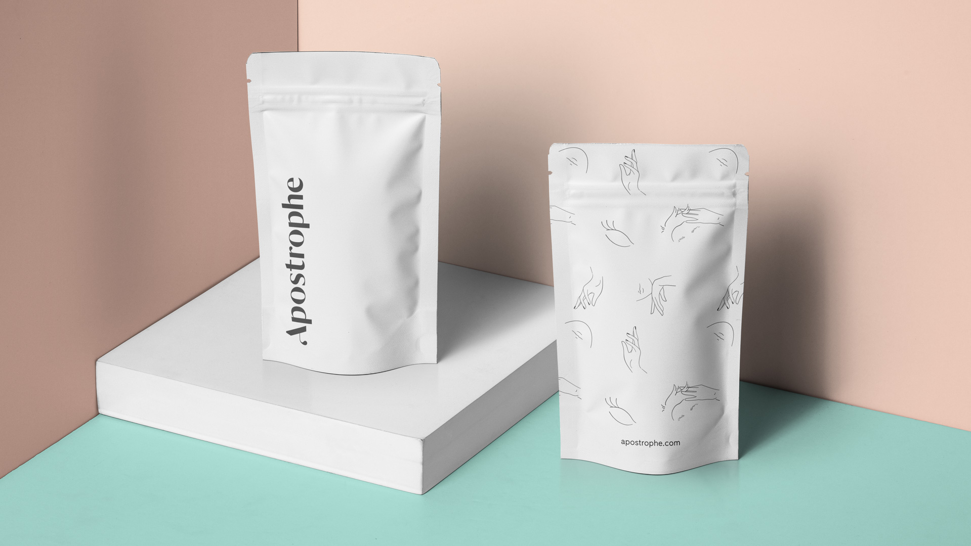
Skin and hair conditions don’t discriminate, and neither does Apostrophe’s services. Apostrophe is building a skin and hair care company that services all people—not just a select few. It was this same culture, which celebrates difference—not—sameness, that informed Character’s approach to photography and illustration approach.
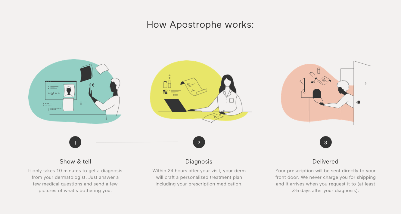
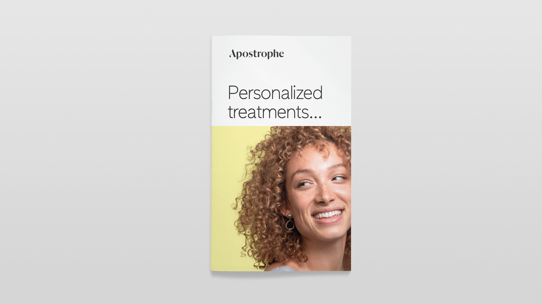
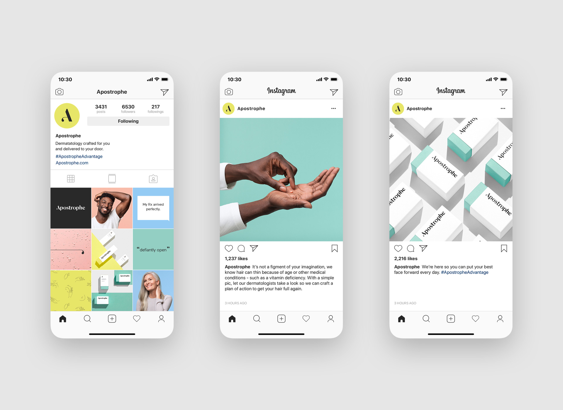
The illustration style is sophisticated, gender-neutral, an approach that emphasizes the diversity of Apostrophe’s audience; both men and women are illustrated with details that make them more distinct such as various hairstyles and skin tones. The photography is grounded in the optimal relationship between patients and doctors — being seen, heard, and understood. Subjects are real people who are interacting with their environments candidly, with an uplifting, welcoming attitude.
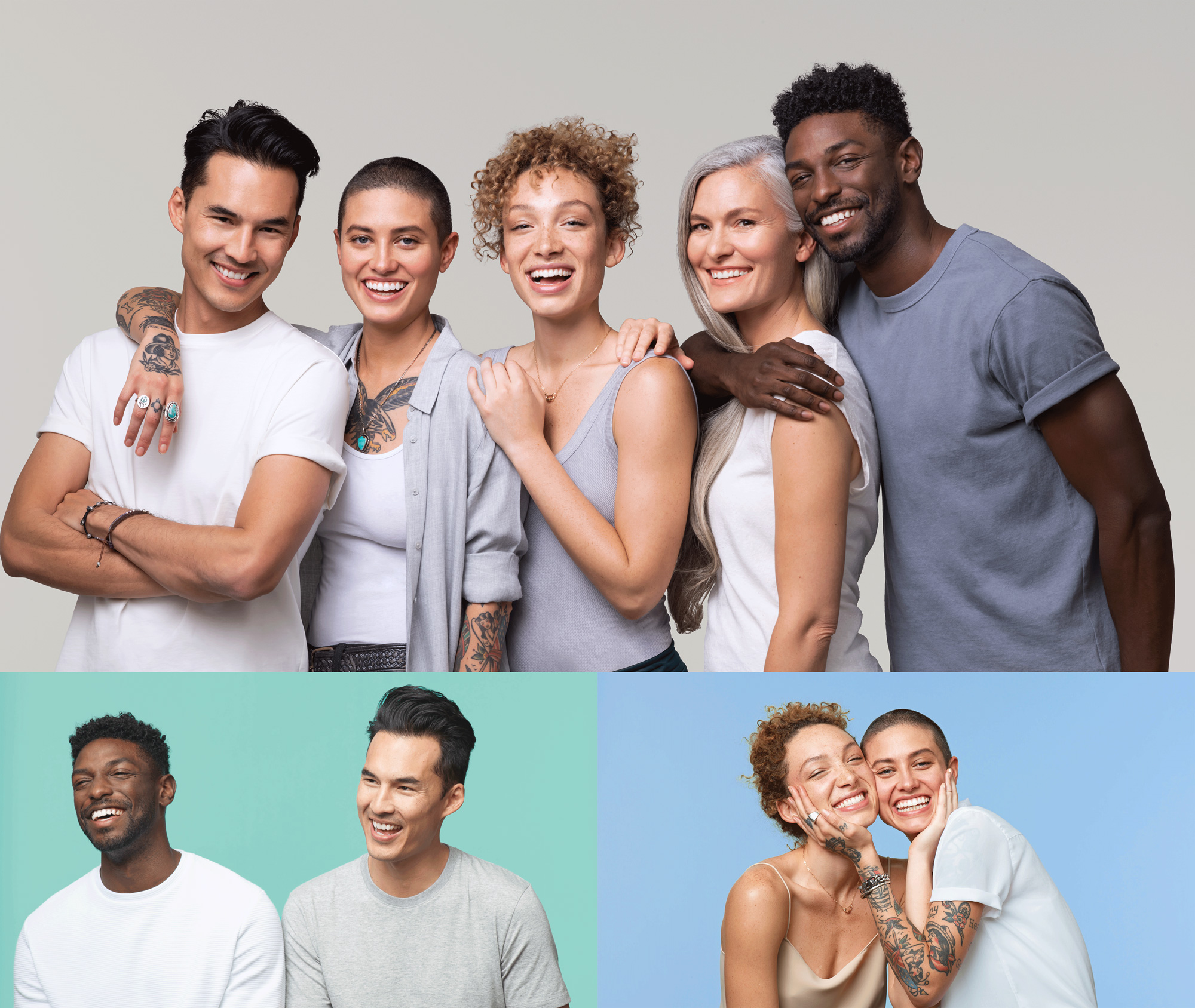
Both photography and illustrations are enjoyable and within the current trends for both. I like how they were able to unify the pastel backgrounds and light-colored clothing in both.
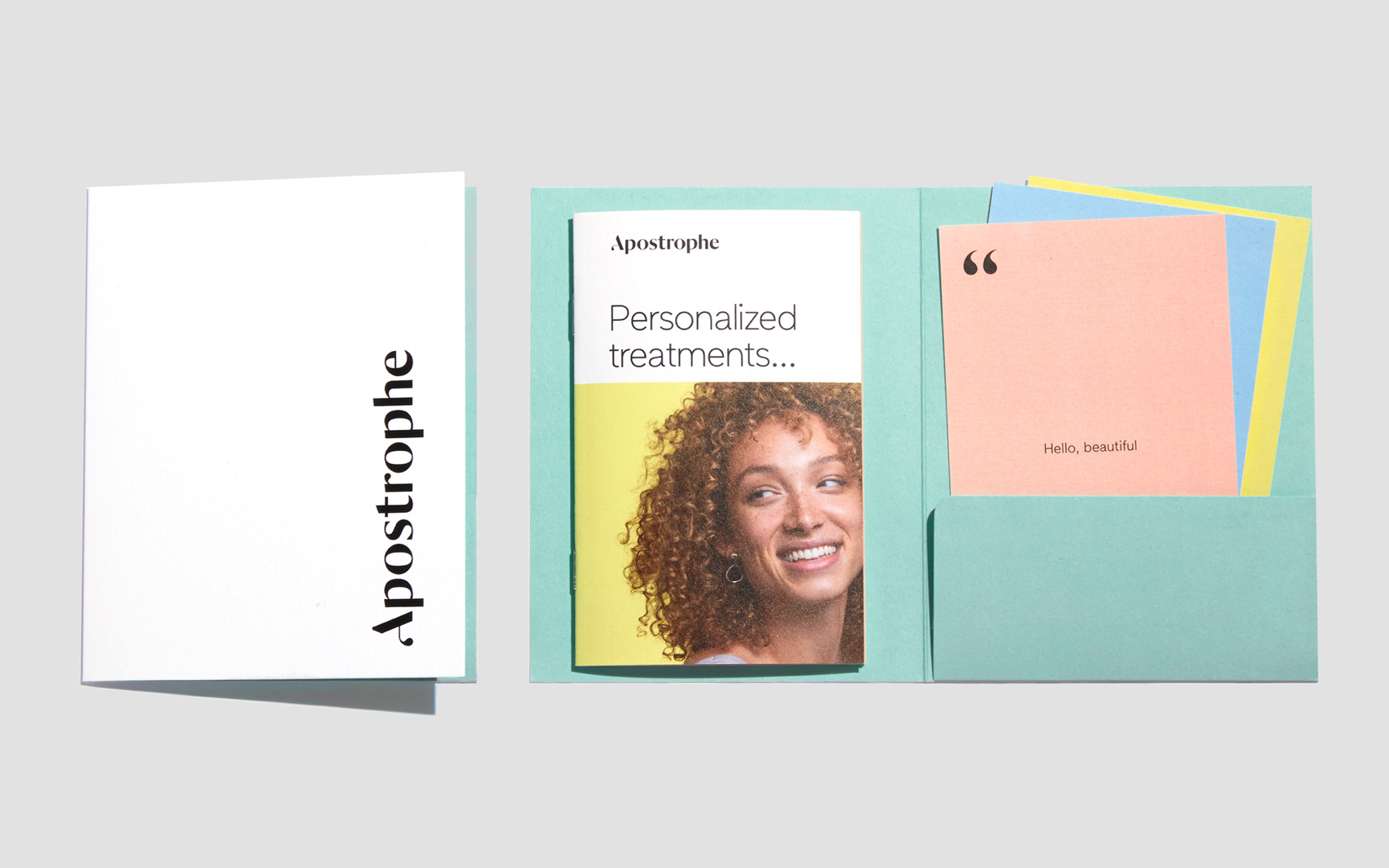
Print applications are alright, with a simple approach and good mix of photography, products, color blocks, and white blocks for content. The use of Maax in its light weight gives the identity a useful clinical aesthetic.
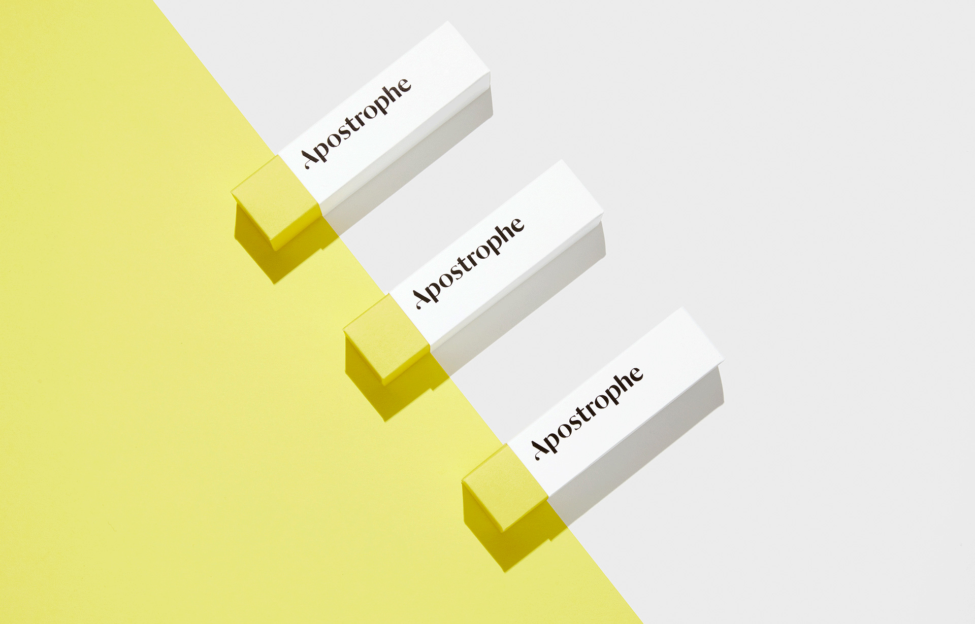
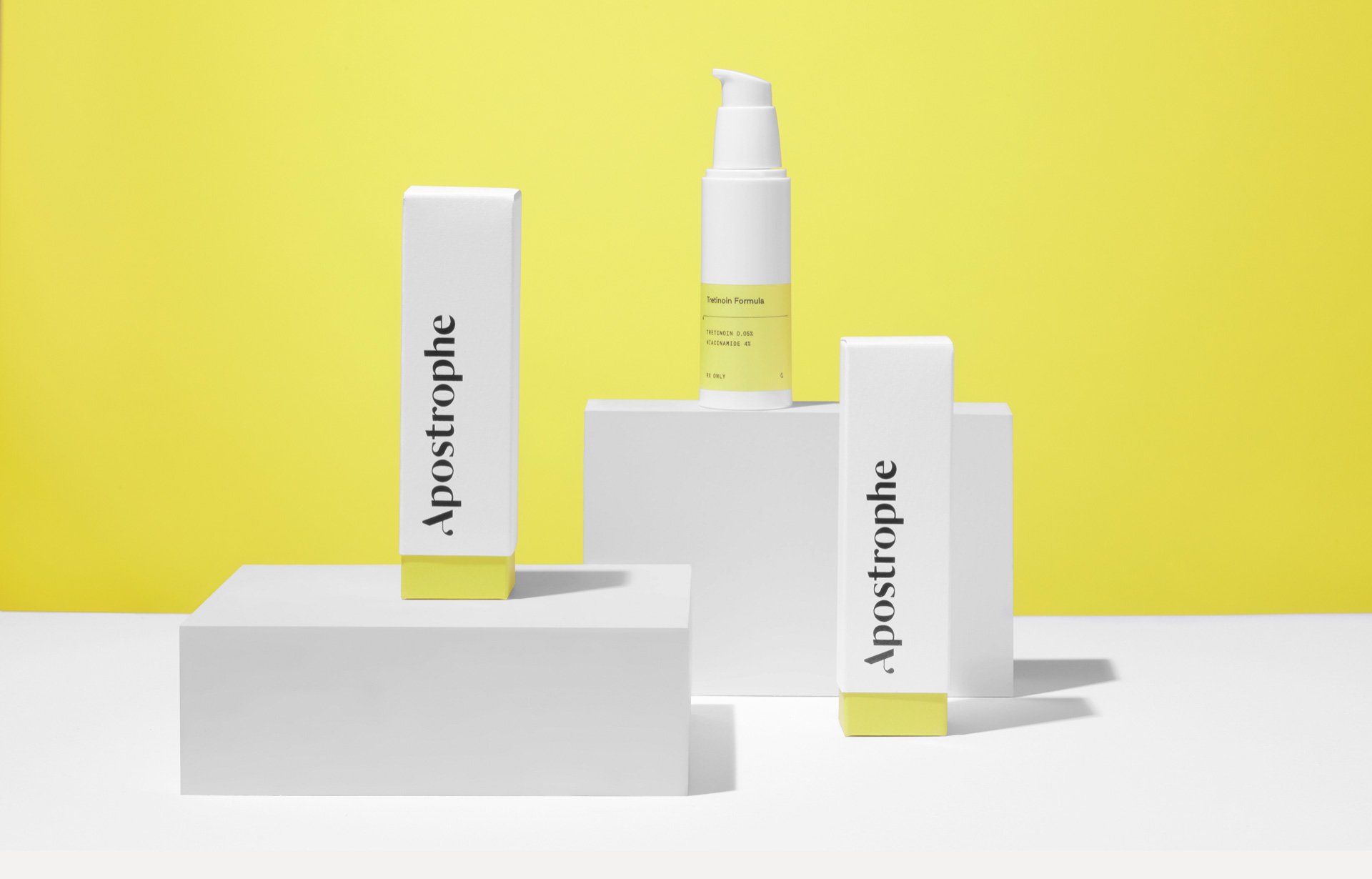
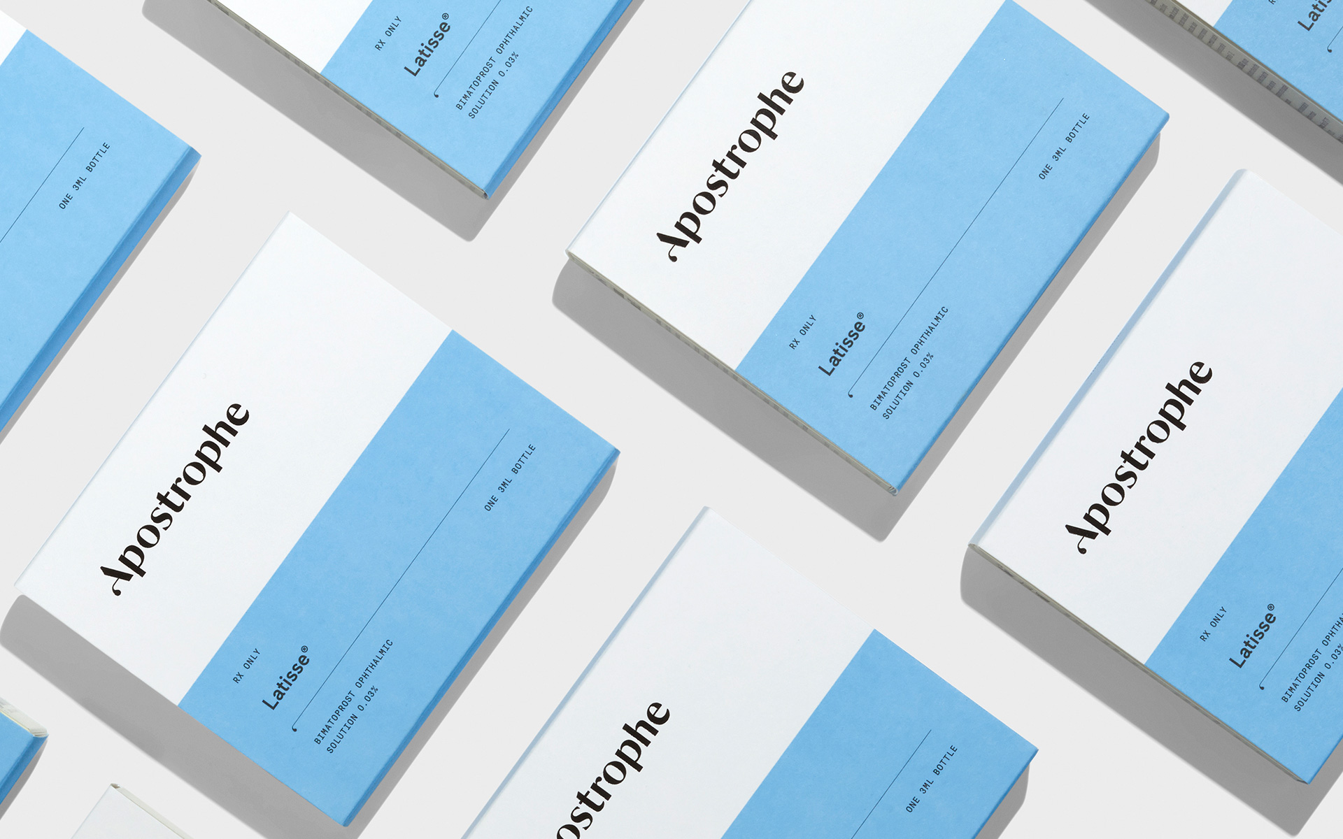
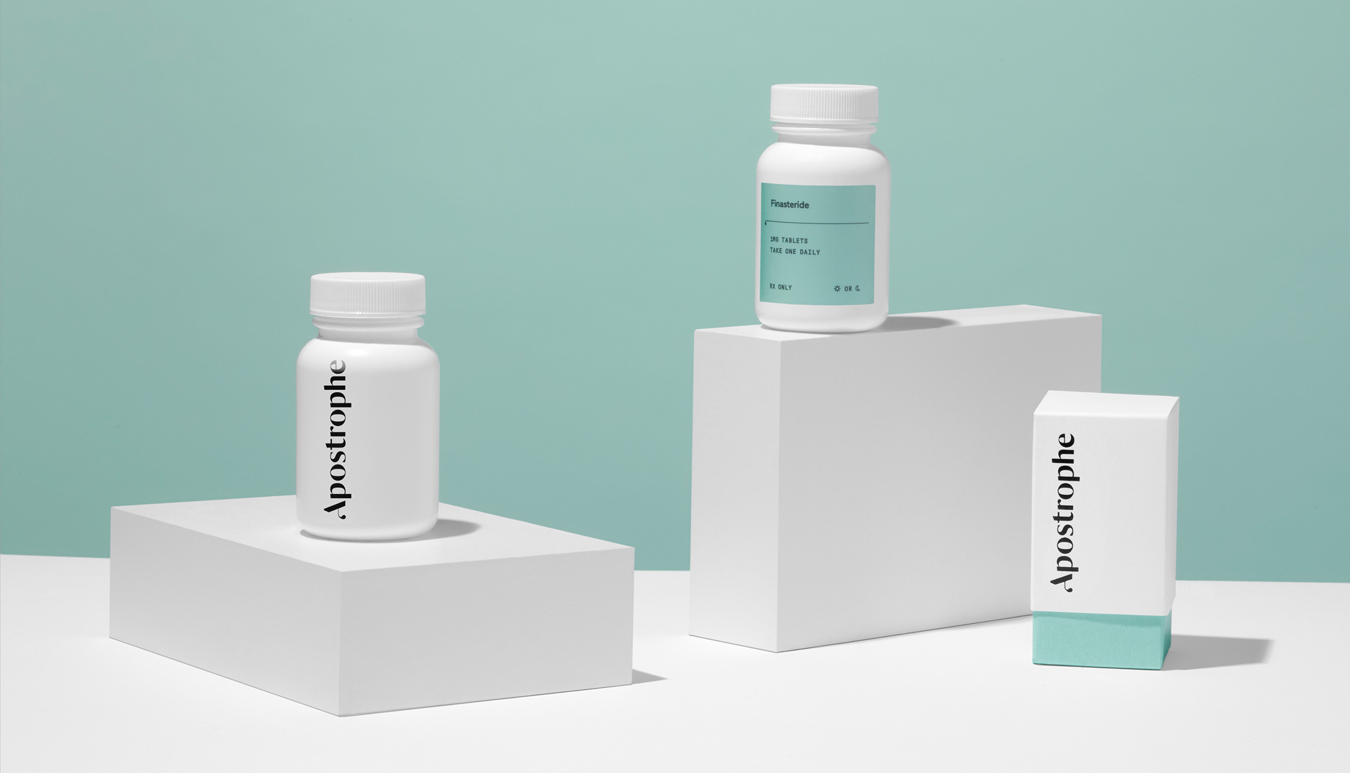
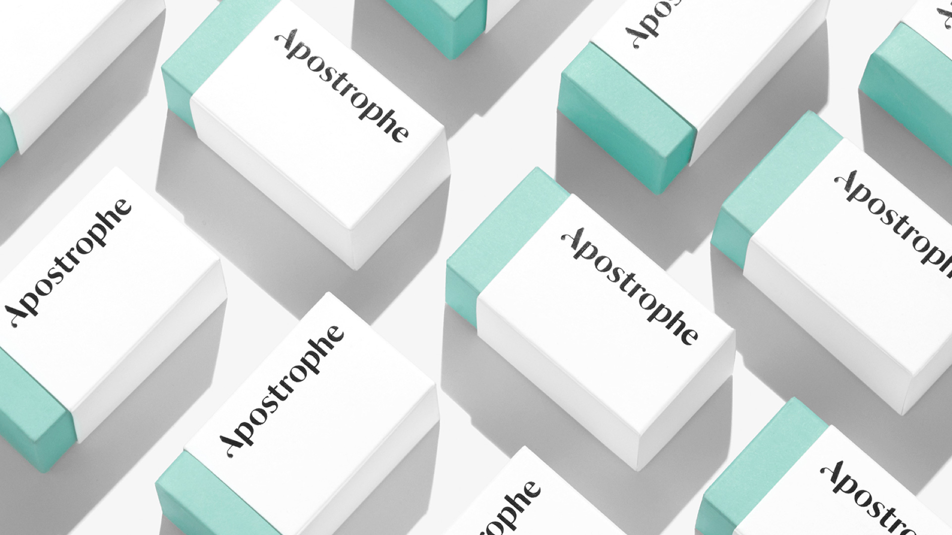
The packaging is the best thing about the project, achieving a good balance of looking like prescription medicine with good taste. The bursts of color against the larger blocks of white with the logo in them make for a great contrast and the informational typography is quite nice — which makes me think that that vibe would be a nice addition to the print applications. Overall, this identity makes online dermatology feel more trustworthy and its packaging feel like you are getting quality treatment and not just off-brand ointments from somewhere mysterious overseas.

 Новости Союза дизайнеров
Все о дизайне в Санкт-Петербурге.
Новости Союза дизайнеров
Все о дизайне в Санкт-Петербурге.