Обзор лучших ресурсов по разработке бренда, разработке упаковки
contact us | ok@ohmycode.ru
contact us | ok@ohmycode.ru
Established in 1786 in Montréal, Québec, the Molson Brewery is the oldest brewery in North America and until recently had been operating from the same location where it started. The brewery first released Molson Canadian, a lager, in 1959, which has become one of the best-selling beers in Canada and the flagship product of Molson Brewing, the Canadian division of Molson Coors Brewing Company. (Molson and Coors merged in 2005.) This month, Molson Coors introduced a new packaging and a master brand for Molson Canadian, Molson Export, and Molson Dry, designed by BrandOpus.
To generate reappraisal and drive the visual presentation of the brand, we looked to revive Molson visual equities that had been lost over time. For generations Molson has been making its mark on Canadian culture, through bringing in historical elements we have been able to evoke the values of founder John Molson and his legacy but in a forward-facing, timeless way.
Once we defined a new visual identity for the masterbrand we extended the same principals into the sub-brands within the portfolio. Each of the Molson sub-brands retains key equities but with the Molson identify playing a much more active role to drive recognition and meaningfulness across the entire portfolio.
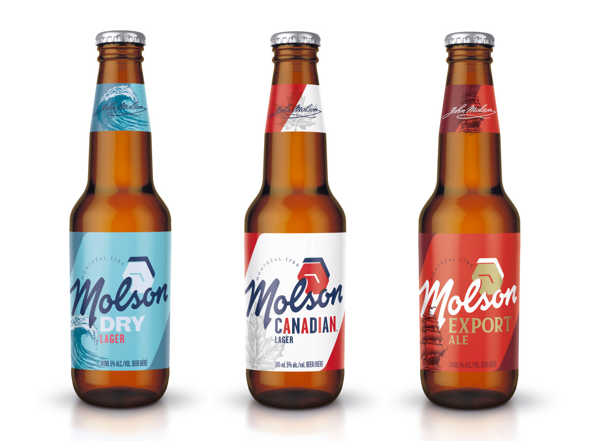
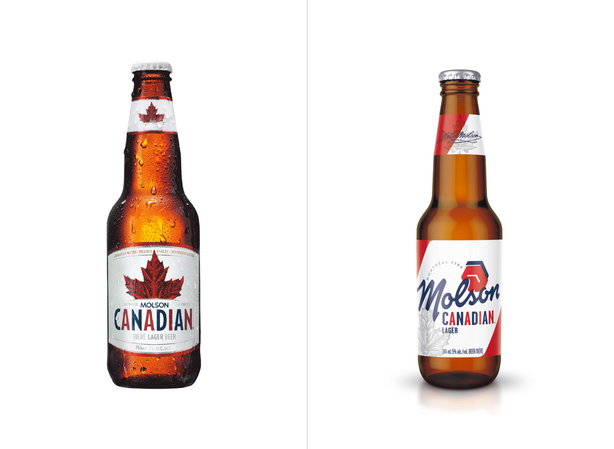
The most recognizable of the old logos is Molson Canadian, with its alternating red and blue wordmark and oversized maple leaf; it was decent. Molson Export was the nicest of the bunch, with its relatively cool ship and somewhat interesting font choice. Molson Dry was the worst, sinking into water. The new logo applies to all three brands but then each, in the packaging, retains an element or two from before: Molson Canadian will still have the alternating color wordmark and maple leaf, Molson Export will still have a flared serif and ship, and Molson Dry will still have weird “speed” lines and a wave. The big change is that now “Molson” has shifted from being a secondary endorsing element above each brand to being the primary visual statement with “Canadian”, “Dry”, and “Export” as the secondary elements.
The new Molson logo is a very weird combination of elements. At the forefront is a script, which is fine… no major problems there. It’s bold, it’s well executed, it has an uplifting angle, etc. Behind it is a really bad rendition of the clock on the brewery’s iconic building in Montréal. The original is such a cool visual reference that it’s really a shame they got it this wrong: the proportions are off and it’s the stroke around the clock that’s recognizable not the fill. The blue addendum to the clock is confusing, plain ugly, and its sharp wisps contrast badly with the softer script. Lastly, there is some curved type in a font choice that has little to do with anything else on the logo and it’s hard to tell exactly what kind of curve it sits on; it’s not a circle, it’s not an oval, and it’s not a wave, it just kind of sits there awkwardly. Had they stopped at the script, this would have been perfectly fine.
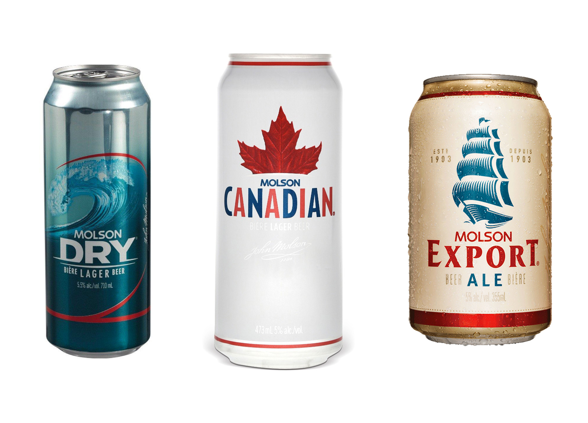
The comments about the previous logo apply quite well to the cans: Canadian was fine and highly recognizable; Export was pretty nice; and Dry was an abomination.
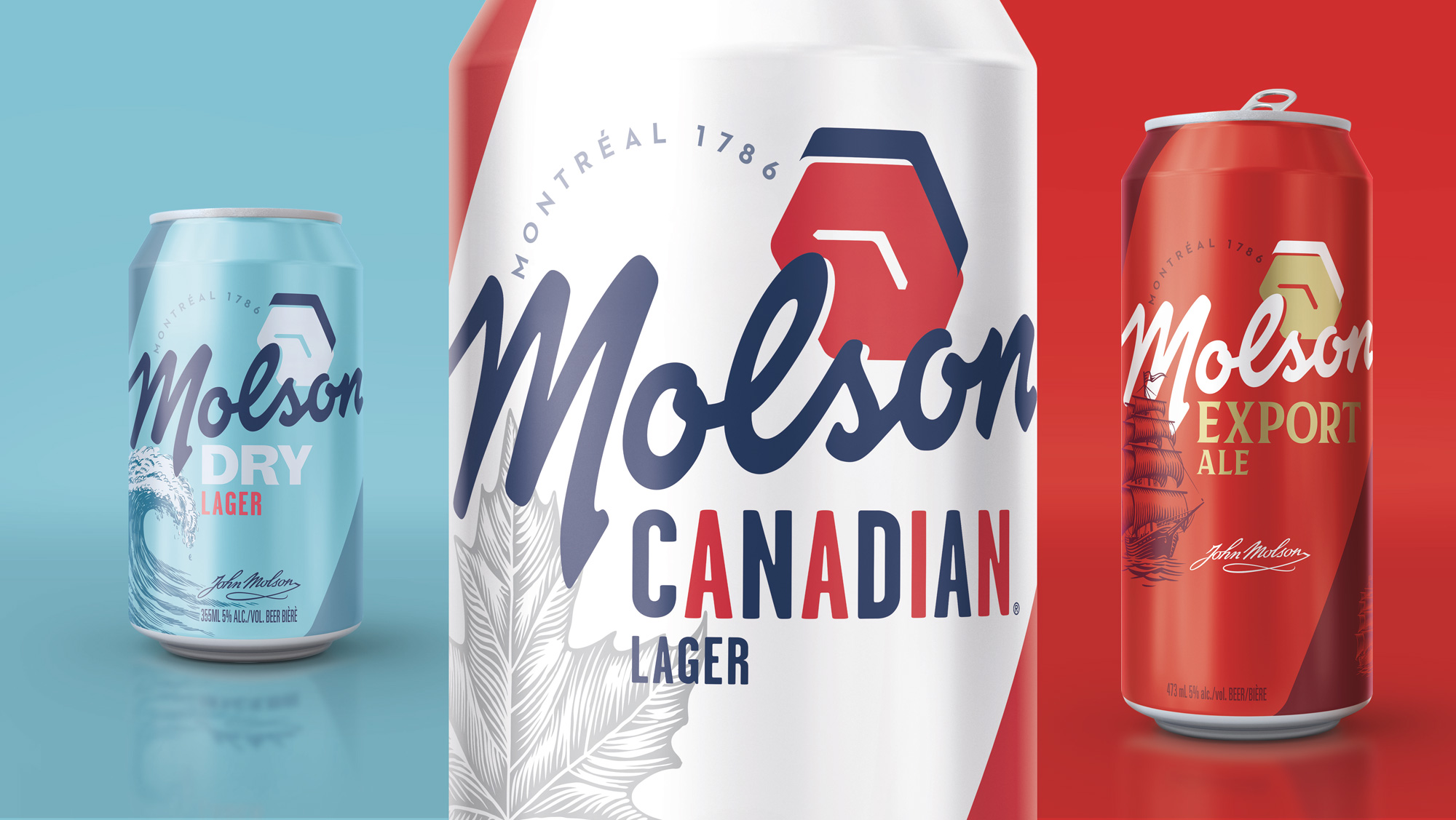
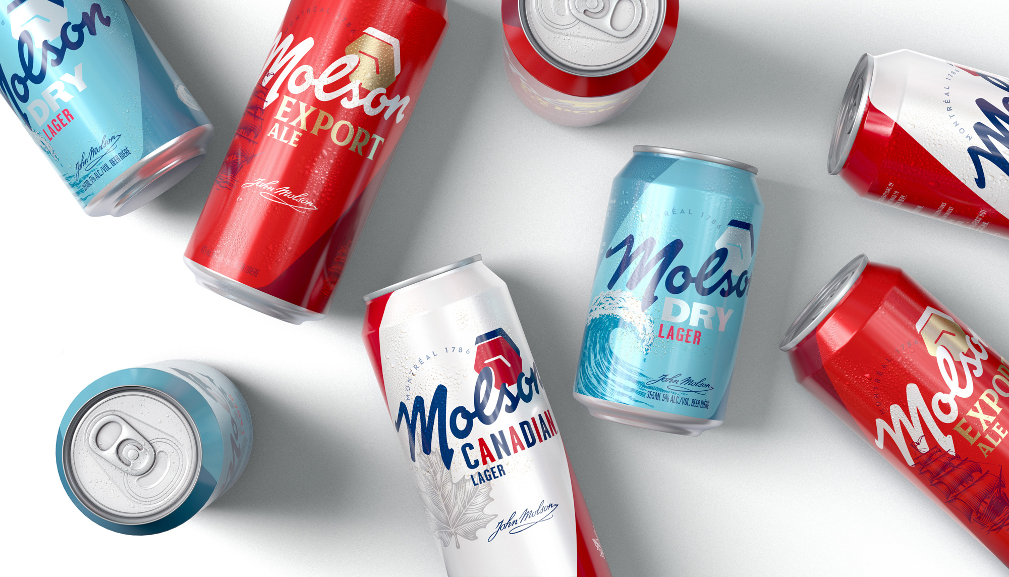
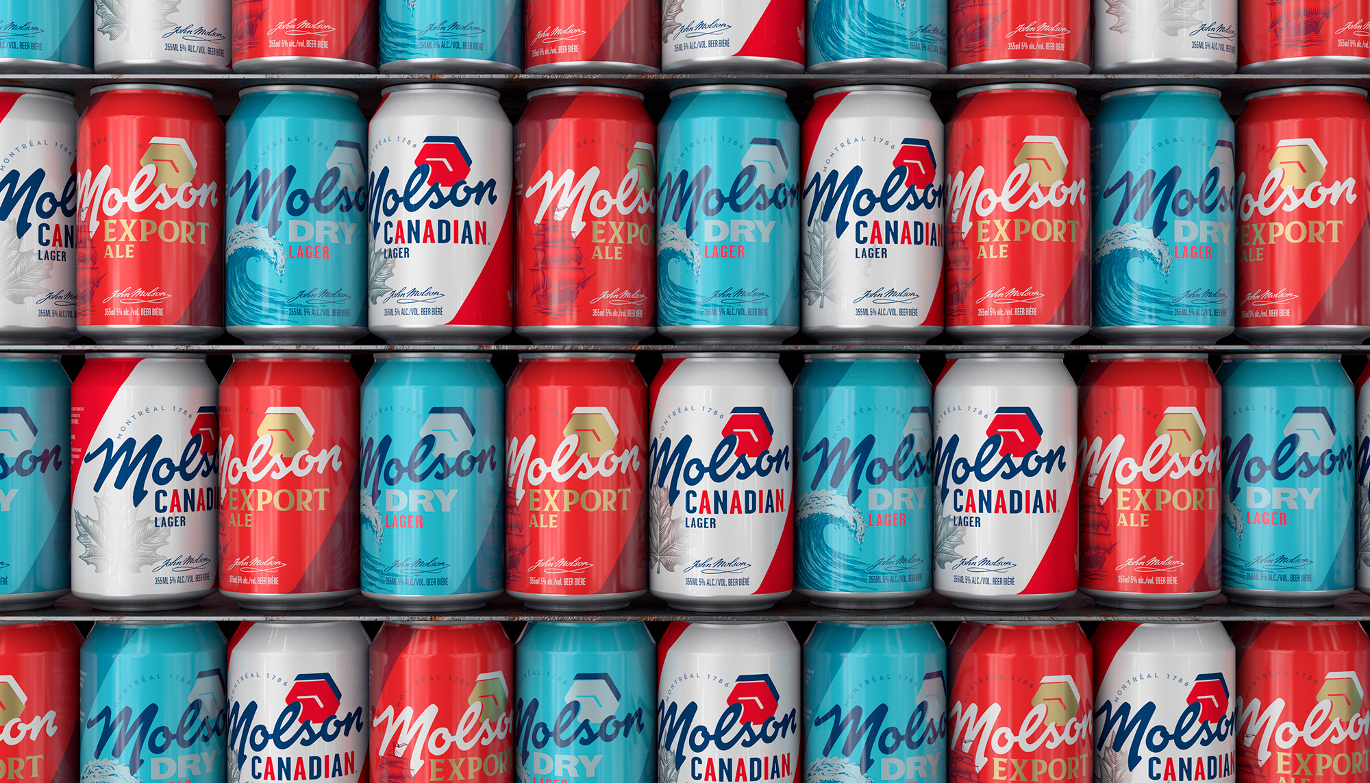
The new cans (and bottles, below) do a good job of bringing back elements from the old in a rather nice way. Canadian still uses the alternating colors, now in a more rounded sans serif and it also has the maple leaf in a single-color etching. Export has the flared serif, a dominating red color as with the bands in the old packaging, and in the same position and style as Canadian, features a ship. Dry is the biggest beneficiary of the redesign, with a more modest font and a less douchey wave drawing. In the context of the dense packaging layouts the logo looks a tiny bit better with all of its myriad elements but I can’t avert my eyes from that clock as a distracting element.
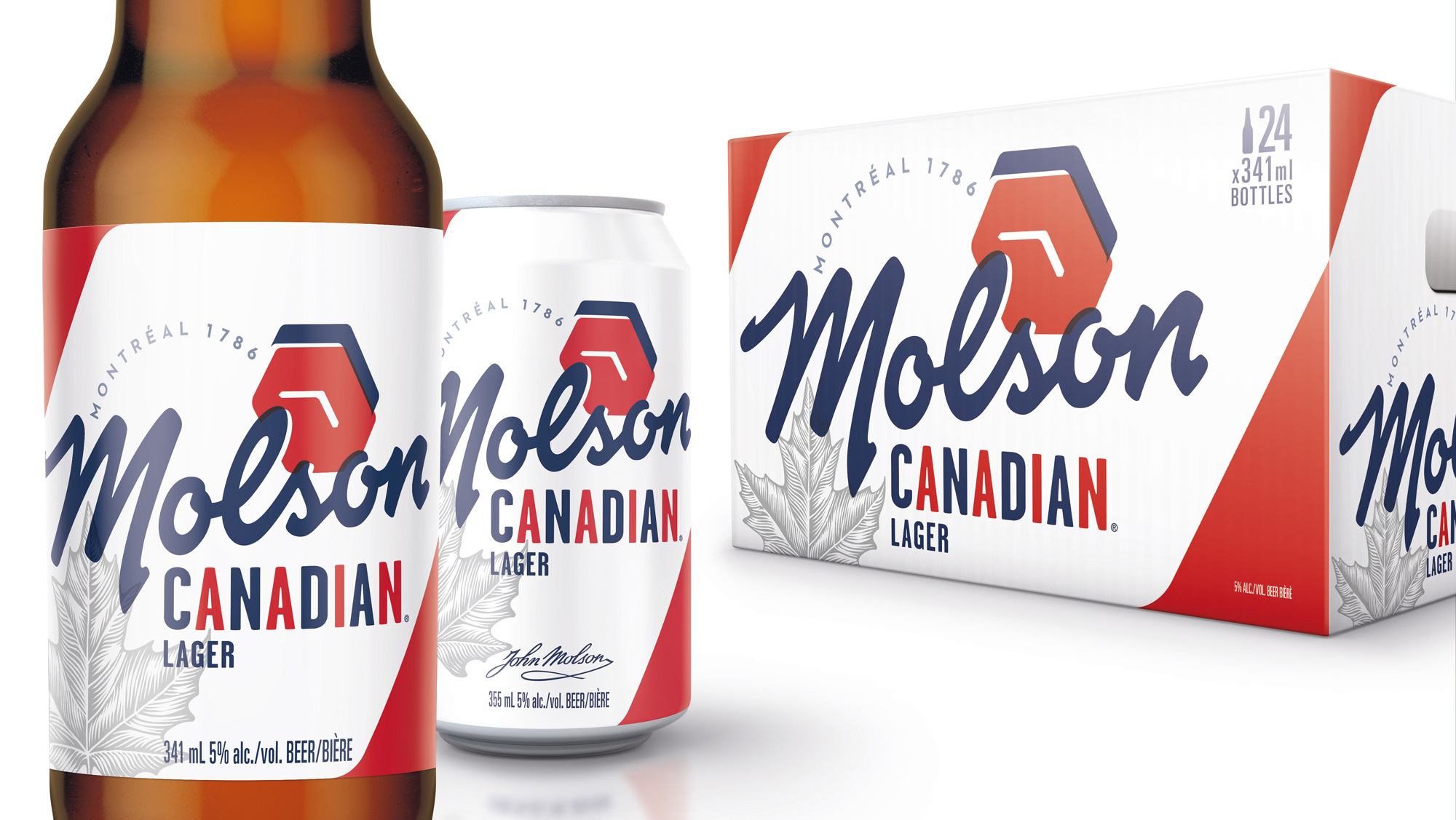
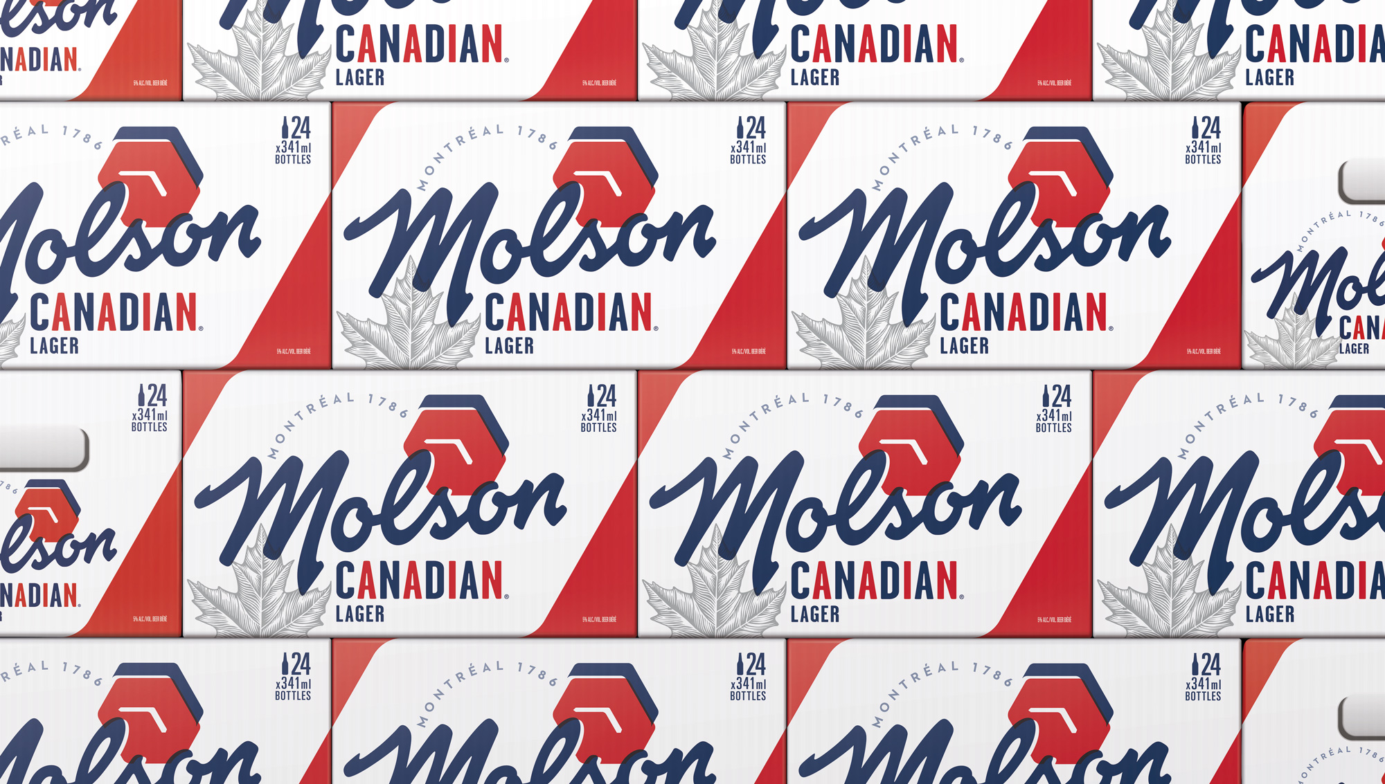
There is something attractive about the packaging. There is a nice density to it and, as is most visible in the boxes above, the corner element that echoes the shape of the clock adds a good burst of energy to the designs. Overall, it’s an effective redesign that brings together three brands that before sounded like they were related but their designs were so disparate they might as well have been produced by different breweries and while I’m not a fan of the logo the packaging is mostly a convincing and successful redesign.
Thanks to Gabriel Parent-Nadon for the tip.

 Новости Союза дизайнеров
Все о дизайне в Санкт-Петербурге.
Новости Союза дизайнеров
Все о дизайне в Санкт-Петербурге.