Обзор лучших ресурсов по разработке бренда, разработке упаковки
contact us | ok@ohmycode.ru
contact us | ok@ohmycode.ru
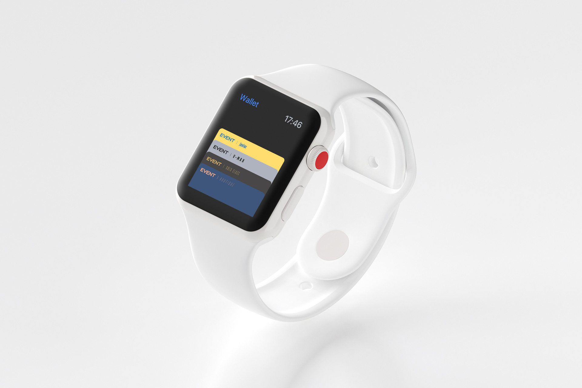
Dating back to 1910 in the silent era of movies, Event Cinemas, under different names over the course of 109 years, is the largest movie theater company in Australia and New Zealand with over 140 cinema complexes. Evolving through different mergers and ownership changes, Event Cinemas counts with over 3,000 employees and aside from operating traditional movie theaters offers special “experiences”: Gold Class, featuring lounge access and full dinner service; Boutique, set in smaller theaters and themed in unique ways; 4DX, which has those seats that shake and a set-up that dispenses scents, wind, and even mist; V-Max, which features larger screens; and Junior, a tricked-out theater experience for kids 8 and under with a little playground inside the theater and bean bags to sit on. Recently, Event Cinemas introduced a new identity designed by the Sydney, Australia office of Landor.
More than ever, people need a reason to switch off from the chaos of their day-to-day lives; from social media to emails, news to politics. Event gives you an escape from the ‘real world’.
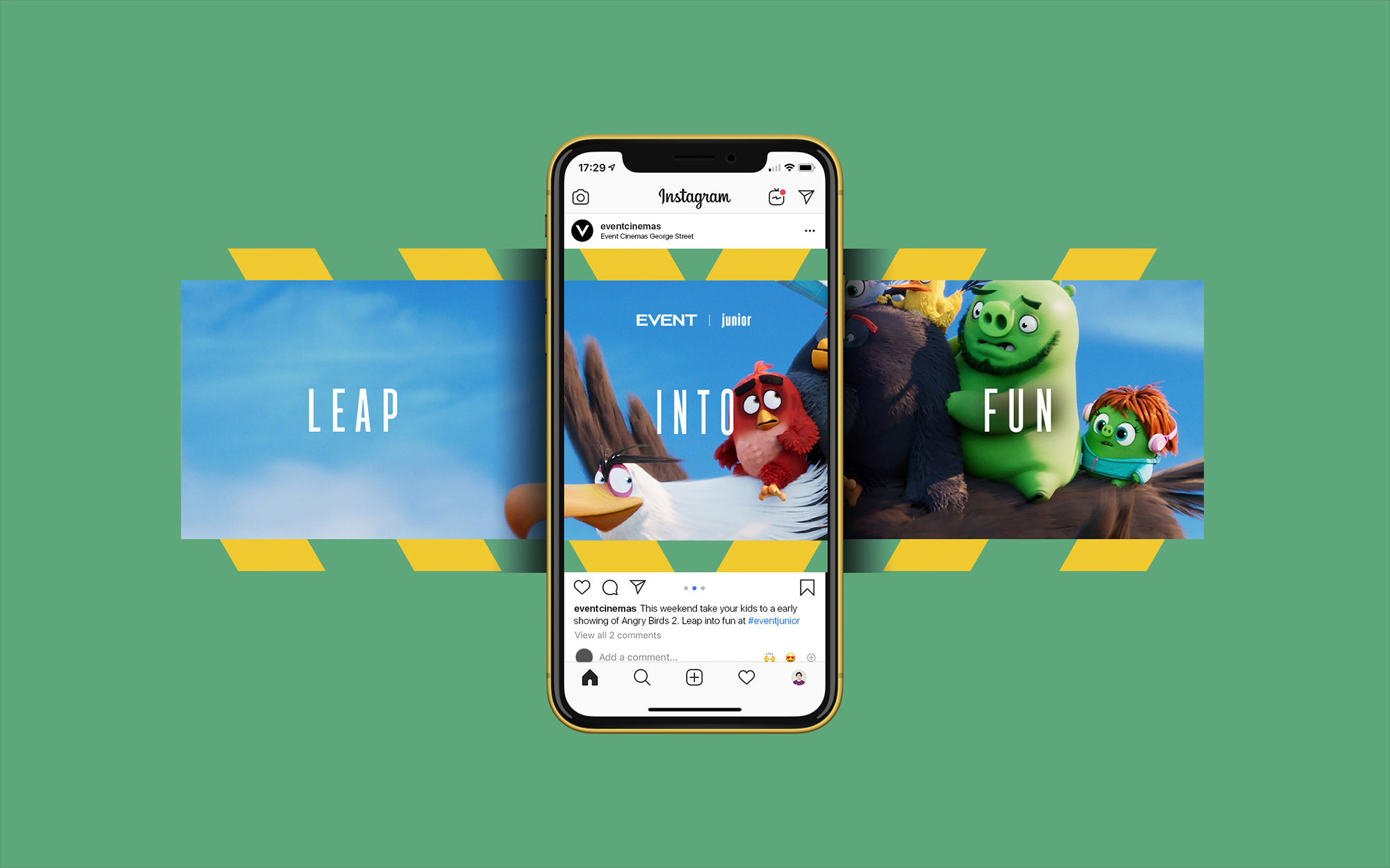
With a different world behind every door, people can immerse themselves in new experiences, from the luxury of Gold Class or the epicness of 4DX, to the fun of Junior.
The challenge was to create a brand to match these experiences. It needed multiple dimensions but a single DNA.
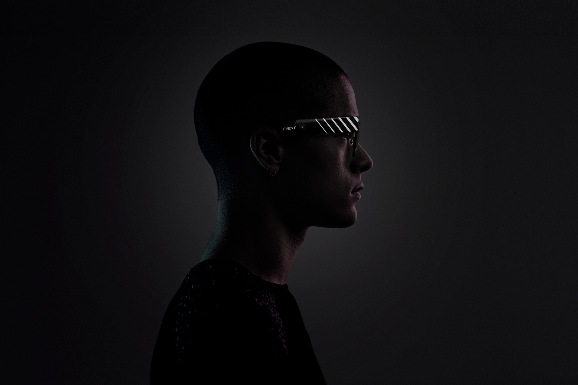
The old logo was a little extreme with its large “V” extending above and beyond the rest of the letters, creating a very awkward wordmark that I can’t imagine was ever easy to use or place into layouts. The new logo simply trims the “V” to its correct height and maintains the way it interacts with the two “E”s that flank it — which wasn’t great then and isn’t great now but at least the whole composition demands less attention. Perhaps some additional tweaks could have been done but also perhaps those additional tweaks were off the table with the client wanting to keep a strong connection with the existing logo.
We started by creating an overarching black and white masterbrand. This forms the brand DNA, and allows the multitude of content to stand out.
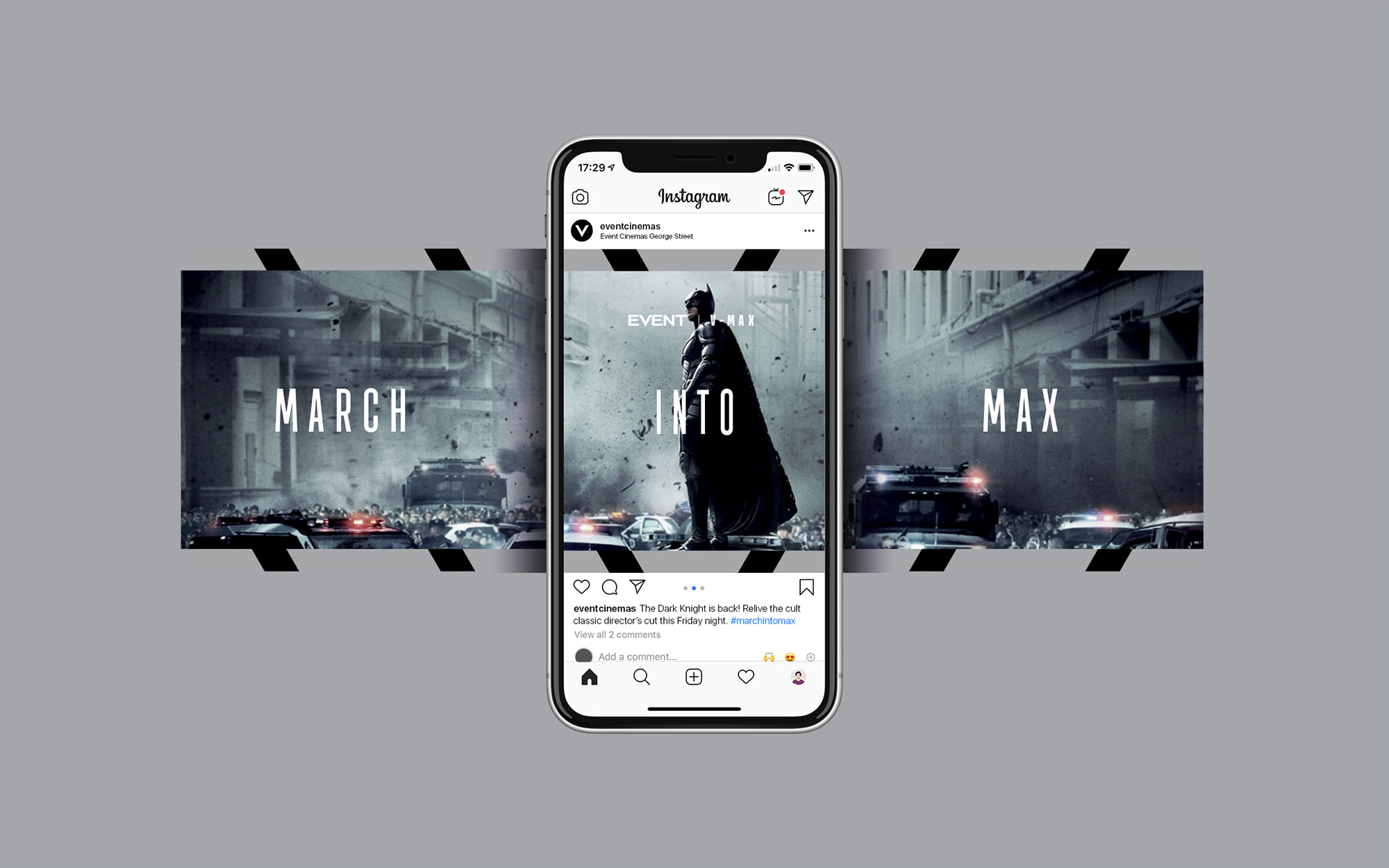
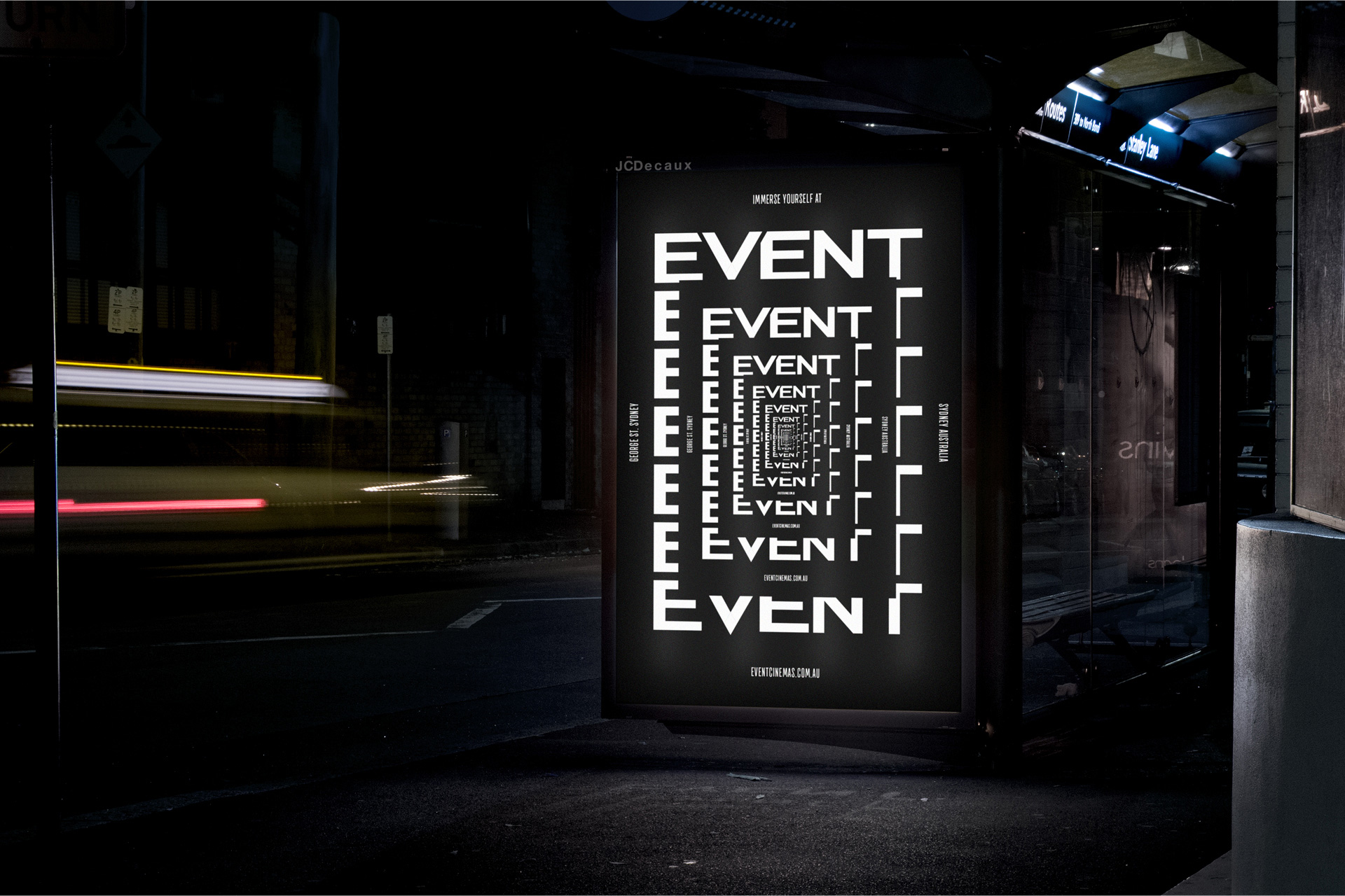
The visual language was inspired by the prominent Event ‘V’, feeding into a suite of 2D patterns, immersive motion sculptures and cinema-inspired typography.
All brand elements are remixed to take on the characteristics of the different worlds, united by a simple logo ticker.

The identity then introduces a series of patterns and 3D “sculptures” in black and white, stemming from the shape of the “V”, that expand the visual language along with a condensed sans serif to contrast with the extended structure of the logo. Both patterns and motion sculptures are fun to look at but I wonder if they are a little too trippy and abstract for a movie theater? In the U.S. the answer would be yes but it’s most likely a different story in Australia. The different weights of the typeface are used for each of the sub-brands (which are the different experiences offered by Event Cinemas).
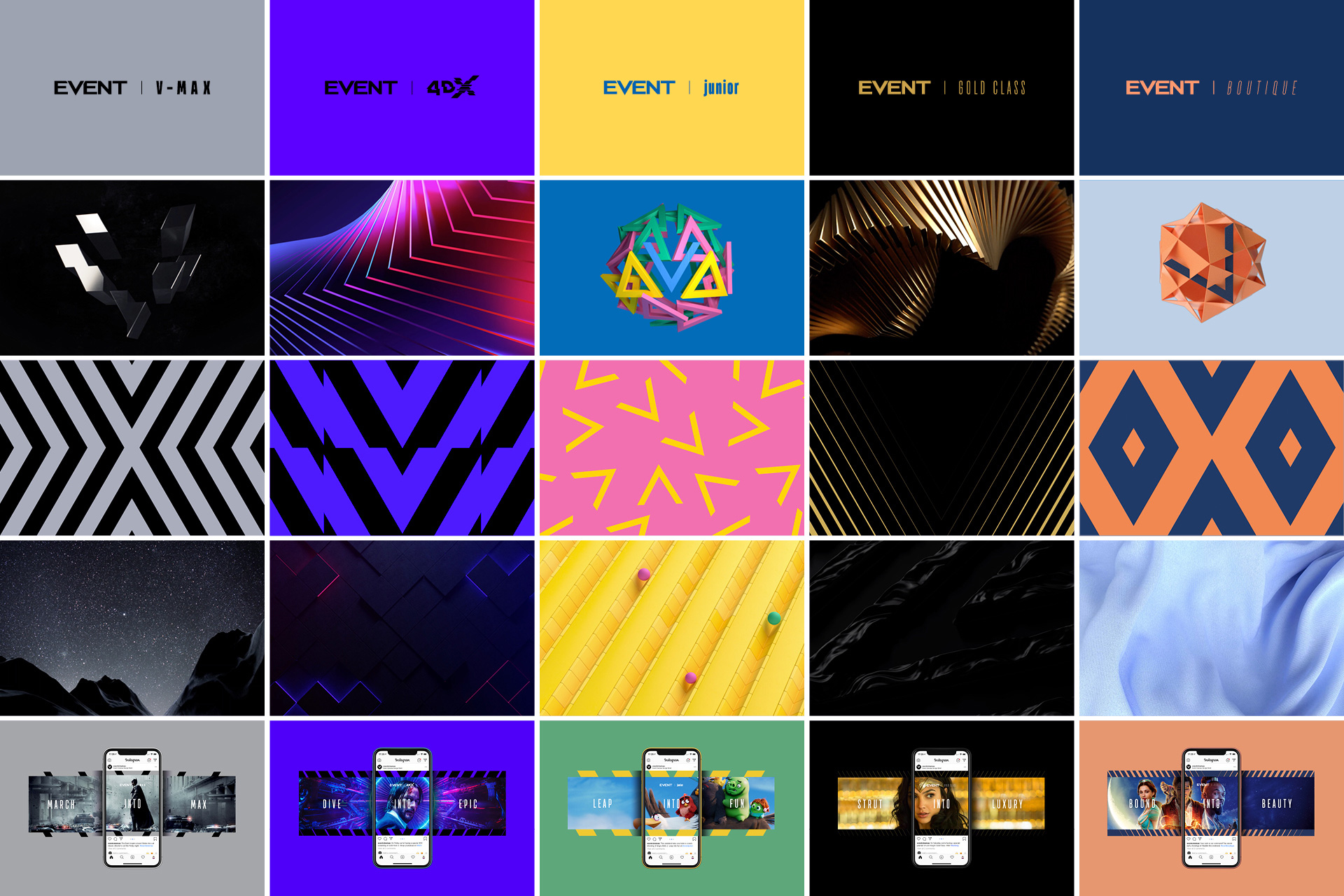
The identity then expands into more colorful worlds for the experiences, with each having distinct look-and-feels, starting with their sub-brand logos, ranging from the boldness and loudness of V-Max to the more glamorous Gold Class to the playful Junior. All experiences share the same category of assets — idents, patterns, and 3D sculptures — so are able to communicate equally across mediums but with each one efficiently targeting the different demographics.
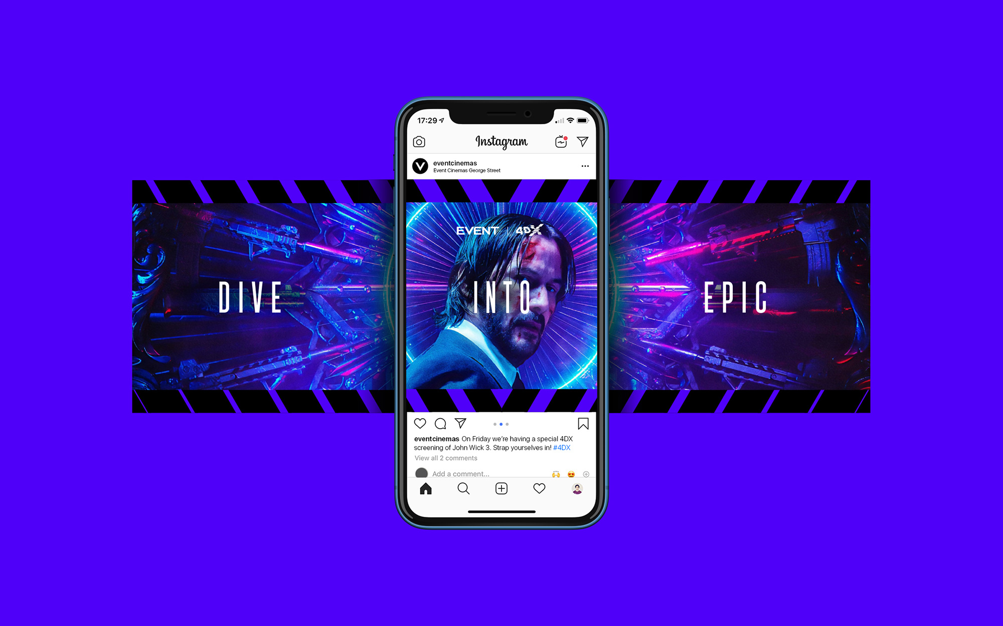
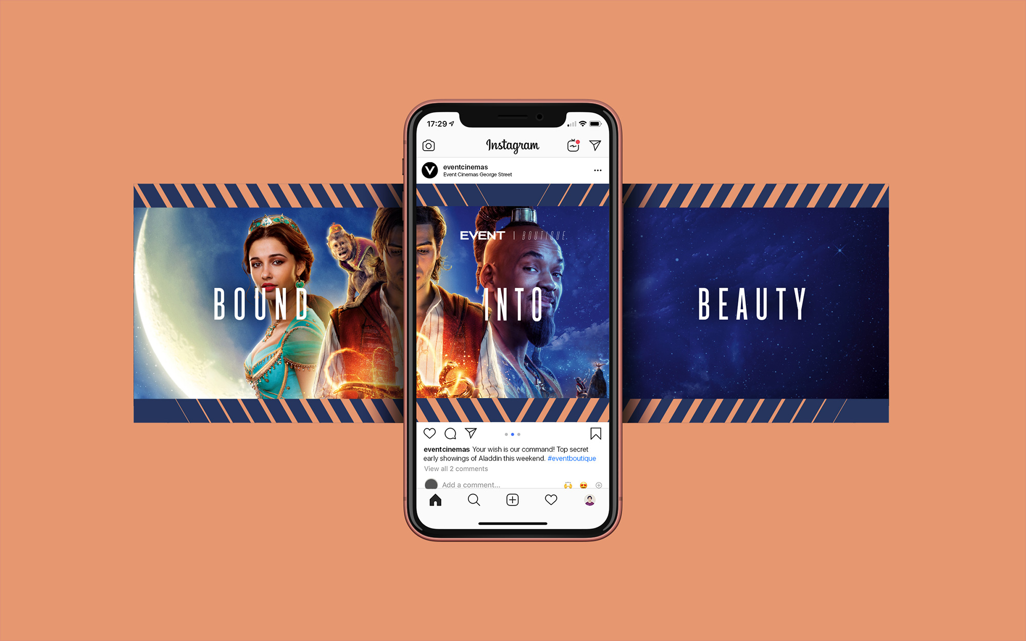
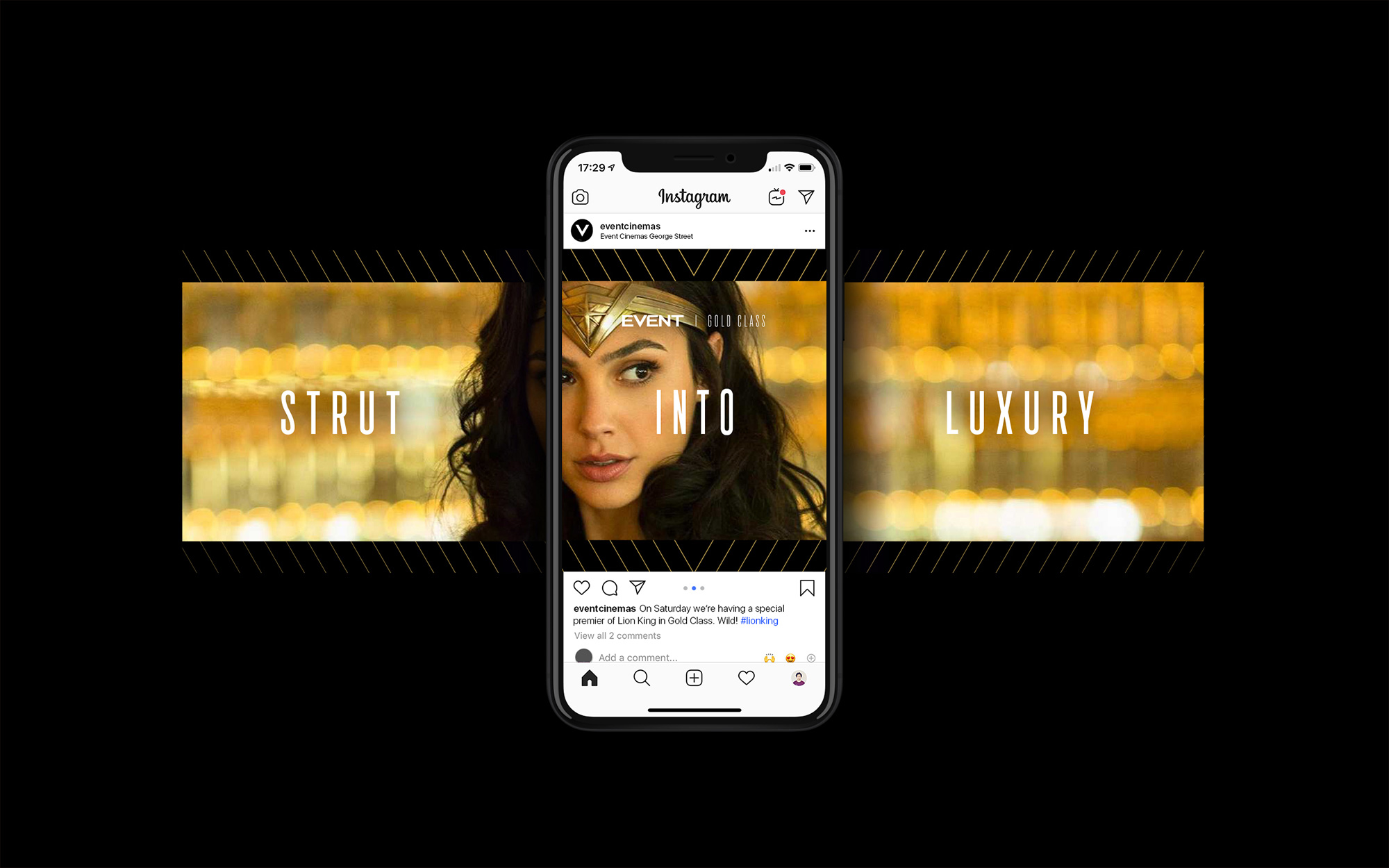
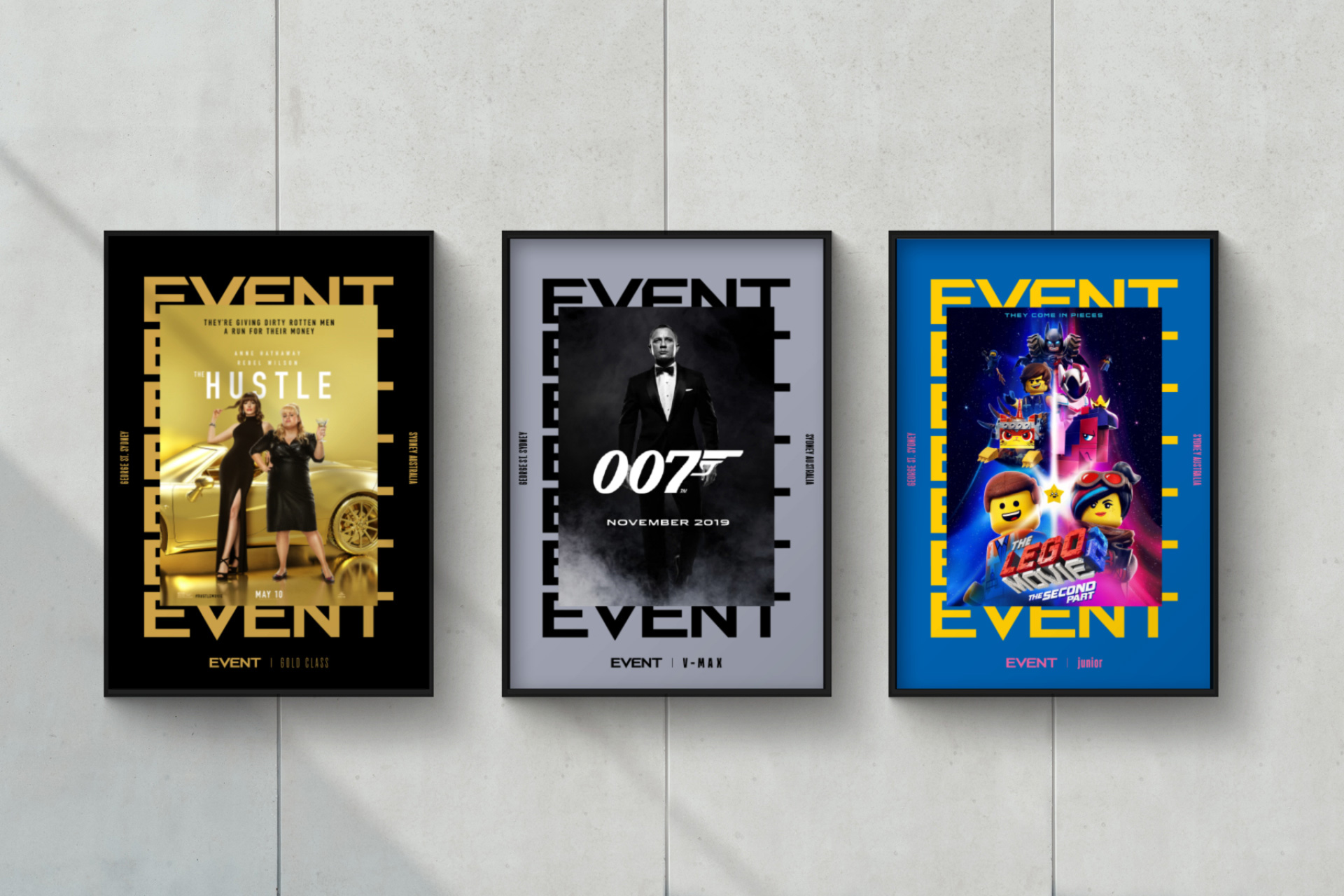
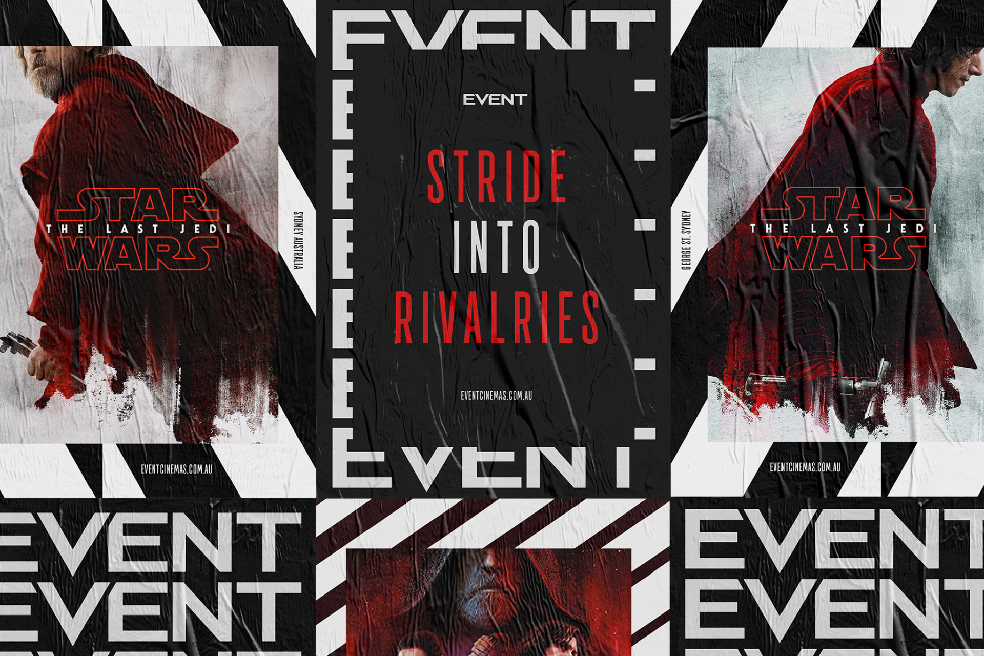
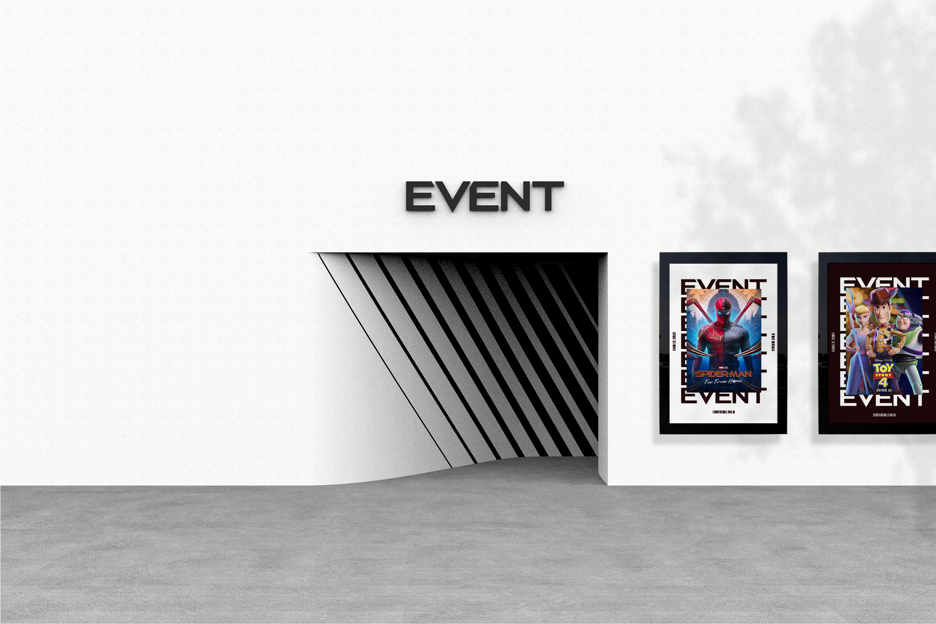
I really like this approach to posters and ads where the movie posters are framed inside Event-branded backgrounds that are modulated to match the movie they are promoting. I also really question whether this approach will see the light of day? If yes, hats off.
I keep getting a sense that this is all too cool for a movie theater company but that is probably because the bar is set so low in the U.S., with the mega chains of AMC and Regal often having very mundane and forgettable graphics, but I guess people in other parts of the world can have nice things. Overall, this is very nicely done and expanded across experiences in a way that has a little bit of Hollywood-esque bravado delivered in a more sophisticated way.
 each year since publication began in 2006

 Новости Союза дизайнеров
Все о дизайне в Санкт-Петербурге.
Новости Союза дизайнеров
Все о дизайне в Санкт-Петербурге.