Обзор лучших ресурсов по разработке бренда, разработке упаковки
contact us | ok@ohmycode.ru
contact us | ok@ohmycode.ru
Although I can’t get official dates or origin of production, there is not much science needed to this one: Fruna is a line of chewable candy in Peru currently sold by Ambrosoli, an Italian confectioner that came to Peru in the 1960s. During the 1980s, though, it was sold by D’Onofrio and at some point Fruna was related to Sugus, the same product sold in other parts of the world, like Spain and Mexico. Anyway… recently, Fruna introduced new logo and packaging designed by Lima, Peru-based Brandlab.
Fruna had its best time in the 80’s as a result of a series of ad campaigns with a highly sticky jingle: The ‘Frunacatoinga’, which was based on the main feature of the product, its taffy texture.
‘Frunacatoinga’ is rebound and jump. This was the inspiration for the great challenge of redesigning Fruna. We rescued what made the brand shine. We created an identity by returning to the iconic colors and elements of the brand, we illustrated the fruits by modeling clay, which gave Fruna a more modern, sweet and fun appeal. We designed a typography to appoint and sort the different flavors and varieties of the brand.
The old logo wasn’t great but it could have easily been worse. Its biggest detriment was the illustration style on the fruits that clumsily made up the counters of the “R” and “A” but, again, nothing too terrible and mostly just a generic-looking candy logo. The new logo aims to capture the bounciness of the vintage ads with a “U” bouncing inside the “R”. I really like the low-riding structure of the wordmark and the chunkiness. My only gripe would be the length of the leg of the “R”, that, after staring at it for a few minutes is awkwardly long. Still, it’s a nice logo and I appreciate that the “U” is the same thickness as the other letters and not just scaled-down from the size of the others.
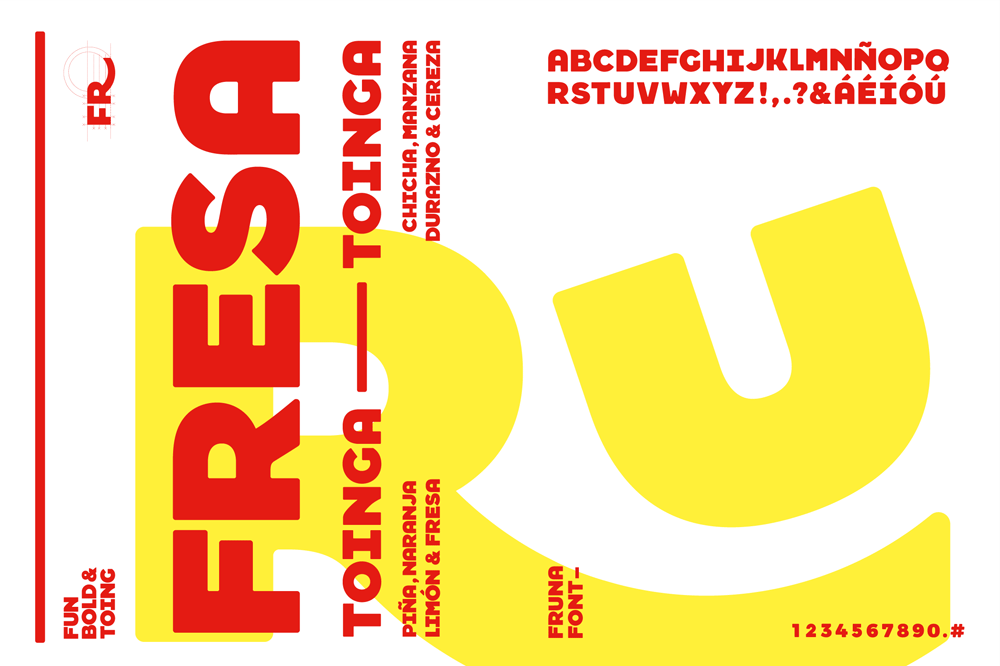
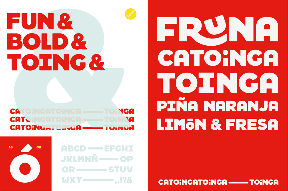
The aesthetic of the logo has been extended into a full font that helps brand the spin-off products from the original. It’s a good-looking font… one I would even consider buying and using if it were available. The “i” is a nice touch that ties in to the idea of bouncing as if the tittle is hammering the stem into the ground (like the Pixar lamp) and I also like how they have handled the accents.
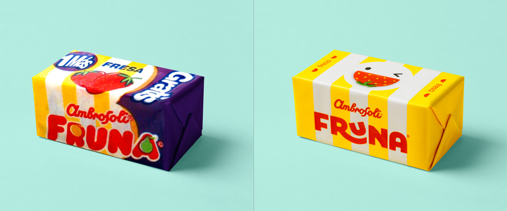
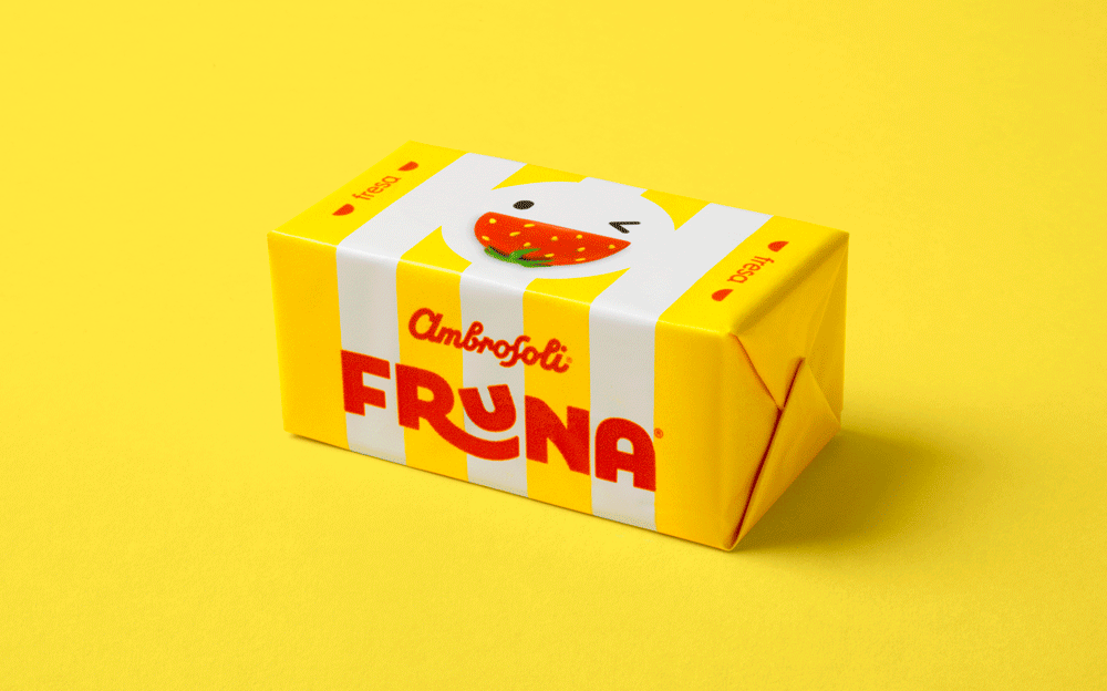

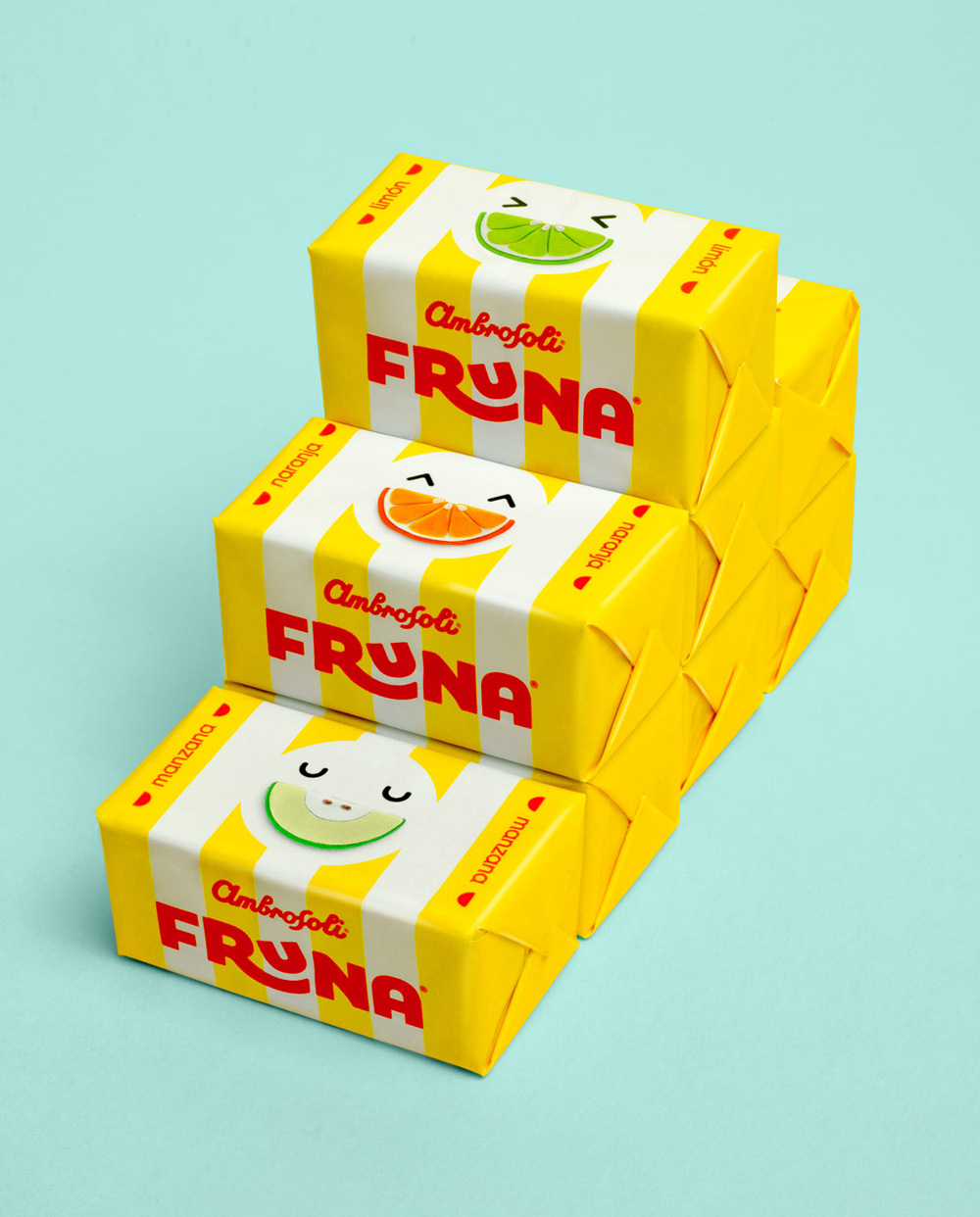
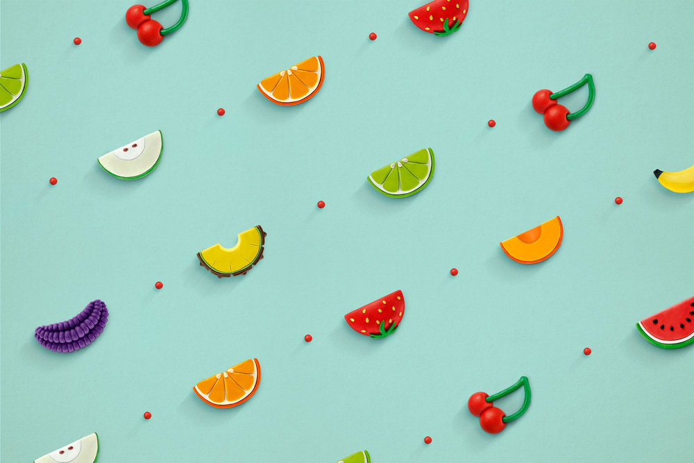
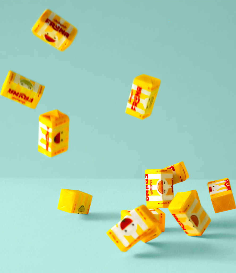
The old individual wrapper wasn’t particularly enticing and it had too many elements too largely sized inside a too small space. The new wrapper has much better proportions and a more thoughtful layout. Granted, it looks great in these manicured photos but once these are being produced at mass scale, I doubt everything will align as nicely as they do here. Nonetheless, it’s a grand improvement, starting with the proper integration of the yellow bars, where the logo aligns with them and the fruit flavor is nicely framed by them and a circle. Speaking of the fruit flavors, each fruit has been modeled in clay, which is a very welcome break from the usual ingredient photo.

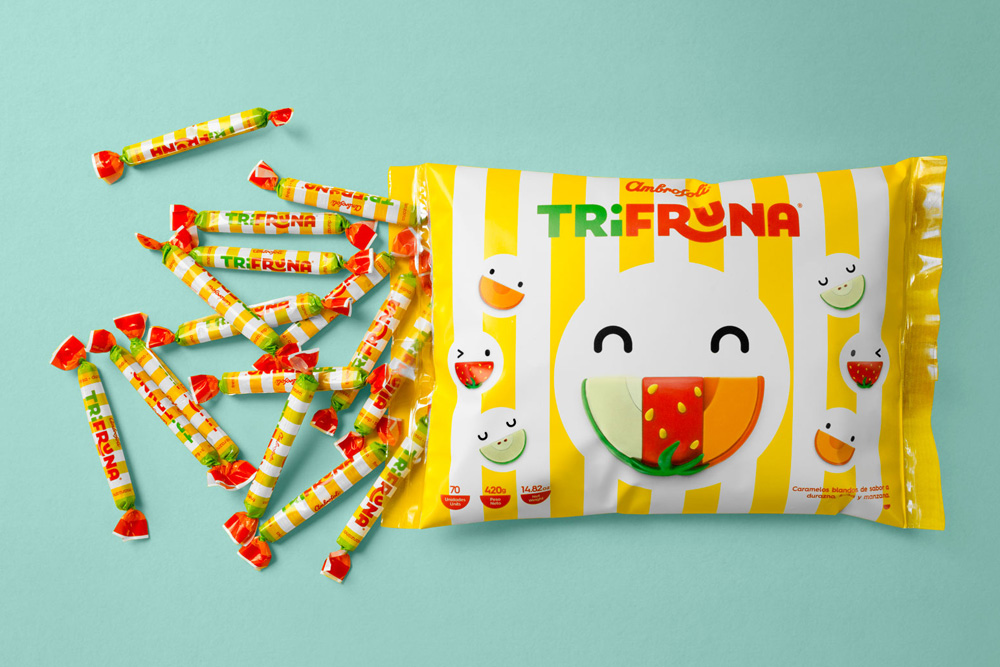
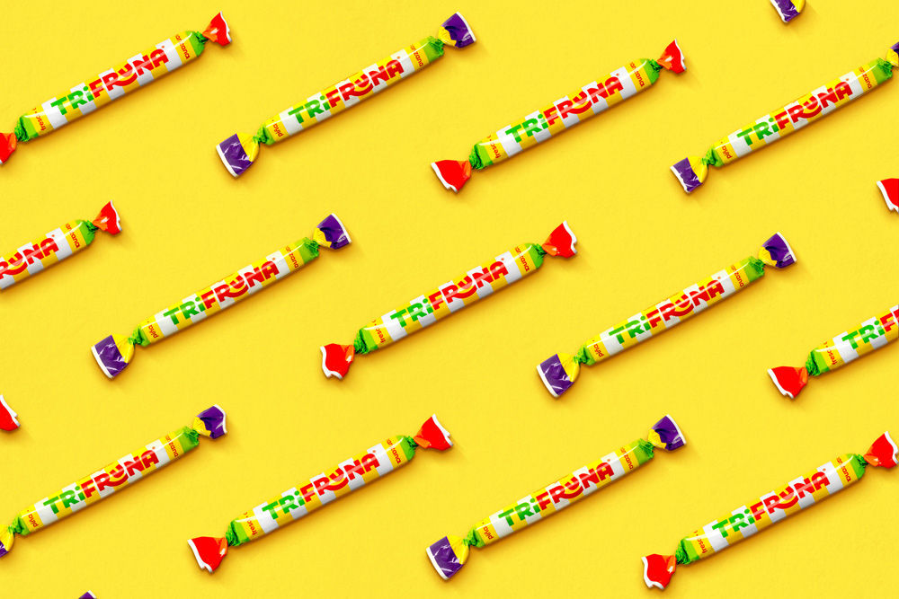

The visual language extends really well to other products and what I like the most is that it still feels like “street” candy — something you get at the corner store or newsstand — and not some high-end gourmet artisan chewable confection.
I could do without the uncanny valley bounciness in the spot and without ever hearing the Frunacatoinga-toinga-toinga jingle, which I know I will have stuck in my head the rest of the week. It would have been cool to bring in some of the clay components into the ad but the spot was clearly done independent of whatever was happening with the packaging. Overall, the product itself, is a great, cohesive improvement that keeps the brand fun and accessible.

 Новости Союза дизайнеров
Все о дизайне в Санкт-Петербурге.
Новости Союза дизайнеров
Все о дизайне в Санкт-Петербурге.