Обзор лучших ресурсов по разработке бренда, разработке упаковки
contact us | ok@ohmycode.ru
contact us | ok@ohmycode.ru
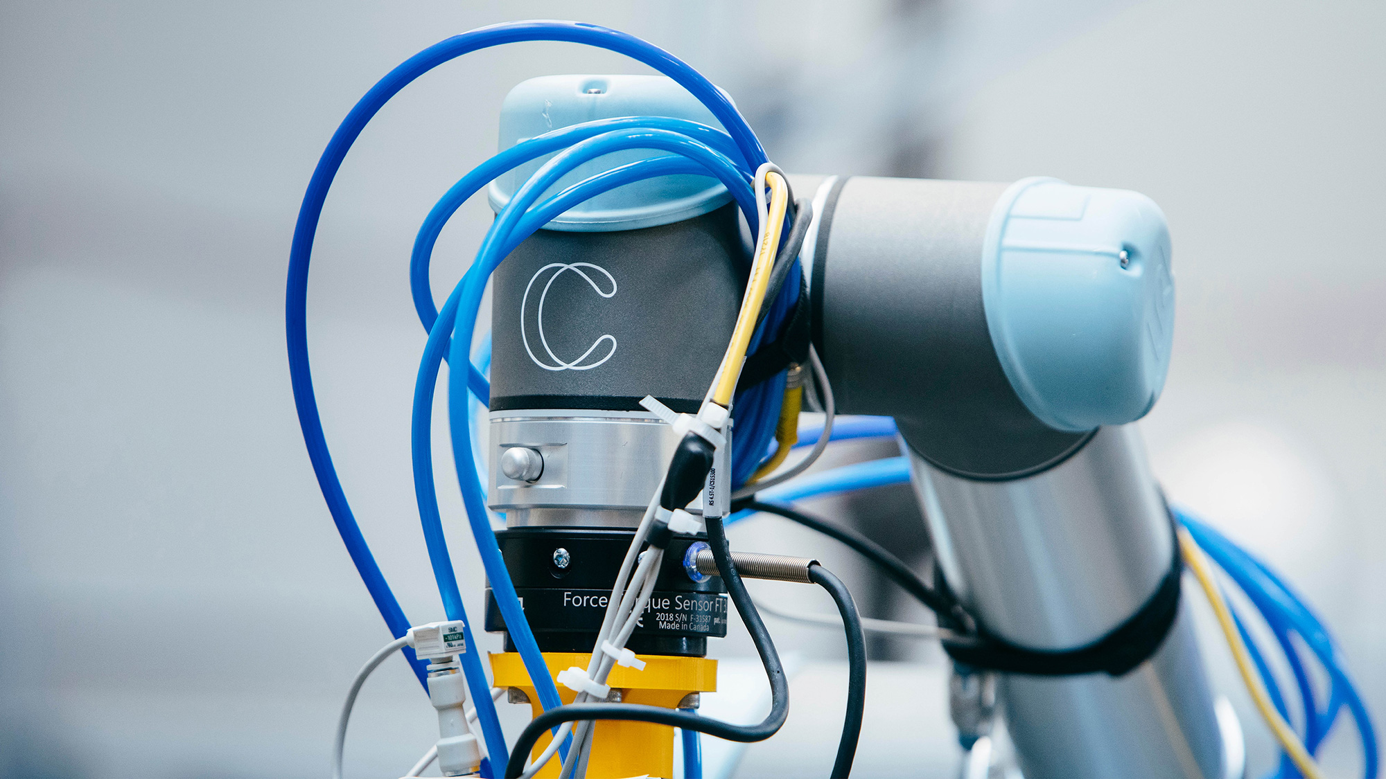
Established in 2017 (originally as Embodied Intelligence), Covariant is a company based in Berkeley, CA, focusing on artificial intelligence. Specifically, building a universal AI to give robots the ability to see, reason, and act on the world around them and, even more specifically, an AI to use with robots in warehouse operations (like sorting, picking, and shelving). Coming out of stealth mode two months ago, Covariant introduced its identity, designed by Pentagram London, UK, partners Luke Powell and Jody Hudson-Powell.
This groundbreaking technology is reflected in Covariant’s new brand identity. This revolves around the ‘Covariant Flow’, an abstract visualisation that represents the process of learning through what’s known as the ‘decision boundary’. A central component in the way neural networks learn, this intelligent layer always lives in the background, morphing and changing in response to external data.
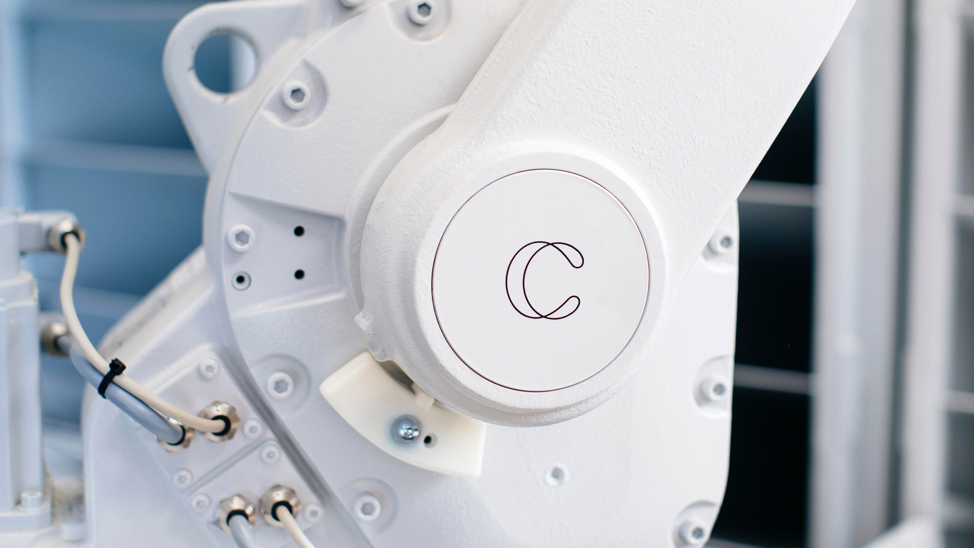
Both the Covariant wordmark and symbol mimic the curves, twists and flow of the decision boundary - this relationship is echoed in the animated version of the symbol and in the brand typeface, a high contrast geometric grotesque font family, which shares typographic similarities to the custom wordmark.
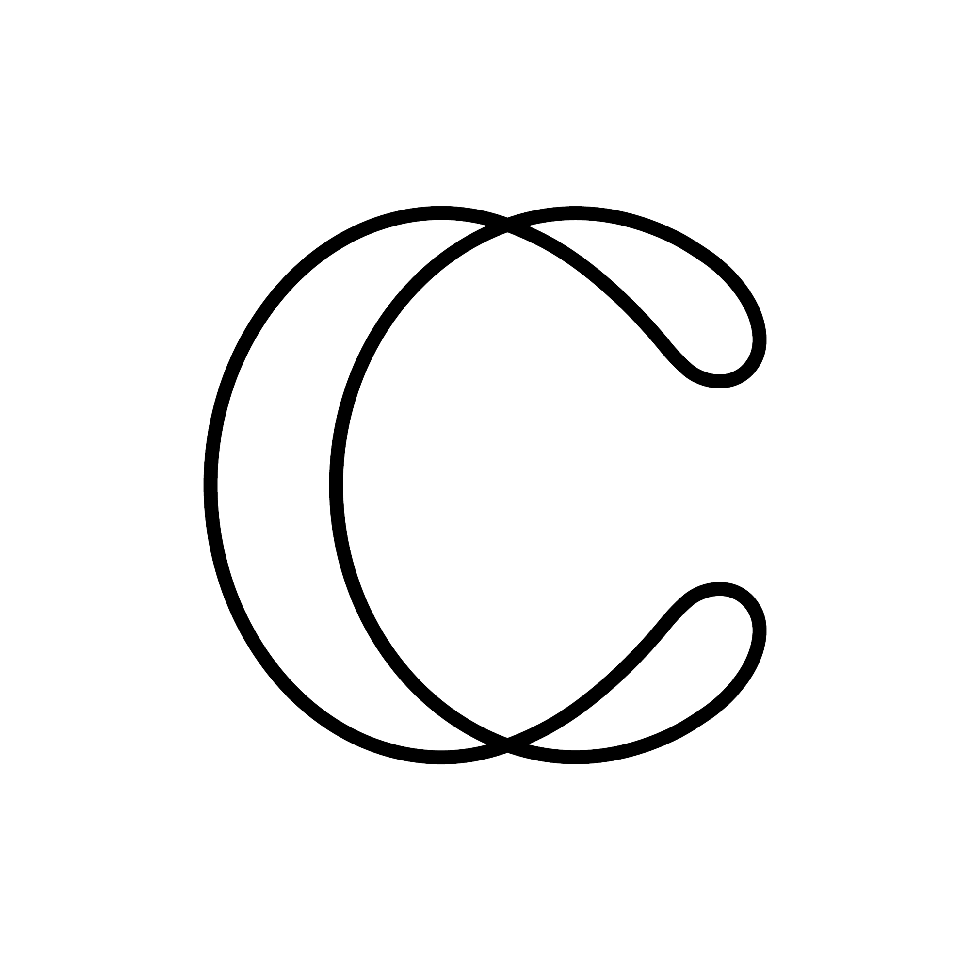
While they share a twisted — literally, not metaphorically as in they are crazy — element, the wordmark and monogram sort of live on their own… this time both literally (as in they never come together in a lock-up) and metaphorically (as in they don’t look like they belong together). The latter being a shame because I really like both elements on their own and I wish they shared a little more DNA between the two. The monogram has a very soft, very rounded construction and I love how the animation reveals so much depth and dimensionality when compared to the flat view. I think if the terminals of the monogram “C” had been made flat (or flatter) it would match so much better with the wordmark, which is also cool on its own. I really like how the “c” and “a”s are “pinched” in different spots and how they convey the twisting approach while also echoing the thin connections of the shoulders in the “r” and and “n”. I think it’s the harsh contrasts in the wordmark that I think are missing in the extra smooth monogram. Nonetheless, very much digging both things as individual things to be dug.
The design team built an app for Covariant for creating unique static and moving image assets. The form, speed, complexity and colour of the decision boundary can be altered manually in the app, and then the graphic can be exported in whatever size, length and format is needed for each platform. This leads to an infinite number of possibilities for Covariant, all within the parameters of the new brand identity.
The brand assets always appear in the friendly colour palette consisting of four core colours, which are a combination of human (red, pink, light blue), with a more serious and industrial feel conveyed by the petrol blue.
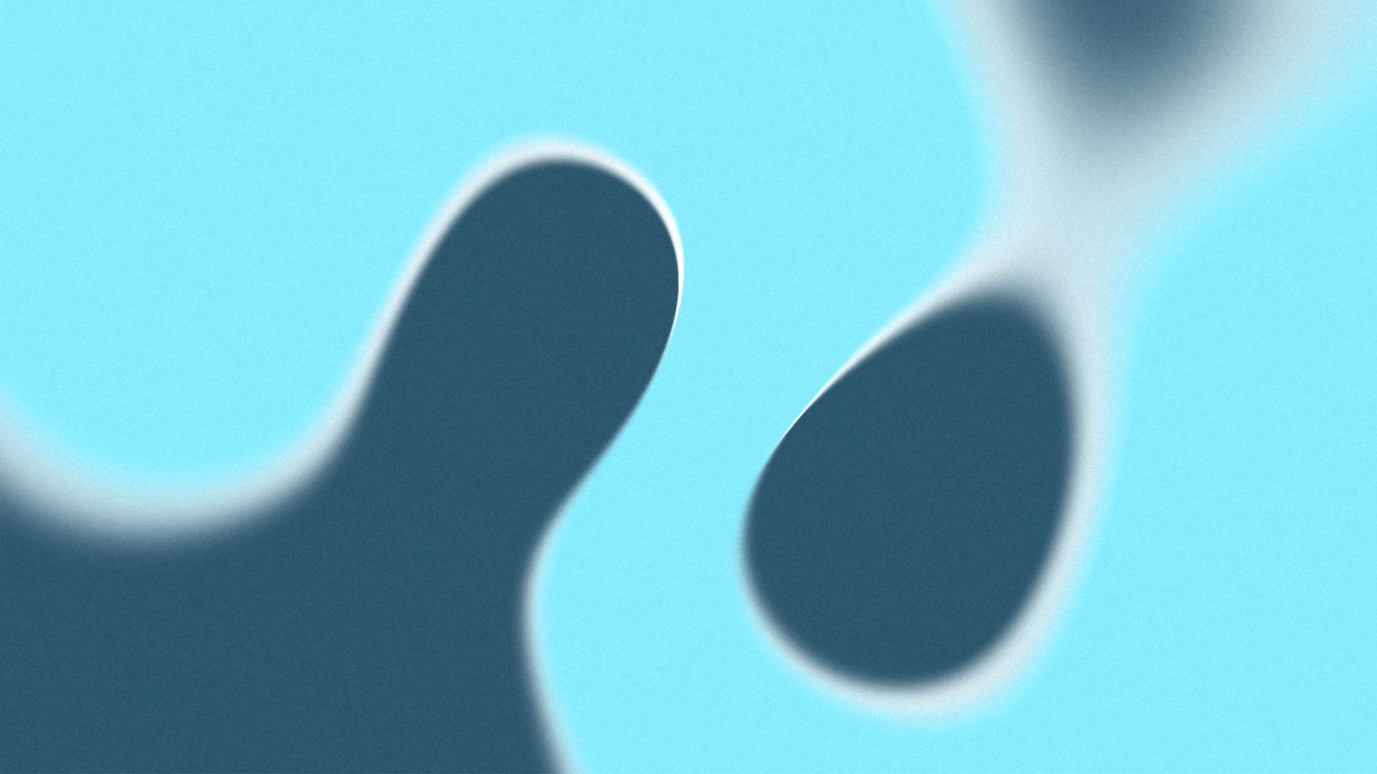
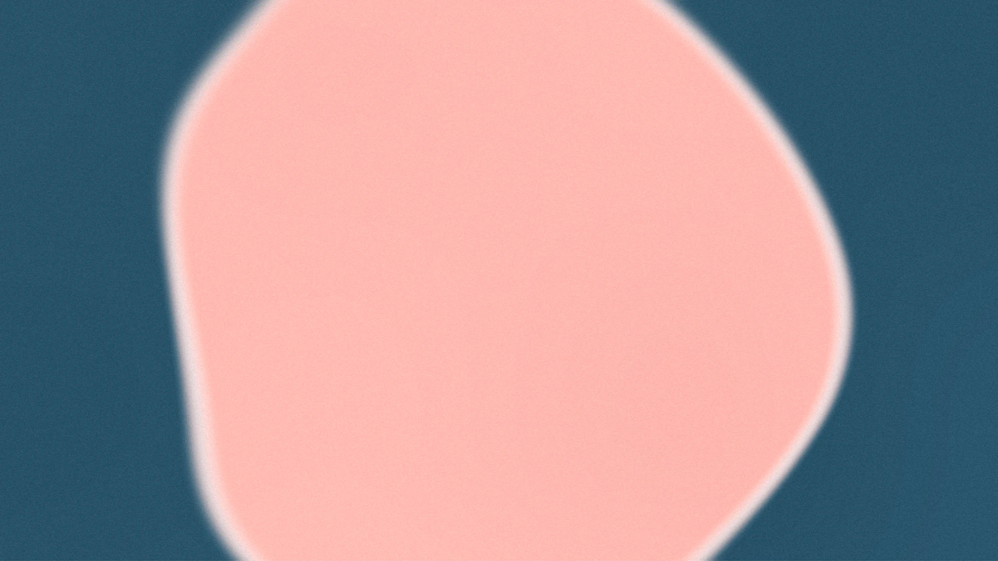
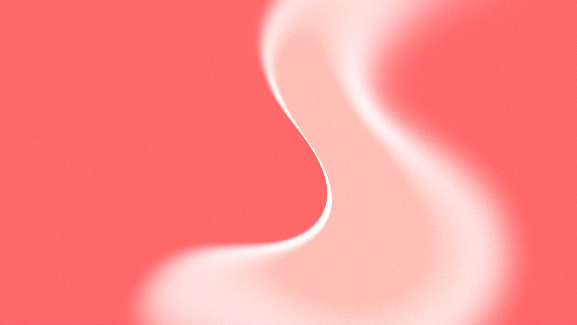
Another highlight of the project are these groovy abstract illustrations that have a great grainy-blurry texture to them and where the various, random curves build on the structures established by the wordmark and icon.
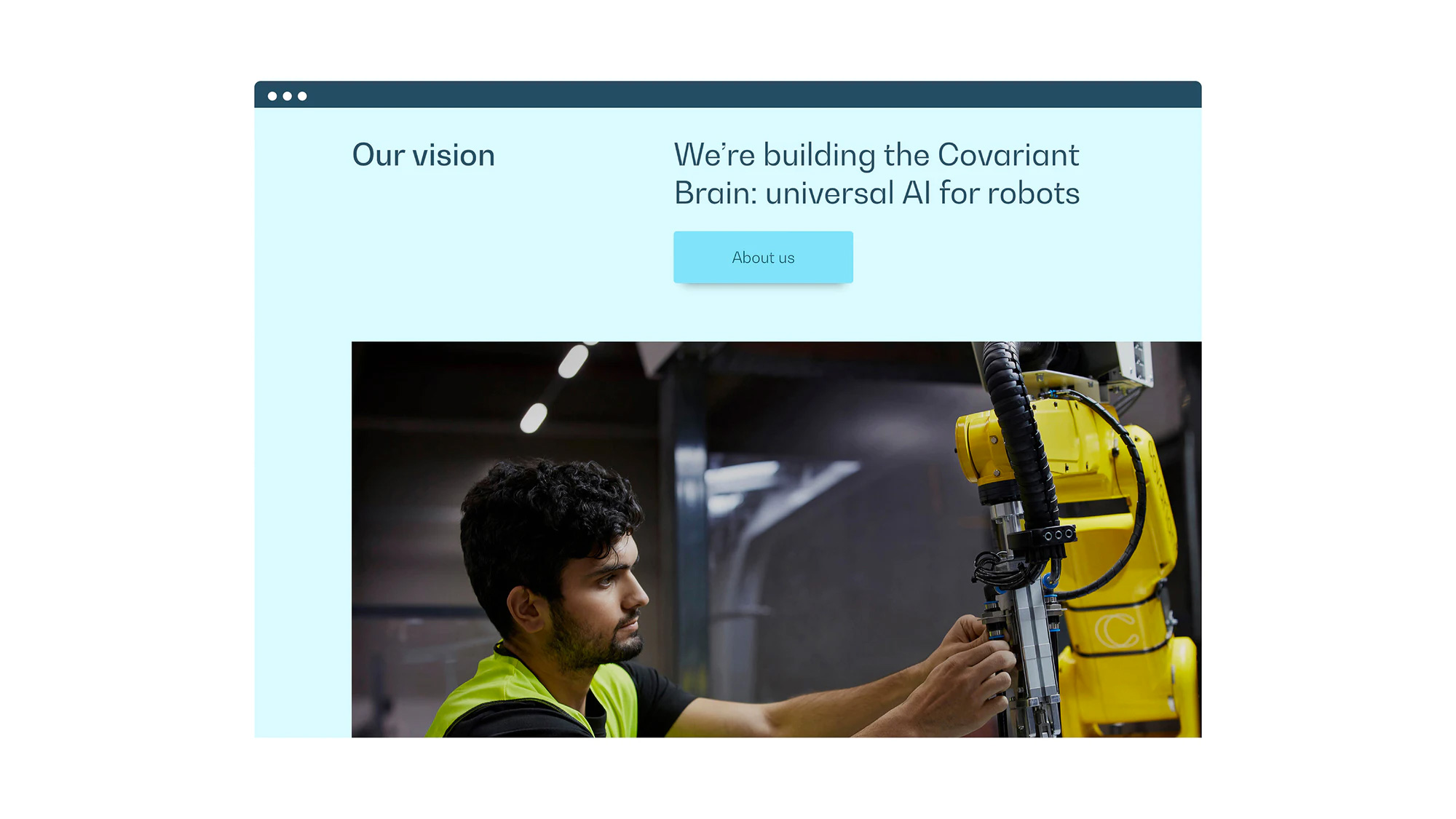
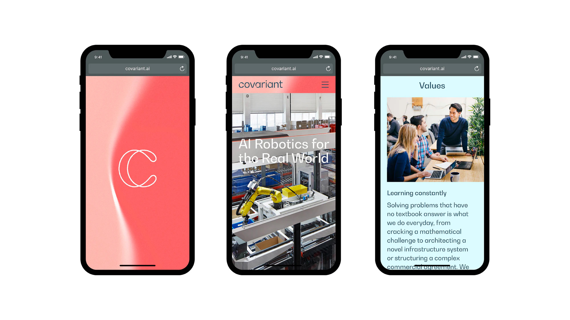
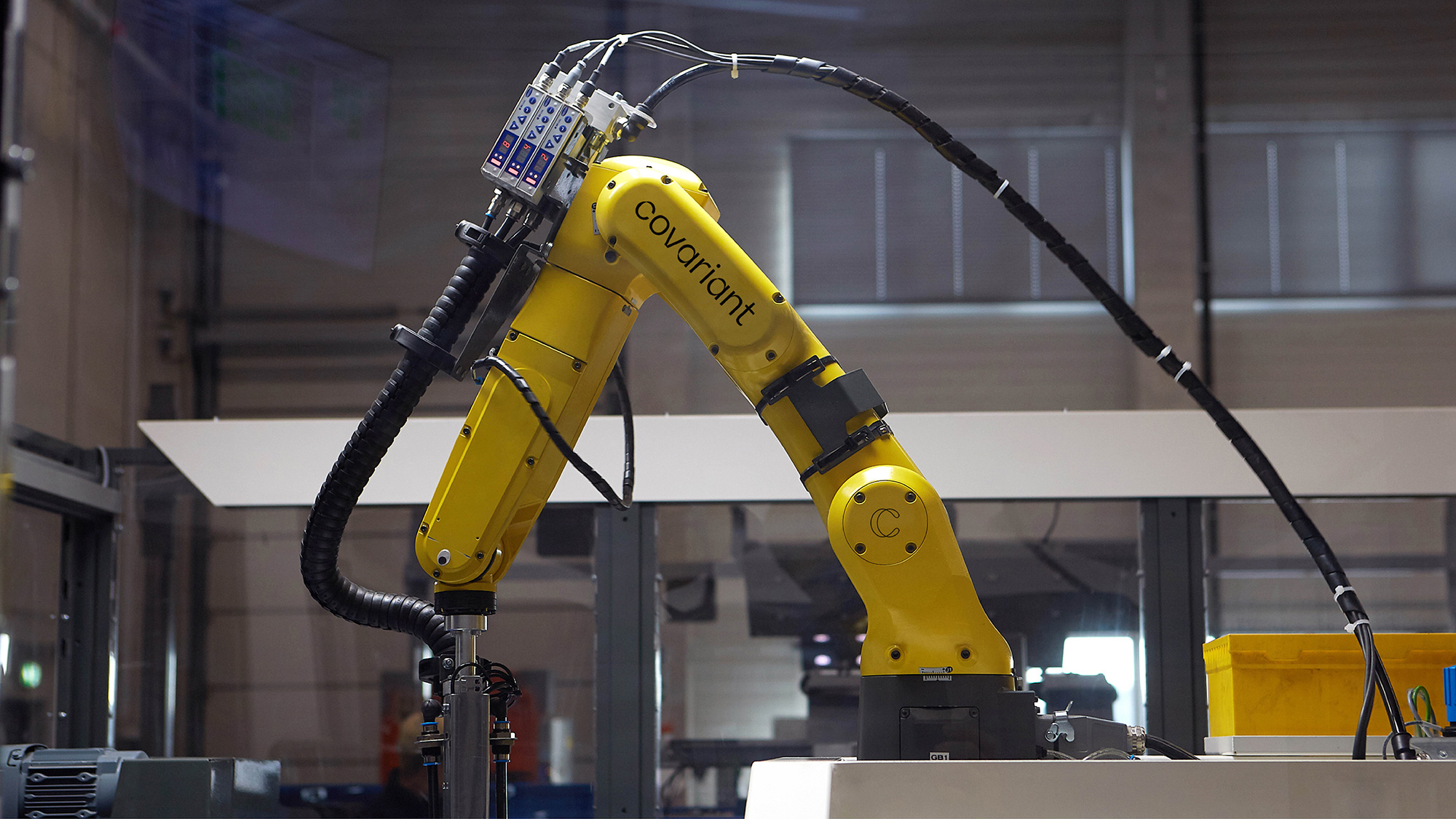
There aren’t any applications to see — logos on robot arms don’t really count even though they do look good — but the website captures all there is to capture about the company and it’s a pretty slick and really nice website to look at. Using a single type family, BW Gradual, and the animated graphics in the background — that sometimes peep through cut-out areas in the layout — the website has a very convincing and attractive AI-ish look.
Overall, this has just enough of a weird, futuristic aesthetic to indicate the potential AI implications of their work but it doesn’t go into full Black Mirror territory where it seems like a robot dog will eventually destroy you.
 each year since publication began in 2006

 Новости Союза дизайнеров
Все о дизайне в Санкт-Петербурге.
Новости Союза дизайнеров
Все о дизайне в Санкт-Петербурге.