Обзор лучших ресурсов по разработке бренда, разработке упаковки
contact us | ok@ohmycode.ru
contact us | ok@ohmycode.ru
Established in 1999, Aegean Airlines is the flag carrier airline of Greece and the largest in the country by total number of passengers carried, number of destinations served, and fleet size. Aegean travels to a network of 151 destinations — 31 domestic and 120 international — in 44 countries with a fleet of 61 aircraft that is going to expand to include 46 new A320neo and A321neo jets by 2025. This month, Aegean introduced a new identity designed by London, UK-based PriestmanGoode.
PriestmanGoode wanted to nod to AEGEAN’s former gull logo, which was widely loved both by customers as well as by AEGEAN staff. The team transformed it into a modern form that references the brand’s heritage, but also references the landscape and the architecture of Greece more broadly.
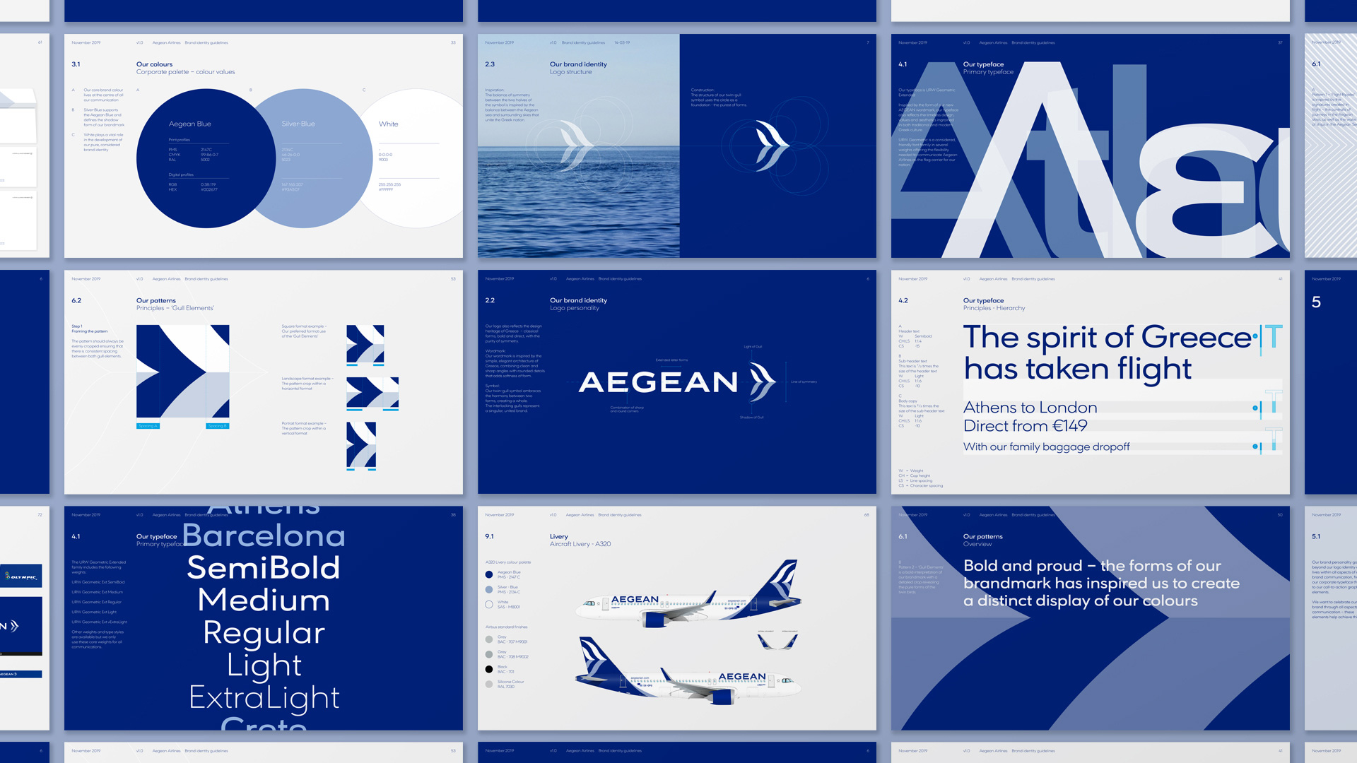
The new AEGEAN logo consists of two elements: the AEGEAN wordmark and the twin-gull symbol. The designs reflect the design heritage of Greece, with its classical forms, bold design and purity of symmetry. The wordmark combines clean and sharp angles with rounded details that add softness of form, reminiscent of classical Greek architecture. The twin-gull symbol embraces AEGEAN’s key values of harmony and symmetry taking inspiration from the balance between the Aegean Sea and surrounding skies that unite the Greek nation.
The old logo was pretty sad with an icon that looked like it belonged on a cheap hotel by the sea but that was across the street without direct access to the beach, which I realize is a very specific simile but that’s where my mind went more quickly than national flag carrier. The wordmark was not terrible. The new logo is a massive upgrade, giving the airline a proper representation that is in tune with other flag carriers. The wordmark is perhaps a little TOO in tune, with an extended sans serif approach that is the same as many other large airlines and has the prerequisite angled cuts on the “E” and small rounded corners but also, for who knows what reason, it does that thing where half the corners are rounded and half are not. The “G” holds the whole thing together as interesting and I like how it keeps the short horizontal stroke from the old wordmark. The biggest improvement is the new double-gull icon in an abstract, aerodynamic rendition that pairs what could be interpreted as a parent bird and a baby bird flying together. Metaphors aside, it’s a nice-looking icon that signals airline! swiftly. I’m not crazy about the baby blue used… I feel like the second color could be something more interesting. Still, it’s a pretty solid icon.
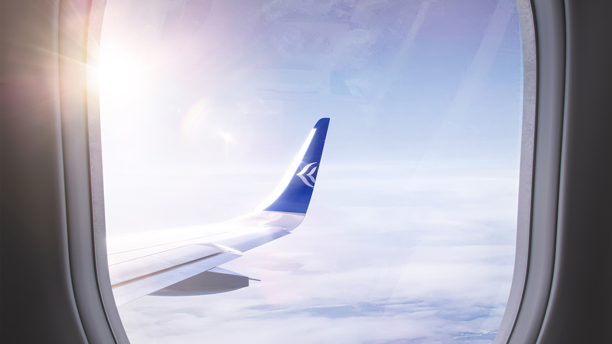
The new brand identity further represents the Greek spirit through a core colour palette of AEGEAN Blue, Silver Blue and White, and celebrates the whites and silver-blues of the Greek skies, and the vibrant blue of the Aegean Sea.
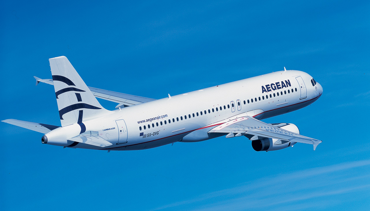
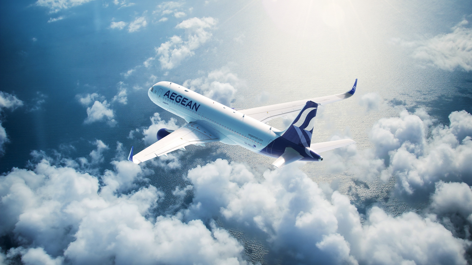
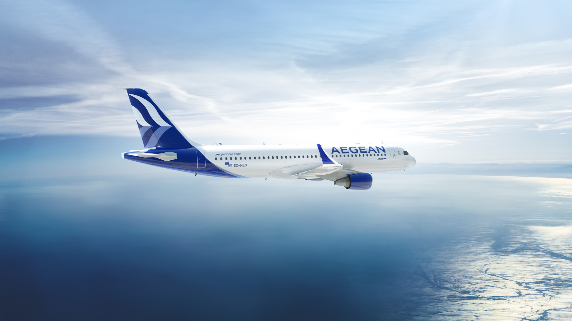
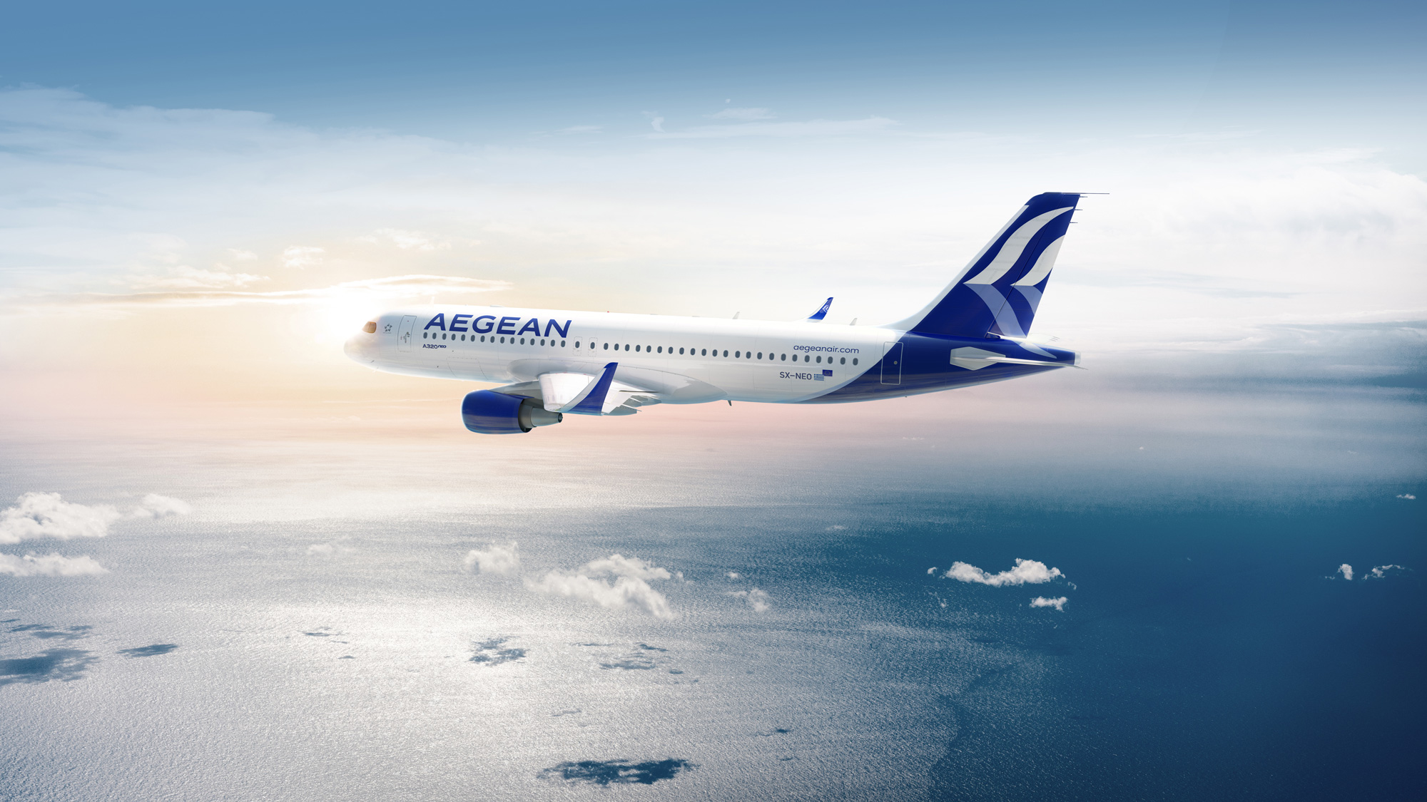
The old livery was as sad as the logo, with the bare minimum amount of design effort exerted on it. The only thing sadder than the old logo? Half of the old logo cropped on the tail. The new livery is not amazing but definitely a huge improvement. The wordmark fills up the front of the plane a lot better and the dark swash of paint along the tail nicely frames the new icon. I realize it would be super expensive but I would have loved to see the angled stripe pattern on the fuselage.
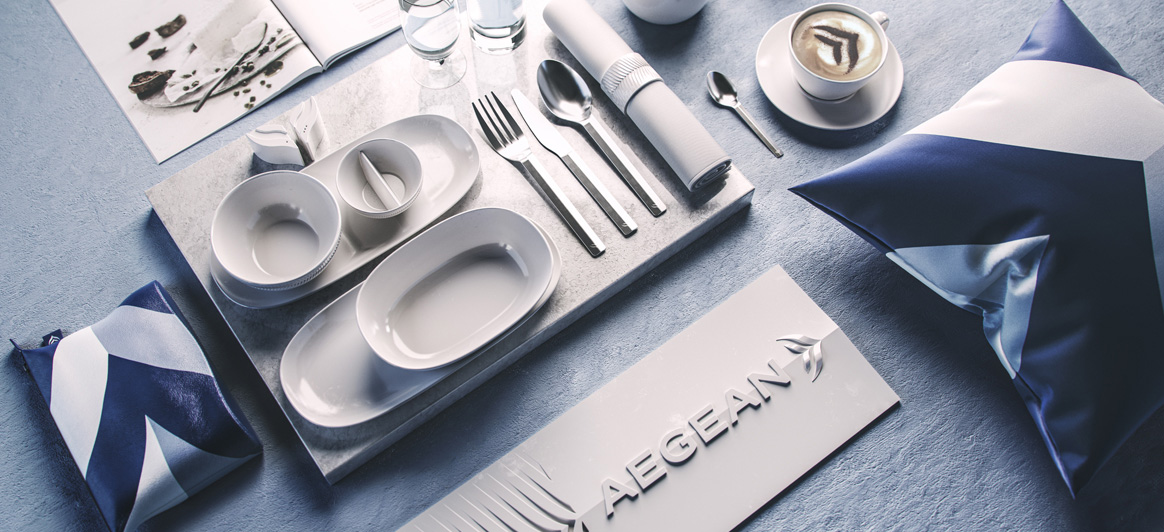
PriestmanGoode has also designed all new cabin interiors for AEGEAN’s new fleet of A320neo, which further reflect Greece’s cultural heritage, and translate the new brand into an onboard environment. Brand motifs have been transformed into subtle patterns to use on textiles, while a signature brand panel sits at the front and back of the cabin. All material finishes have been custom-designed and are unique to AEGEAN.
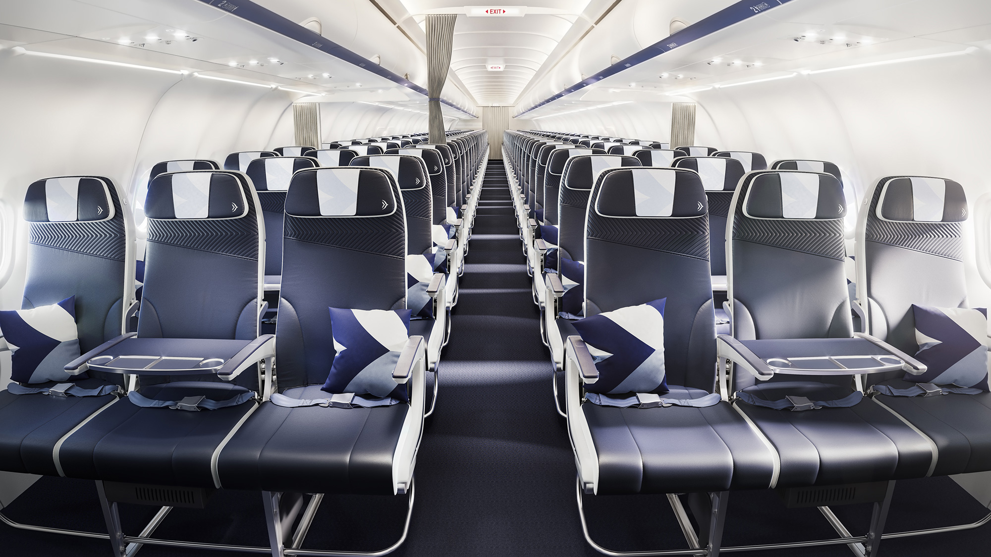
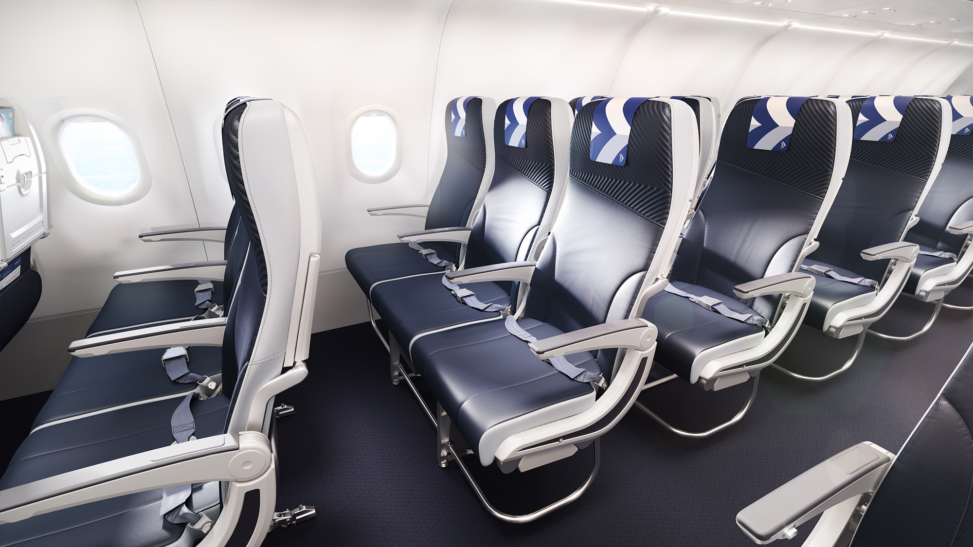
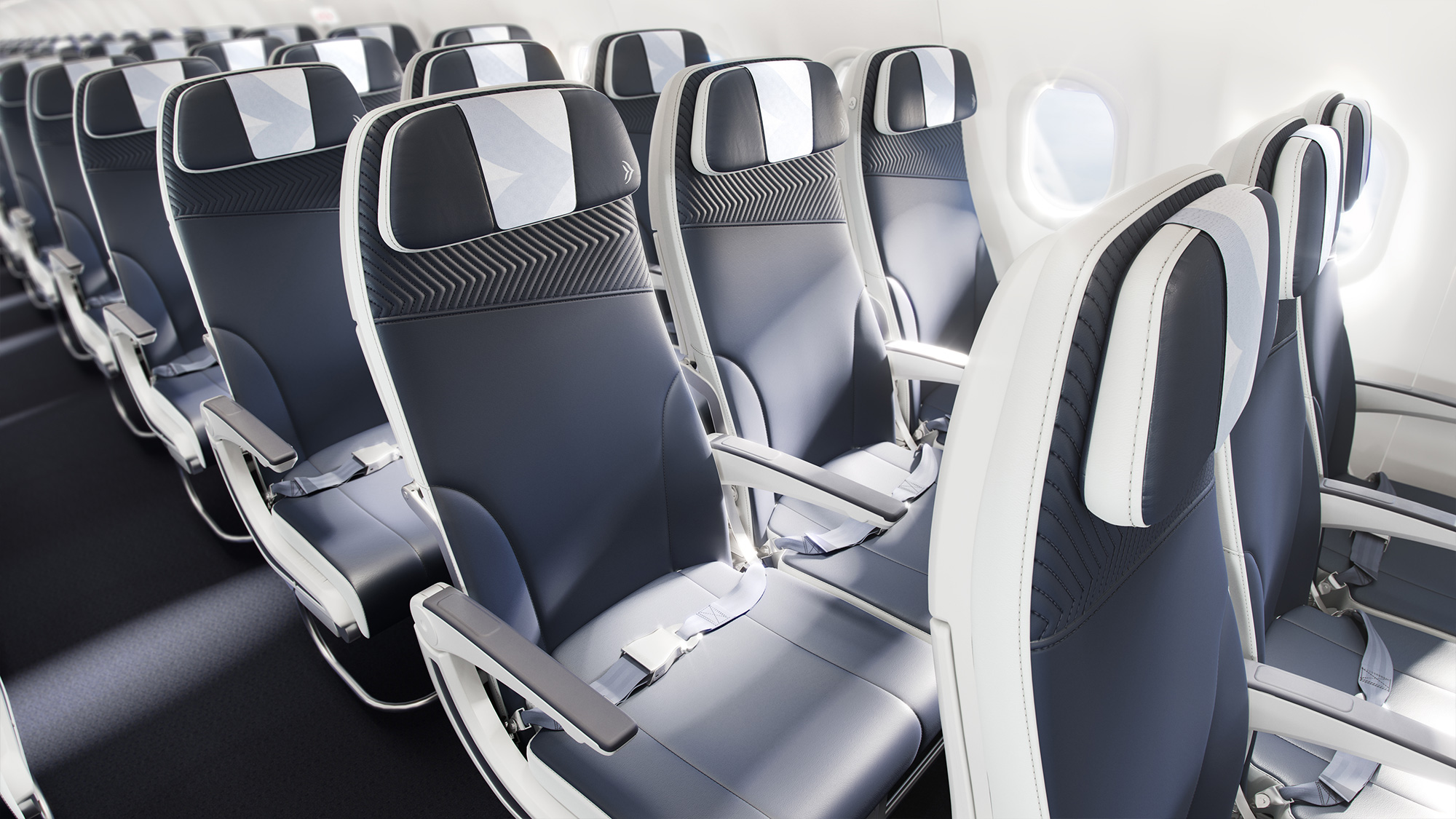
The cabin looks slick. I really like what they have done with the seats, building in a graphic element into each of the pieces that make up the seat. The pillows look great to the point where I would consider stealing one to put on my sofa and the angled stripe pattern achieved through stitchin’ is bitchin’.
Overall, this was a much needed redesign and the update delivers an identity on par with other national airlines that, even if it’s not the most groundbreaking, it looks contemporary, trustworthy, and classy.
 each year since publication began in 2006

 Новости Союза дизайнеров
Все о дизайне в Санкт-Петербурге.
Новости Союза дизайнеров
Все о дизайне в Санкт-Петербурге.