Обзор лучших ресурсов по разработке бренда, разработке упаковки
contact us | ok@ohmycode.ru
contact us | ok@ohmycode.ru
Established in 2009, Cloudreach is a leading, global cloud solutions provider, helping companies take advantage of public cloud services like Amazon Web Services, Microsoft Azure, and Google Cloud Platform. With more than 1,000 employees in 20 offices across the world, Cloudreach works with clients like Hearst Corporation, Time Inc., Eurostar, Penguin Random House, Moonpig, and more, offering services that “make [their] systems, processes and culture cloud-ready” and services that “help [them] continually maximize returns and seize new opportunities”. I’m not exactly sure what that means but they seem to be doing it at the highest level. Recently, Cloudreach introduced a new identity designed by the London, UK, office of Siegel+Gale.
The new brand positioning expresses Cloudreach’s strong competitive advantage. Its capabilities go beyond leveraging the full benefits of cloud technology to cultural transformation—its services and software create behaviors and cultures that drive innovation and a better way of working. Cloudreach’s new tagline—Elevate your future—is a clear expression of its brand mission and personality.
“Cloudreach has an innate understanding of what the future looks like, giving them the ability to help their customers stay one step ahead and successfully navigate their migration to the cloud.” said Deva Corriveau, Design Director, Siegel+Gale. “To suggest this predictive quality, the graphic style of the brand recalls isobar diagrams on a weather map, creating a visual language that subtly references ‘the cloud’ and, more importantly, the elevated perspective that customers of Cloudreach benefit from.”
The old logo was mostly okay, with dynamic-looking arrow-like things going upwards (presumably into the cloud) in formation, along with a decent, techie typeface, which was fine until someone couldn’t resist making the “A” look like the flying arrows, making that letter stand out like a sore thumb. It was all fine but didn’t exactly feel like a category leader. The new logo has a more confident presence with a bold — really bold — wordmark and a groovy accompanying graphic masked in a circle that gives it a globe-like quality. The graphic is an abstraction of isobars, a “line on a weather map of constant barometric pressure” that help weather forecasting so there is a slightly ambitious concept behind with a slight stretch of relation to their services in that Cloudreach can help navigate the ups and downs of the cloud as if it were the weather. Or something. Point being, the identity isn’t just a generic sans serif with all the colors and faceless people illustrations — there is some sort of conceptual exercise in play and it’s quite alright. The isobar graphic looks good in the thin line approach on the logo but it comes nicely to life in the 3D renderings.


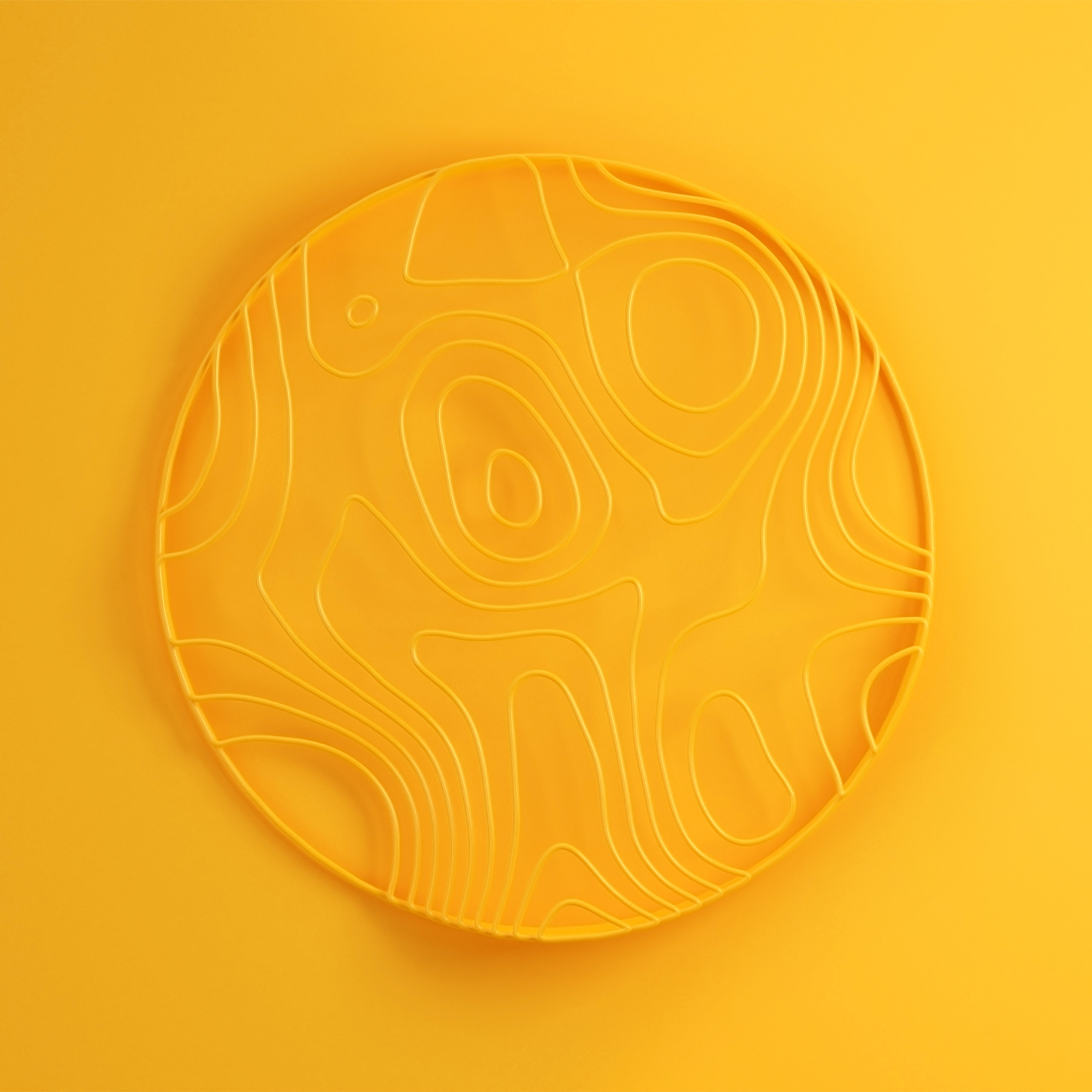
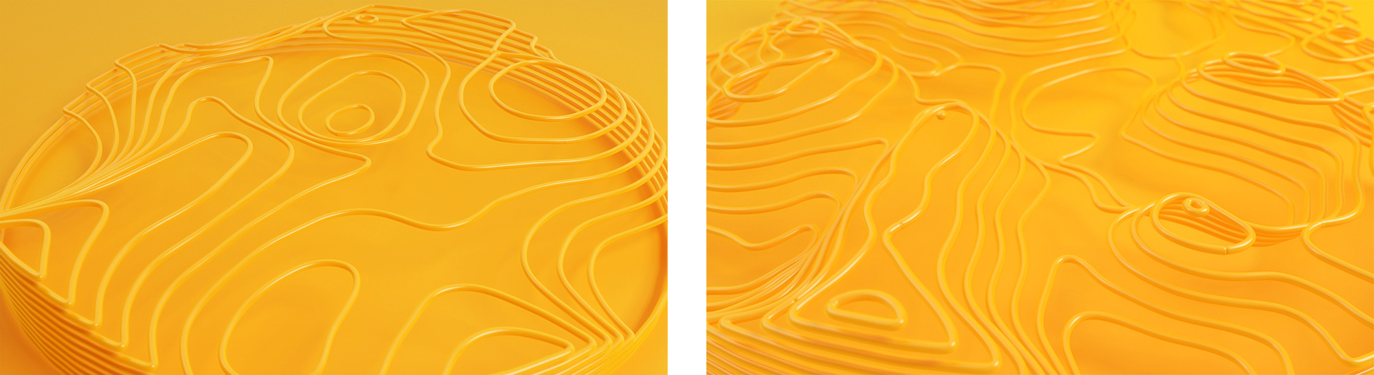

The renderings become attractive and engaging backgrounds for the applications that, along with the yellow brand color, ever so slightly avoid the usual cloud aesthetics of blue and green computer-looking things. The thin sans serif used for headlines looks good in contrast with the bold wordmark and 3D backgrounds (not so much with the line-art background in the posters below).
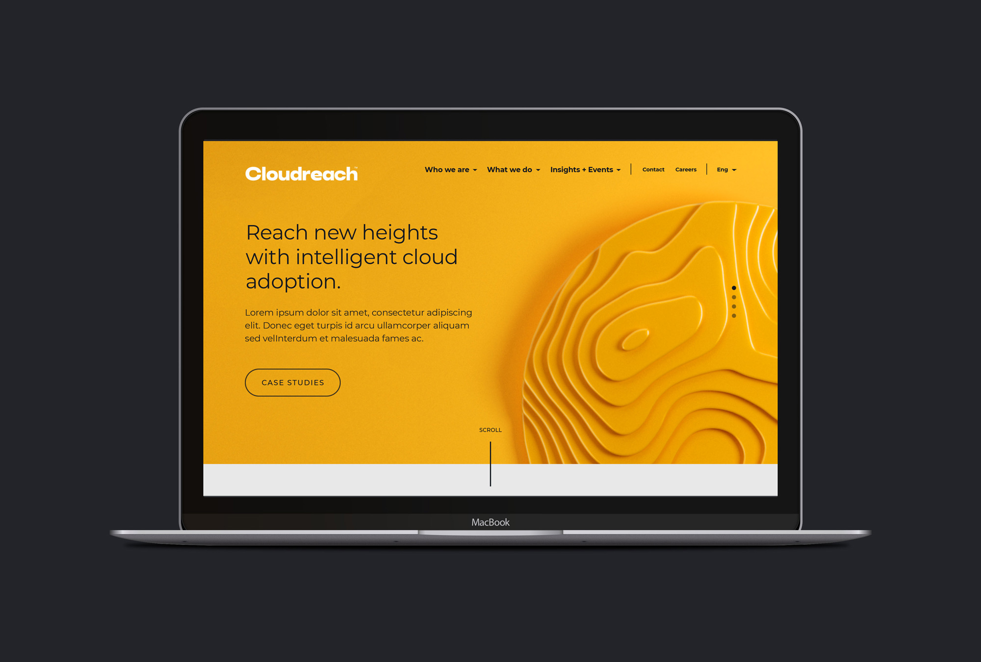
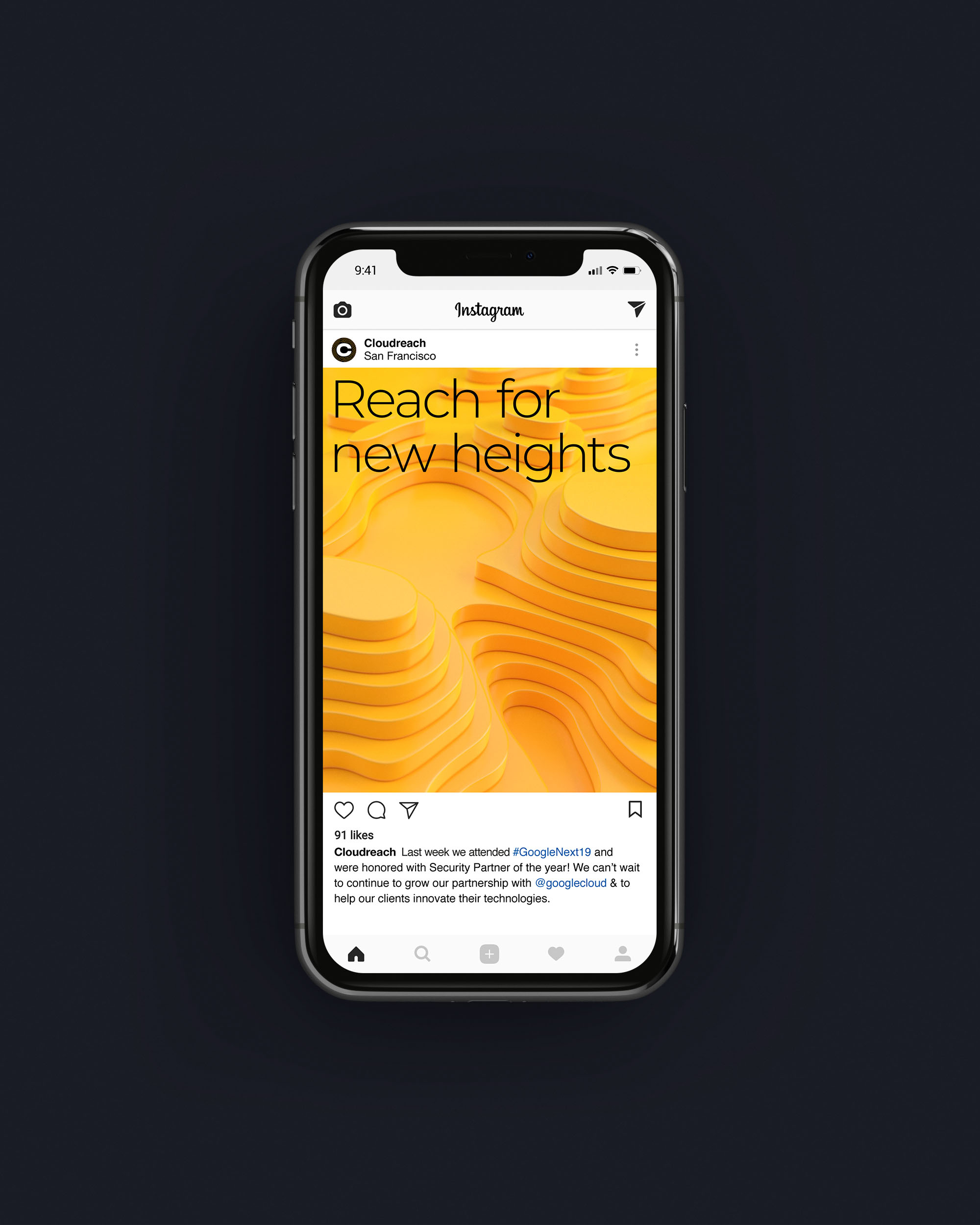
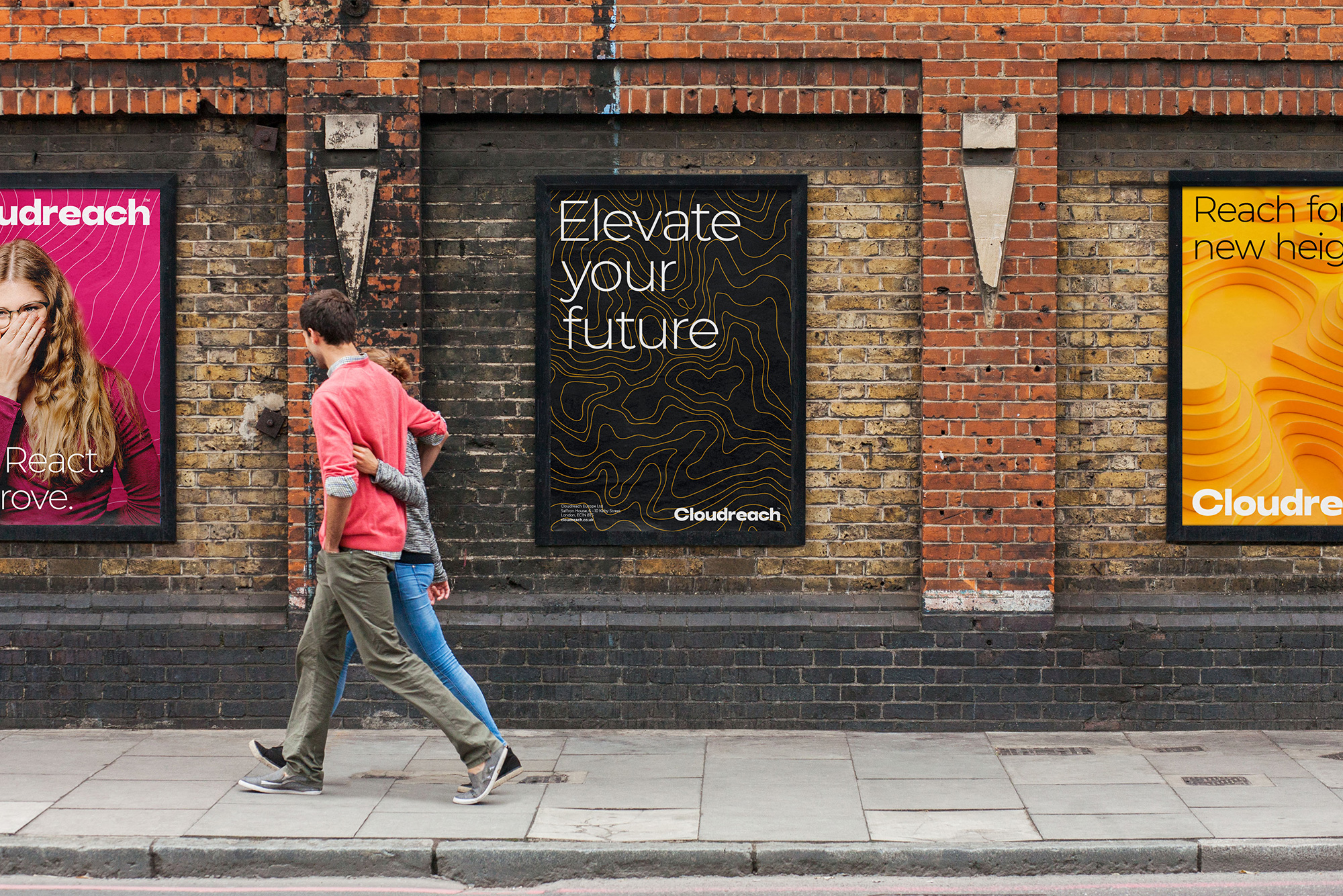


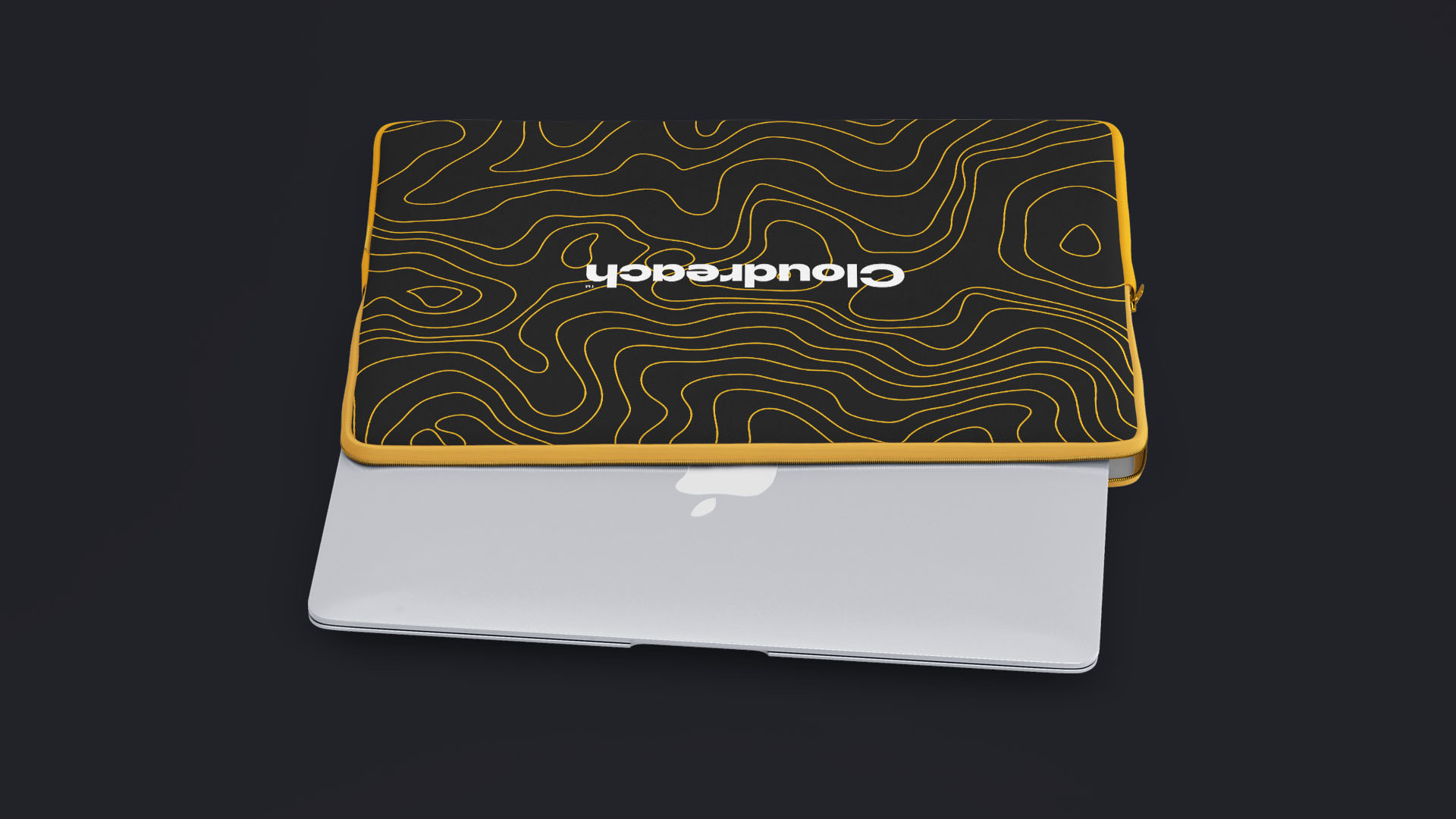

The applications are fine… it’s mostly the logo on surfaces. For some reason, in this particular case, I wish the renders were less aspirational and more grounded… like, just show me the business cards, employee ID card, or office pens… street posters that are not going to happen look cool but I want to see real, dorkier approaches. But I digress. Overall, I really like the isobar graphics visually and as a different interpretation of cloud services and how they help Cloudreach look like a more interesting, attractive, and thoughtful company to work with and for.
 each year since publication began in 2006

 Новости Союза дизайнеров
Все о дизайне в Санкт-Петербурге.
Новости Союза дизайнеров
Все о дизайне в Санкт-Петербурге.