Обзор лучших ресурсов по разработке бренда, разработке упаковки
contact us | ok@ohmycode.ru
contact us | ok@ohmycode.ru
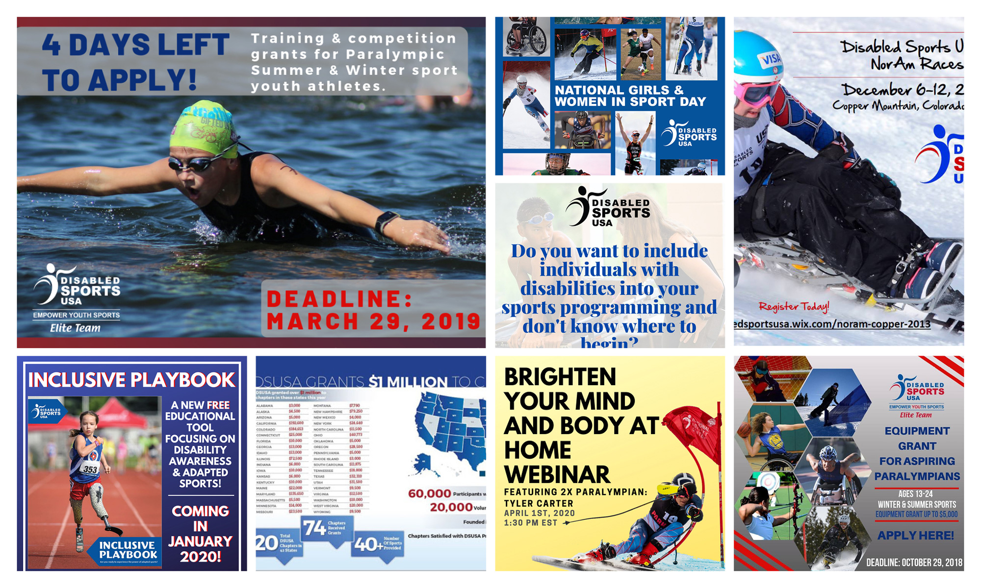
Established this year as a merger of Disabled Sports USA (est. 1967) and Adaptive Sports USA (est. 1956), Move United is a non-profit organization and a member of the United States Olympic & Paralympic Committee with the mission to “provide national leadership and opportunities for individuals with disabilities to develop independence, confidence, and fitness through participation in community sports, competition, recreation, high performance sport and educational programs.” With 150 community-based chapters in more than 40 states nationwide, Move United helps over 70,000 young and adult athletes train and compete in more than 50 sports with the help of over 30,000 volunteers. With the merger announcement earlier this month, Move United introduced its new identity, designed by the New York, NY, office of Superunion.
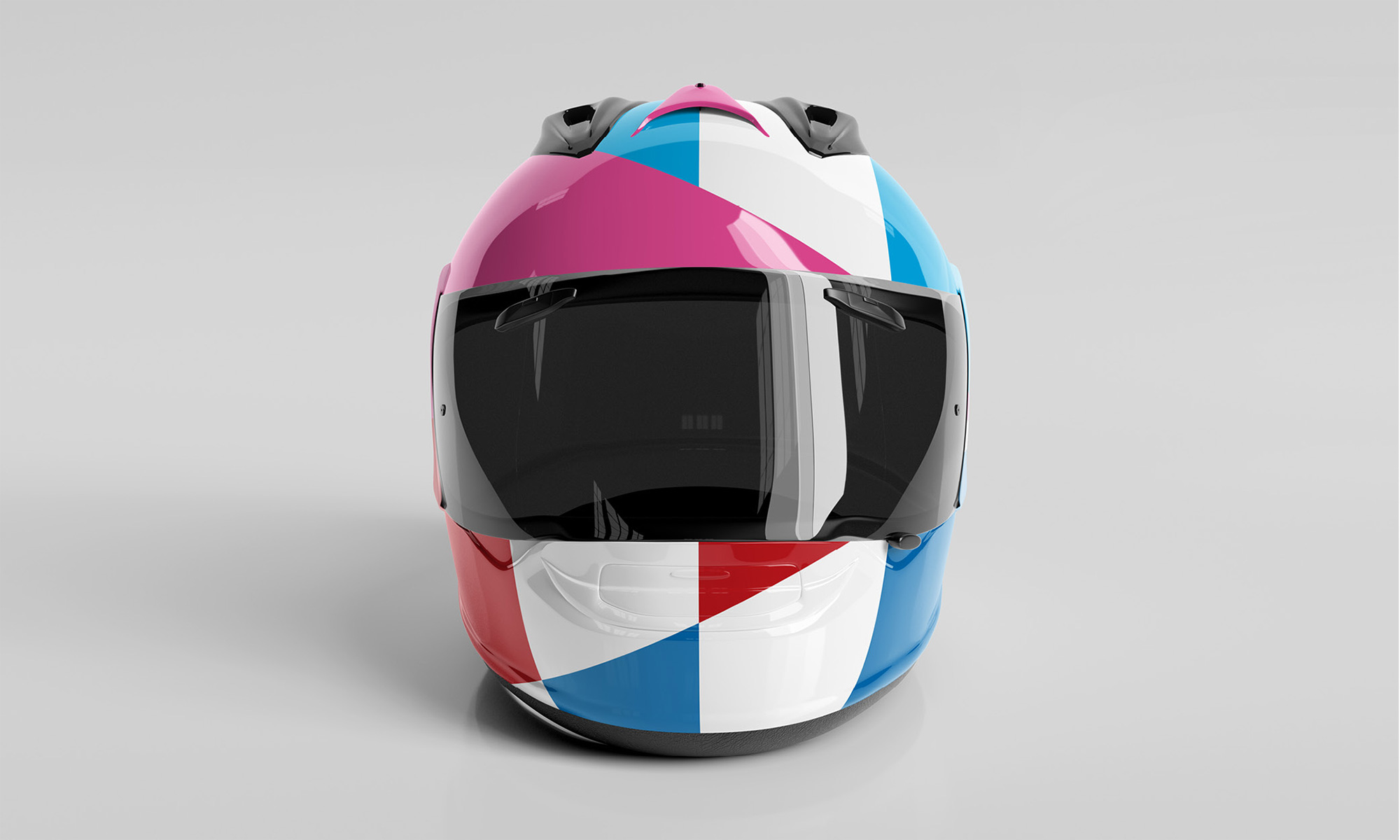
To shatter stereotypes and shift the narrative from disabled to this abled, Disabled Sports USA and Adaptive Sports USA have merged to become Move United. As two of the largest national adaptive sports organizations with decades of history and over 100,000 athletes combined, they’re fueling a movement that invites anyone to compete, play, or move. The new visual identity redefines what disability looks like, by taking the word “disability,” breaking it down into 29 pieces, and using those pieces to create a whole new language. This same idea is carried throughout the system of patterns, which breaks down the stars and stripes of the American Flag and rebuilds a new identity from it, resulting in a look and feel bold enough to support the movement.
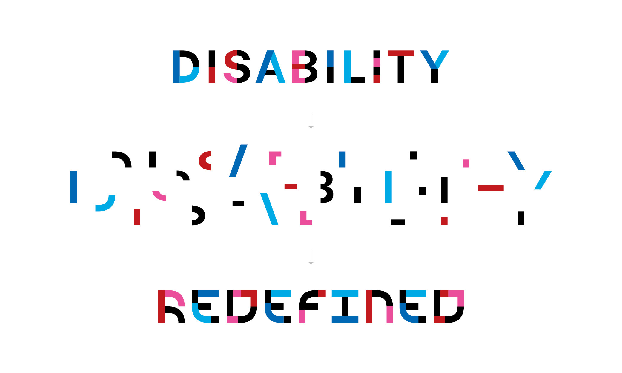
It’s not easy, at all, to negatively criticize the logos of two organizations that do so much good for so many people but, well, the two previous logos were not very good at all and, interestingly, they were both not very good at all in almost the same way, using ambiguous human shapes in rather awkward depictions of motion and accompanied by generic typography. Along with the new name, the new logo feels much more empowering and action-oriented as well as coming across as being a bigger social/physical movement. The concept behind the logo — to literally break apart “Disability” and rearrange it — is strong and supports the resulting odd letterforms as a way of conveying a sense of transformation and of looking at things differently. Design-wise, it’s an interesting result that definitely stands out but there are a few issues here and there with some letters being more successful than others and a strange dynamic between really wide letters like the “O” and “D” and the rest of the letters. The “m” is quite nice in its abstraction but that doesn’t really happen anywhere else. The lone “D” in the second line stands out too much not just because it’s so far out to the right but because it’s the least pleasant letter BUT I understand that it ended up all the way out there so that the “m” and the “u” could align to eventually merge into a monogram that makes an abstract torch, which is pretty damn great.
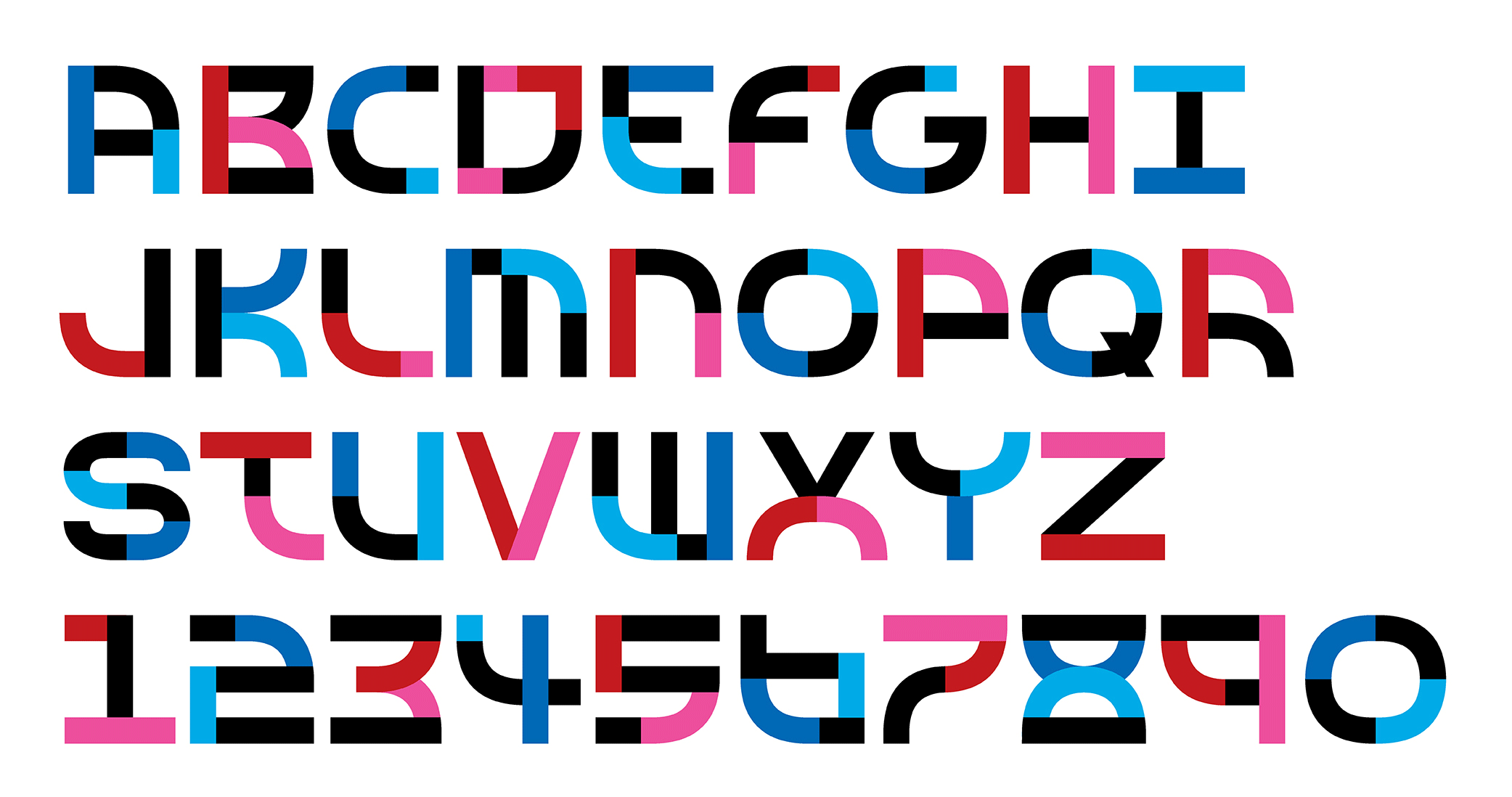
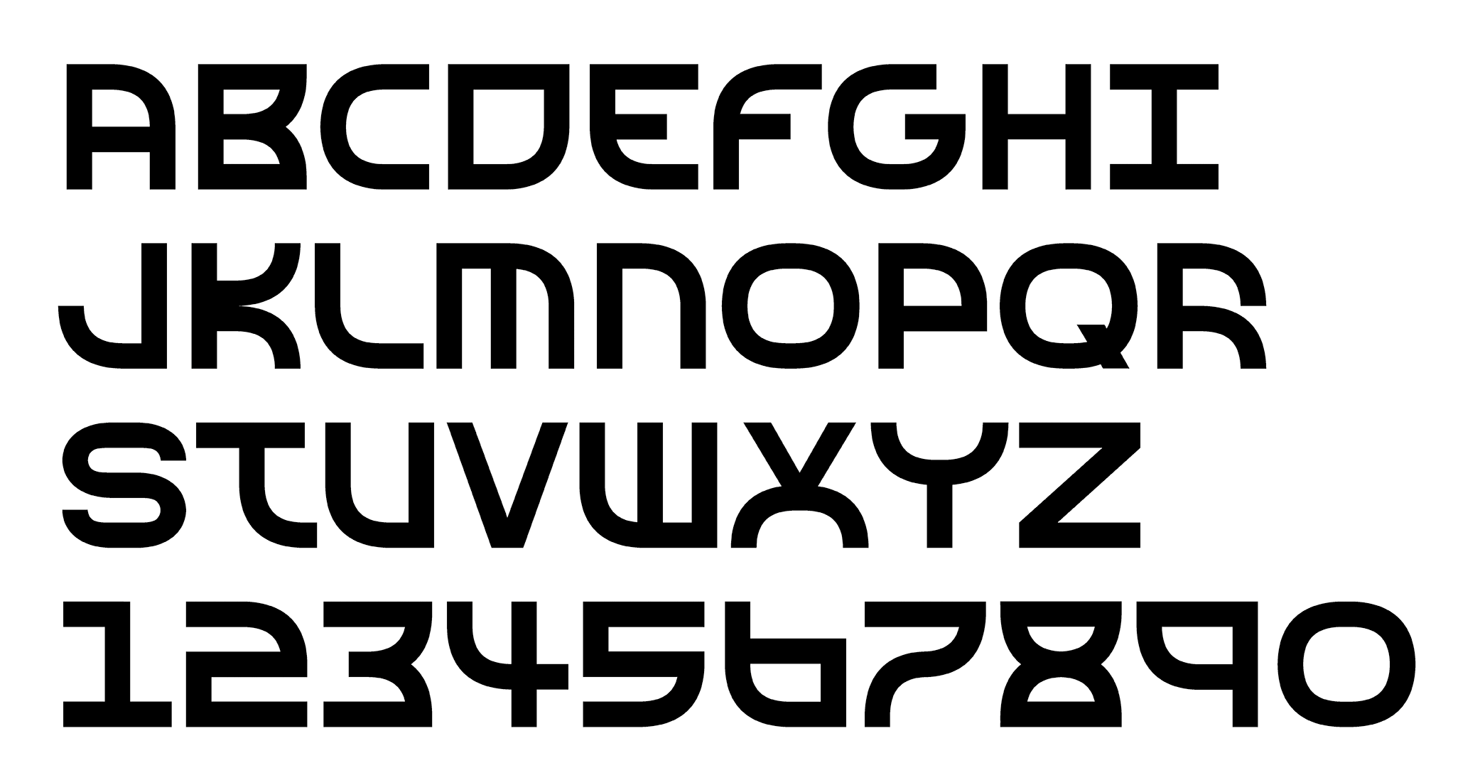
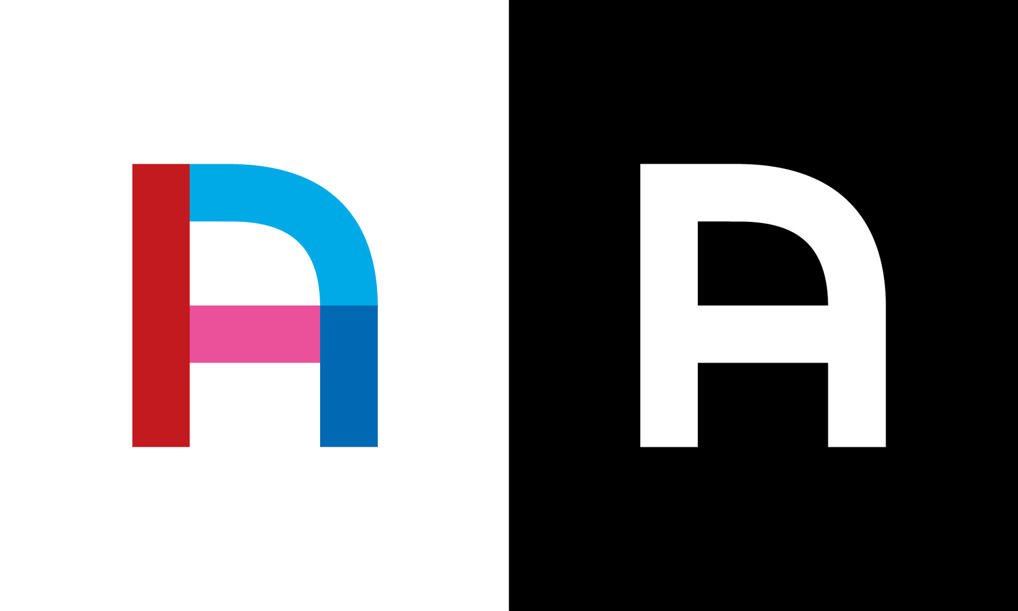
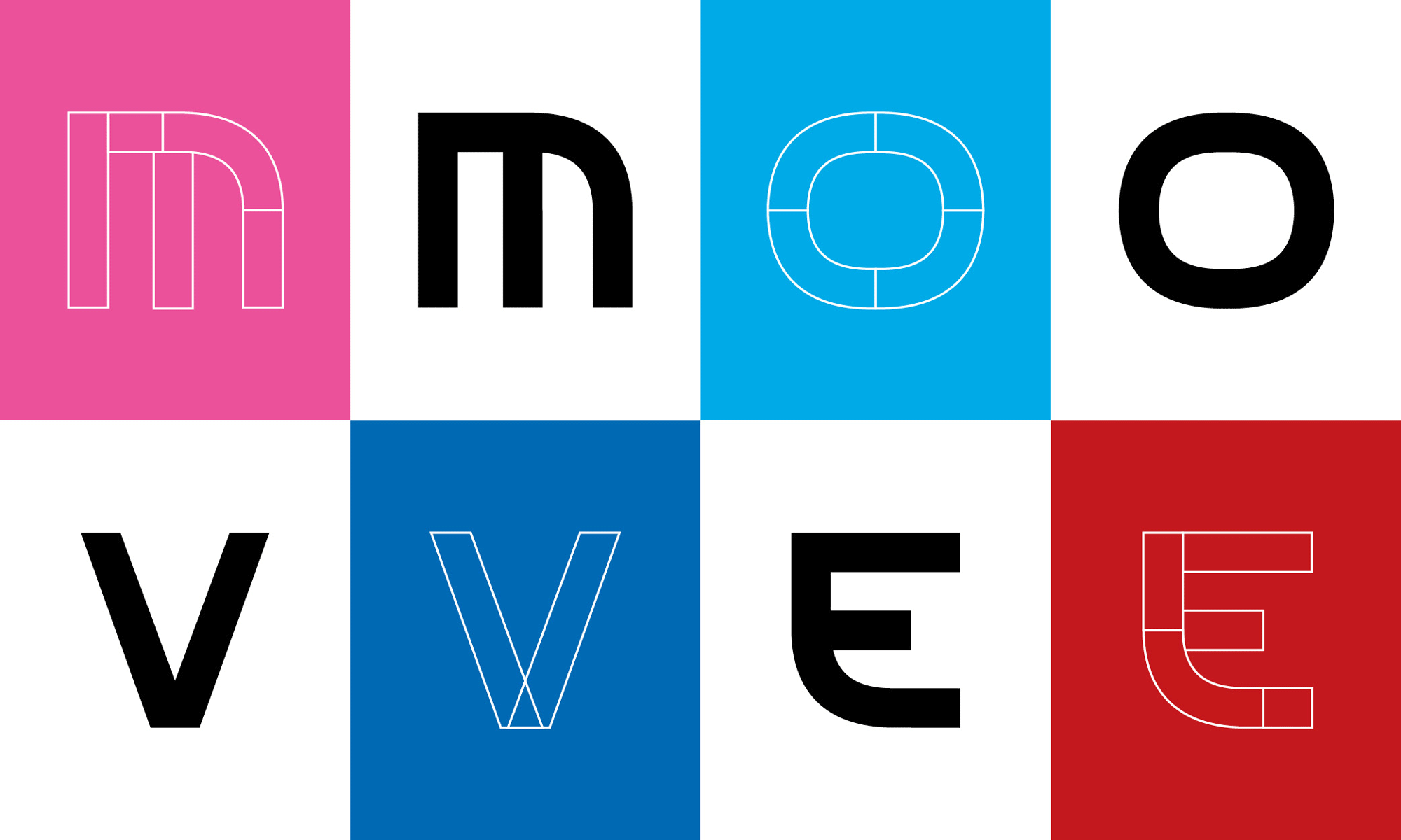
The custom display typeface only works when it’s used in multiple colors because you can see the pieces that were puzzled together into readable letterforms. When the letters turn black (or any other single color) it results in a very jarring alphabet that feels like early digital font designs from the 1990s. But, yeah, in multi-color I can get behind it.
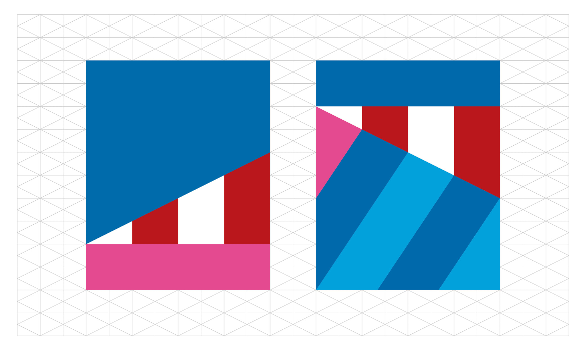
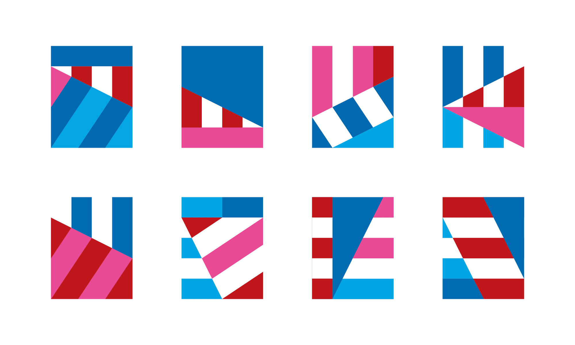
The patterns are really great and rather unique. I like how they are USA-ish but not in an overt way. The pink and light blue colors really help to add range to the palette and make it far more interesting than just the traditional red, white, and blue.
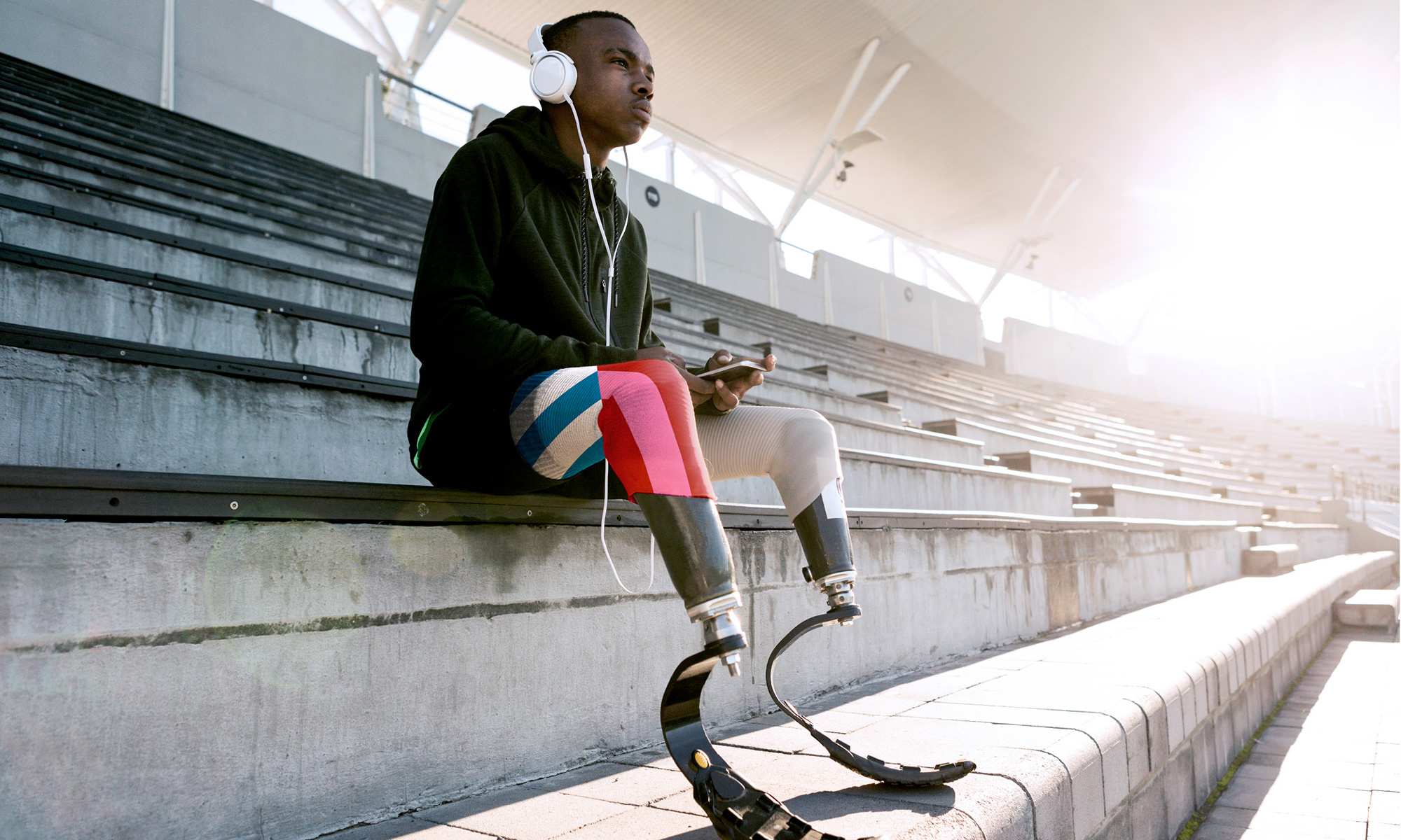
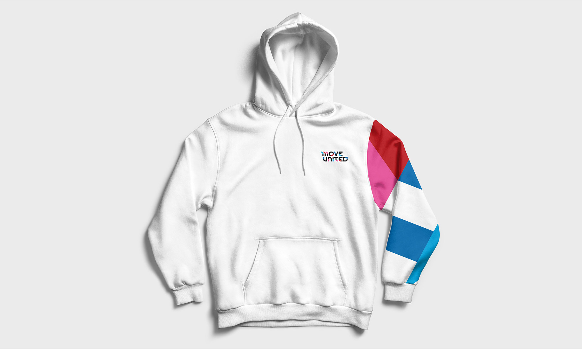
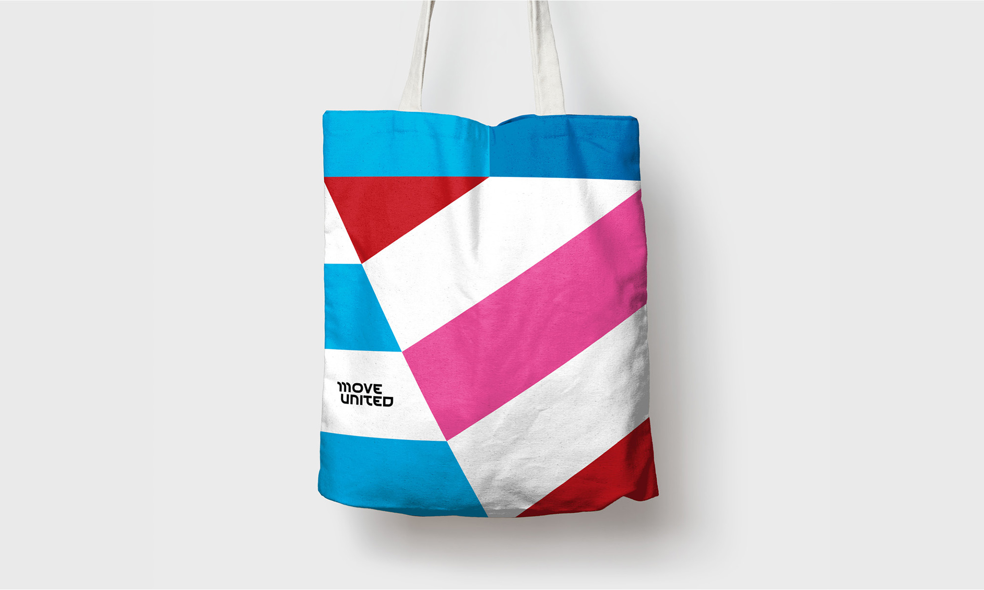
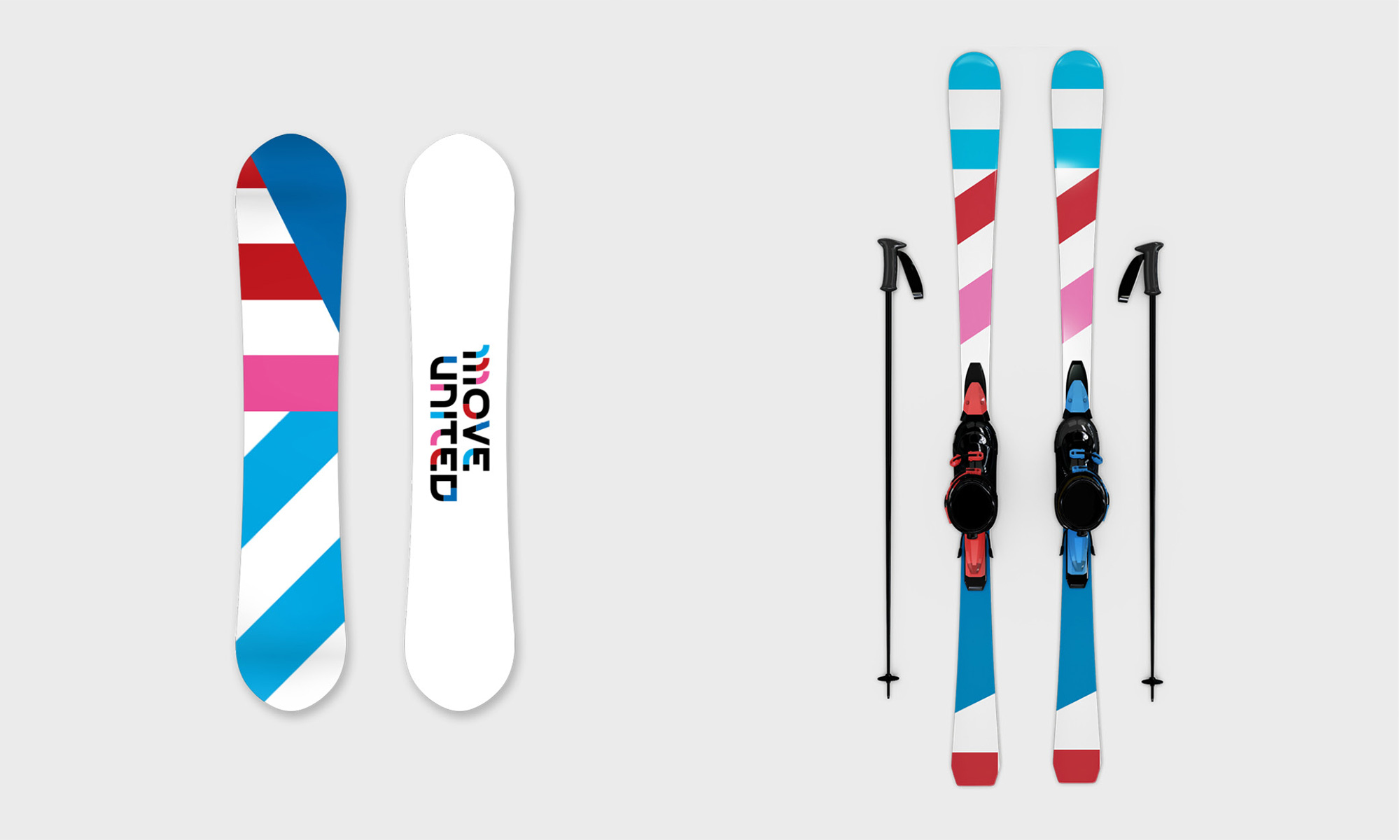
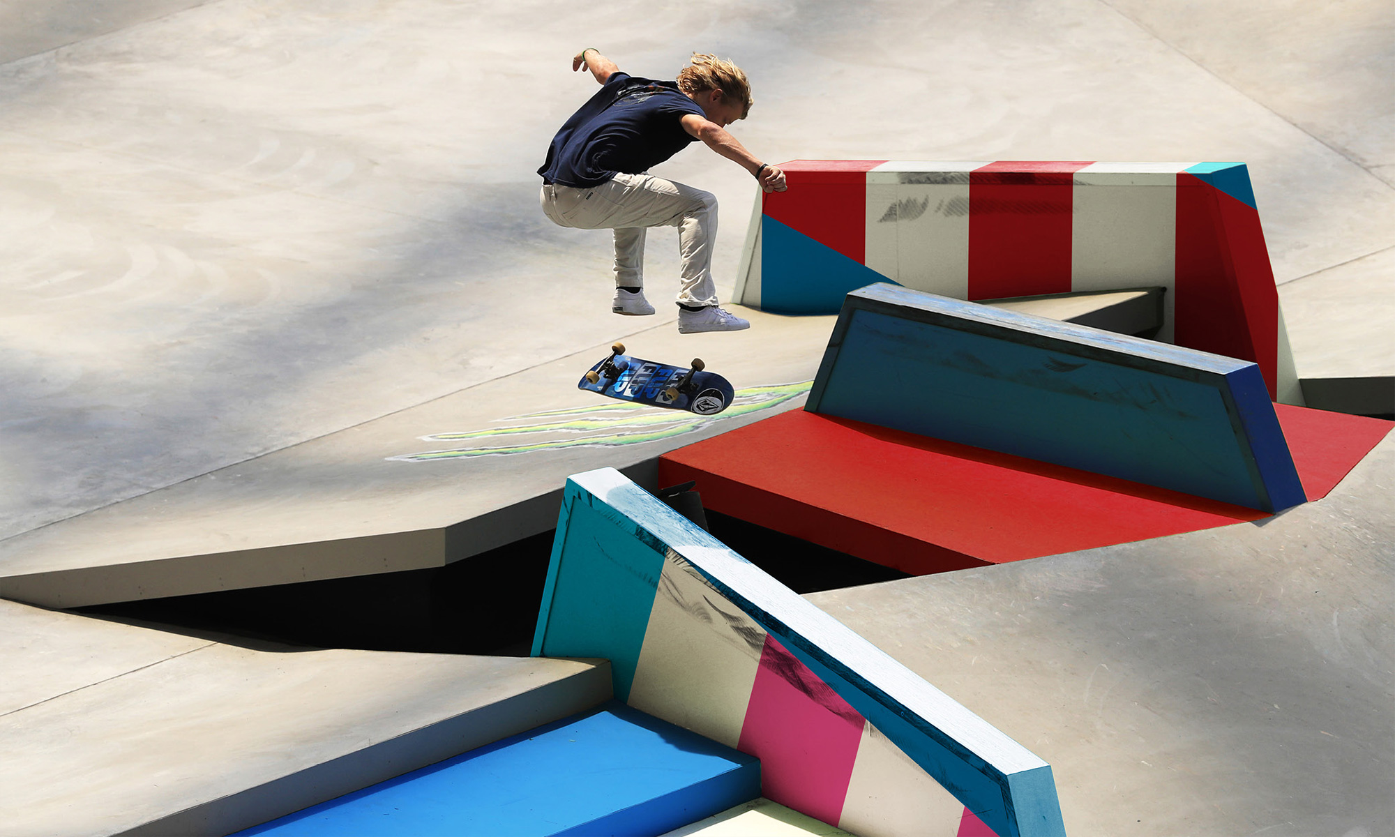
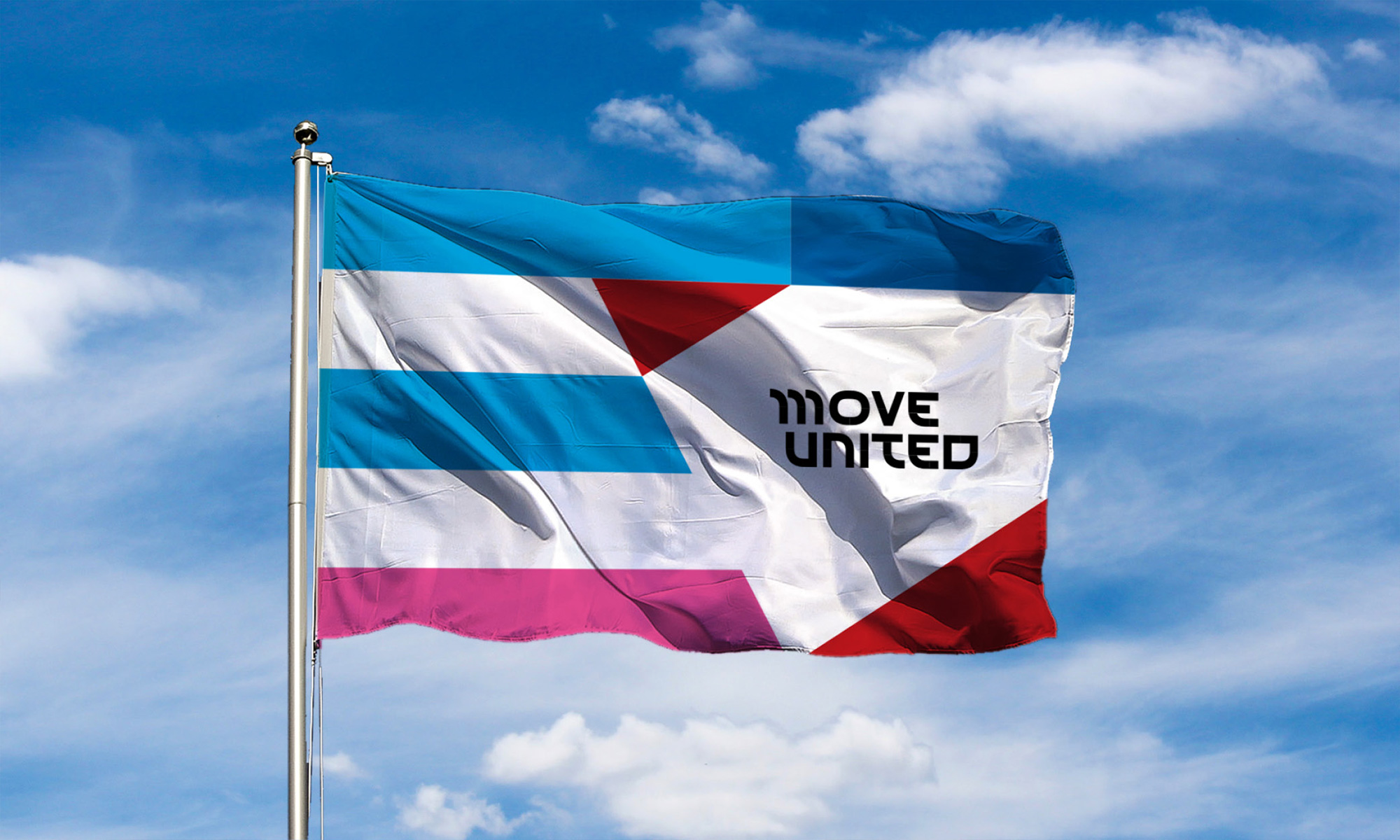
Not much in application other than the various renders of the patterns on things which, yeah, they are cool enough and the flag directly above almost makes me change my mind about the single-color font. I would love to see how the patterns extend into actual communication pieces — the social media usage leaves room for improvement so far — because used well, it could be quite nice. Overall, this is definitely an improvement of what existed before, all done in a way that feels more energetic, empowering, and dynamic.
 each year since publication began in 2006

 Новости Союза дизайнеров
Все о дизайне в Санкт-Петербурге.
Новости Союза дизайнеров
Все о дизайне в Санкт-Петербурге.