Обзор лучших ресурсов по разработке бренда, разработке упаковки
contact us | ok@ohmycode.ru
contact us | ok@ohmycode.ru
Established in 1996 but with a history dating back to 1883, NSB Group (Norges Statsbaner in full form, “Norwegian State Railways” in English), a subsidiary of Norway’s Ministry of Transport and Communications, is a Nordic transport group that operates various subsidiaries of its own: The eponymous NSB for passenger trains in Norway, Tågkompaniet for passenger trains in Sweden, Nettbuss for passenger buses, GreenMobility for an electric car sharing service, and a couple of other non-public-facing services. On their two main networks of buses and trains more than 190 million trips were made in 2018. This month, NBS Group announced it would merge its services under a new name, Vy, and introduced a new identity designed by Oslo, Norway-based Snøhetta.
Vy is a Scandinavian word meaning outlook, overview, prospect or “a picture of”. If we as a society are going to turn “sustainability” and “travel” into two words that belong together, we need to think differently - we need a vision. For us, the name Vy means having the vision and ambition to create the transport solutions of tomorrow. Punctuality and a high standard of service remain our top priorities, and we will do all that we can to make your journey with us even better. [The word vy stems from the French word vue, derived from voir, which means “to see”.]
Pronounced “vee” (as opposed to “vie”, which was my inclination), the name is enviously short and easy to use and pronounce. The meaning behind it is, um, meaningful and appropriate for a transportation brand. More importantly, it’s a name that can encompass trains, buses, and cars without being tied to any of those in specific as the old NSB was.
The logo is presented as one movement, from beginning to end, or from V to Y, more specifically. It forms a whole, continuous line that brings associations to railway tracks, to the motorway, to tire tracks on an open road, or even to the staves that govern movement and pitch in musical notation. The notion of movement is present throughout the visual identity, from the shape of the logo to the molding of the typography.
The old NSB logo was fairly nice with a bold and dynamic icon and decent-enough type over it. The old Nettbuss logo was a little too friendly with what looked like a smiley face icon and its rounded sans serif wordmark. Both were well-known logos so it will be a challenge to replace them — not so much literally as in physically updating where they appear but metaphorically as in mentally updating how travelers refer to trains and buses in Norway. With such a short and memorable name, the challenge will be easier and the rather pretty logo will also help. We’ve seen a number of ribbon-esque logos before and my first reaction when I saw this logo was “Oh, great, another one of those” but this one is particularly well done and doesn’t rely on shading and gradients to convey its volume — instead, a green line that runs on the “back” of the ribbon appears and disappears as it twists and turns. Even in a single color, the effect is perfectly captured. I also like that even though “V” and “Y” are the angl-iest of letters, they managed to soften them. Conceptually, it also hits all the necessary topics from travel to connectedness to movement.
Referencing grotesques and gothics from the time of the State Railway’s founding, Vy Sans has a crisp, modern look with a subtle distinctiveness. Vy Display shares the same skeleton but mirrors the pen strokes of the logo. The resulting semi-seriffed typeface has a unique and strong personality that supports brand recognition.
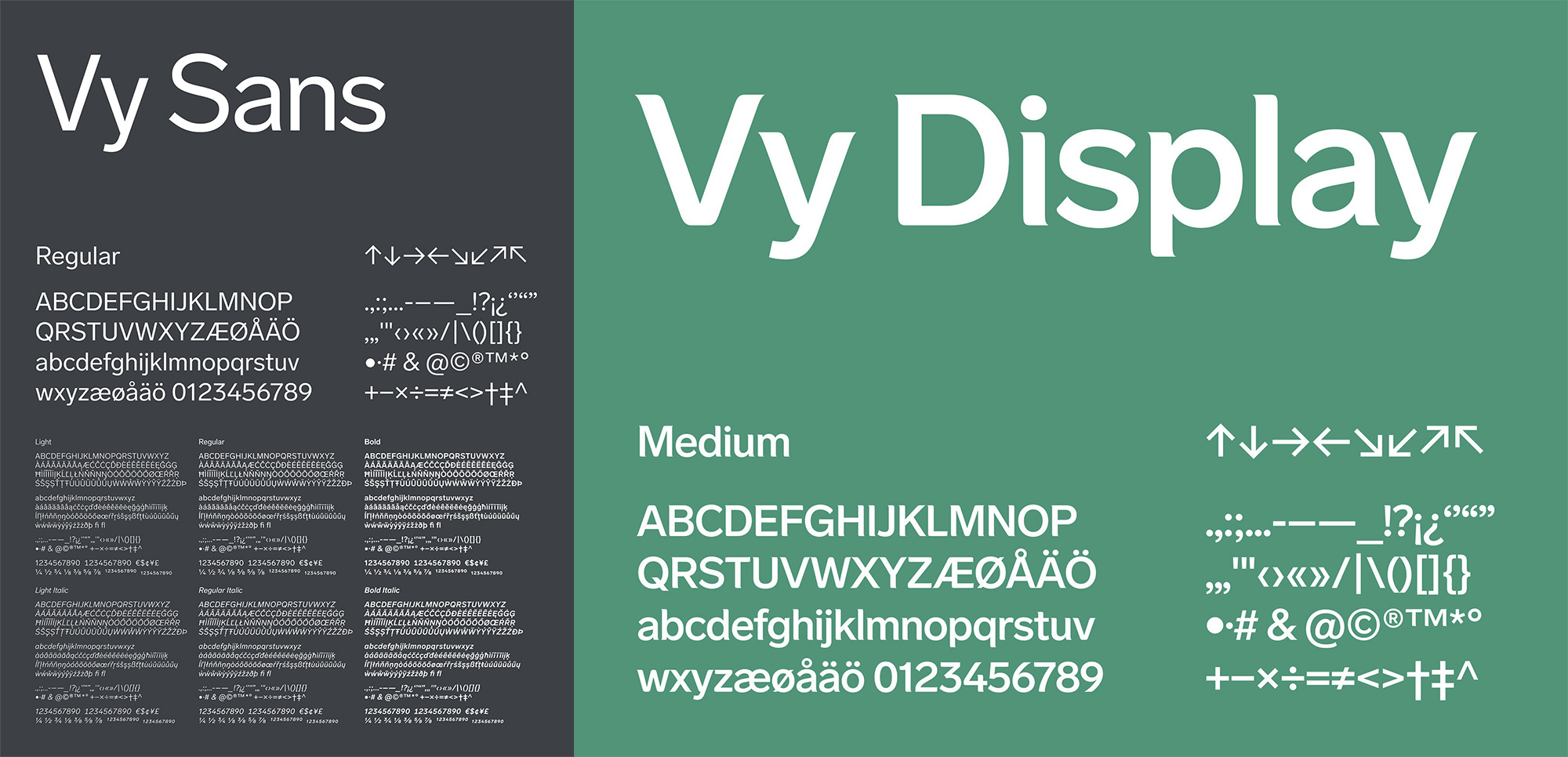
The custom type family has a simple sans that’s fine and a semi serif display version that I don’t like at all. It’s well done and I’m sure many people will like it but, personally, I’m not a fan of the tiny spiky serifs and odd rounded corners.
The palette is based on the encounter between nature and culture; colors you see and experience when you move through cities, fjords and mountains - representing Vy’s multifaceted services within public mobility services. The green tones particularly emphasize Vy’s commitment to developing and promoting environmentally friendly transport services.
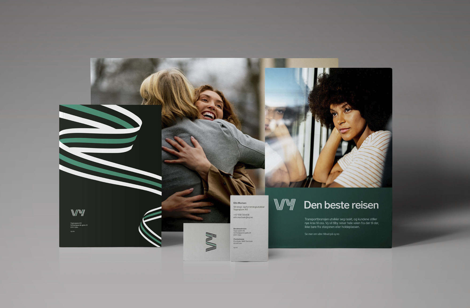
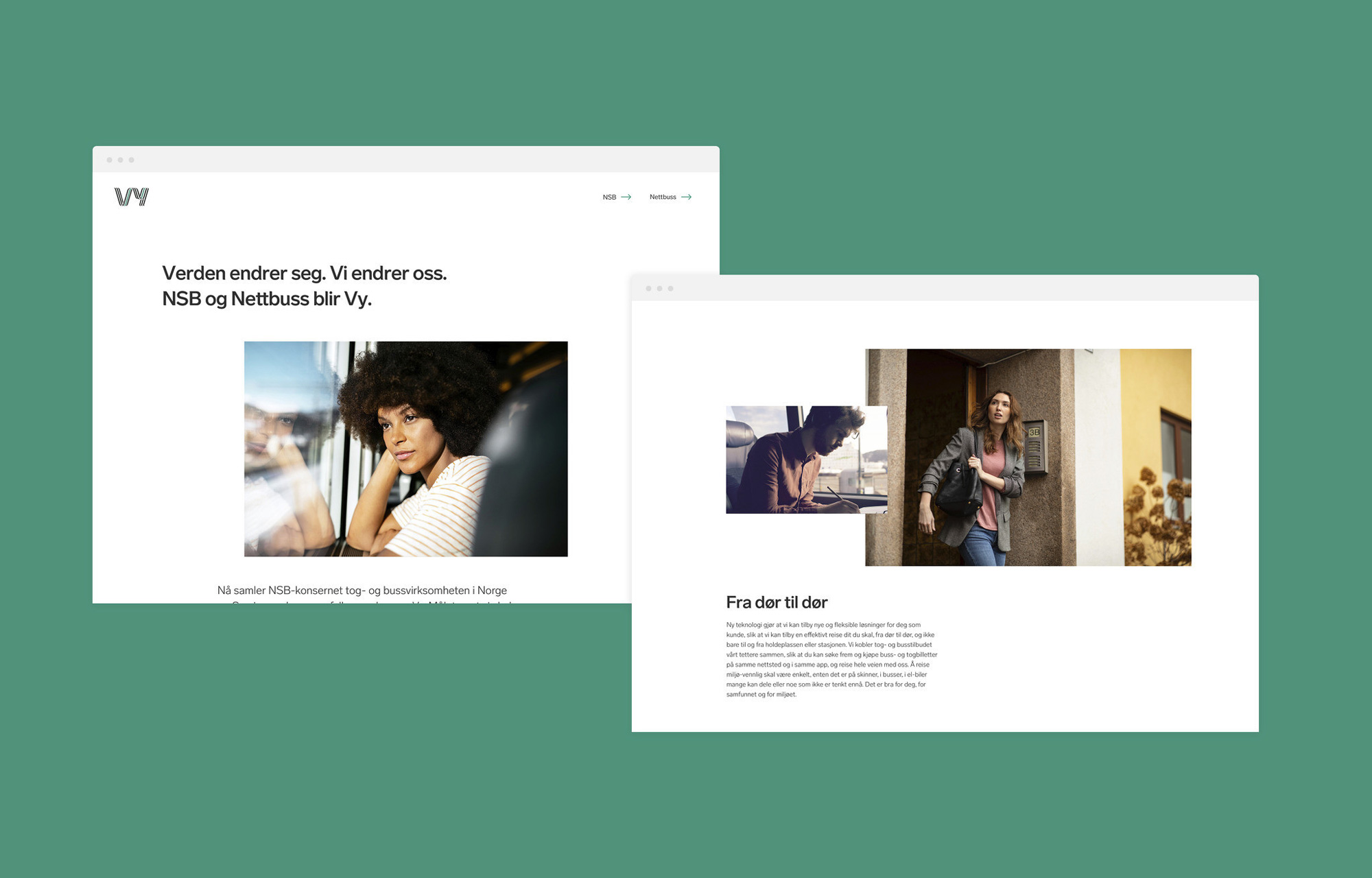
The few print applications shown above are really nice and show plenty of promise with the introduction of additional ribbon graphics, muted photography, and a strong dark green color as the brand accent.
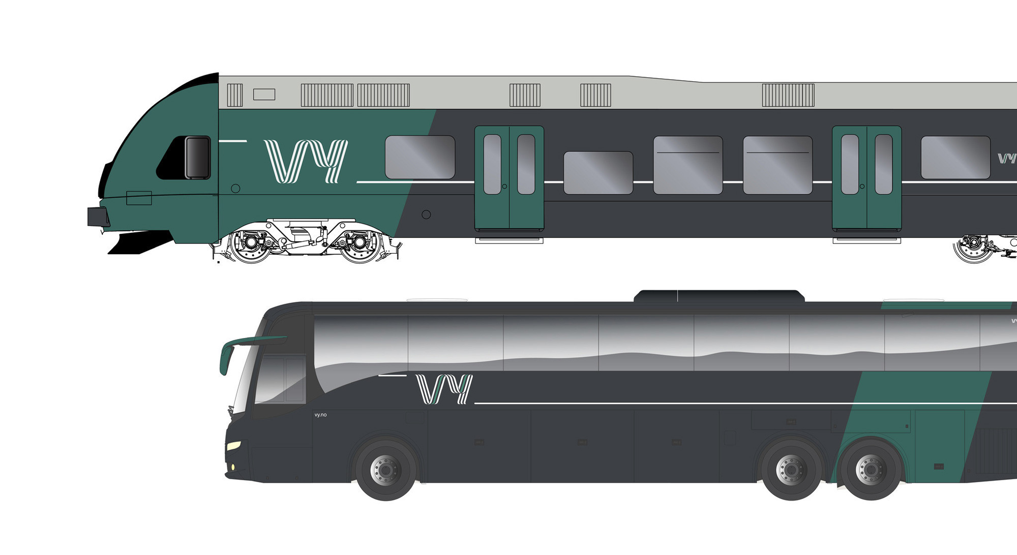
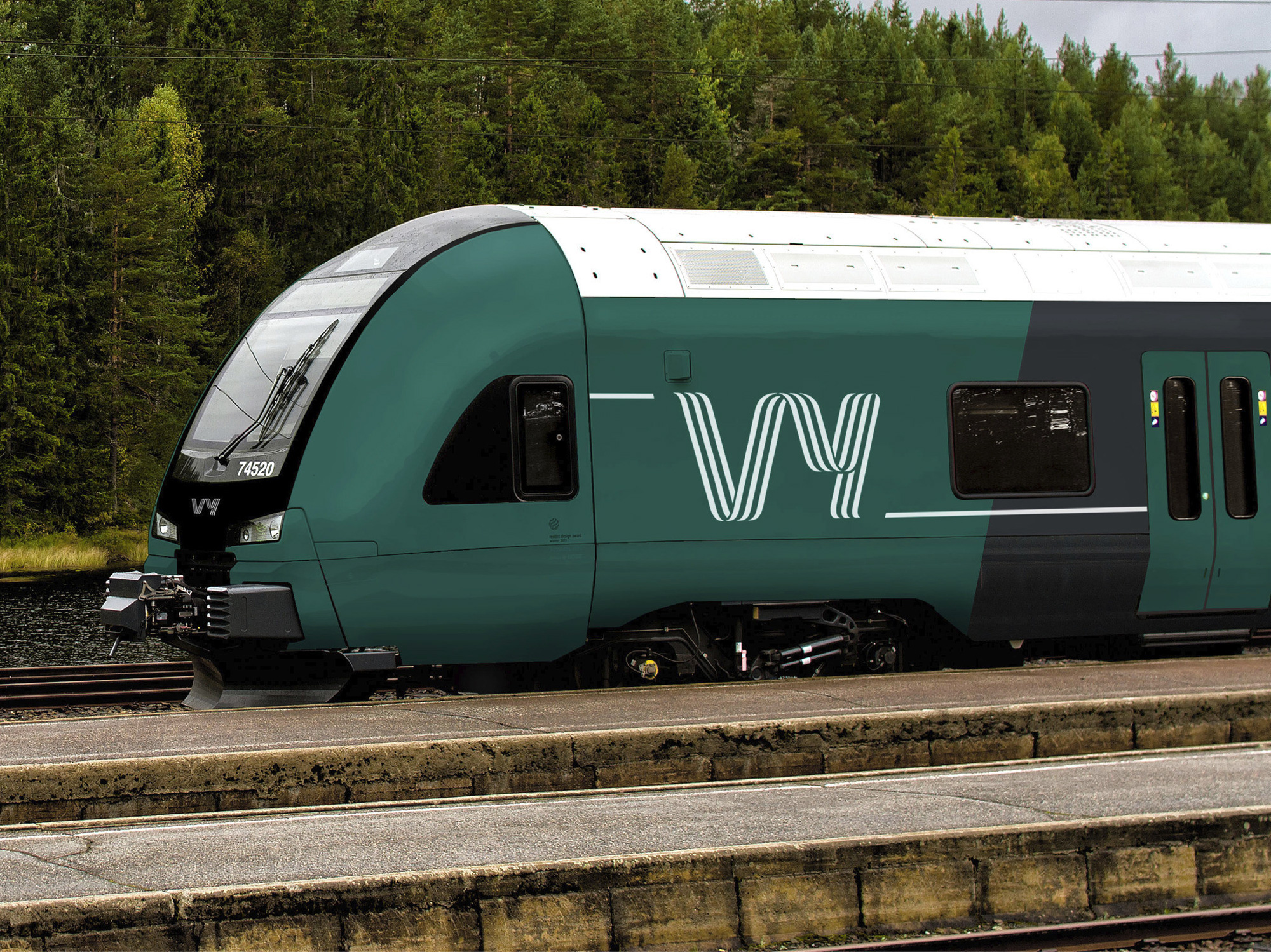
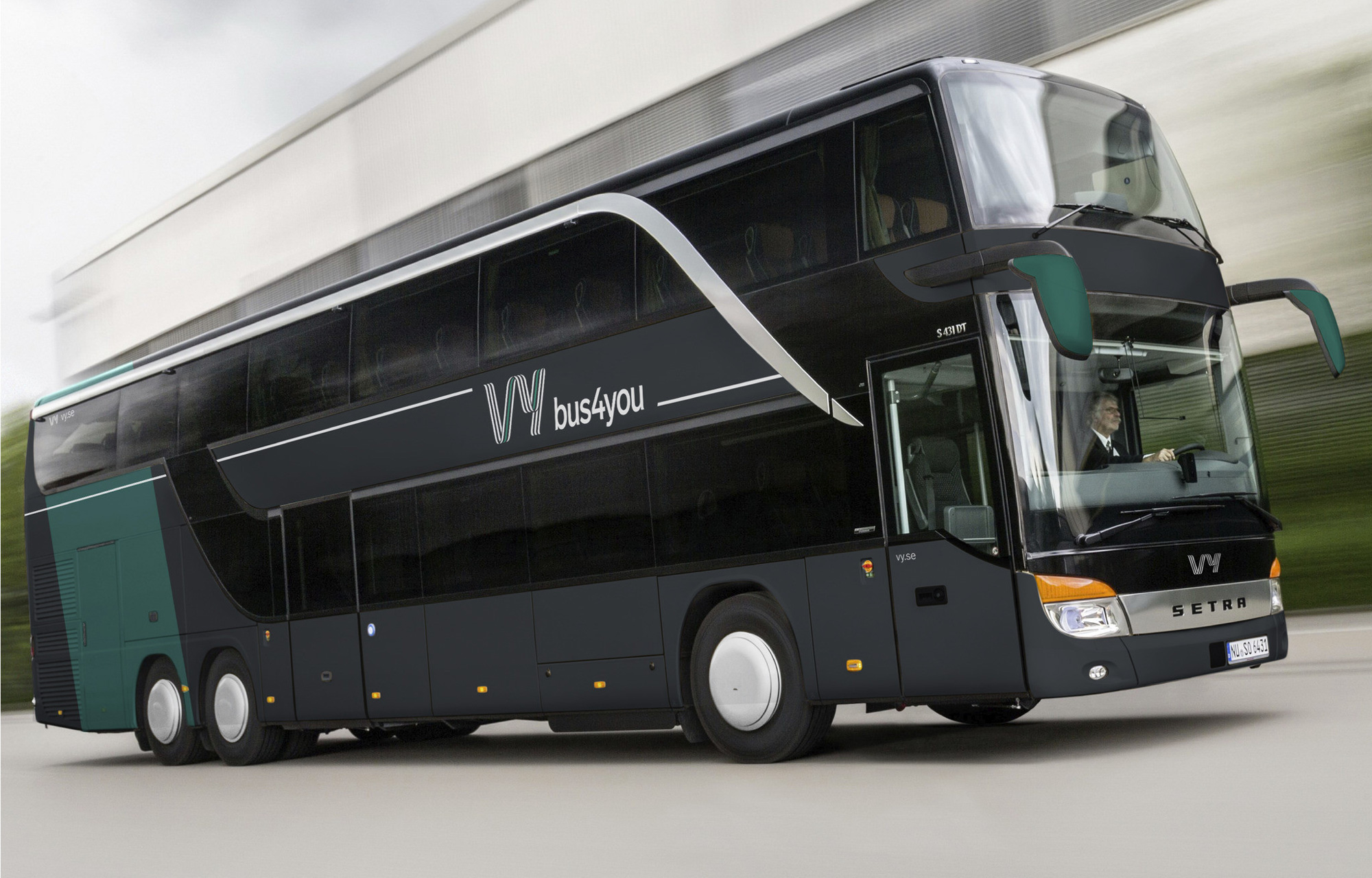
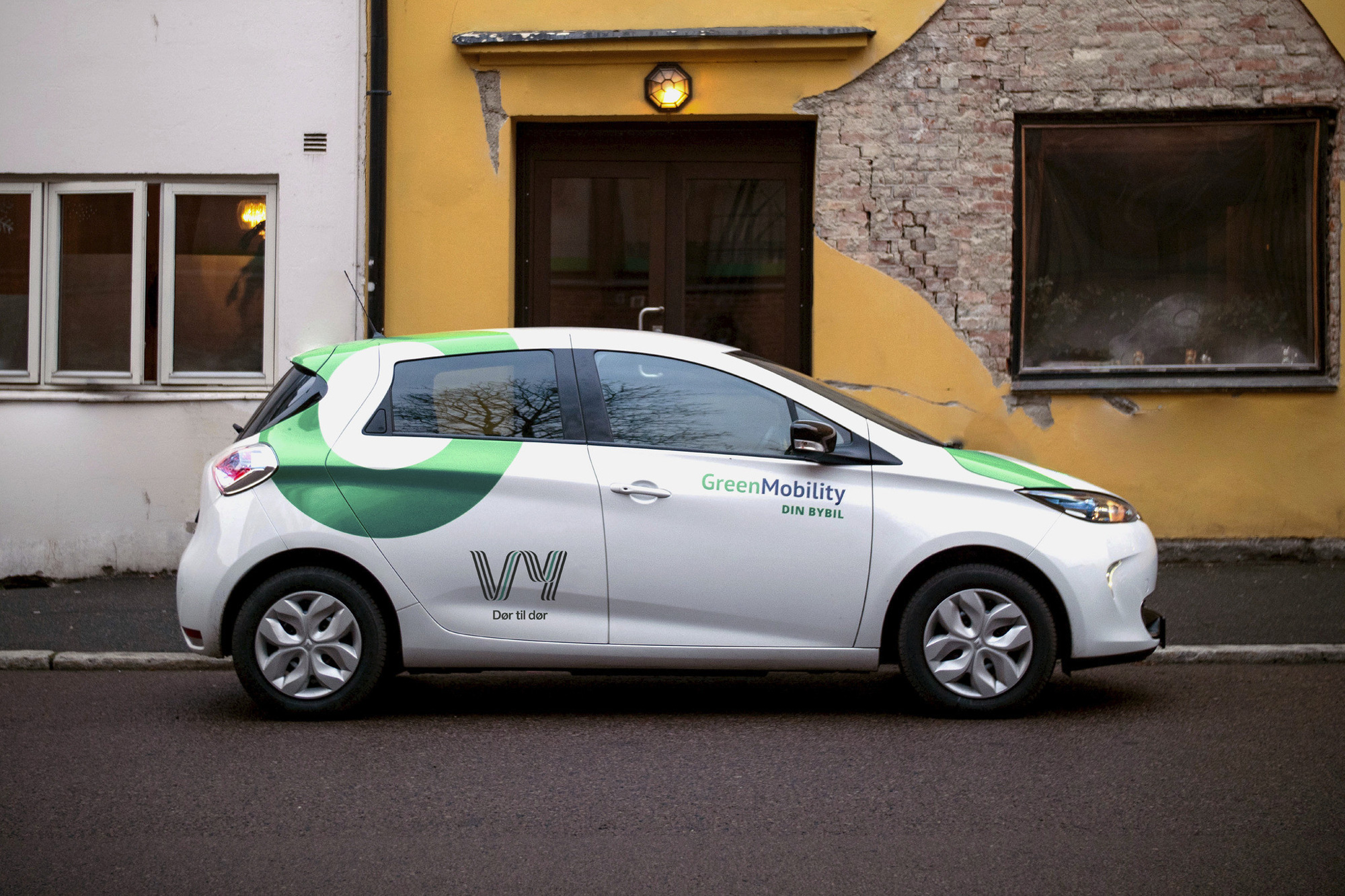
Given how cool the logo is, the liveries are kind of a letdown… I am guessing there are limitations to what can be done on these but somehow it feels like there is something missing.
Overall, this is a great new transportation brand and the kind of aesthetic you would expect from a Nordic country on a range of services that normally look like afterthoughts in the U.S.. Perhaps the actual liveries will have some more ambition to them once they start rolling out but even if not, I imagine that the applications (maps, signage, uniforms) around it will be on point.

 Новости Союза дизайнеров
Все о дизайне в Санкт-Петербурге.
Новости Союза дизайнеров
Все о дизайне в Санкт-Петербурге.