Обзор лучших ресурсов по разработке бренда, разработке упаковки
contact us | ok@ohmycode.ru
contact us | ok@ohmycode.ru
Established in 1826, Politechnika Warszawska (Warsaw University of Technology) is a technical research institution — one of the leading institutes of technology in Poland and one of the largest in Central Europe. The university is home to more than 35,000 students across 20 departments with more than 2,400 teaching faculty. Last November, Politechnika Warszawska introduced a new identity designed by Warsaw-based Podpunkt.
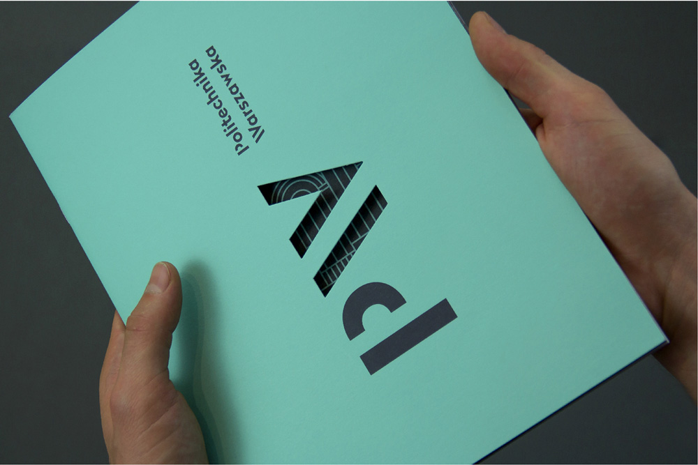
The new logo of the Warsaw University of Technology is based on typography. The idea—transforming the “W” into “≥” underlines the scientific character of the school but also reflects its position as one of the best universities in Poland.
The “PW” or “WUT” symbol, when rotated by 90 degrees, becomes part of the school’s motto “imagination is greater(/equal) than knowledge”. Within the scope of the identity other symbols have also been created to express WUT values in a visual, consistent way.

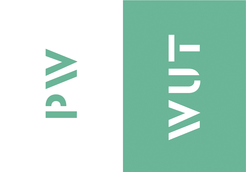
The university’s official seal served as its logo as well so its ornateness was understandable — although what’s the deal with the eagle showing off its muscles? — but seals rarely make for good promotional logos. The one advantage it did have was that it carried the English and Polish name in one unit but that was way too much text to set on a curve. The new logo comes in two flavors: a full wordmark, spelling out the whole name, and a shorthand, with just the initials; both in English and Polish. The shorthand versions are the most convincing in their use of a stencil structure, generating a nice texture of lines and delivering on the concept of the “W” being a greater-than sign (“≥”) by rotating it 90 degrees. It’s a simple, solid concept and I like how it places emphasis on the university’s location (the W for Warsaw). In their full wordmark, the logos get slightly weaker visually because the “P” and “W” now look less weighted than the rest of the bold characters; the “P” in Politechnika being the most telling. But it’s not terrible… maybe just odd that the stenciling stops at the initials.
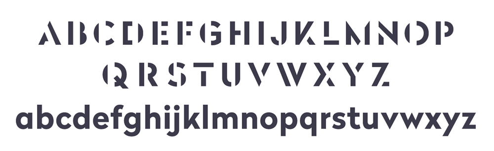
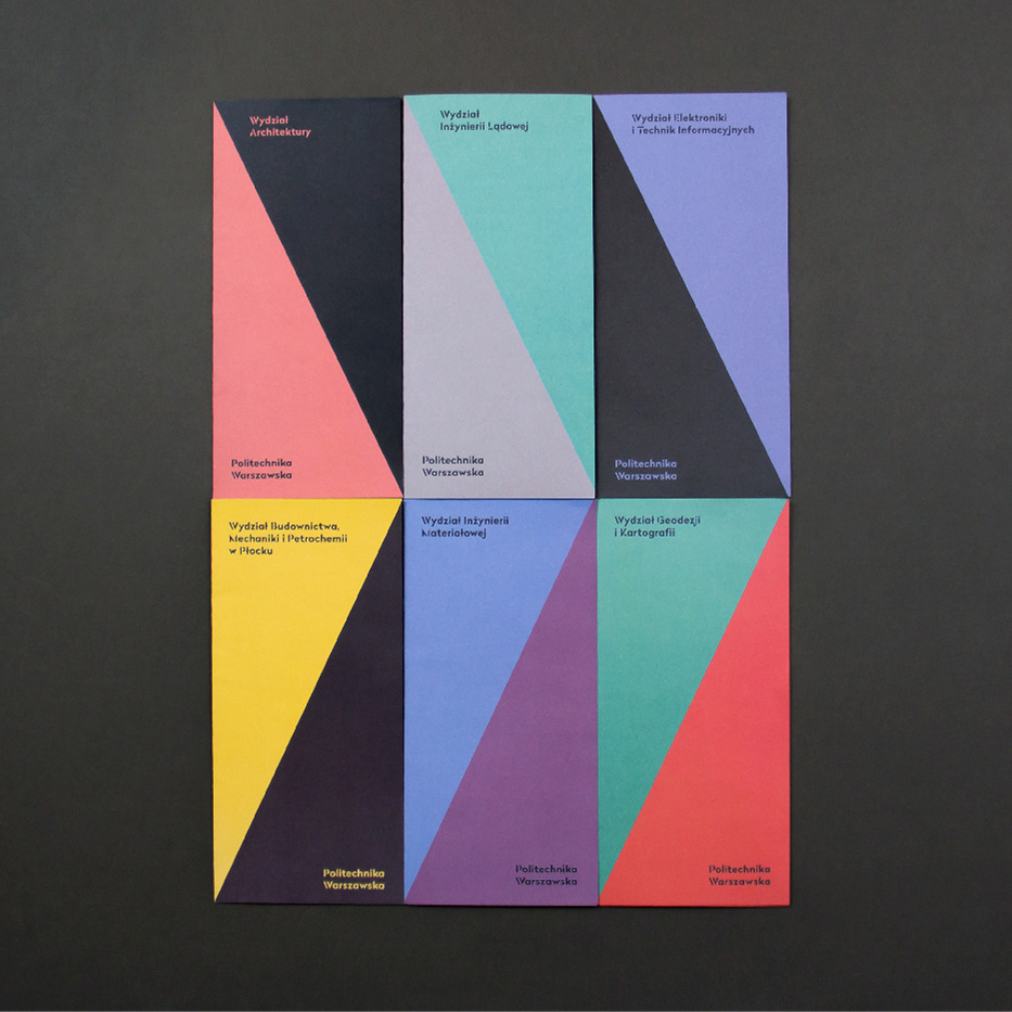
The new identity introduces a coherent visual language for the whole University—comprising 20 faculties, many institutes and bodies. Each logo within the structure is typeset in Radikal WUT—a custom typeface created in collaboration with Nootype. Traditional symbols of each Faculty have been redrawn in a consistent linear style—now it is apparent that they represent the same University, all the while preserving their autonomy and roots.
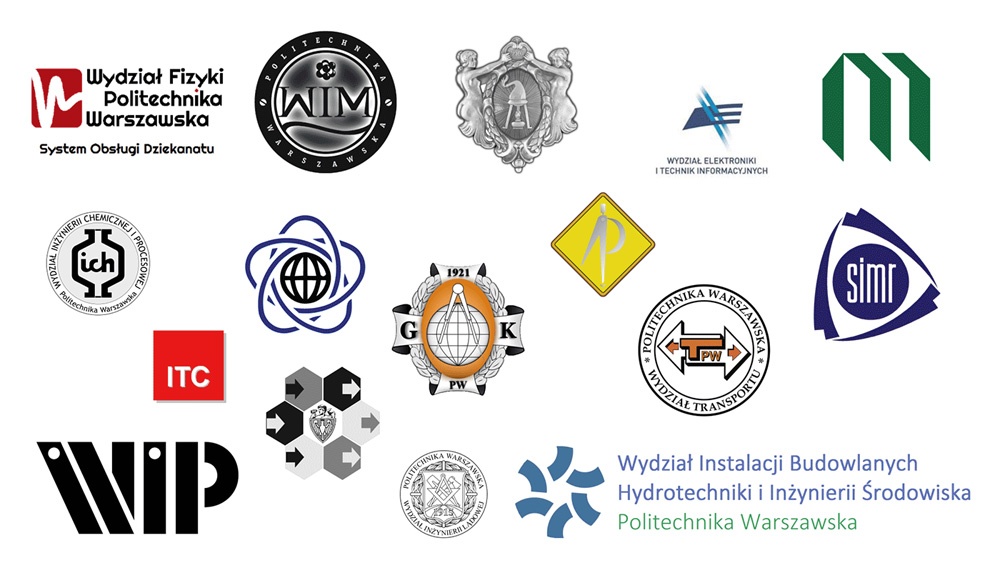
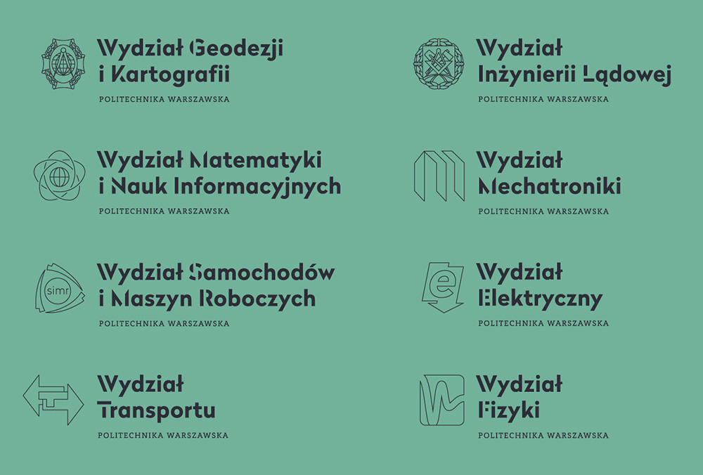
The previous set of department logos is the stuff of nightmares, not just because they are bad but because they are bad in completely different ways. Some of the drawings in the new system are a little too complicated for their own good, while others are too simple but they are all neatly unified by the thin line approach. I bet keeping the essence of each logo helped sell the system to all the department heads (who, in most universities, always want their own logo.)
Warsaw University of Technology next to the new sign uses also in official materials historical mark - an emblem. To unify the traditional graphic element with the new identification emblem has been redesigned in a linear way.
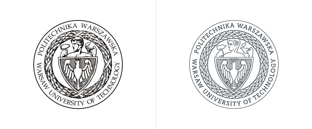
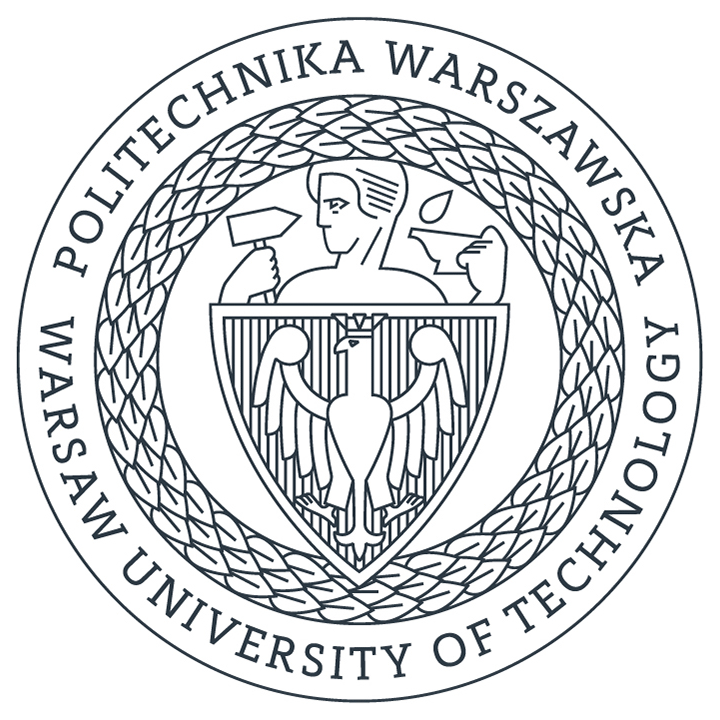
Where the department logos benefitted from the thin line illustration approach, the seal seems to have not. Yes, it looks better by default because the old one was a digital facsimile of something drawn in charcoal on parchment paper in the nineteenth century — kidding, sort of — but there is a lack of seriousness in the details. The eagle looks cartoonish and the hands of the man are impossibly postured. Type looks nice though.
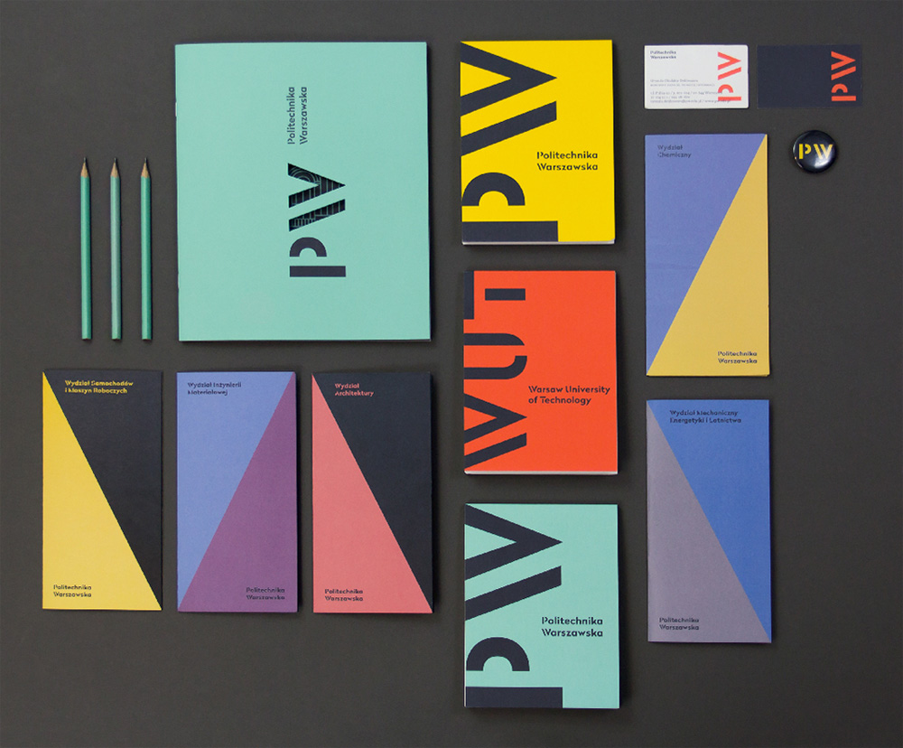
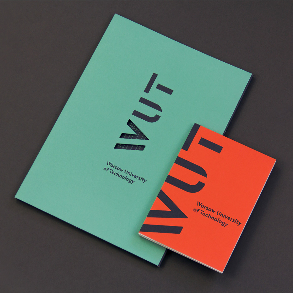
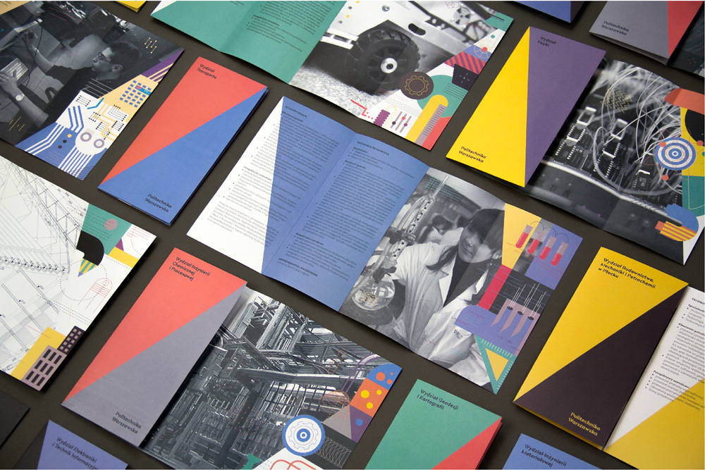
The applications are quite nice, led by a strong angle derived from that of the “W” and a colorful but muted palette. On some of the covers, the full and shorthand wordmarks are used together, which is… I don’t know what it is… good, bad? It works, though. The small brochures are a great manifestation of the identity, feeling vibrant but also with a degree of seriousness befitting a technological university. Overall, if I were in the market for getting a degree in technology in Central Europe, this would totally sway me to go there.

 Новости Союза дизайнеров
Все о дизайне в Санкт-Петербурге.
Новости Союза дизайнеров
Все о дизайне в Санкт-Петербурге.