Обзор лучших ресурсов по разработке бренда, разработке упаковки
contact us | ok@ohmycode.ru
contact us | ok@ohmycode.ru
Established in 1880, World ORT (Obchestvo Remeslenogo Truda in Russian, “Association for the Promotion of Skilled Trades” in English) is the world’s largest Jewish education and vocational training non-governmental organization. Its mission is to work for the advancement of Jewish and non-Jewish people through training and education worldwide. The organization is operational in 37 countries with a network of schools, colleges, training centers, and programs that helps around 300,000 students every year. Earlier this year, World ORT introduced a new identity designed by Tel Aviv, Israel-based Firma.
World ORT is an umbrella group for a sprawling federation of country-based affiliates that operate independently of one another. So we helped the organization focus on the core values and goals that forms a common DNA for all its affiliates, no matter where they are located, or who they serve: “Placing the future in a new generation’s hands.” Whether in Uruguay or in Israel, the ORT network aspires to form connections between past and future, vision and reality, different generations and people. Underlying it all are progressive Jewish values like knowledge, pluralism, and healing the world.

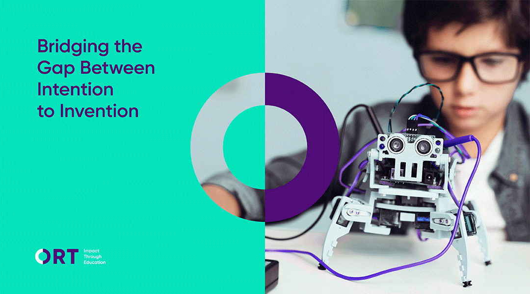
Those concepts formed the guiding principles for a new organization logo. The “circle of ORT” is formed through a combination of two semi-circles coming together to complete each other. The shape represents human connection, one universal globe and the way people come together for a larger good. The circle of ORT is then brought to life with images of the joined hands of two different people to form a circle. Opposite the O, is a new slogan that neatly distills exactly what the network does: “Impact Through Education.”
To better highlight ORT as an idea that rises above its various federation components, we decided to drop the “World” from the basic logo. ORT’s global presence is established enough that it doesn’t need to be explicitly spelled out. Instead, the stripped down slogan forms a unifying system to allow ORT’s local entities to remain connected to the global network while expressing their unique identity.
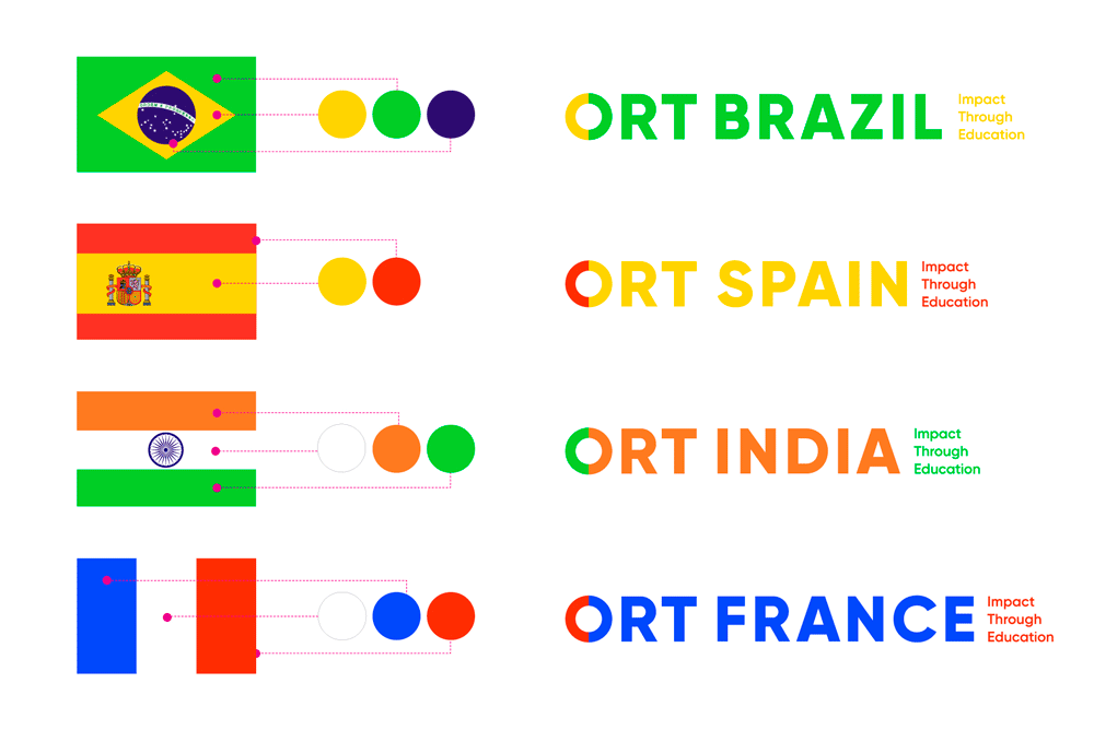
The old logo was quite a sight with a clunky flattened globe illustration and brusquely placed typography. Were it not for the “Educating for Life” tagline — set unironically in Mistral — this logo could be for anything from a freight ship company to a fabricator of tires to a 1970s movie villain’s evil corporation. The new logo does not have the swagger of the old one but it’s more up to par with today’s standards of not just global NGO organizations but of generally decent design. The core element of the logo is the “O” circle split in half through color to signify all the warm and fuzzy things mentioned in the second quote provided. When seen together here as a case study, the split circle seems surprisingly ownable and the identity is convincingly built around it to help establish engrain it within its constituents.
The full “ORT” wordmark is very straightforward and done very well — not that it is the biggest challenge but it could easily be botched. The ORT wordmark then works well as the basis for a logo system and is particularly effective in the country-specific logos, providing personalization for each location but working within the boundaries of the global brand.
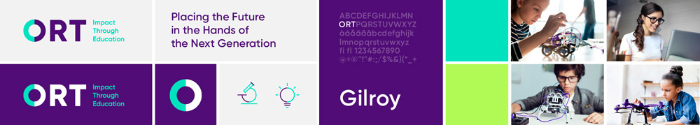
To express ORT’s pioneering spirit, passion and impact, we selected a palette of vibrant and fresh colors. The circle of ORT is composed of two of those colors, and serves as a base for the organization’s illustrative language and icons. The typography is clean, modern, crisp, and confident — yet friendly. All of these design elements combine to create a distinctive identity for the ORT brand, whether it plays out on a business card, notebook, conference room or a mobile app.
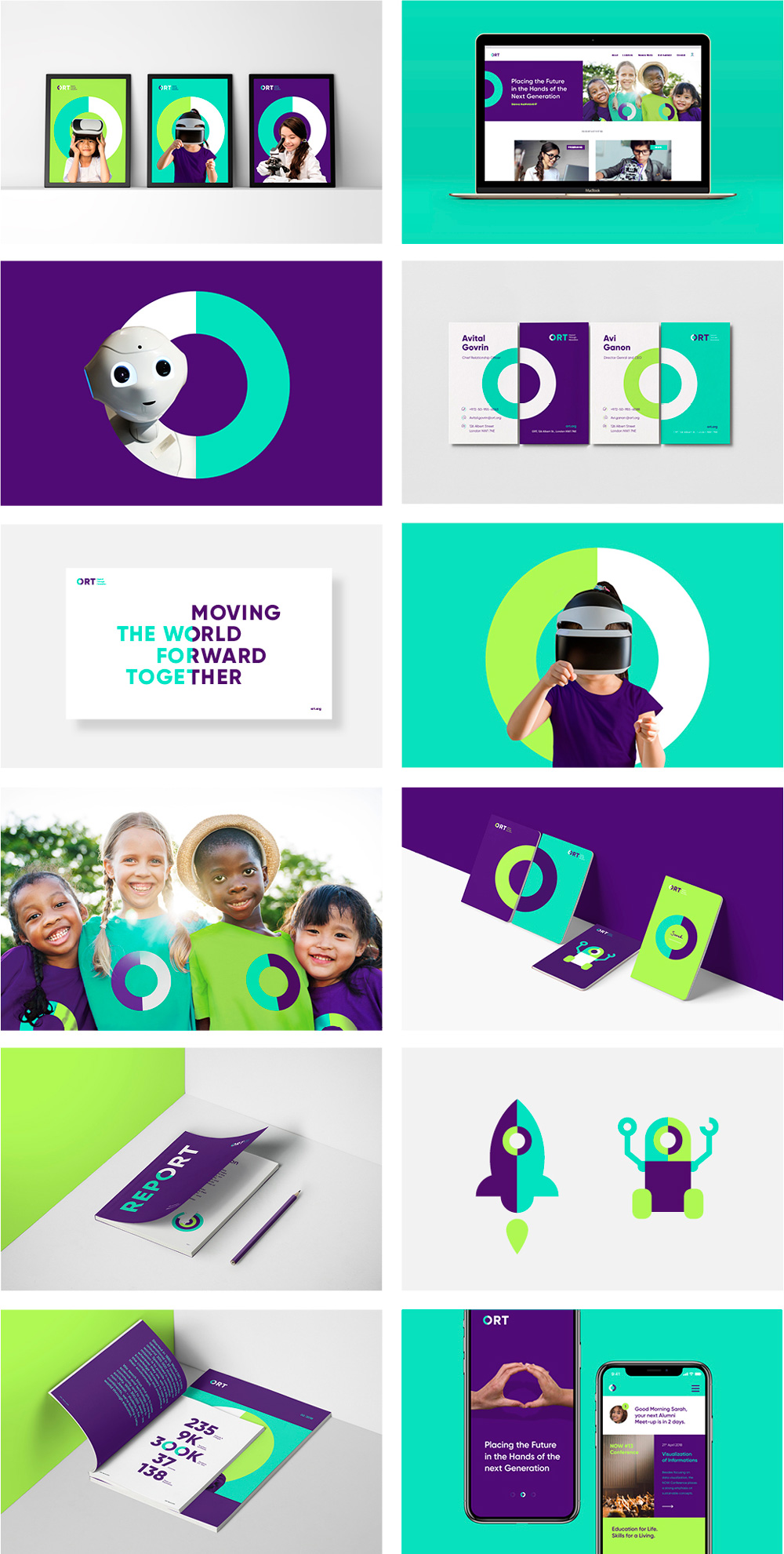
The applications are lively, clear, and make good use of the split circle as a recurring device in different ways: cropped in half at the edges of print applications, as a background for posters, as a window to hold things inside, as part of individual illustrations, and more. It’s not a raise-the-roof kind of identity but it gets the job done crisply and competently. The only thing that irks me, for its cheesiness, is the photos of two hands coming together to form the circle — I could have gotten on board with it if they had kept the idea of contrasting colors by using hands from people of different racial backgrounds. Overall, a strong, efficient update with plenty of flexibility for such a large organization.

 Новости Союза дизайнеров
Все о дизайне в Санкт-Петербурге.
Новости Союза дизайнеров
Все о дизайне в Санкт-Петербурге.