Обзор лучших ресурсов по разработке бренда, разработке упаковки
contact us | ok@ohmycode.ru
contact us | ok@ohmycode.ru
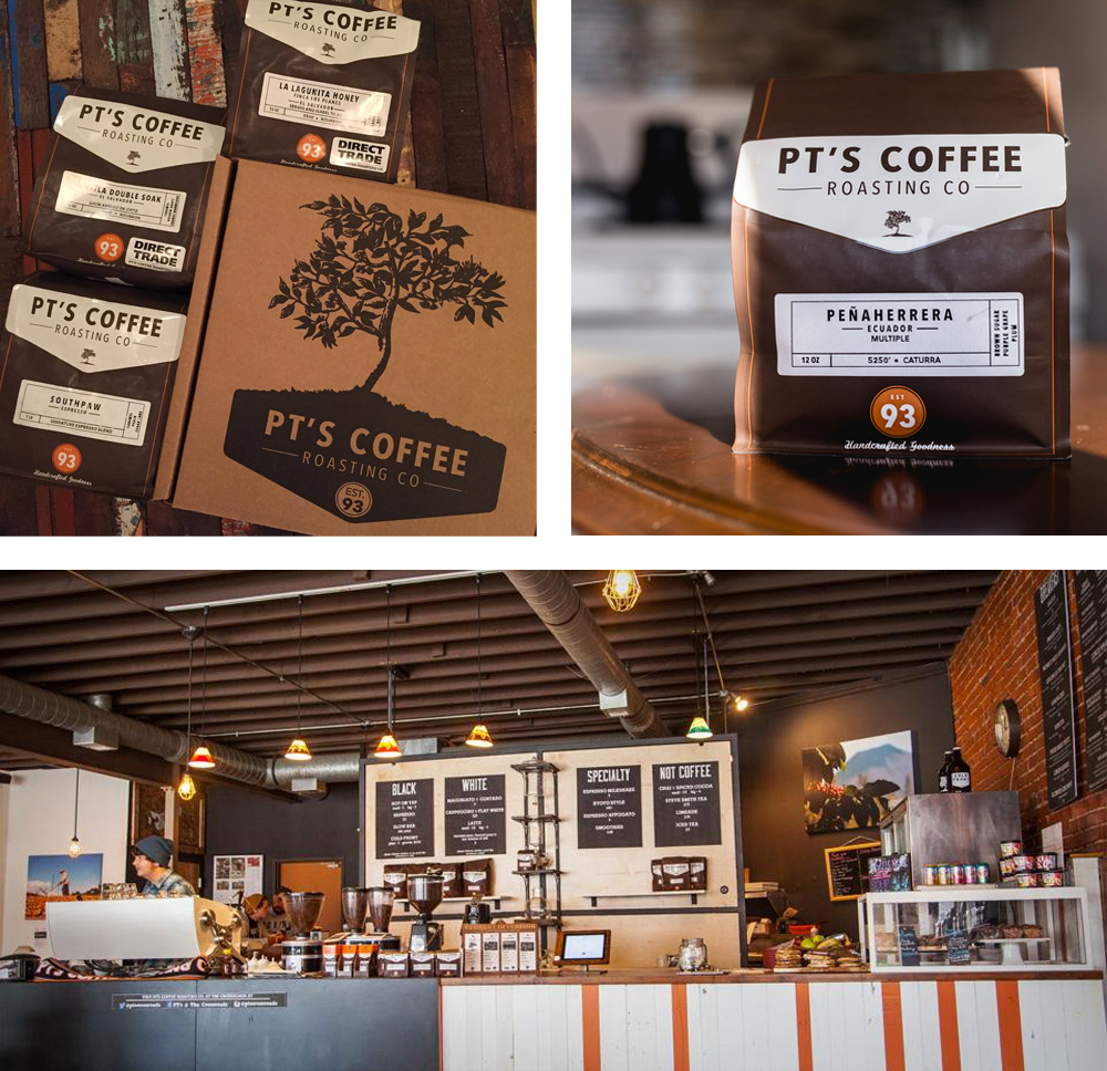
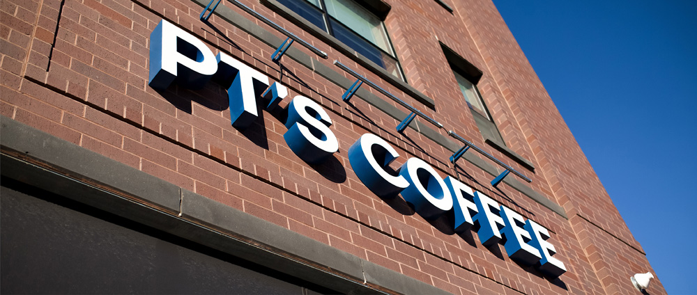
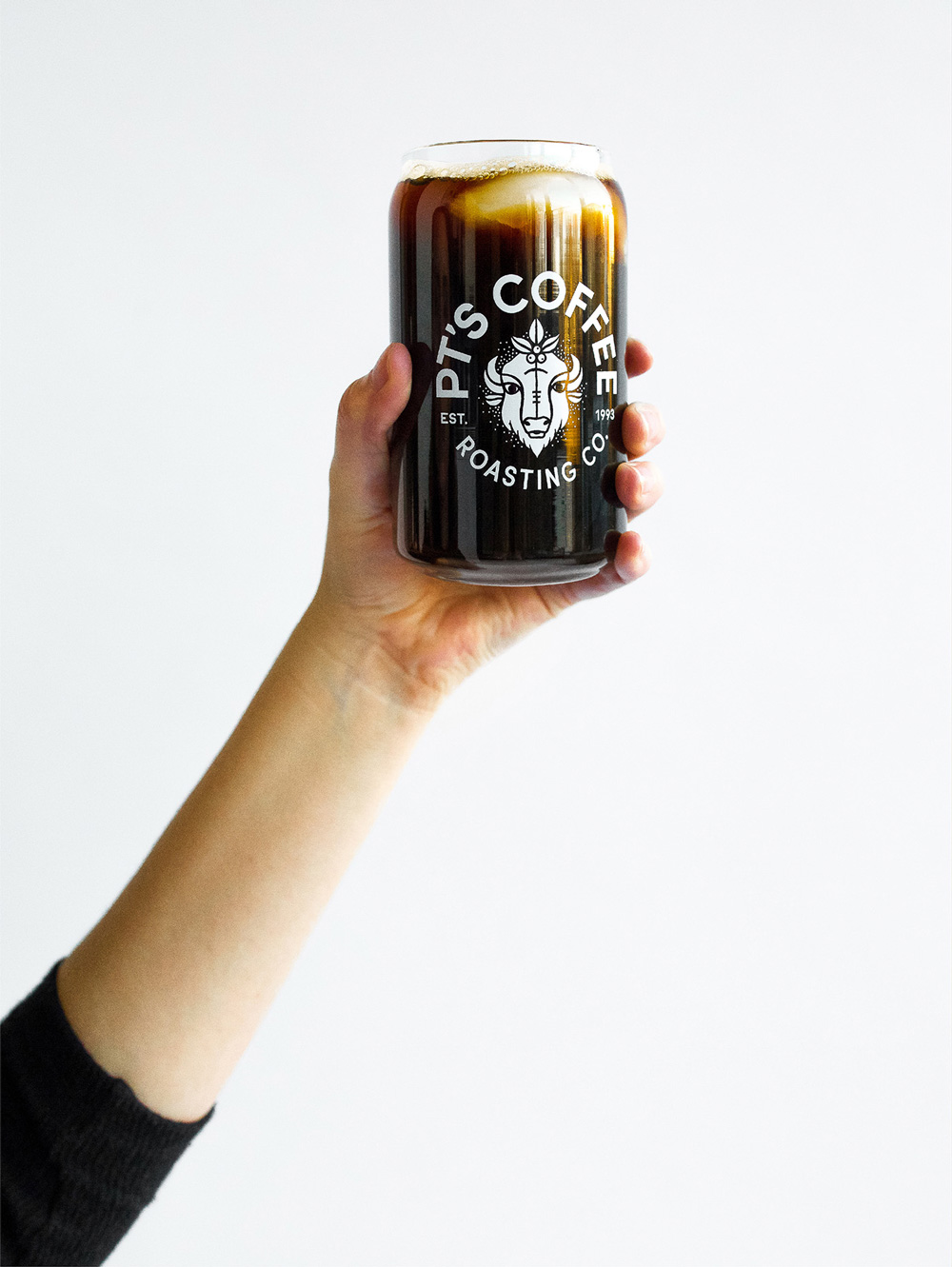
Established in 1993, PT’s Coffee Roasting Co. is, as its name implies, a coffee roaster that’s based in Topeka, KS, where it operates one of three retail cafes — the others are in Kansas City, MO, and in Lawrence, KS — and operates as a macro roaster, selling wholesale across the Midwest. They were one of the first coffee roasters in the U.S. to establish an ethical Direct Trade program with coffee farmers around the world. As part of their 25th anniversary, PT’s recently introduced a new identity designed by Kansas City, MO-based Carpenter Collective.
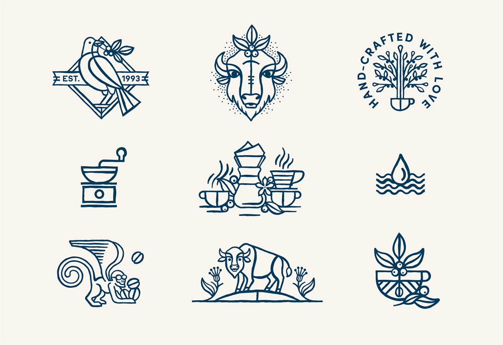
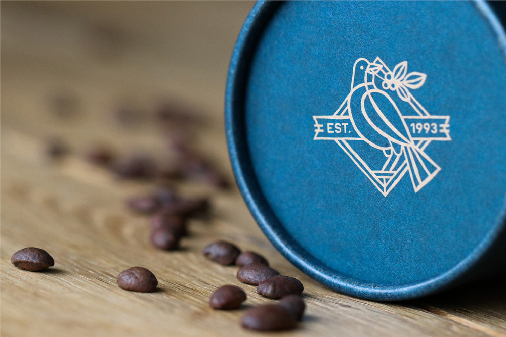
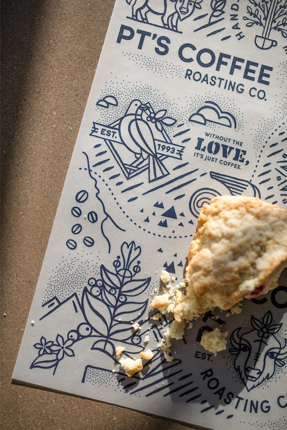
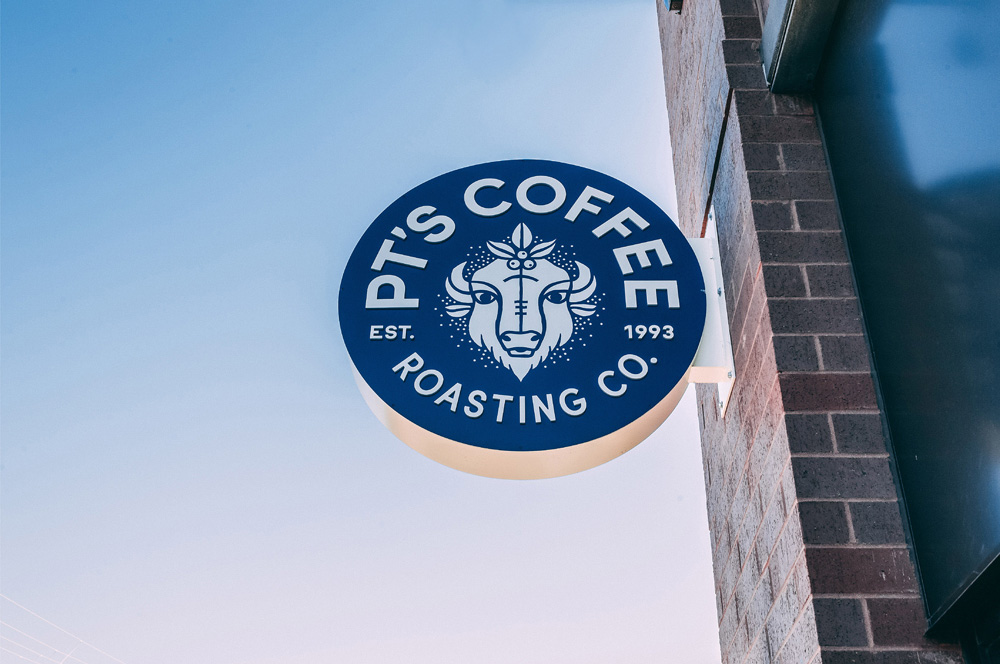
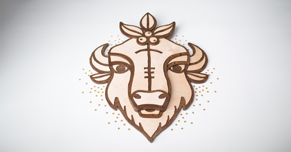
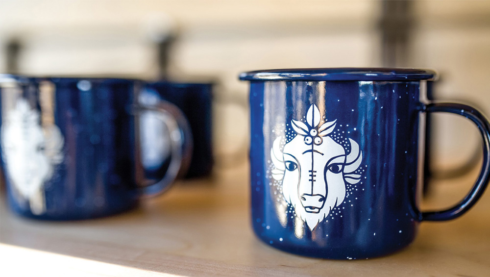
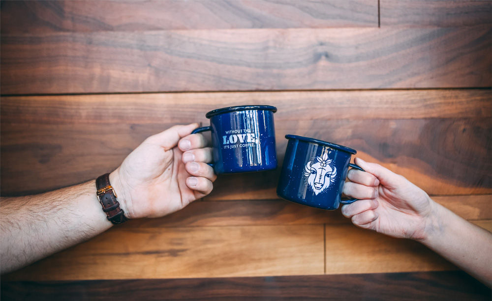
The inspiration behind the updated PT’s mark and identity happened on a visit to PT’s Coffee headquarters in Topeka, Kansas. Less than two miles from PT’s roasting facility, we drove by a herd of bison grazing on the Kansas prairie. The bison of the great plains represents strength, unity and abundance. PT’s wanted their new identity to be reflective of these same values as well and connect to their Midwest roots. The design style reinforces the hand-crafted nature of PT’s products—making their brand more approachable and memorable in the market.
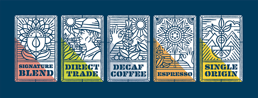
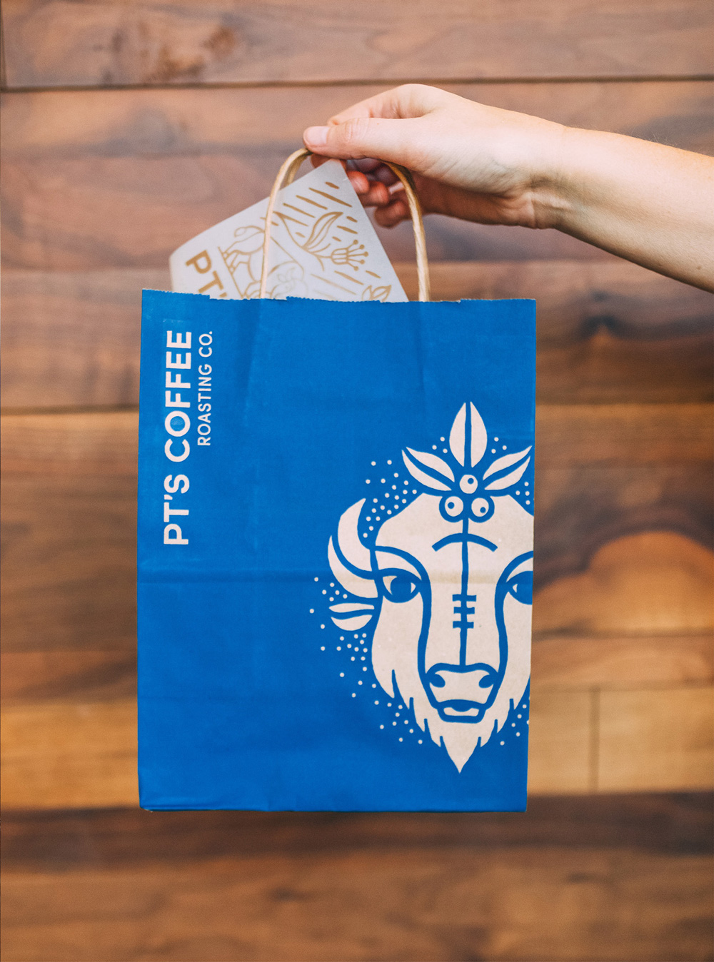
The old logo was very bland, with a somewhat sad-looking brush-like shape of a coffee plant on a pile of dirt. Not the most inspiring or distinctive. The new logo features the darndest, cutest, coolest bison you’ll find. It may not be immediately clear why there is a bison on a coffee roaster’s logo and even after learning why I’ll admit that it’s a loose-ended explanation but it’s such a fetching depiction that even if it were a jellyfish in that same style I would go along with it. The typography around the bison is bold and perfectly set in a circle. The logo sets the tone for a great range of illustrations and fun, expressive typography.
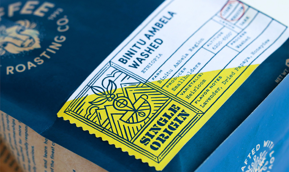
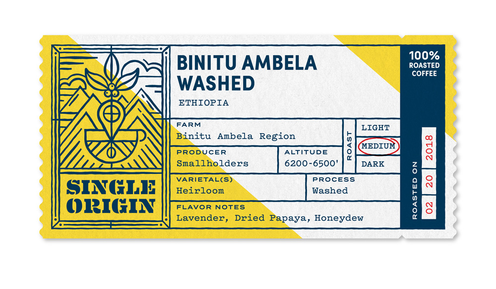
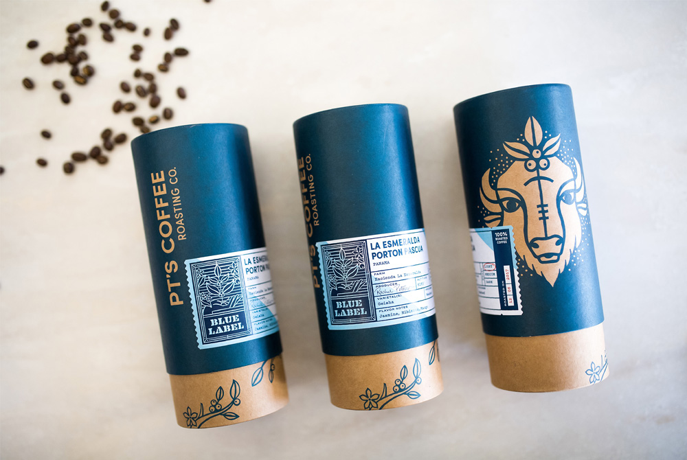
We created a labeling system that categorized PT’s 70+ roasts and allows them the flexibility to adjust and print each label on-site the day it is roasted.
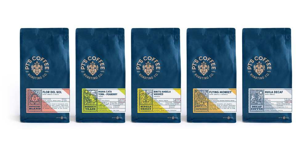
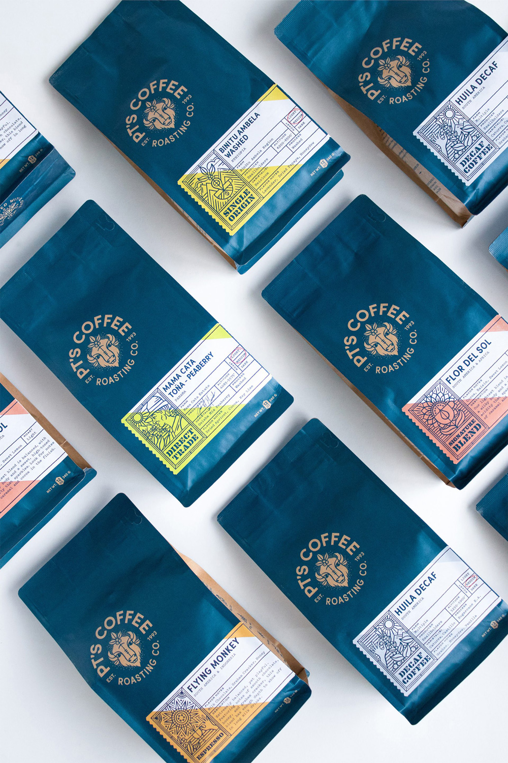
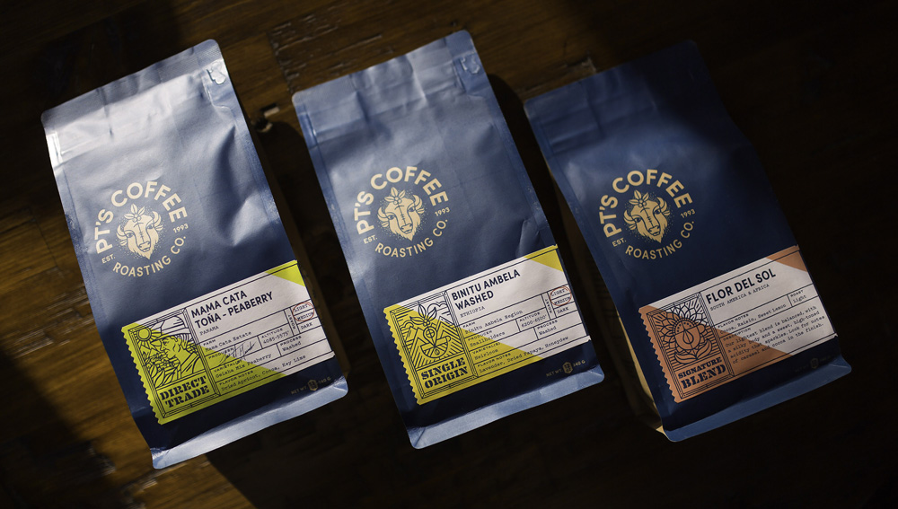
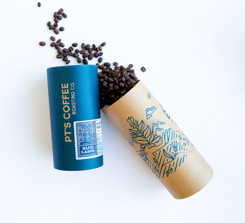
The old packaging was mostly passable but it almost looked like motor oil packaging with the heavy use of chevron shapes. The brown color was also a bit heavy-handed and, yes, I understand coffee is brown but its use in the old look was a little too sad. The new packaging changes to a dark blue as its key color and it works beautifully on the new kraft paper bags with the logo rendering a little more subdued while the white labels pop with their brighter color palette. The illustrations are great and the typography is crisp and attractive. I love the use of House Industries’ Eames Century Modern stencil variation.
The updated brand identity also extended to their new cafe location in Lawrence, Kansas. Within this system we designed an exterior signage package, interior wayfinding, custom retail shelving that is completely customizable to their needs, a wooden dimensional bison wall piece, wall murals and a flexible menu board.
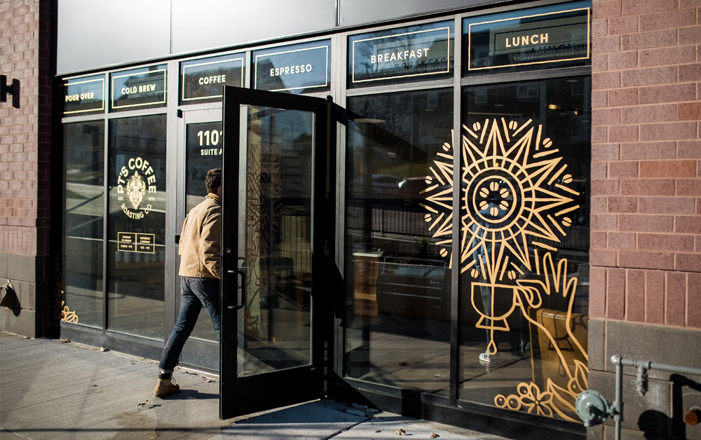
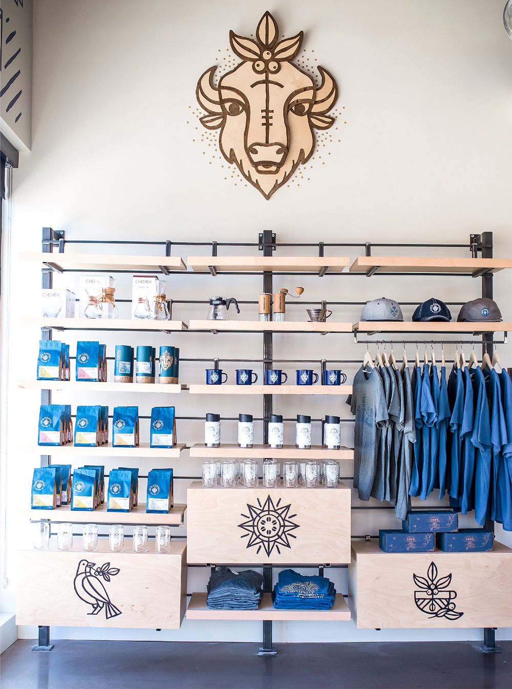
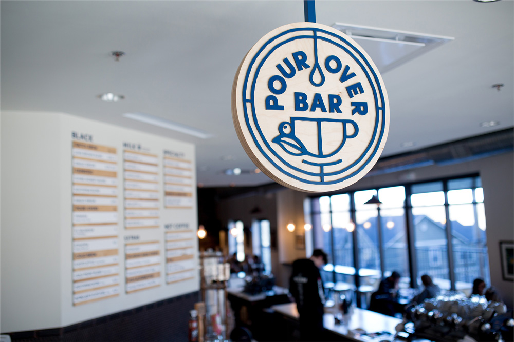
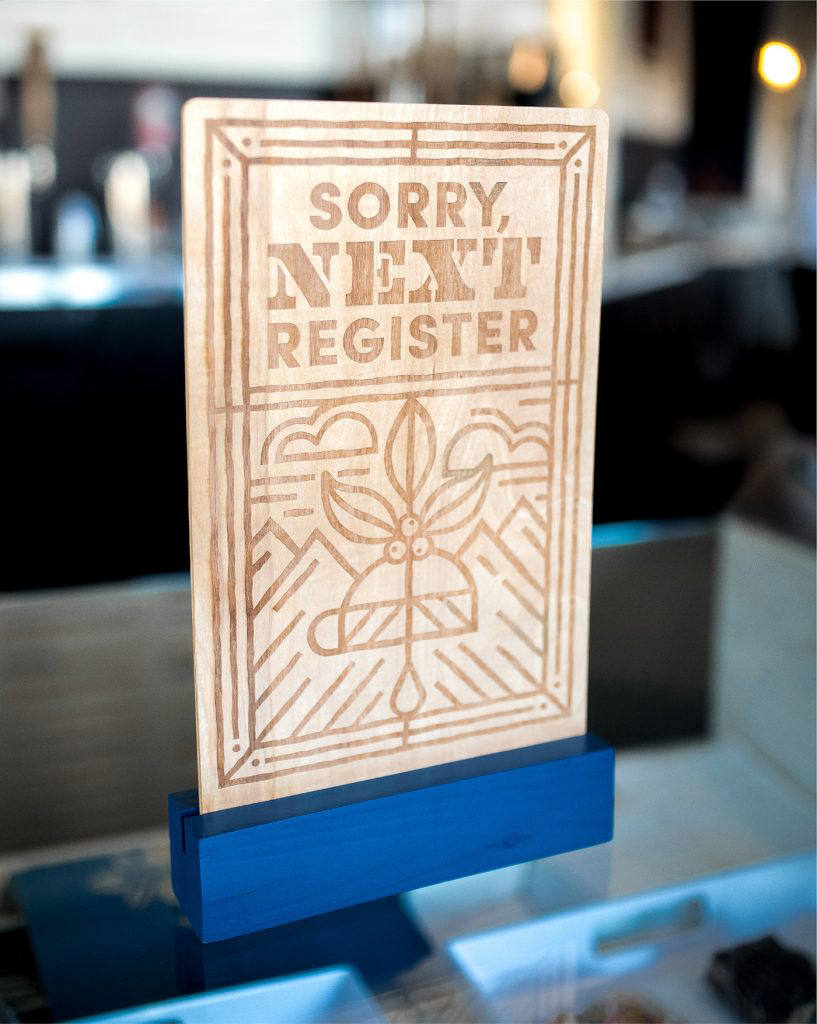
As you can see this is endless scrolling fun and there are even more pictures at the project page… The attention to detail — down to the closed-register sign — is impressive and the flexibility of the style of illustration adapts great to merchandise, signage, and mural decorations. Overall, this is a great solution for a smaller-scale coffee roaster — this wouldn’t work for something like The Coffee Bean & Tea Leaf (not to mention Starbucks) — creating a sense of coffee-ness: it’s warm, attractive, and satisfying.

 Новости Союза дизайнеров
Все о дизайне в Санкт-Петербурге.
Новости Союза дизайнеров
Все о дизайне в Санкт-Петербурге.