Обзор лучших ресурсов по разработке бренда, разработке упаковки
contact us | ok@ohmycode.ru
contact us | ok@ohmycode.ru
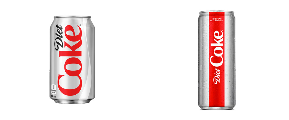
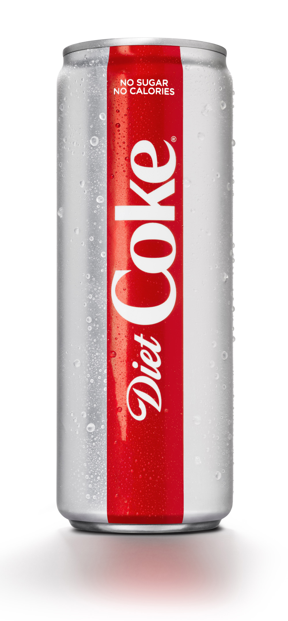
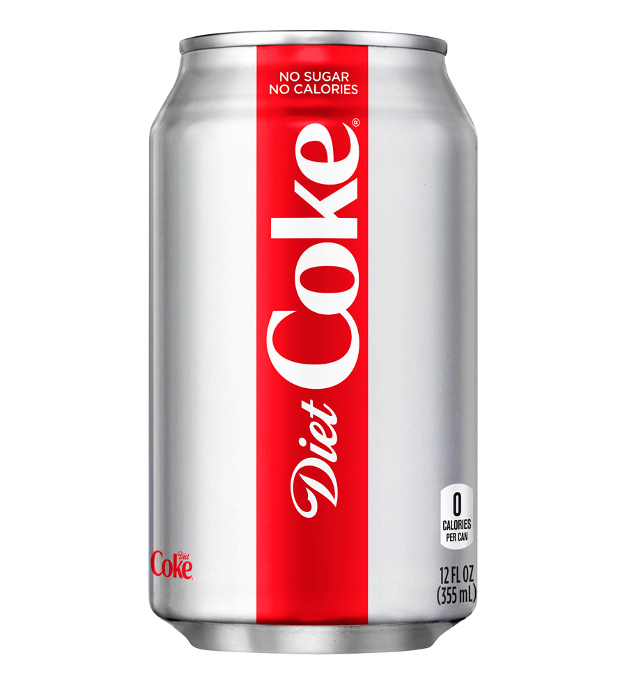
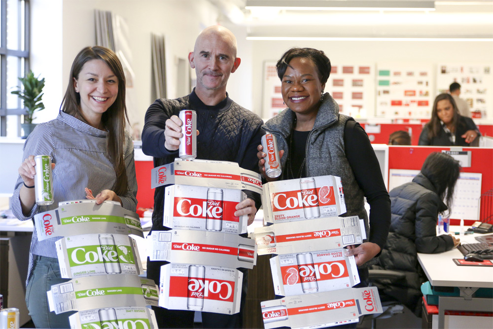
Launched in 1982, Diet Coke (or Coca-Cola Light in some markets) is the sugar- and calorie-free version of Coca-Cola and was the first new brand since 1886 to use the Coca-Cola Trademark — now there is, like, a hundred Coca-Cola This and Coca-Cola That. Available in more than 150 markets around the world, Diet Coke announced yesterday a major redesign of its packaging along with the introduction of four new flavors because, apparently, millennials. The new design was a collaboration between Coca-Cola’s in-house design team, led by James Sommerville, vice president, Coca-Cola Global Design, and UK-based Kenyon Weston.
The two-year innovation process was fueled by consumer research pointing to younger Americans’ affinity for big, yet refreshing and great-tasting, flavors in their favorite foods and beverages - from hoppy craft beers to spicy sauces.
“Millennials are now thirstier than ever for adventures and new experiences, and we want to be right by their side,” [Rafael Acevedo, Coca-Cola North America’s group director for Diet Coke] continued. “We’re contemporizing the Diet Coke brand and portfolio with sleek packaging and new flavors that are appealing to new audiences.”
The sleek cans - the same shape and size DASANI Sparkling fans know and love - will give Diet Coke a more contemporary feel. A refreshed visual identity, meanwhile, lives up to Diet Coke’s new flavors and packaging.
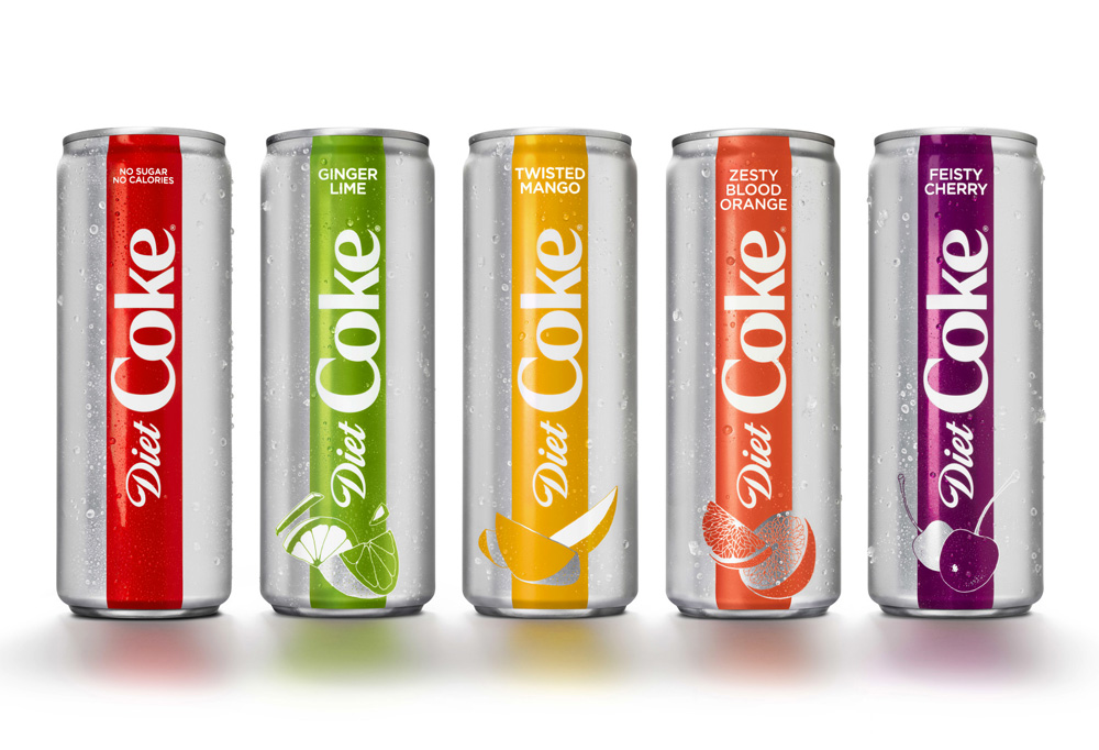
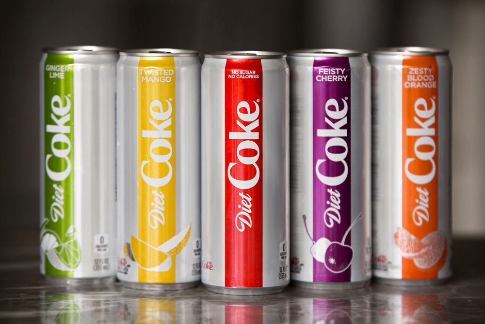
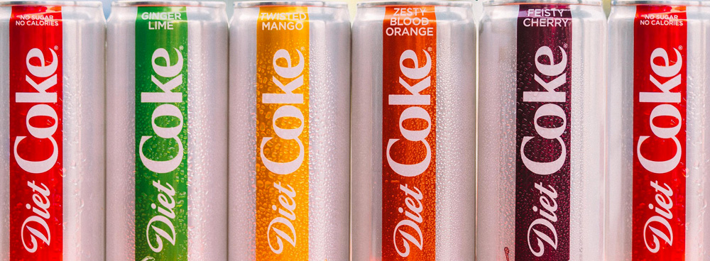
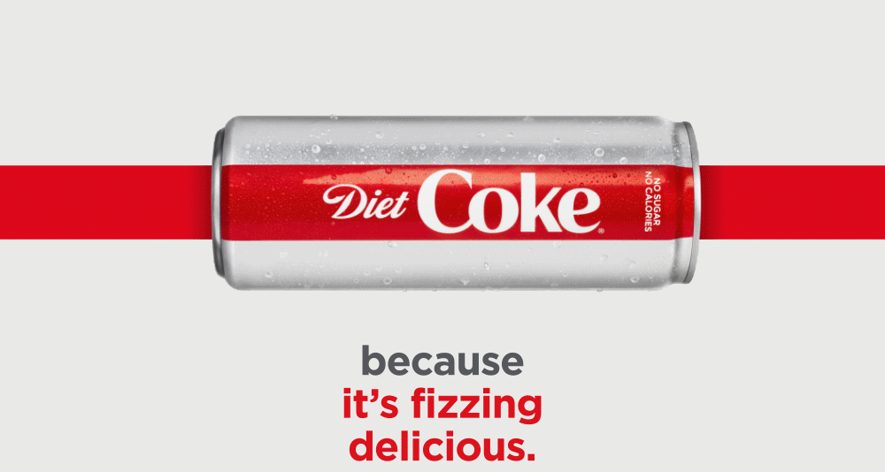
Anchored by the brand’s iconic silver color, the new look-and-feel has a simplified color palette focused on silver and red with accents of bold color to represent the new flavors. A slightly refined typography simultaneously preserves Diet Coke’s heritage, yet presents it in a more progressive manner. Learn more.
The new look also features a dynamic asset James Sommerville, vice president, Coca-Cola Global Design, and his team named the “High Line” - a vertical red band that flows through Diet Coke packaging and into all communications, from outdoor advertising to social media.
“The ‘High Line’ is a Coca-Cola red disc that has gone for a walk,” Sommerville explains. “It visualizes how the Diet Coke brand, the innovation - and the consumers who love Diet Coke - are continually on the move, with confidence.”
Coca-Cola’s R&D team developed and tested more than 30 Diet Coke flavor combinations, featuring tropical, citrus and even botanical notes. Ultimately, Diet Coke landed on four flavors that received the most positive consumer responses.
Ginger Lime, Feisty Cherry, Zesty Blood Orange and Twisted Mango bring more variety to the trademark by complementing the unique, crisp taste of Diet Coke with unexpected-yet-delicious tastes. They aim to satisfy adventurous fans’ thirst for bolder tastes and more dynamic and uplifting experiences.
Earlier in this century, Coca-Cola did a great job of going minimal — probably one of the first major brands to do so — and dropped all the swirls and sweat drops from its packaging in favor of very slick designs, Diet Coke included. What has been great about the Coca-Cola (and Diet Coke) cans recently is that they look and feel comfortable, not trying too hard, and simply embracing its history and equity. This new design feels like it’s trying so, so, so hard to be cool and relevant while still trying to abide by that minimalism of its predecessor. Trying hard does not necessarily equate to it being bad as there is nothing inherently bad about this, it just seems like it’s trying to elevate something that isn’t quite there yet to iconic status.
The main design element of the packaging is the thick line that goes from top to bottom and it creates a really odd, slightly unpleasant division on the cans, which is even more pronounced by how tightly the logo fits within — I’m sure if anyone drew up guidelines for the logo, this packaging would be breaking the minimum-white-space-around-it rule. “Coke” simply feels too confined. The bar works better in the flavor versions where the illustrations at the bottom break out from it and spread into the rest of the cans. It’s too bad, though, that the illustrations are so… weird. I wouldn’t categorize them as “bad” and they are well integrated but they look very clinical or like something you would find in a biology textbook.
In essence, I guess, I don’t like the new packaging very much.

The line device does work well in application beyond the cans to establish a recurring graphic for the Diet Coke brand that is different from Coca-Cola’s wave. I’m surprised the animations above don’t feature the new TCCC Unity typeface… it would have been the perfect product launch to introduce it, instead of using Gotham.
![]()
The logo also got a slight update, mainly in the “k” getting straightened out. I’m slightly indifferent to the change, I think both versions are viable, with the new one looking more elegant and the old one more playful. It’s also possible that “Diet” went on a diet and lost some weight.
Understanding the driving force behind the change and the introduction to the new flavors is probably above my pay grade but one thing that seems clear, and made overt in this case, is that major brands are contorting to Millennials and the resulting design expressions are coming out too forced. I get it that Millennials are poised to be the economic driving force of the next couple of decades (as Baby Boomers once were and still are) but I’m concerned that brands are not necessarily sticking to what made them the brand they are today but instead catering to the whims of folks like the ones shown in the video above, who, sigh… the majority of are slightly on the irritating side (and makes you wonder why brands will do anything to get on their good graces). Anyway… this redesign feels forced; I doubt it will hurt Diet Coke sales in any way and the new flavors might at least spur curiosity and increase sales at launch but I do have a feeling the design will not last longer than three, five years before another major redesign comes through, which is normal in consumer packaging but a bit of an antithesis to Coca-Cola, which exemplifies consistency and sticking to the same things for decades.
Thanks to Matt Means for the tip.

 Новости Союза дизайнеров
Все о дизайне в Санкт-Петербурге.
Новости Союза дизайнеров
Все о дизайне в Санкт-Петербурге.