Обзор лучших ресурсов по разработке бренда, разработке упаковки
contact us | ok@ohmycode.ru
contact us | ok@ohmycode.ru
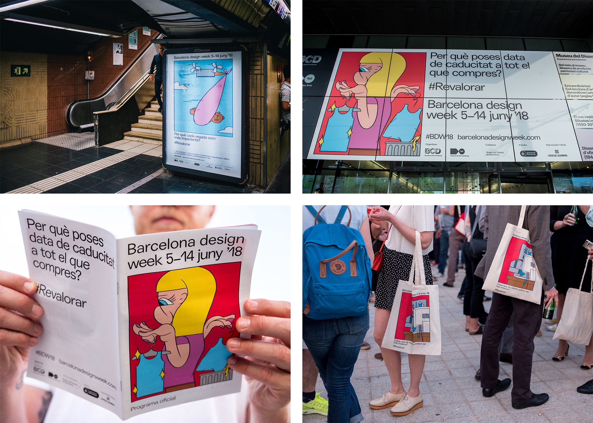
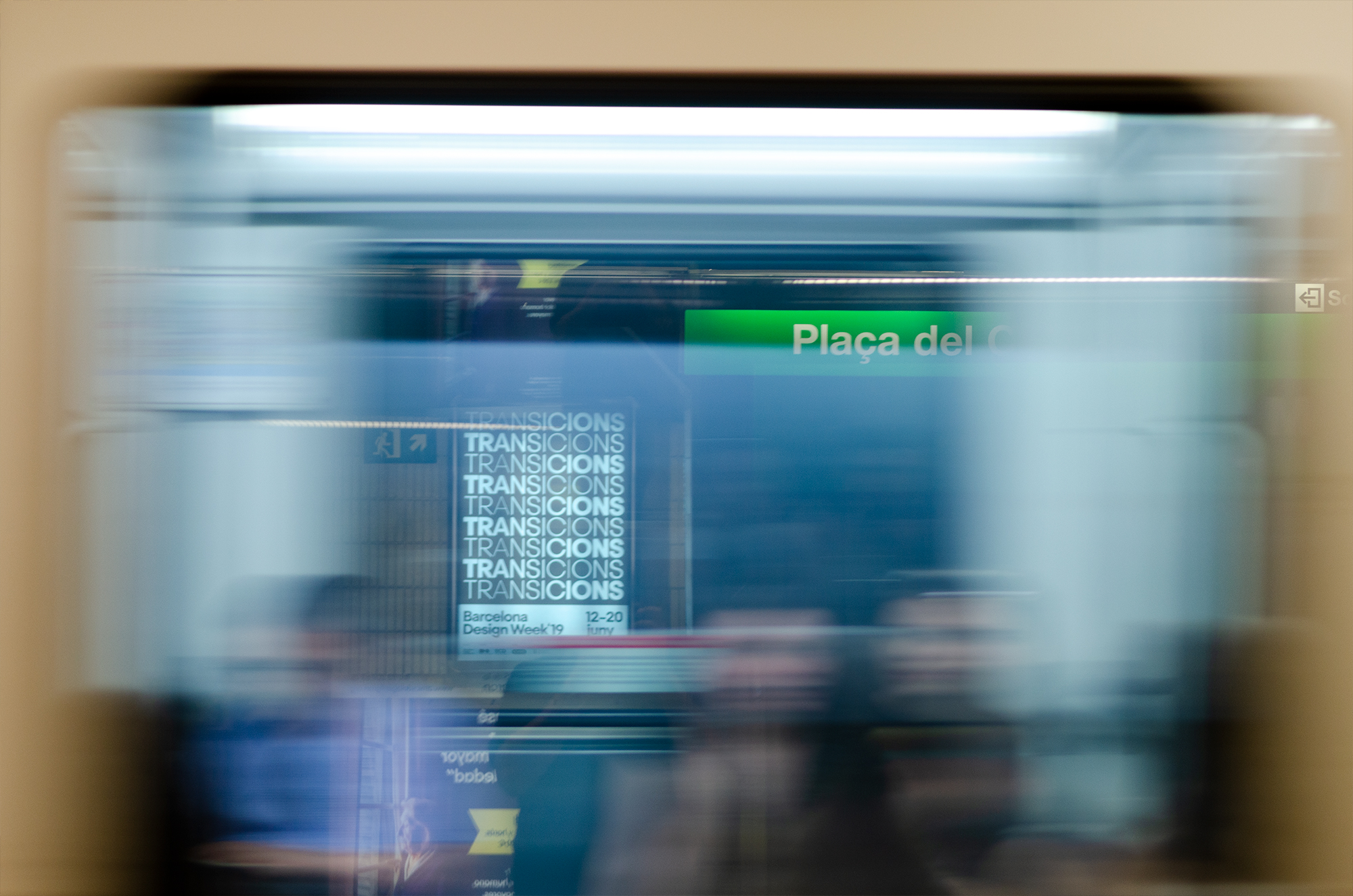
First celebrated in 2006, Barcelona Design Week (BDW) is an event focusing on design, creativity, and innovation that takes place, no surprise, in Barcelona every year. One of the founding members of World Design Weeks, BDW hosts more than 120 activities that range from exhibitions to workshops, talks, open houses, and more, attracting over 12,000 people. The identity for this year’s event, with the theme of “Transitions”, was designed by local firm ESIETE.
The typeface selected by ESIETE for the campaign is conceived in Barcelona. The studio has worked with the Argentine type designer Eduardo Manso, […]. He created this hybrid typeface, with classic-looking letters, but others with unexpected twists. This is the Steradian typeface family for which, its creator sought to move away from the typical geometry to differentiate itself amongst a very popular genre. The widths in their type are variable, the forms derive from the circle, the transition of the forms between weights is fluid and the letters are endowed with a great personality. It is a typography with a modern voice that conveys a contemporary message.
Innovation has played a fundamental role in the development of this project. ESIETE […] has collaborated with the typographer Joan Carles Casasín for the development of a Python code, which was able to facilitate the entire system in a very controlled manner, but at the same time with the surprises that technology offers, in the multitude of supports. It is one of the first dynamic campaigns generated with variable fonts and Python in our country.
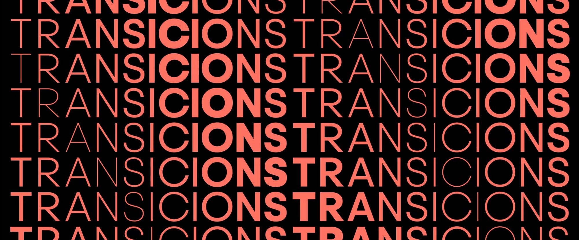
I will be the first to acknowledge that typographically representing the concept of “transition” through a transition from lightest to boldest weights in the word “transition” is as basic as it gets. I’m sure many of us did it as an assignment at school or have done it as a sketch for a logo (most likely for words other than transition) because it’s such an easy, efficient way of conveying the idea of change and movement. When I first took a peek at the project I didn’t even think I was going to post it but I’m a sucker for some good motion and I’m a double-sucker for variable typography motion so here we are. Using Emtype Foundry’s lovely Steradian, the identity and the animations go beyond the basics by modulating the transitions from lightest to boldest not just left to right or top to bottom but diagonally and in chevrons. The animation above, I could watch all day long. There is also something oddly satisfying in the simplicity and directness of the transition animations being for the word “transition” — it goes back to the basic-ness of the concept that makes the execution so easy to appreciate and enjoy.
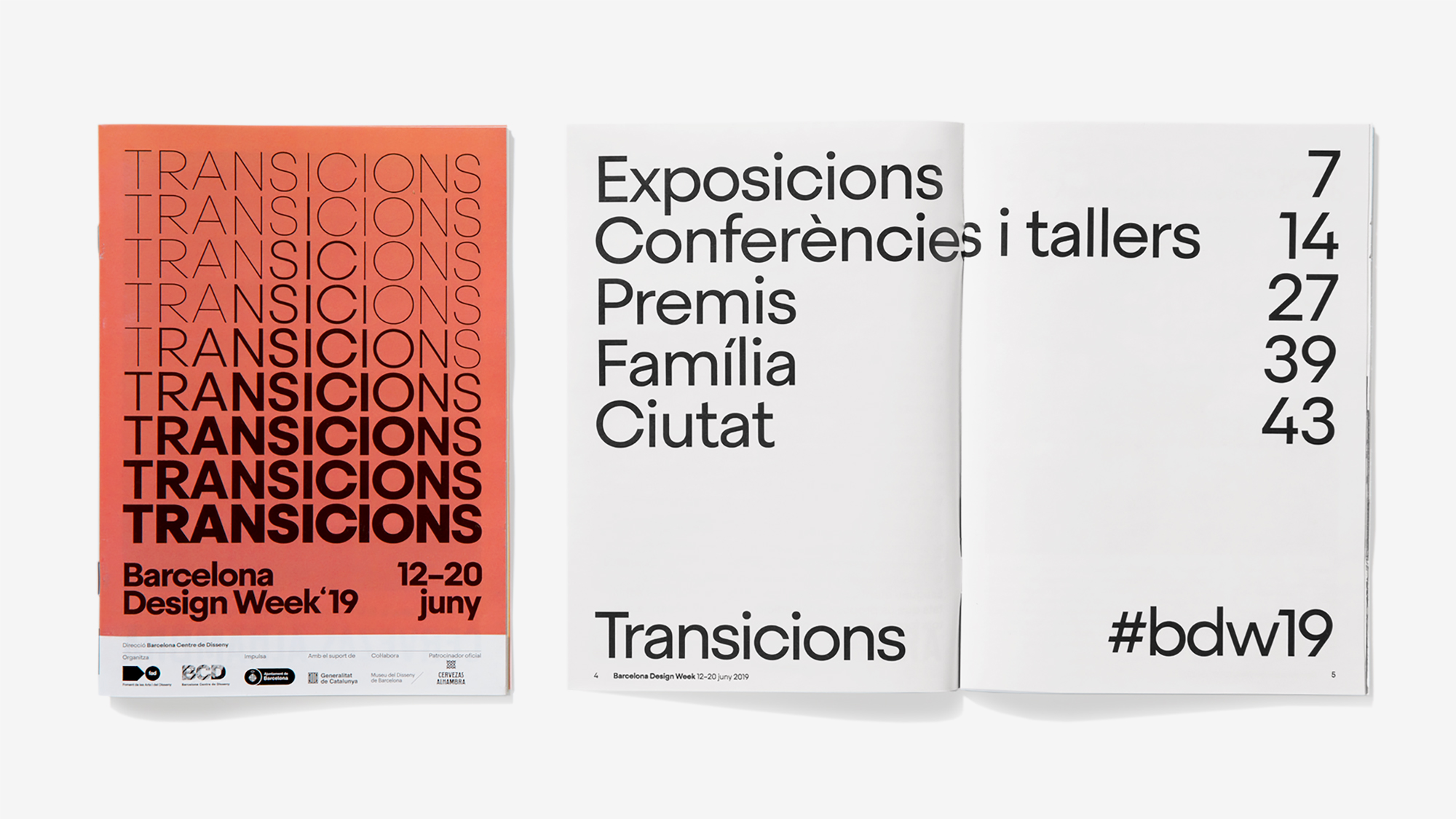
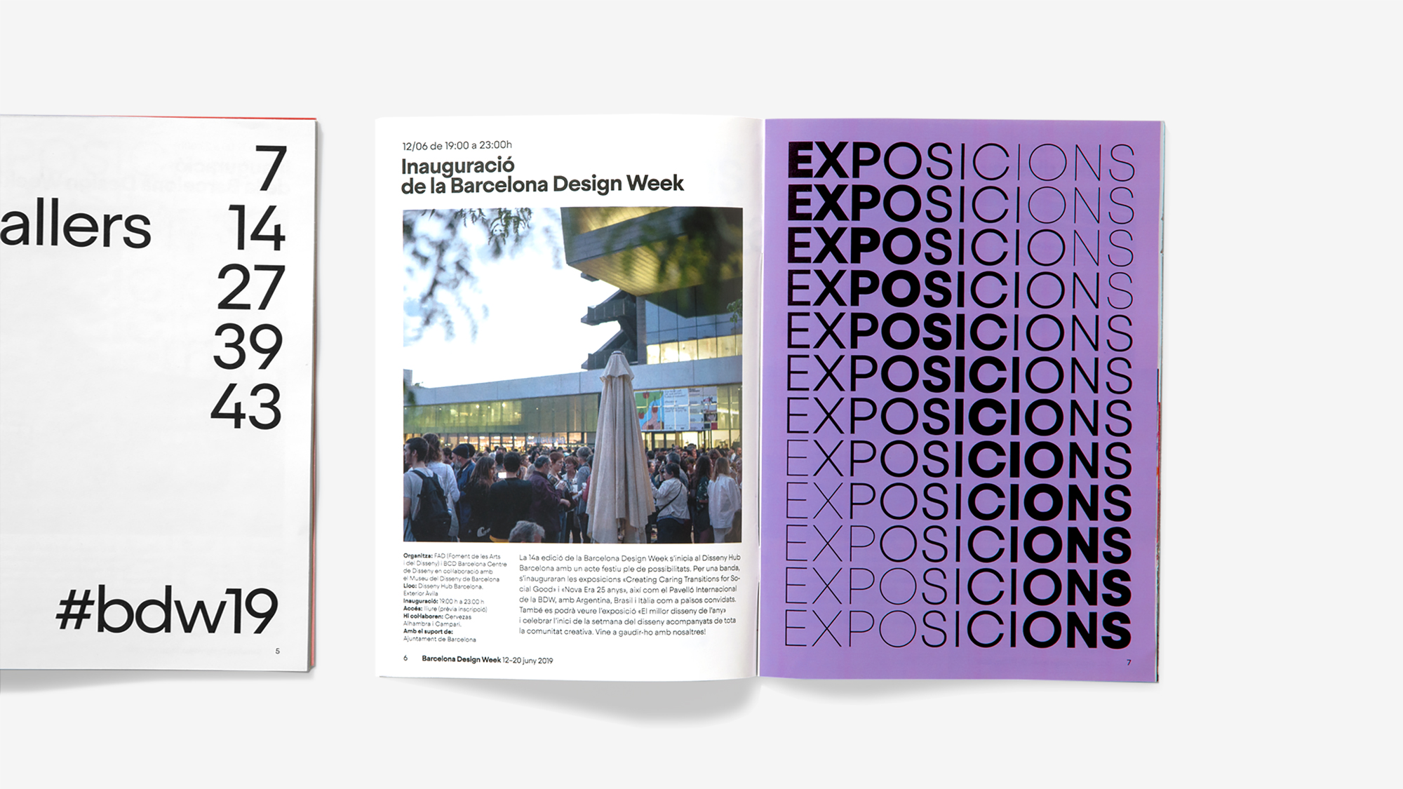
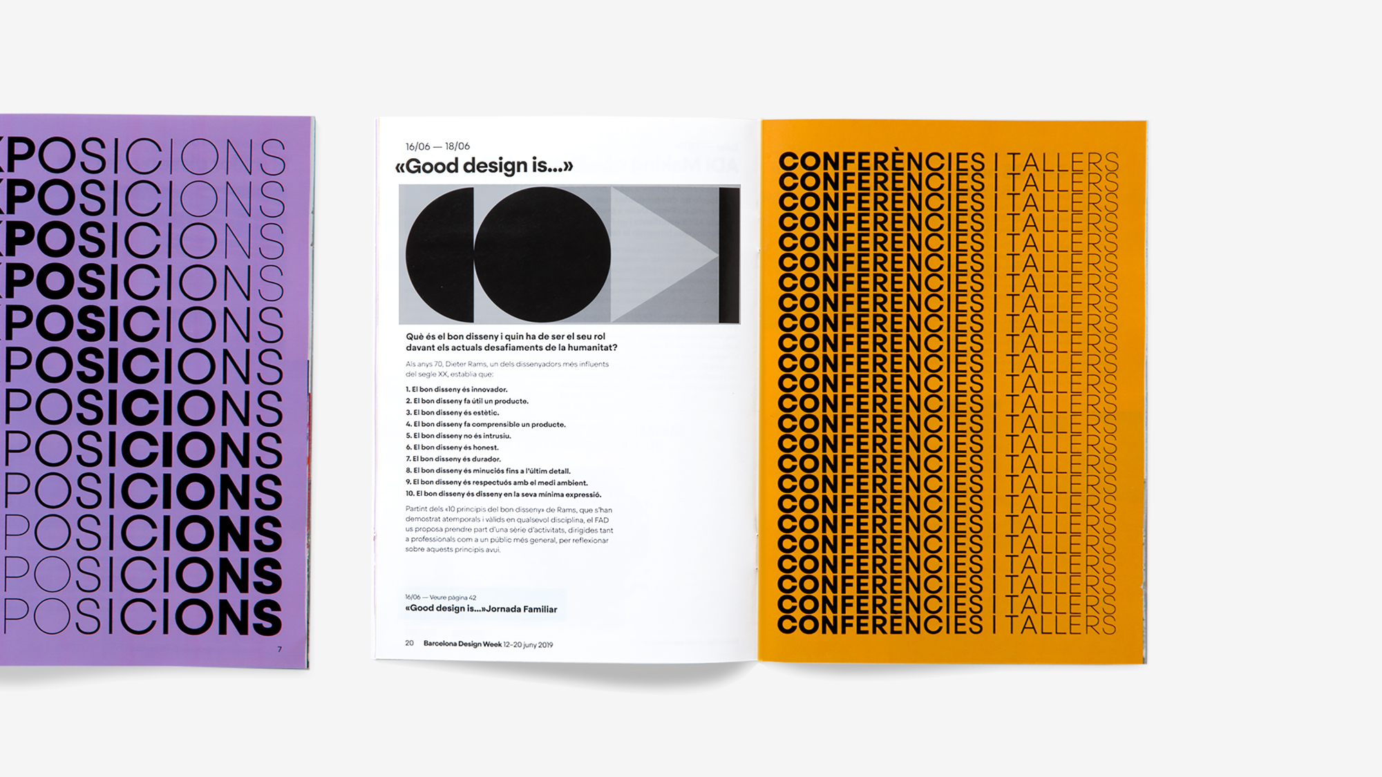
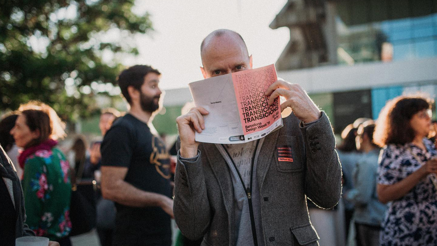
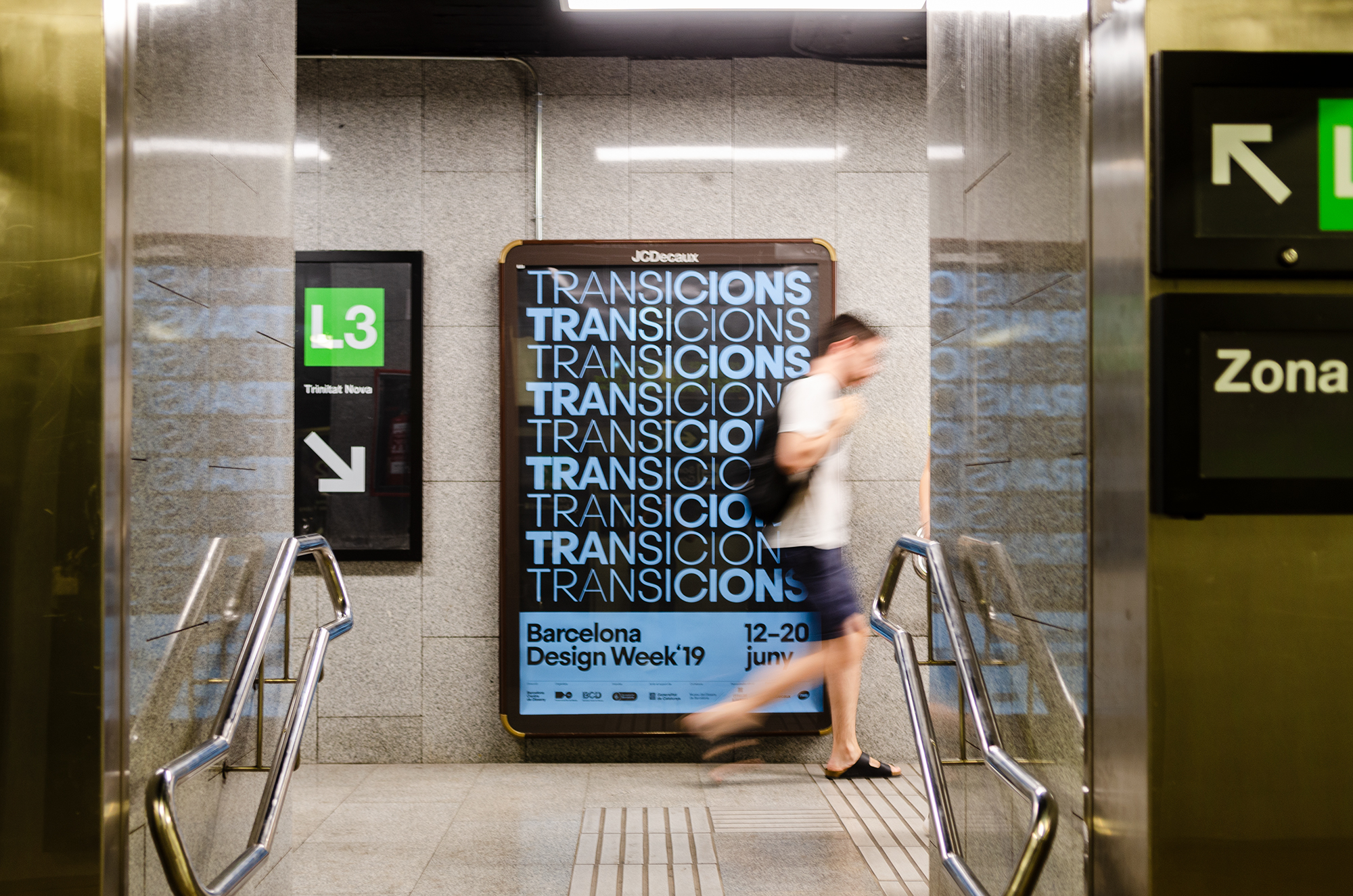
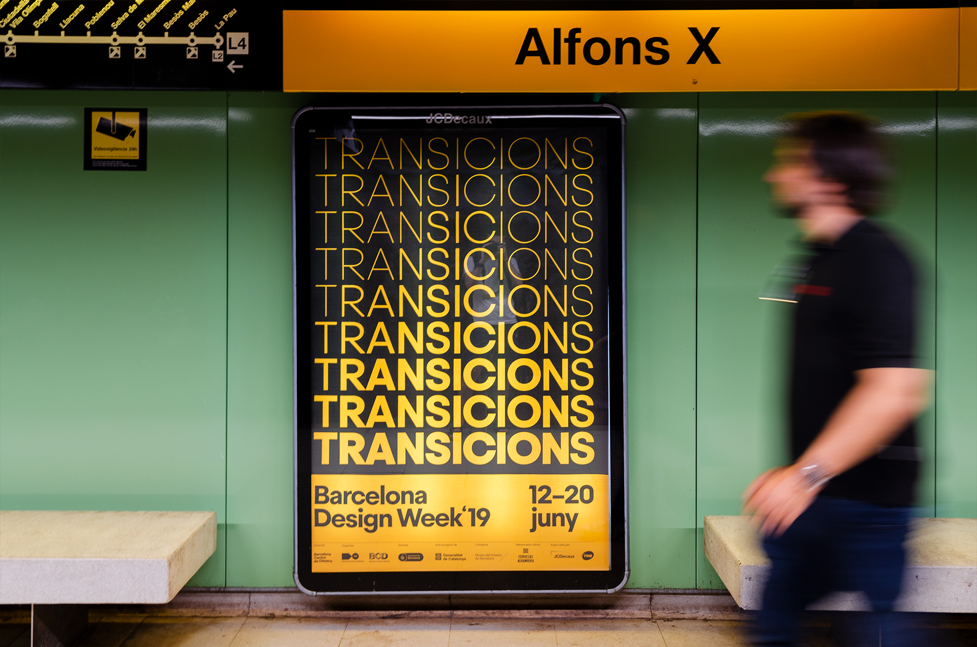
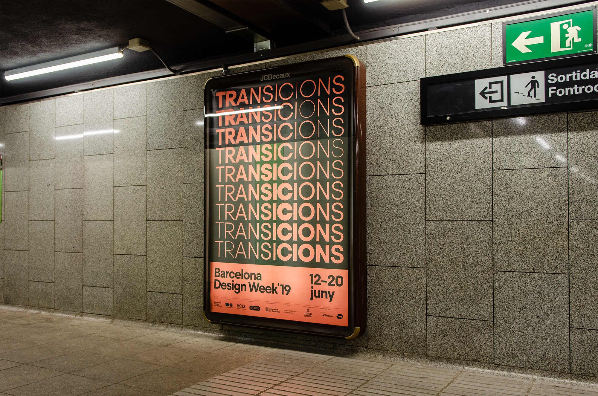
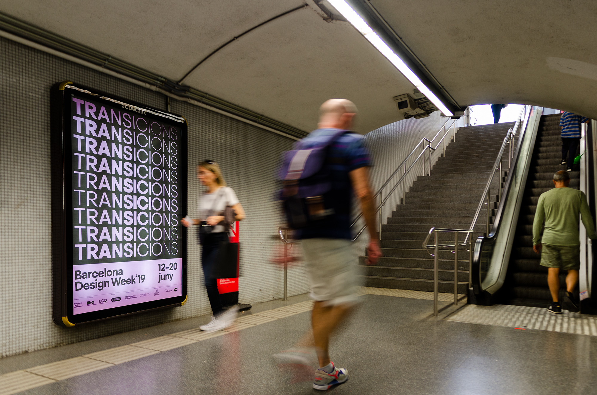
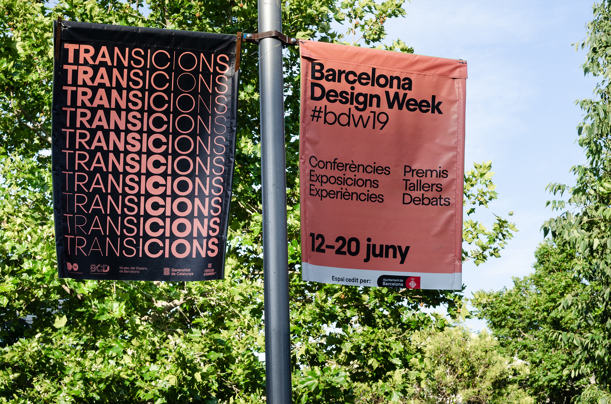
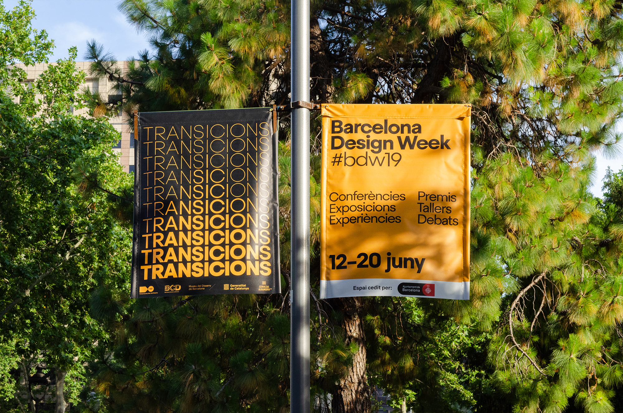
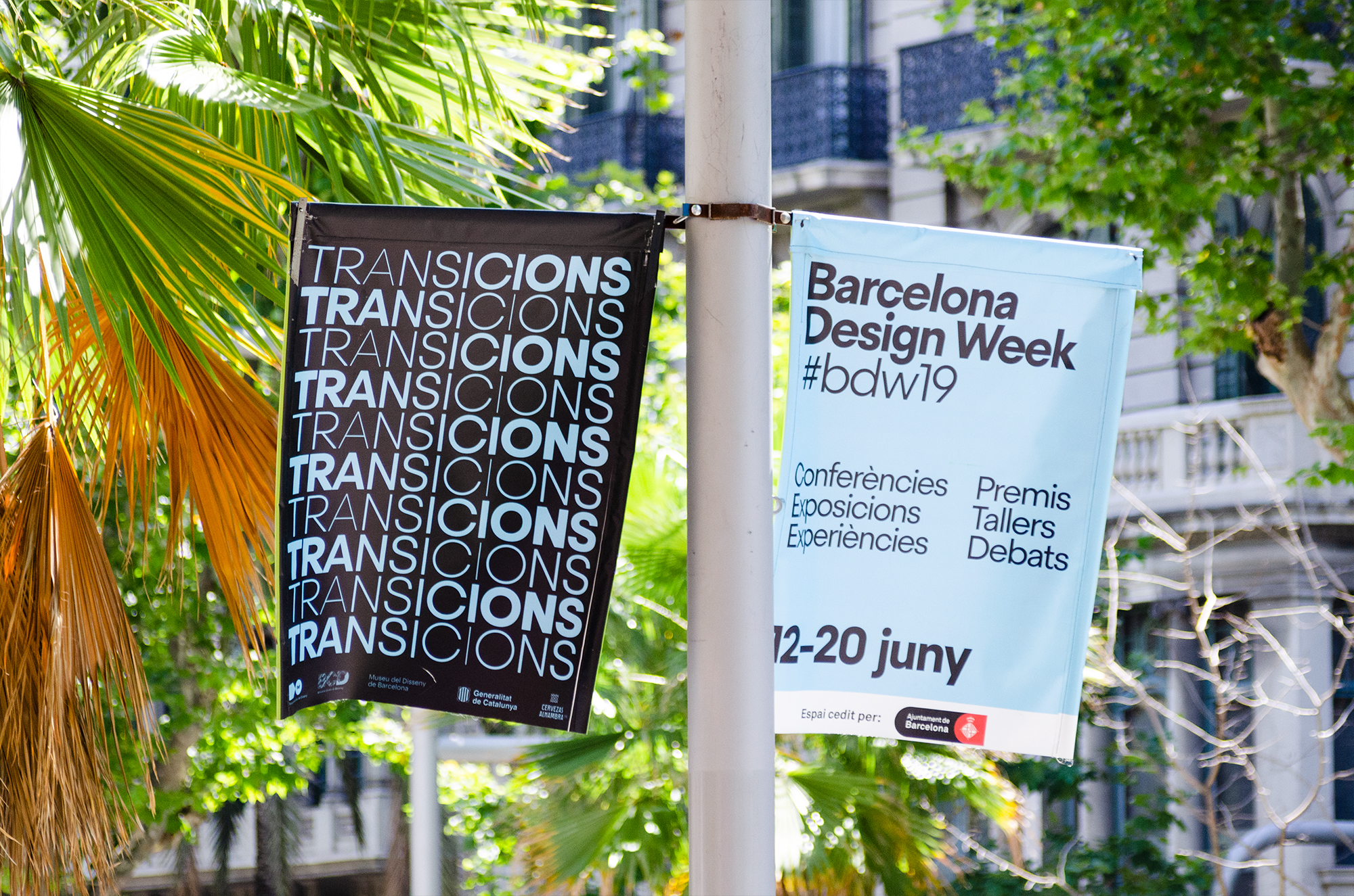
The identity is literally a one-trick-pony — rendering different words in different transition compositions and filling up the allotted areas in each layout — but it’s a damn good-looking trick that, in its repetition and given the amount of exposure it seems to get in the streets of Barcelona, is as good a branding maneuver as putting a swoosh on everything. I do kind of wish there was one more element/layer/plot-twist to the applications; something to add an element of surprise or create some additional tension but, overall, it’s a satisfying design-y solution for a design-y event for design-y people.

 Новости Союза дизайнеров
Все о дизайне в Санкт-Петербурге.
Новости Союза дизайнеров
Все о дизайне в Санкт-Петербурге.