contact us | ok@ohmycode.ru
contact us | ok@ohmycode.ru
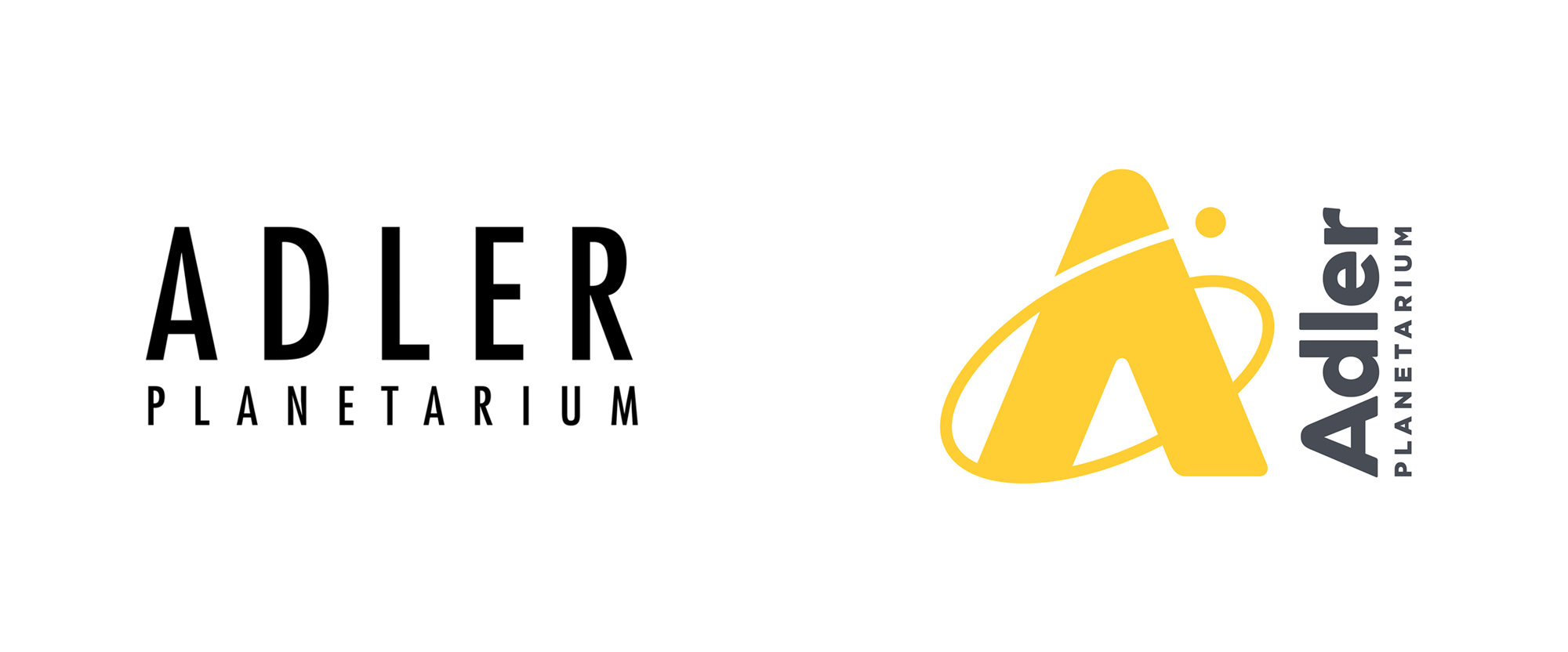
Opened in 1930, the Adler Planetarium in Chicago, IL, is a museum dedicated to the study of astronomy and astrophysics and was the first planetarium — projecting an image of celestial bodies onto a dome — in the United States. Founded by and named after Max Adler, who became a philanthropist after working at Sears Roebuck & Co., the Planetarium now hosts more than half a million visitors each year with the mission to “connect people to the Universe and each other”. Yesterday, Adler Planetarium introduced a new identity designed by New York, NY-based Pause for Thought and San Francisco, CA-based The Change Project.
The Adler Planetarium’s new logo borrowed from the sky in multiple ways. It now incorporates a warm yellow which is bright, cheerful, and optimistic, much like the Sun. “Early on in the process we established that the logo should not include the dome.” said Janice Pedley, Creative Director of Pause for Thought. “Although it’s an iconic building, the Adler’s mission is much bigger than the sky shows inside.” The Adler reaches millions through youth STEM programs, neighborhood skywatching events, online citizen science, and other outreach projects. “We suggested this extensive programming reach could be expressed through the metaphor of an orbit of influence, with Adler at the center. The circular planet is propelled upwards with gravity assist, symbolizing how the Adler inspires people to ‘reach for the stars’.”
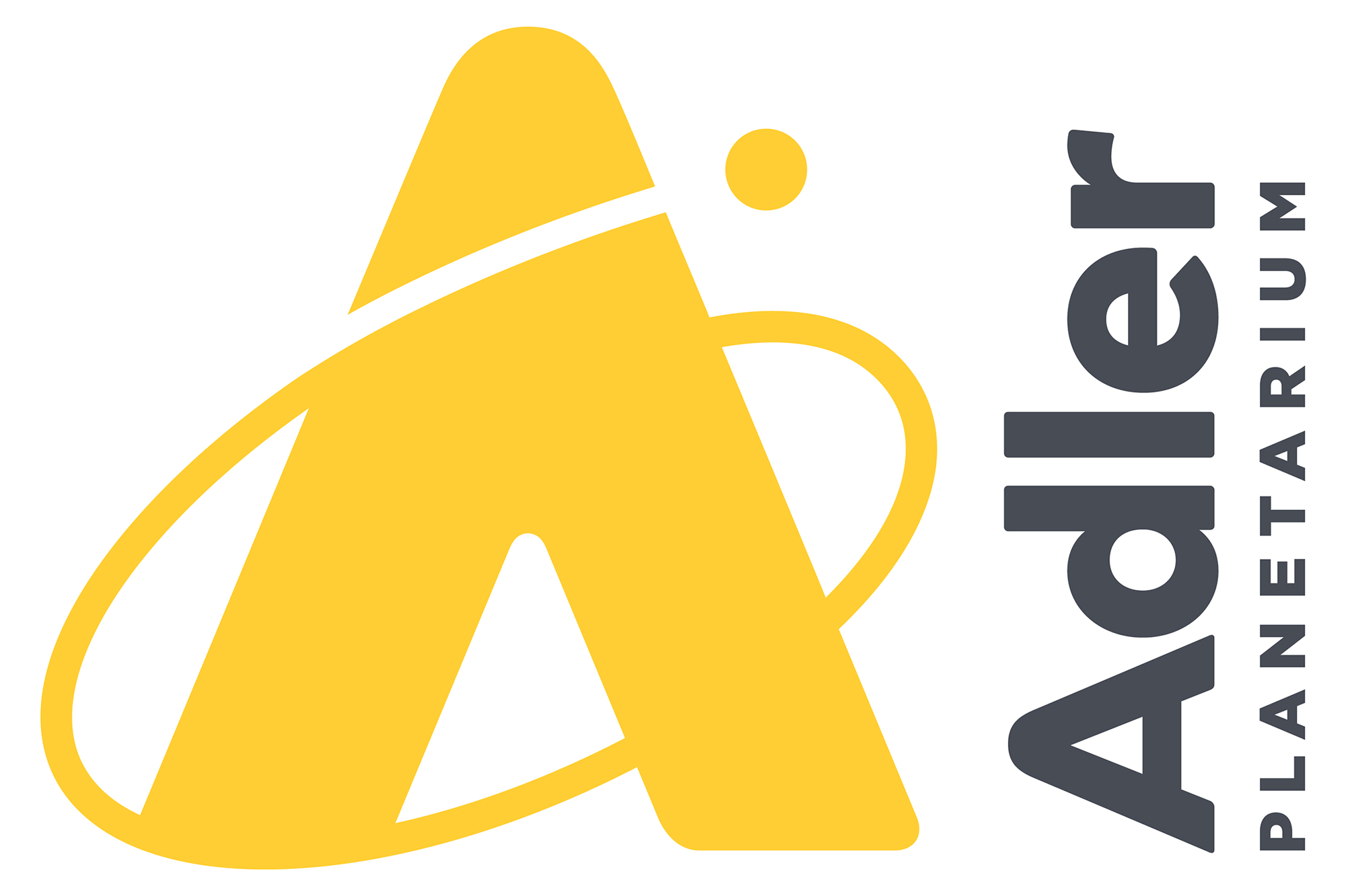

The old logo wasn’t too exciting or evocative but it was mostly fine and its loosely spaced — see what I did there?! — tracking could have been interpreted as elements moving away slowly from each other as if by gravity in space. The new logo drops the somber mood of the previous one with a bright, cheerful, and more space-themed approach through a monogram “A” with a planet orbiting around it. I don’t love it but I think it’s fine as a more instant expression of “Fun! Space!” that makes the museum feel more approachable. The orbit line could have been executed in a little more interesting way, perhaps with some contrasting thicks and thins and better ways of depicting depth so that it didn’t feel so flat. The wordmark on its side does annoy me. I get it that it’s like a rocket or something going up into space but it just looks silly. Other than that, the typography is mostly fine with the “A” in “Adler” echoing the shape of the monogram.
The new visual identity makes use of the Adler’s historic collection, that has been given new relevance and photography to showcase the human experience. Illustration has a part too and in fact here, the whole Adler team jumped in. “We co-created the ‘Adlerverse’, a collection of hand drawn stars and doodles from the staff and volunteers that feature throughout the identify system.” Adds Pedley, “With over a hundred submissions, the Adlerverse is an authentic expression of the whole organization and a celebration of the community.”
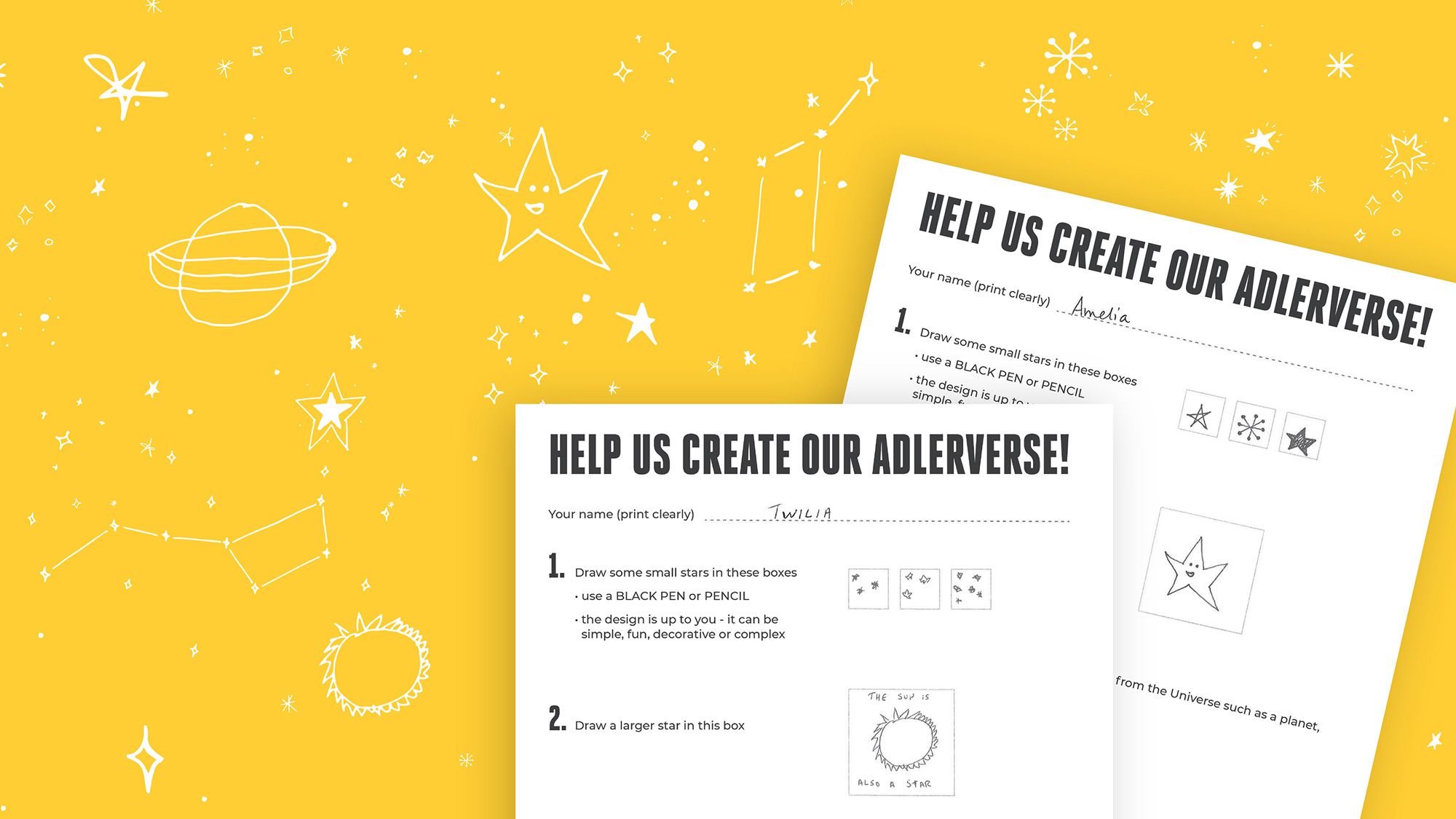
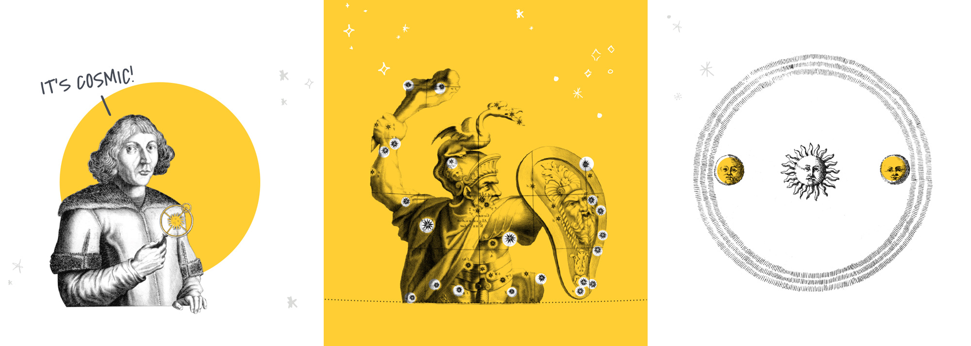

The identity elements are a good set of ingredients. I like how they pull historic imagery and add contemporary flourishes while also unifying them with touches of yellow. The new illustrations are charming and I really like the idea that they were created by the museum’s staff. A hand-drawn font, an element that appears in combination with both styles helps bridge them into a single universe. The introduction of a hand-drawn font seems to be good but, as I stared at the applications, I came to dislike this one, in part for its odd angles and in part for its use where each character is independently leaning back at an angle and with a very weird baseline alignment.
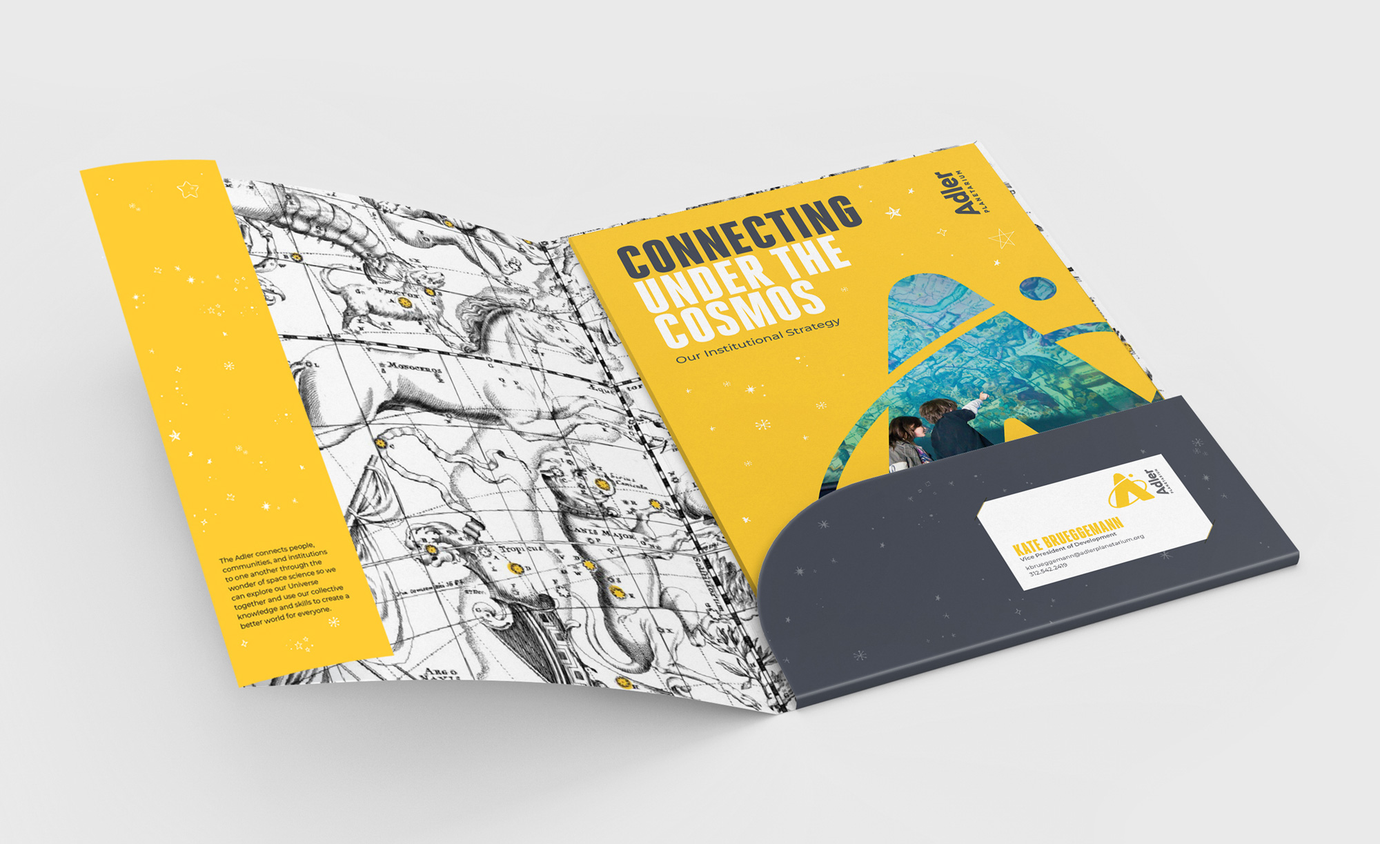
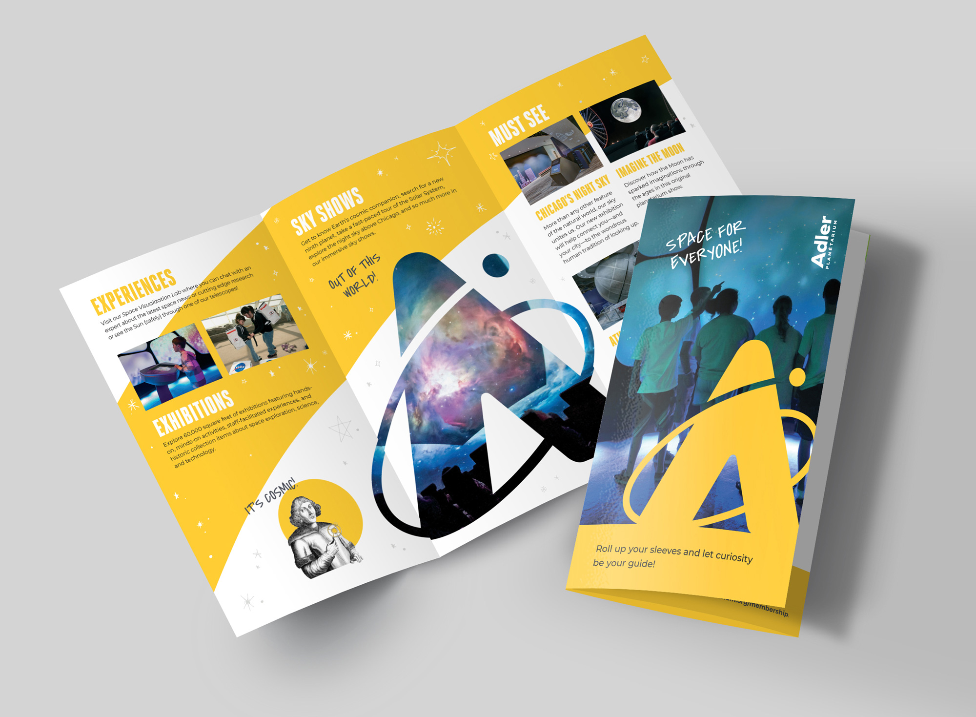
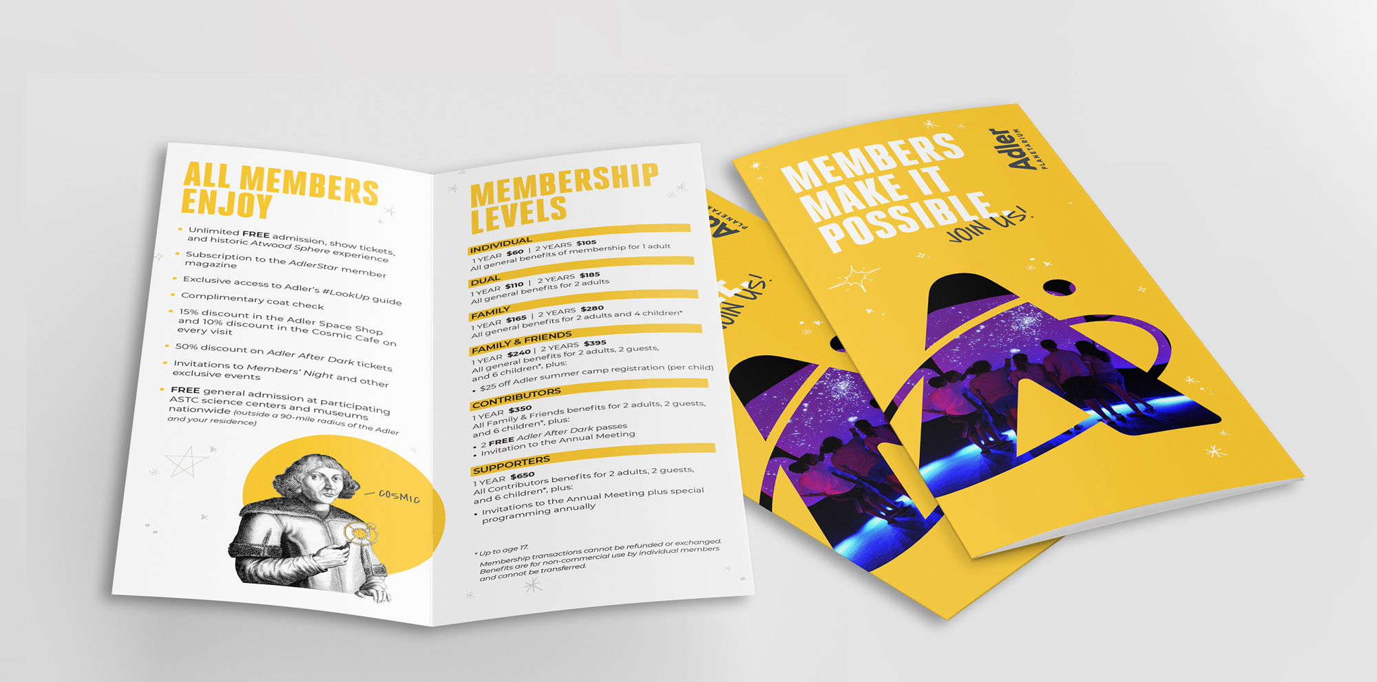
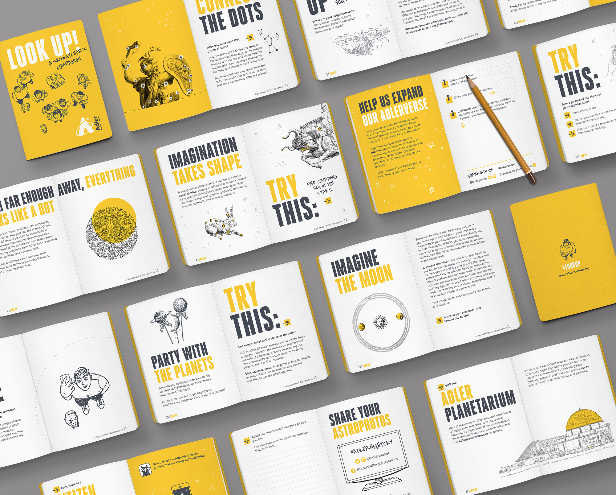
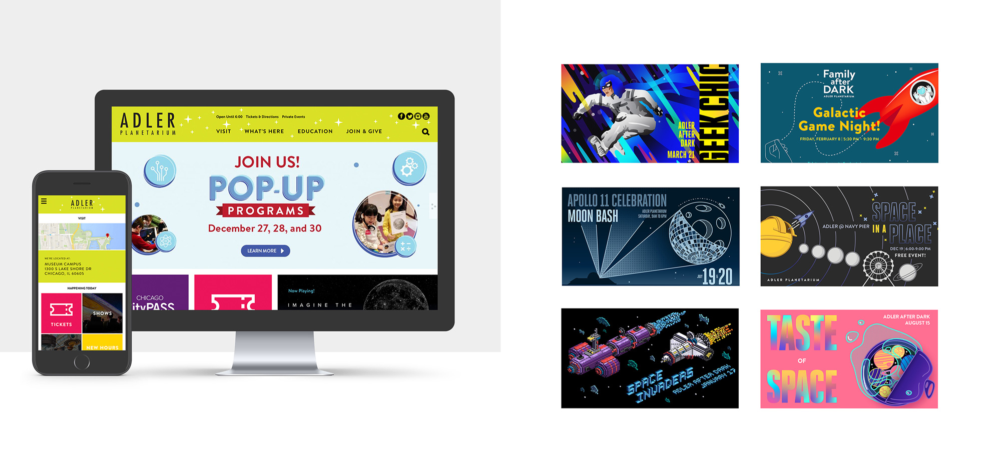
The applications are fine. A little too joyful and kid-oriented for me but definitely nothing wrong with any of it — maybe the brochures are one trick too many with the logo-as-window, swooshes in the back, illustrations, photos, all of it all of the time. They definitely have plenty of elements to work with — also including a condensed bold font, Heroic — that all together do amass to a recognizable style.
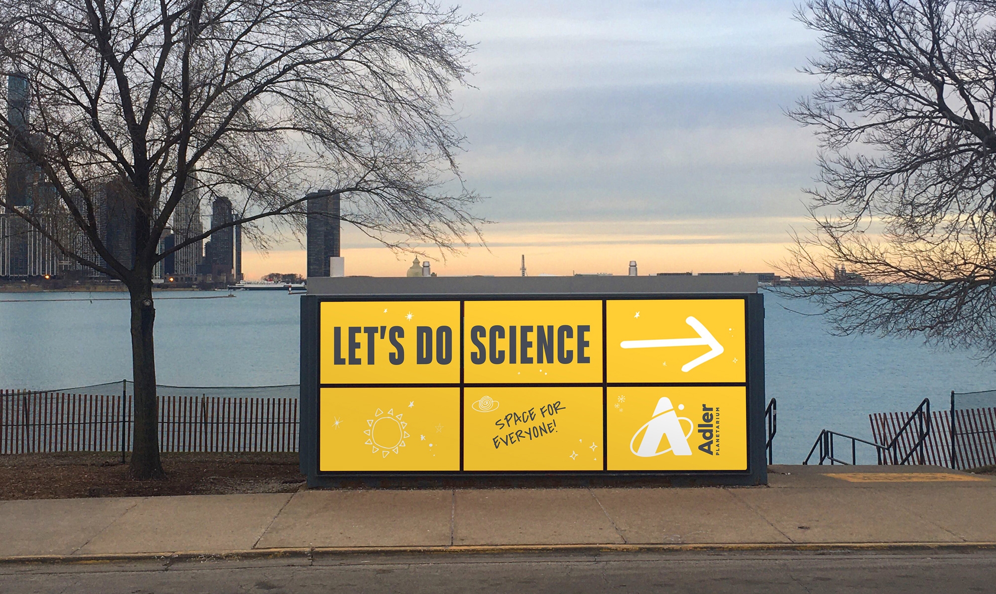
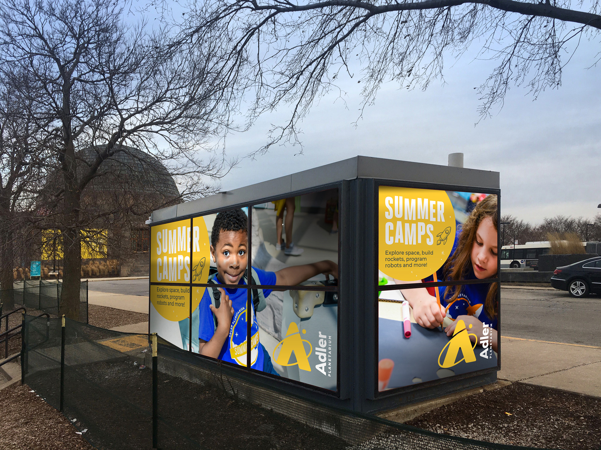
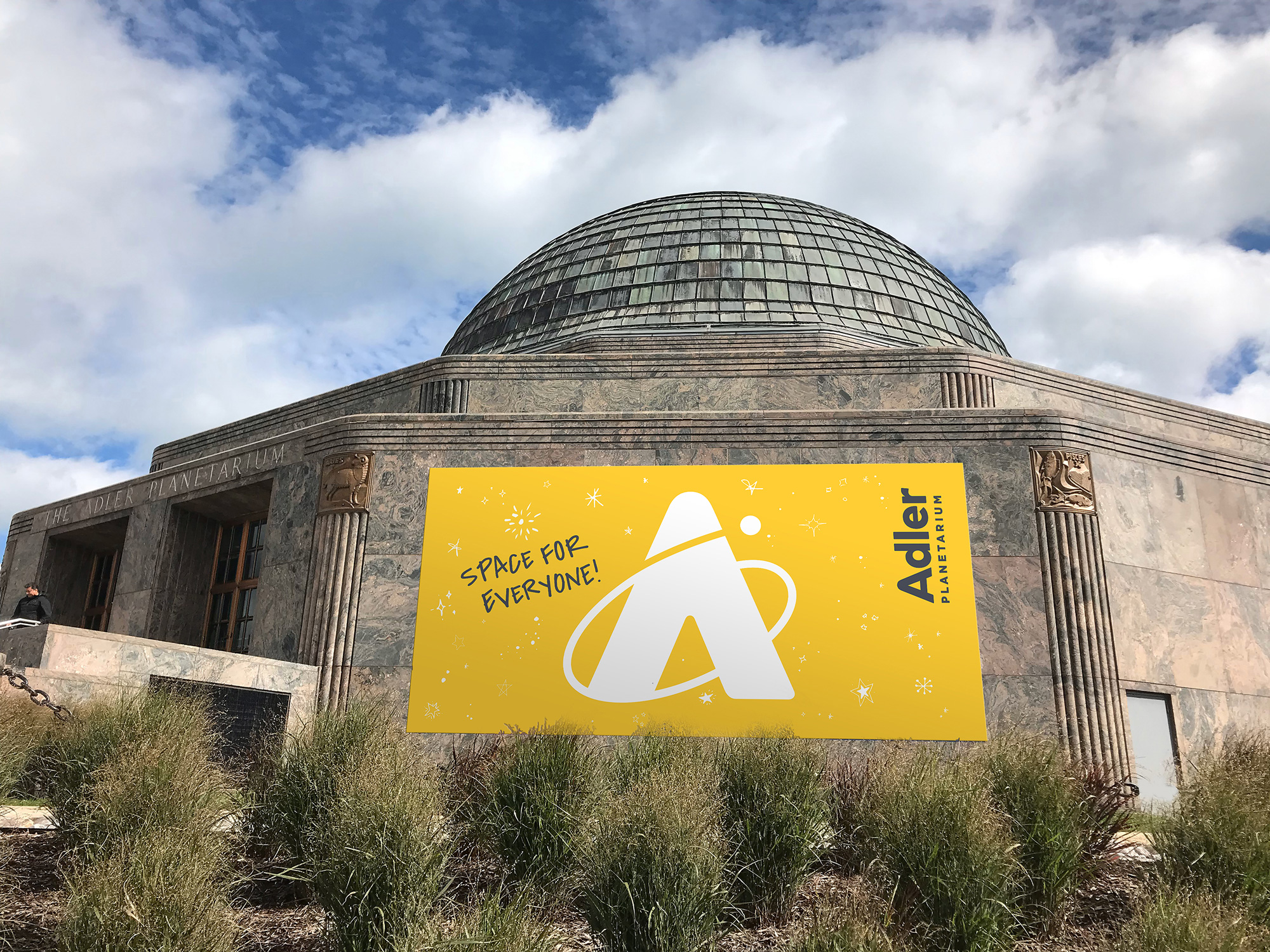
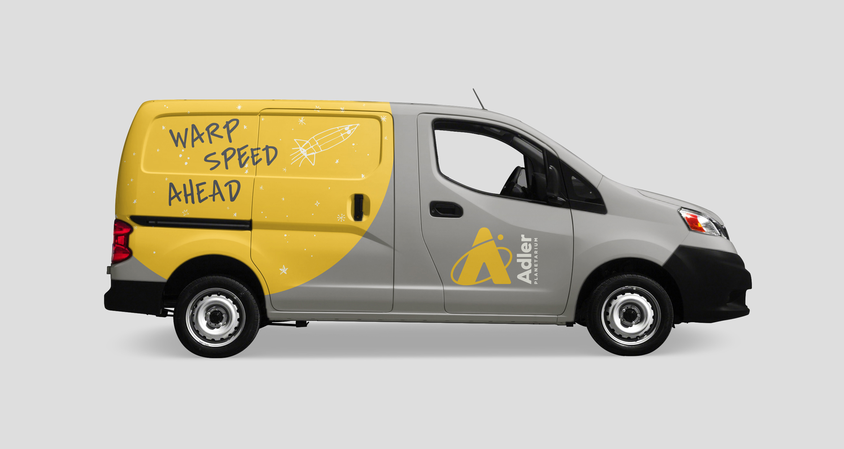
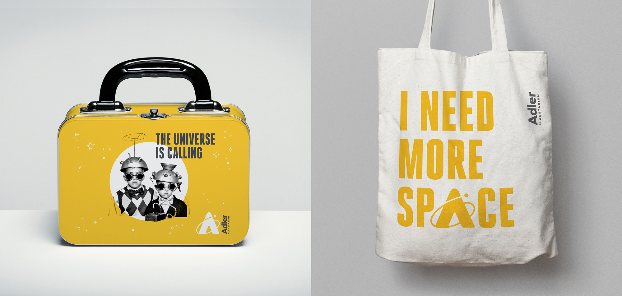
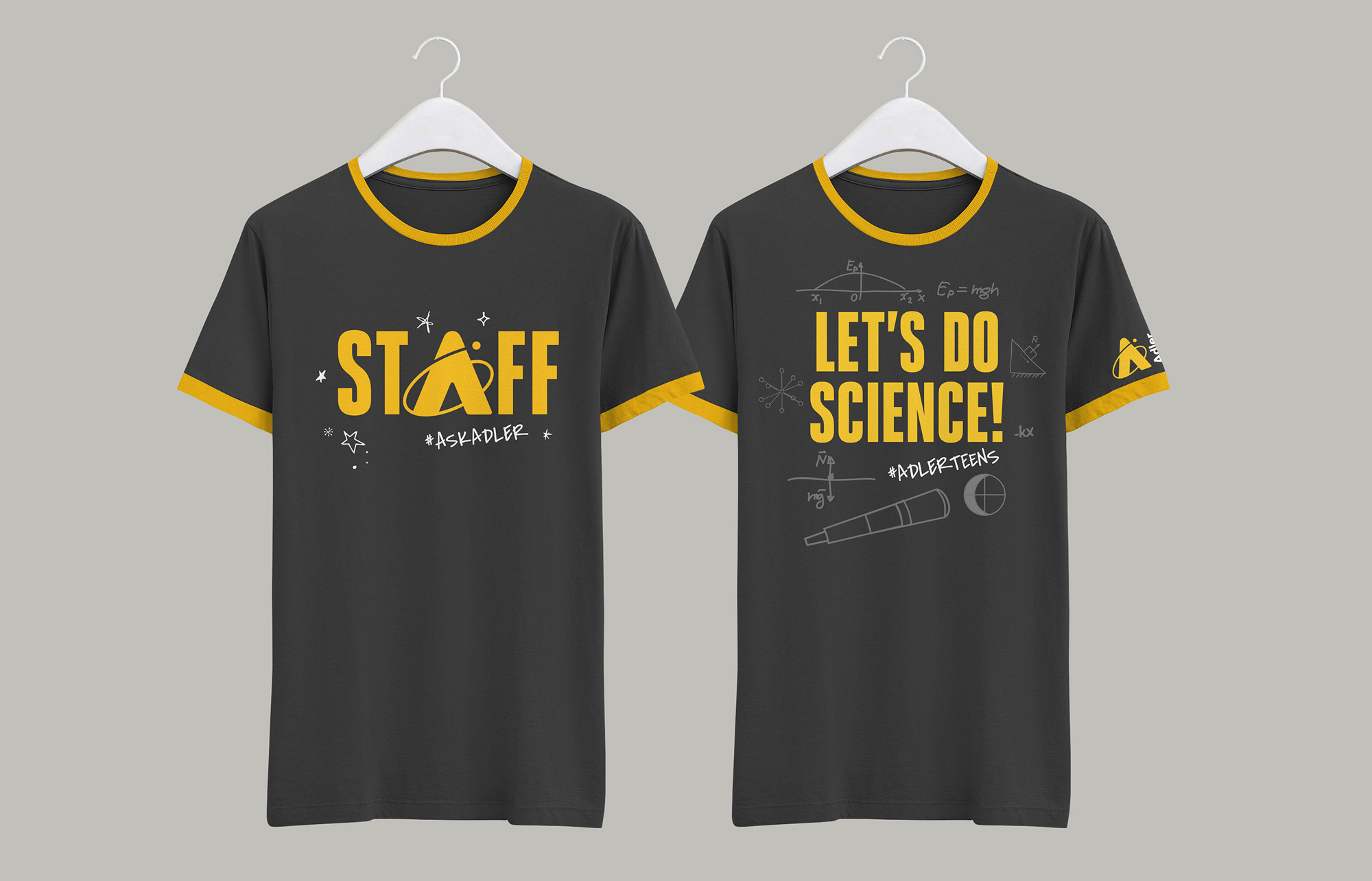
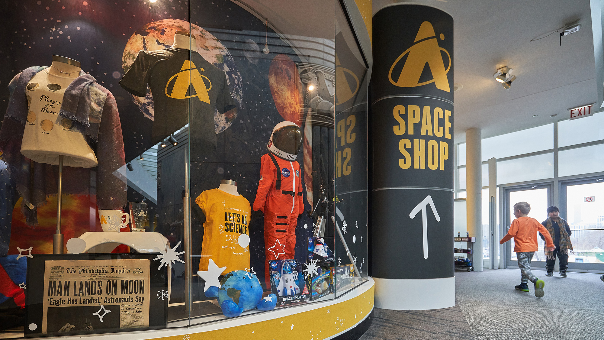

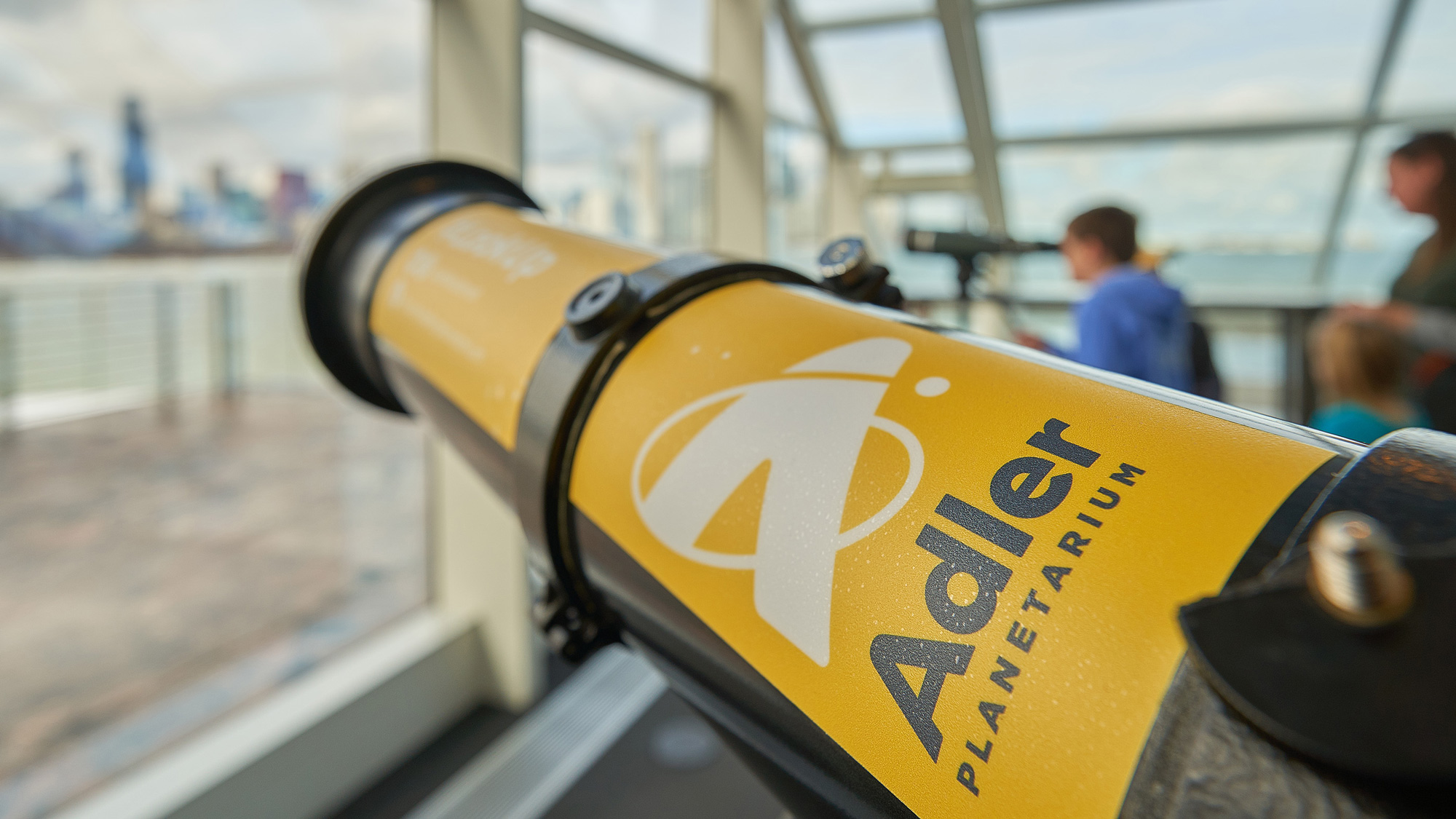
Overall, even though I had plenty of nitpicks and especially after seeing some photos of the actual implementation, I do think this is a very right approach for this museum: it feels lively, it feels space-y, and it feels new-yet-comforting in a way where the design isn’t trying to be too cool for cool’s sake.

 Новости Союза дизайнеров
Все о дизайне в Санкт-Петербурге.