contact us | ok@ohmycode.ru
contact us | ok@ohmycode.ru

Launched in 2003, Squarespace is a web publishing platform that allows anyone to easily design websites through pre-built templates and/or drag-and-drop functionality. Originally the work of Anthony Casalena who ran the company on his own for four years with seed money from his dad and a university grant, Squarespace now has more than 800 employees in three cities and an unspecified range of millions of websites have been done through its platform. I remember the days when Squarespace was just beginning and even few designers knew about it — now it has been advertising during the Super Bowl with Keanu Reeves since 2014 and they are the first sponsor to appear on the jerseys of the NBA’s New York Knicks. Rags to riches, yo. This week, Squarespace has introduced a new identity designed by New York, NY-based DIA, and a new custom font with Geneva, Switzerland-based François Rappo.
The essence of New York is sophistication with an edge. It shows up in the architecture, the fashion, and the art that’s created here, as well as in the personalities of the people who make this city their home. The tension between those two ideas is expressed in the design of our headquarters at 8 Clarkson Street, and it was equally important to bring it into our typography.
We worked with DIA Studio, François Rappo, and Optimo, to create an entirely new brand typeface, that’s intentionally idiosyncratic, balancing the clarity and sophistication of a neo-grotesque sans serif with the edge formed by thoughtfully cutting the letterforms. Slightly left of center, it perfectly communicates our New York heritage. Meet Clarkson.


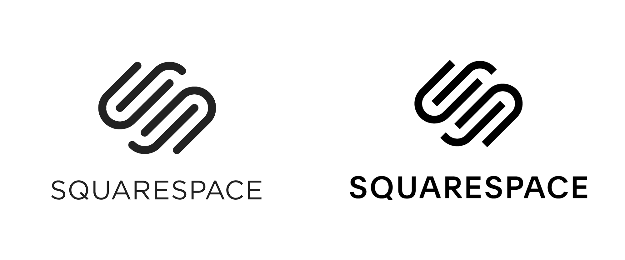
The updates to the logo aren’t radical but they certainly change the mood. The rounded caps of the old icon were bubbly and friendly, making it feel more consumer-y whereas the flat ends of the new icon exude a more serious look, which I find much more interesting. The flat caps also help show the “SS” in the icon a little better while still maintaining it mostly abstract. The thickness relationship with the new wordmark is better too and gives more importance to the name. Like the icon, the new wordmark is more business-like and now that Squarespace is a fairly mainstream product/service, it’s more fitting. Which brings us to the typography…


The new font is very nice and has some really great peculiarities. The reverse angle of the “r” for example or the very light angle of the endings of the “C”. While it’s yet another sans serif in a world of extremely similar sans serifs that do little to really differentiate one company, product, or service from the other, it’s one of the most interesting ones I’ve seen.
New York is a study in movement; like jazz, it constantly heads in unpredictable directions. Since much of our output is interactive and screen based, we knew the brand needed to make sense in motion. So we developed a kinetic identity system that dimensionalizes our name and reinforces the two syllables in Squarespace.
The new identity revolves around a system that plays with depth and perception. I like the systemic thinking behind it, how it can yield a somewhat unique language that does stand apart from most identities, and it’s super cool to look at as a system either here on Brand New or on their microsite but, as you’ll see in some of the layouts below, it might be somewhat aleatory when seen on its own.


Let’s say I’m not a graphic or web designer and I invented an orange peeler that I need a website for. I’m not sure any of the above layouts would make me think “Oh, there is the accessible solution I need”. I fear this might be too cool/daring for the new mainstream customer base they are aiming to reach. However, I very much commend Squarespace for going in what is a relatively drastic direction that aims to convey that they are not your average platform and that a commitment to design is a big part of what they offer. A large part of their audience, I assume, is still graphic designers who don’t code and use Squarespace either for their own websites or for their clients’ websites, and for that audience, this is perfect, making them look cooler than other options like Wix or perhaps even Shopify (which also offers templates and Squarespace now offers online sales tools so it’s a fairly direct competitor).


Trial and error was an integral part of the design process—and of the resulting system. Much of the image-making is handled by a generative system that introduces happy accidents and unexpected collisions into the compositions. It also ensures that the system will remain continually fresh and grow beyond the initial guidelines into a robust, extensible visual language that works across marketing, social, product, and our website.
The kinetic motion work is great. I’ve been really enjoying DIA’s exploration of this approach — check out their Instagram account — over the last year or two and it’s great to see it applied to a project with so much visibility. But, again, I wonder if it’s too much of a good thing or too much of a thing that is not easily digestible by many? Overall, this positions Squarespace in a similar corporate mainstream wavelength like Uber, as a kind of luxurious yet accessible necessity that provides a more stylish experience than jumping in a yellow cab or using a template from GoDaddy.
Thanks to Jonathan Lawrence for the tip.

 Новости Союза дизайнеров
Все о дизайне в Санкт-Петербурге.