Обзор лучших ресурсов по разработке бренда, разработке упаковки
contact us | ok@ohmycode.ru
contact us | ok@ohmycode.ru
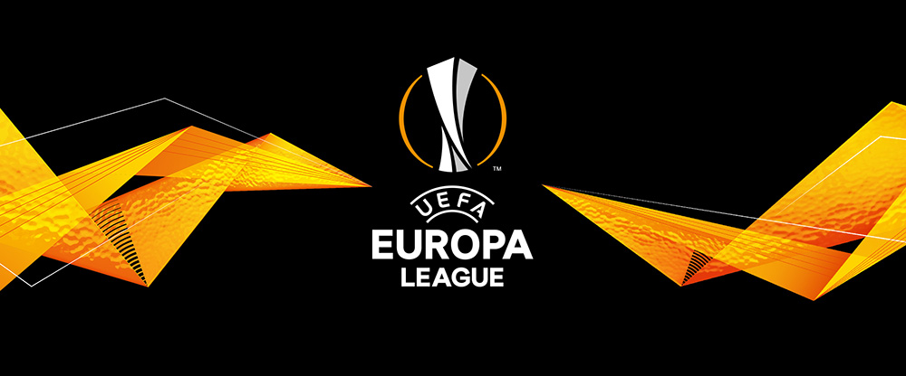
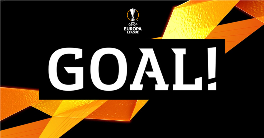
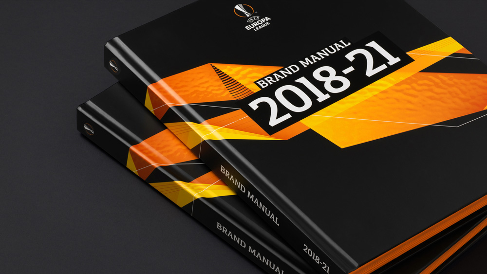
First played in 1971 (named UEFA Cup then), UEFA Europa League is the second highest level football competition in Europe (behind UEFA Champion League) with 48 teams competing for the cup and a spot in the following season’s UEFA Champion League. For the 2018 - 19 season and planned through 2021, UEFA Europa League is introducing a new identity designed by London, UK-based Turquoise.
Turquoise has a brand montage video that you can watch here (embedding was disabled).
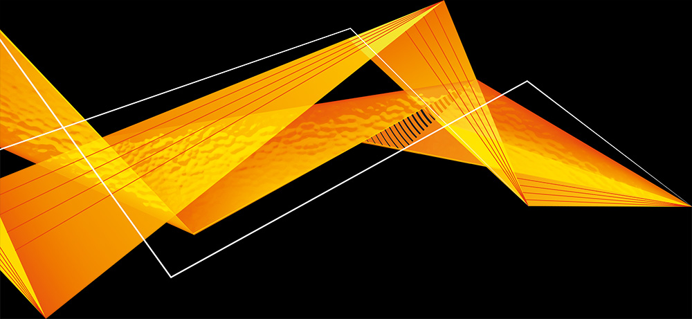
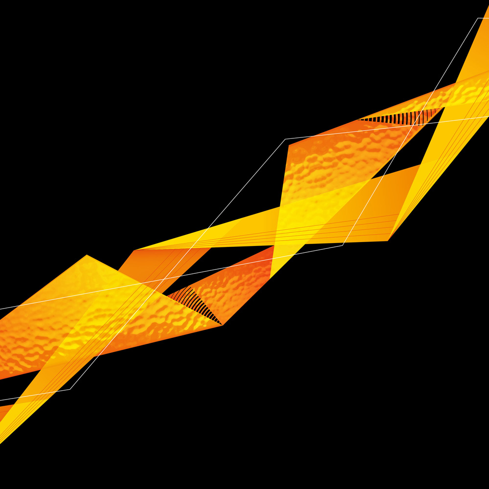
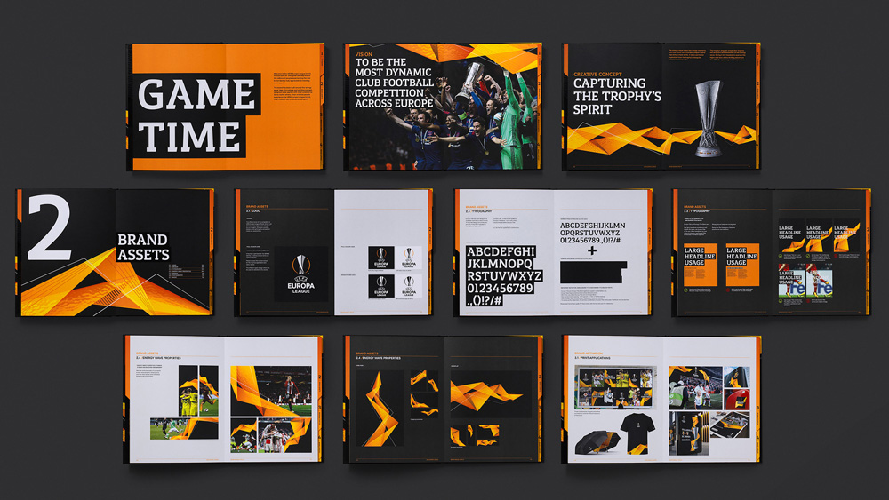
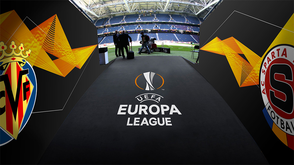
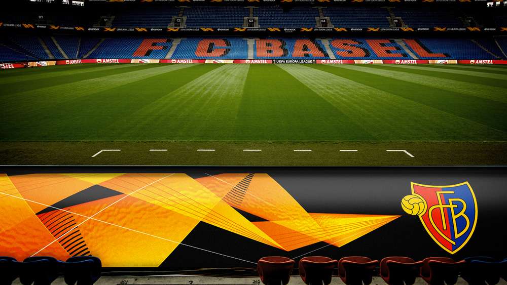
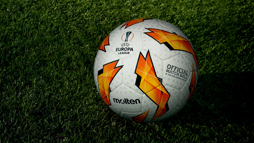
Thrilling adventures happen when diverse groups of people come together in pursuit of bold and ambitious dreams. The energy wave represents this sheer adventure of competing in the UEFA Europa League - the raw emotion felt in victory and defeat and the ambition it takes to keep moving forward and overcome the next challenge.
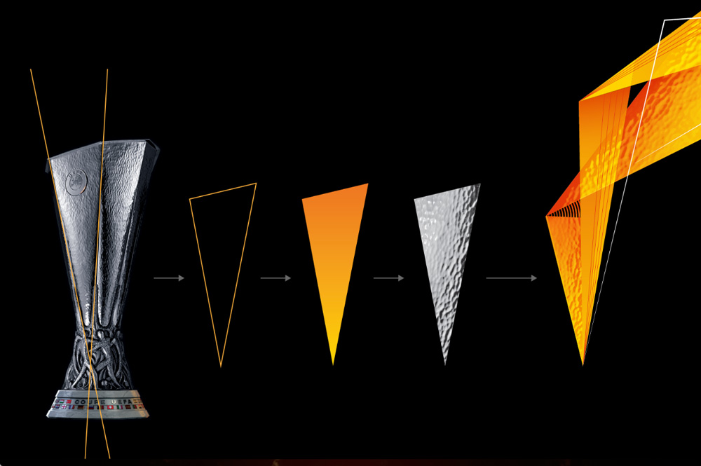
The energy wave looks to express the spirit of this sporting adventure by interpreting key design features of the iconic UEFA Europa League Trophy, with its distinctive, triangular sides with hammered metal detail. The angular shape also informs the structure and movement of the energy wave, giving it the freedom to express the highs and lows of this thrilling adventure.
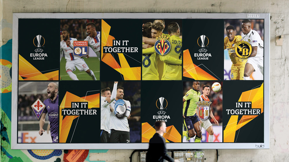
Since I don’t watch soccer, I have no idea what the UEFA Europa League graphics have looked like so I can’t compare experiences or previously-set expectations. However, if I were to start watching the UEFA Europa League, based on this identity, I would certainly be expecting an energetic exciting tournament — which, from what I’ve read, seems to be the case as I believe there is also a round where losers of the UEFA Champions League come into another round of the Europa League, but, again, I don’t watch, so… I find the wave graphic attractive and I like how it animates. It feels like an odd thing to build an identity around for three whole seasons but I guess it’s distinctive enough and through sheer repetition it should eventually become highly recognizable.
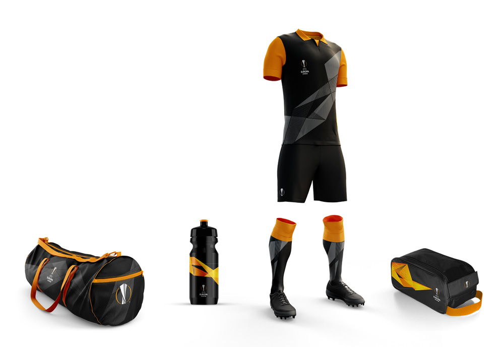
A bespoke headline font has been designed to work alongside the existing Europa Nuova typeface. A slab serif font with unique angled serifs, the Europa Title, imbues a sense of rawness and attitude to the overall brand experience.
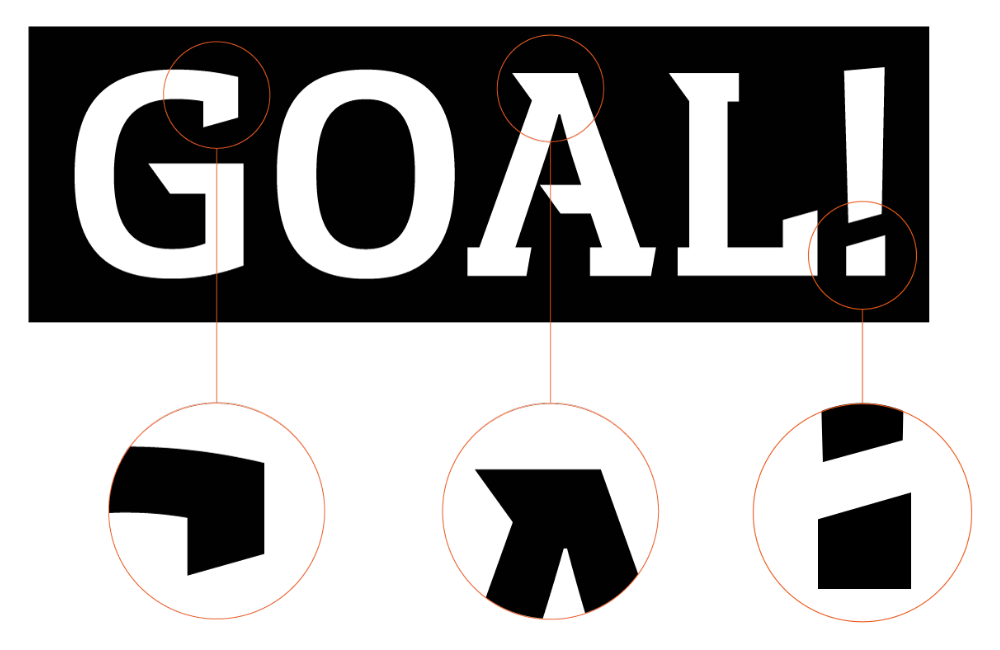
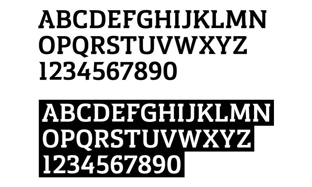
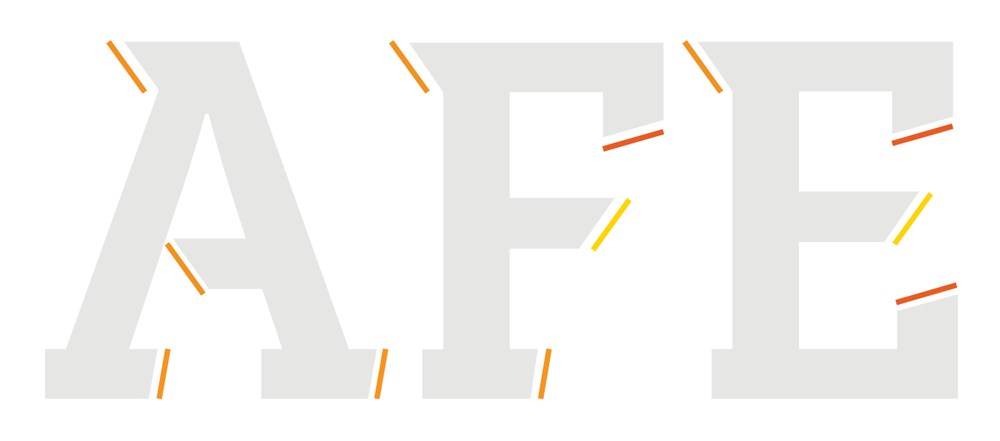
I might be wrong in this but I feel like this is the first time (or one of the first times) that the spike-and-slab aesthetic has entered European sports graphics in such an overt way. It’s something we see a lot — A LOT — of in the U.S. and in particular with college sports but I can’t quickly think of an example in European sports where it has been used so slab-ily and spike-ily as it is here. Anyway… the custom font is super whack, with slabs and spikes going in all and any direction. It’s a really uncomforable-looking font.
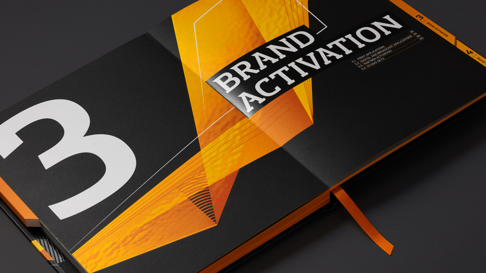
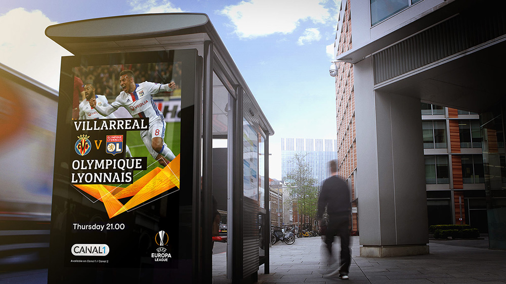
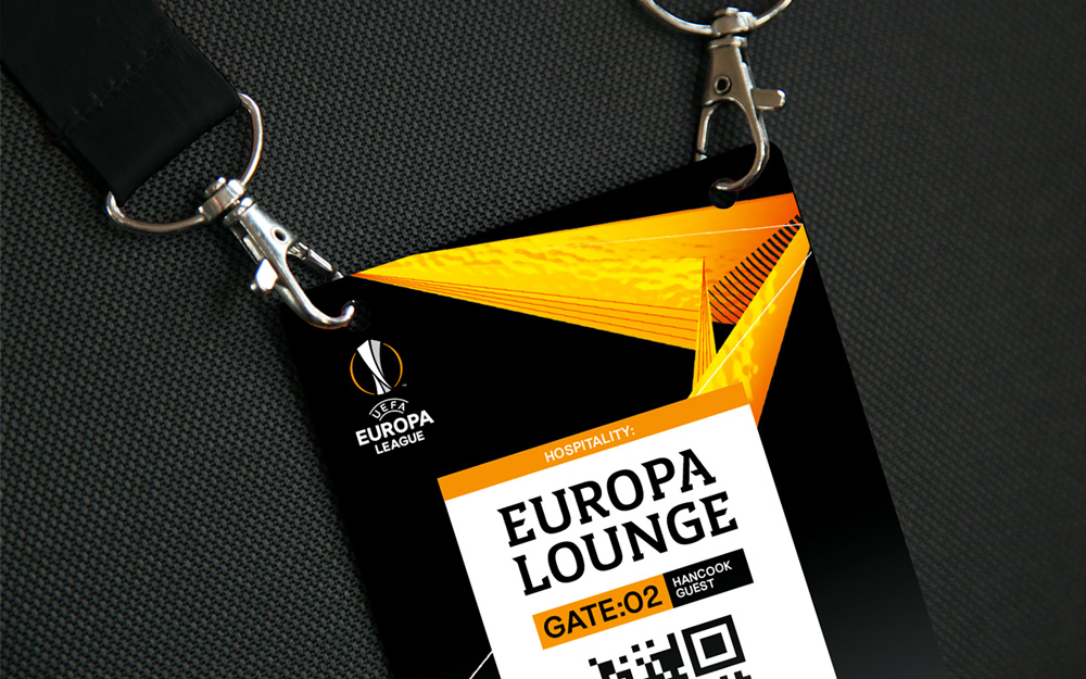
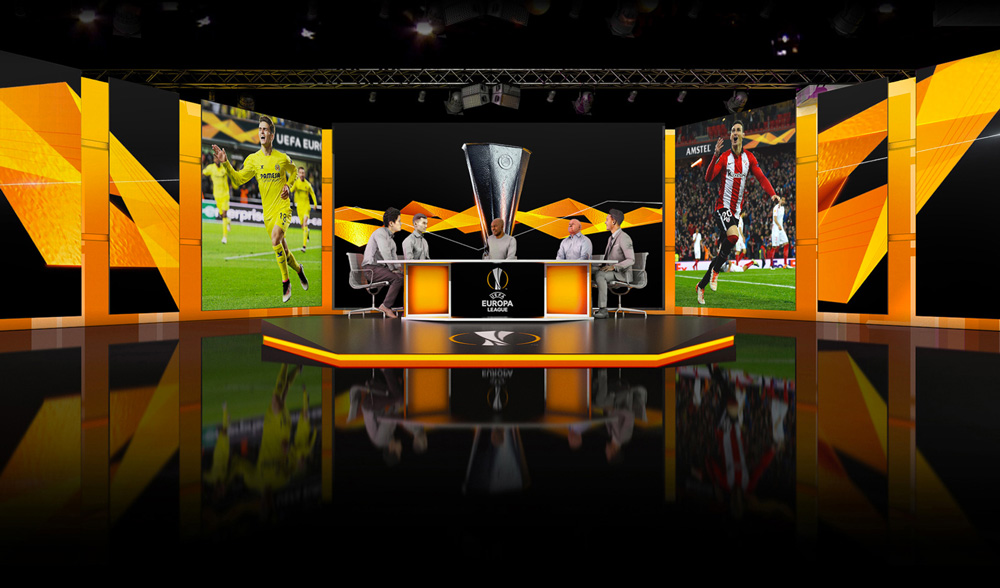
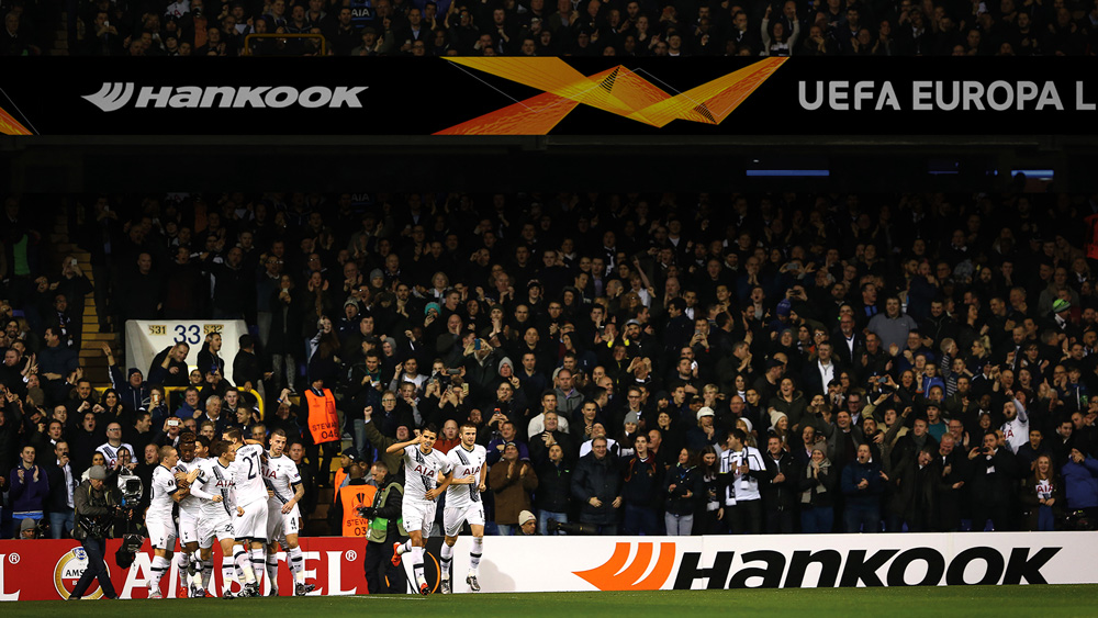
The applications are kind of cool, in a more-is-more, sports-are-epic kind of way. It reminds me again, a little, of the London 2012 Olympics original presentation but more tempered and unified through the orange color. I think what I like is the brand manual more than the applications themselves.
Overall, I’m stuck between liking it and disliking it. There is something cool and energetic about the wave and how it’s applied but there also moments where it feels like visual glitter applied to any surface that will take it. It works great animated and since that’s the main interaction between audience and event, it will be easy to go along for the ride.
Thanks to Serge Born for the tip.

 Новости Союза дизайнеров
Все о дизайне в Санкт-Петербурге.
Новости Союза дизайнеров
Все о дизайне в Санкт-Петербурге.