Обзор лучших ресурсов по разработке бренда, разработке упаковки
contact us | ok@ohmycode.ru
contact us | ok@ohmycode.ru
Established in 1976, Maplin is a retailer of electronic goods in the UK and Ireland (an equivalent of Radio Shack in the U.S.) with more than 200 stores offering an inventory of over 30,000 products (in stores, online, and catalog sales). Maplin has gone over a number of owners in the past 20 years and, like Radio Shack, has struggled to remain competitive in the electronics industry, but some company changes in 2015 have set up an expansion of inventory and overhauling brick-and-mortar stores. This year Maplin is testing two concept stores and begin the rollout of a new identity designed by London-based SomeOne.
Maplin needed to move on from being known just as an electronics specialist to be a more inclusive multi channel technology retailer offering broader services.
Maplin has undisputed credentials in terms of expertise and trust, but which could sometimes be viewed as too specialist and even ‘daunting’ for a non specialist customer.
A commitment to focus on the connected home in terms of product curation, services and store design really helped bridge both these gaps by being a current tech trend as well as being more in tune with broader customer needs.
Working closely with the executive committee, we created the new strategic cornerstone ‘Connecting brilliant ideas’ - building on Maplin’s unrivalled heritage to encourage customers to ‘try’ and ‘discover’ more about how technology can improve their everyday lives supported by impartial expertise.
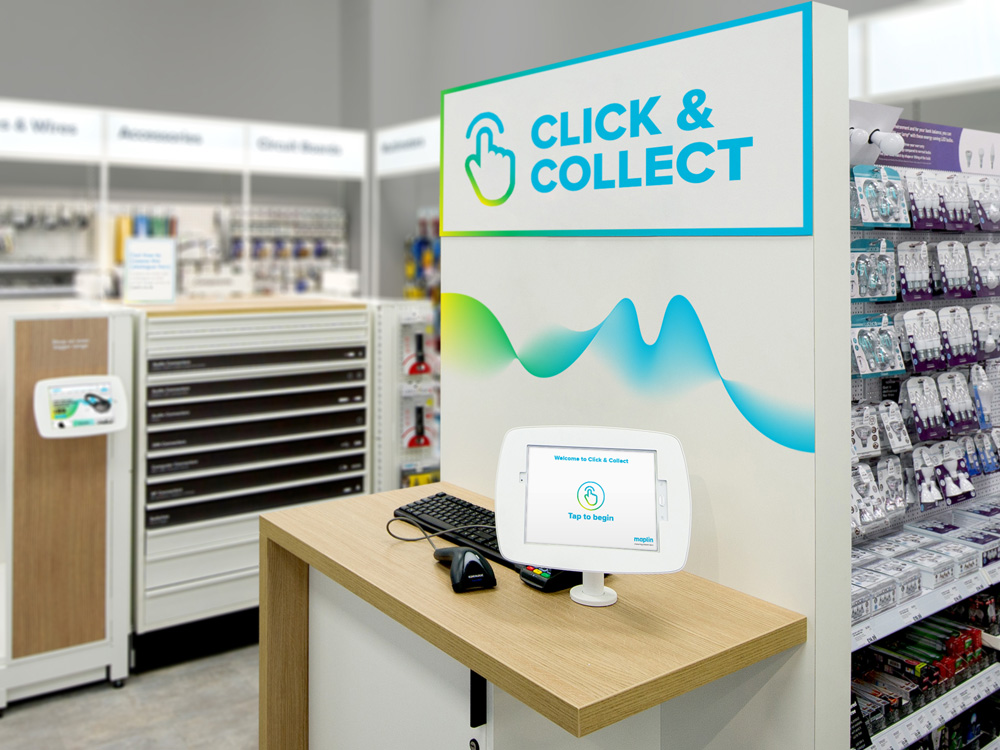
“We introduced the Maplin ‘wave’ - a constantly moving and evolving graphic property to represent the ease and fluidity of Maplin’s service and technology.” Says Helen Altoungarian, Senior Designer. “This helped the communications flex and adapt for seasons and product ranges with the use of colour.”
The old logo was fairly decent with the kind of retro-ish wordmark that is now all the rage for revivals and is exactly what SomeOne has done. The new wordmark is a very nice evolution that keeps the proportions of the old one but improves them for better reproduction. The new letterspacing isn’t the most amazing design thing you’ll see all year and it’s the minimum effort expected from a designer these days but it’s amazing what a difference it makes in this particular before/after comparison. Changing the tittle of the “i” from a square to a regular circle literally makes Maplin look less square and less like a nerd. The other obvious change is the addition of the gradient wave… In terms of gradients, this one is particularly nice in that it has a cool twist (literally) that gives the gradient an added sense of dimensionality and I like how it fades into white. As a logo lock-up it almost looks like a hard candy wrapper and that’s not a bad metaphor. The animation is awesome, especially the part where it looks as if you are shaking a bed sheet and it undulates.
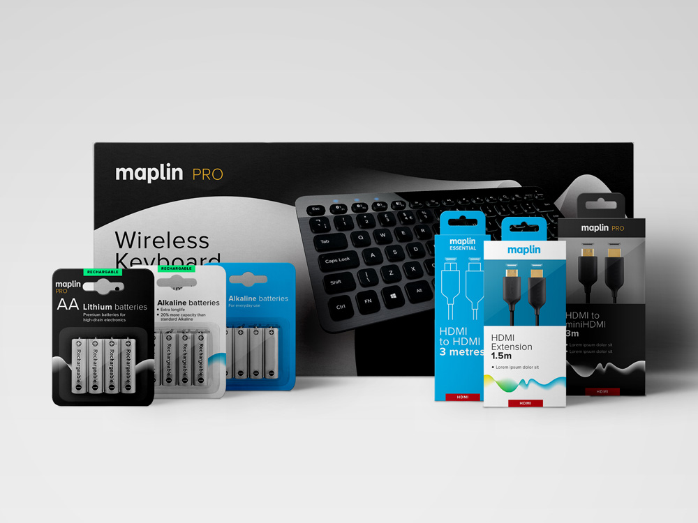
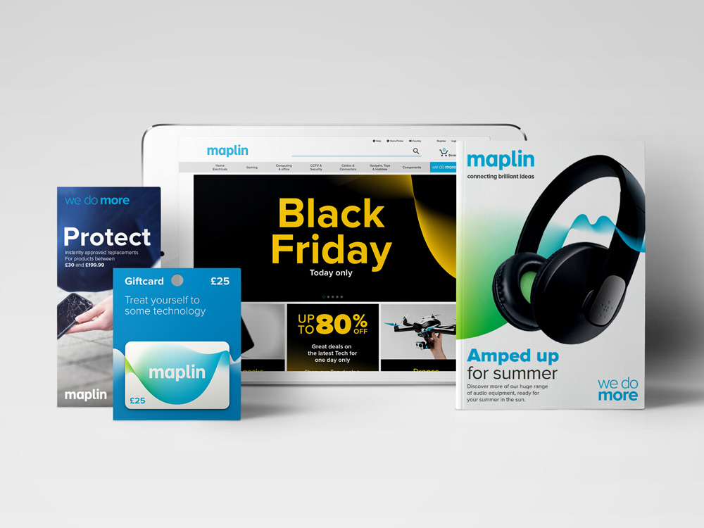
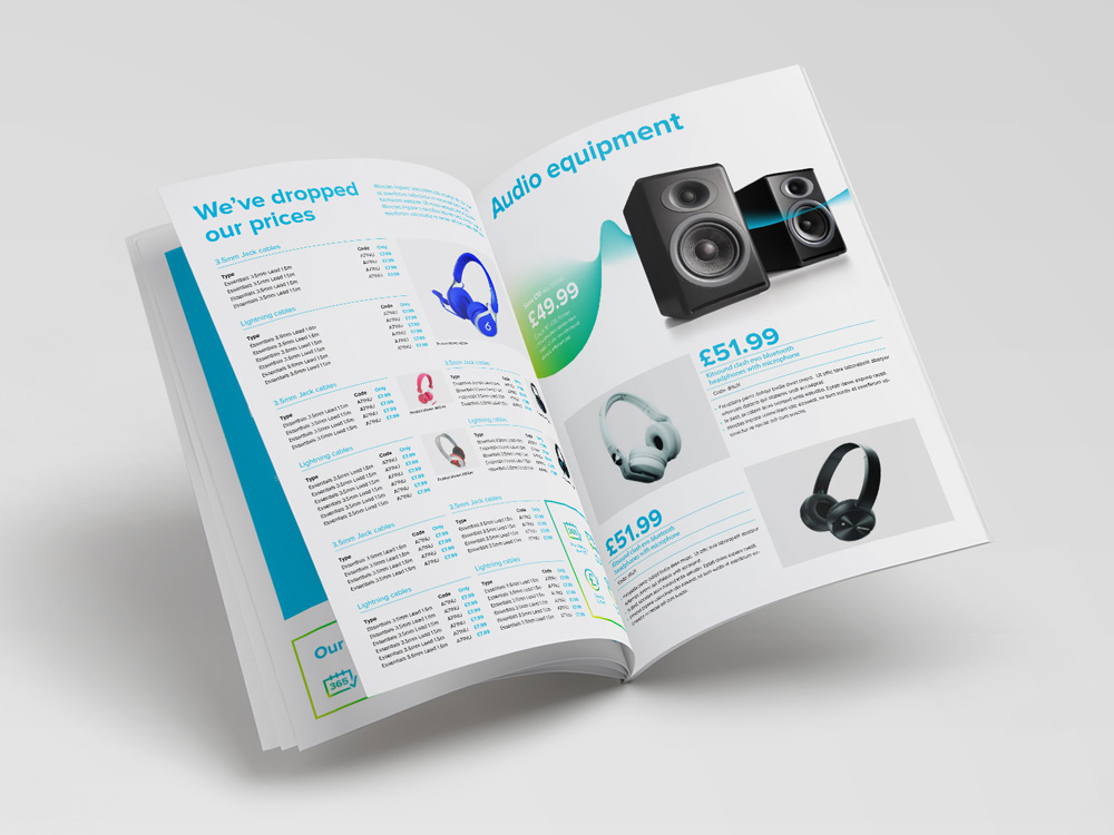
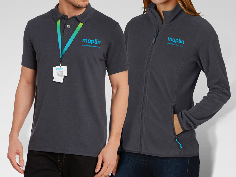
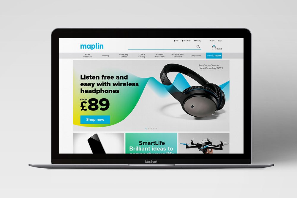
Most of the applications are renders for now, as the store prepares for rollout. Things feel a little shy, dry, and not overly exciting. There are some interesting things happening here and there, like the catalog cover with the headphones but overall, the wave doesn’t come across as well when used small and there is a lot of bold/light typography combinations that make it hard to follow what the hierarchy is.

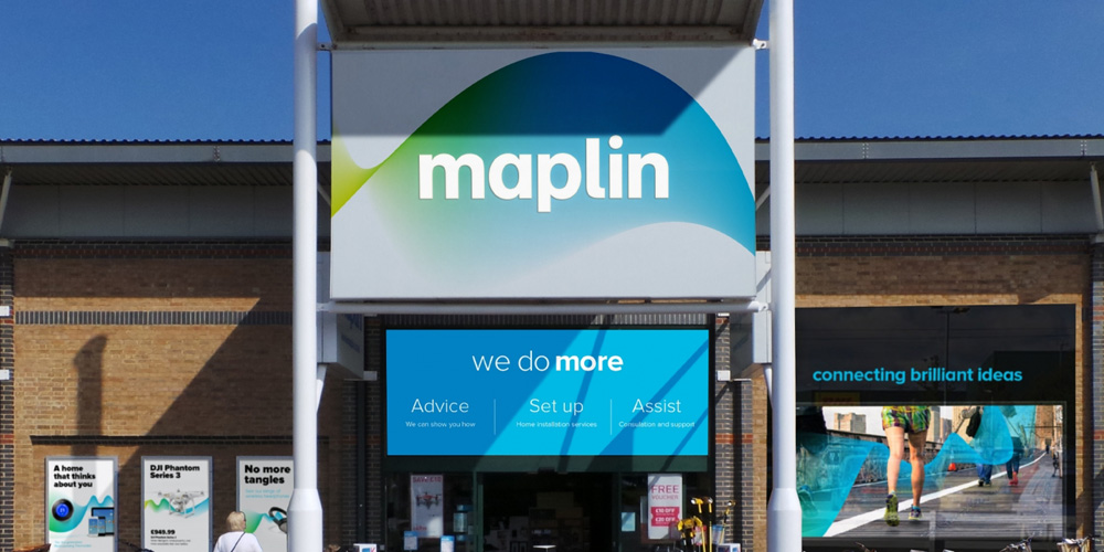
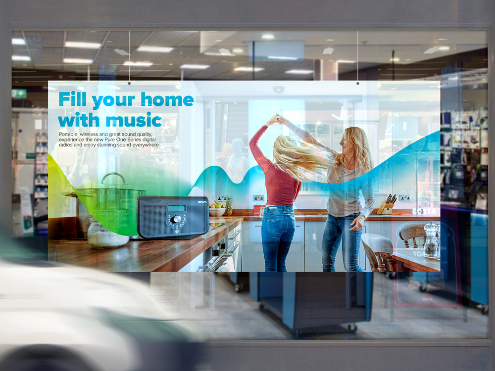
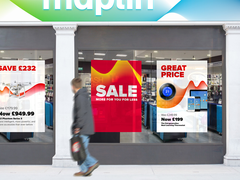
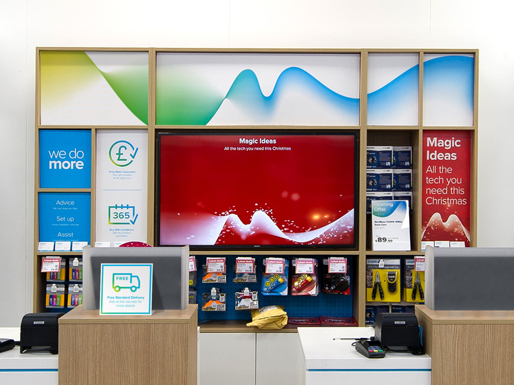
The store applications are far more convincing and they manage to convey a certain dense-ness and deal-of-the-day-ness of an electronics store while adding some visual interest. The introduction of an alternate colorway for the wave (red and yellow) is a good move to add some variety (although it can also be confusing as it almost feels like a whole other store). Like in the packaging renders, the use of Proxima Nova isn’t quite right… it’s hard to tell what the specific typographic approach is, unless the approach is everything-in-your-face-every-chance-we-get. The best case of the identity might be found in the three tiny posters on the left side of the facade picture, where there is a clear headline and a cool interaction between the wave and the product photography. Overall, this does feel like a positive change that infuses an old retail brand with some visual relevance but in application it still may lack some finesse to feel like the place to buy your drone.

 Новости Союза дизайнеров
Все о дизайне в Санкт-Петербурге.
Новости Союза дизайнеров
Все о дизайне в Санкт-Петербурге.