Обзор лучших ресурсов по разработке бренда, разработке упаковки
contact us | ok@ohmycode.ru
contact us | ok@ohmycode.ru
Established in 2009, CARPRO is a producer of car detailing products for car enthusiasts — in other words, if you don’t really care, stick with Turtle Wax. Self-described as “the original creator of Nanotechnology car detailing products” — which I am not writing that way to mock but because I literally have no insight into the world of car detailing — and ceramic coating technology, CARPRO creates products for both interior and exterior coverage, detailing, and maintenance and is available worldwide at select car detail business and a handful of online shops. Last year, CARPRO introduced a new identity and packaging designed by NECON.
Between rough and refined
Between savage and spotless
Between brute and beauty
The old logo looked quite cheap and like it could be for any small-scale, car-related business, whether it were car detailing, car washing, or car insurance. The new logo could still be for any of those but at least it now looks like a top-tier car… thing. (By now you may have probably gathered I am not a car guy.) It could easily be the logo for the leading car magazine/website or a place where you can buy cool import cars… point being, it looks more serious, upscale, and like a leader in the general car category. The typography looks nice and bold; I like the low crossbar height and wide structure. It’s also commendable they were able to maintain the old swoosh but translated it into a more confident dash across half of the wordmark and I like how it shoots over the ™, integrating it more than most logos.

The sub-brands for the product categories are not as commendable though… I mean, they are fine, and look car-ish but the so-similar yet so-different structure of “c.quARTZ” and “NAUTIK” drives me a little crazy. Choose one approach and stick with it, or choose two distinctly different approaches. The infinity symbol thing is alright.
Packaging design was the core task of the project. Navigating product lines and subbrands, colour differentiation within a palette that makes sense for over 80 products, various bottle types and sizes, boxes, all while maintaining distinctiveness and being able to visually compete on shelves.
We have used a variety of printing techniques and heavily experimented with materials, pigments, foils and production methods, to achieve the final effect of full cohesiveness and impression of ultimate quality the products always deserved.
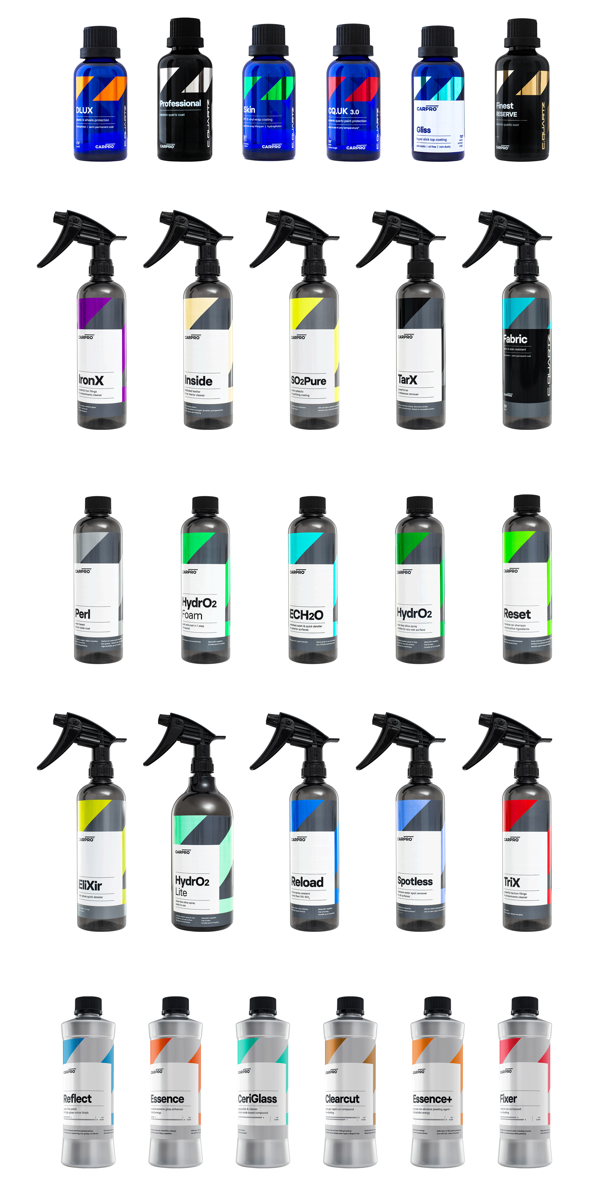
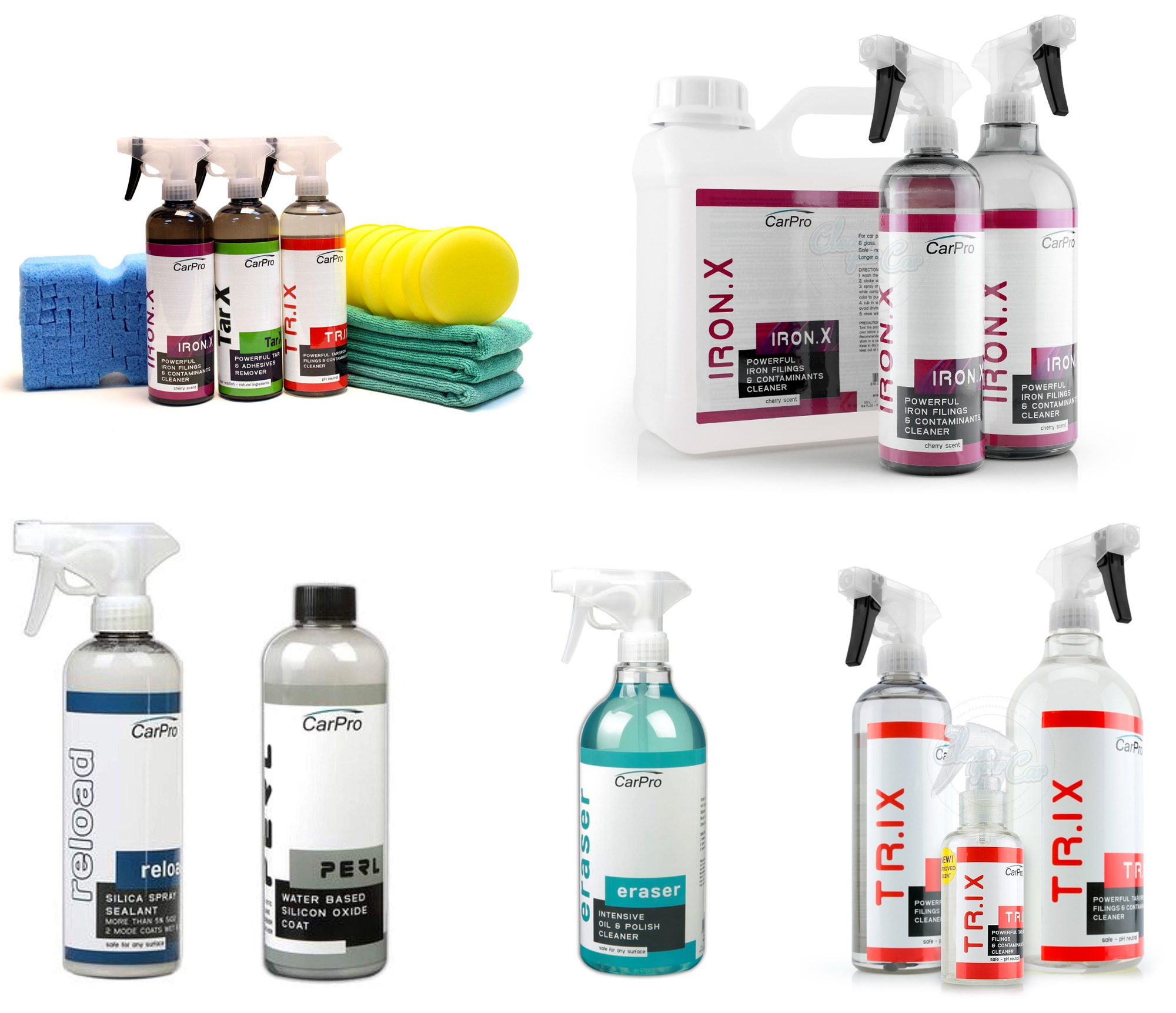
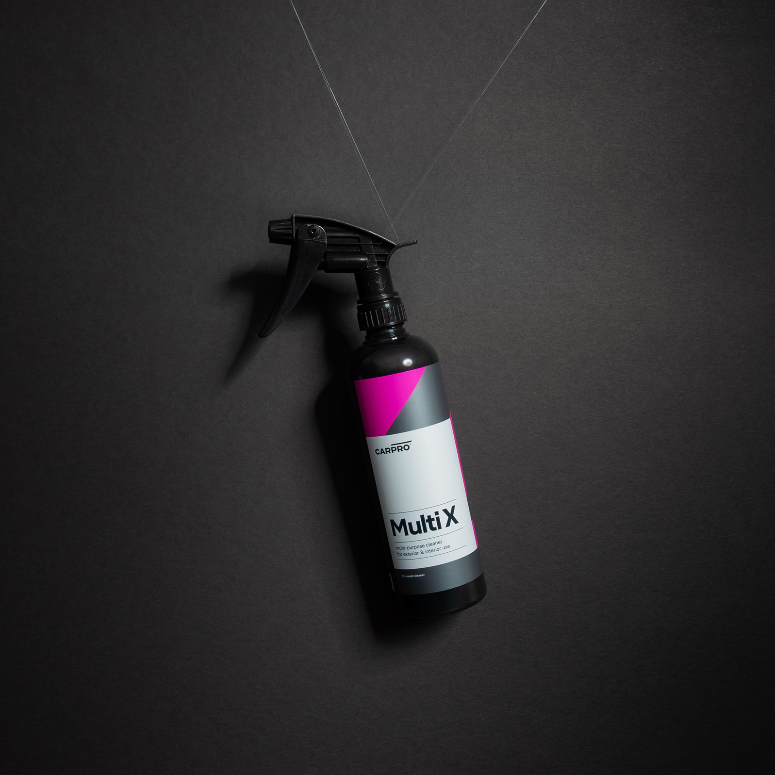
The old packaging almost looked like home-made labels and it’s kind of amazing that they were able to build such a cult-following with those — which just goes to prove that product quality is king and branding is there to support it. To their credit, though, they did have a system in place with overlapping boxes and sub-brands going sideways, and color coding. Like the logo change, the new packaging completely transforms the product into a leader, with a very confident, very striking, very put-together system. A simple set of very thick, very large angled stripes serve as the backdrop for easy-to-read, easy-to-scan blocks of product information, all in nice, simple typography with good hierarchy. What follows is packaging photography porn.
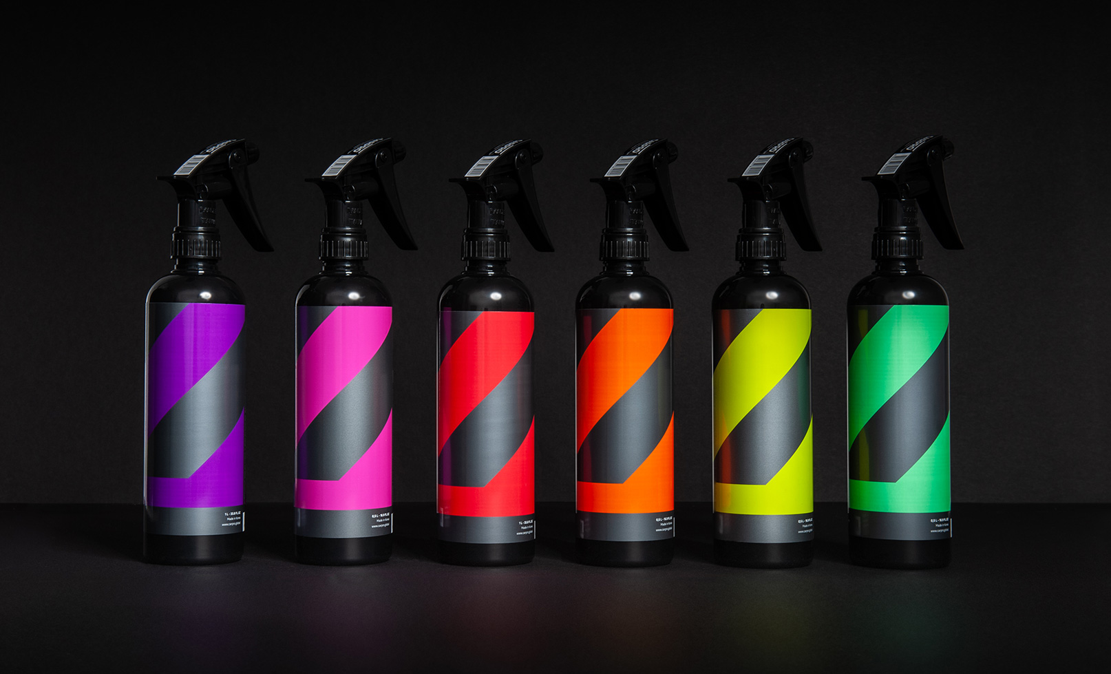
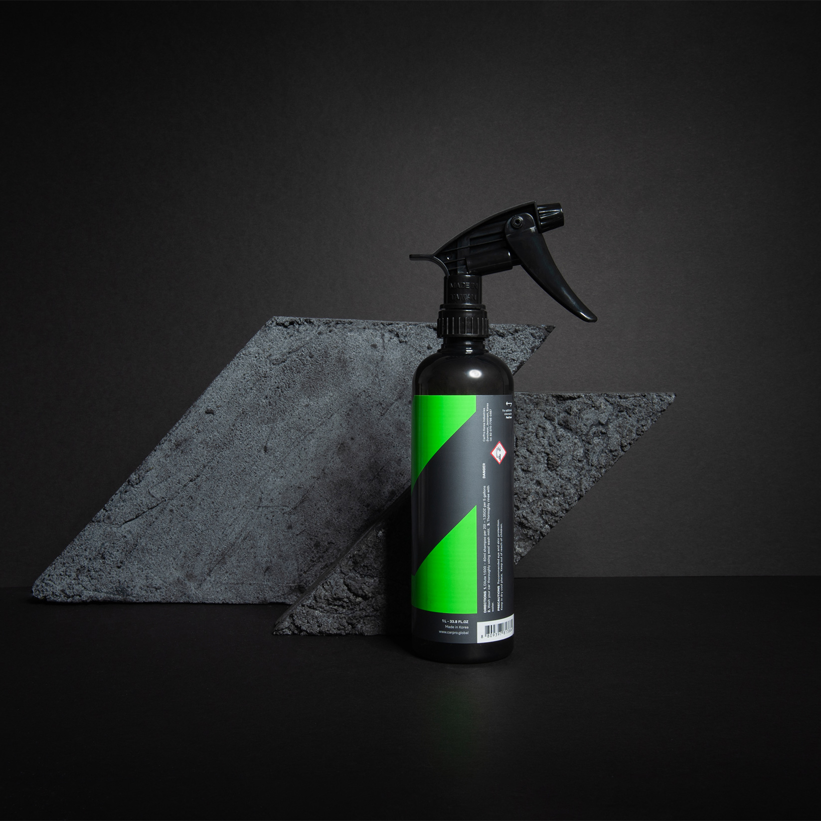
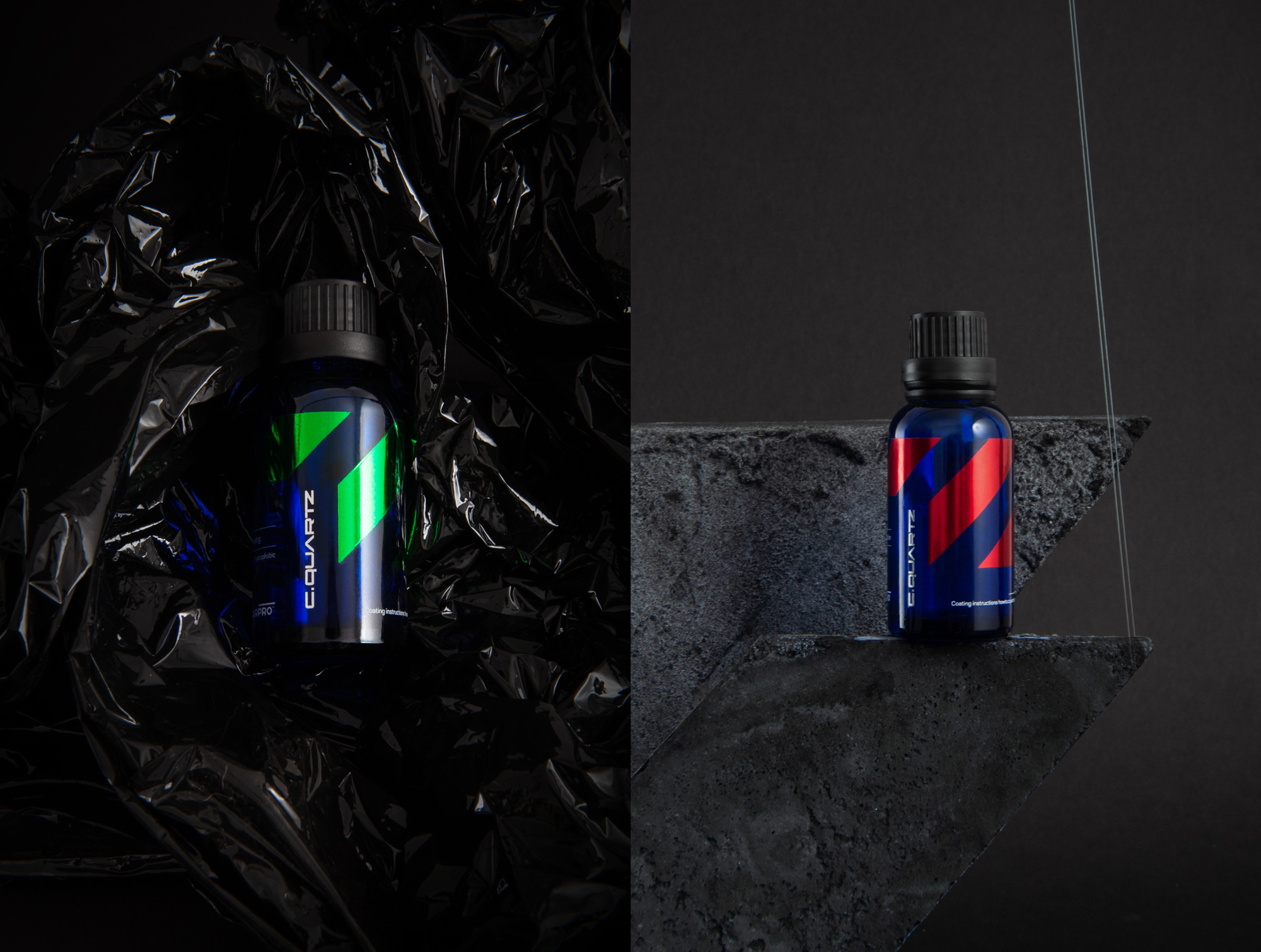
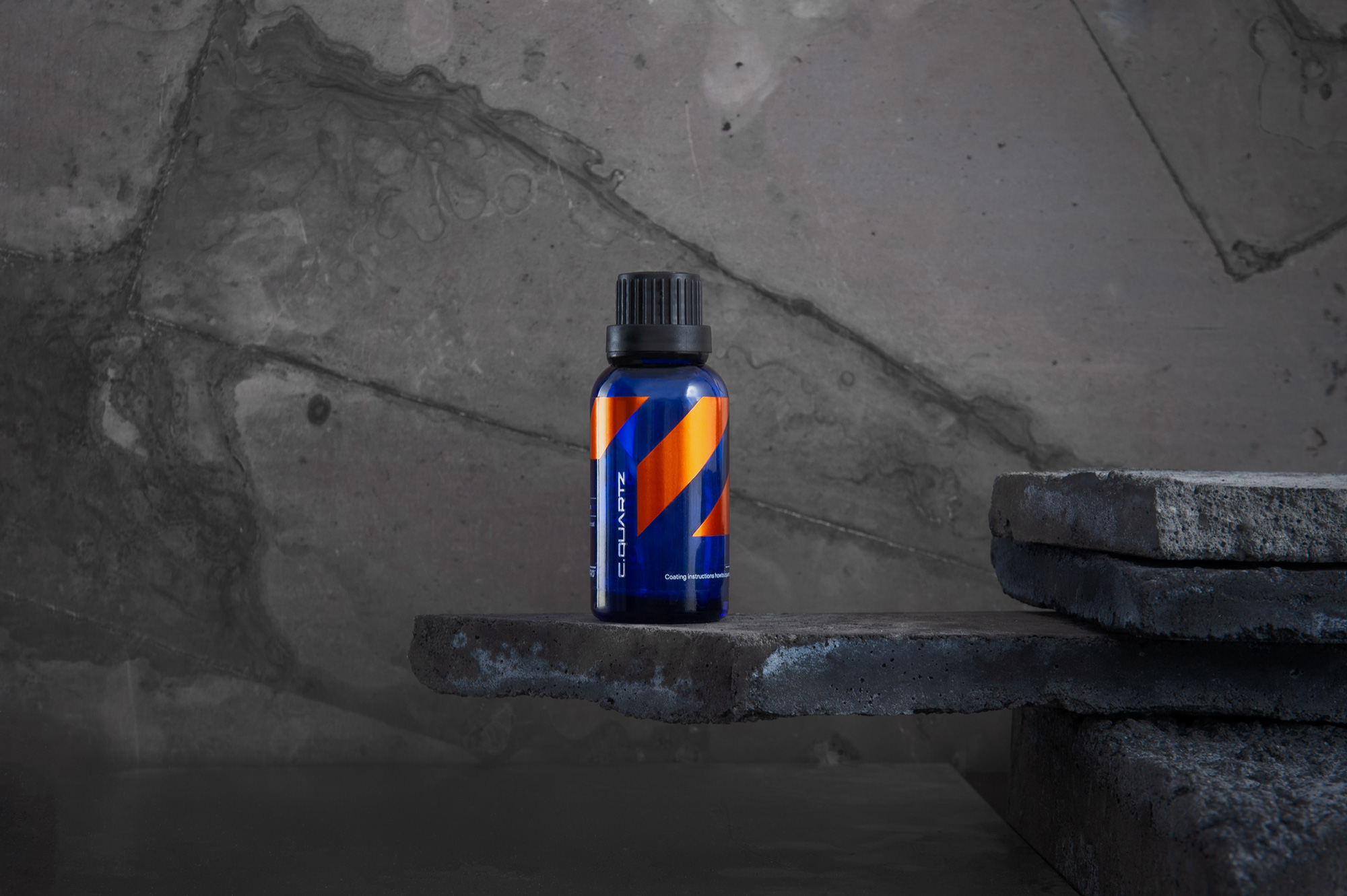
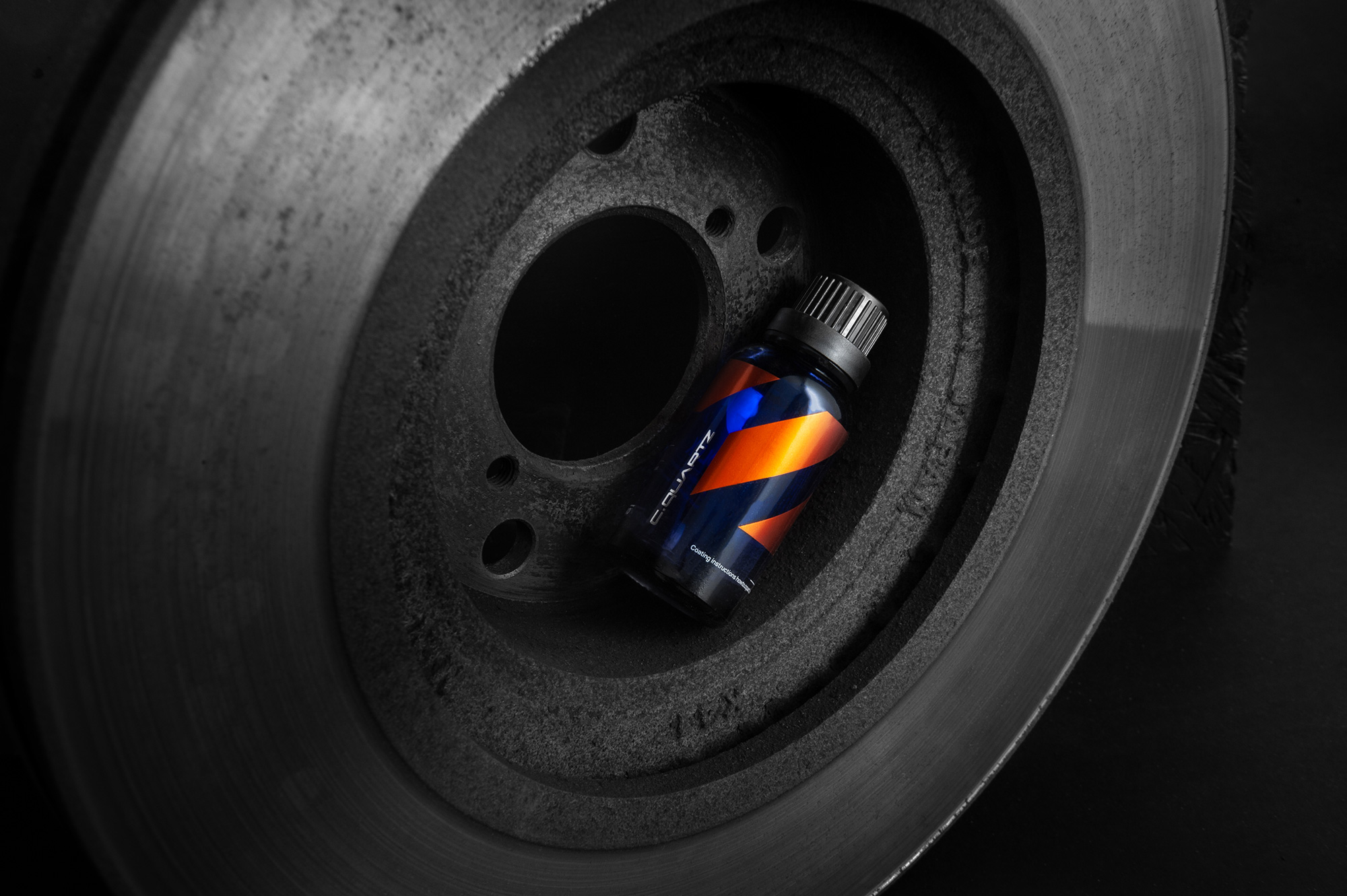
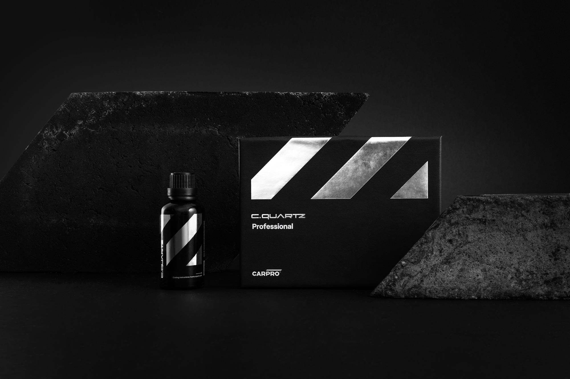
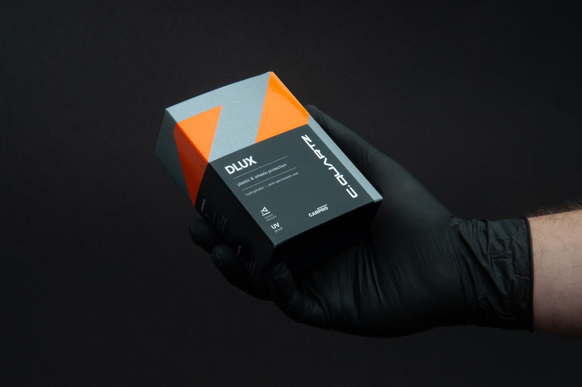
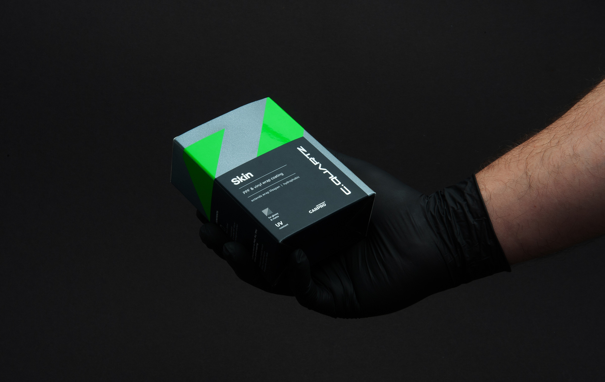
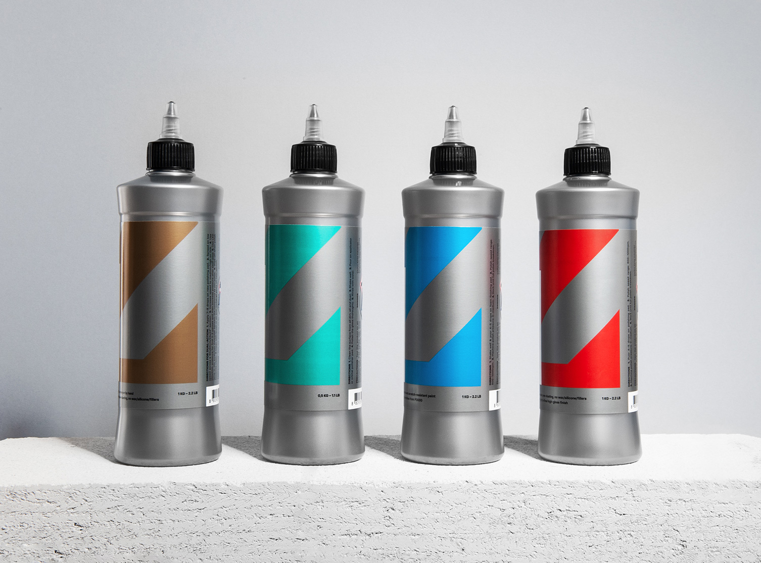
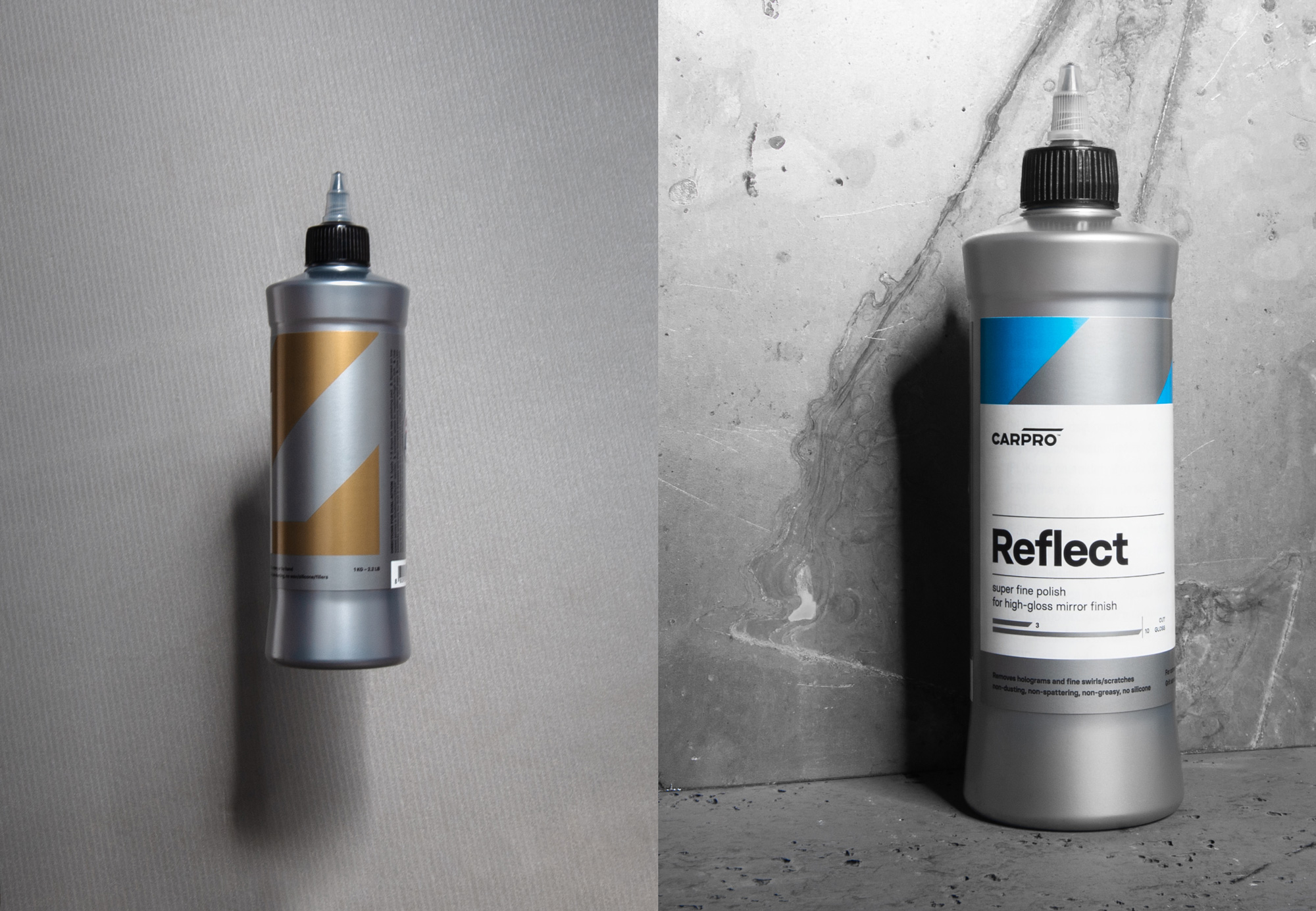
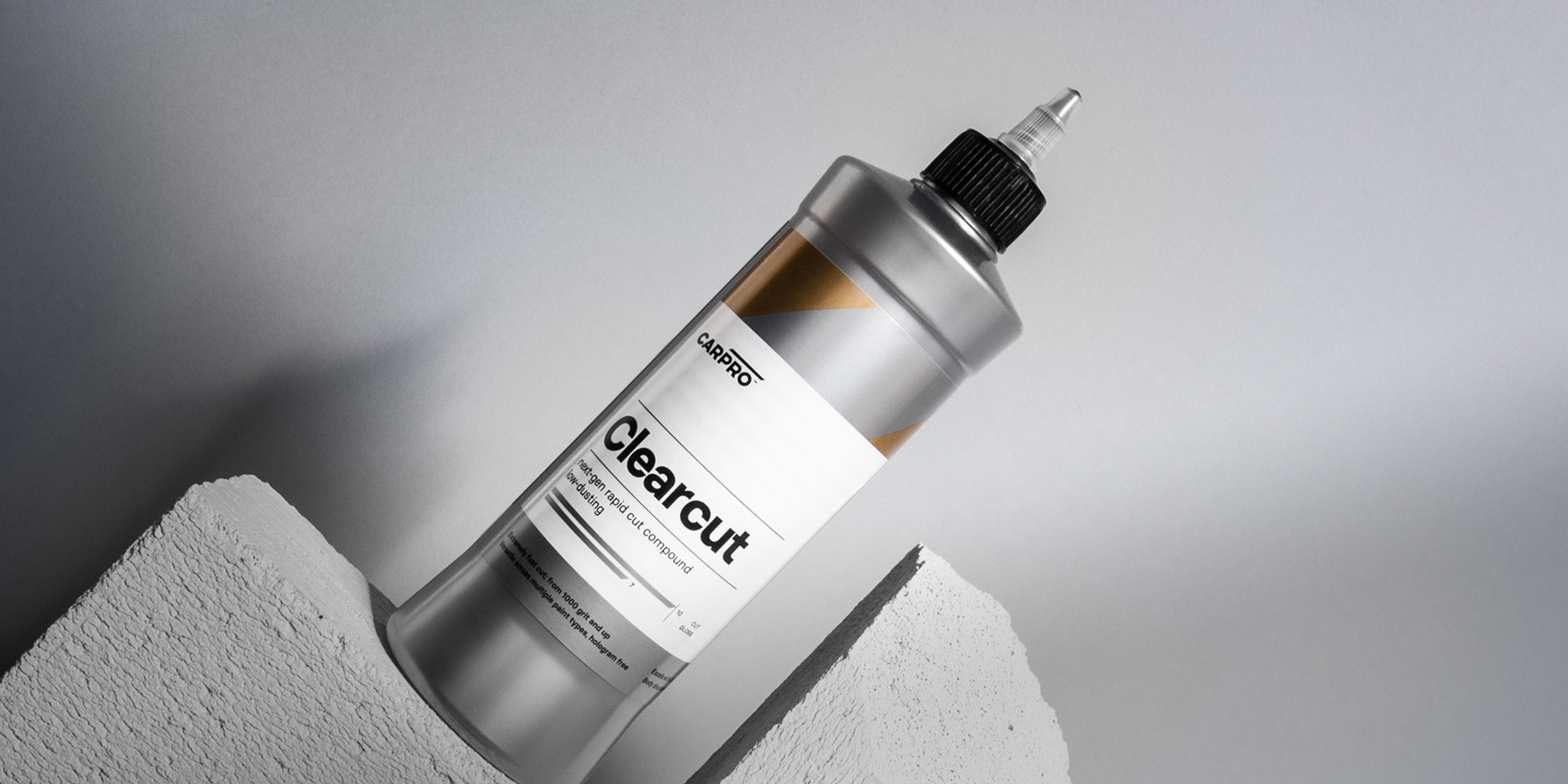
The most striking thing about the new packaging is how seamlessly the design elements apply to the very different container shapes. I know the design elements are fairly simple and straightforward but it’s still a difficult task to pull it off across such a variety. The different production methods work great to make some products look fancier than others as well as simply create more variety using the same elements.
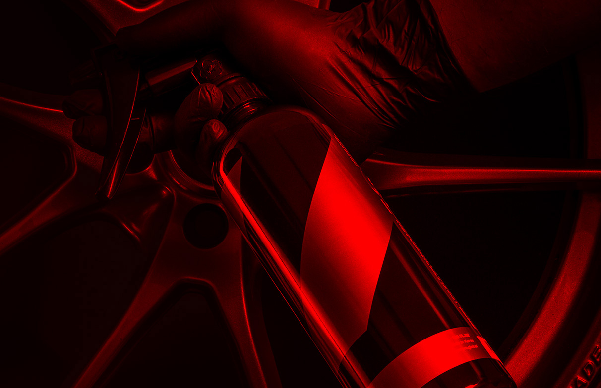
Overall, this is super slick and, given that some of its products have high price points — $140 for a 100ml bottle of car moisturizer stuff — the new packaging totally makes it look worth it, whereas the old packaging would have felt like a scam. Also, the new look very much speaks a car-enthusiast language that should make it the talk of the town.

 Новости Союза дизайнеров
Все о дизайне в Санкт-Петербурге.
Новости Союза дизайнеров
Все о дизайне в Санкт-Петербурге.