Обзор лучших ресурсов по разработке бренда, разработке упаковки
contact us | ok@ohmycode.ru
contact us | ok@ohmycode.ru
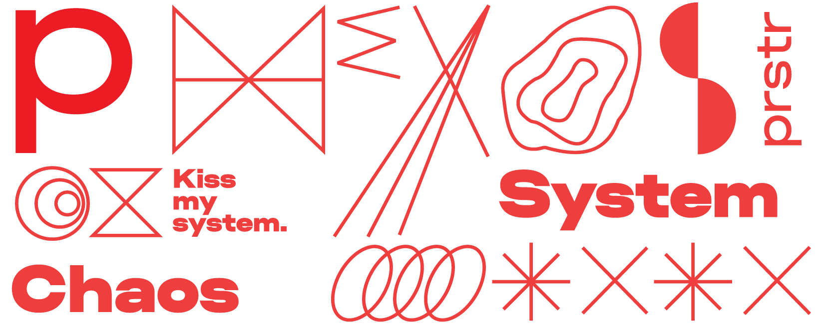
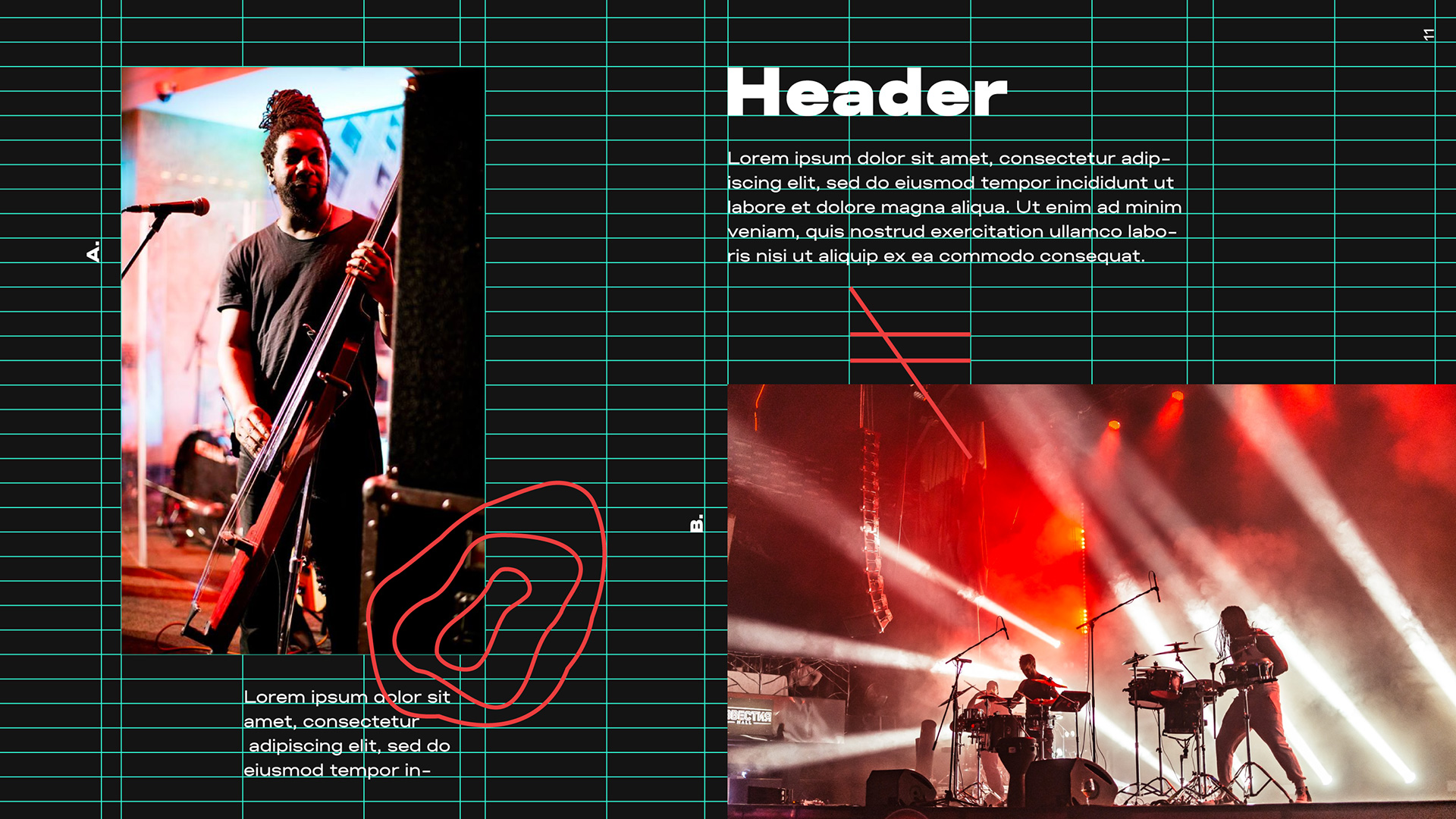
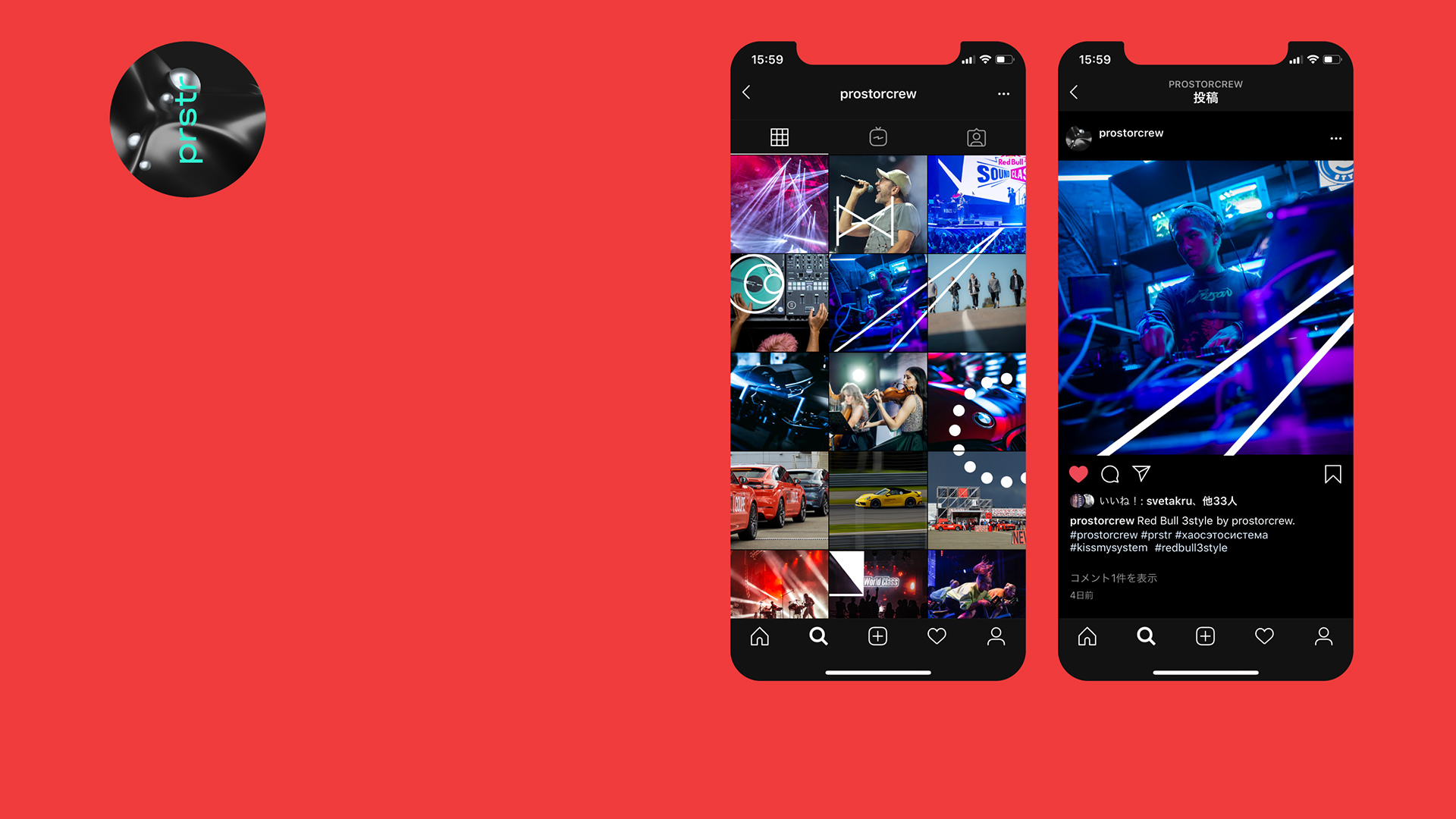
Established in 2013, Prostorcrew is an event management and event design company based in Moscow, Russia. Their work ranges from organizing an exhibition project for Hyundai Motorstudio and Ars Electronica; to a music duel festival for Redbull for 7,000 attendees; to an exhibit space for Porsche; or to the opening of a BMW dealership, overseeing concepts, execution, production, staffing, and artist management, among many other services. Last year, Prostorcrew introduced a new identity designed by Moscow-based Roma Erohnovich (who also designed the previous identity in 2016).
Prostocrew is business and art, work and action-packed movement, budget tables and watching the sunsets on the site. We don’t oppose one to the other. We manifest chaos as a system and the system as chaos, as an approach to business and life organization. We allow luck, mistakes, emotions and total control to happen, we allow productivity and meaninglessness, we are ready to participate in your tender with our opinion and attitude :)
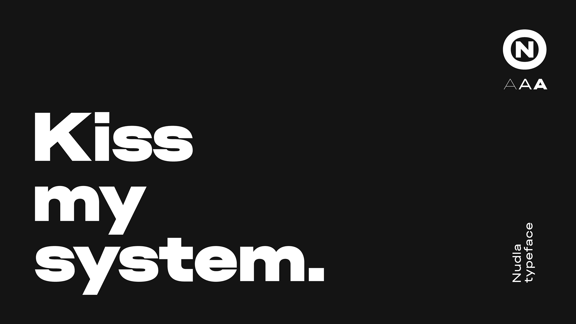
This is a great follow-up to last week’s Sloy project… perhaps I can start a companion to Friday Likes: Russian Thursdays. While the logo starts out tame, things get crazier from here on out. The old logo had a 1990s rave flyer aesthetic that I don’t personally like but I can see its appeal and the wide wordmark was decently executed. The new logo goes for the Awkward Sans Serif trend with a custom type family, Nudla, that has that nice Brutalist patina. The logo isn’t great by any means but it starts to set the tone for the identity that combines deadpan minimalism with exuberant maximalism.
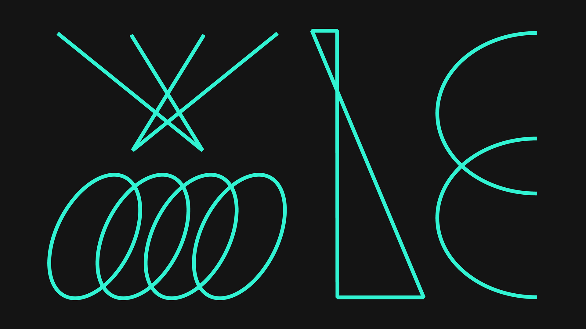
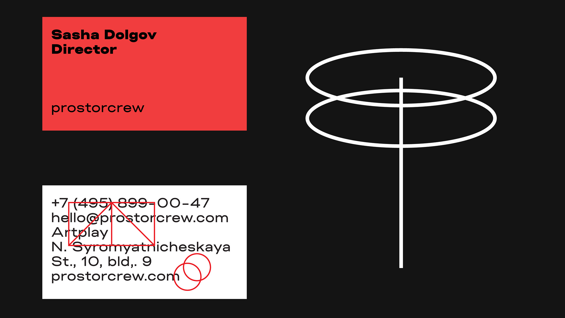
The ‘chaos-system’ metaphor is reflected in our graphical tools:
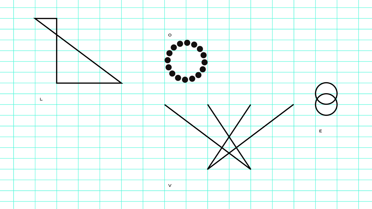
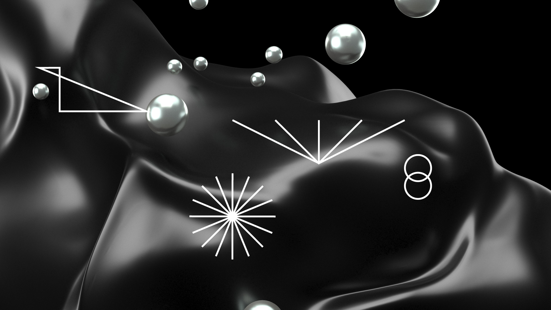
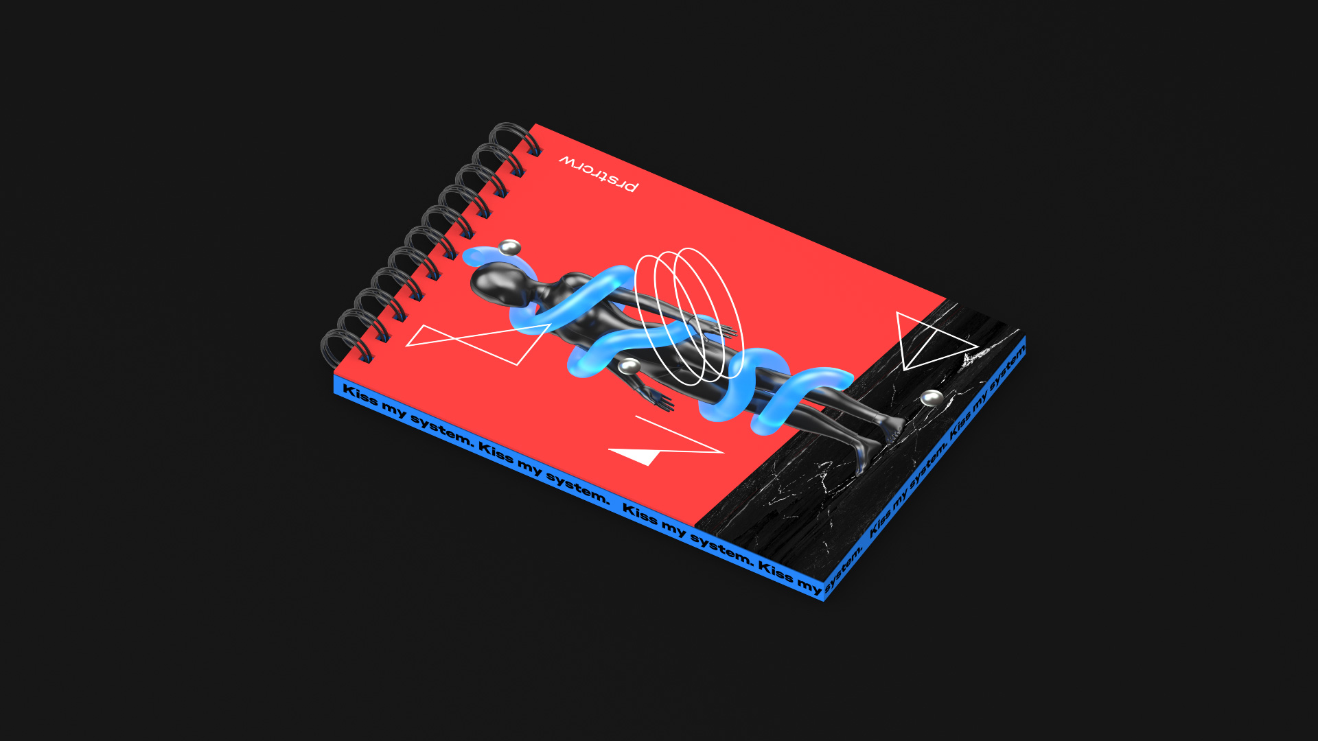
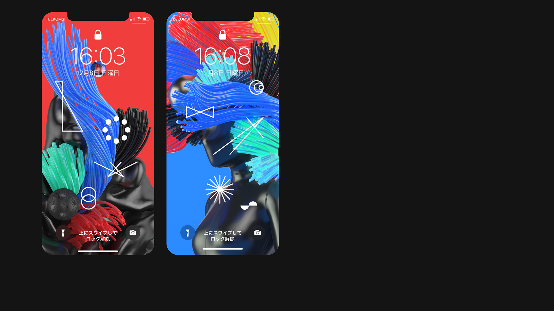
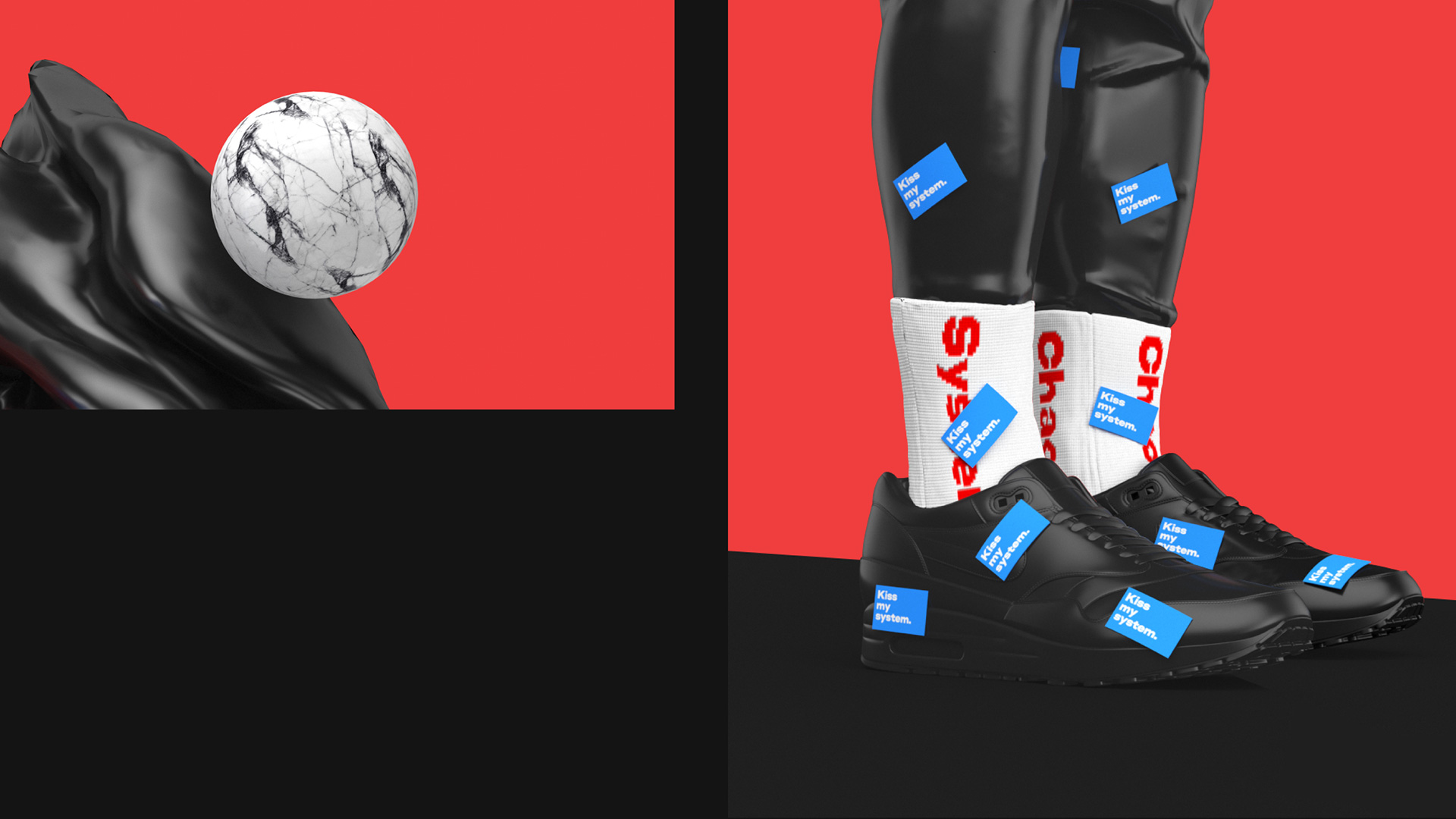
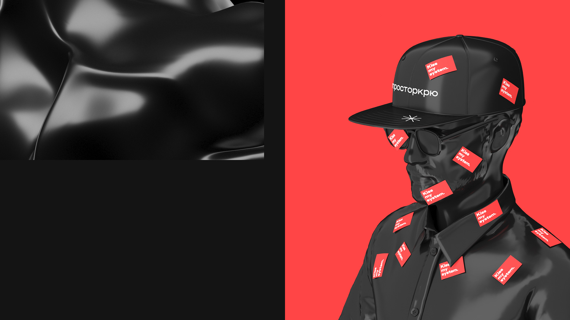
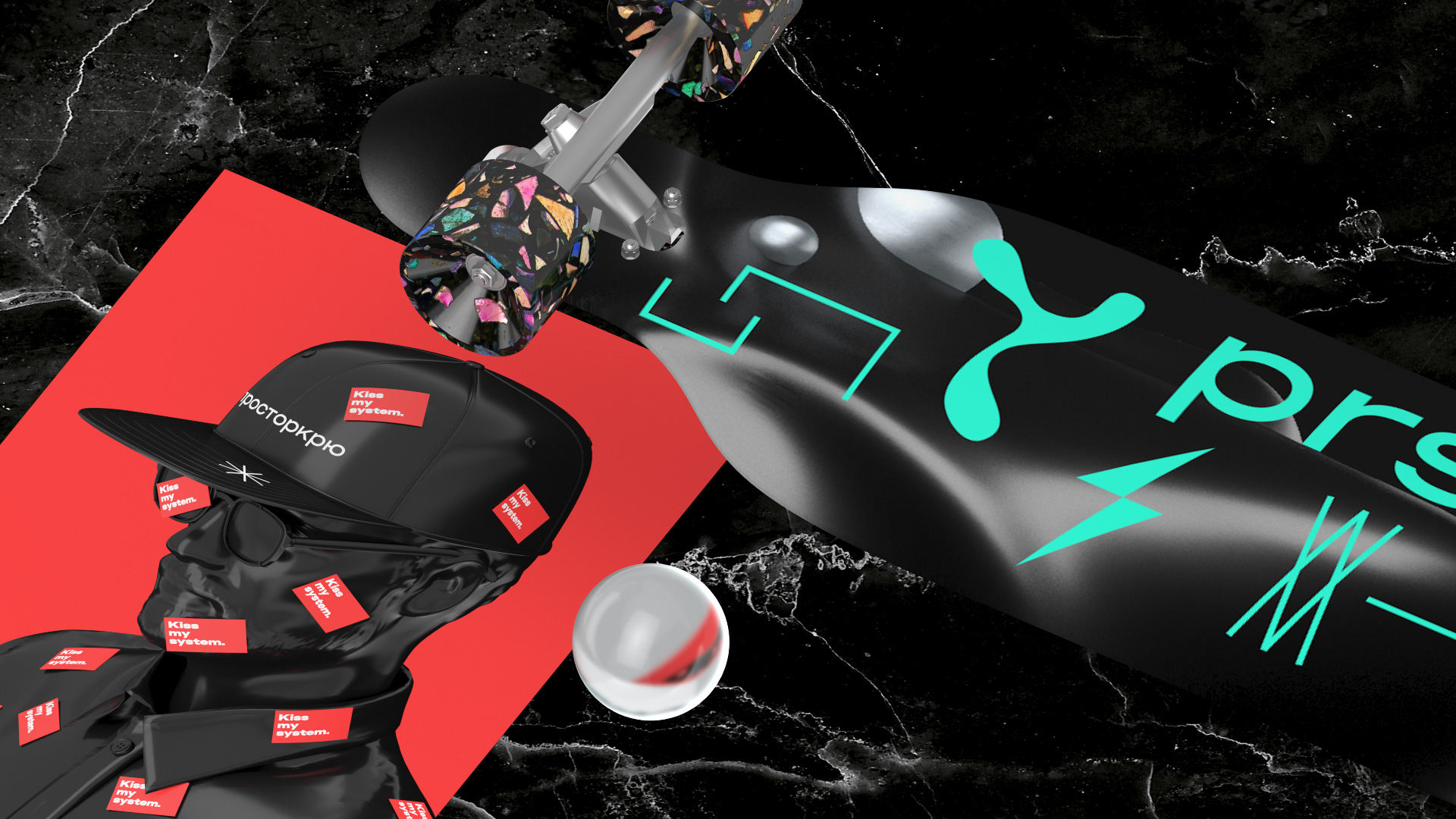
Modular design: random, chaotic visuals are, in fact, built using a strict grid. This is a visualization of how confusion and chaos can live within the guidelines of modularity and system laws. This is a key graphic metaphor that can be traced in all our media. Animated shapes: they bring dynamics to the design and make the layout perception more difficult, as well as support and highlight the chaos effect. Typography: our own Nudla typeface, as a strict grotesque in modern style, gets the system by the balls and stops it from falling apart. Creative 3D illustrations and animations: they complement the visual imagery and expand the variability of media usage. Color model: gives an affirmative and sometimes aggressive note to communication.
A completely random range of doodads and graphics in a mono-thickness structure, along with bits of text, are paired with a completely random range of human figures, spheres, and other 3D extrusions that all together are like a Tron-on-acid stream of consciousness. I don’t know how it applies to event management but let’s try to find out. Spoiler: we don’t find out.
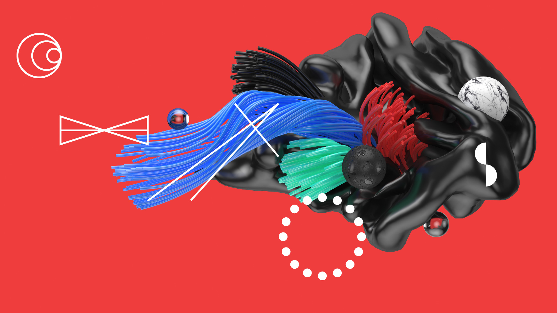
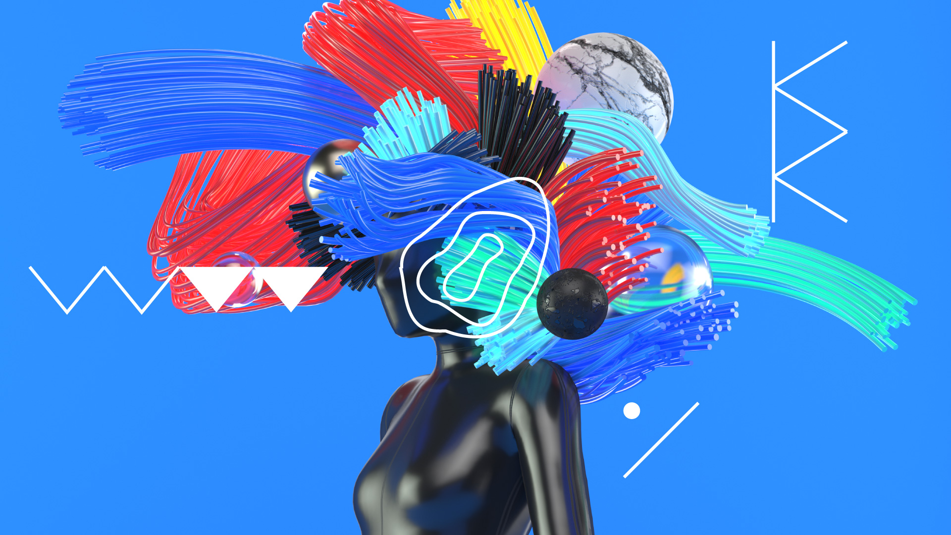
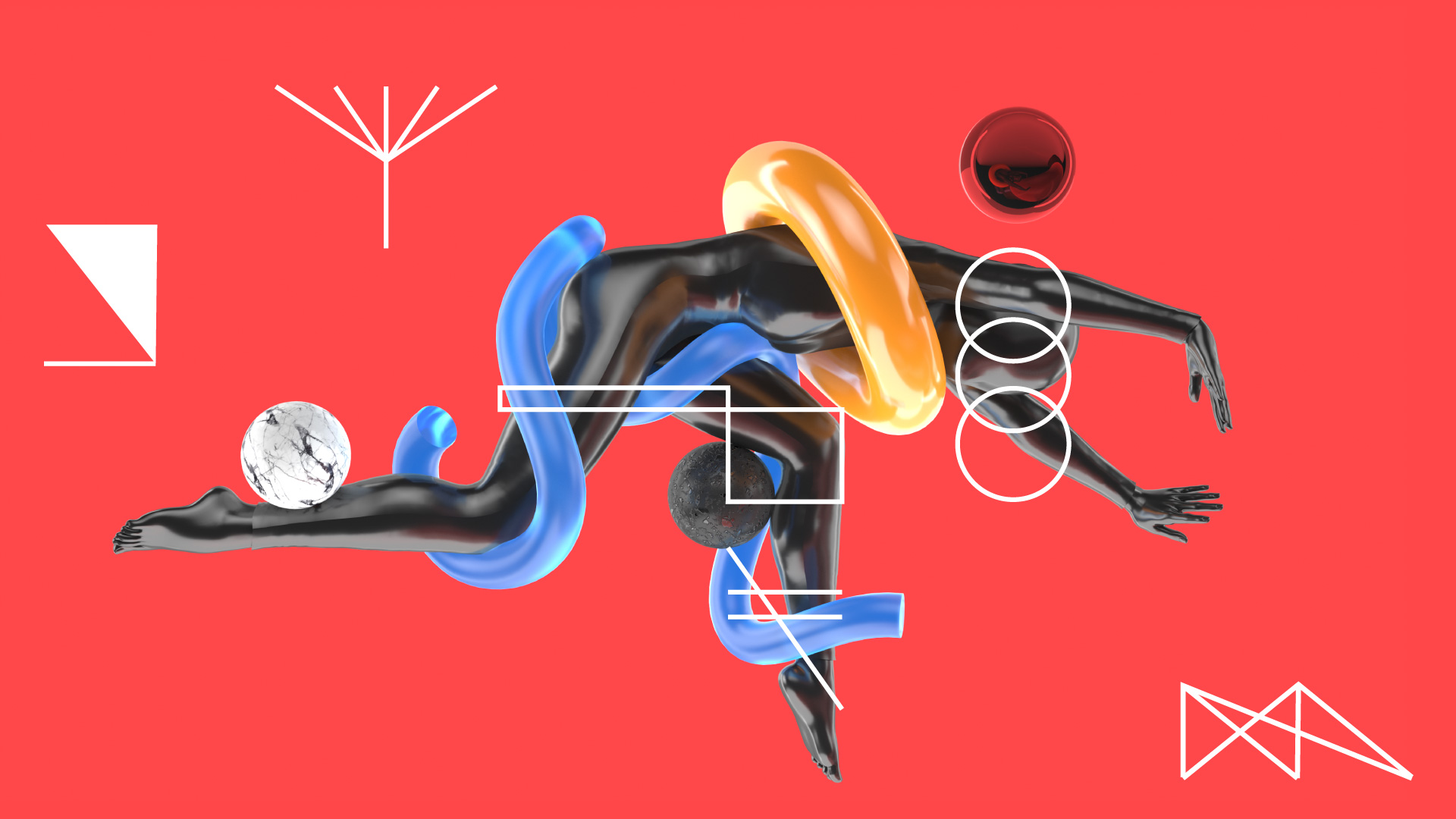
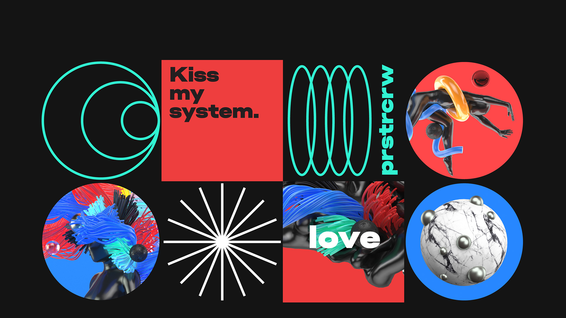
The combinations are fun to look at if perhaps a little frustrating in terms of trying to derive not just meaning but sense from them.
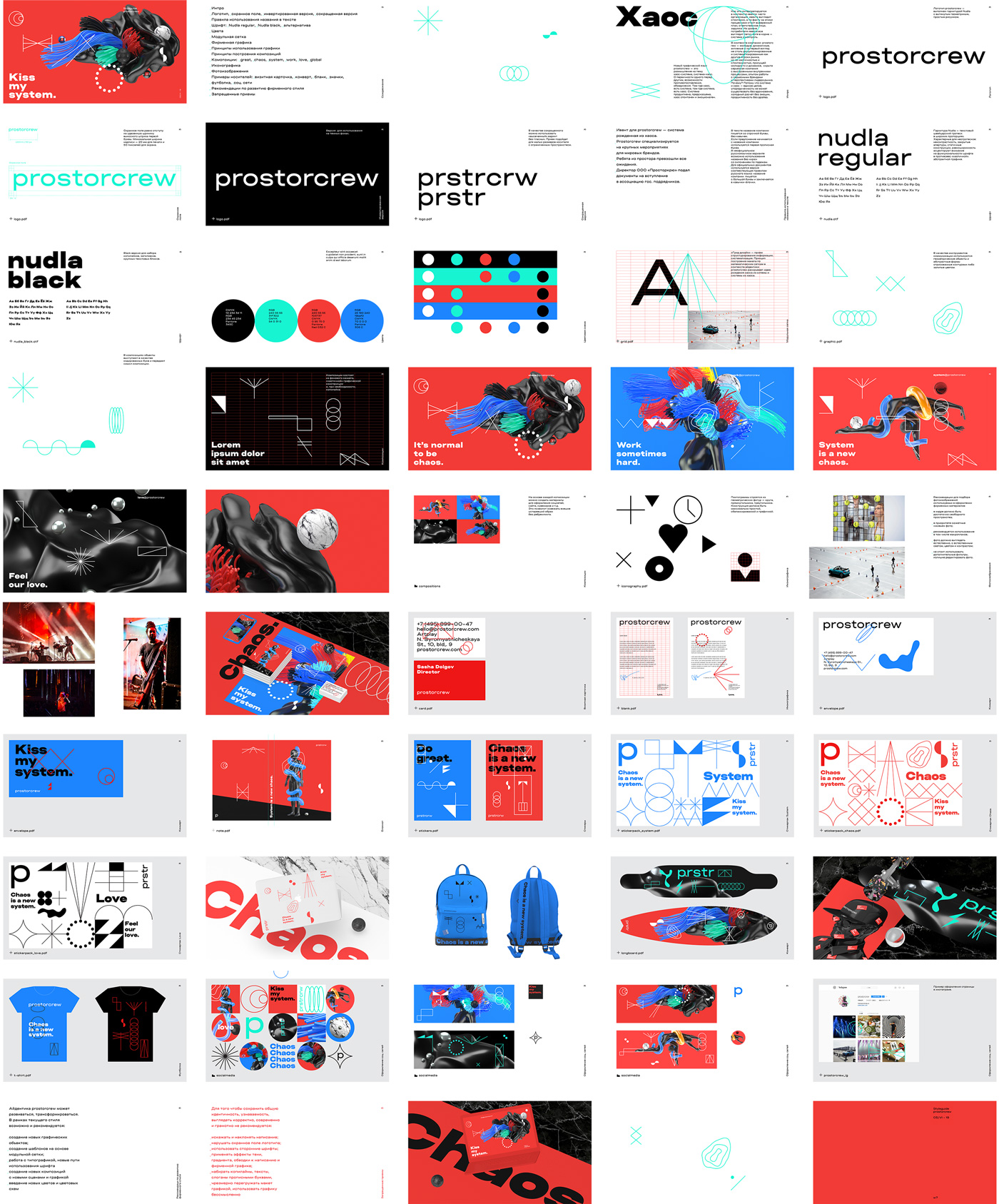
While everything does look like chaos it’s, perhaps, reassuring to see that there is a method to the madness and that everything was actually able to be explained in guidelines — although I think I would be petrified if I had to execute something on behalf of Prostorcrew after being given the guidelines.
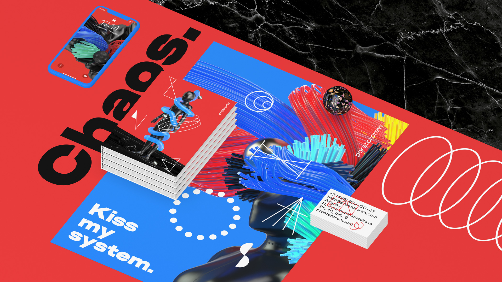
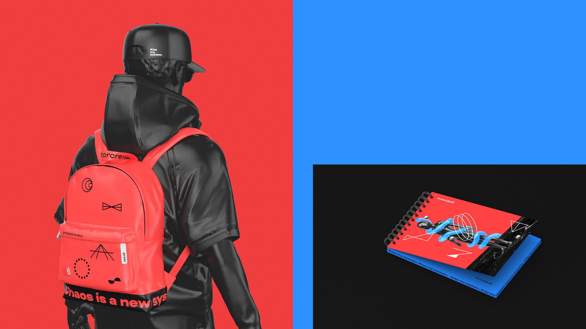
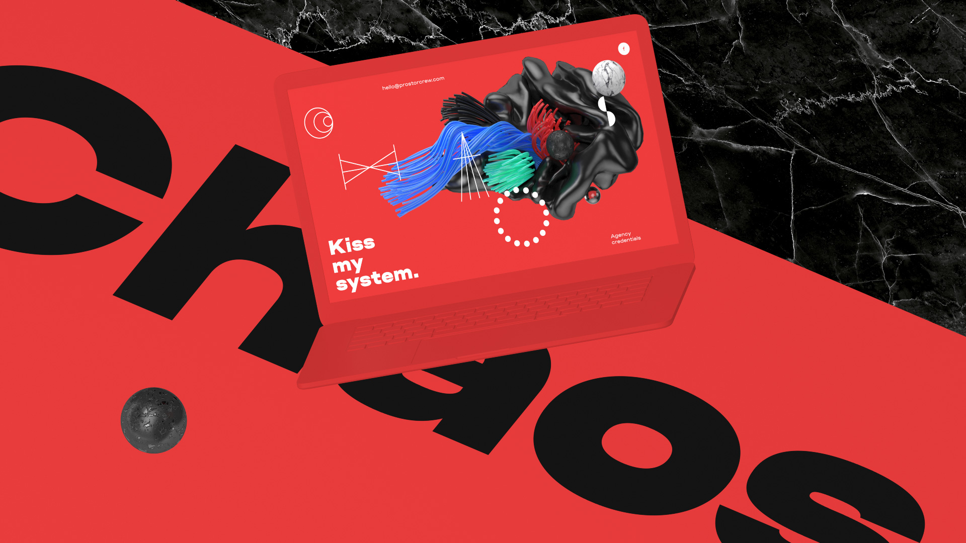
The heavy render approach of all the applications shown makes the viability of everything displayed above questionable, not just because they are obviously rendered but everything there is full-bleed, RGB-based craziness that just doesn’t really exist in the physical world. BUT, in this case, I don’t really think it matters as this isn’t, like, a bank that actually needs to produce lots of physical applications — the renders are the applications. This is as real as it gets. With that in mind, sure, it’s cool. Random, but cool.
Overall, I’m not sure if there is a point in trying to overthink this: An event management company in Russia wanted a crazy-looking identity and a designer in Russia delivered a crazy-looking identity. Seems like a happy outcome. What’s interesting here and, in combination with the Sloy project and a number of other things, is that perhaps we are inching close to a new Postmodernism in identity design. It will be a couple of years before this starts to seep into the mainstream but I can totally see the pendulum swinging away from the safe sans serif, happy colors, faceless line-art people illustrations to stuff like this. Brace yourselves.
 each year since publication began in 2006

 Новости Союза дизайнеров
Все о дизайне в Санкт-Петербурге.
Новости Союза дизайнеров
Все о дизайне в Санкт-Петербурге.