Обзор лучших ресурсов по разработке бренда, разработке упаковки
contact us | ok@ohmycode.ru
contact us | ok@ohmycode.ru
Ville de Nevers is the prefecture of the Nièvre department in the Bourgogne-Franche-Comté region in central France. A city with a population of 35,000, it is well-known for its art, history, and architecture that includes the Ducal Palace, one of the principal feudal buildings in central France, as well as this amazing church that has nothing to do with anything. Recently Ville de Nevers introduced a new identity designed by Paris- and Lyon-based Graphéine.
Nevers is a city rich in history and heritage. Yet, like many medium-sized cities, its demography is on the decline, leading to the inevitable economic slowdown. Nevers is often described as “sleeping beauty” and it is precisely this image that we have sought to change. In this context, choosing a new visual identity is choosing to assert an ambition! To give back the departmental, regional and national stature that Nevers deserves. This new identity is therefore there to inscribe the city in modernity, movement and energy.
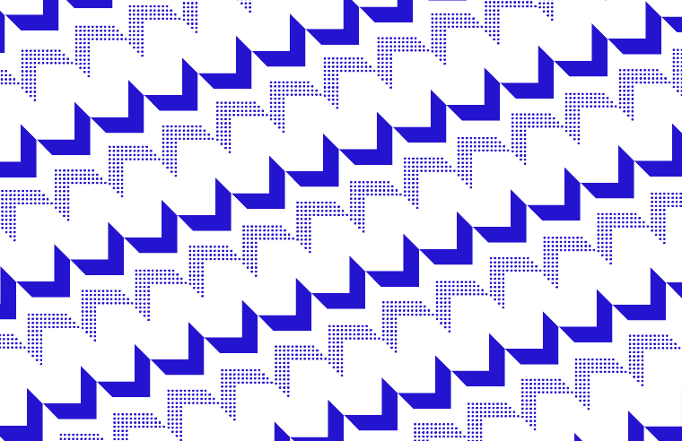
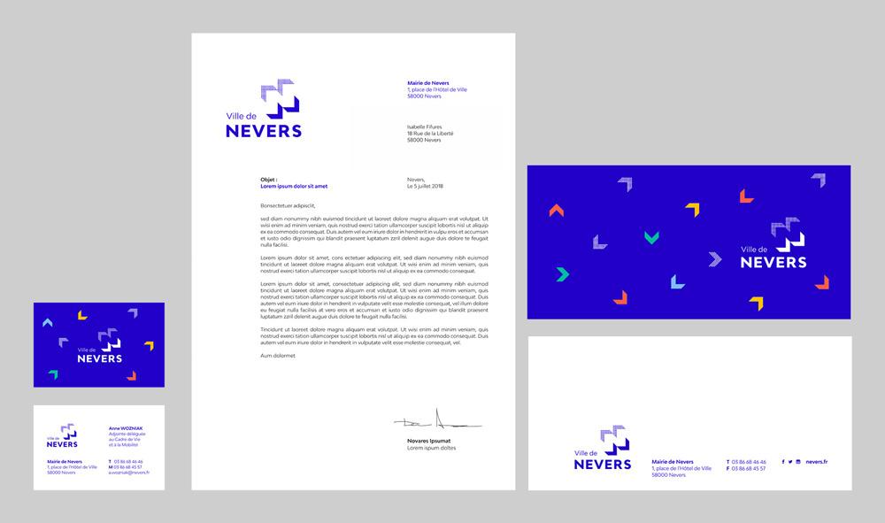
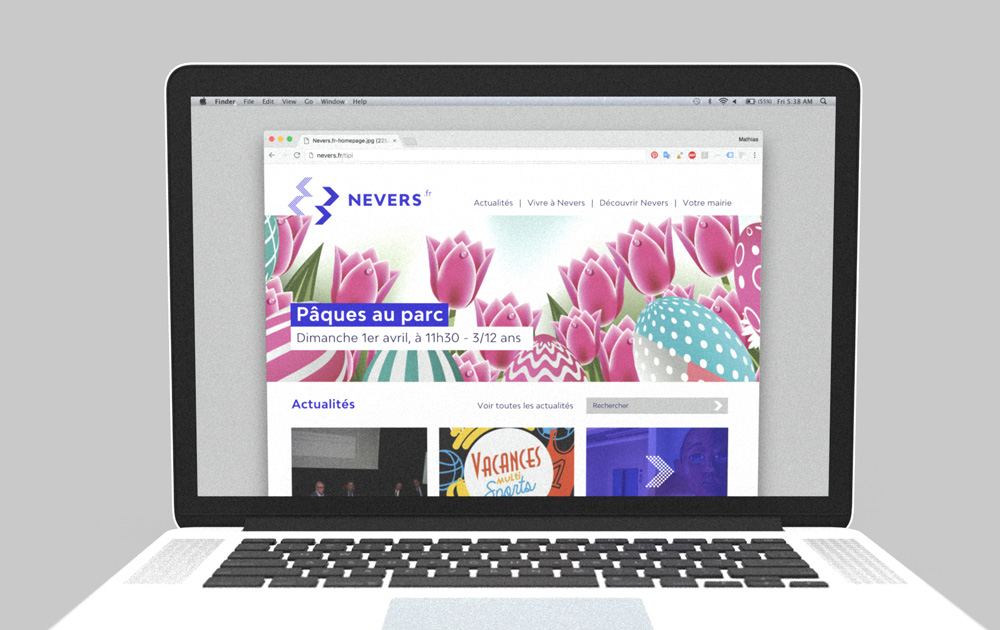
The logo is designed in a modular way. In its initial configuration it draws the letter “N”, but it can be recomposed in a thousand ways… The idea of movement is written into his DNA. These arrows seem to open up as if to unfold the city’s potential.
The old logo was quite sad, with a terrible illustration of the Ducal Palace that looked as if Clifford the Big Red Dog peed on it and the typography was, well, it was not good. The new logo abstracts the distinctive polygon turrets of the building into chevrons that are then reconfigured to form an “N” in their counterspace. The resulting monogram is contemporary and surprising — eschewing the more typical let’s-make-our-quaint-city-look-quaint approach. The mix of solid chevrons with dotted chevrons creates an interesting sense of dimensionality as if the logo had two sources of light, casting different shadows. The wordmark does a good job in echoing the light/dark composition of the monogram with a small light “Ville de” and a bold, all uppercase “NEVERS”. We just need to move that “S” a little bit to the left and we’ll be all set.
The monogram’s animations are entertaining but if I had one philosophical question it would be what, if anything, do these animations tell us about Nevers? Of course, I know they are not meant to tell the story of the city, but this type of animation seems more appropriate for some kind of industrial corporation or tech-forward city, which doesn’t seem to be entirely the case here. Still, I spent more billable hours staring at those two GIFs than I should have.
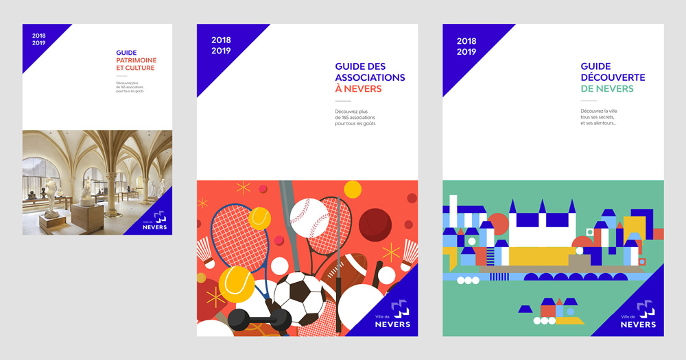
The chevrons, as the main ingredients of the identity, are used in a lively and colourful way.
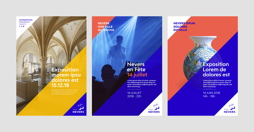
The angle of the logo is the starting point of the composition of the posters. Large diagonals cross the format to draw rhythms through the posters. Colours, texts and images produce structured and moving compositions. The system can be put in minor to give prominence to the visual, or express itself fully when the iconography is deficient.
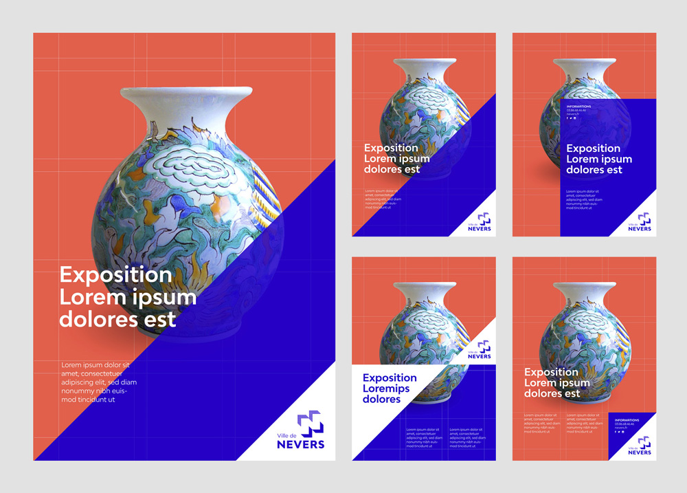
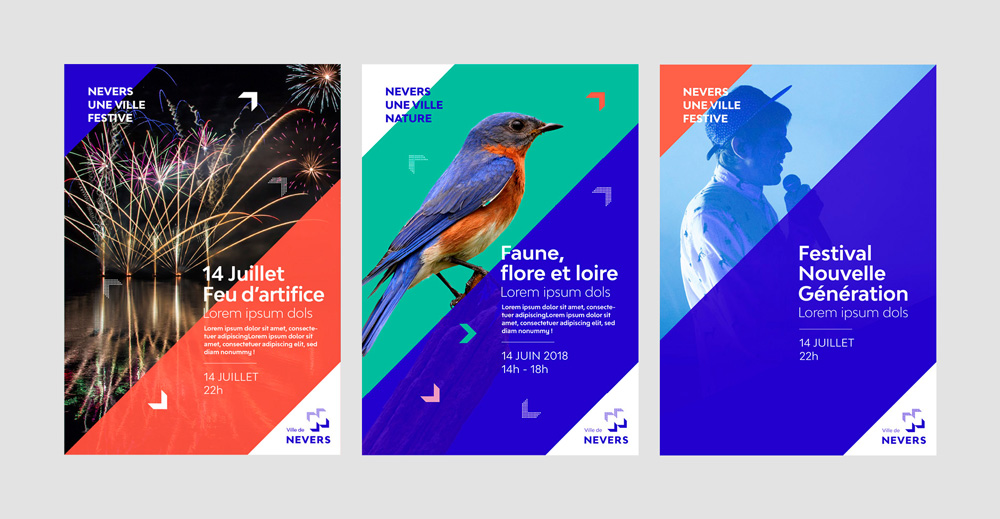
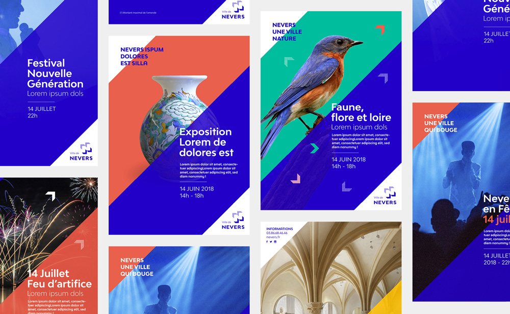
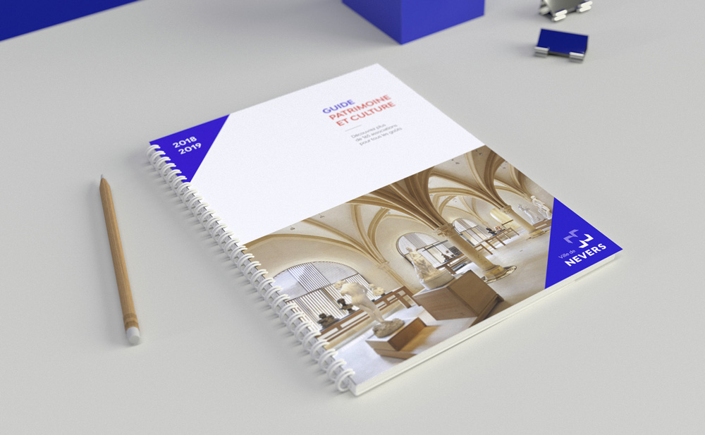
The extension of the angled nature of the chevrons is nicely done in the applications, setting up a flexible system that’s dynamic, colorful, and engaging. I particularly like when they sprinkle chevrons going in different directions (as in the photo with the bird).
The additional animation work is pretty slick but I wonder though, how relevant this (and the applications) are. As a disclaimer, I have never been to Ville de Nevers but judging from the Google Image search, the identity seems way too cool for what looks like an… old town. With some destinations that I’ve never been to, the Google Image Search result test does match what an identity is doing and I know it’s far from scientific but it seems like a disconnect in this case. Optimistically though, this very well-crafted identity could help set the tone for a cooler Ville de Nevers.

 Новости Союза дизайнеров
Все о дизайне в Санкт-Петербурге.
Новости Союза дизайнеров
Все о дизайне в Санкт-Петербурге.