Обзор лучших ресурсов по разработке бренда, разработке упаковки
contact us | ok@ohmycode.ru
contact us | ok@ohmycode.ru
Launched in 1986, FOX is a free-to-air television network that became the main competitor of the initial “Big Three” TV networks in the U.S., ABC, CBS, and NBC, after years of failed “Fourth Network” attempts by other companies. With hit shows like The Simpsons, Married… with Children, and Beverly Hills 90210, among many others, FOX gained in viewership and ultimately caught up and surpassed the Big Three by the mid 2000s, ranking among the top two networks in primetime entertainment for the past 23 years among 18- to 34-year-olds. Well-known for pushing boundaries, FOX created shows like 24, Arrested Development, and, um, American Idol. The FOX brand name has expanded into additional channels, including FOX Sports and FOX News. This last decade hasn’t been as kind, with declining ratings and a shift in ownership when Disney purchased 21st Century Fox that, although it didn’t include FOX the TV channel, it’s not far-fetched to assume there was a disruptive ripple effect. In preparation for the next decade — which will most likely continue to be ruled by streaming services — FOX has introduced a new identity designed by New York, NY-based Trollbäck + Company.
When FOX launched in 1986, it was sharply defined by its ability to push boundaries and take bigger swings than any other entertainment company. In reawakening this rebellious brand character, we worked collaboratively with FOX to question the legacy models holding them back and dared each other to build the future of network TV. We reconsidered and redesigned every detail, from the iconic FOX logo to how they engage with fans.
To stand out in a content-rich entertainment landscape, the new FOX brand provokes, pushes and engages its audience. We developed a daring brand strategy that internally encourages FOX employees to break rules and conventions, and externally engages audiences by breaking expectations and boundaries. We then created a new tone of voice that gives FOX license to fully embrace fandom and deliver a more daring perspective on pop culture. The visual identity emboldens this strategy by allowing FOX designers and animators to continually break things to make new things, even the logo itself.
While the update to the logo seems negligible, the correct optimization of the “O” to have an overshoot is worth any amount of money FOX paid to Trollbäck + Company. Not a whole lot more to say about the logo update since it really is imperceptible to the audience which is a good thing as the chunky logo has very strong equity.
In our design phase, we deconstructed and rebuilt the FOX identity into a high-end, hyper-modern system. After updating the brand mark, we broke it into the geometric shapes that form the basis for the brand’s graphic language. Each piece can be reassembled into an infinite array of possibilities, in 2D or 3D space, forming an ever-expanding design system that welcomes creative expression. In motion, we defined characteristic behaviors that adapt to any mood and message, building a proprietary animation toolkit that supports all programming genres and works for all screen sizes.
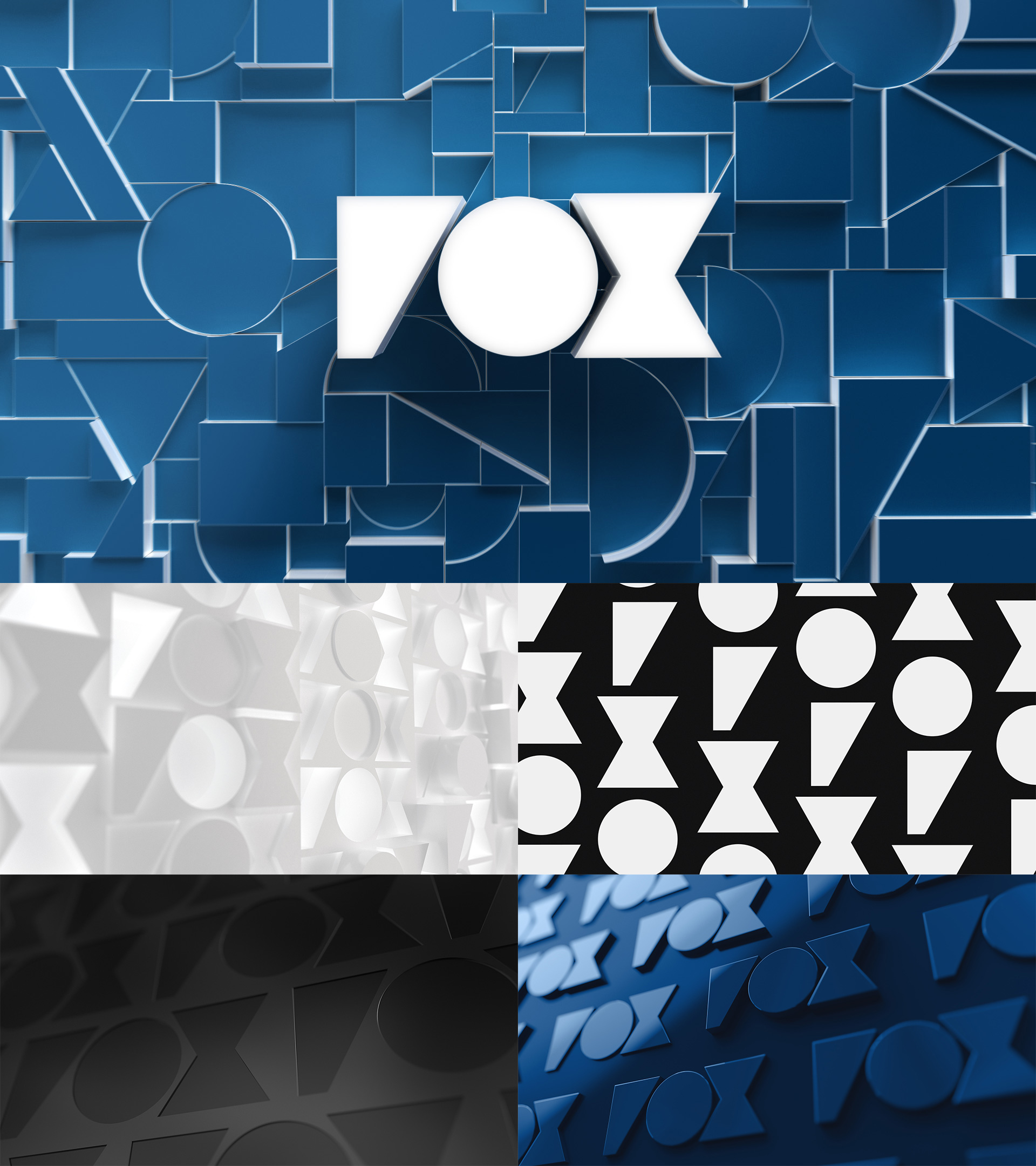
A couple of months ago, when this redesign first came up (without the existing comprehensive project page from Trollbäck + Company) there was a bit of a hubbub about FOX changing its logo to the abstracted version that, without too much pessimism needed does read as “VOX”. Despite the numerous tips and PR pushes to cover the story with only a few random stills, I knew there was more to the story so I waited to jump on it… and it’s funny that now that there is more to the story no other outlet has covered it because, I guess, it’s not that controversial in the end. The abstract FOX mark does not replace the regular FOX type treatment and, to be honest, I’m not sure it’s the greatest of ideas to introduce something that does indeed have the potential to confuse BUT it looks and works great in animation as a kind of Dr Jekyll and Mr Hyde tag team except not evil.
There is a lot to like in the video above — the video itself is great and makes it hard to not get excited about the new look — watching the interplay of the two FOX marks and how smoothly they blend into one another. The little triangle that moves around is also kind of cool. The one element that is perhaps a little odd is the use of full circles as “O”s in combination with a condensed typeface, which feels like a forced combination. But other than that, there is plenty of material here that feels exciting and energetic in a way that none of the Big Three networks could pull off.
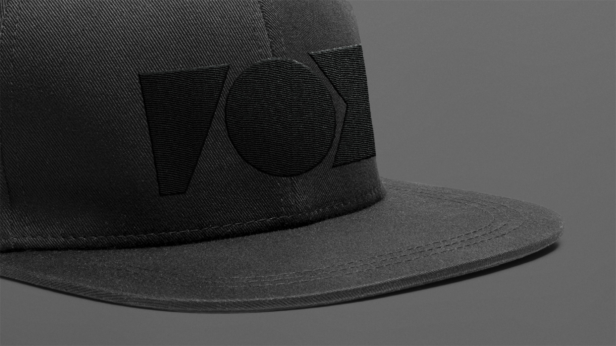
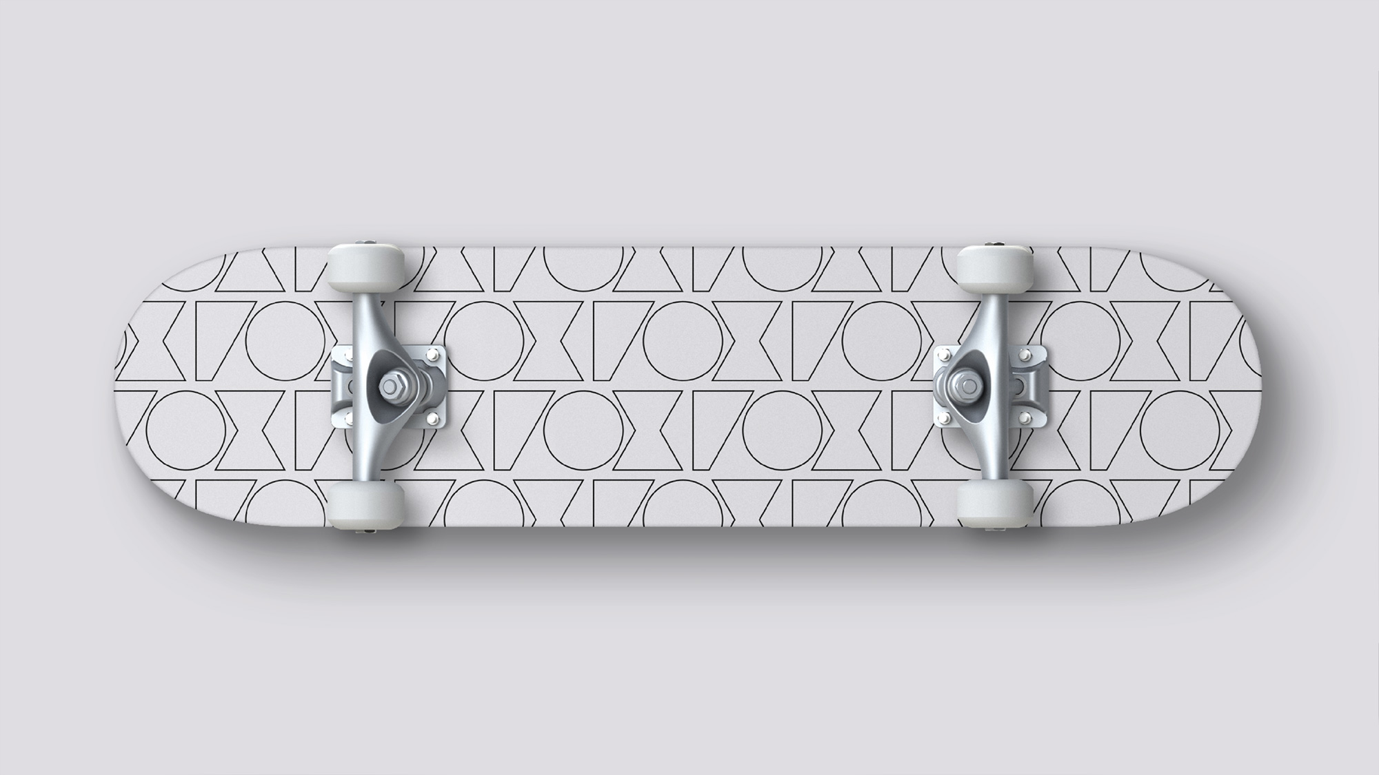
As a modern media brand, television is just one of the ways FOX entertains. It follows that the digital/social guide and toolkit we created for FOX far outweighs its on-air guidelines—another reflection of the brand’s shifting strategy. Unconstrained by TV, the design system expands further into brand applications across every touchpoint, from large-scale environmental settings, to social platforms, to advertising and marketing.
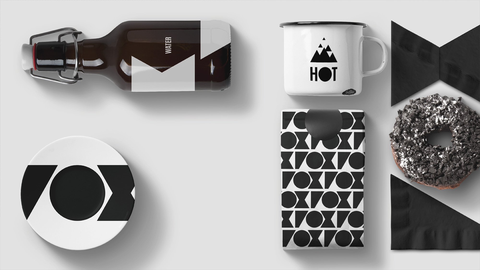
The applications above, eh… trying a little TOO hard to make the “VOX” thing happen, which I don’t think it works in static applications without it resolving into the correct logo. Nonetheless, the overall approach does feel like the good ol’ FOX that gave us The Simpsons, with an unconventional and relatively daring tone of voice.
 each year since publication began in 2006

 Новости Союза дизайнеров
Все о дизайне в Санкт-Петербурге.
Новости Союза дизайнеров
Все о дизайне в Санкт-Петербурге.