Обзор лучших ресурсов по разработке бренда, разработке упаковки
contact us | ok@ohmycode.ru
contact us | ok@ohmycode.ru
Established in 1857, BBVA (Banco Bilbao Vizcaya) is one of the largest financial institutions in the world. A multinational Spanish banking group focused on direct-to-customer retail business, BBVA is present in more than 30 countries — having acquired dozens of local banks and financial groups from 1995 to today — and counts with nearly 8,000 branches and 74.5 million customers, with its strongest presence in Spain, Mexico, South America, and Turkey. In many countries, it operates as a shared brand name: BBVA Compass in the U.S., BBVA Bancomer in Mexico, BBVA Francés in Argentina, and BBVA Continental in Peru, among others. Until now. Yesterday, the company announced it will unify its brand worldwide, doing business as BBVA everywhere and introduced a new logo.
(Brandemia credits Landor for the design but I could not find a second source mentioning Landor, or them mentioning it on their site or social media, and have not received confirmation from them if they did it. Will update when possible.)
The new identity is a reflection of the values of BBVA, especially of the ‘We are one team’ value, which emphasizes the importance of the people working at BBVA and their commitment to the project.
BBVA CEO Onur Genç also noted that BBVA is a global group with a presence in over 30 countries. “We are unifying our name, alongside a change in the BBVA logo, to better convey our increasingly digital and global reality. This new identity will reinforce the bank’s commitment to BBVA’s approximately 75 million customers to bring them the best of our global capabilities while maintaining a local service mindset. And this is exactly our purpose: to bring the age of opportunity to everyone.”
For bank standards, the old logo was extra funky with those awkward “B”s that defied typographic conventions but that were well supported by the more normal “V” and “A”. It was a fairly recognizable wordmark, especially considering it was usually paired with another name in different fonts around the world and “BBVA” was the one graphic constant. Now, that’s not an issue anymore, since all of them will be known as BBVA alone, which is a good thing because the new logo will have a harder time standing on its own with a far more generic sans serif wordmark in a lighter weight and its main distinction being a levitating “A”.
There is some merit to the idea and there is enough name recognition for it to be read as BBVA instead of BB Down Up because the shape arrows are so pronounced and the “A” so un-pronounced but, visually, it’s not very pleasant. In the old logo, the two “B”s blended in well with the “VA” making it read as a unit but in the new one the two elements feel more stylistically separated making the two “B”s stand out too much and the two arrows stand out too much — it’s just a weird balanced imbalance. I want to appreciate the disruptive “A” as it does take some relative courage for a giant finance institution to do something like this to their logo but I don’t think they pushed it enough and I don’t know if it’s the height that the “A” reaches, the lightness of the font, the structure of the letters, or what, but it misses the mark in the end.
I really hope they don’t adopt the above as the main driver of the identity and that it’s only a gimmick for the video. Not a single one of those are interesting or imaginative, much less relevant and it makes BBVA look like a terrible 1980s MTV knock-off, 30 years too late, or a less cool 2010s AOL knock-off, 10 years too late — either way, these all feel dated and painfully uncool.
Even though it’s cheesy, I prefer the subtle arrow shapes hinted at in the video through the stock footage than the graphic interpretations. The shadowy logo animation is also kind of interesting but clashes with the rest of the video — it’s like they tried a dozen different things in there as a kind of global focus group test to see who reacts to what in what way.

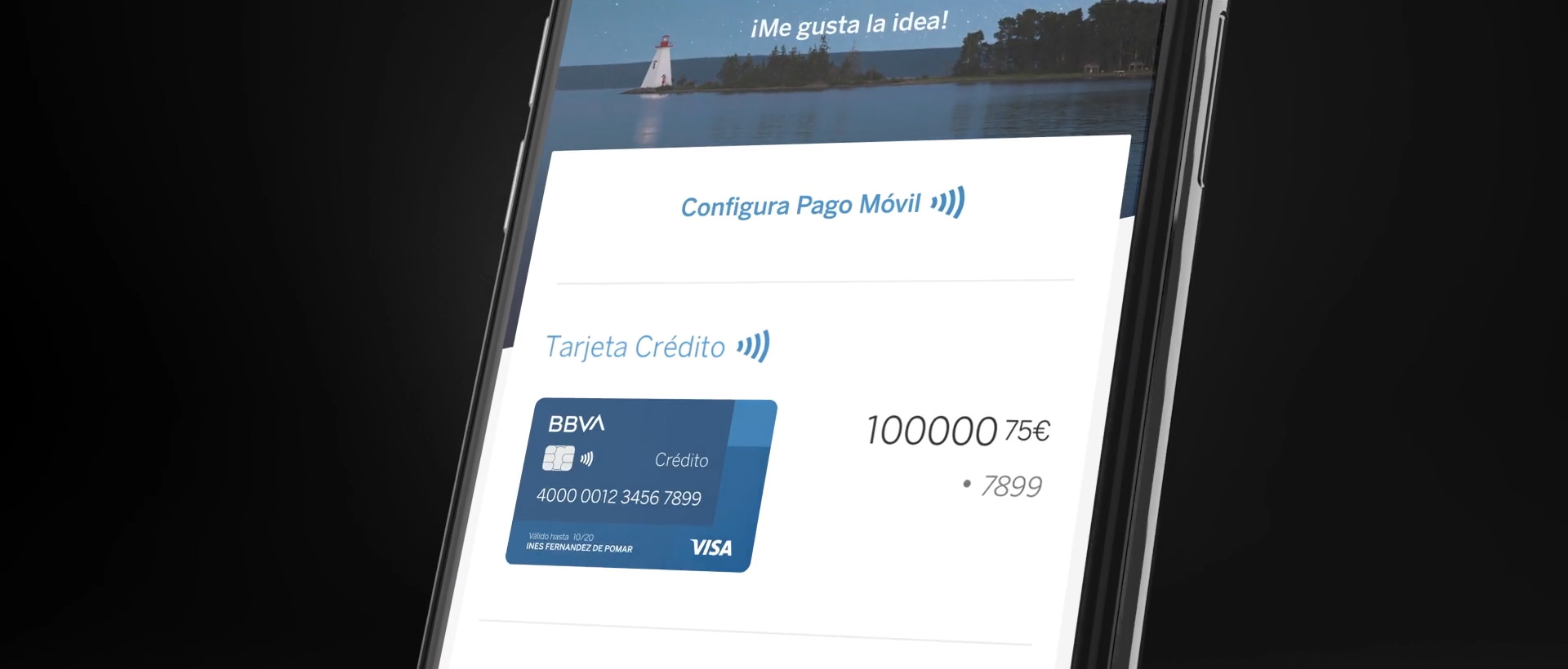
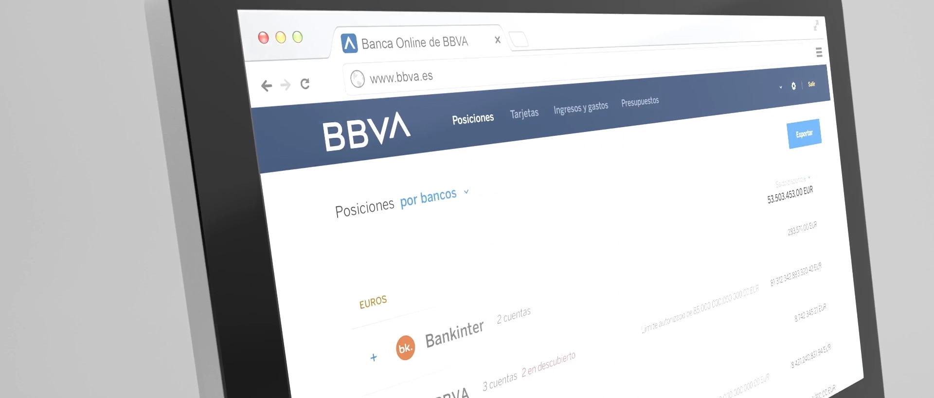


Not much in application — just a few random mobile and web screens that don’t demonstrate any significant graphic direction. Perhaps BBVA has a trick up their sleeves we will see as this rolls out but for now it doesn’t look very promising. I feel like this identity really needed to be a home run to support such a big change of moving to a global BBVA brand but, unfortunately, it’s not.
Thanks to Arturo Elenes for the tip.

 Новости Союза дизайнеров
Все о дизайне в Санкт-Петербурге.
Новости Союза дизайнеров
Все о дизайне в Санкт-Петербурге.