Обзор лучших ресурсов по разработке бренда, разработке упаковки
contact us | ok@ohmycode.ru
contact us | ok@ohmycode.ru
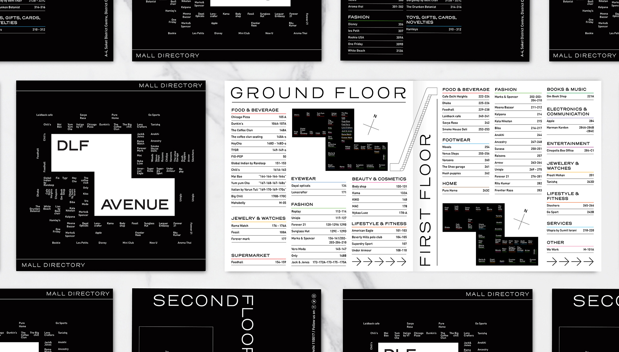
Opened in 2009, DLF Place is a large shopping mall in Saket, an upmarket residential neighborhood in Delhi, India. Owned by DLF — the largest publicly listed real estate company in India, with residential, commercial, and retail properties in 15 states and 24 cities — the 519,000-square-foot mall was closed for renovations for one year and re-opened this February as DLF Avenue with a focus on dining, events, and spaces for social interaction to complement the shopping, which now includes major retailers like Uniqlo and Under Armour. The identity for DLF Avenue has been designed by Wieden + Kennedy, Delhi.
DLF Avenue is a bit different from the average Indian mall. Which is helpful, considering that there are over a hundred of them in Delhi alone—and they all look exactly the same. The idea was for it to occupy a space that’s closer to a town square than a shopping mall, very much a part of the community and informed by culture at large.
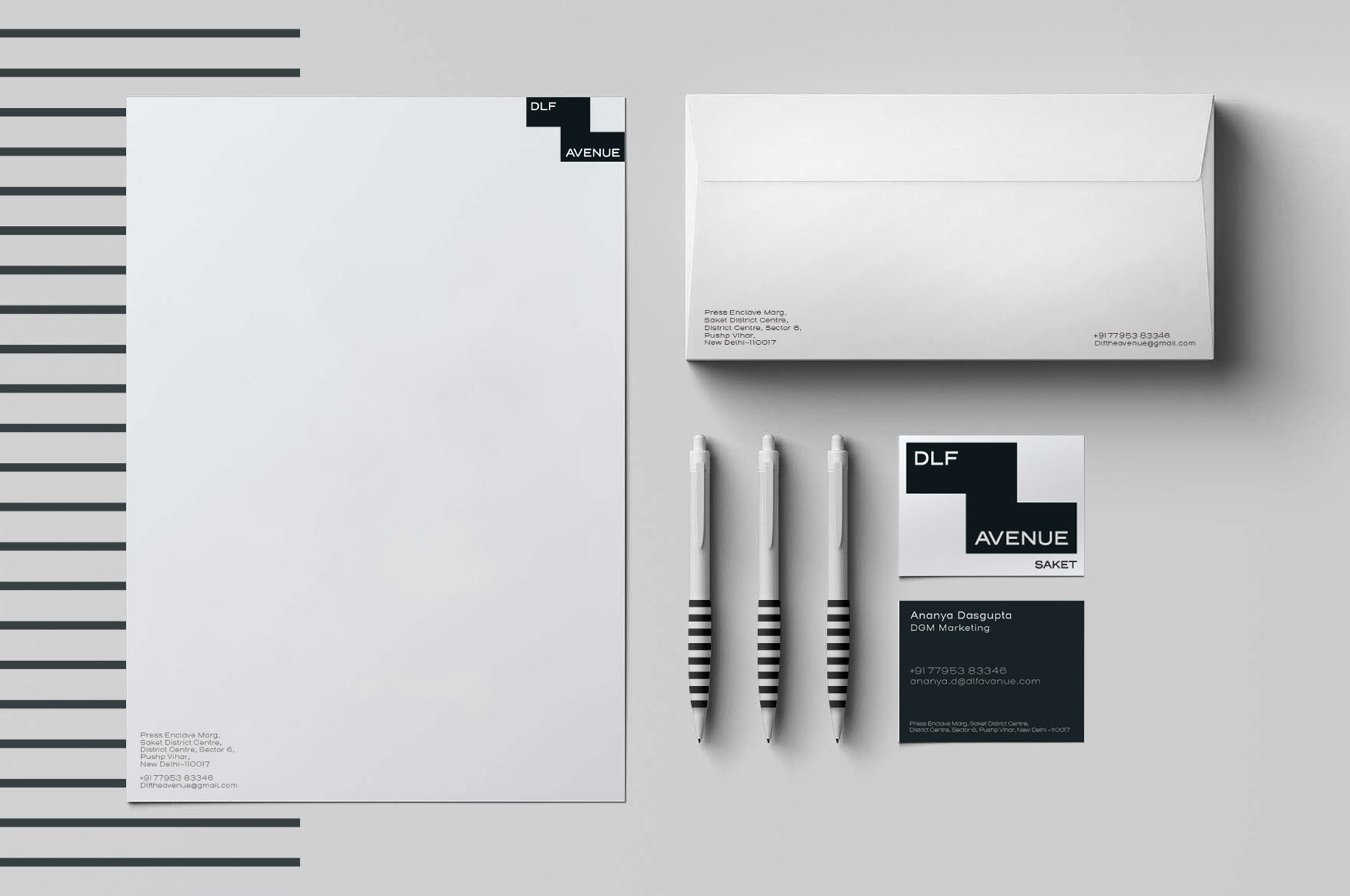
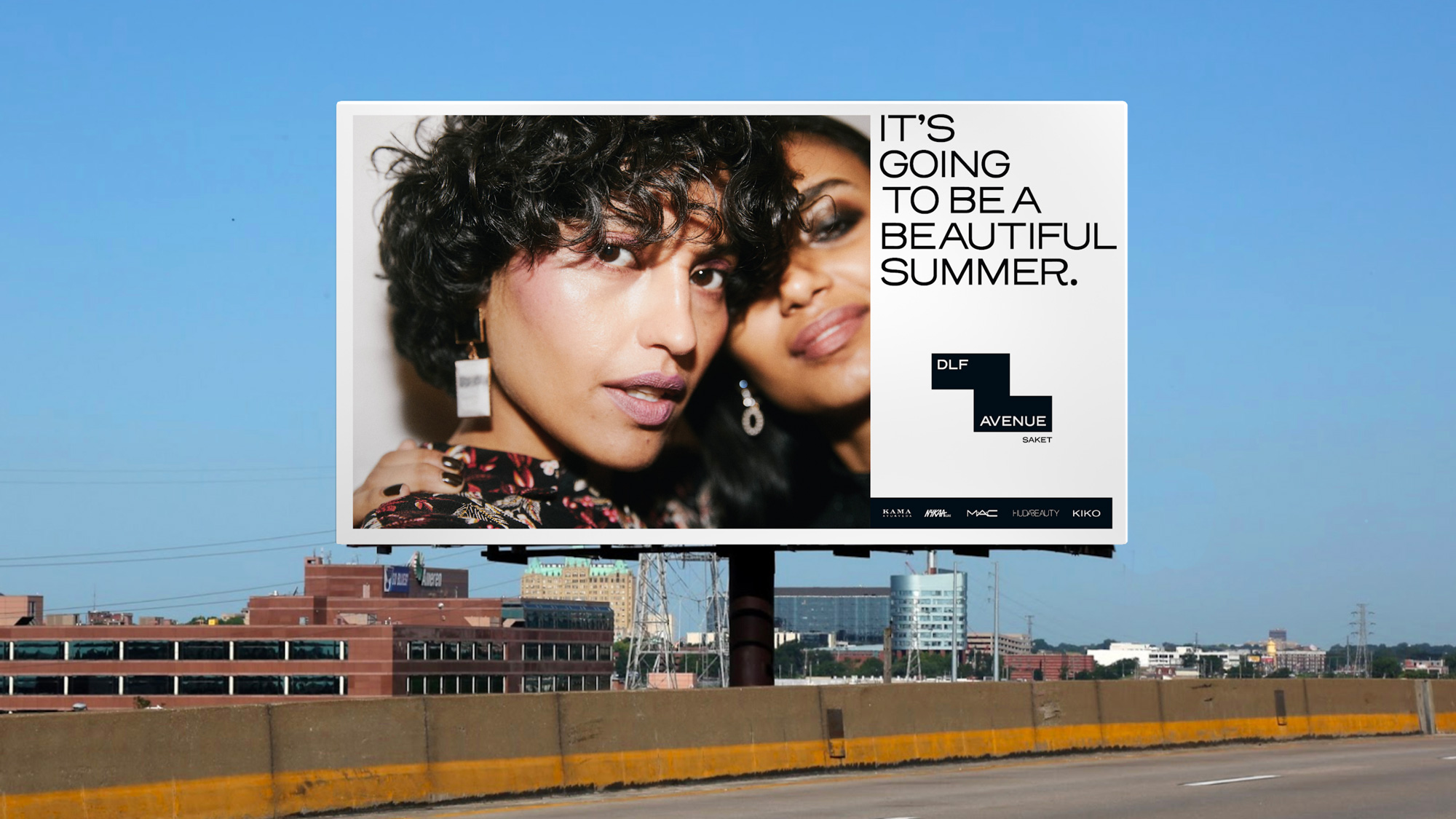
For its identity, we took inspiration from the space itself—the architecture of DLF Avenue forms a strange little Z that we turned into an instantly recognisable icon. It was the starting point for a rather extensive design system and everything from signages to collaborations with local artists and designers.
The old logo was pretty bad. I am assuming there may be a meaning to the shapes of the icon that I am missing but even then, the execution of those curves is painful to look at and the italic Futura wordmark in stark black was out of place. The new logo starts off well by adopting the “Z” shape of the footprint of the main building of the mall to create an interesting holding shape but the typography within it feels unresolved. Part of the problem is the two very different lengths of each word that create the wrong kind of asymmetry that makes the logo feel unbalanced. It’s not bad, per se… it’s not good per se either. So, we’ll call it a wash on the logo and as its major pro, the logo does manage to look and feel like it belongs on a high-end shopping mall.
Our design system is more of a flexible framework than a rigid set of guidelines. For instance, DLF Avenue doesn’t have a color palette per se—because how do you pick a color for a brand that houses hundreds of brands? That’s why we picked neutral tones of black and white, with pops of fluorescence. Put simply, this system sets the tone and visual language for all things DLF Avenue.
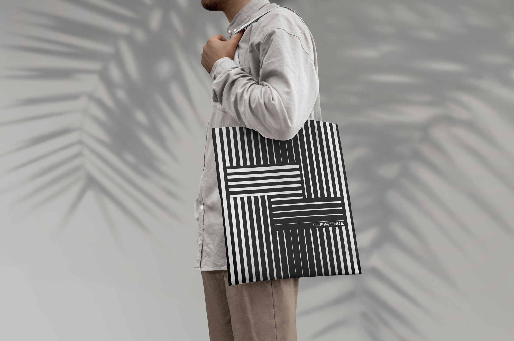
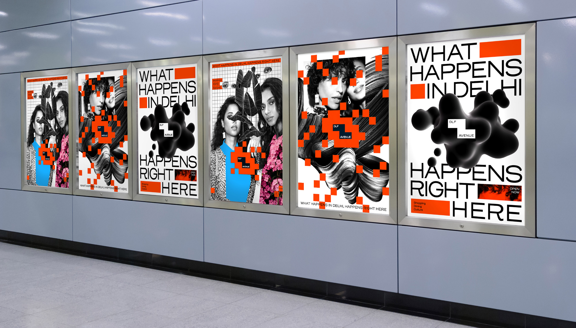
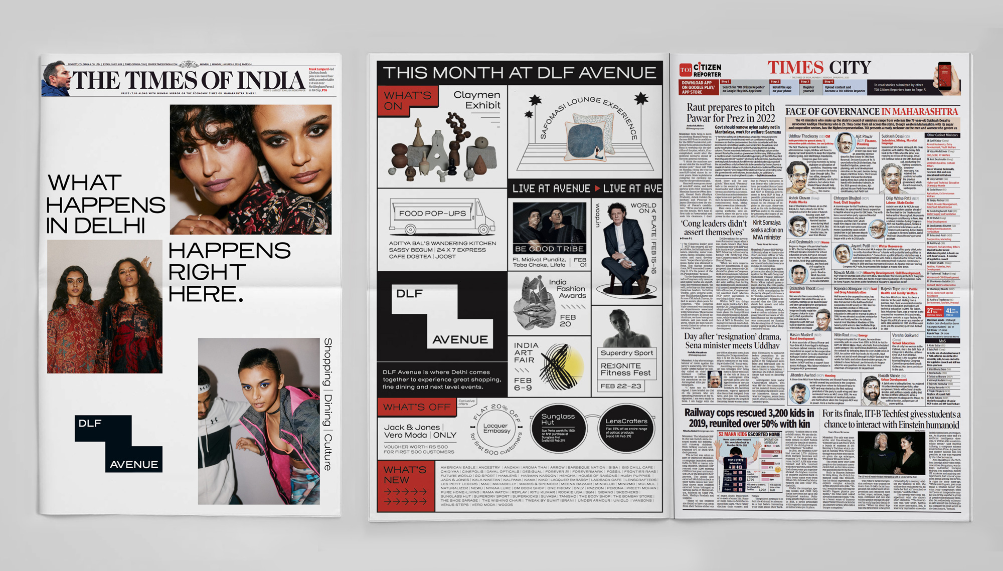
In application, things go in about a dozen different directions and while the quote higher up does state that this is “more of a flexible framework than a rigid set of guidelines” this redefines the meaning of flexible as a free-for-all that includes 3D graphics, concentric patterns, thick black strokes, red square pixel invasions, and pretty much any trendy typographic treatment available. I’m not particularly fond of any of the approaches on their own or even the whole but I have to admit, it certainly sets a mood of variety and excitement with a fashion-y bent that should positively attract an audience to the mall which, itself is activated in the same kind of anything-goes approach.
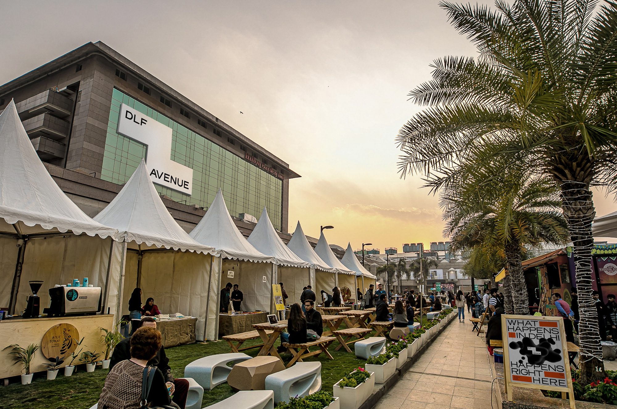
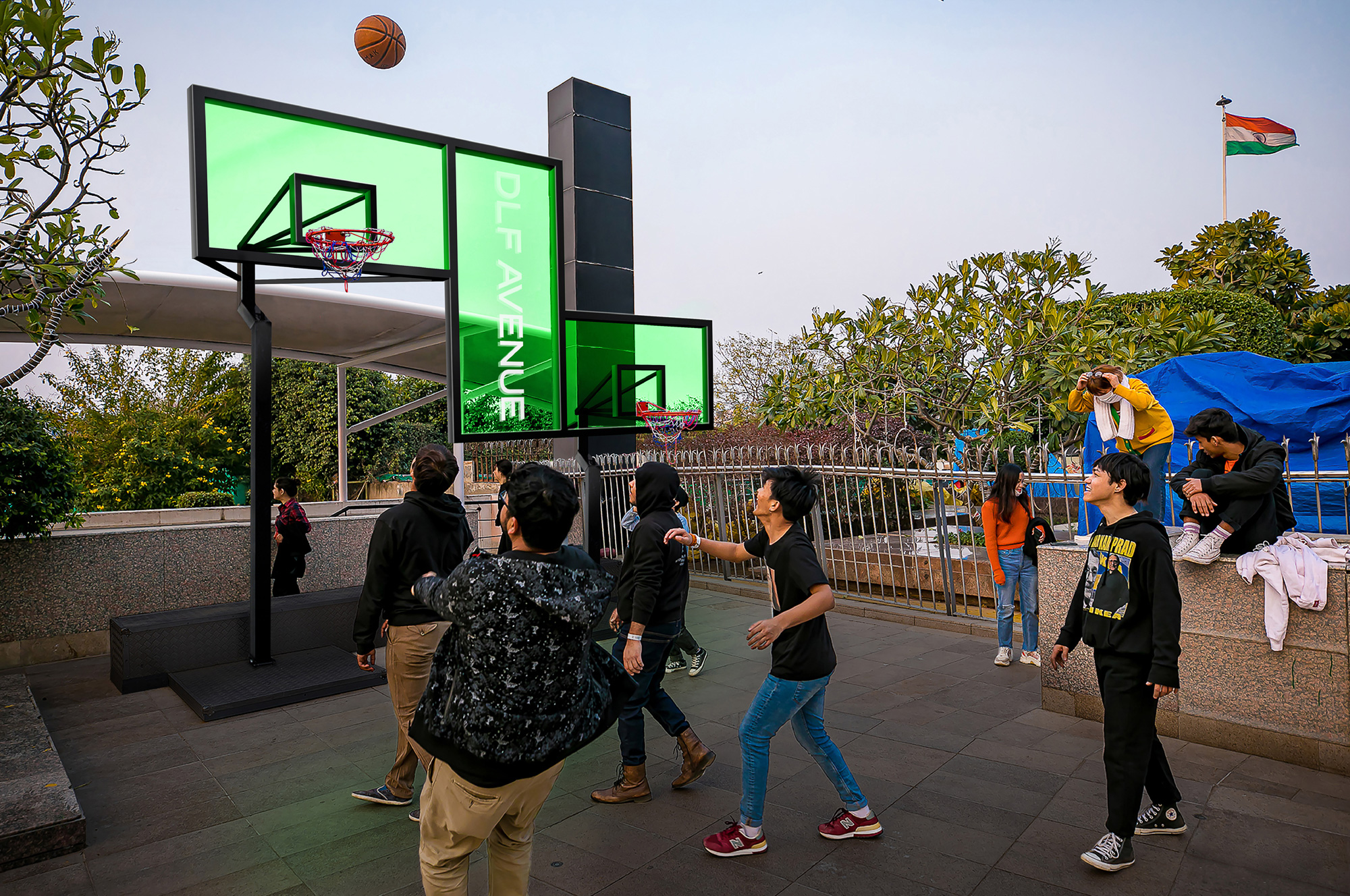
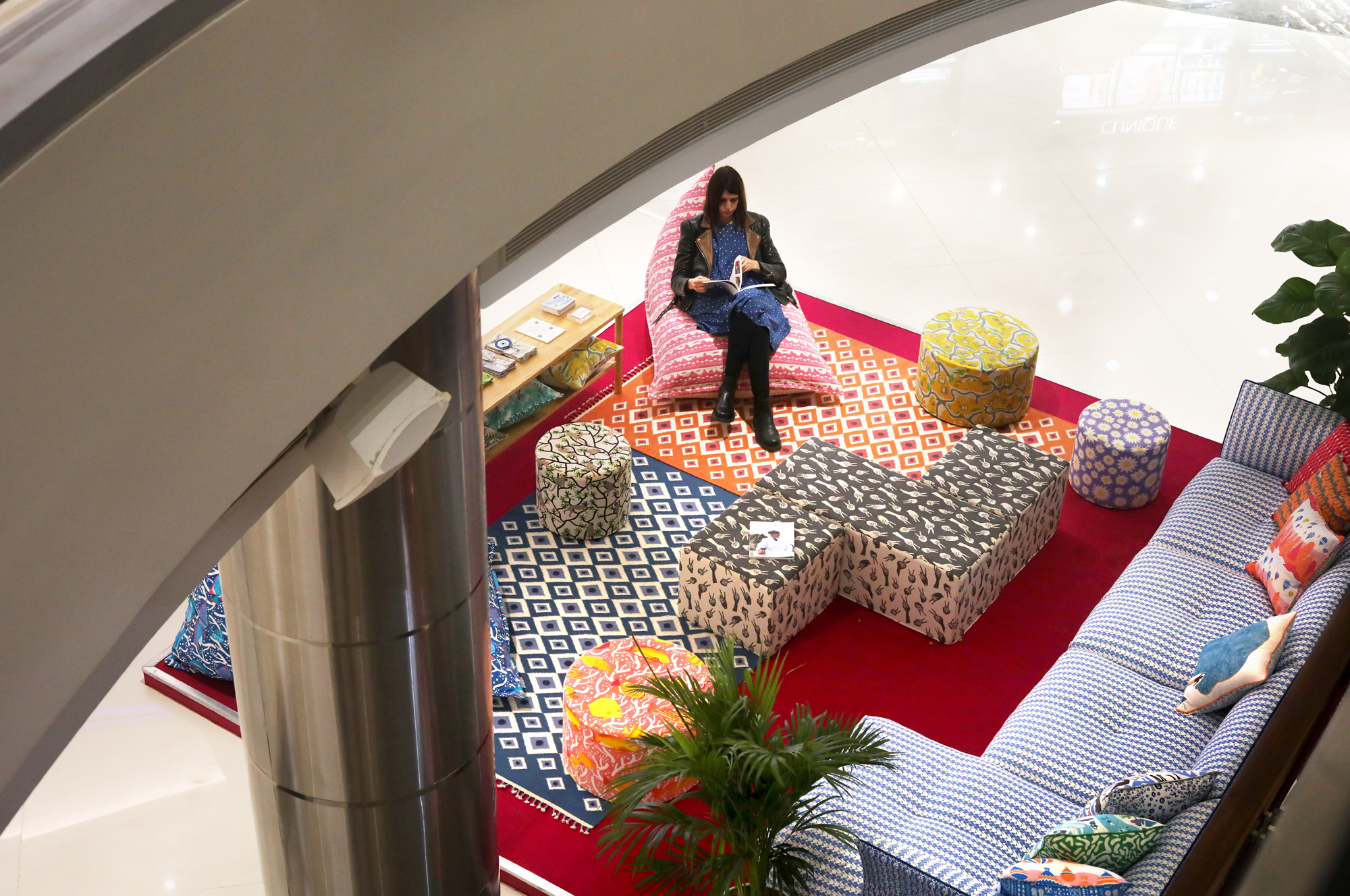
At first I thought these were all just crazy, pie-in-the-sky renders but then I found this video and everything from the Z-shaped couch to the super wide video walls is there — I was hoping for a glimpse at the basketball hoops but no luck. Overall, I may not be a fan of the design decisions but this is all appropriate for the mall and the younger audience they are aiming to attract.
 each year since publication began in 2006

 Новости Союза дизайнеров
Все о дизайне в Санкт-Петербурге.
Новости Союза дизайнеров
Все о дизайне в Санкт-Петербурге.