Обзор лучших ресурсов по разработке бренда, разработке упаковки
contact us | ok@ohmycode.ru
contact us | ok@ohmycode.ru
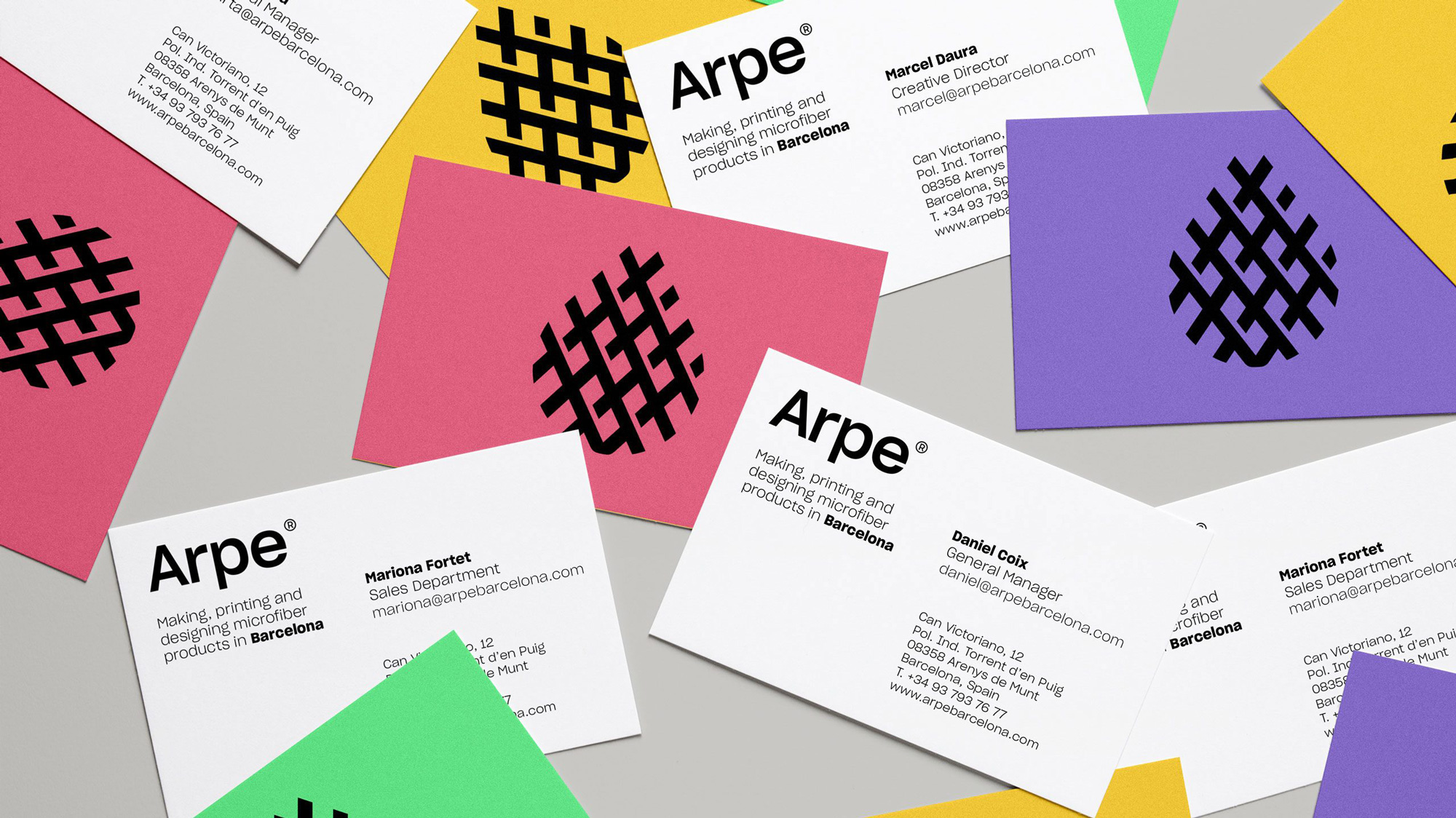
Established in 1991, Arpe specializes in the very specialized specialty (yes, I know that’s redundant thrice) of the manufacturing and personalizing of microfiber cloths, towels, and fabrics with custom artwork. Based in Spain, near Barcelona, Arpe creates its own fabrics from scratch and has varieties for applications like beach towels, cosmetic pouches, travel pillows, mobile device sleeves, eyeglasses wiping cloths, and even baby bibs, all produced so that they can be digitally printed with full-color images. Primarily, a business to business service, Arpe has also launched Tuva, a retail brand of towels using their fibers, design, and printing. Looking to expand internationally, Arpe recently introduced a new identity designed by Barcelona-based Toormix.
[We] built a new image and graphic code that represents the values mentioned in a creative way, in order to represent creativity and innovation. The drop refers to the stamping, while the pattern designed draws the microfiber fabric and, finally, a colorful and contemporary graphic expression has just given coherence to the new positioning.
A brand architecture that includes the word Barcelona in its name. Which is a strategic decision to have visibility in international markets. As for the composition, a flexible brand is created that allows other designations in its form, depending on its use and context. «Making, printing and designing microfiber products in Barcelona» fully defines its differential argument. This baseline explains on the one hand the range of products they develop, and on the other, the values and other strategic elements of the brand. To this is added the creation of a library of icons and different very representative stamps to mark the products.
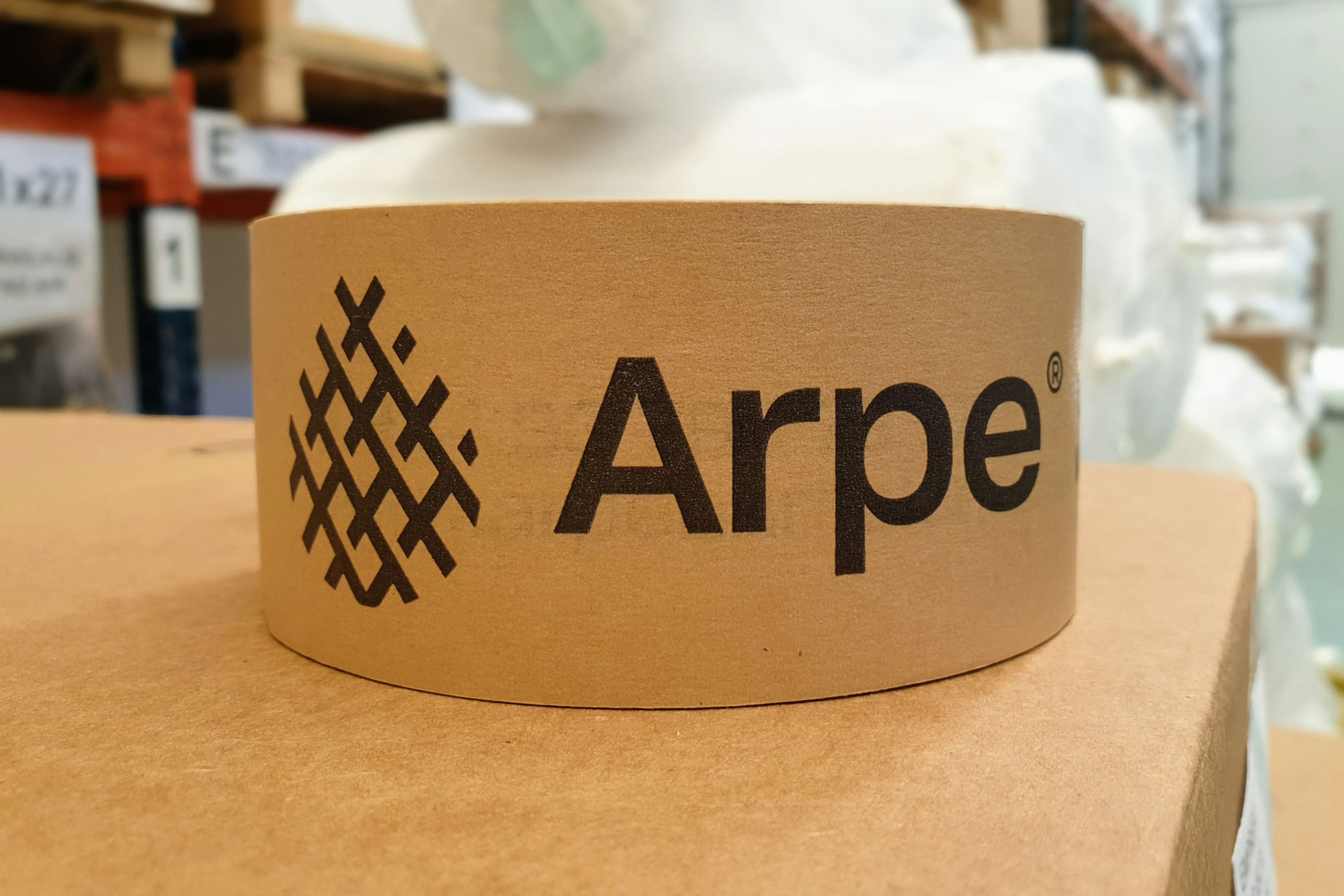
You gotta hand it to the old logo for trying to pull off the flipped “a” doubling as an “e” trick and I would say it even succeeded, despite the unicase approach — shudder — and a late 1980s-early 1990s aesthetic but, it did look dated, and the script underneath made it look almost like a single retail clothes store in Barcelona. The new logo revolves around a great icon that shows the pattern of a microfiber as if it were being seen under a microscope through a drop-shaped lens. The weaving effect is perfectly executed and the drop is an apt representation for printing, which may not be an obvious deduction to anyone that isn’t aware of what Arpe does but it’s an easy connection once it has been established. The wordmark is cool and funky enough — it also deserves a golf clap for the baseline and descender alignment with the strands of the fiber in the icon.
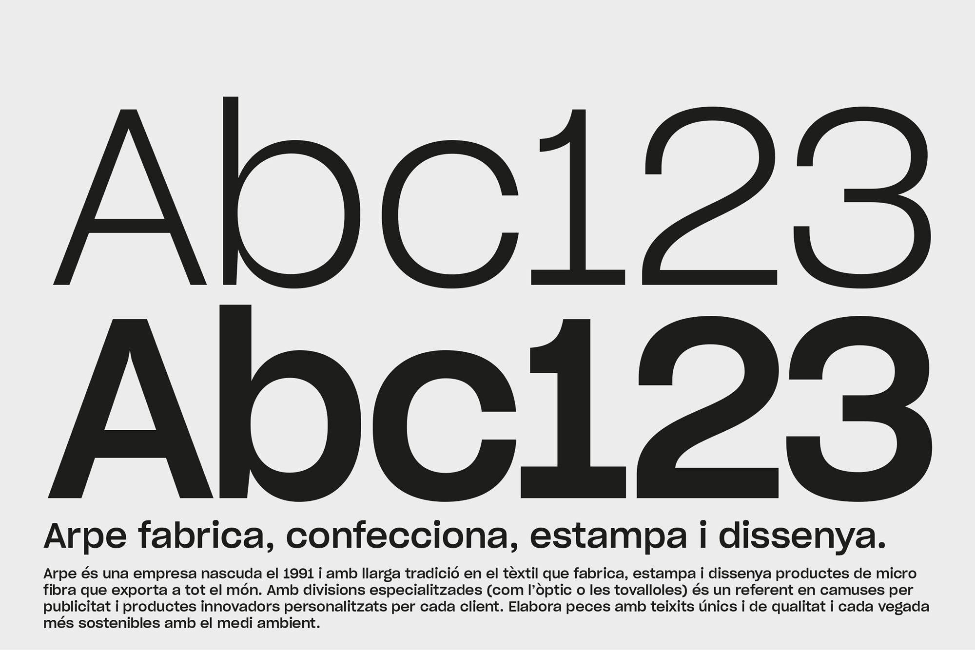
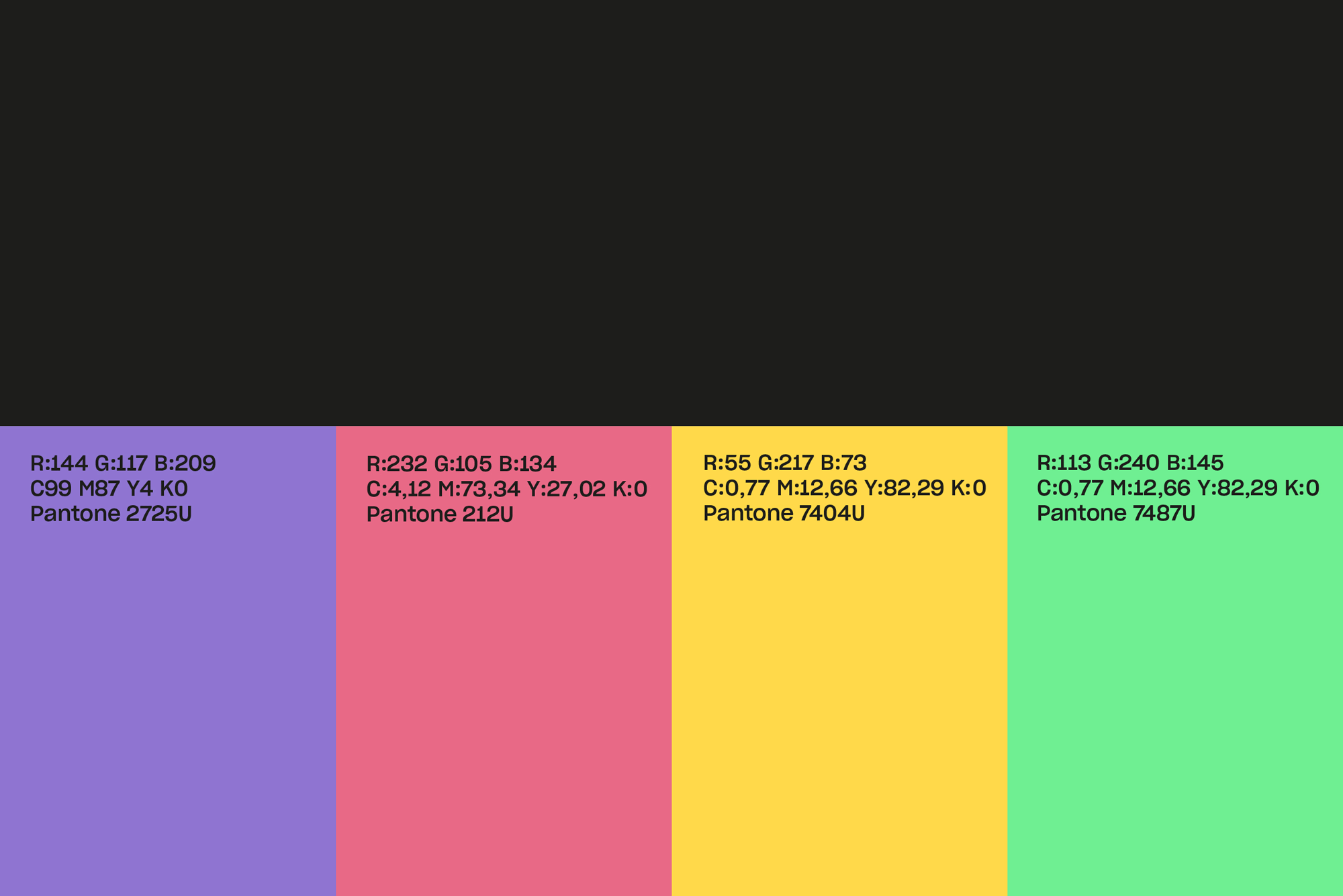
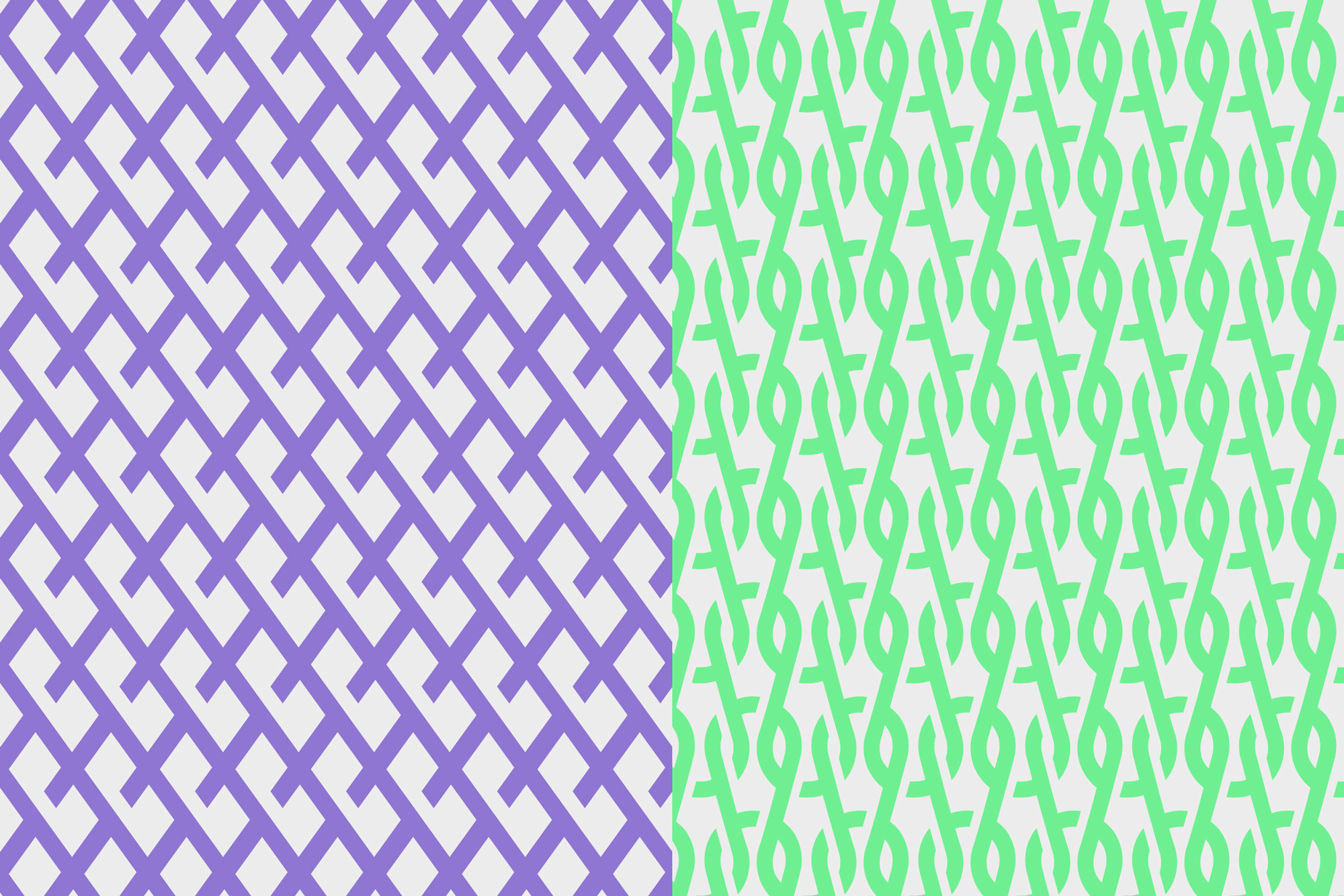
Typography, color palette, patterns, and icons are all good, with a vibrant and contemporary feel but without any of the elements trying to be overly cool or too design-y for the sake of it.
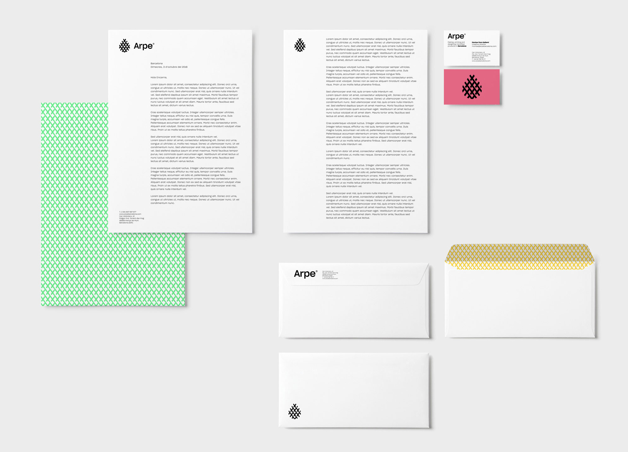
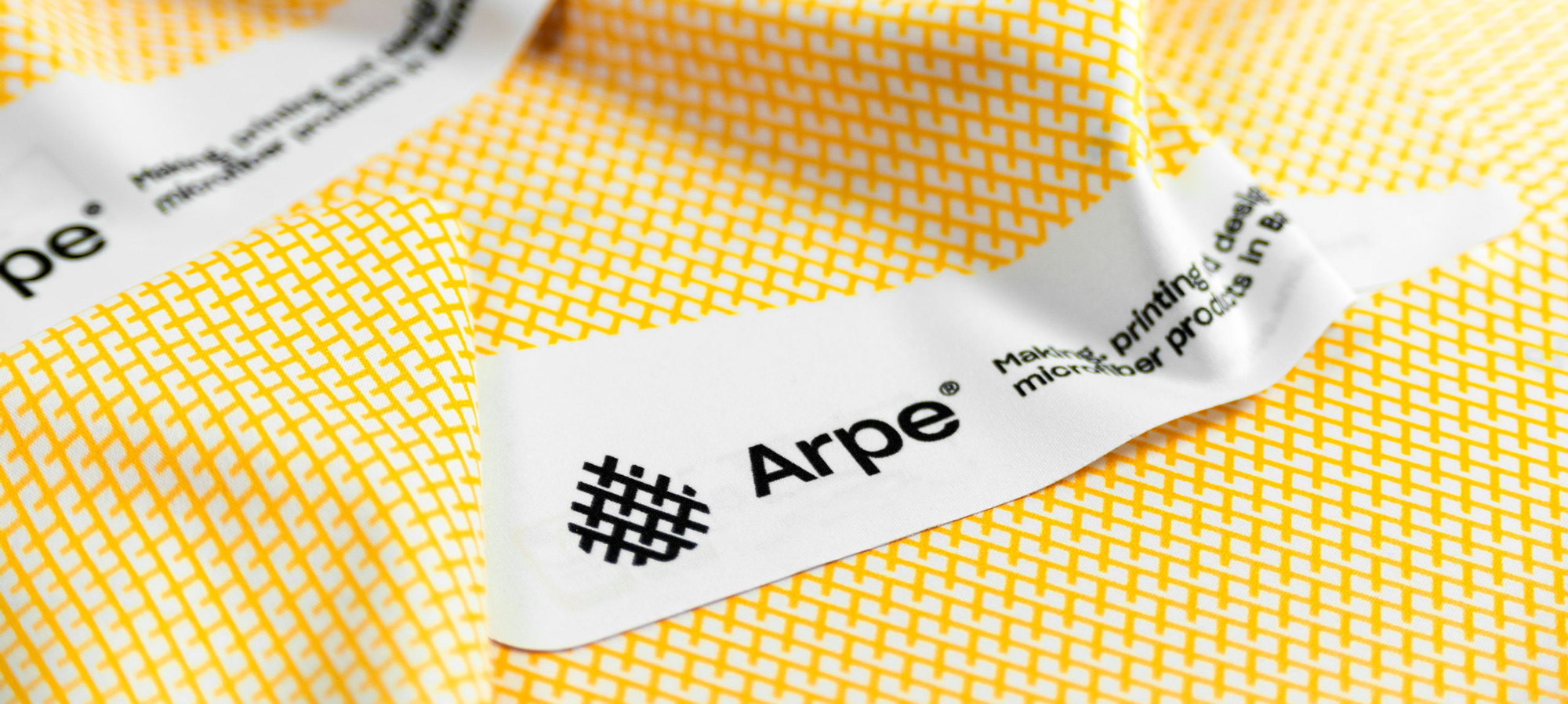
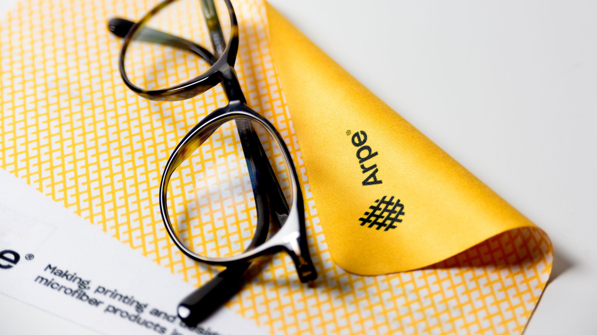
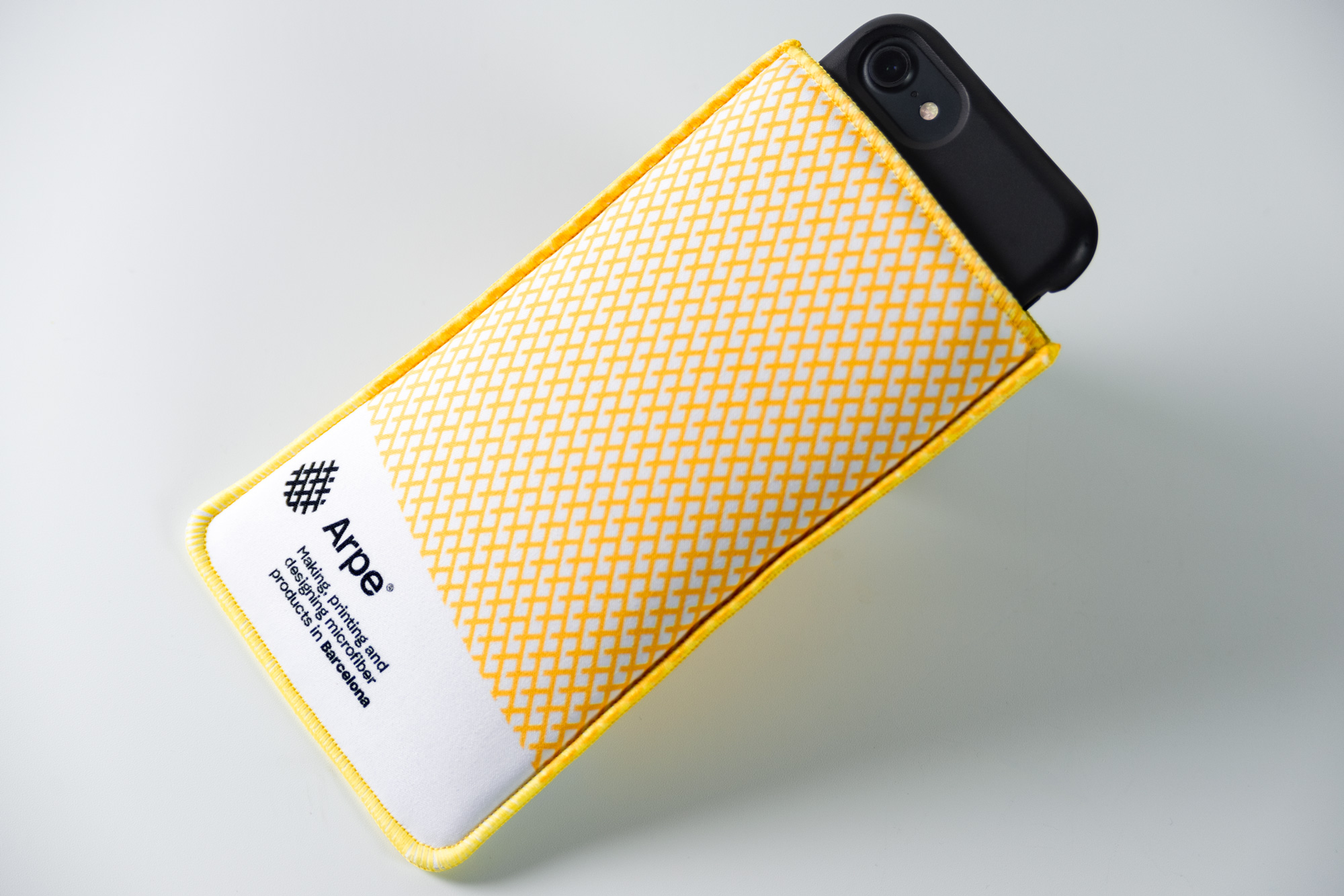
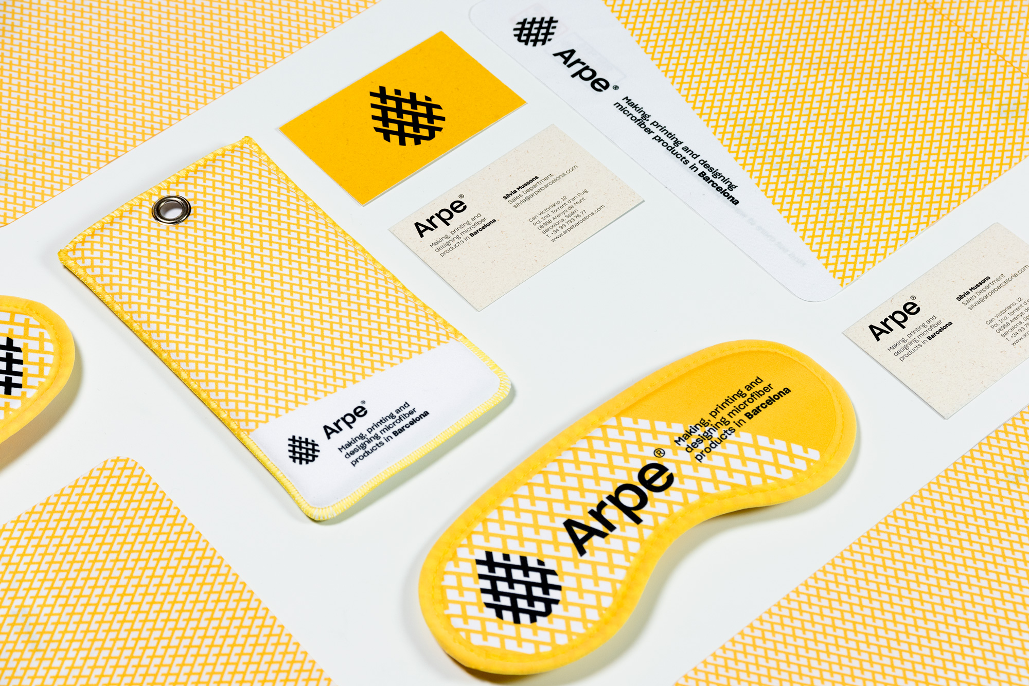
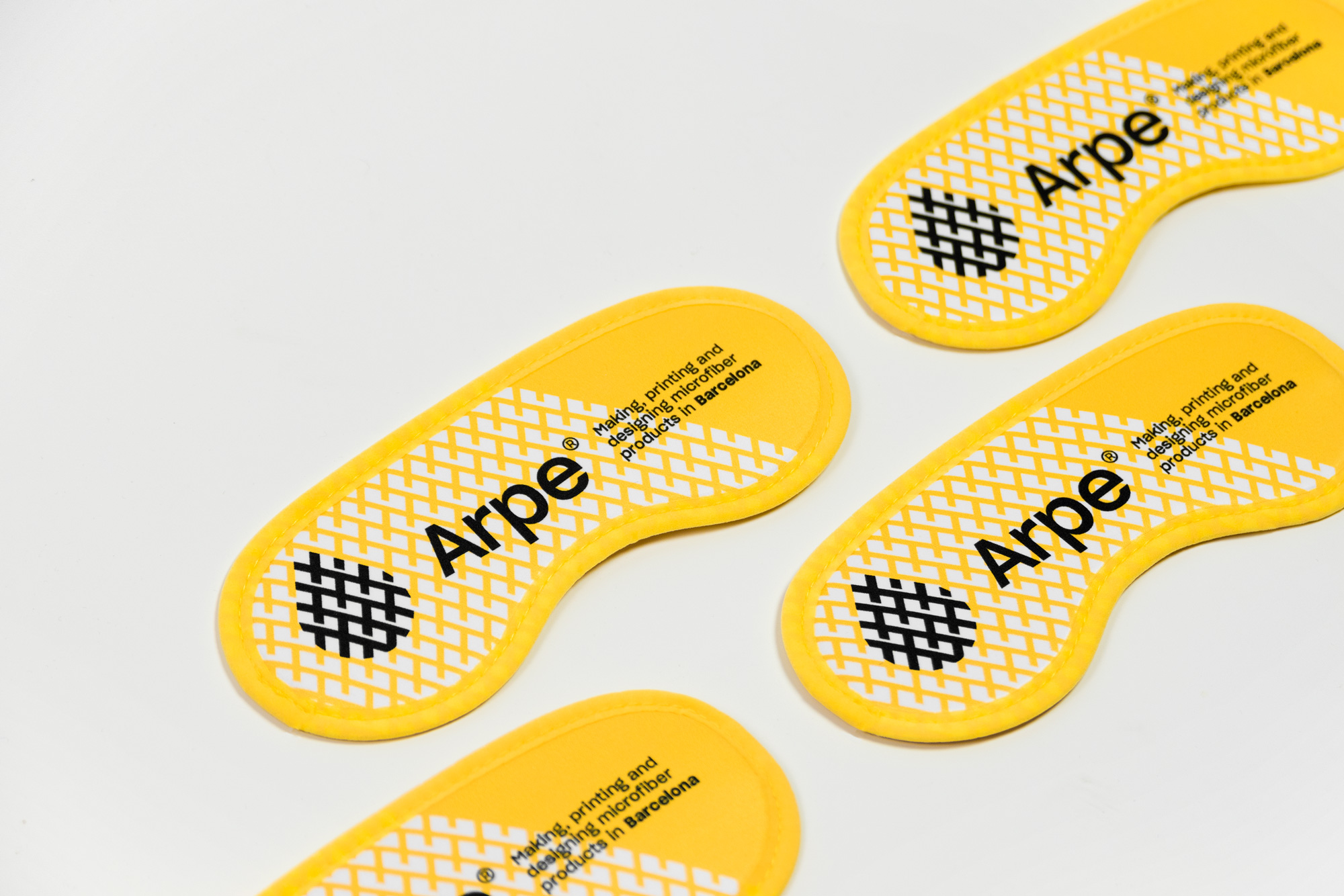
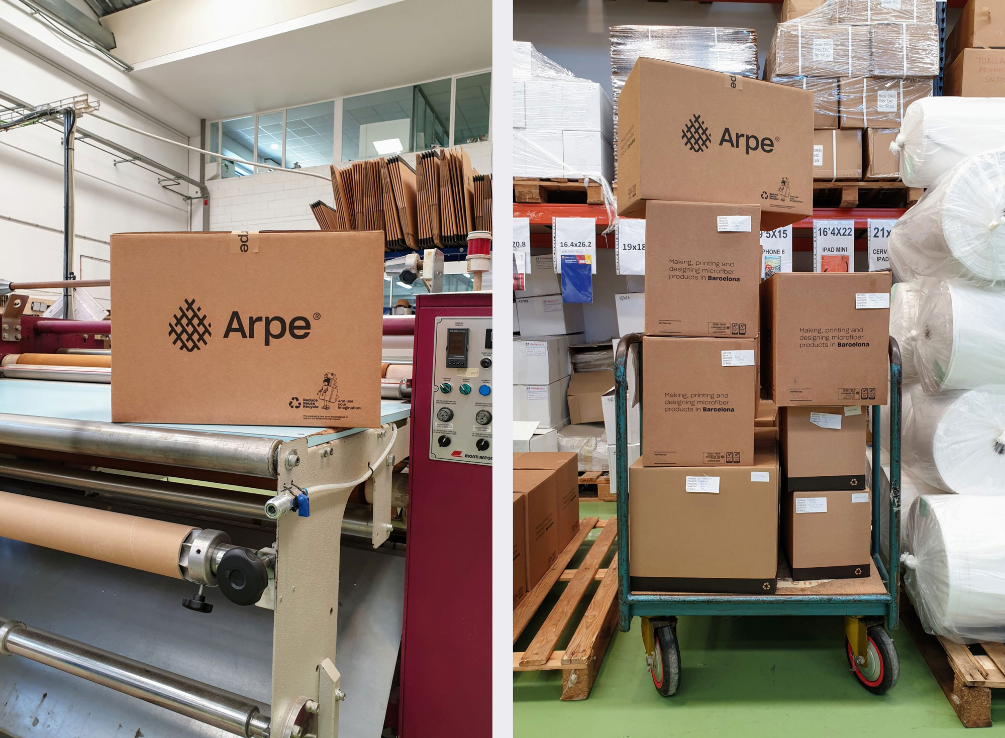
The applications are fairly straightforward but the richness of the pattern makes everything look livelier and more exciting. For some reason I am also getting some Geigy Pharmaceuticals vibes, which is never a bad thing.
Overall, this is a great redesign with a great icon at its core and a visual language that nicely represents the product all while making the company look on par with bigger product innovation companies like, say, Dupont.

 Новости Союза дизайнеров
Все о дизайне в Санкт-Петербурге.
Новости Союза дизайнеров
Все о дизайне в Санкт-Петербурге.