Обзор лучших ресурсов по разработке бренда, разработке упаковки
contact us | ok@ohmycode.ru
contact us | ok@ohmycode.ru
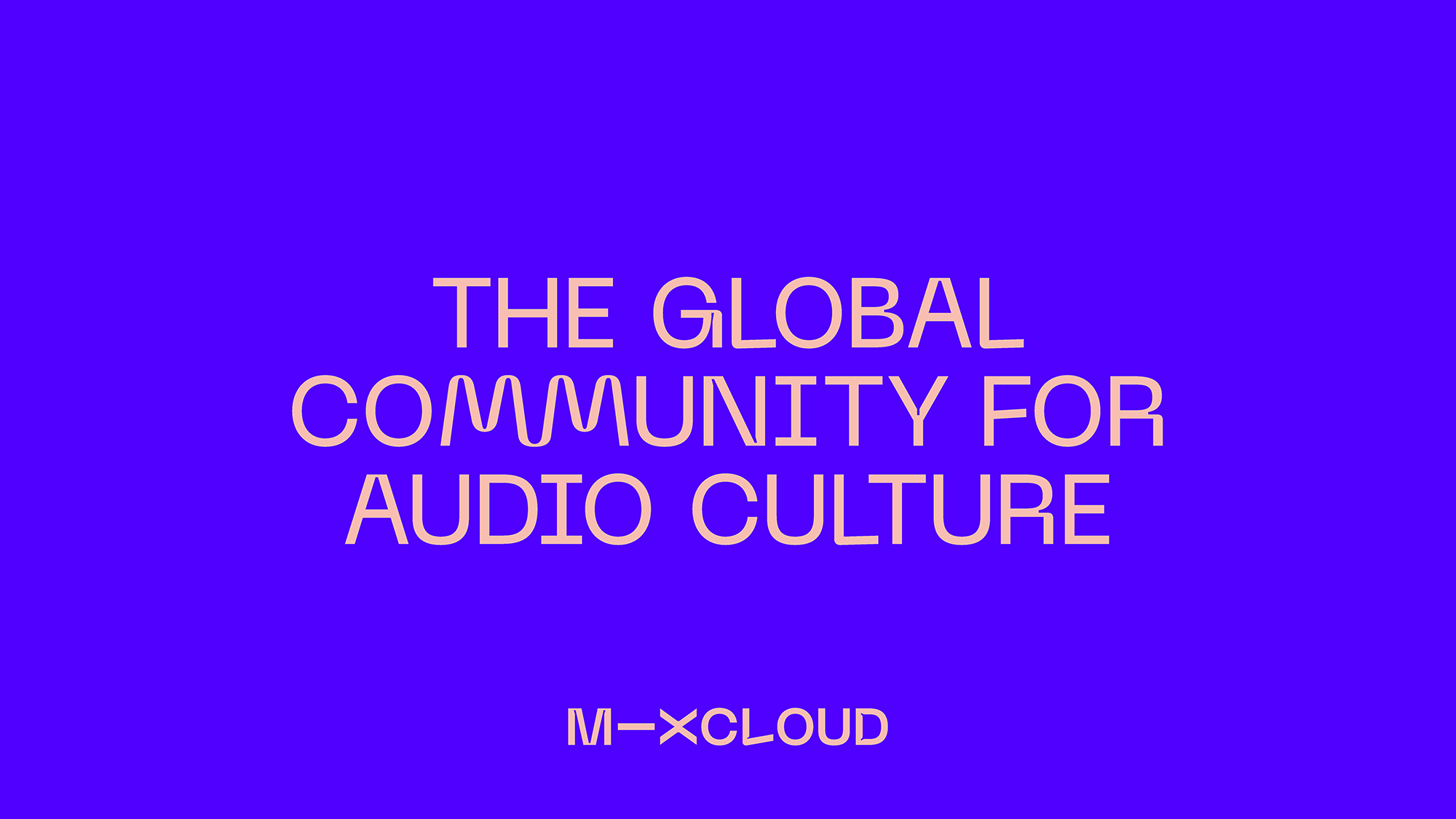
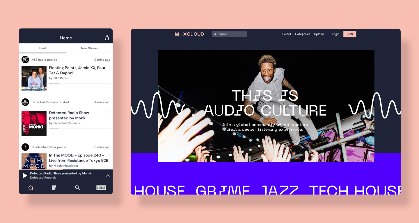
Established in 2009, Mixcloud is an audio streaming platform whose mission is to “get more fans directly supporting creators and build a more sustainable future for audio culture”. In its ten years, Mixcloud has built a catalog of more than 15 million radio shows, DJ mixes, and podcasts across every genre, taste, and scene created by over 1 million creators and enjoyed by more than 20 million listeners. This week, Mixcloud introduced a new identity designed by London, UK-based Output.
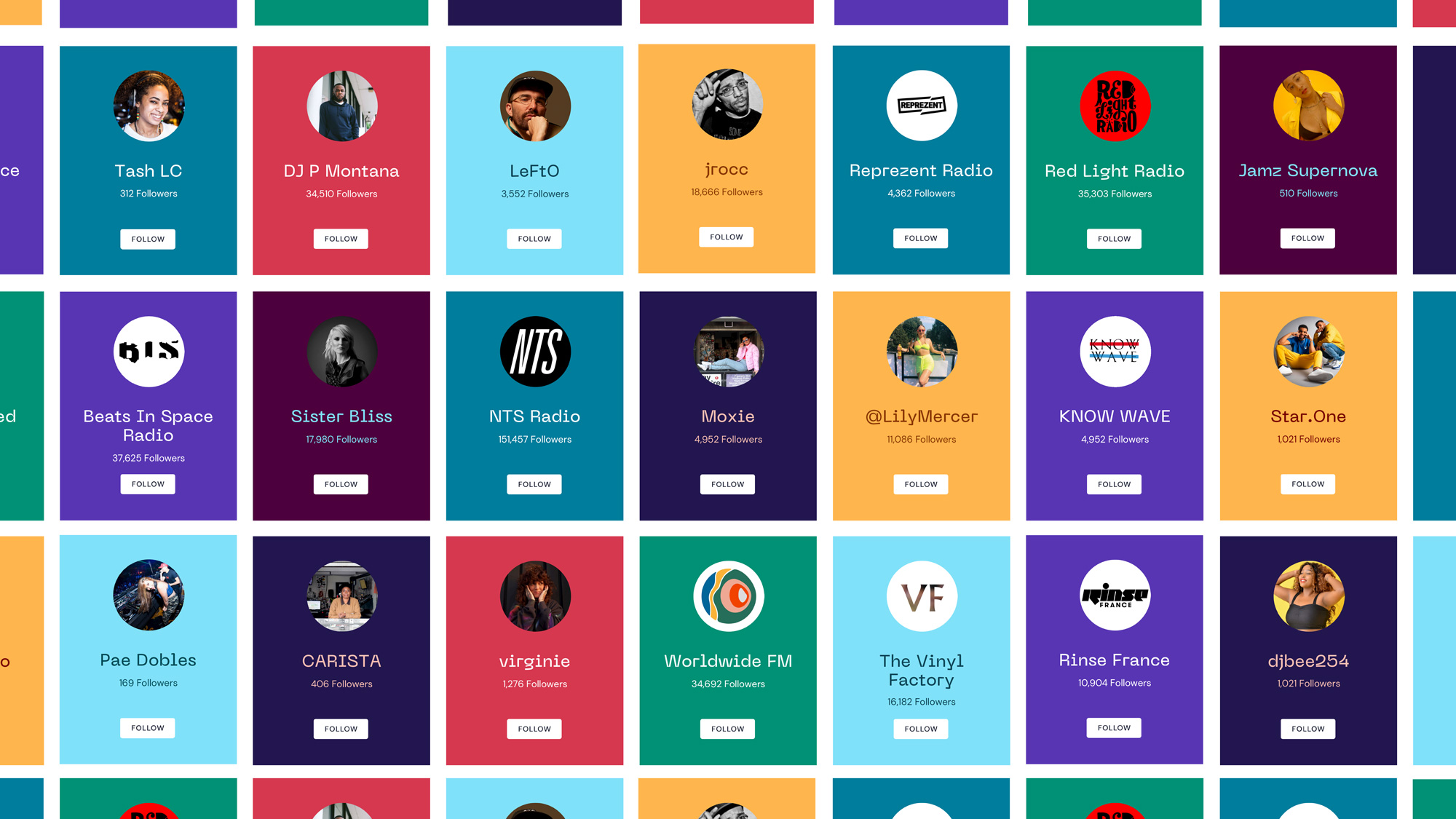
Through exploration and workshops, we found the key to clear space in the market - the emotional connection Mixcloud nurtures between a creator and their audience.
This thinking led us to the central creative idea - the connector. It amplifies key words, connects genres, people and locations. Its scale and rhythm varies dependent on mood. Sometimes calm. Often frenetic. Always moving and bursting with energy.
The old logo was painfully generic, with an obligatory cloud for a business with the word cloud in its name. I’ll admit that the little volume waves emanating from it were kind of charming. Being a music platform and having a cloud with waves/signal, it was a little close in spirit to Soundcloud’s logo. The new logo is a great departure from the minimum viable logo approach into something driven much more by attitude and personality instead of trying to be descriptive. The custom wordmark is weird in many ways, with the most obvious being the horizontal “I” that, sure, it challenges readability — “M - Xcloud” anyone? — for anyone not familiar with the brand but it seems like Mixcloud already has a solid audience that’s deep into what it offers, so it’s a very small risk. The rotated “I” also becomes the hero of the identity as it grows into a squiggle that serves as the main visual element that brings to life the concept of the “connector”.
Then there is the wide “X”, which also looks as if its been rotated 90 degrees… I kind of like it and it works well with the wide “M” and long “I”. Then there is the angled horizontal stroke of the “L”… which I’m torn on because I do like its defiant spirit and how it helps make the space between it and the “O” less glaring but it’s the only letter that messes with the horizontal/vertical strokes like that. And, finally, there is the ink traps which, at this point, you know I’m going to dig. And dig I do. Although I feel like they could use some modulation, at least in the “M” where the ink traps feel much bigger than the others and maybe the “X” could have used some? Overall, a great weird logo that is not a geometric sans. The shorthand version is cool but the readability issue is a little more evident where it reads more heavily as M — X. Still, not a big issue and I love how the squiggle animates in the constrained space.
Extending the connector idea, the bespoke typeface we produced with Pangram Pangram is a vital brand component. Its role is both emotive and practical. With a mass of user-generated imagery, a customisable font pulls everything together with a sense of ownership. Ligatures can join pairs of characters, or become much more playful to show the brand’s exuberance.
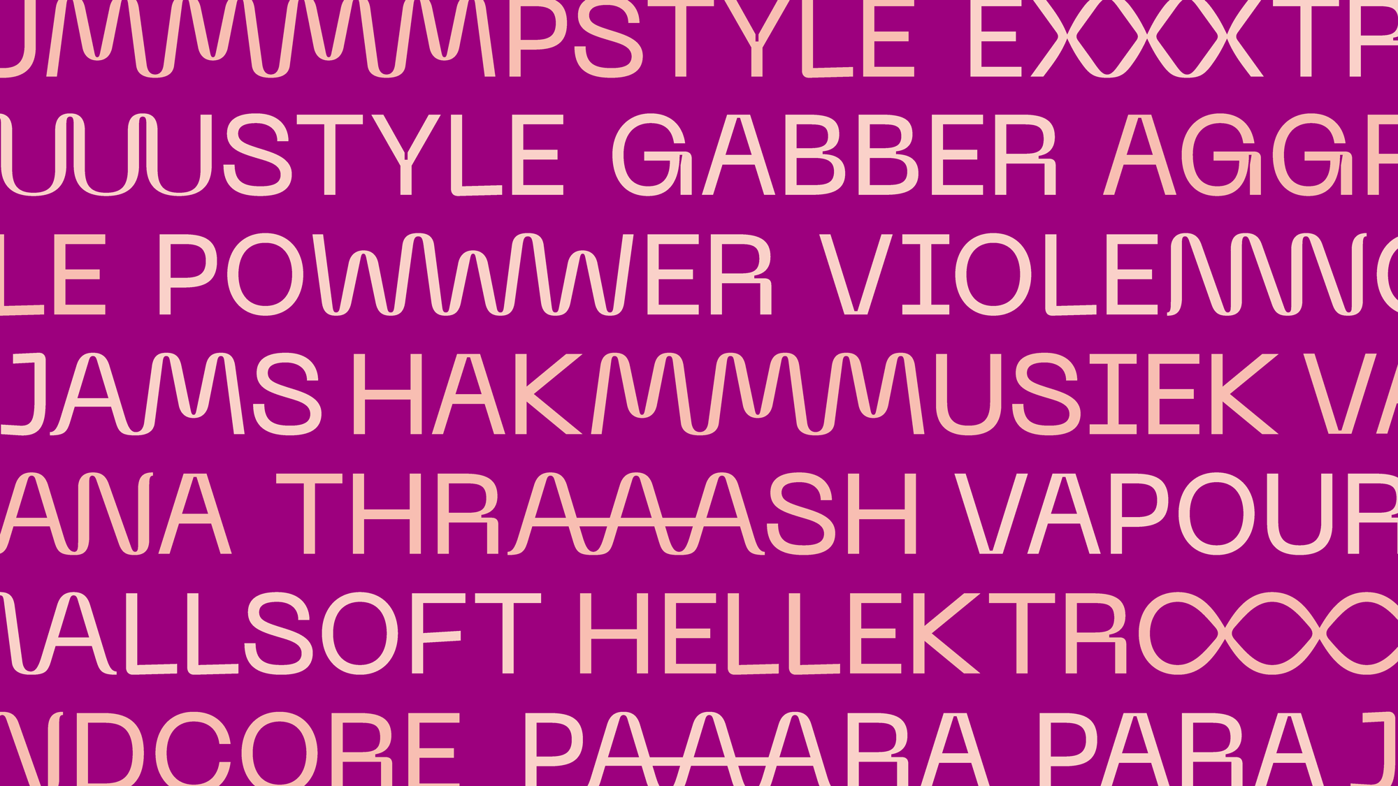
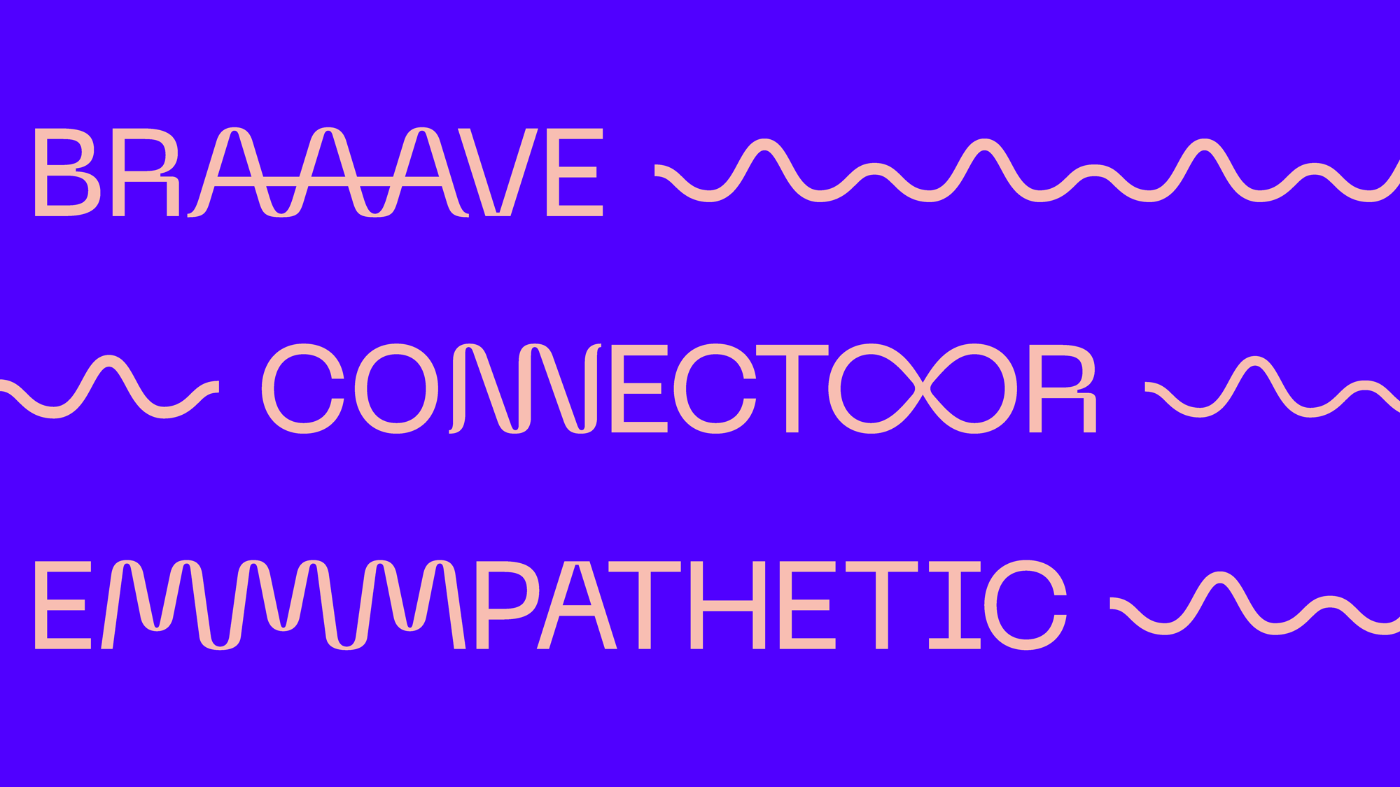
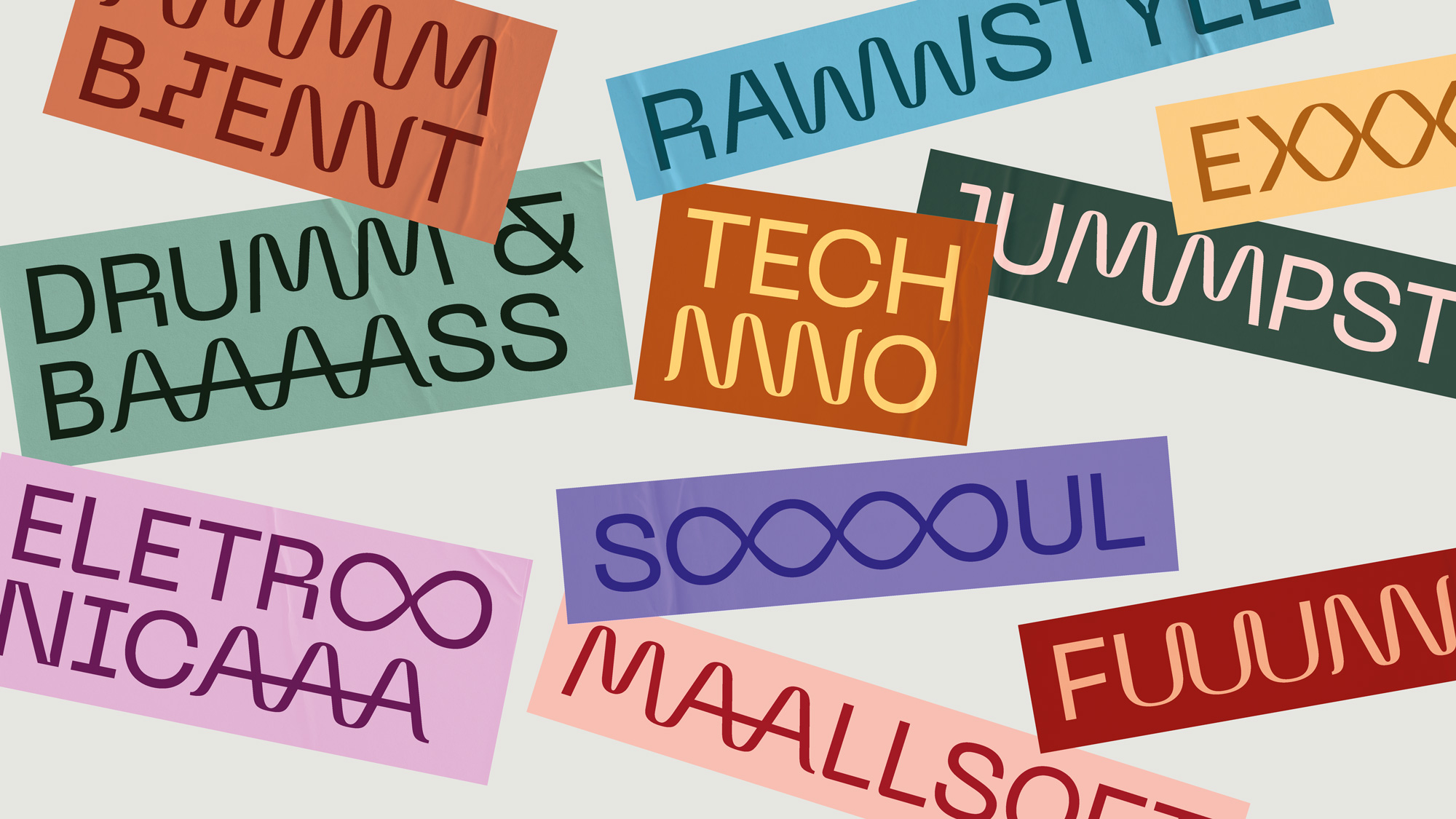
The connecting squiggle concept (and weirdness) expands into a super groovy typeface with epic, exaggerated ligatures that aren’t formal ligatures of two different letters but mini patterns of repeating letters that yield some funny words like “BAAAASS” or “POWWWWWER”. Part of what makes the typeface work is that, at its core, it’s a deadpan sans serif but then it has some really weird letters like the “R” or the “I” that looks like it broke a bone, and check out the “G”. Just wild. What’s crazy, and maybe it’s just the fact that we know that this is for a music platform, but this somehow screams music. It’s also the music-interpreted-as-a-typeface typeface we didn’t know we wanted.
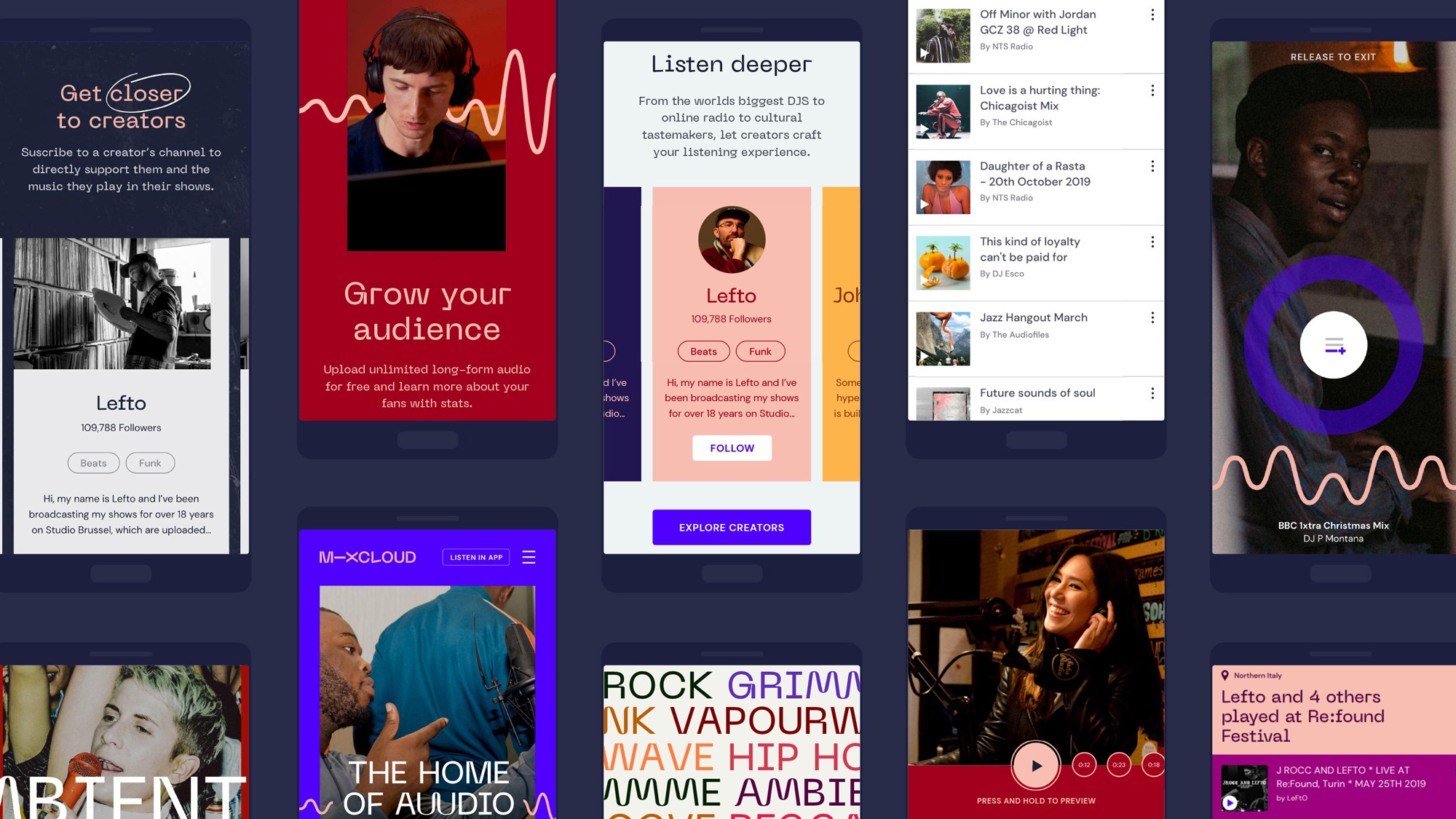
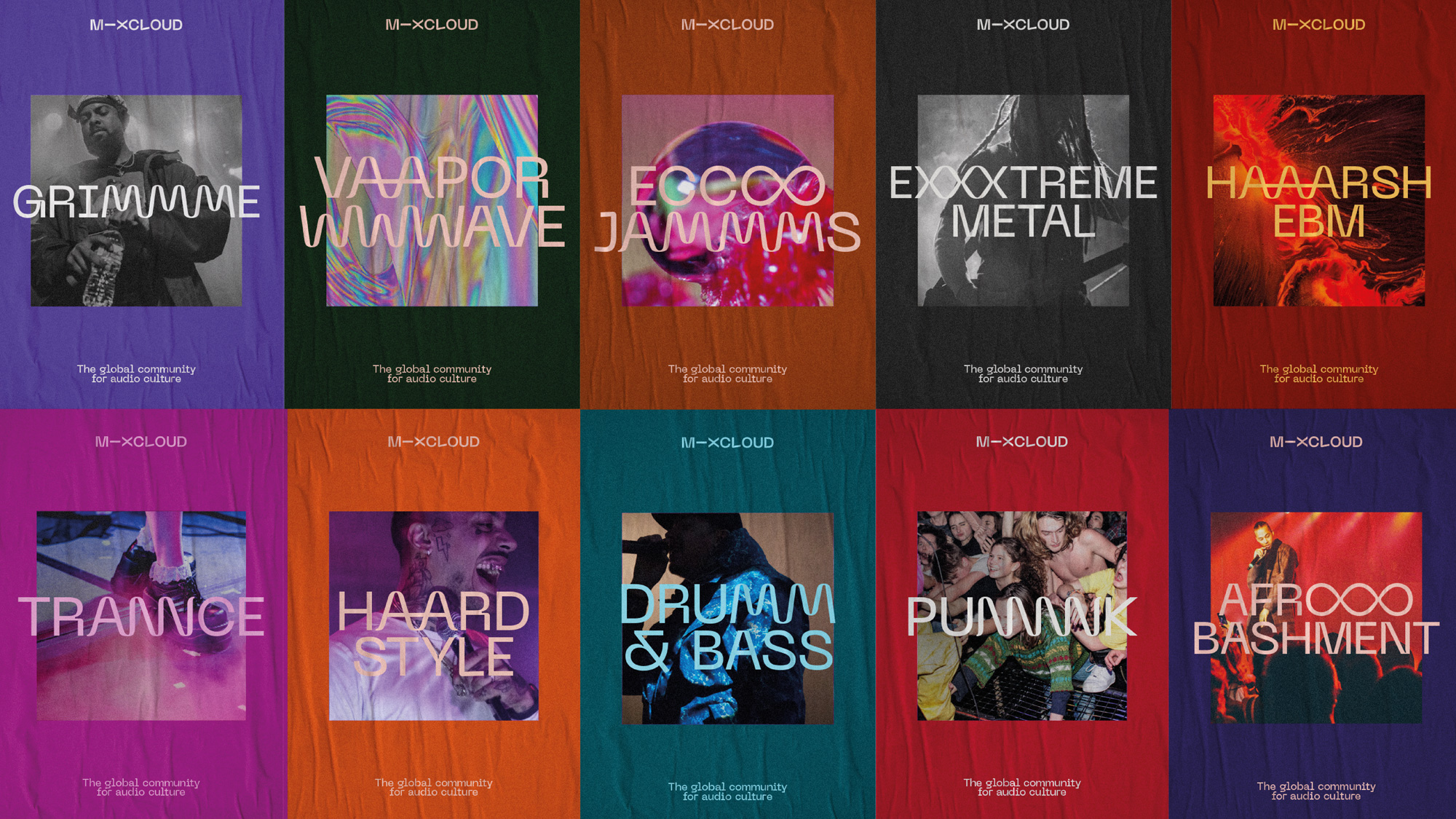
In application, it’s really just about letting the type loose and it gets the job done on its own, creating a unique, consistent, exciting, and recognizable visual language for the platform. The connecting squiggle provides an almost literal connecting thread as well and thrives on the ’gram. Overall, this is pretty fantastic, building on the further mainstreaming of ugly design but done in a rather sophisticated way. This also does a great job of establishing some distance from Spotify, looking almost like the anti Spotify with a more rebellious, independent vibe.
Thanks to Mark Shields for the tip.
 each year since publication began in 2006

 Новости Союза дизайнеров
Все о дизайне в Санкт-Петербурге.
Новости Союза дизайнеров
Все о дизайне в Санкт-Петербурге.