Обзор лучших ресурсов по разработке бренда, разработке упаковки
contact us | ok@ohmycode.ru
contact us | ok@ohmycode.ru
Established in 2016, Fat Llama is an online platform that allows users to rent and borrow tools. Originally available only in the UK, the service has grown to the U.S., and has given some lenders the ability to earn up to $10,000 a month through it. When lending or borrowing, Fat Llama’s messenger service will hand-off the tool and it will also insure it. Whether you are looking to rent a piano, a drone, or a drill, you can probably find it here. Recently, Fat Llama introduced a new identity designed by London-based Koto.
Larry is the friendly face of Fat Llama: your personal guide to borrowing and lending. We gave him space to roam free and express his personality through playful poses, scenes and expressions. The soft, fluid graphic language is inspired by Larry’s fur, while the bright pastel palette ensures his optimism and energy runs through the whole brand.
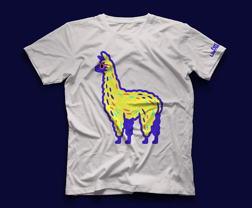
The old logo had the right idea but the execution was maybe too cute and looked more like a service related to kids. The bite out of the circle was odd too and the wordmark in Brandon Grotesque wasn’t very exciting. The new logo introduces a far cooler, more interesting, and engaging llama with a great deadpan expression, a fluffy coat, and some vibrant coloring. I like how he — his name is Larry — is a fairly literal depiction in his proportions and features but his rendering is minimal while still conveying his fur-ness and plenty of other detail. The motion in the animation above is fantastic, giving him a ton of personality — that skidding is so fun. The wordmark is about what you would expect from an online platform with the geometric sans but at least this one is a little more interesting with the tight spacing and solid aligning of some of the letters. The vibrant pastel-y colors are also kind of expected in general but I like how they apply to the llama.
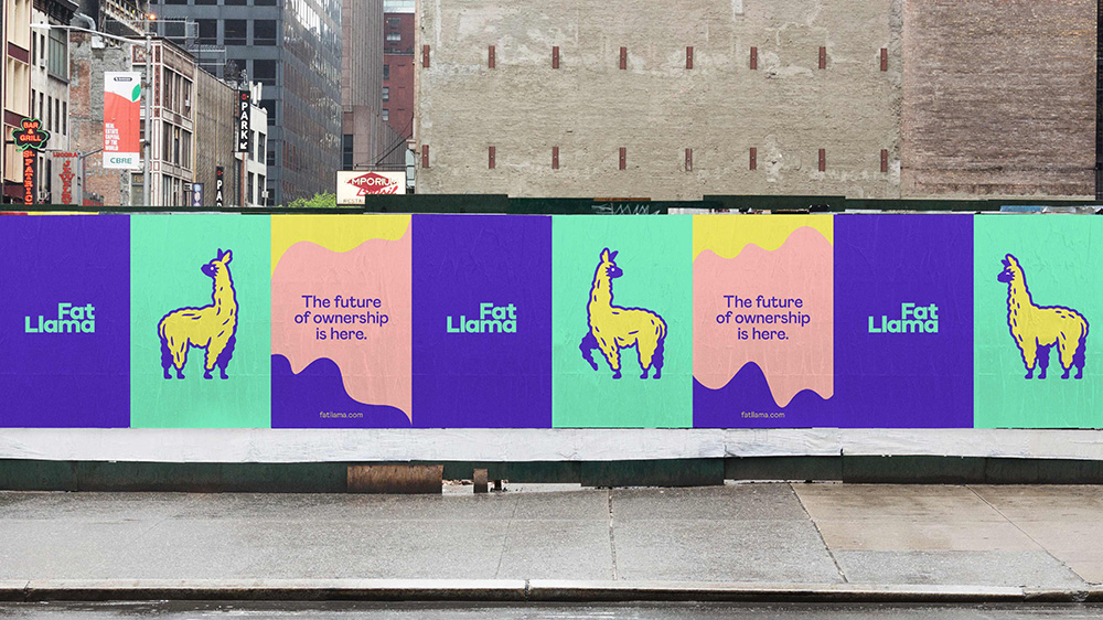
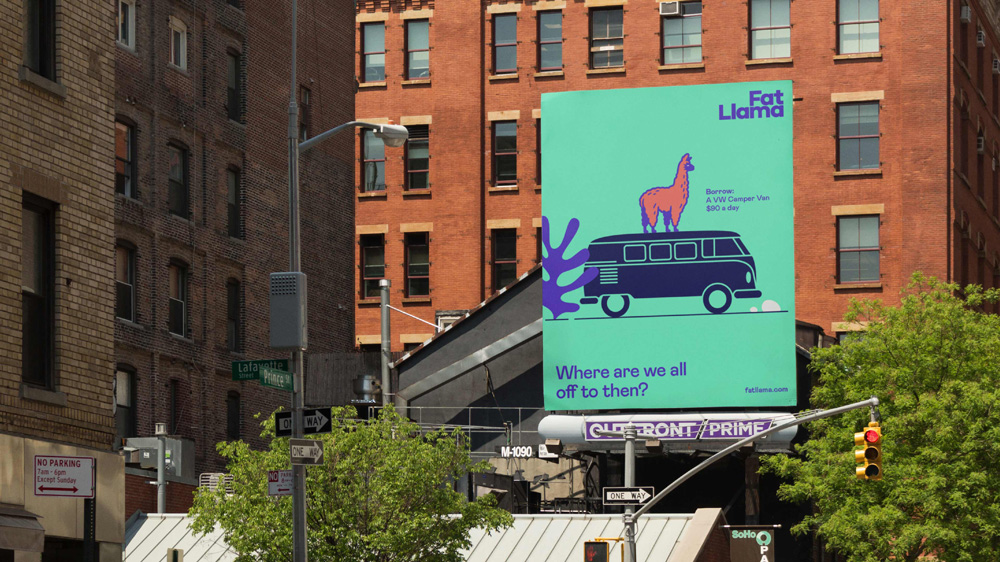
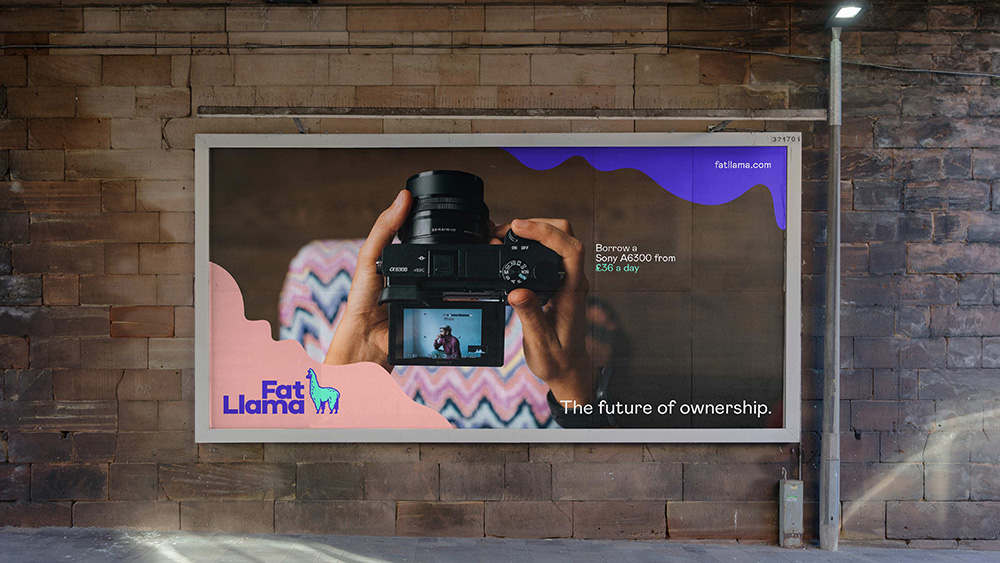
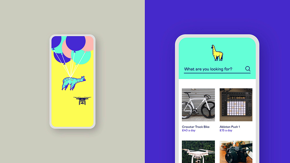
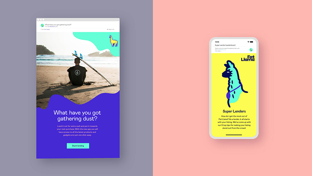
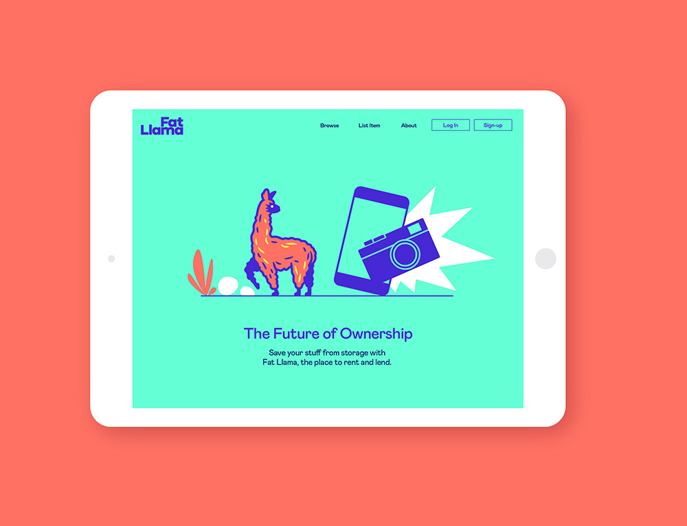
The applications are okay. Lots of wavy forms to frame and separate content that echo the fur of the llama and add a general touch of playfulness to the layouts. I like when the llama appears in illustrations with rocks and plants, which are nicely done and add to the overall whimsy of the identity.
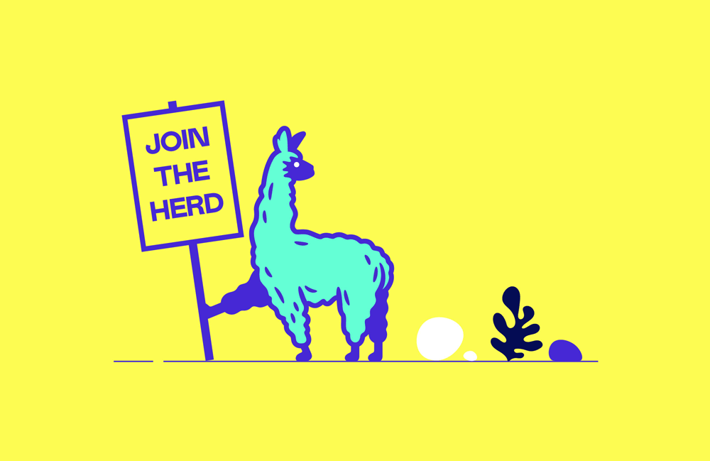
Overall, this is a fun redesign that is very well done. It hits on a number of current trends that may be growing weary for many here but I still find this enjoyable and, no question, it’s the best use of a llama in an identity within spitting distance.

 Новости Союза дизайнеров
Все о дизайне в Санкт-Петербурге.
Новости Союза дизайнеров
Все о дизайне в Санкт-Петербурге.