Обзор лучших ресурсов по разработке бренда, разработке упаковки
contact us | ok@ohmycode.ru
contact us | ok@ohmycode.ru
Launched in September of 2019, MUTHA is a new brand of body butters and body oils created with mothers in mind and the resulting stretch marks after a pregnancy (or from weight loss). Made from natural ingredients, all boldly and transparently listed on each product page, MUTHA was conceived by model, entrepreneur, philanthropist, and, yes, mother, Hope Smith. At $95 and $104 each of the products, it’s not a cheap impulse buy and it’s nice to know that 5% of sales are donated to humanitarian nonprofit organization, International Medical Corps. The identity and packaging for MUTHA have been designed by San Francisco, CA- and New York, NY-based Character.
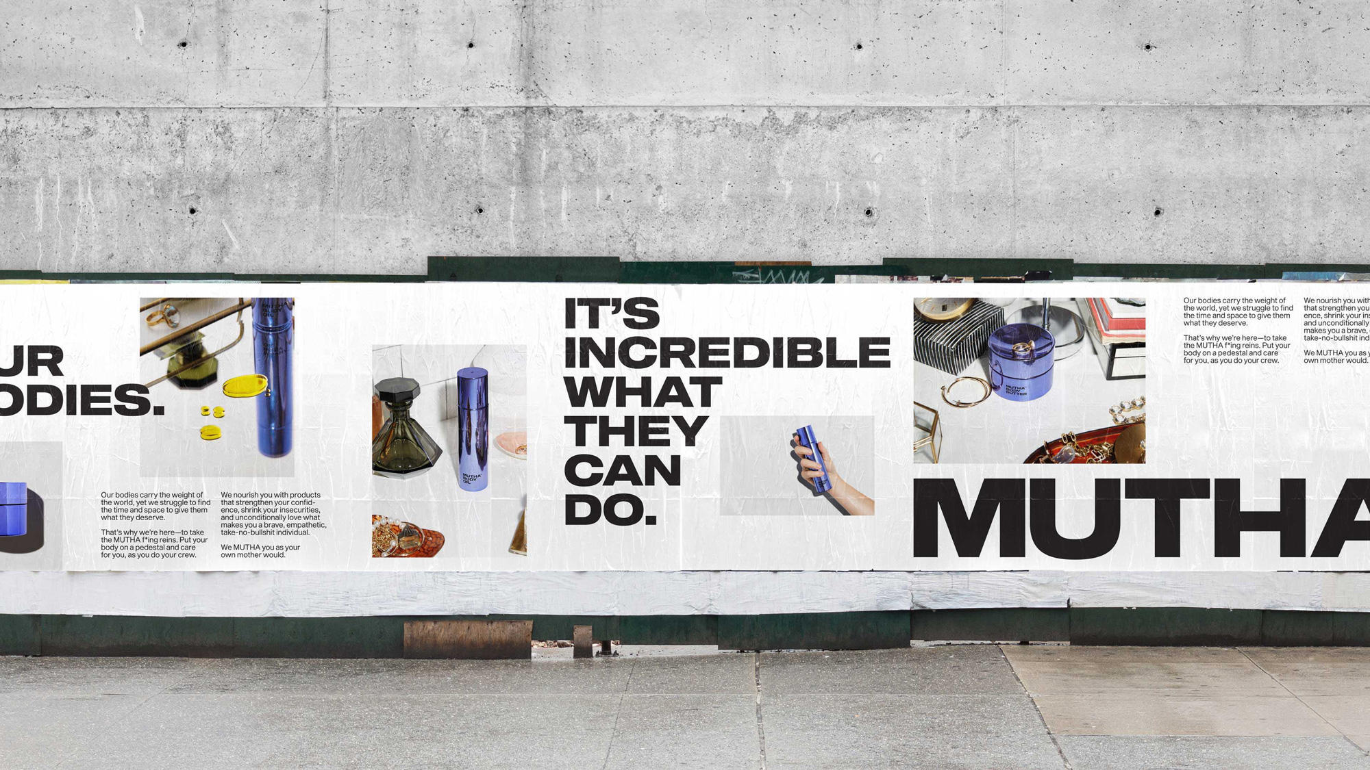
Our job: take one mother’s mission and turn it into a MUTHA f*ing rallying cry— a brand that would embody Hope’s ambition and carve out an unforgettable place in our crowded bathroom vanities.
So we looked at motherhood for what it is—an ever-evolving cycle. Something for the brave, the powerful. Unique, different, personal. These often ignored truths led us to a singular conclusion, one that oriented all our work—there’s no one way to MUTHA.
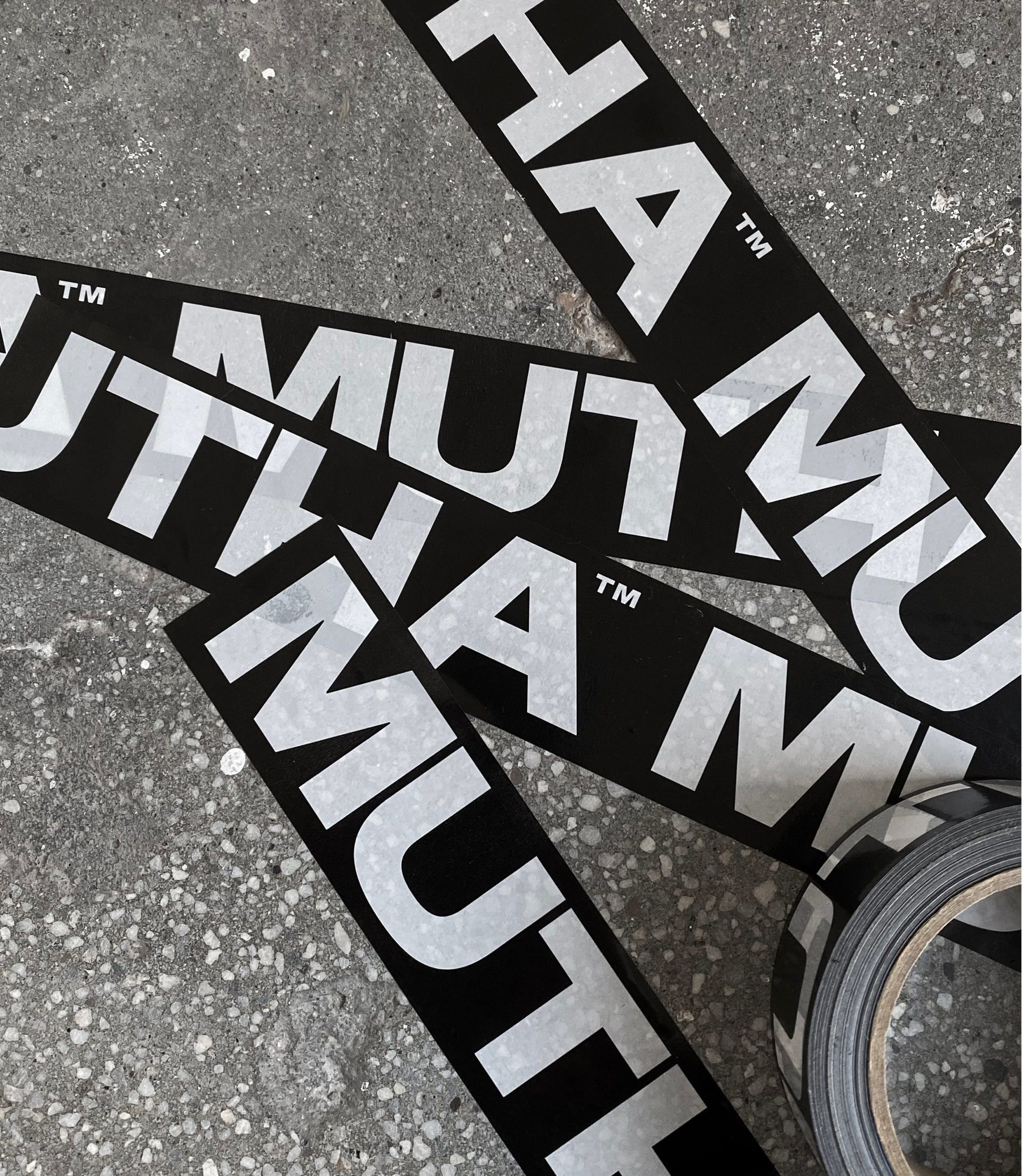
From the outset, both the name and the logo set up a tough, no-shit-taken, no-fucks-given attitude that is unexpected in the category. I will leave it up to mothers to share with us if this vibe speaks to them at all. From the perspective of a male, father of two, and reviewer of brands, I like the approach simply because it breaks the soft and silky conventions of body oils that (stereo)typically look and sound feminine. It’s impossible to read this name and not also think about that second word that’s usually associated with snakes on planes, so I appreciate the boldness and willingness to go there, especially in an era when it’s so mutha-effin’ easy to offend people.
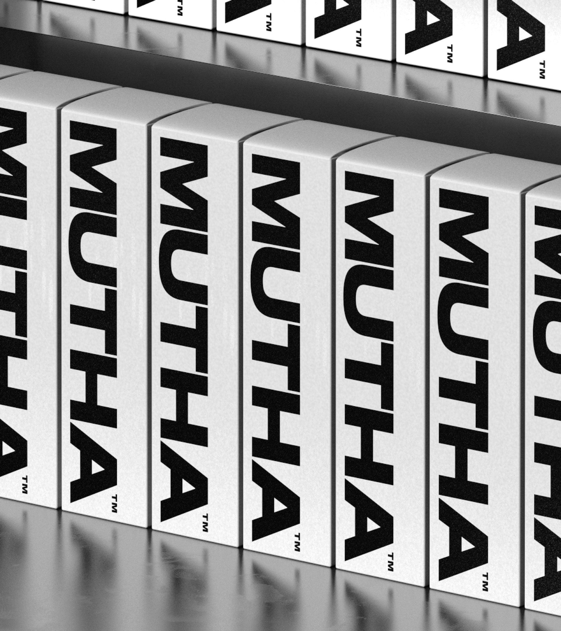
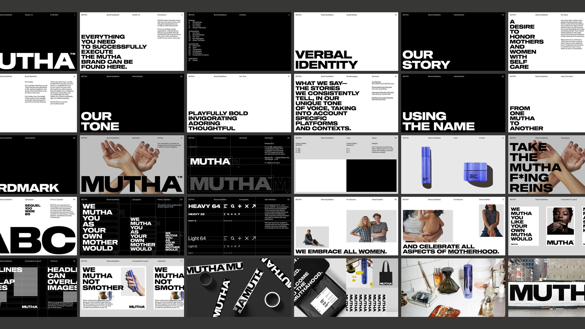
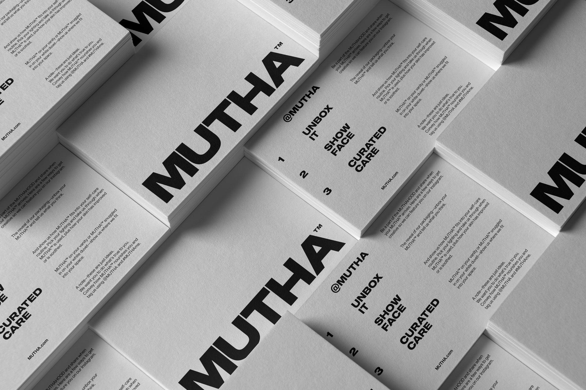
The bold, extended, all uppercase, sans serif wordmark — typeset in Sequel 100 Wide — captures the essence of the name quite well and bluntly presents it with no additional decoration or attempts at being clever. The flip side is that, yeah, it’s just another dry sans serif that pretends to be cool, so I’m with you too on anyone that is on this side of the argument.
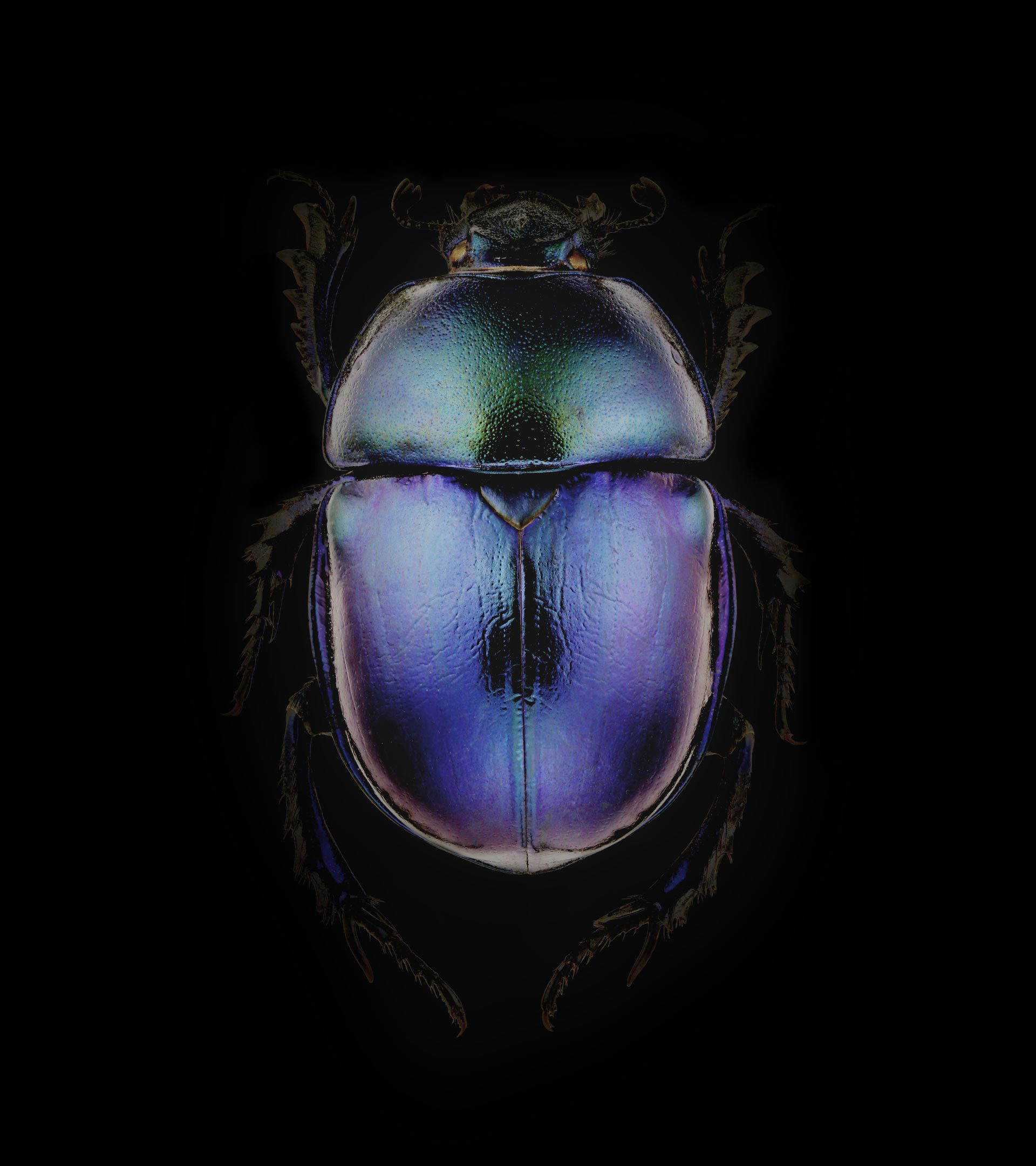
There’s an innate strength and bravery that radiates from every MUTHA. To reveal and celebrate this self-sufficient power, we scoured the world for things both bold and organic and found natural armor, one that displays the inner force of each MUTHA with vibrance and pride.
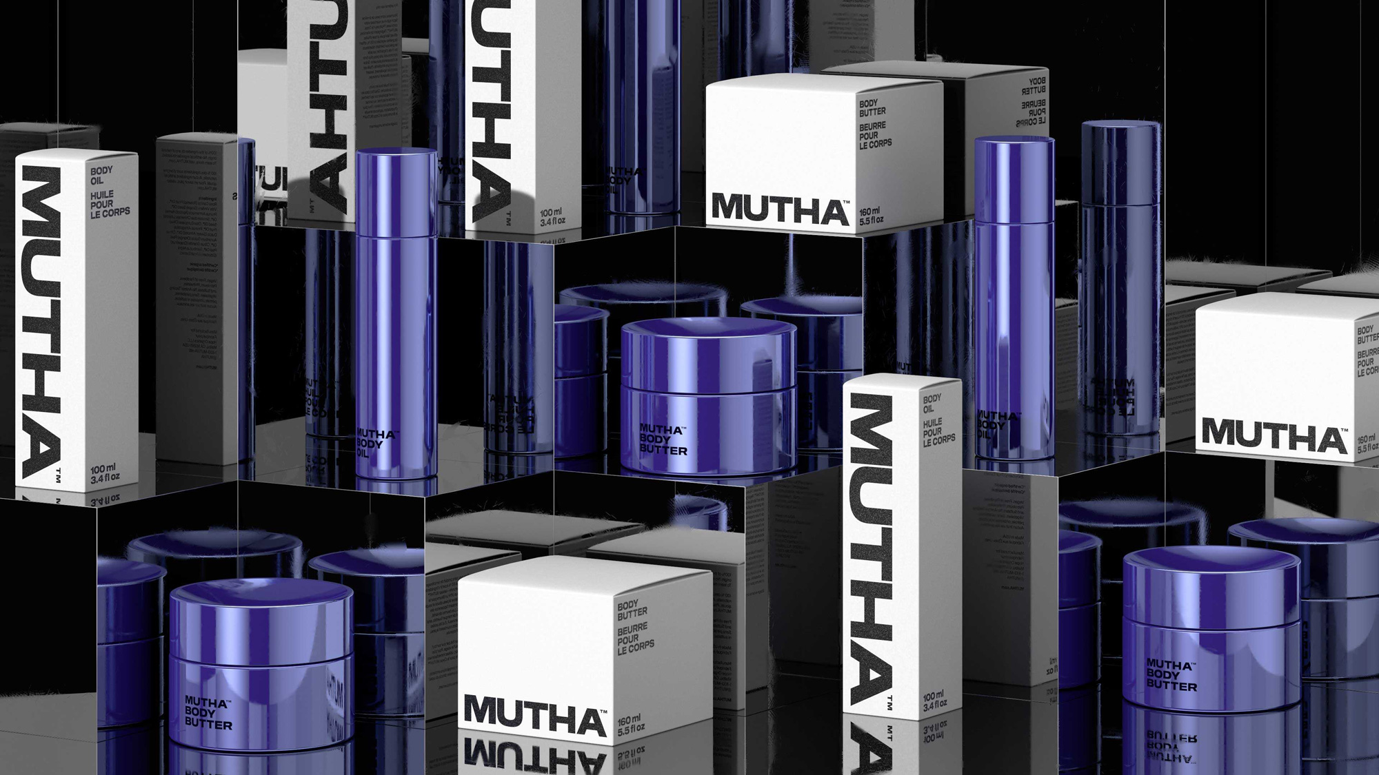
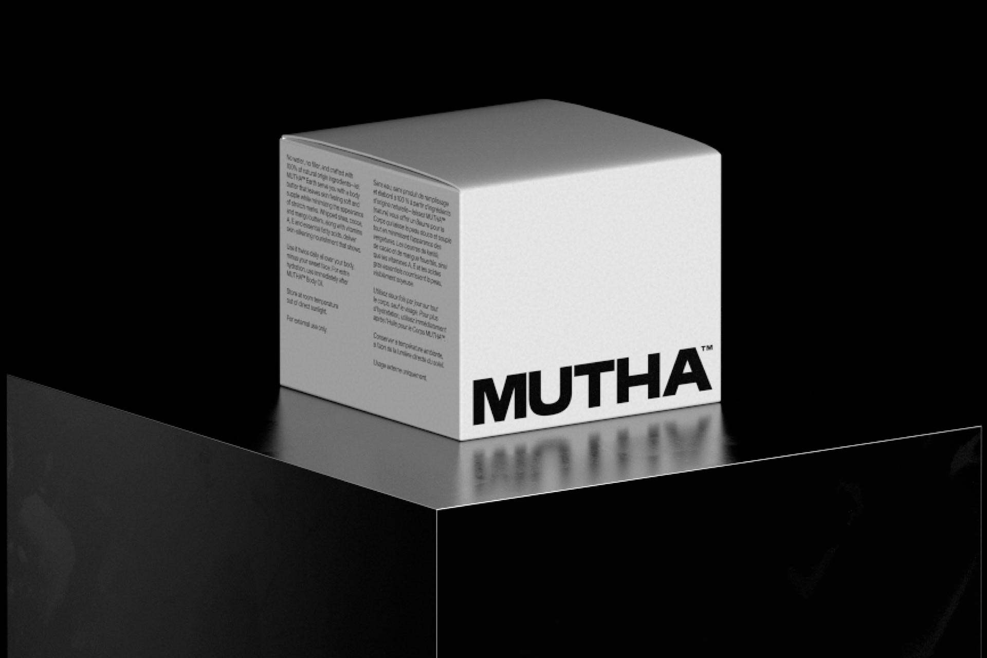
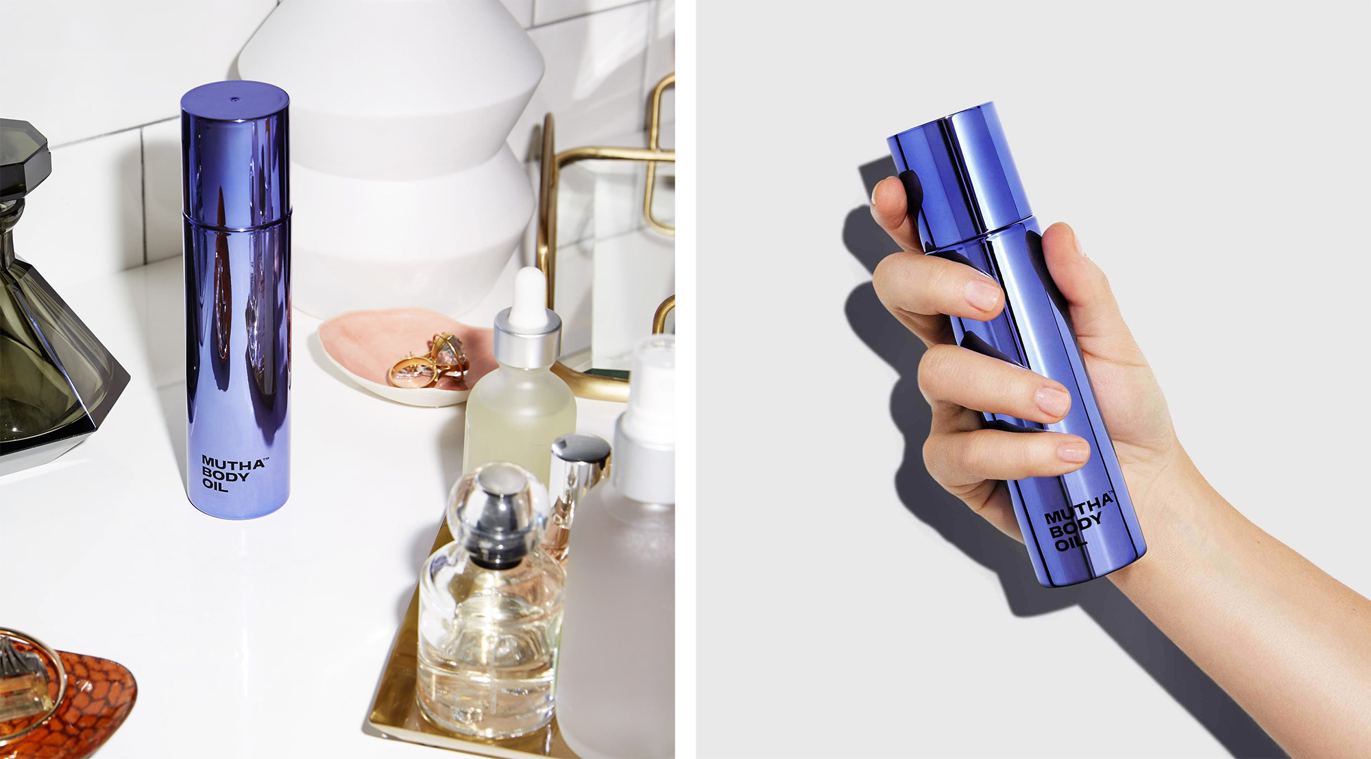
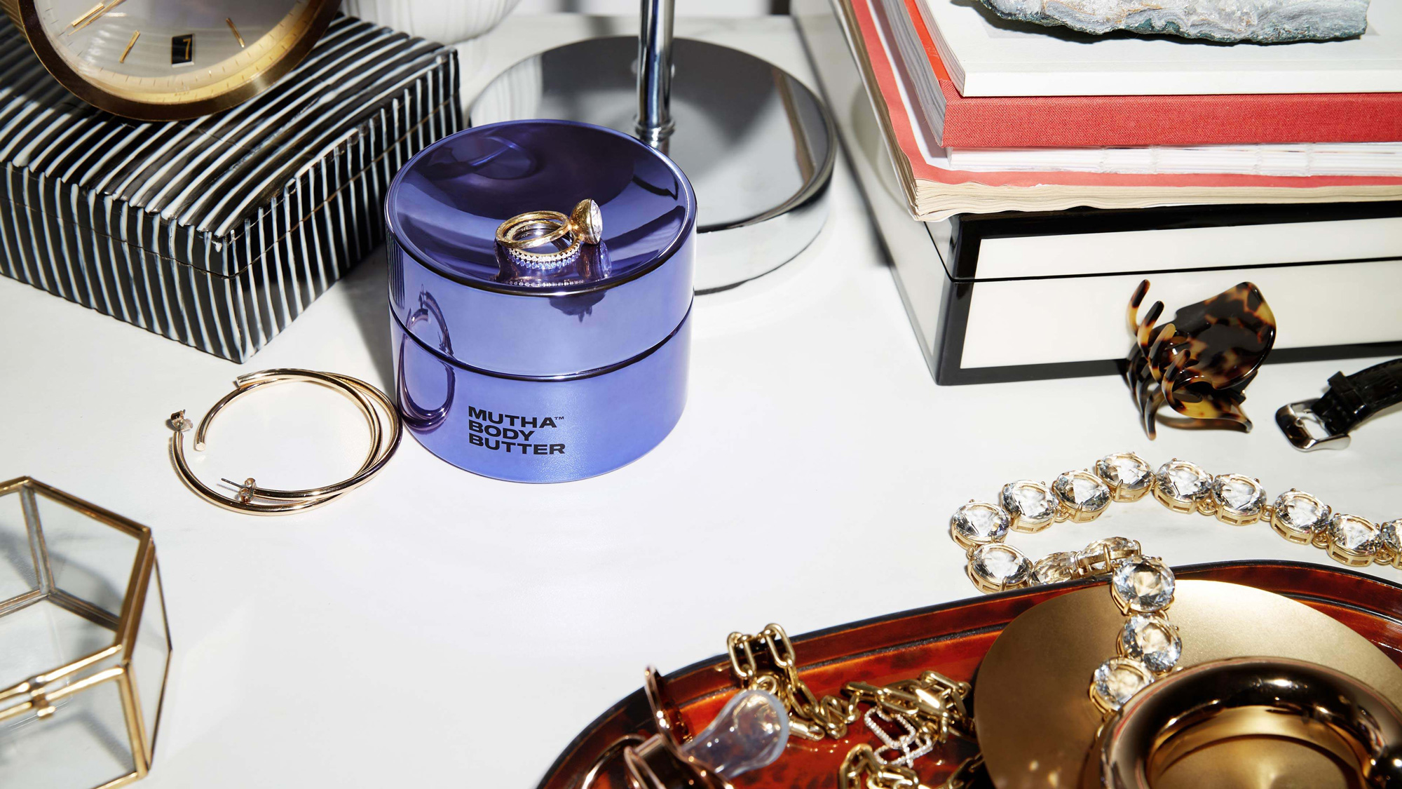
As you would expect from the logo, the packaging follows the same minimalist approach that works thanks in part to the great color and finish of the purple reflective containers that look quite nice. The logo, used small on the bottom of the two containers, gives it a luxury feel you wouldn’t expect from a product call MUTHA. The outer boxes are a lot louder and a nice contrast to the product, photographing extremely well together.
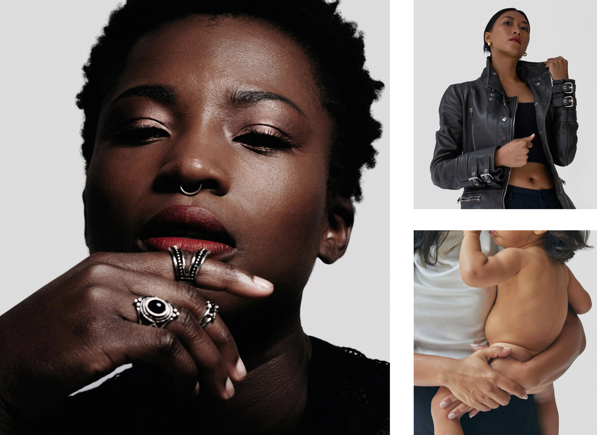
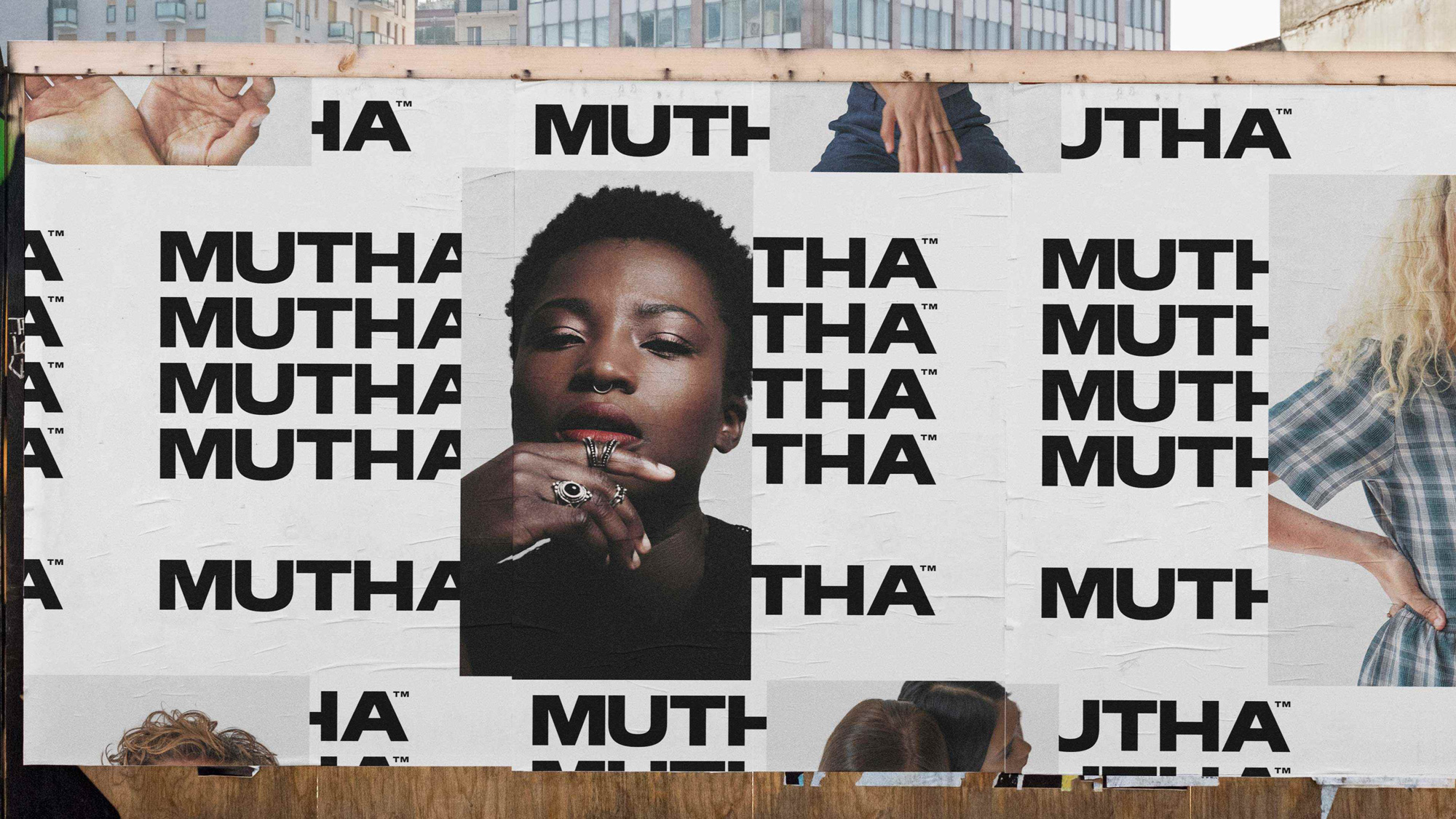
In application, things get a little on the trendy side with the repetition of words and abrupt crops but does manage to come across as bold and confident. The brand photography is pretty great too — I wish it played a bigger role on their website and Instagram page (instead of the few, more model-y photos there).
Overall, the identity and tone of voice nail the mutha attitude, perhaps a little too well to the point where it might be a turn-off for some people but, in the end, I guess that’s the goal, to create a unique product and brand that appeals to a like-minded group and this establishes clear parameters who it’s for… perhaps, even, your own mom mutha.
 each year since publication began in 2006

 Новости Союза дизайнеров
Все о дизайне в Санкт-Петербурге.
Новости Союза дизайнеров
Все о дизайне в Санкт-Петербурге.