Обзор лучших ресурсов по разработке бренда, разработке упаковки
contact us | ok@ohmycode.ru
contact us | ok@ohmycode.ru
Established in 2016, FC Cincinnati began play in the United Soccer League (USL) where they finished the 2018 season as the team with the most wins (but lost in the second round of the playoffs) and set the record for biggest average attendance ever for a USL team during that season. This past May, the team was awarded an expansion slot in the MLS and will begin play in 2019 and move into a fancy new stadium. Yesterday, FC Cincinnati introduced its new crest, designed by the local office of Interbrand.
Symbolism abounds in the new crest, meant to celebrate the city’s German heritage in a modern way. The lion’s crown pays homage to the “Queen City,” while the seven points of its mane are a nod to the seven hills of Cincinnati. The three-feathered wing represents the club’s three-year journey to MLS and, perhaps most noticeably, its tail takes a “c” shape.
The old logo had a semi-decent good idea of turning a crown into an abstract ball but the proportions of the crown in relation to the shield were off the mark, leading to a huge ball/crown. But more terrible, were the proportions of everything else, with a huge “FC”, small “Cincinnati”, and tiny lion that, at that size, looked like it was holding up a toothpick. Part of the problem with anything Cincinnati related is that it’s a super long word and not easy to work with but the new logo does a fantastic job in not just making it fit but making it prominent without sacrificing proportions anywhere else. The city name, set at a vertiginous angle, fits beautifully in the crest shape, which breaks away from the typical shield shape by adopting the contour of a single panel of a soccer ball. It’s kind of amazing no team has (notably) done this before.
The city name cuts the crest cleverly to fit a new lion in the lower portion and “FC” in the top portion. The “FC” element is probably the only minor complaint I would have about the crest in that it sits somewhat awkwardly in that space. The lion, if you can get past the dozen or so hidden rationalizations in it*, is mostly a great drawing — the wing looks like it was designed by someone else — that works great in that orange shape.
In general, the new crest is great. It has a kind of vintage Italian car racing aesthetic with a modern twist that is quite appealing.
* It’s lovely that they were able to build all those little details in the main and wing but the explanation graphic starts to border on looking like a parody.
The club’s new secondary mark is the stylized FCC from the full wordmark, while stand-alone tertiary elements will eventually include the full lion from the crest, the lion’s head and mane, and the crown. Those elements will be introduced more prominently in future years as the brand gains traction in the marketplace.
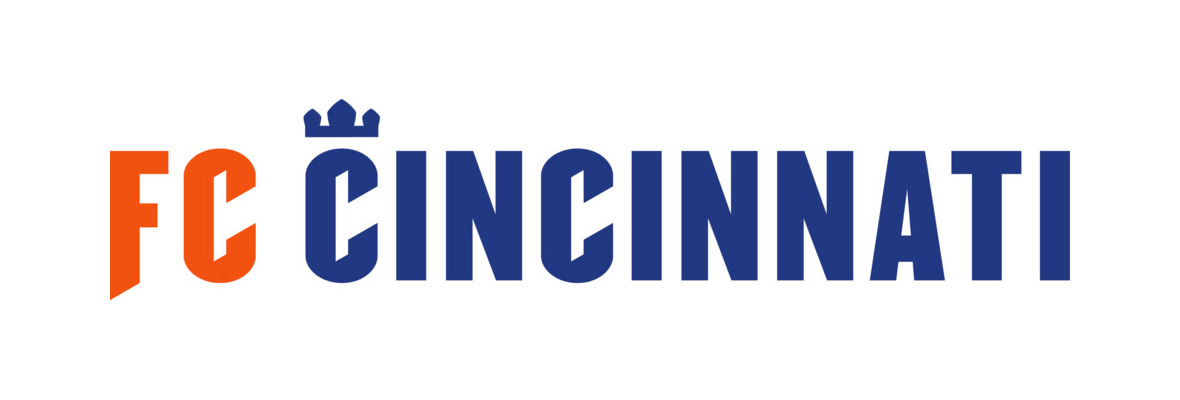
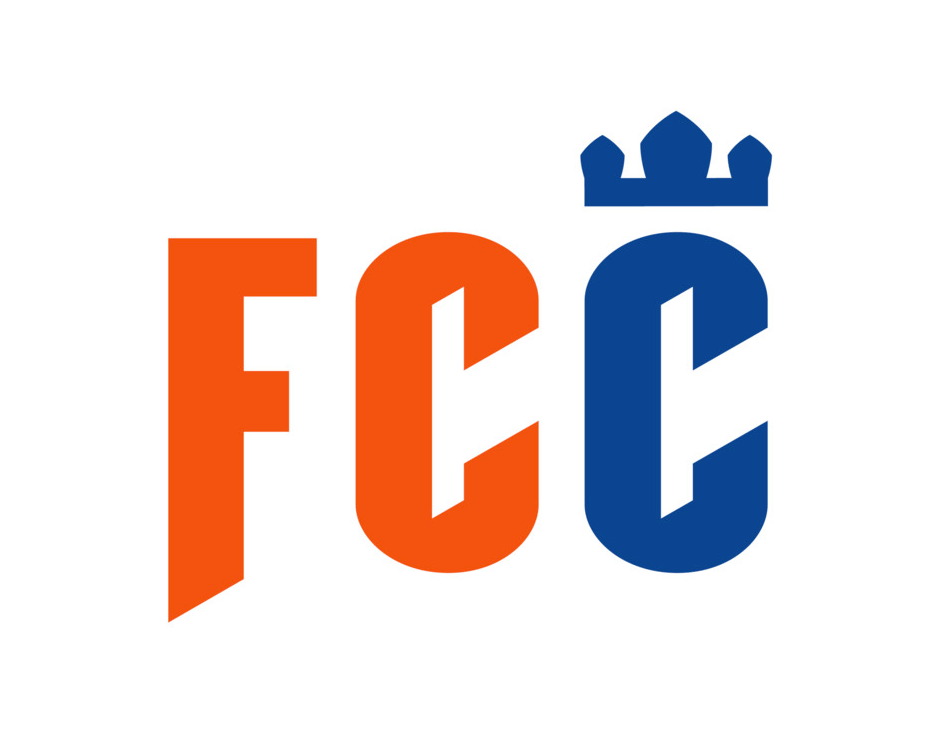
The secondary marks are fine but not as exciting as the crest. The “C”s having such a pronounced angled feature makes them stand out in a weird way. Perhaps the crossbar of the “A” could have been angled too. The crown works well on its own on top of the “C” and I do like how the bottom of the “F” is a continuation of the “C” to its right.
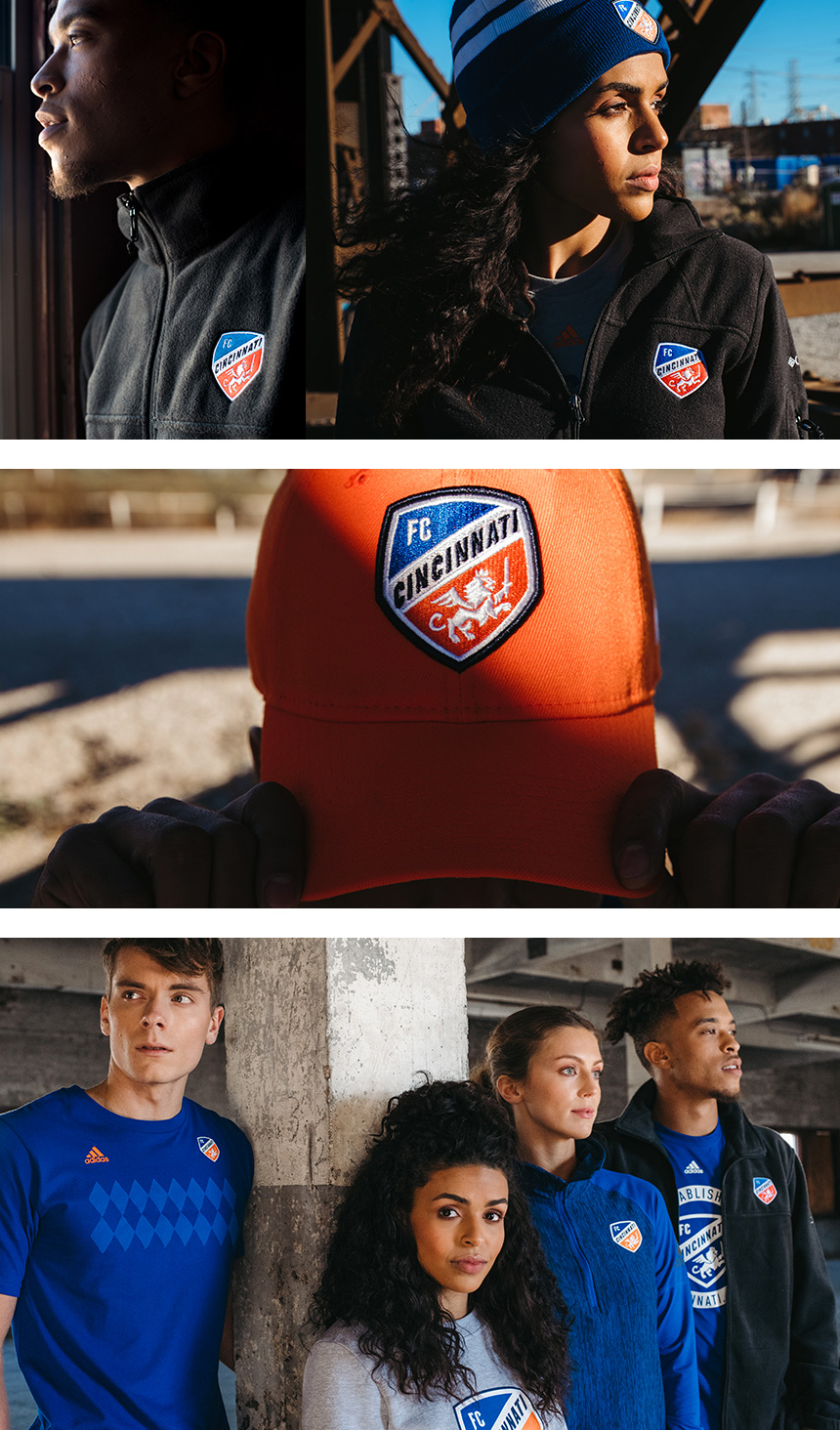
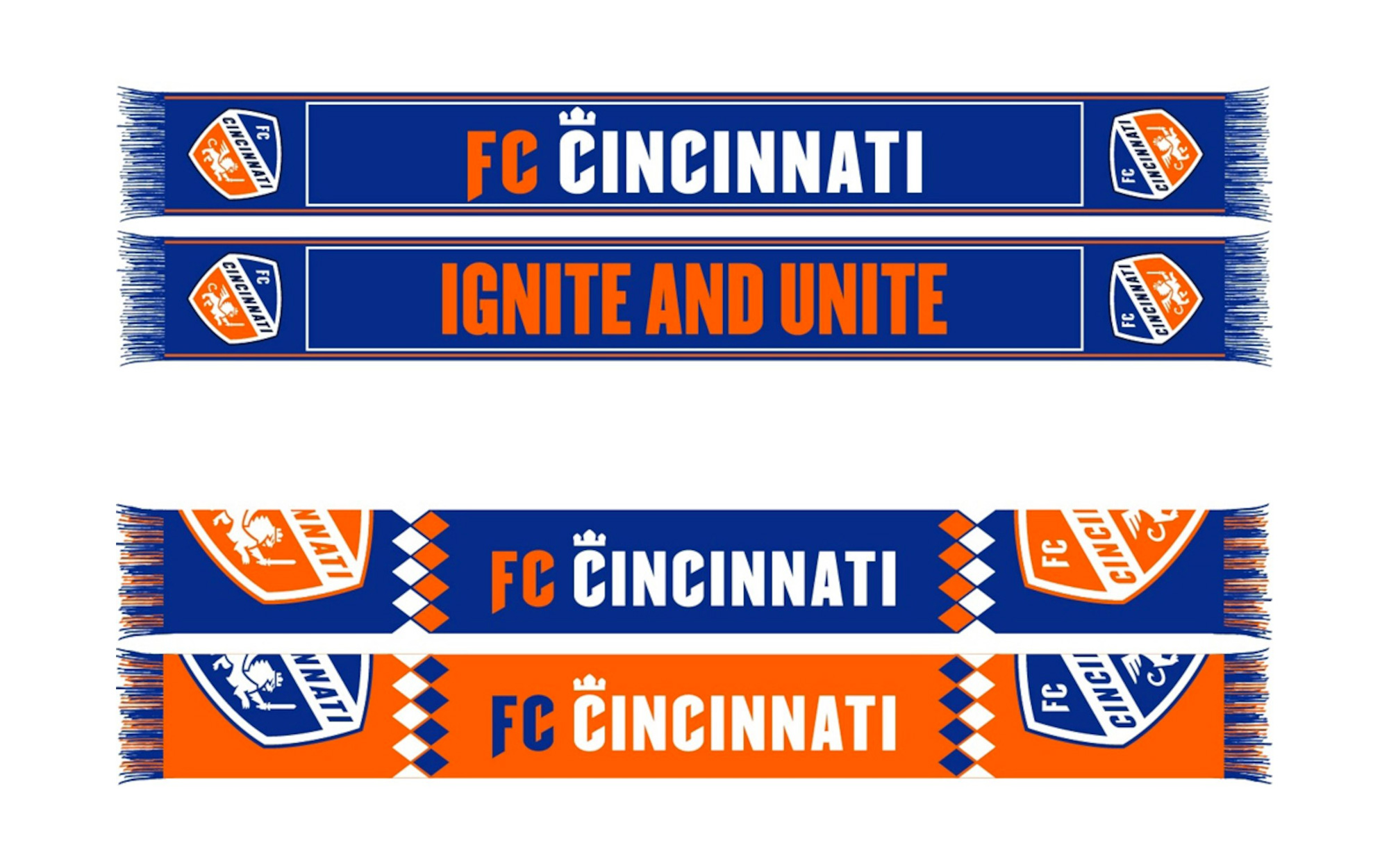
Merch looks great. Given the strong fan base the team already has and renewed excitement of it joining the MLS, this is going to sell like crazy.
Overall, this is another excellent logo in the MLS — along with Austin FC and Club Internacional de Fútbol Miami — that is able to bridge the notion of traditional football crests with contemporary elements and is turning the MLS into the best-designed professional sports league.
Thanks to Big C for the tip.

 Новости Союза дизайнеров
Все о дизайне в Санкт-Петербурге.
Новости Союза дизайнеров
Все о дизайне в Санкт-Петербурге.