Обзор лучших ресурсов по разработке бренда, разработке упаковки
contact us | ok@ohmycode.ru
contact us | ok@ohmycode.ru
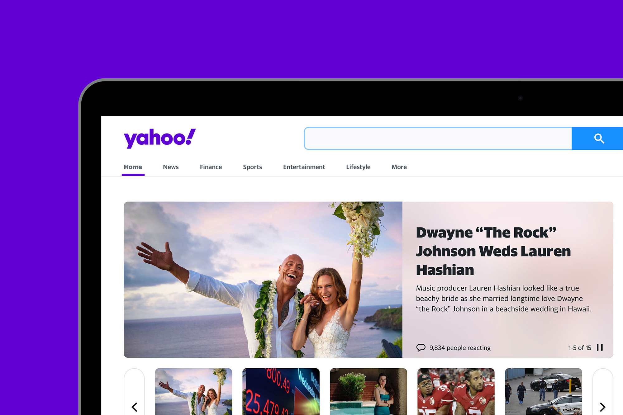
Established in 1994, Yahoo! was one of the internet’s early pioneers and a giant upon whose shoulders others have built on. Its web portal, at the quaint time, was literally a portal to the web, welcoming all the new souls that, understandably, had no idea where to go or how to start internet-ing and it was intrinsic to the web experience for a large majority for many years. How times have changed. Especially, and quickly, after 2013 when Yahoo! tried to reignite its brand under the leadership of Marissa Mayer and then things just rolled downhill into a big snow ball of irrelevance. Nonetheless, Yahoo! is still at it, as a web portal, a search engine, an e-mail service, and a news outlet for various genres under the ownership of Verizon Communications, who purchased it in 2017. Yesterday, to everyone’s surprise, Yahoo! introduced a new identity designed by New York, NY-based Pentagram partner Michael Bierut.
With its new products, Yahoo will empower users to better sift out irrelevant parts of the digital world, giving them more control of what they see and when they see it. The strategy positions Yahoo as an “amplification brand,” amplifying the things that matter, helping to “amplify you.” The idea is neatly visualized in Yahoo’s exclamation point, a punctuation mark that literally stands for amplification.
This strategy of simplicity and amplification is expressed in a new logo that is simpler and more flexible than its predecessor, and that looks back to the original, quirky 1996 logo. The new wordmark is set in Centra No. 2 Extrabold, and the letters of the logotype have been modified to be more geometric and compact. The exclamation mark has been italicized for emphasis, as it has been in every iteration of the logo since the company’s founding. The “y” and “!” of the logo are both set at an angle of 22.5 degrees, a forward tilt that suggests a sense of momentum and excitement. The angle—precisely 1/16th of a circle—is the basis for visual language built around angles and incremental slices.
The last time we talked about the Yahoo! logo was in the distant past of 2013, when they decided it would be “fun” to release a new logo a day, for 29 days, before revealing the new (old) logo on day 30. Not only was the build-up lame but the climax was far from climactic in part because the logo wasn’t a complete train wreck, which would have at least given us all a release for the pent up frustration. At the time I called it “fine” and six years later I still consider it to be fine — I think it managed to keep some of the quirkiness of the original with the bigger “O” leading up to the exclamation point. Looking at it now with the accrued wisdom, LOL, of six more years of reviewing logos I actually feel like it was a pretty good solution and if the “YA” pair could have been solved better it would have been a great logo. But it’s too late for that and here we are, facing yet another geometric sans serif logo in lowercase.
The new logo is perfectly, absolutely fine. The new logo is also perfectly, absolutely indistinguishable from a hundred other logos to come out in the last two, three years. Even the exclamation point, at its vertiginous 22.5-degree-angle, passes unnoticed, blending in with the rest of the nice, round, amiable letters every company has grown complacent with as a solution to a new logo. Which is kind of sad for the exclamation point because I do like how its angle matches that of the “y” and it’s a valiant effort to capitalize on the two strengths of the name but its delivery is so unexciting that it’s hard to appreciate.
The logo has been optimized to work across various platforms and scales, from the small canvas of a mobile app to the side of a building. The identity is further streamlined with a simple “y!” monogram, useful for favicons and social media icons. The monogram is also the foundation for a cohesive brand architecture that locks up the “y!” with various channels to create sub-brands for Yahoo Finance, Yahoo Sports, and Yahoo Weather.
The one moment where this new effort shines is in the “y!” monogram as it creates a great, bold mark with a strong angle and a big fun dot. It will take some time — and a lot of people even caring about Yahoo! — for the y! shorthand to be quickly associated with Yahoo! or gain as much recognizability as Facebook’s “f” or Google’s “G” but it has potential. The sub-brands are fine, with the categories set in the matching Centra No.2. It’s too bad Yahoo! is not implementing what’s the most interesting part of the identity — the Sports and News pages, for example, feature another kind of lock-up.
These icons are interesting but way too cute for such a big, unfun company.


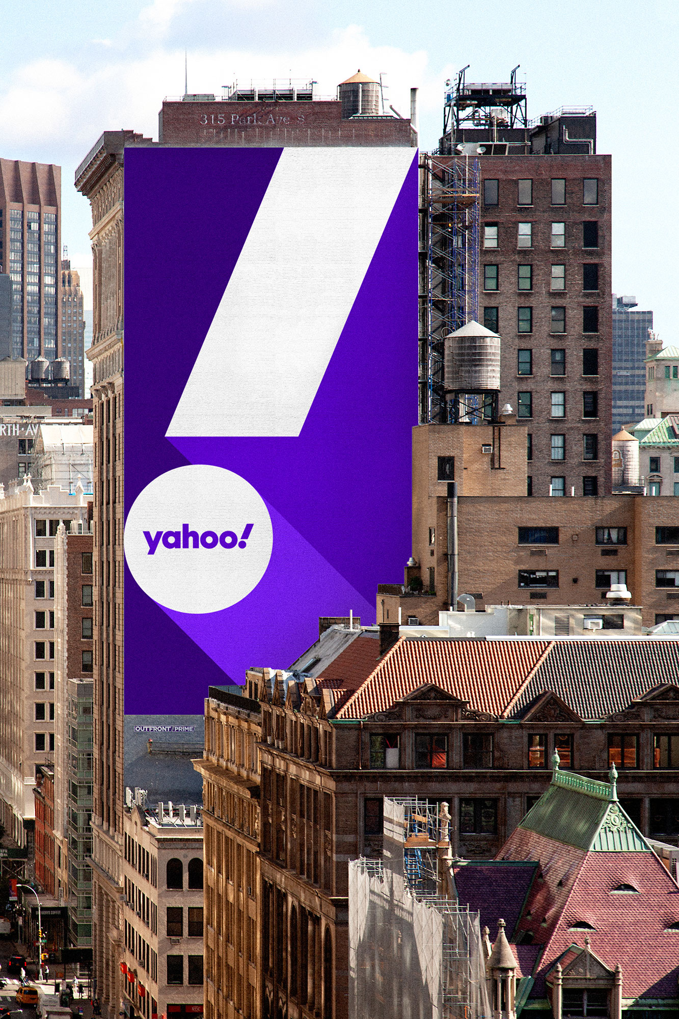

There is not much in terms of applications… the closest to something that the public might eventually see is the subway entrance ad, which is yet another “fine” execution with strips of colors at an angle that matches the exclamation point but there is nothing particularly differentiating that would make it recognizable as Yahoo!. The use of the y! monogram has some potential… like, the cap below, I sort of want to like but it feels like there is something missing. Maybe a lot of something.

Overall, my general ambivalence about this isn’t so much driven by the unsurprising design but by the complete lack of interest in Yahoo!. When I received the first tip about it in my inbox my first thought was genuinely, “Are they still around?”. They can’t compete with Google on search, they can’t compete with Gmail on e-mail, and they can’t compete on news coverage with the insane amount of specialty news outlets that far outshine anything Yahoo! could do, so a rebrand, at this point, doesn’t feel like it will be the catalyst the company needs to jump into relevance. It’s a signal that it’s trying but it’s a signal that simply blends in, and ultimately dissipates, with the hundreds of other signals everyone else is sending.
 each year since publication began in 2006

 Новости Союза дизайнеров
Все о дизайне в Санкт-Петербурге.
Новости Союза дизайнеров
Все о дизайне в Санкт-Петербурге.