Обзор лучших ресурсов по разработке бренда, разработке упаковки
contact us | ok@ohmycode.ru
contact us | ok@ohmycode.ru
Established in 2013, Future London Academy is an organization that offers week-long immersive courses throughout the year geared towards international, creative, like-minded professionals, covering five disciplines: Graphic design and branding, Digital design, Design management, Interior design, and Photography. Each course includes talks, mini-workshops, office visits, and roundtable discussions, all while highlighting the creative, commercial, and cultural life in London. Recently, Future London Academy introduced a new identity designed by Moscow, Russia-based ONY in collaboration with Michael Wolff and Oliver St John as consultants.
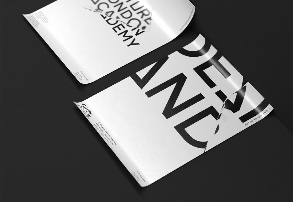
One interesting rhythmic feature that appealed to our attention was a triangle, that appears in the architecture of the city. Mostly, it is a module structure, as seen with London’s “Gherkin” building. Connecting geometry of the city with the plastics of the font, the triangle became the first origin of the visual decision. The second element became refraction, that was inspired by geometry of the London’s architecture and Harry Potter’s mystical impression of London. As a result, abstract visuals took shape involving brave and bold solutions.
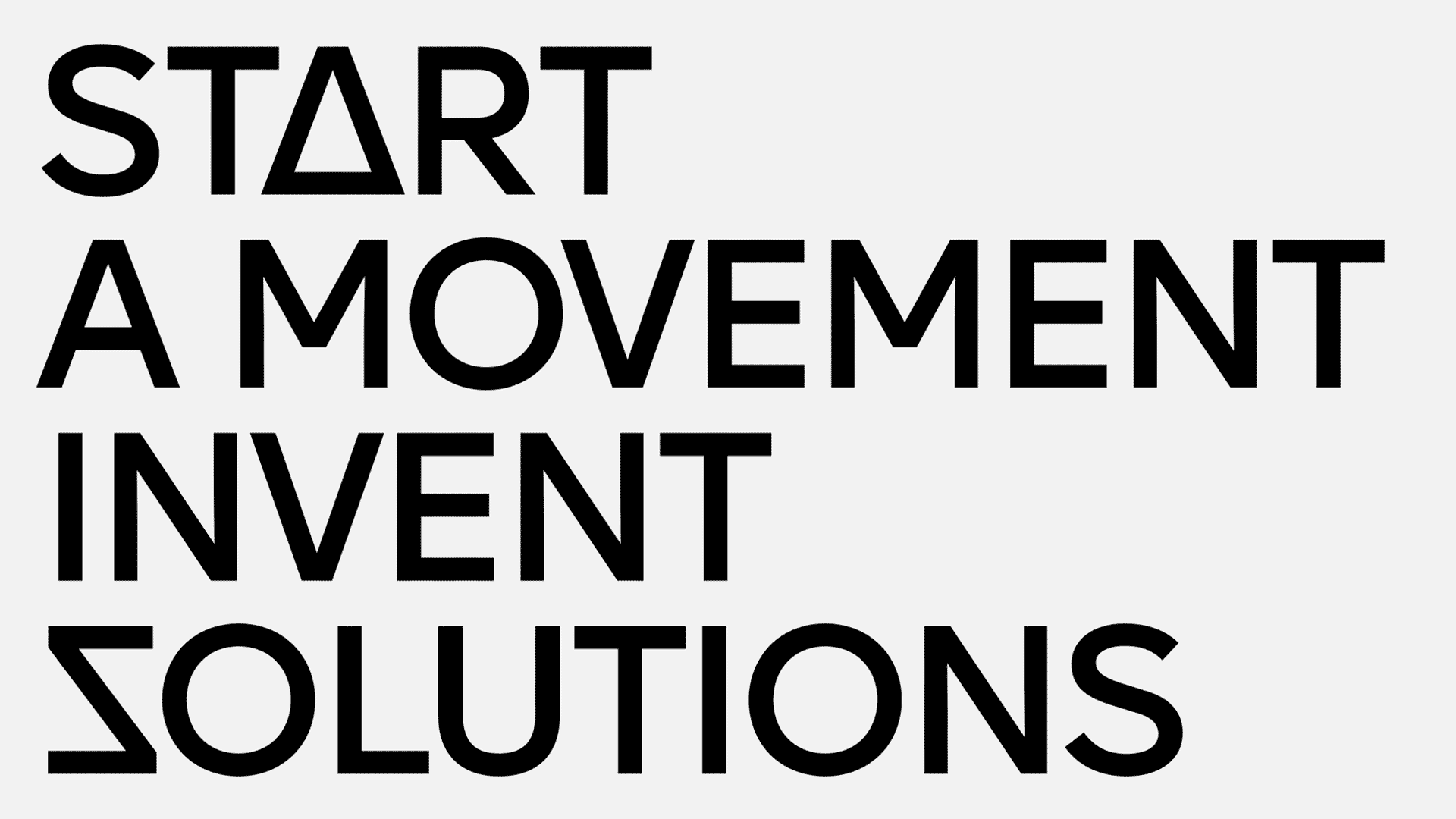
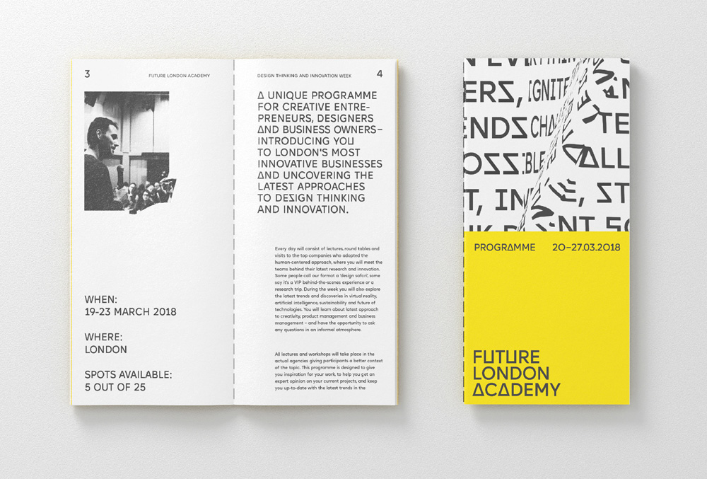
The old logo was quite bland, with the name typeset in increasing weights of Helvetica for each line. Woohoo. The new logo is infinitely more interesting — at least in relationship to the old logo — and hints at the customized approach of each course as well as being a little future-y-looking with the squared “U”s and “A”s. It’s a decent, visually intriguing wordmark that sets the tone for when things start to get wild.
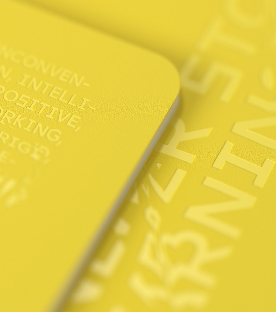
The typography gets refracted by objects from London architecture. We took models of the main architectural and cultural symbols of the city which echo the idea of Future London Academy - knowledge through the lens of London. In terms of the technical side: a 3D model of a building is layered on to an image or a text to get a refraction. It can be interacted with by turning the model right and left. The library of 3D objects can always be extended - this gives the brand an unlimited way to experiment and express itself.
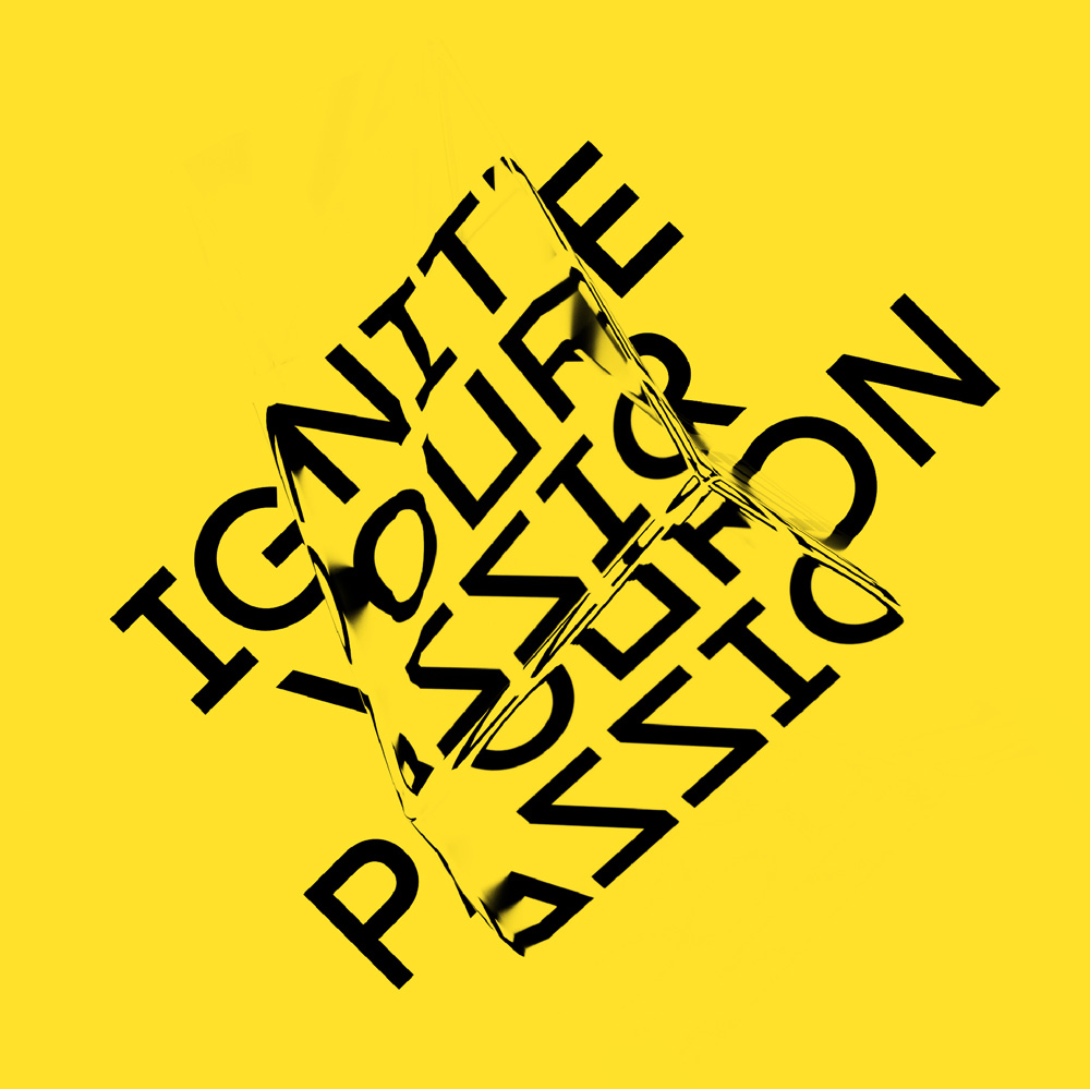
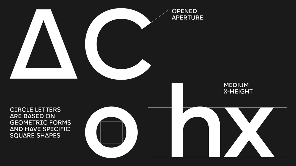
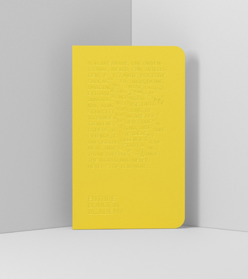
The identity revolves around a custom font and a 3D effect that distorts the typography in groovy ways (which are meant to be shapes taken from buildings around London). The results are entertaining to look at and feel appropriate for a creative organization trying to do things a little differently — sometimes, though, a little gimmicky and detractive from readability (as in the booklet directly below).
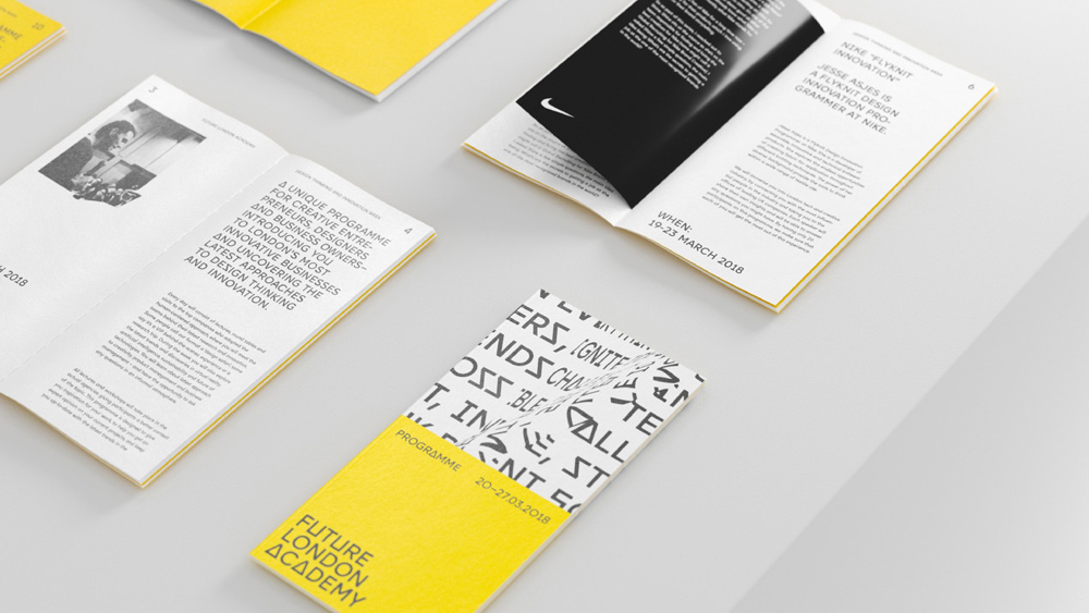
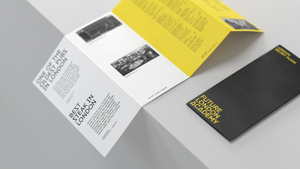
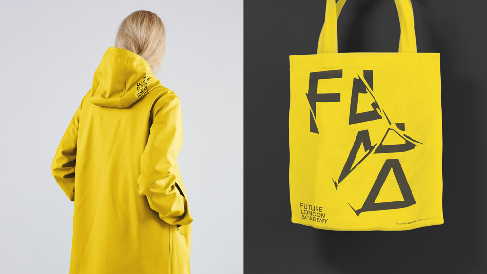
Besides the main brand that is Future London Academy, there are also various programmes Academy runs that needed a sub-branding. The task was to find an easy way to show every programme in a unique way while visually keeping them consistent. The solution was to create a secondary colour palette, that could work with the main yellow colour without overpowering it.
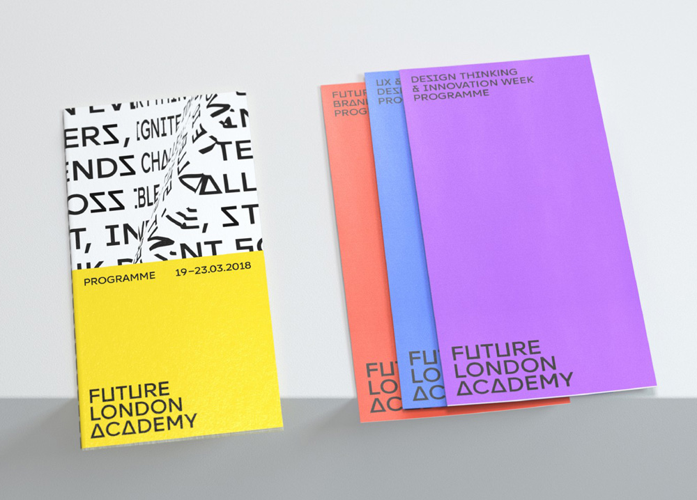
The applications look energetic and bold and they strike a good balance of having clean and simple layouts that provide a sane structure for the crazy refracted typography to be highlighted. It could have all easily been crazy all the time. At times, the custom “A”s and “S”s, get a little annoying — click around on their website for a minute — as it starts to feel like you are reading a Constructivist manifesto while using a Playstation controller. Still, the overall effect gets the point across that this is meant to be about creativity and disruption and it gives Future London Academy a presence that is almost like an arts organization or museum.

 Новости Союза дизайнеров
Все о дизайне в Санкт-Петербурге.
Новости Союза дизайнеров
Все о дизайне в Санкт-Петербурге.