Обзор лучших ресурсов по разработке бренда, разработке упаковки
contact us | ok@ohmycode.ru
contact us | ok@ohmycode.ru
Established in 1957, the Recording Academy is a U.S. organization that represents performers, songwriters, producers, engineers, and all music professionals while honoring achievements in the recording arts and supporting the music community. Headquartered in Santa Monica, CA, with 12 chapters across the country, the organization is best known for its annual Grammy Awards, presented since 1959. This month, the Recording Academy introduced a new identity designed by Siegel+Gale.
By introducing color and rendering the gramophone in both static and animated form, the new logo illustrates the variety of music genres and music creators the Recording Academy advocates on behalf of. In its pure graphic form, the gramophone remains the core identifier for the GRAMMY Awards and the Recording Academy’s programs. When animated, the logotype adapts the width of its letters to the sound and rhythm of music it is paired with. The various renderings of the gramophone serve as the foundation for a modern visual identity that is as dynamic as the music it is designed to represent.
Any time a logo loses its Trajan wordmark an angel wins back the wings it may have previously lost through any number of other design crimes. In its defense, there was nothing inherently bad about the old logo but Trajan is the least imaginative or differentiating font to be used in a logo. The new logo keeps the gramophone icon intact — after all, it’s a graphic representation of the Grammys’ trophy — but supplements it with a sans serif with contrasting thicknesses, exuding a 1950s glamour aesthetic without being completely a throwback as there is some modernity to the letterforms. I understand that the icon had to stay but perhaps could have been run a little smaller to make it feel less monolithic.
The musically-responsive wordmark is cool and a valiant concept but I wonder what its application is, given that the Recording Academy is more of a “parent company” with less contact with the general audience. I mean, I’m not saying it’s useless in any way, more like being sad that it’s not actually going to play a significant role in the identity, because I also don’t picture static applications where the logo is rendered in those funky widths. Still, I enjoy this and perhaps a Joshua-Davis-like music activation could take it up to 11.


The gramophone icon has been rendered in 3D to be used in dramatic close-ups as an abstract graphic element in the applications. It’s a nice idea and perhaps, like the shifting wordmark, the gramophone could be rendered in different textures — concrete, fabric, wood — to convey different moods.
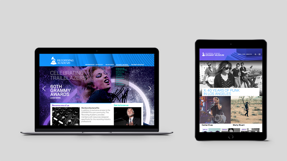
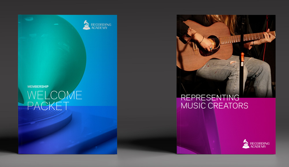
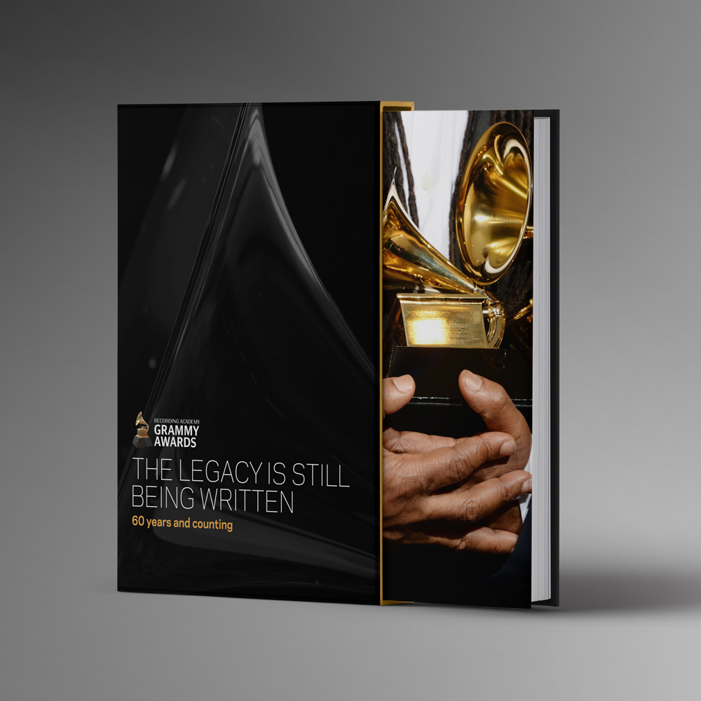
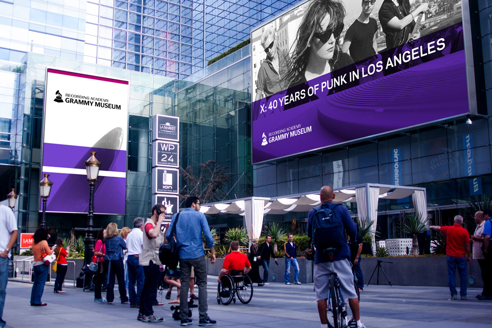
The applications are okay; I like the brochure where the green crop of the gramophone meets the blue crop but not so much how it’s integrated with pictures. The supporting typeface feels very default-ish throughout. These could all be fairly cool with a little more refinement and structure. Overall, it strikes a good balance of feeling like an organization with 50-plus years of legacy but not completely out of touch with the present.

 Новости Союза дизайнеров
Все о дизайне в Санкт-Петербурге.
Новости Союза дизайнеров
Все о дизайне в Санкт-Петербурге.