Обзор лучших ресурсов по разработке бренда, разработке упаковки
contact us | ok@ohmycode.ru
contact us | ok@ohmycode.ru
Established in 2015 and based in Toronto, Canada, Inkbox offers semi-permanent tattoos with designs created by a community of contributing artists. Unlike temporary tattoos that are more sticker-like, these seep into the top layer of the skin with an active ingredient derived from a plant that grows in the jungles of Central America and works as a dye. Also, unlike temporary tattoos, these take more effort to apply and require 24 to 36 hours to fully “develop”, like a very slow Polaroid, but the result is a more real-looking tattoo. Aside from pre-made designs, all available only in single-color black, Inkbox offers a squeeze bottle for freehand application. Last month their logo redesign was included in the Spotted section and their team reached out to share the rest of the identity designed by local firm Concrete.
This rebrand sets out to empower and celebrate the artistry and stories of Inkbox’s growing community of fans, collaborators, and artists. The updated brand and visual language aims to better communicate our commitment to developing products, community, and experiences that create moments for personal expression.
Inkbox’s semi-permanent tattoos provide a medium of self expression that allows people to explore different versions of themselves. The new wordmark anchor’s this ever-changing canvas of community content and visual language. The ink drop icon provides a flexible addition to the wordmark and can be swapped out for a variety of symbols depending on the context of the application.
The tagline “For Now” embraces the temporal nature of Inkbox tattoos and the ever-shifting personal identities of the community.
The bold typography and ecstatic visual language is a reflection of the Inkbox attitude; be original, be inclusive, have fun, inspire creativity, be loving, and live in the now.
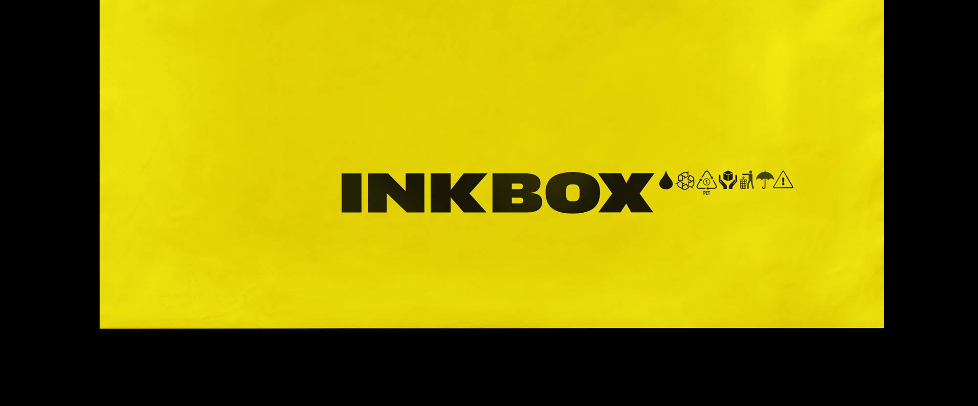
The old logo was sort of interesting, with a drop of ink oddly floating inside/outside a cube that sort of implied “ink in a box”. The wordmark, dipping below the baseline, was meant to represent the ink seeping into the skin. It was fine but looked more like a video game company than a consumer brand. The new logo feels so much more like a lifestyle brand, something that would be featured on, like, VICE. It’s a nice combination of uppercase characters — the angled “K” and “X” at the 3rd and 6th positions are a good anchor — and the extended structure makes for a bold wordmark. The ink drop at the end is a nice touch and I like how they kept it as a minimal element instead of making it the centerpiece. Probably done on purpose, the ink drop now looks more like a tear, which is often associated with prison tattoos and has multiple possible meanings, some good some bad, so… I’m not sure if the move is good or bad but it’s there.
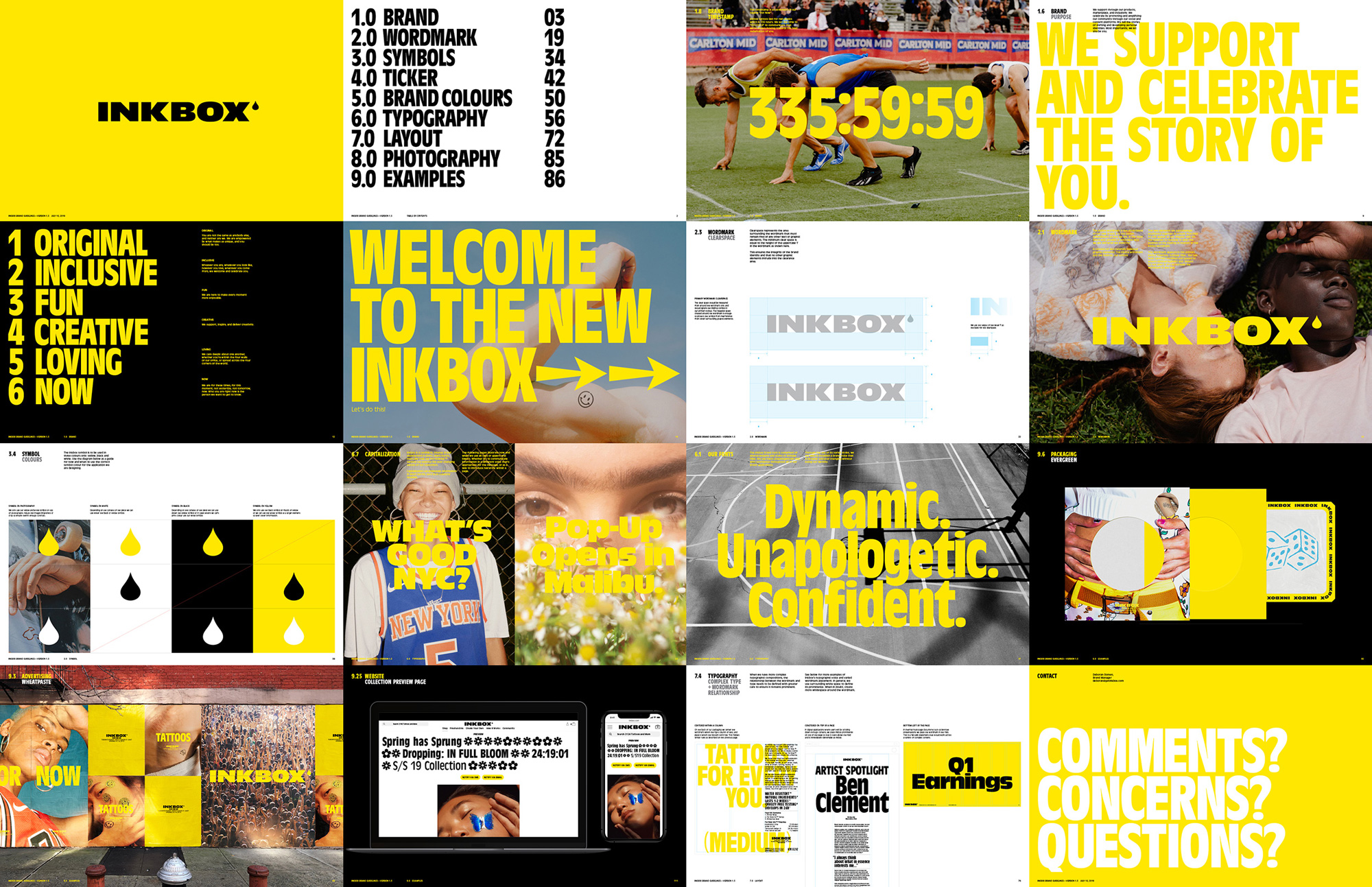
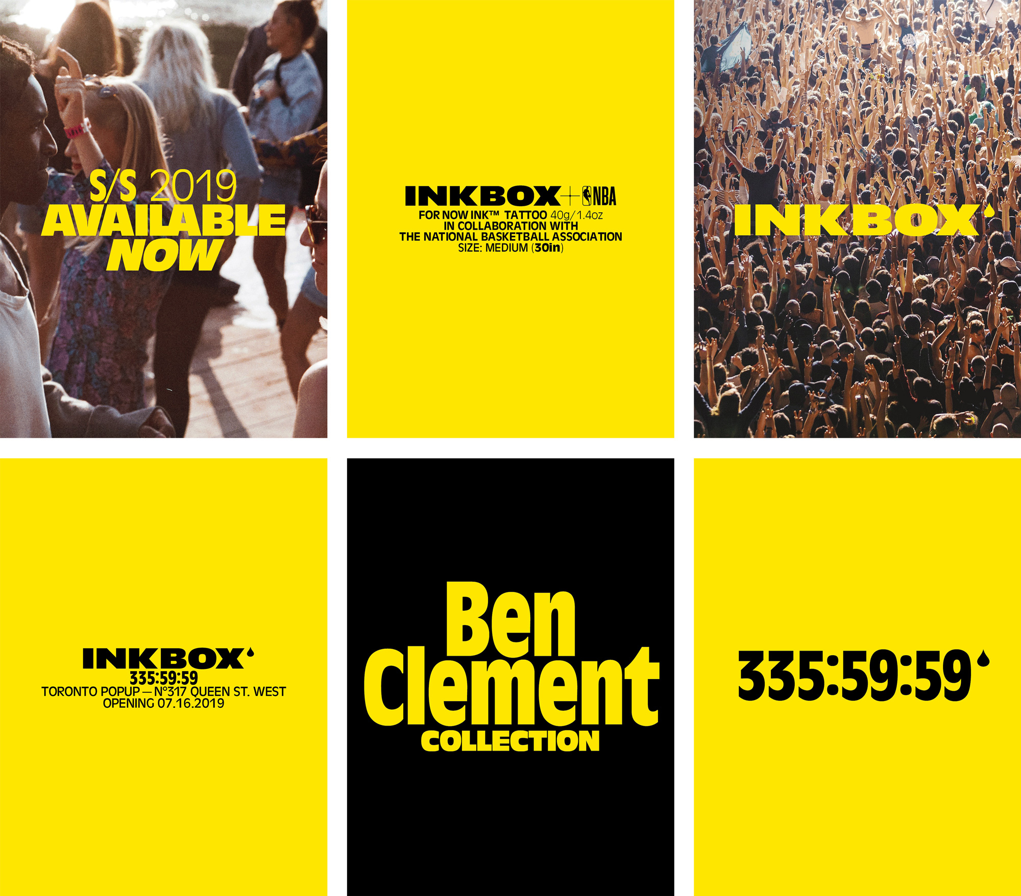
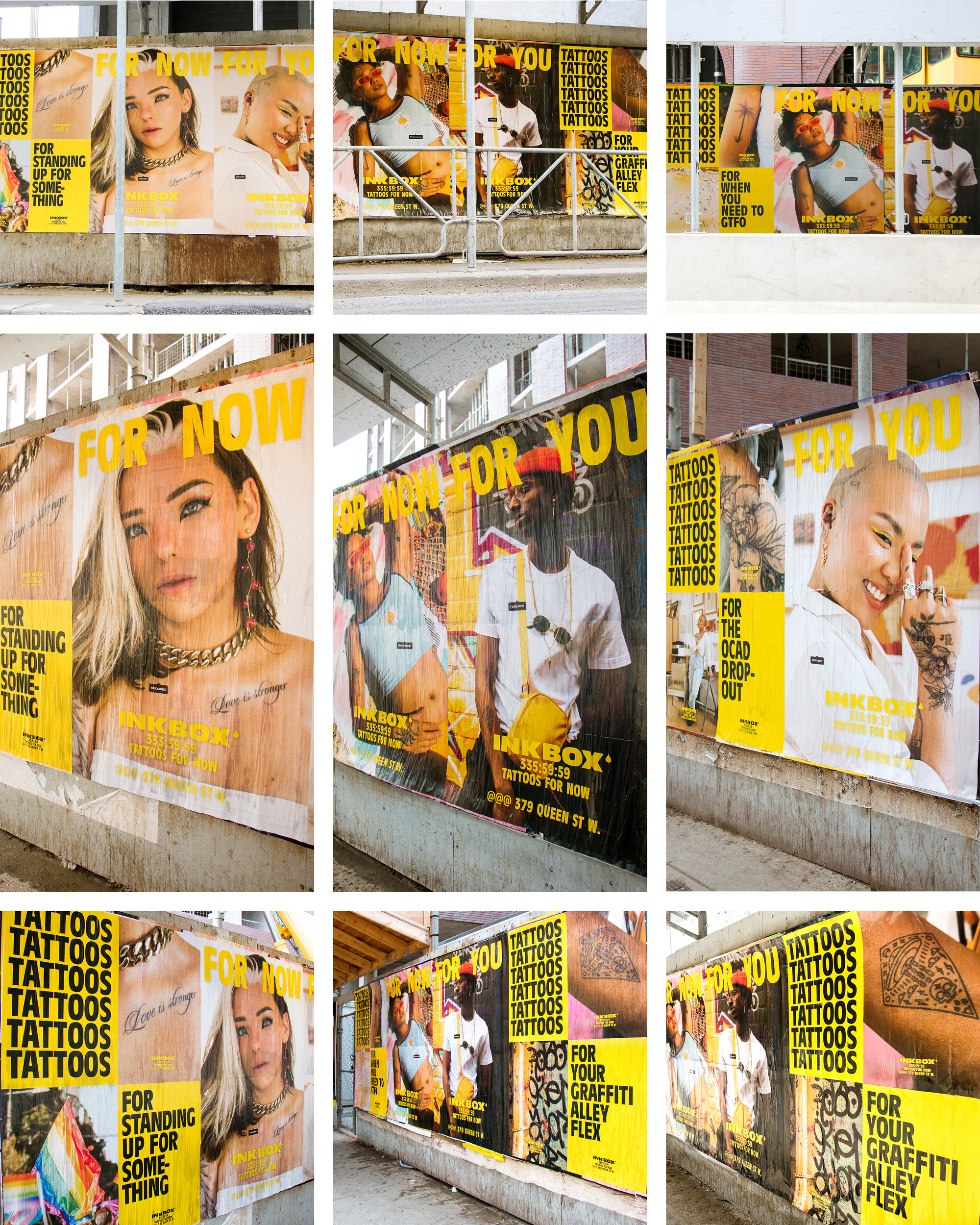
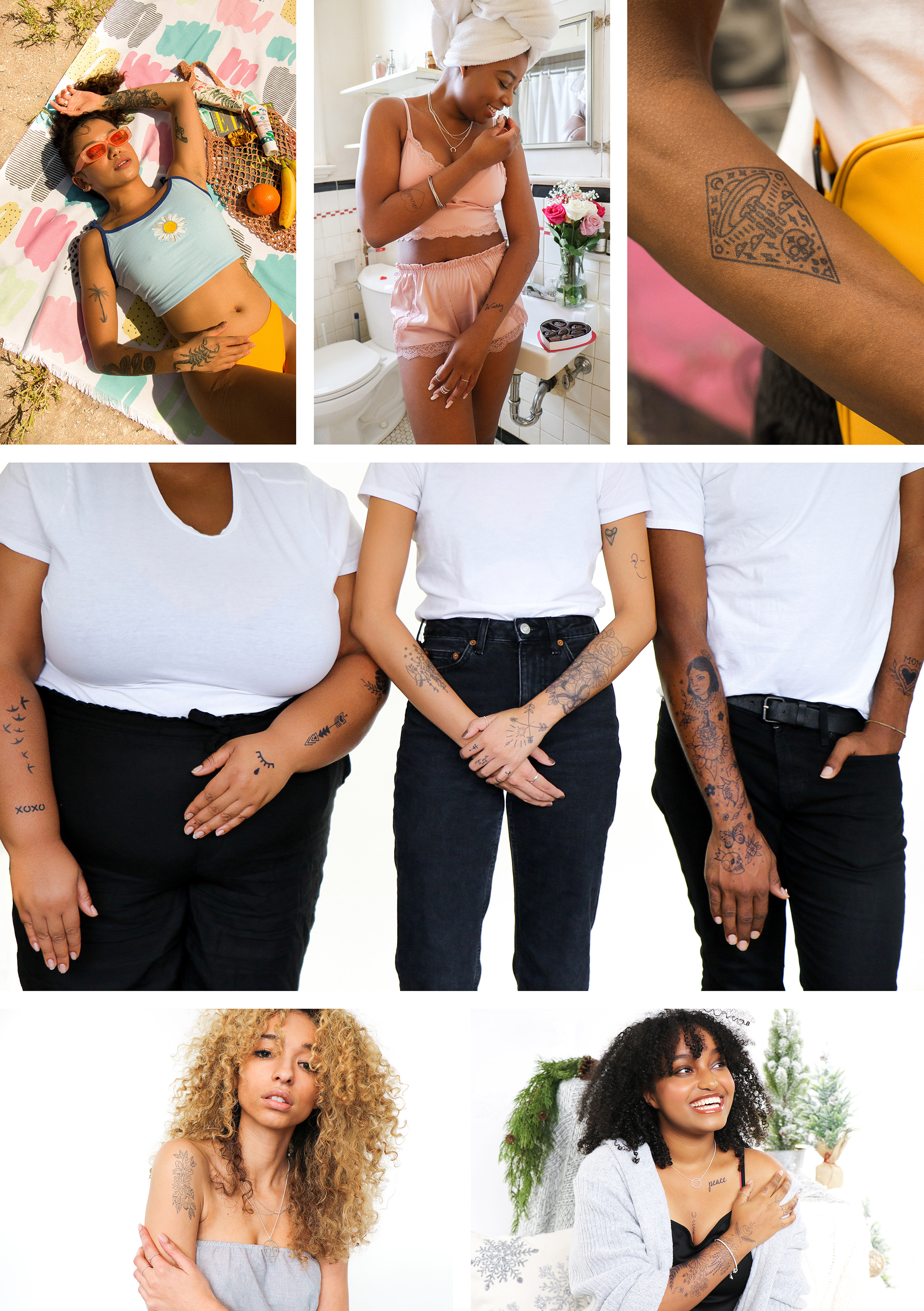
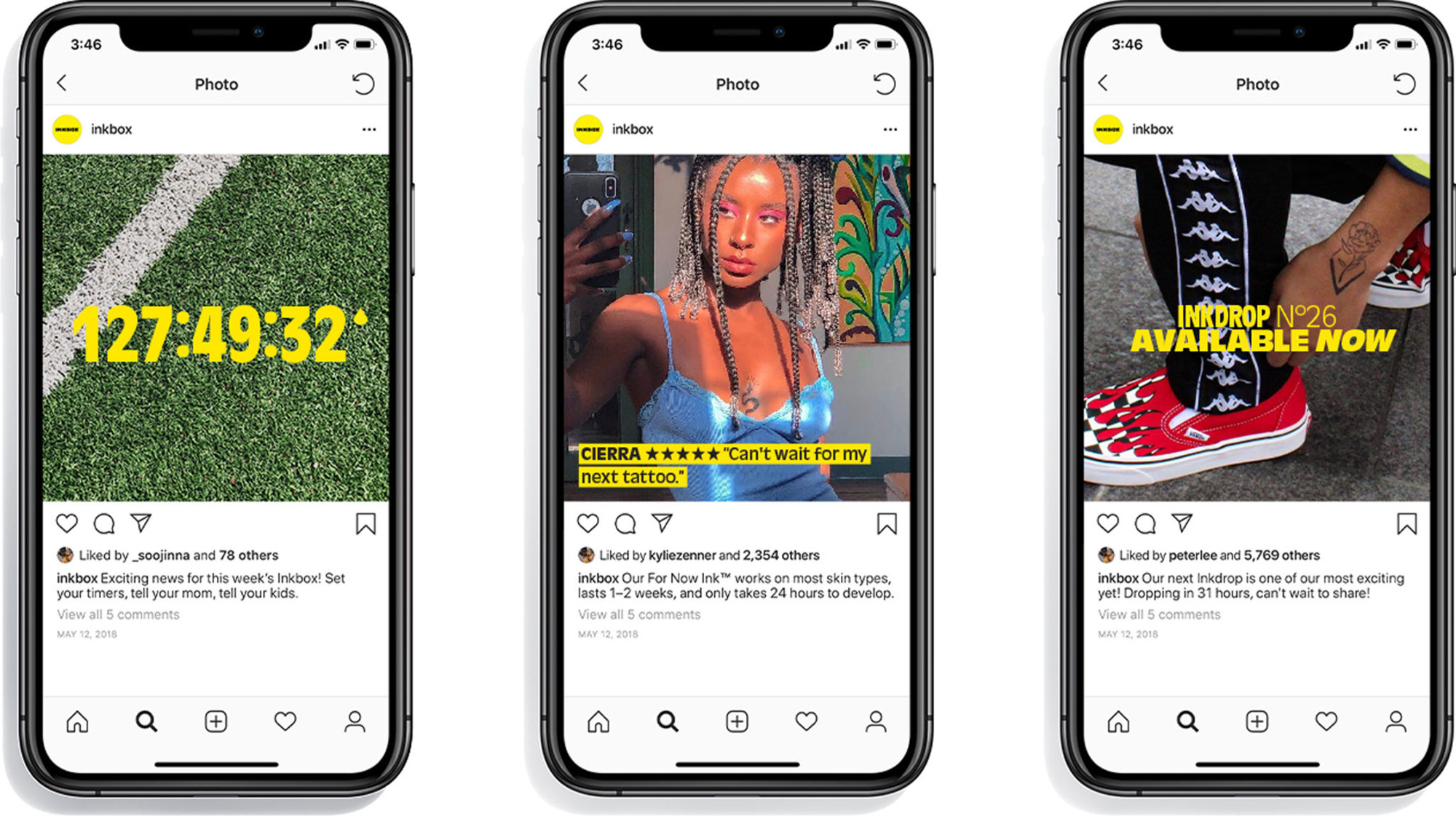
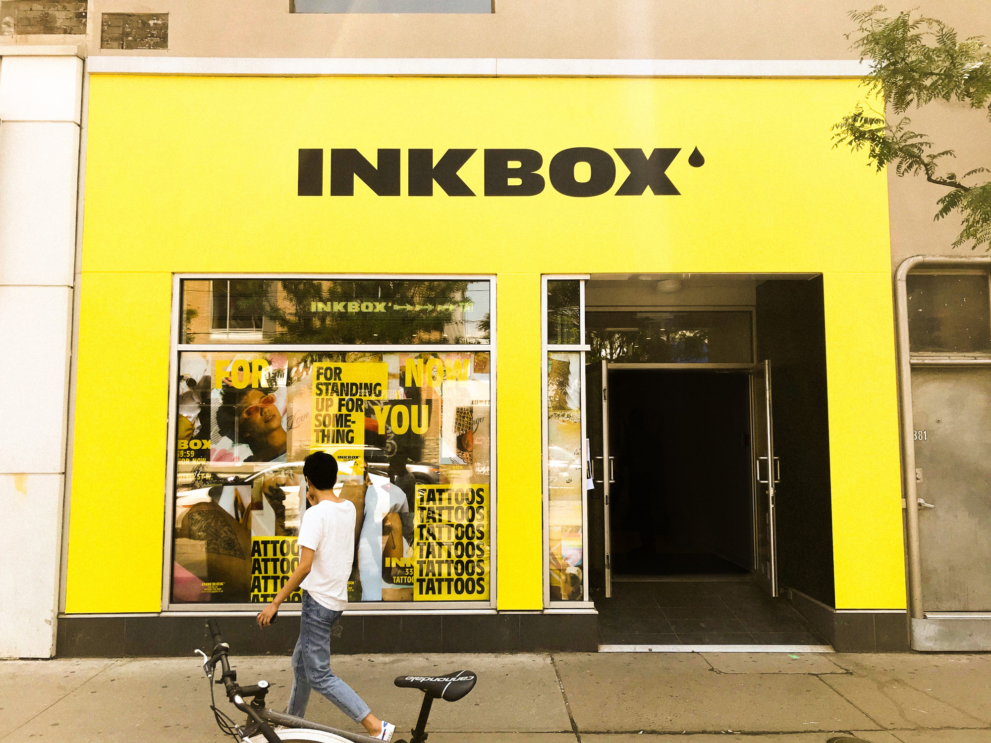
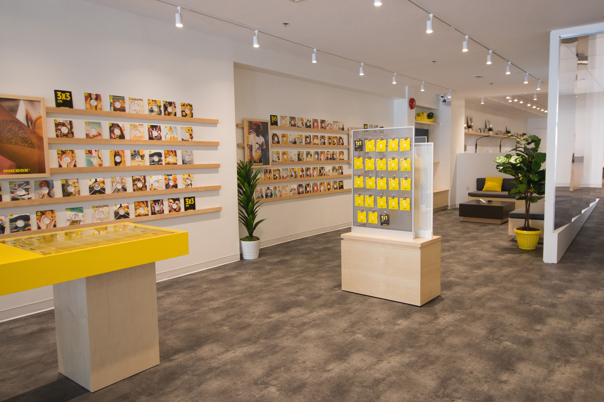
The logo plays a nice counterpart to the condensed typography used in application: a lot of Antique Olive Condensed, which is one of my favorite typefaces that I have always tried to work into a project but have yet to pull off. In combination with the lifestyle photography (below), the communications definitely have a “street” flair that separates Inkbox from the more wholesome Tattly — neither is better than the other but they each target a very different audience (promos to both, though, who do a great job of inclusivity through their models).
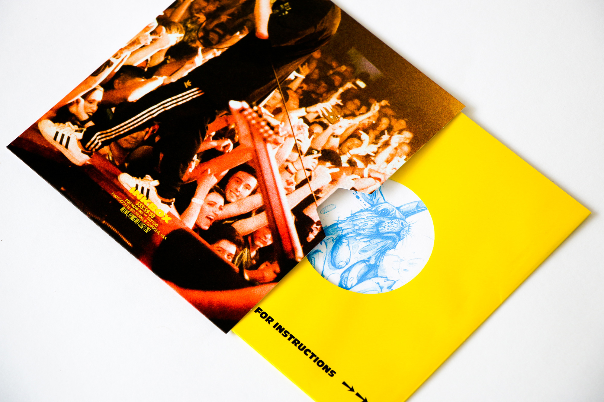
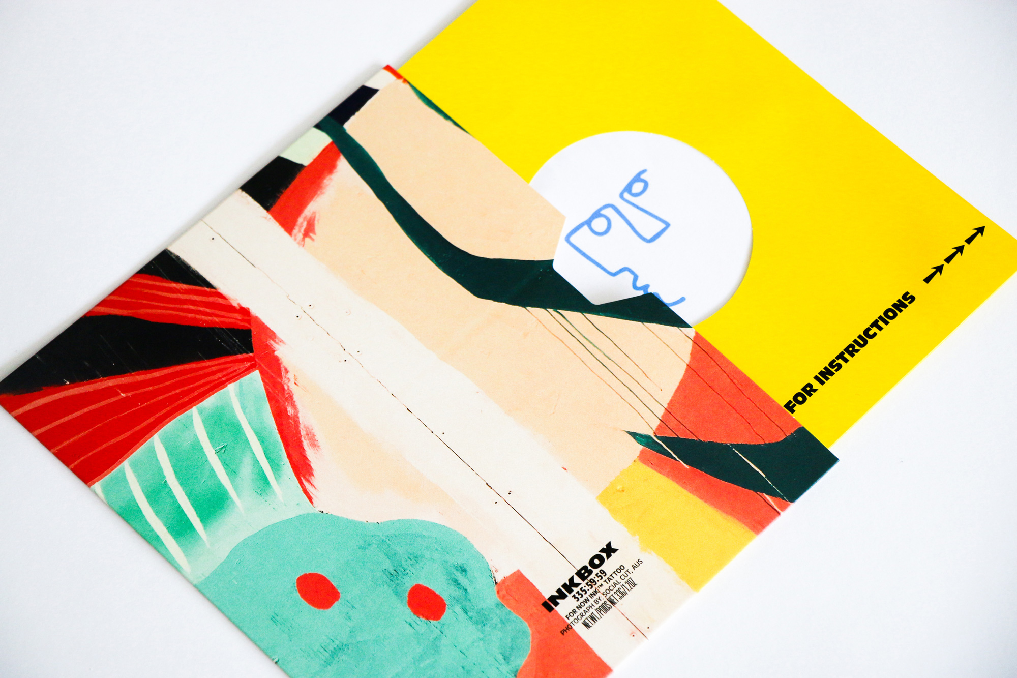
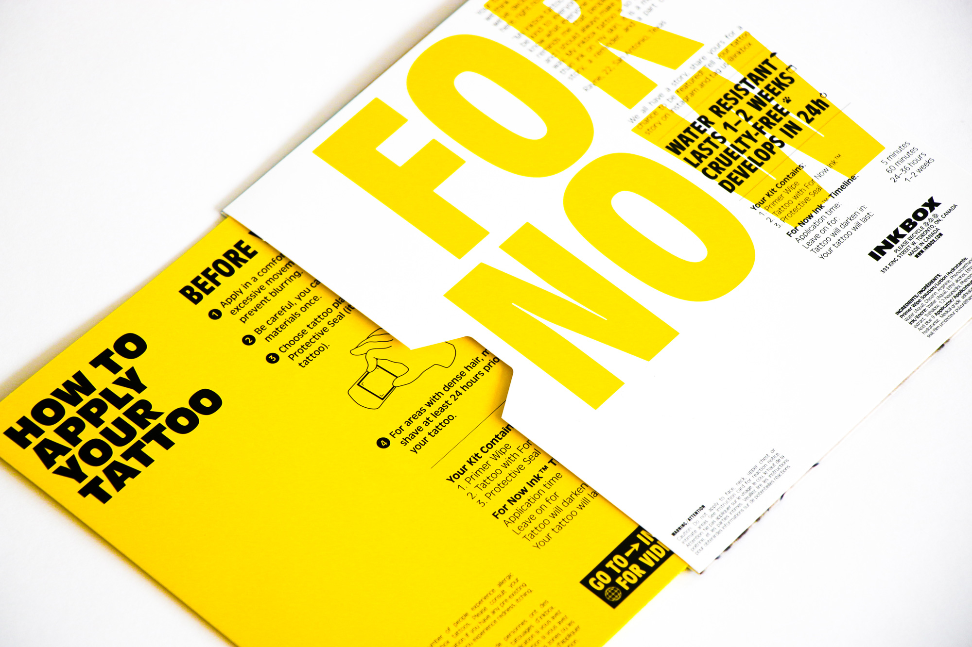
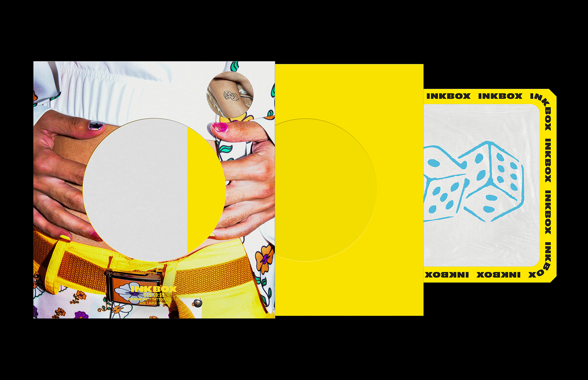
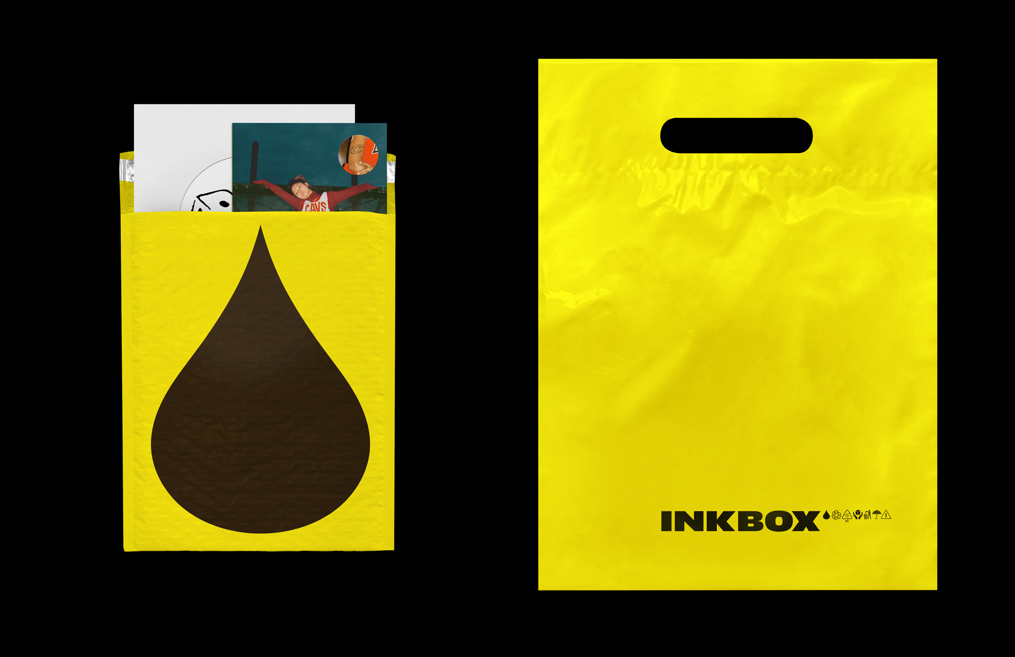
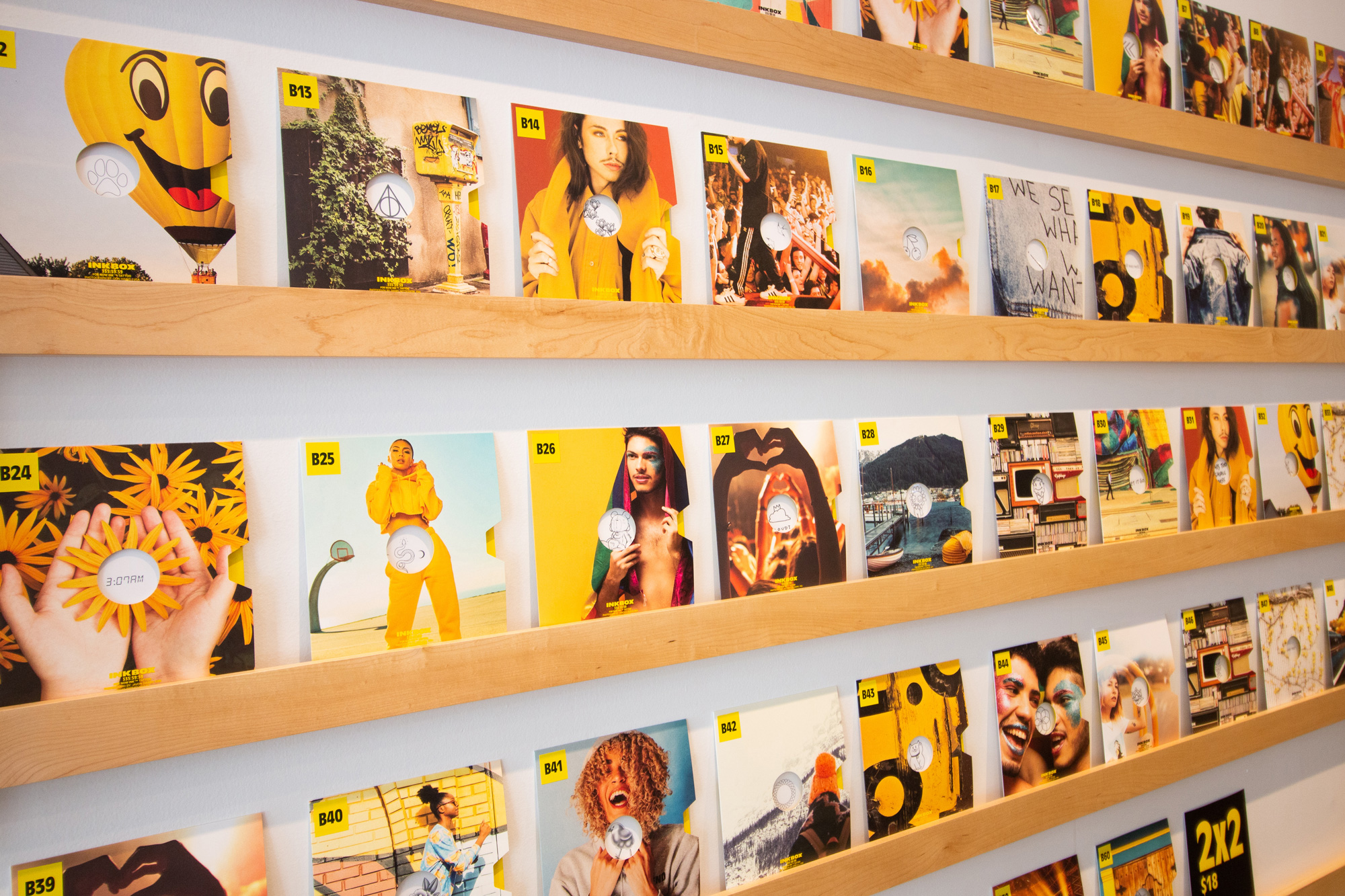
The single tattoo packaging is pretty neat, offered in record-sleeve-like, um, sleeves that allow you to peek the design and accommodate the large amount of instructions needed, all presented in yet a lot more Antique Olive. Yeah!
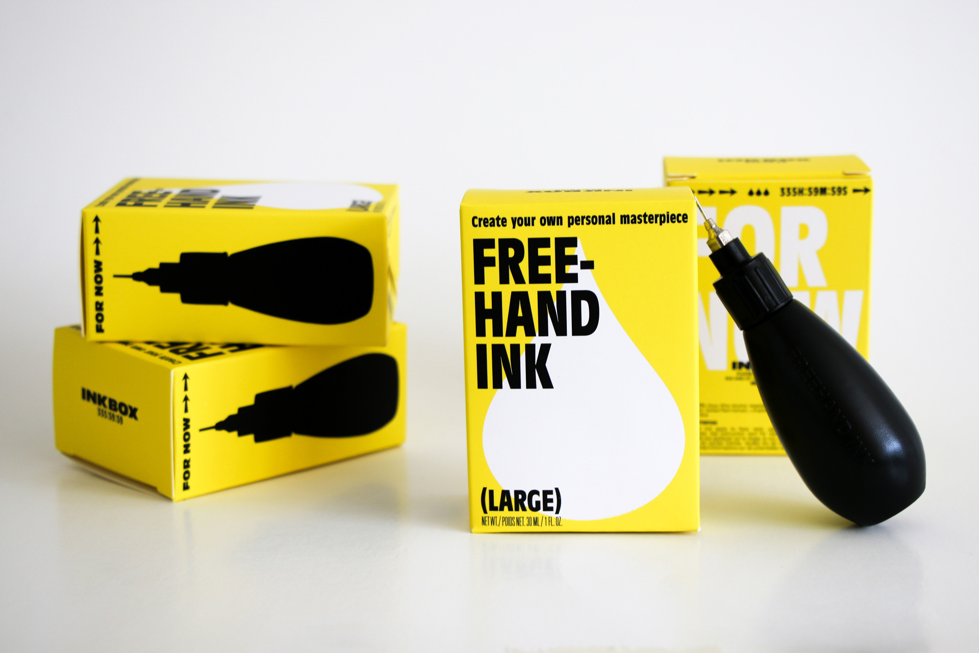
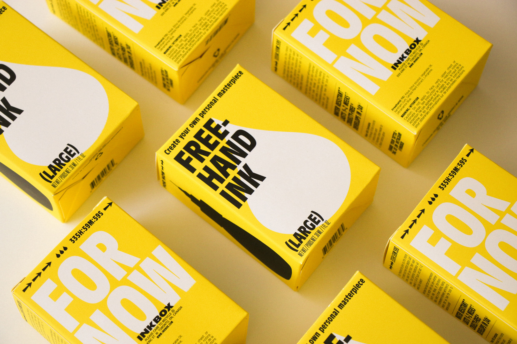
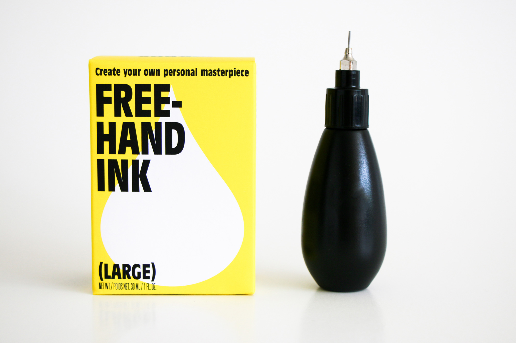
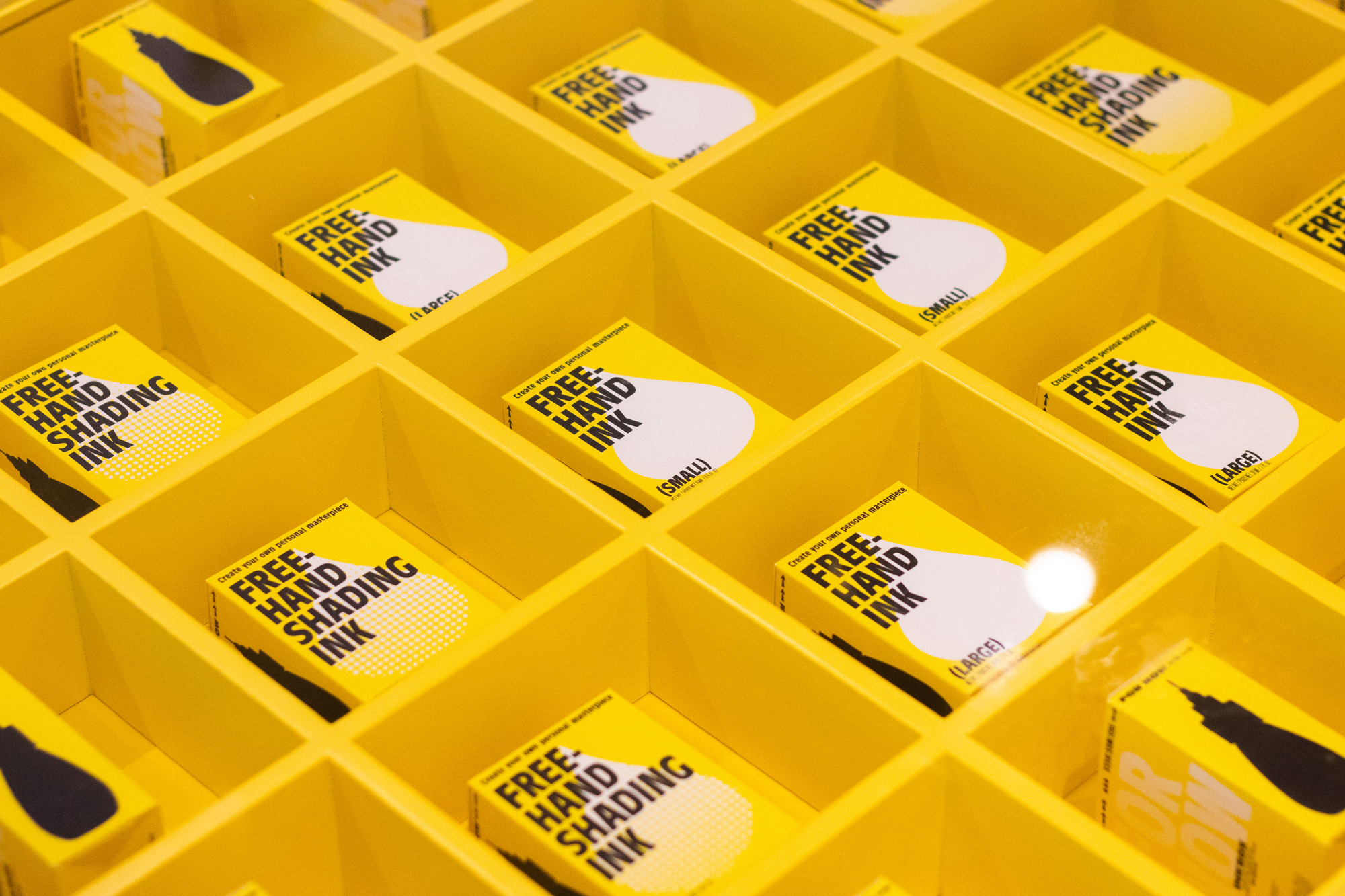
I dig the freehand ink box too… almost looks like light bulb packaging had a baby with Geigy Pharmaceutical packaging.
Overall, this is a great redesign that infuses the brand with a lot more attitude but stops right before getting too douchey or questionable, achieving a good level of making the prospect of a semi-permanent tattoo feel a little more adventurous and anti-establishment but without the repercussions of a permanent one.
 each year since publication began in 2006

 Новости Союза дизайнеров
Все о дизайне в Санкт-Петербурге.
Новости Союза дизайнеров
Все о дизайне в Санкт-Петербурге.