contact us | ok@ohmycode.ru
contact us | ok@ohmycode.ru
(Est. 2007) “Zendesk builds software for better customer relationships. It empowers organizations to improve customer engagement and better understand their customers. More than 81,000 paid customer accounts in over 150 countries and territories use Zendesk products. Based in San Francisco, Zendesk has operations in the United States, Europe, Asia, Australia, and South America.”
In-house
Zendesk press release
Zendesk blog post
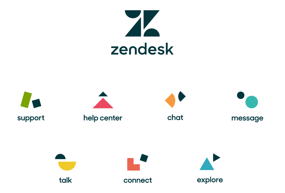
Zendesk’s redesign reflects the company’s expansion beyond customer service. Called “Relationshapes,” the brand system represents each of Zendesk’s seven products with a logo showing the interaction of two simple shapes. Symbolizing the business and the customer, these shapes have unique personalities and relationships.
While each product has a unique identity, they fit together into a greater whole that is represented by the new Zendesk company logo. The logo is a large Z comprised of the individual shapes connecting together.
I was a bit delayed on posting this one as I was trying to get some additional material but doesn't look like that's going to happen. The old logo was okay: a lotus flower with a heart in it to convey a sense of zen with one of the most hated things in the first world, customer support. But as a logo I don't think many people associated it with Zendesk as much as they did the Buddha character that literally eclipsed the logo. I was never a fan of it but then again I was not the target audience. "Buddhy" as it was sometimes referred to internally has been dispatched and in its place comes a series of squares, circles, and triangles that make up the main monogram and product logos. The new logo focuses strongly on the "Z", which is a pretty nice rendition with a simple playfulness to it. The wordmark is a cleaned up version of the previous rounded sans serif that is in tune with today's standards. The product logos are great… if you see the animations (in the first video below) because on their own and static they are a little ambiguous. "Support" and "Connect" are the best ones. Overall, a great improvement from the more joke-y vibe of the Buddha to a playful but still serious visual tone.


Thanks to Michael Mizrahi for the tip.

 Новости Союза дизайнеров
Все о дизайне в Санкт-Петербурге.